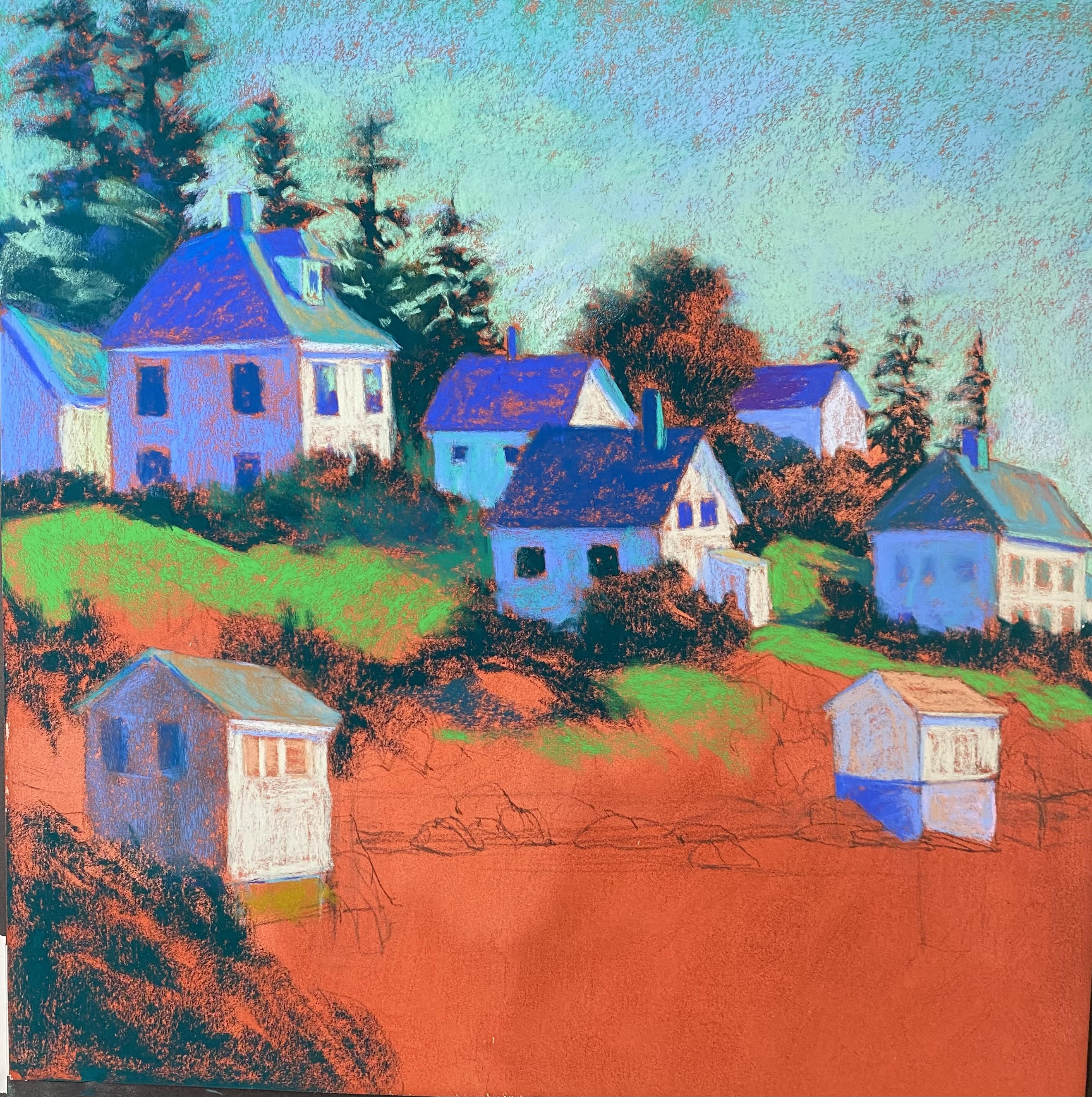
Morning Light, Stonington, 18 x 18, Lux Archival
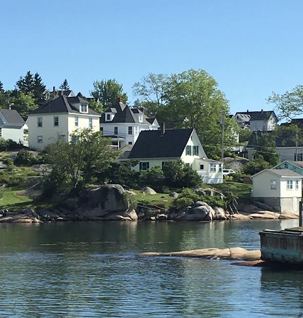
Reference photo 1
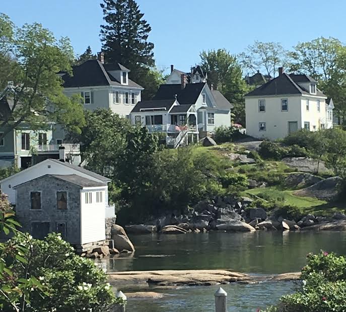
Reference photo 2
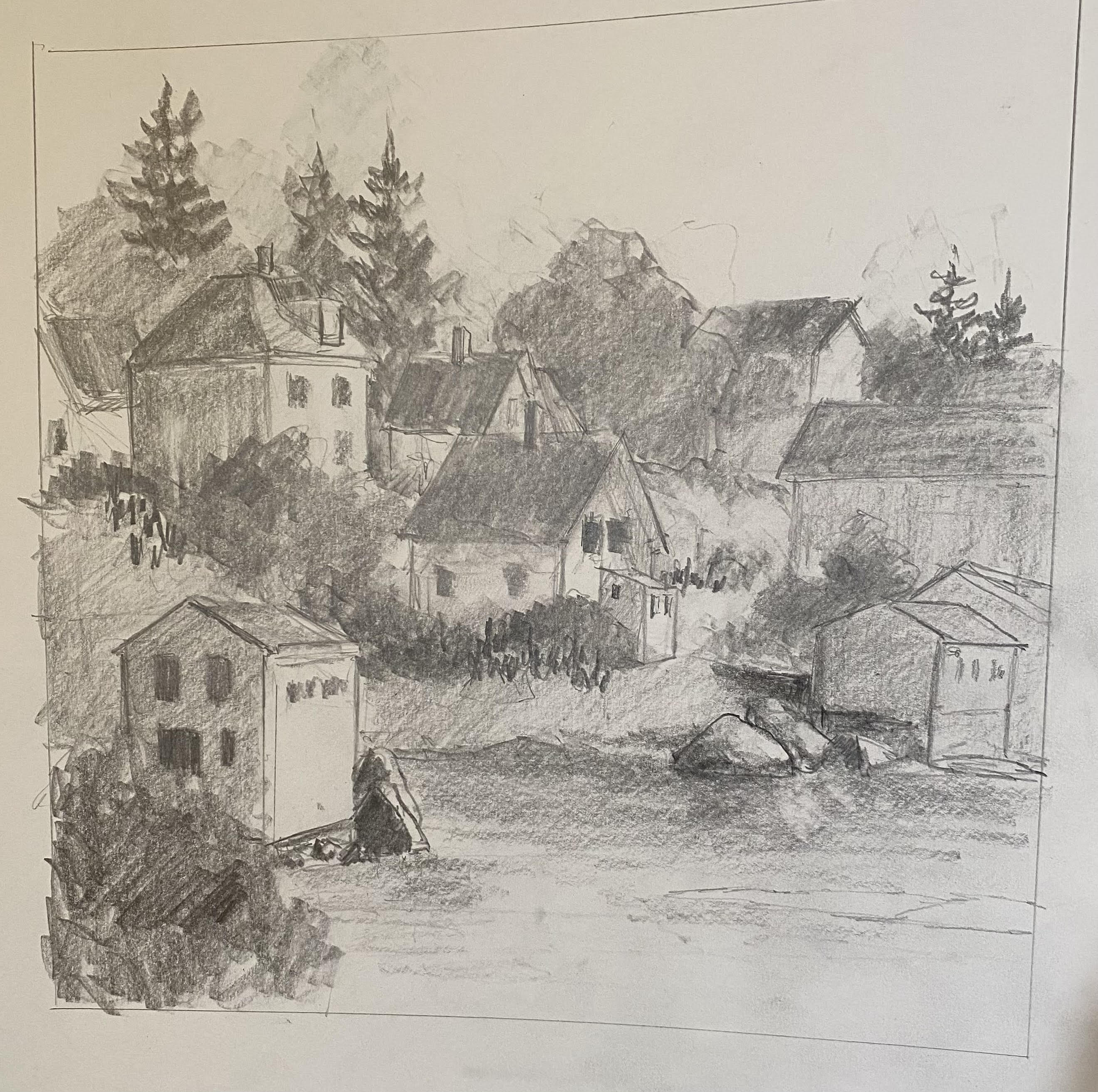
Drawing
Partial lay in of hard pastel showing red ink surface
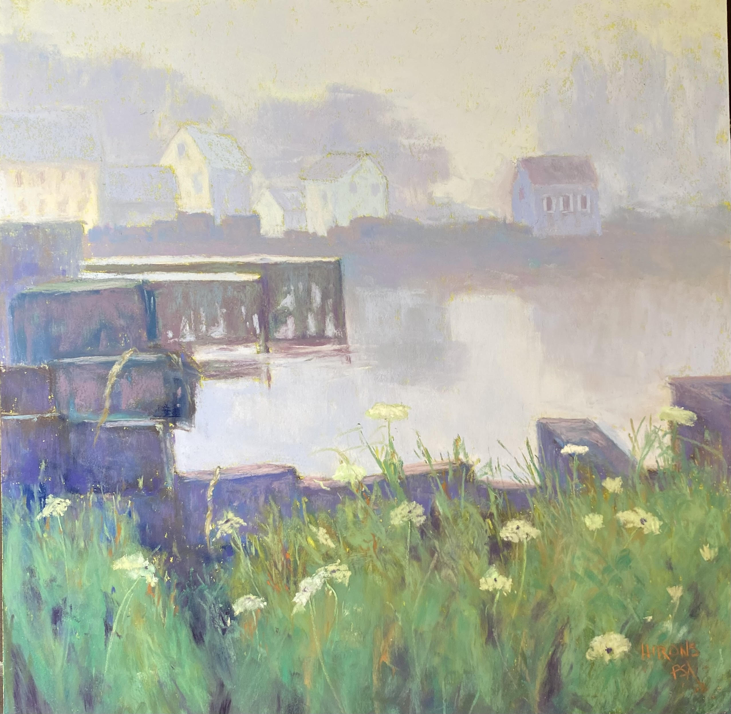
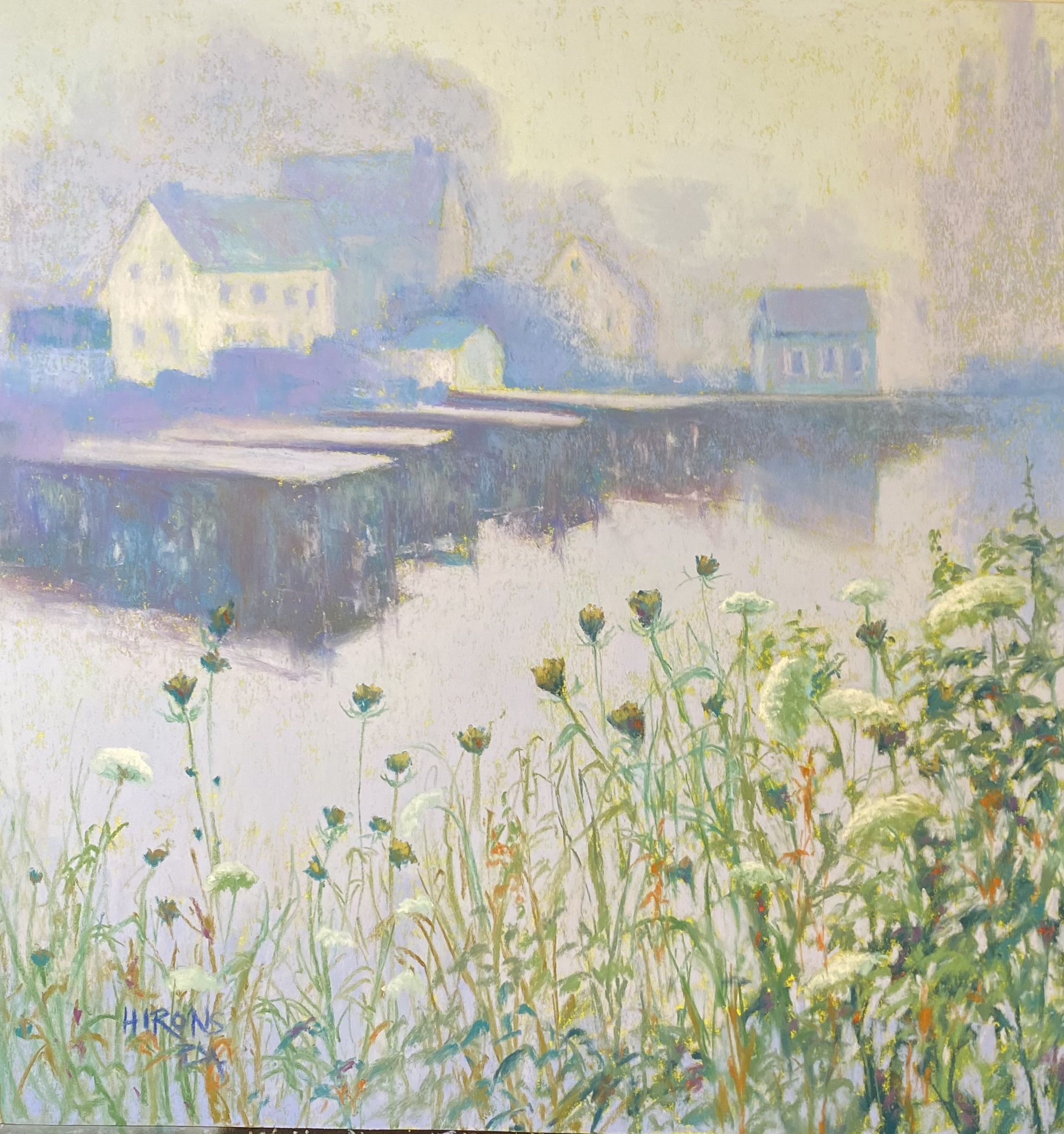
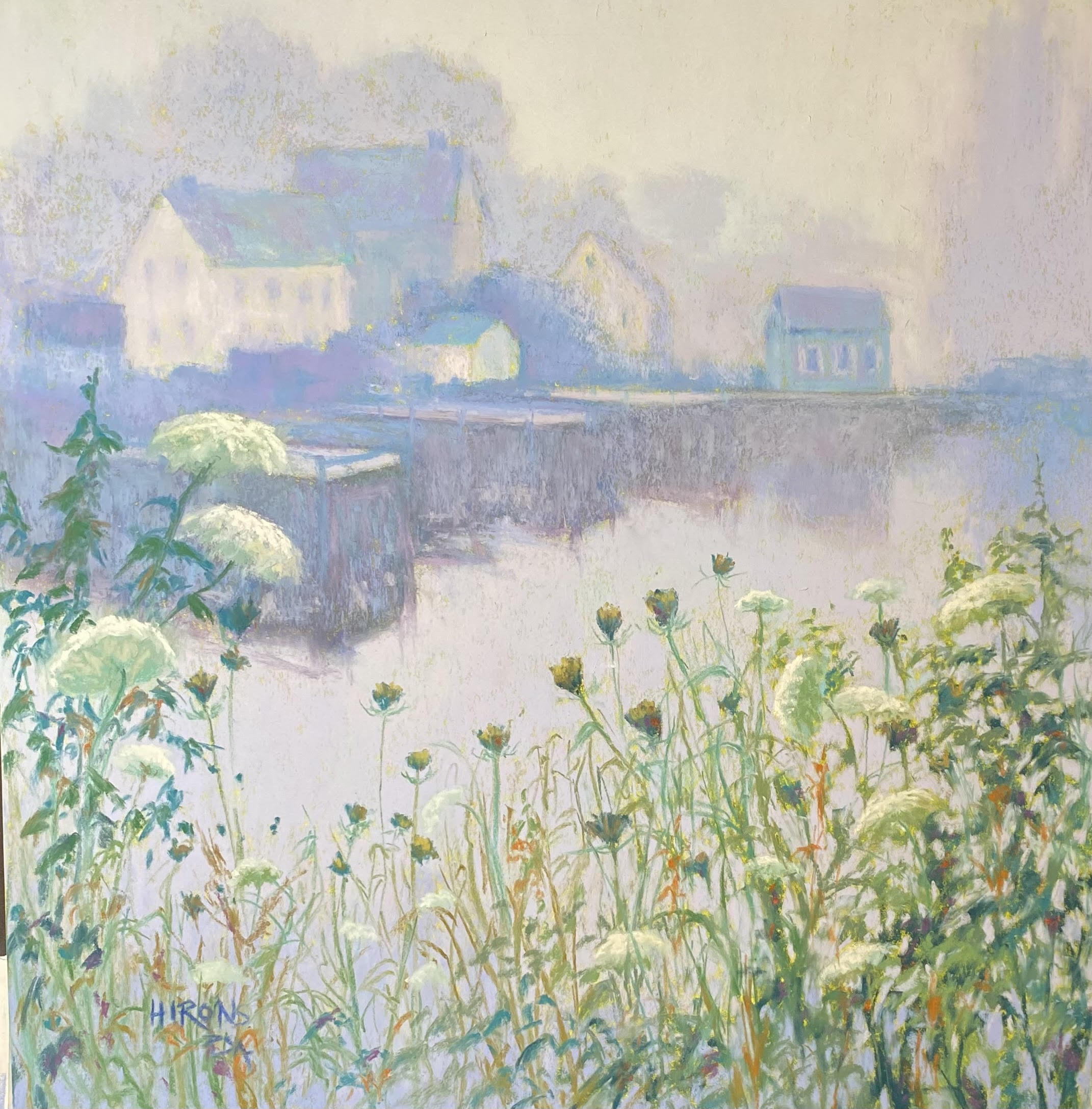
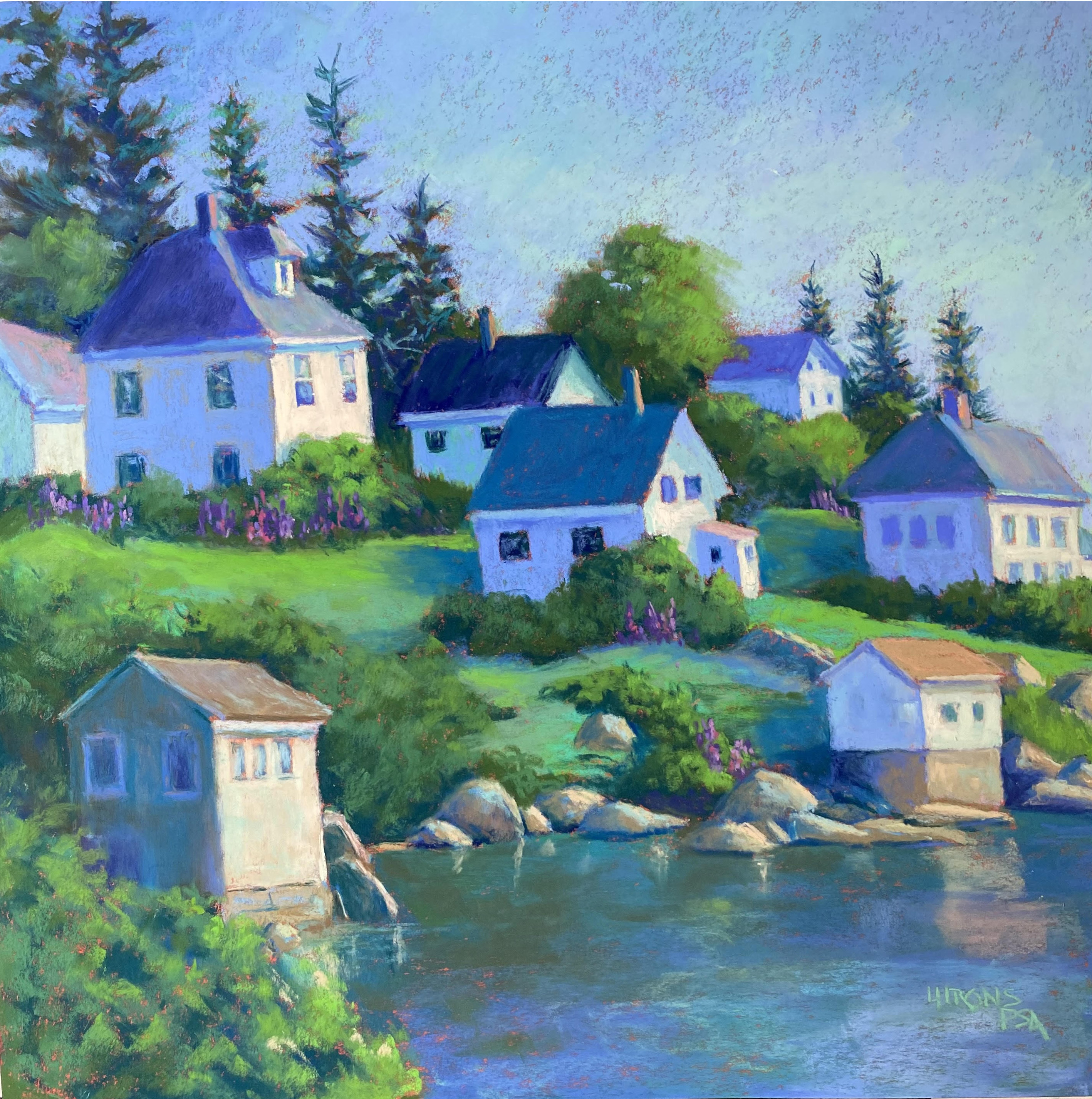
My most recent painting was begun some time ago. I decided to use two different photos of Stonington, Me harbor as I wasn’t completely happy with either. I wanted the lower building from photo 1 and some of the houses from photo 2. I worked on a drawing, picking and choosing houses and simplifying them as well. I used red earth ink to tone the paper and liked the effect of it. I did a drawing then started with hard pastels to lay in the basic colors. I decided to use primarily blues and greens.
I made a number of changes, including adding tall evergreens behind the houses and removing the one really tall tree from photo 1. I left out the rock in the water and, as mentioned, I simplified the houses. I wanted the yellow house at the top of the hill to be the center of interest and tried to keep the others a little cooler with less sharp lines.
I also decided that I wanted to add lupines to the painting as they were all over Stonington when I was there (June). You can see them in front of the yellow house and a few other locations. I didn’t want them to be too obvious, but I wanted to at least hint at them.
I was happy witht the way the painting came out and I’m feeling more confidant in making major changes or even working without a reference. I took a lot of photos and am using them as a PowerPoint demo for my zoom class.