
After I finished the commission, I decided to do some 18 x 18s for Jud Hartmann’s gallery in Blue Hill, Maine. I sold four paintings in 2021 and havent’ sent him anything new in some time. I decided to stick with my recent 18 x 18 format but use Lux Archival and not the prepared surfaces. I was reminded of my 12 x 12 Port Clyde fog paintings that I did in 2012 and decided to revisit them.
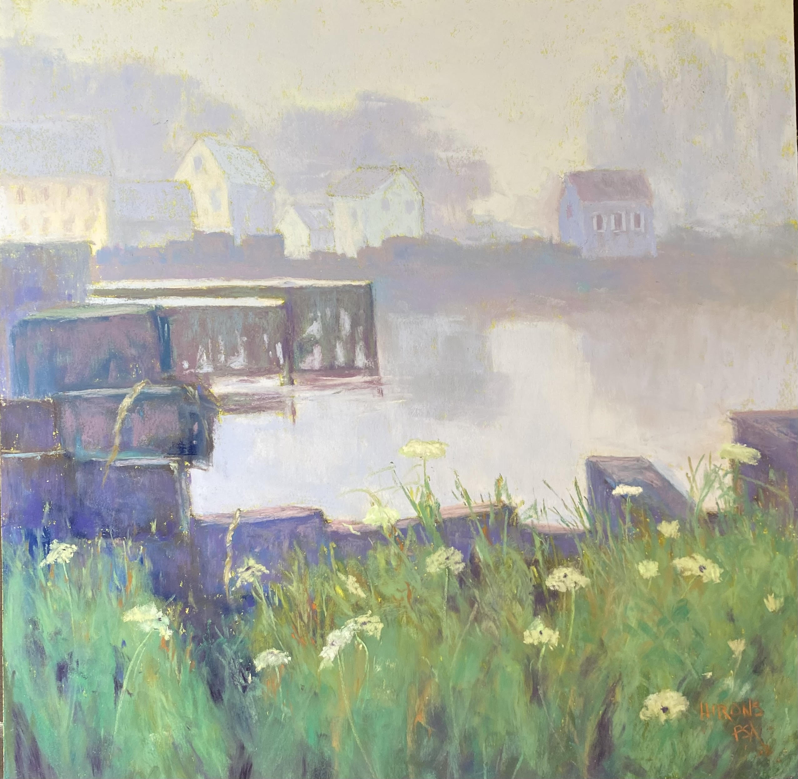
Port Clyde in Fog, #1
The first one is a picture with lots of lobster crates. I’ve made them into more of a solid shape. I struggled with the values in both this and the subsequent painting, not having done fog in some time. I ended up making this painting much lighter than the original 2012 painting. And I added trees behind the houses at left that weren’t there. This painting involved input from some of the members here at Fox Hill! It was interesting sharing my process with them. My goal was to have the eye travel around the foreground to the left and over to the little building at right. This is a painting with a defining shape around which everything is organized–the water. I liked having that.
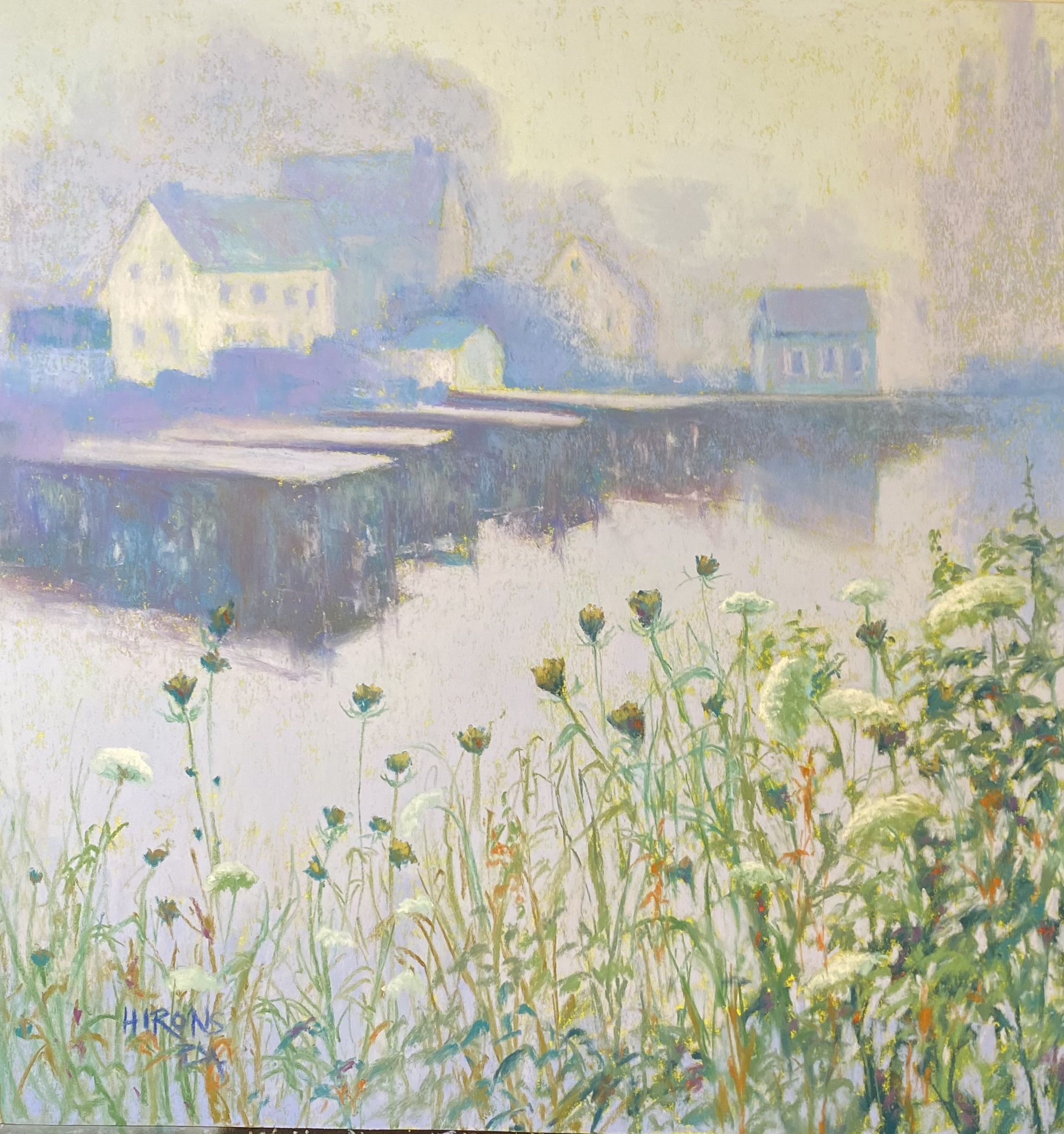
Port Clyde in Fog, #2 before flowers added
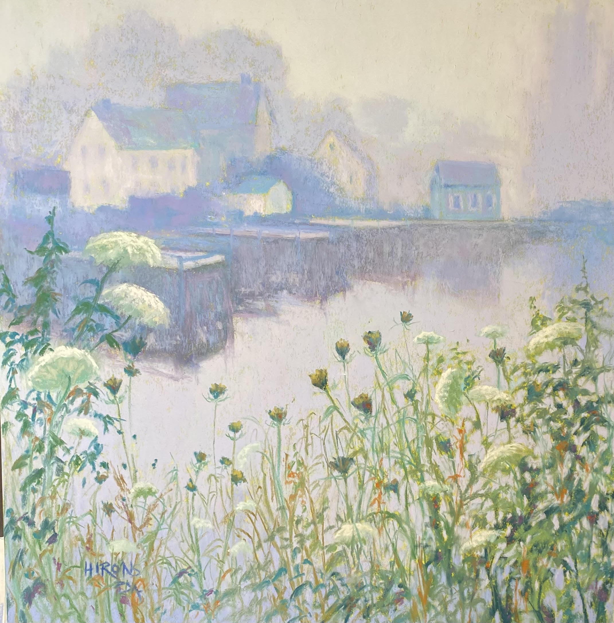
Port Clyde in Fog, #2, 18 x 18, Lux Archival
Then I began the second one which didn’t have any lobster crates and instead had flowers against the water. I decided to focus on the right side with the flowers and have the buildings in the upper left. But when I thought I was finished, I realized that I had two separate paintings with no connection! It was terrible! So, I brought flowers up on the left to over lap the buildings, lightened the piers, and now I think I have a unified painting. (I’m currently teaching a zoom class on composition so it was fun sharing this stuggle with them.)
Now I have to get them to Maine! Fortunately my framer found beautiful 18 x 18 gold plein air frames from Omega that look really wonderful on them. The paintings are predominantly blues and violets (not so obvious from these photos) and the gold is stunning with them.
For both paintings, I began by toning the paper with a yellow green irredescent acrylic ink, which warmed them up and you can see this in the photos. Very little shows through but it was just enough. The pictures look kind of weak in the photos, I have to say, but they look really wonderful in the frames!
One more for Maine in a separate post.