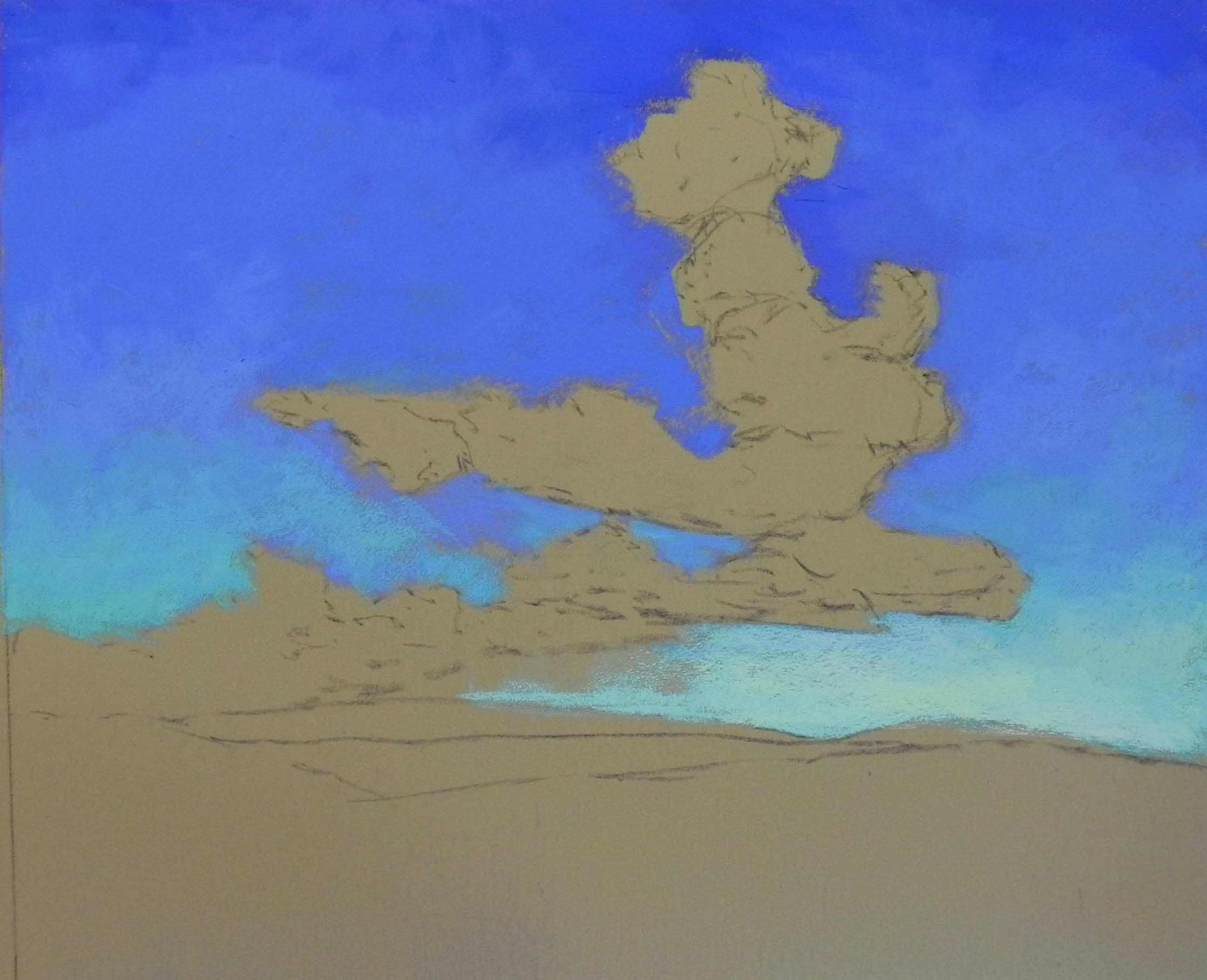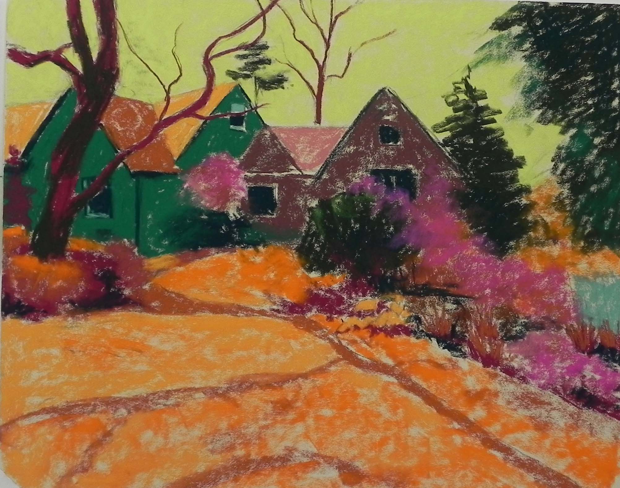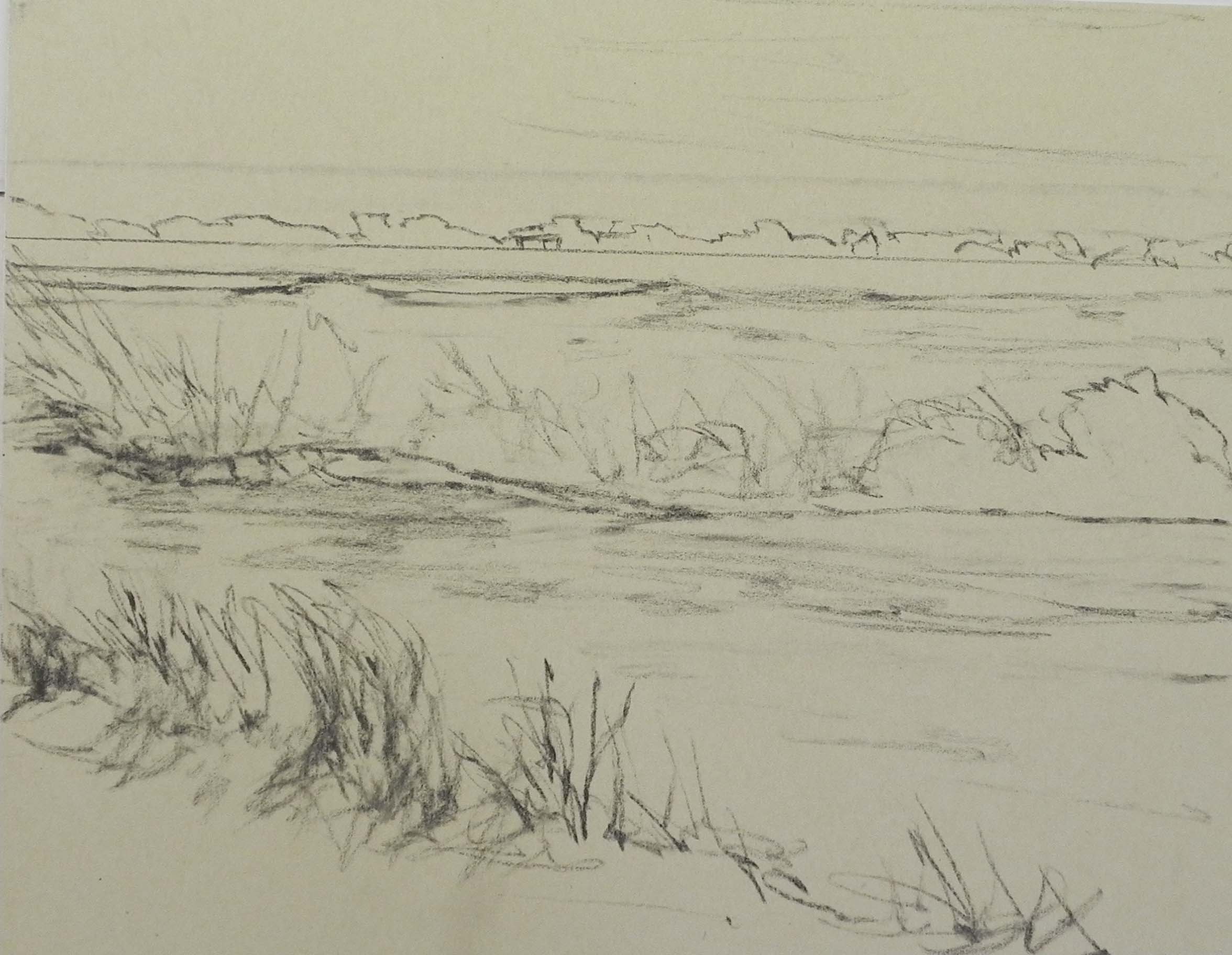
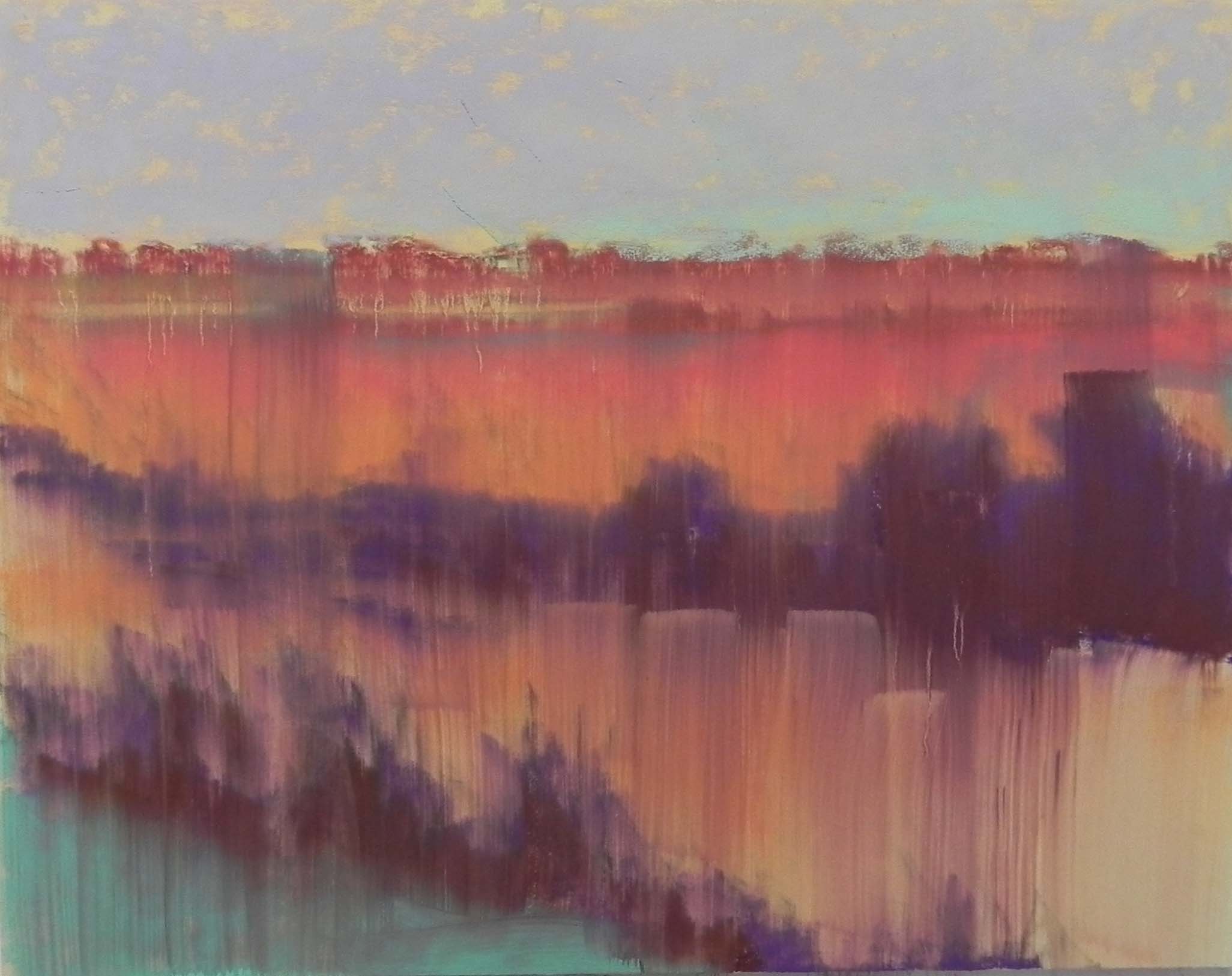
Initial drawing on board
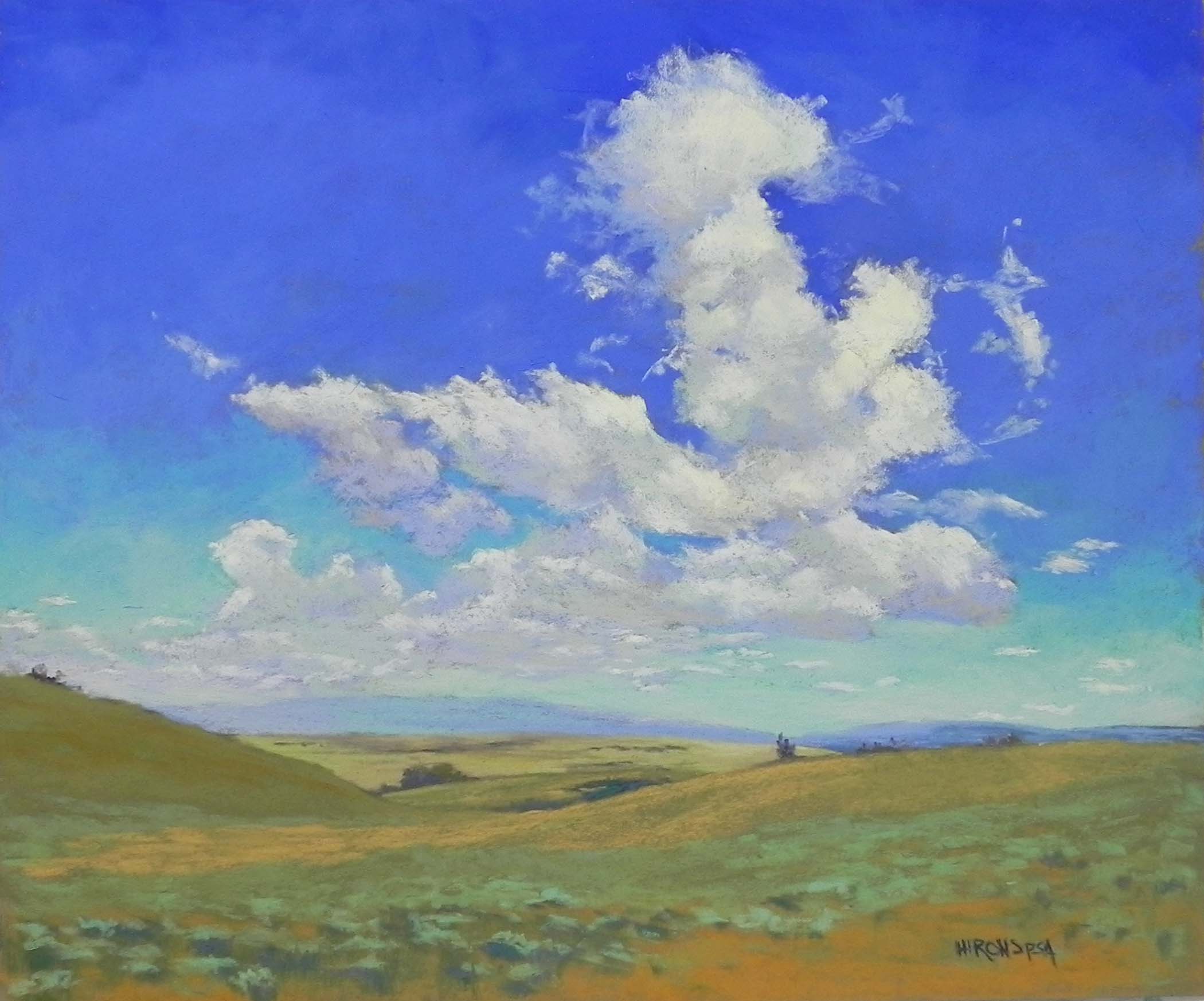
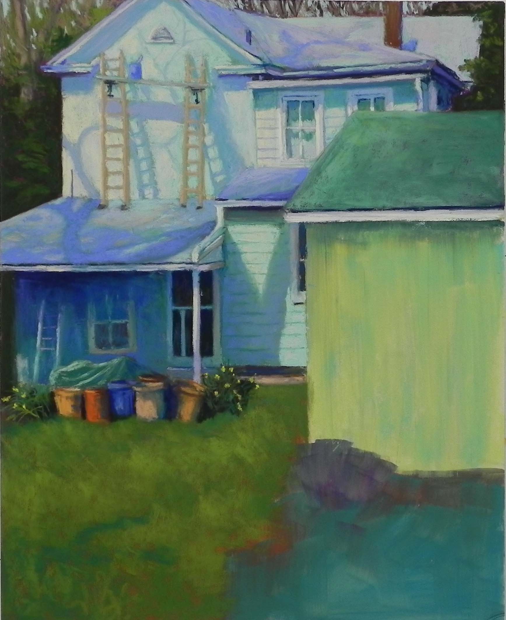
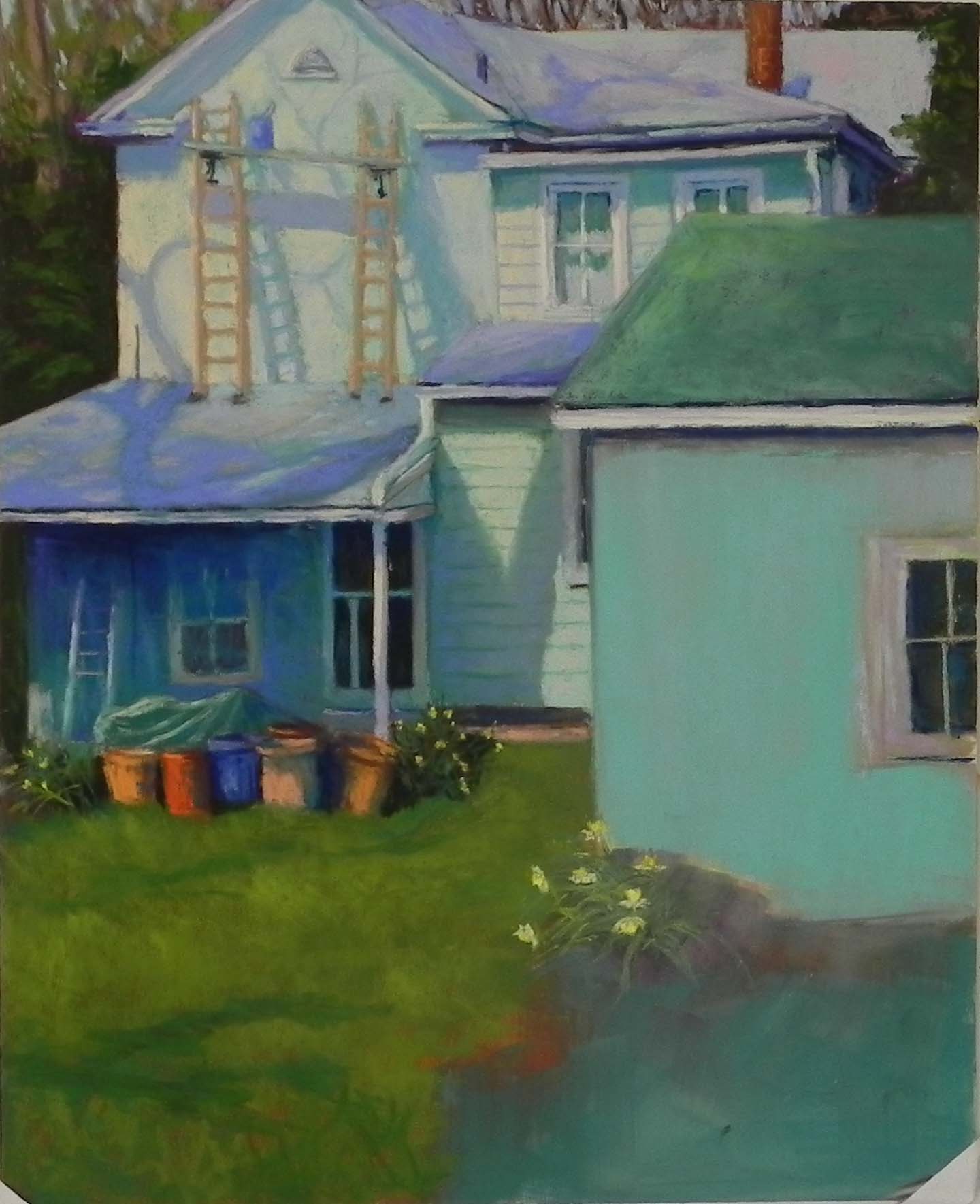
Painting at end of video
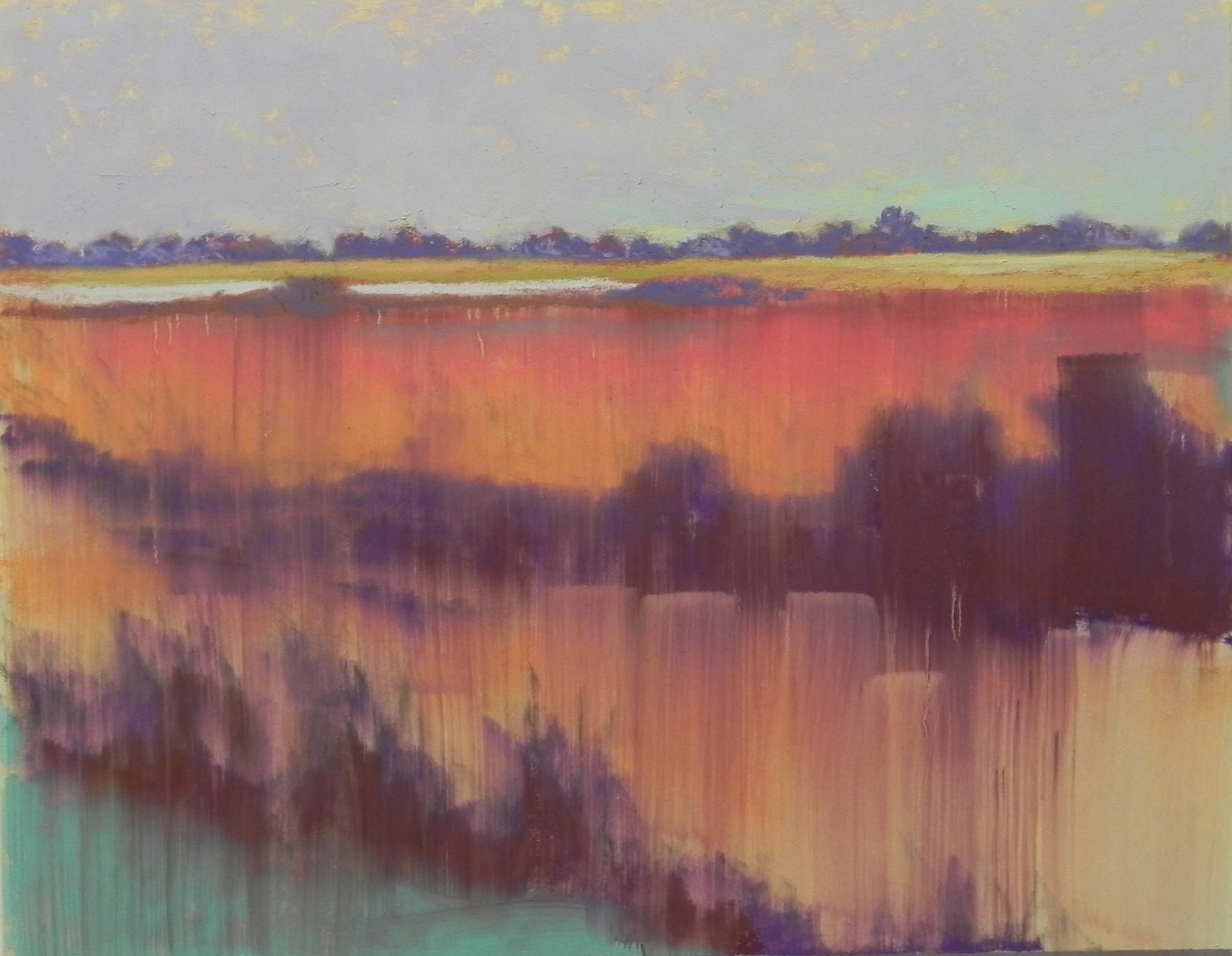
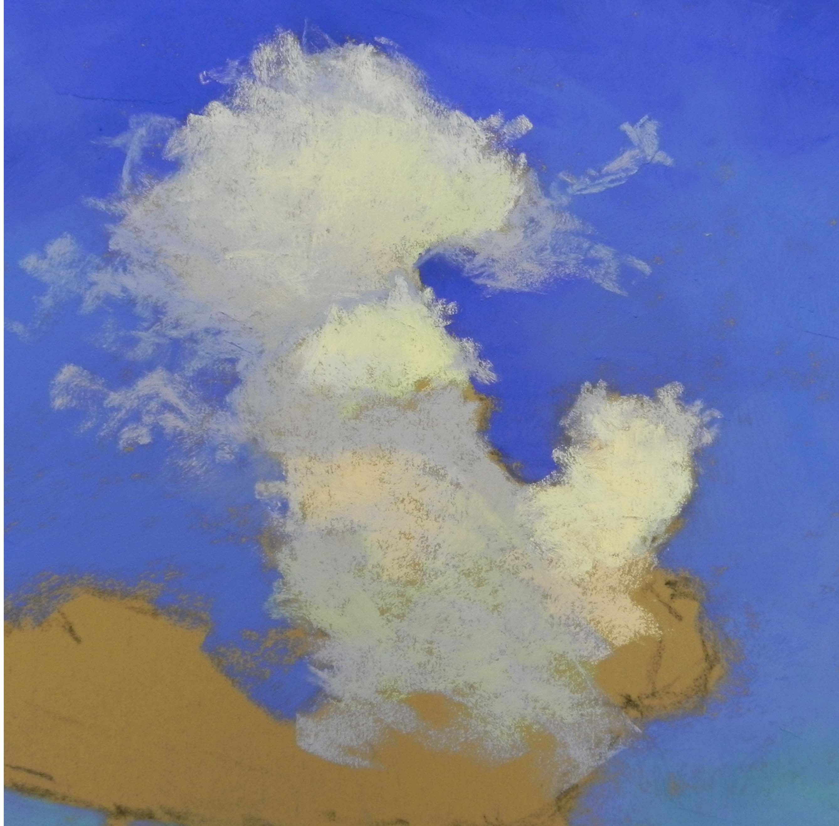
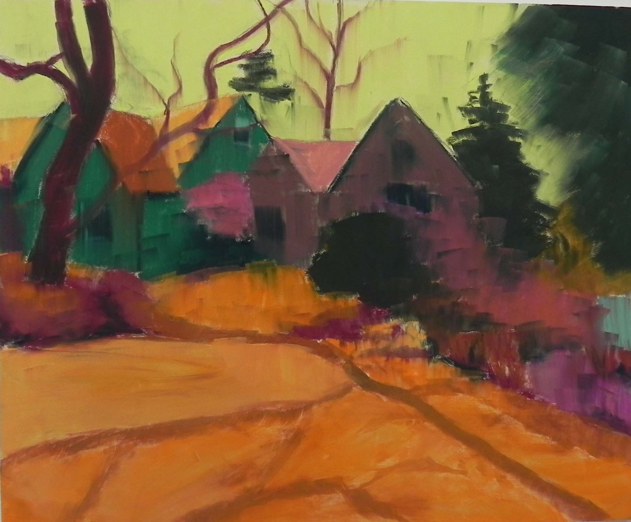
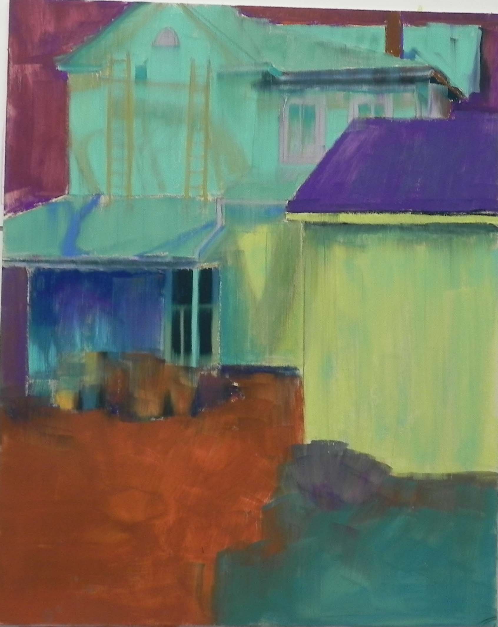
Background added
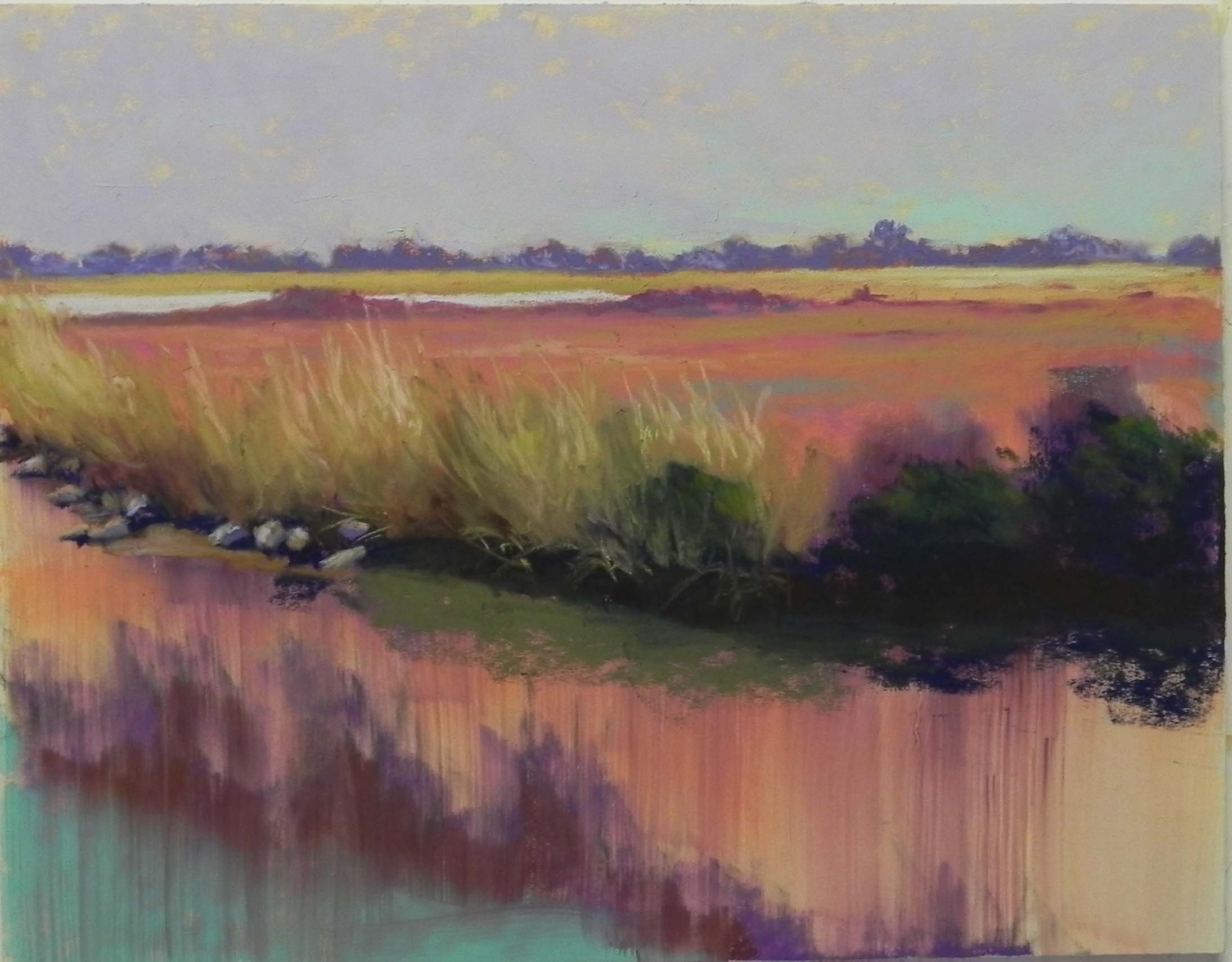
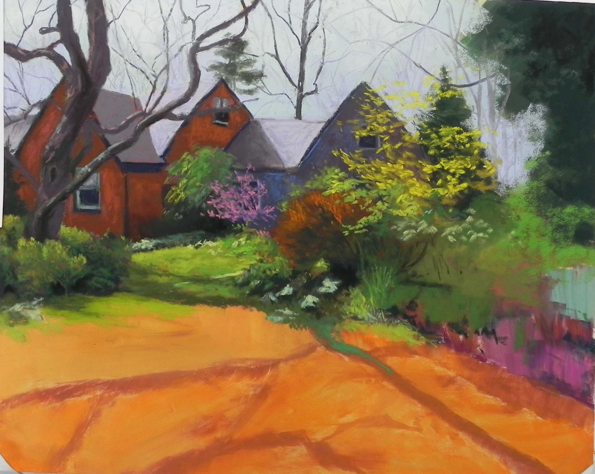
Beginning grasses
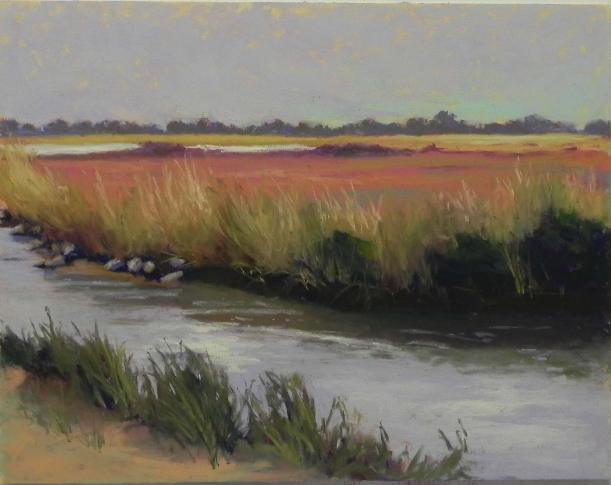
Water and foreground added initially
Hi Friends. I’ve had several things “hanging over me” lately. One is to get a good enough video of the Bach fugue I’ve been working on for over a year to share with my piano group. The second is to provide a short video for District Arts Gallery in Frederick. It’s a wonderful place and I said immediately that I’d do it! Had no idea HOW I would do it.
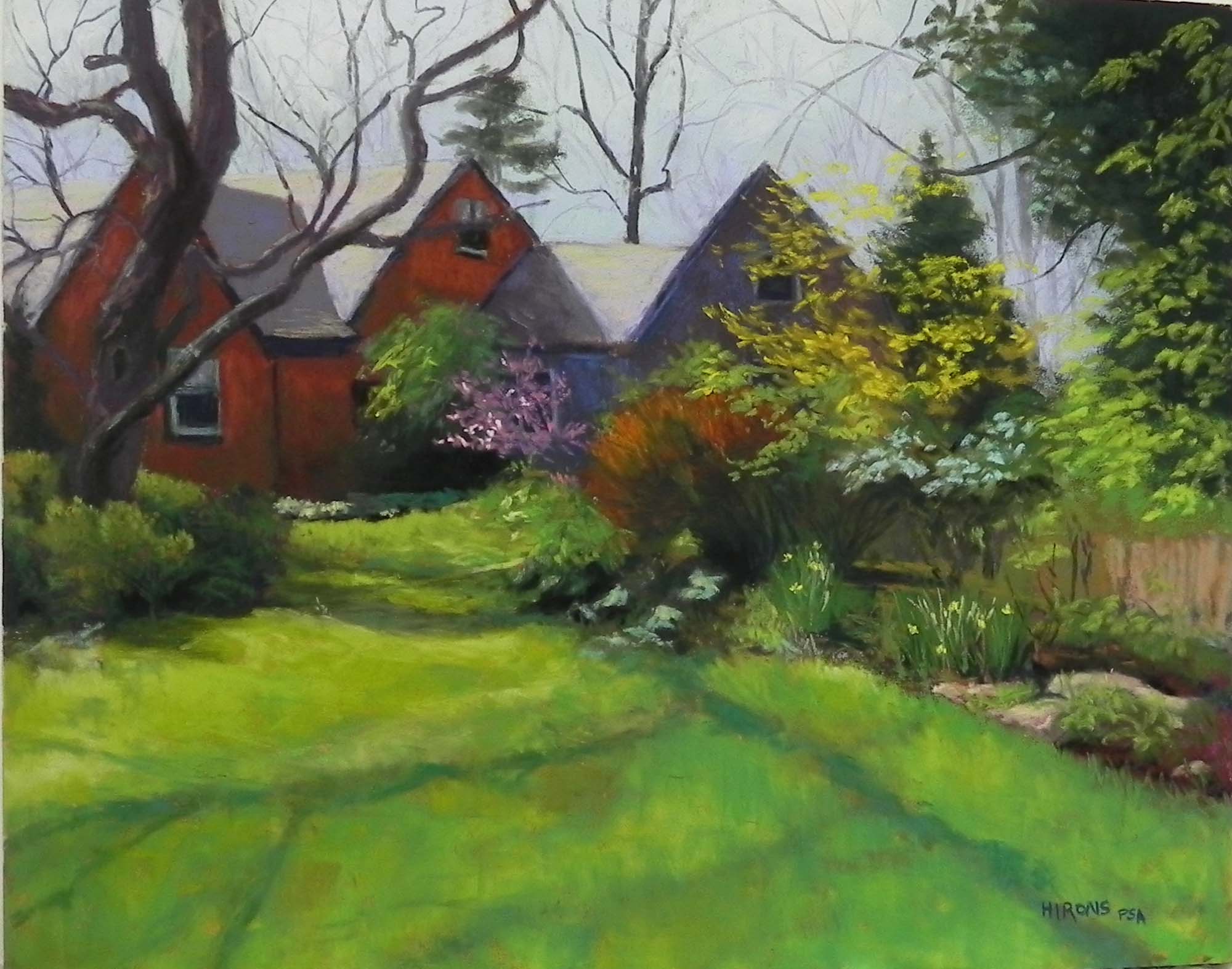
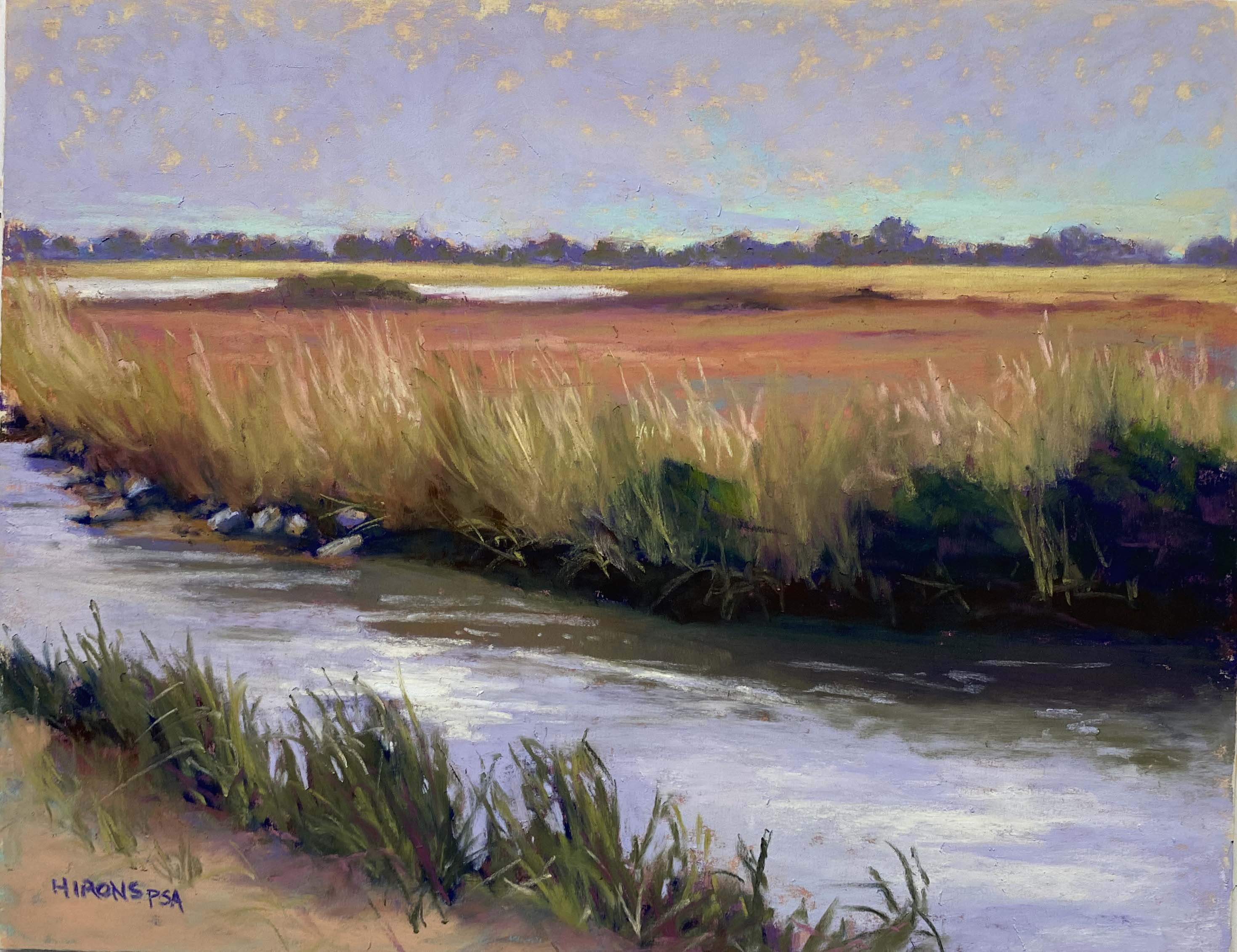
I started by creating short teaching videos for my students and ended up creating a YouTube channel! It’s not impressive but there are two short videos on there under my name. For the gallery video, I wanted something short and to the point and decided to discuss and demo an underpainting. I chose a scene from the Eastern Shore for it’s fairly straightfoward shapes and printed it out in B&W.
For the underpainting, I chose some oranges, orangey browns and violets–colors I really like! I added the alcohol to the sky horizontally, then moved from the tree line down using vertical strokes. This produced a really interesting, colorful, very loose underpainting on which to work.
I worked solely from the B&W photo. The color image wasn’t terribly inspiring so I just decided to use my intuition and it worked pretty well. For the sky, I lightly brushed a Girault violet over the orange underpainting and something in the texture of the paper left a lot of the orange showing through. It looked like cirrus clouds! I really liked this effect but wasn’t sure what to do with it. I had in mind adding some aqua at the bottom of the sky to indicate a break in the clouds, which I did. But I ended up leaving some of the orange showing through and I like it.
I started with a violet for the distant trees and later added a dull gray green over them. Then used a combination of yellow ochres and reddish browns for the flat grassy marsh. For the tall grasses, I used a comination of greens, browns, violets, ochre and pink.
When I got to the water, I could see that there was some real brightness in it. I put in the green/brown reflections first, then used three different values of violet to lay in the water horizontally. I finished this with a light yellow Terry Ludwig pastel to provide sunlight hitting the water. (There may be clouds in the background but there’s nothing to say that there couldn’t a little sun coming through overhead!) I really liked the effect of this. I next added the lower grasses and dirt and indicated some shadow under the grasses. I brought some magenta into the lower grasses to help tie them to the reds above, and I added the same color to the dark green bushes (not sure you can see it).
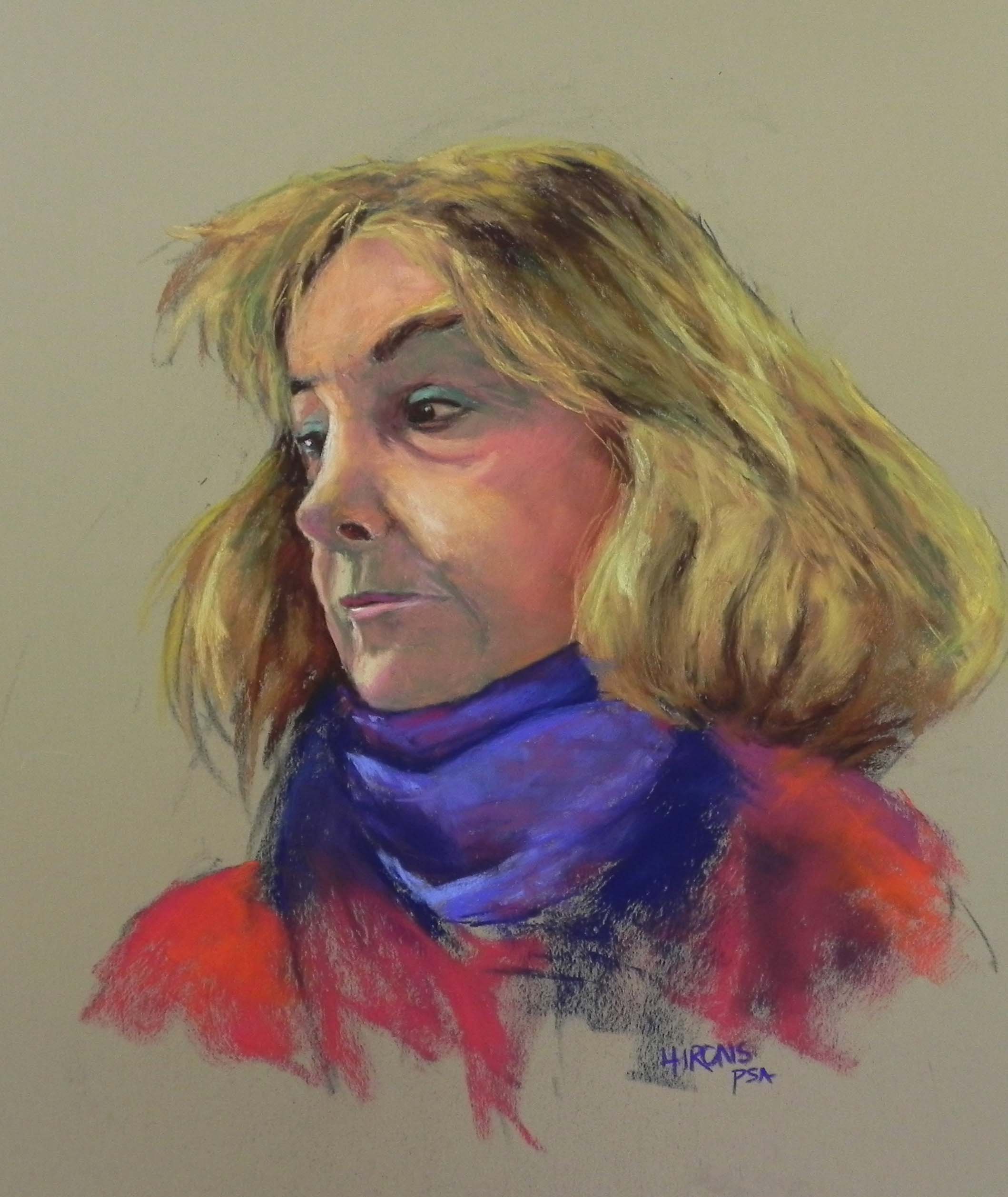
This was a fun painting to do. Much easier than a self portrait! Or even my dancing cloud. But it posed its own problems and I spent a wonderful afternoon painting after dealing with the frustrations of technology! (And–this morning i produced the first complete recording of the fugue. I’m making progress!)
Stay well.
Cloudy Day Marsh, 11″ x 14″, UART 320