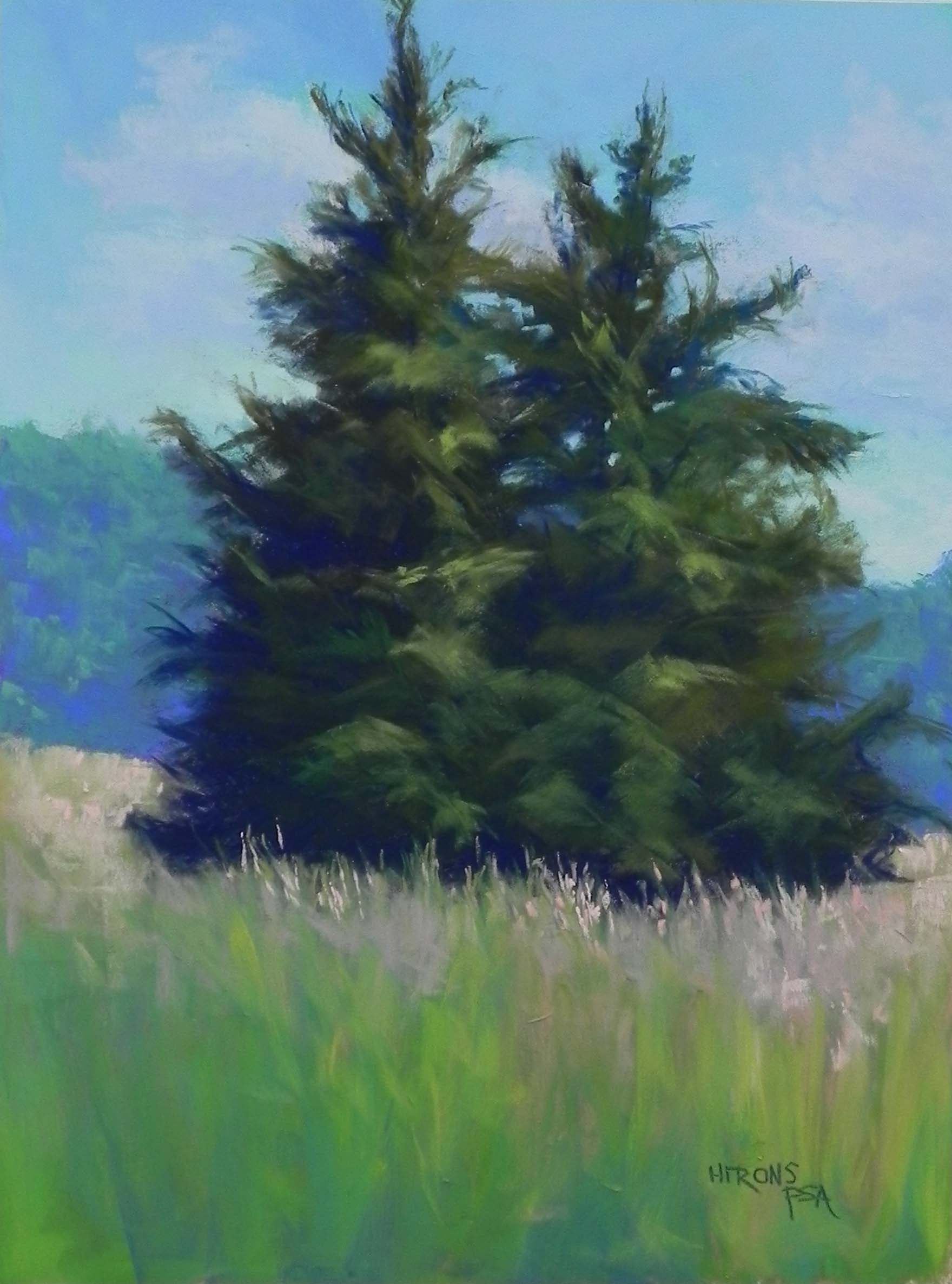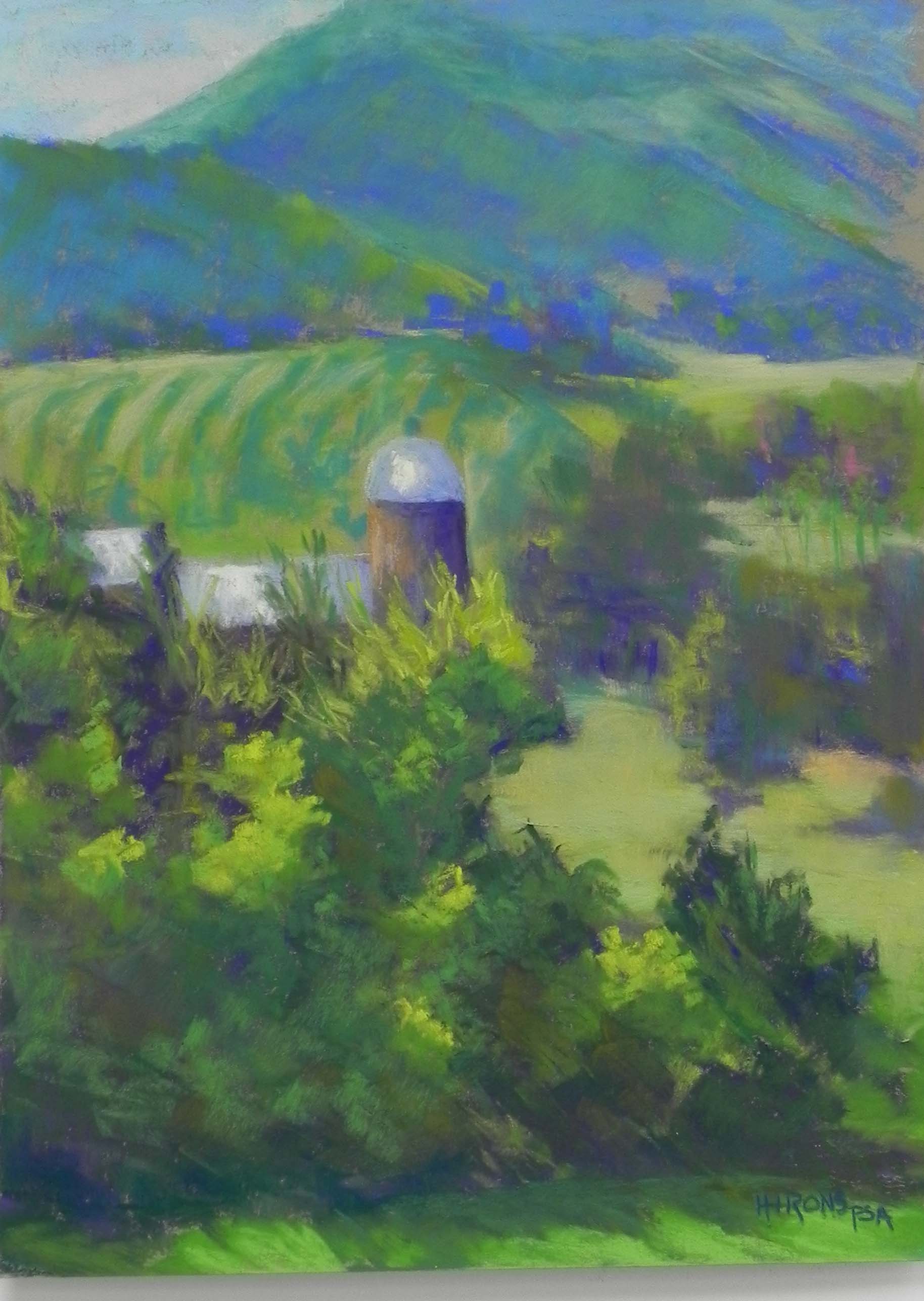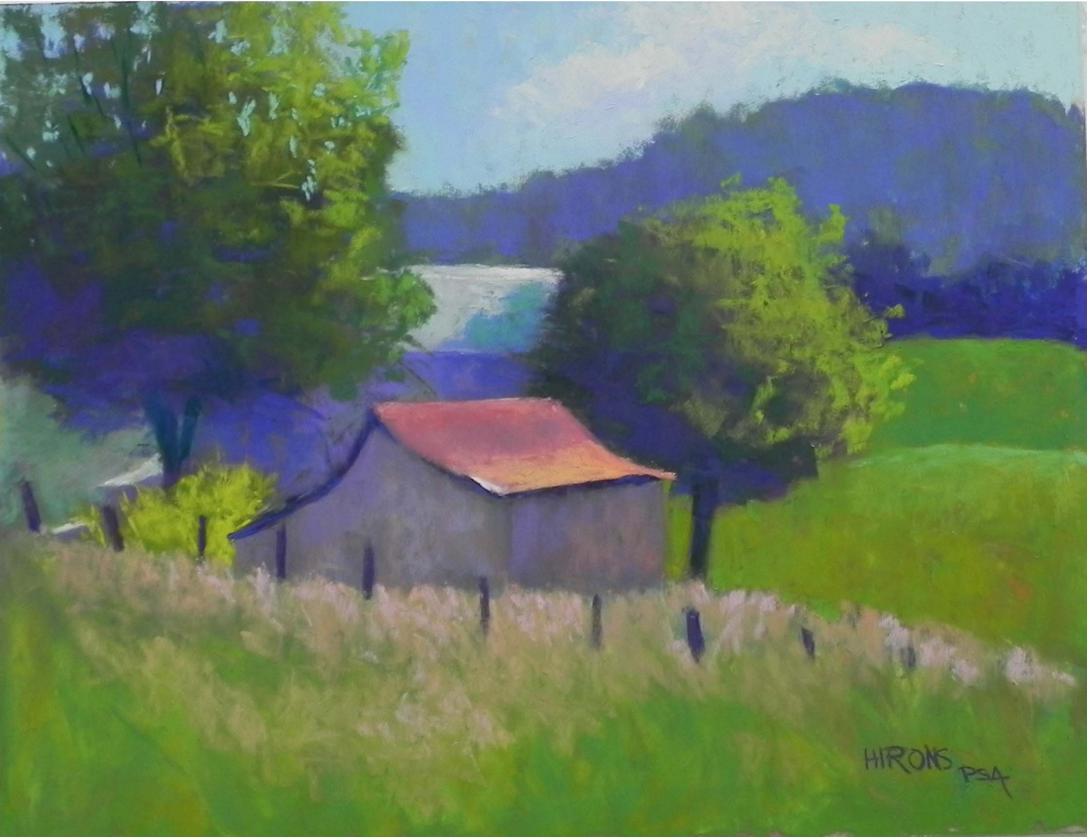
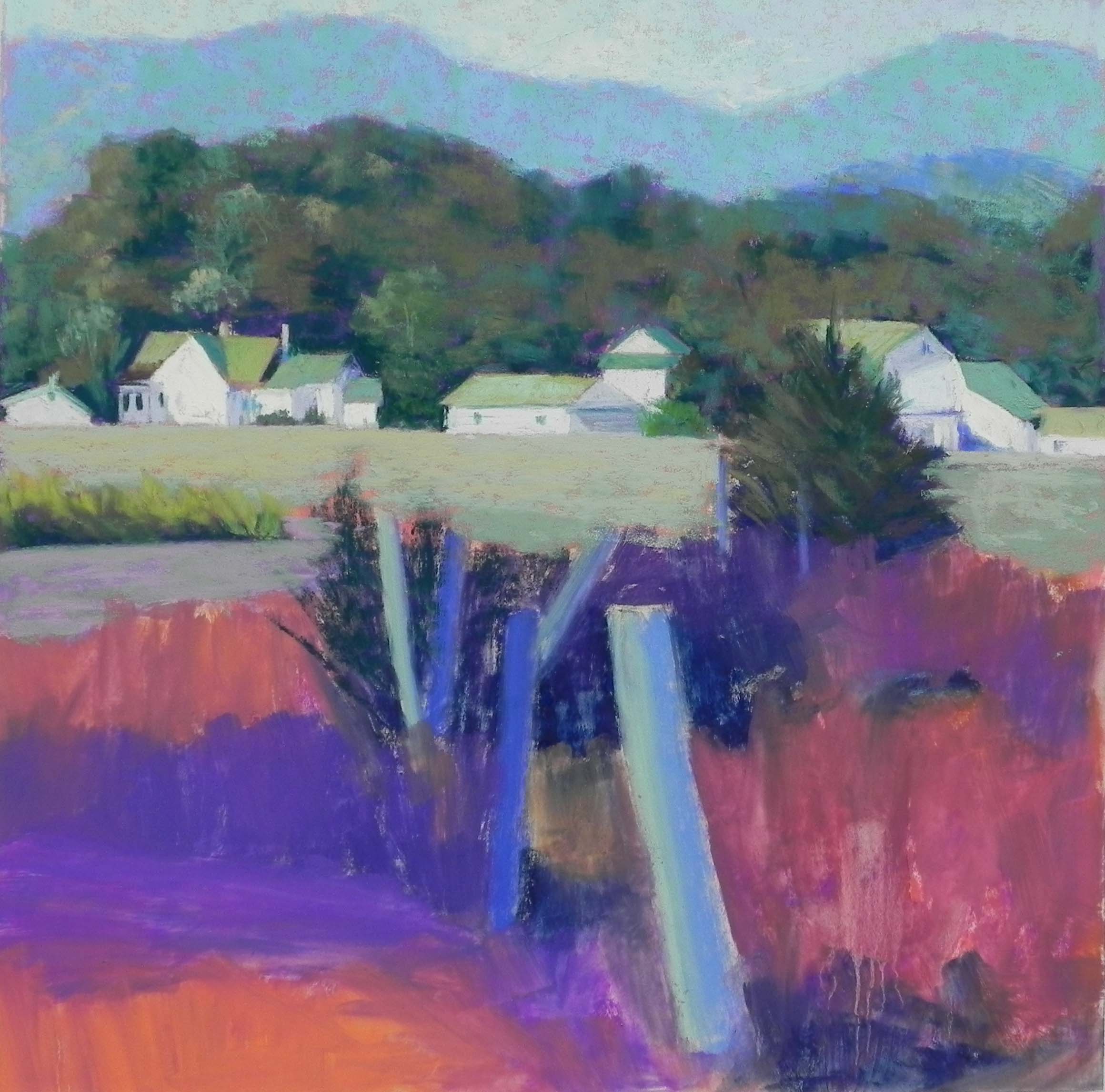
Blue Ridge Village, 16 x 16, UART 400
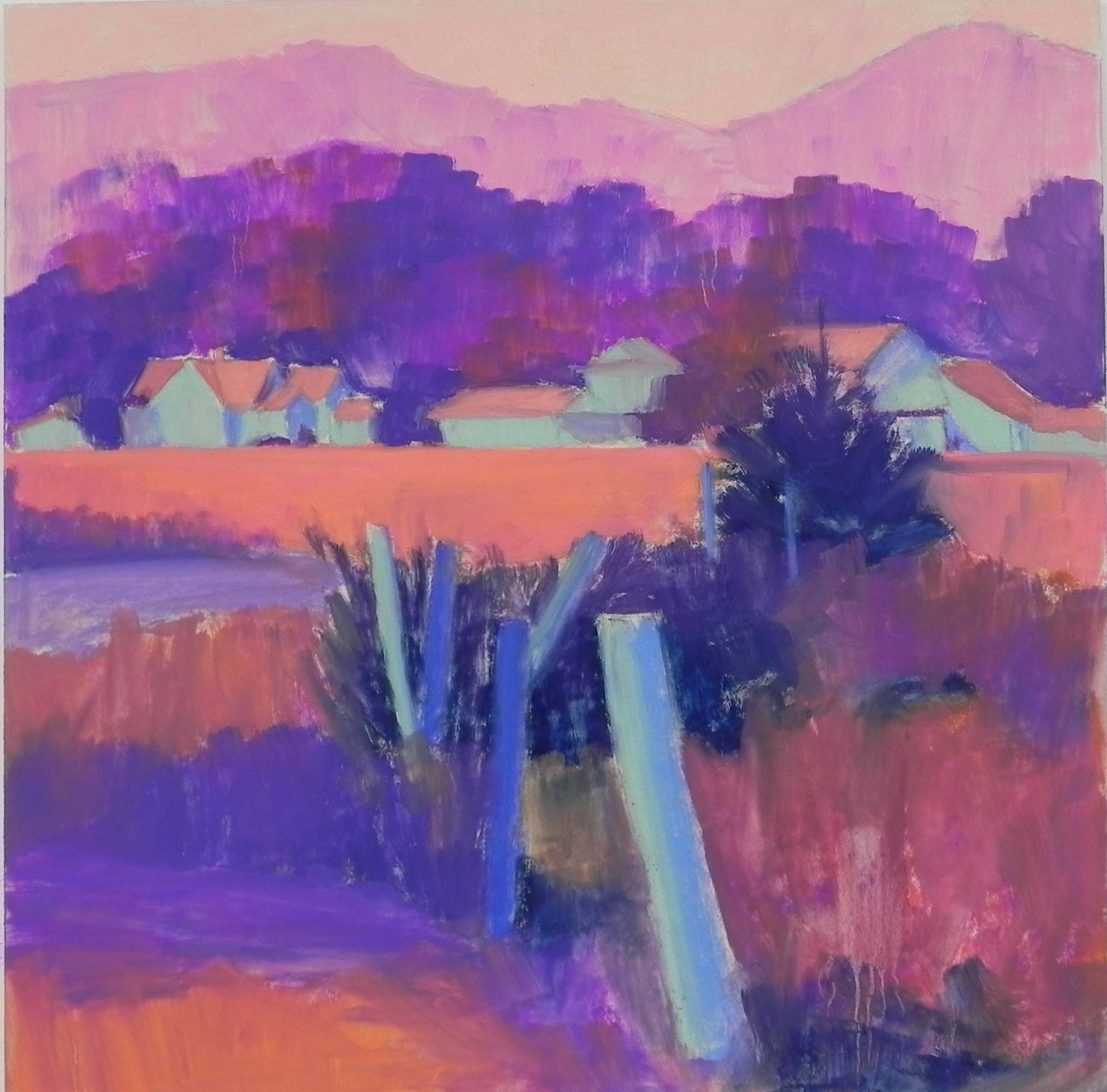
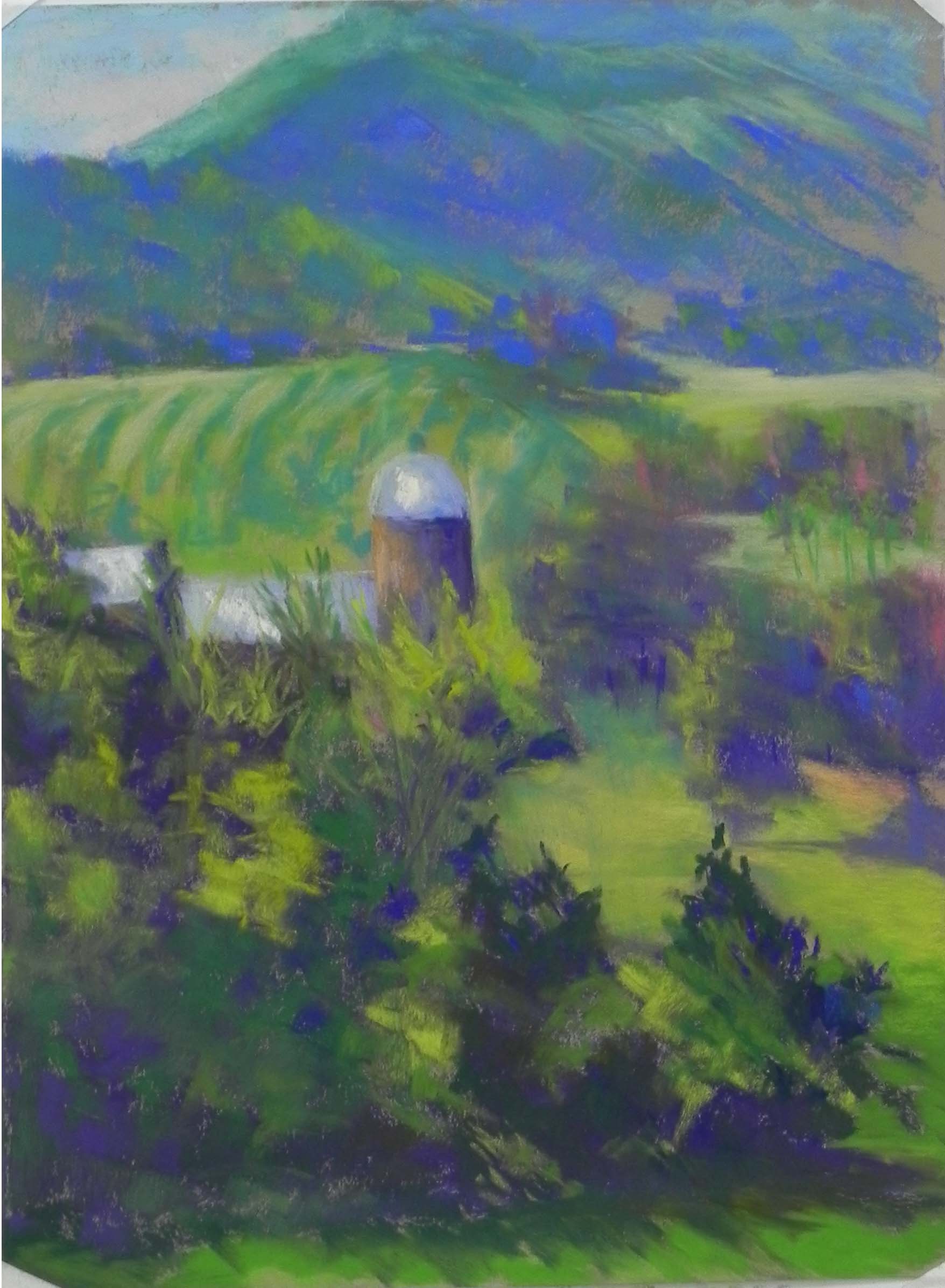
Underpainting
Initial stage
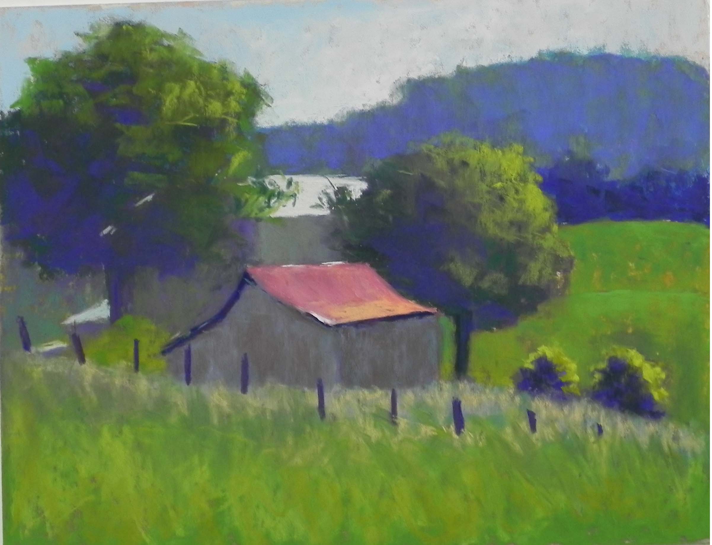
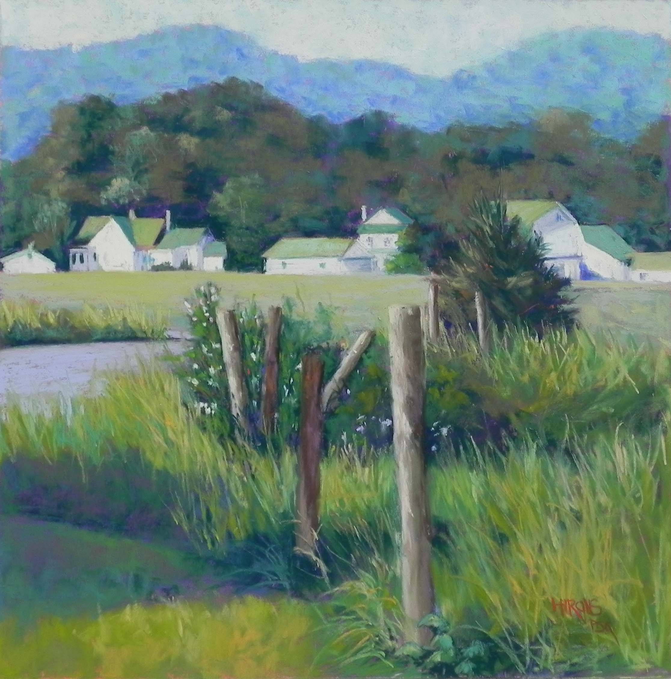
I decided to do one studio painting before we head off to the Hamptons and New England next week. This is from one of the photos I took on my trip to Syria, VA several weeks ago. This is the small town of Criglersville, which has a large number of white buildings, all with green roofs. This being May, there was a great preponderance of green! I could have changed the roof color, I guess, but I wanted to represent it as it was. Instead, I decided to work from a black and white photo and do a colorful underpainting.
Compositionally, I had to decide whether to have more background and sky or foreground as I didn’t want the row of buildings to be right in the middle. I decided that the foreground was more interesting and placed them about an inch up from the halfway mark.
I used blues and blue greens for the background mountain and a combination of aqua and very light yellow for the sky. I actually started the background hill lighter than it is, as you can see in the partially completed painting. When I came in today, I decided that the difference between the background mountain and foreground trees was too great. So I had to carefully darken it. I used a Girault blue and blue green and kept it very soft and impressionistic.
I used warm and cool greens for the trees, but kept them to the more grayed varieties (Unisons, primarily). For the buildings, I used a number of tinted whites. The buildings at left were done with yellow, the house in middle with pink, and the barn with some very light blues. I wanted the house at left to be the primary building and I liked the way the progression of fence posts leads the eye to the house.
I tried to leave some of the undercolor showing in the trees, mountain and grasses. But when I was done, I felt the need for more color. I used a warm red violet to add richer color to the shadowed area of grasses in the lower left, and added some of it to the fence posts. Then I used a fairly dark red orange Girault to add some small specks of color in the evergreen tree and posts and added more orange to the foreground grasses. Small changes, but I felt that it really needed it. And I signed my name in red orange!
I don’t expect to do much painting again until Aug. However, next week we will be spending 5 nights in the Hamptons, and I realized this week that I’ll be staying in the Shinnecock Hills region. This is the place painted so often by one of my favorite painters, William Merritt Chase, who just so happens to have a show at the Phillips Gallery in DC. I hope to get there before we go, and I plan to take some paper and my very small Heilmann box in the hopes of doing a few small paintings. Of course, I doubt that the area is going to bear much resemblance to Chase’s paintings–particularly no women with parasols walking through the fields! But I can dream.
Hopefully, I ll have something to show for my time when I get back, as well as a report on the Hamptons show.