
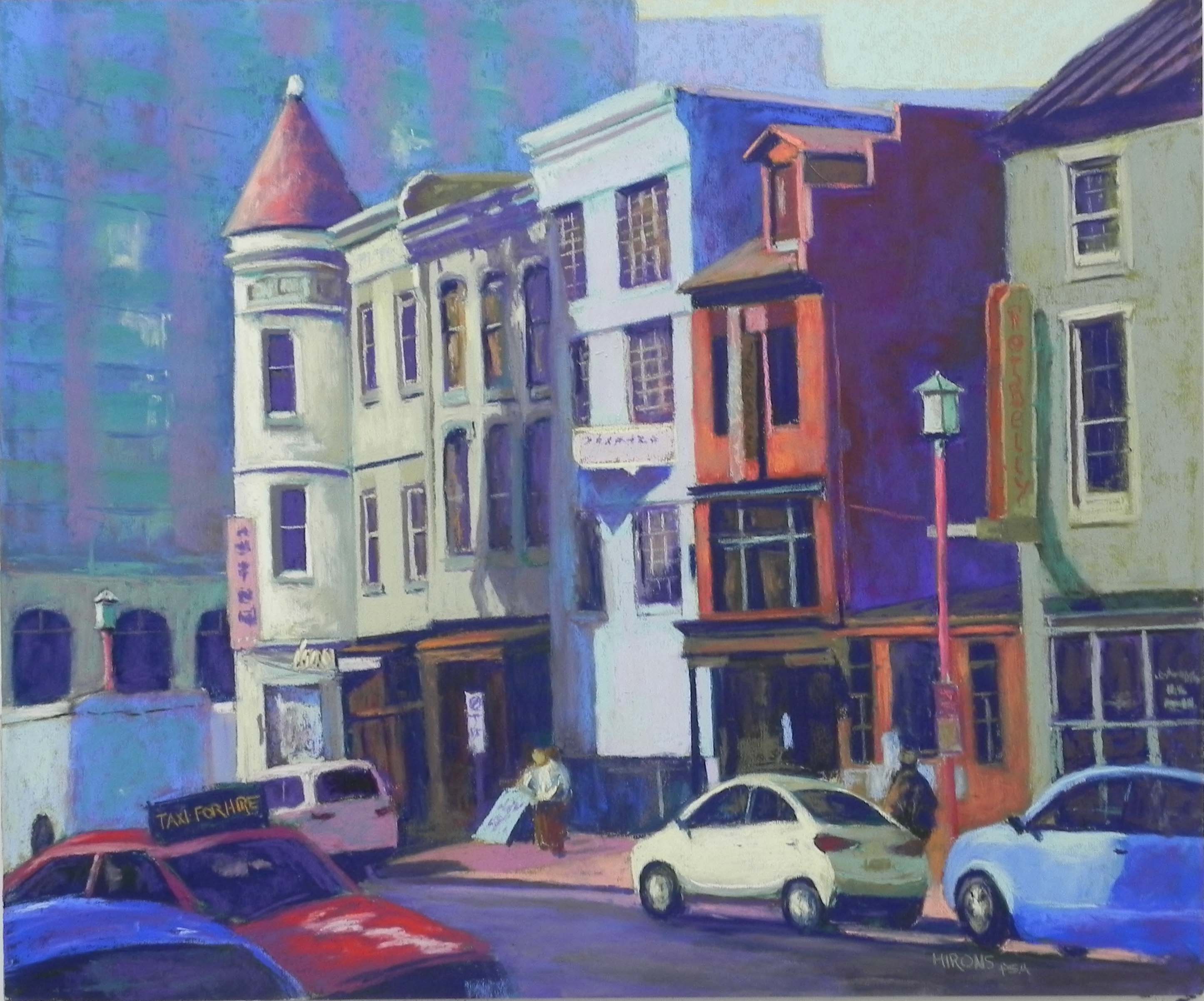
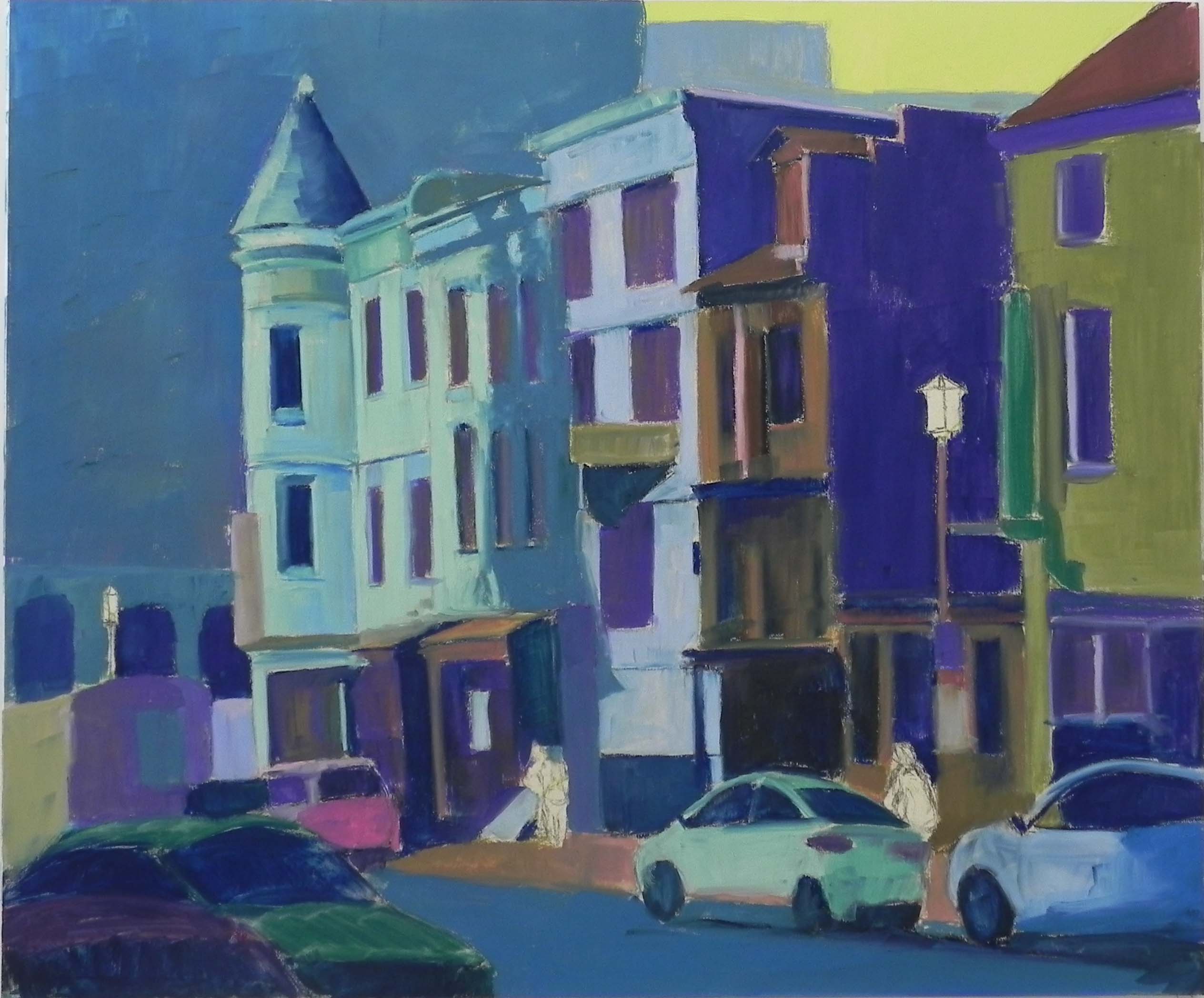
Lunch in Chinatown, 20 x 24, UART 320
Color photo reference
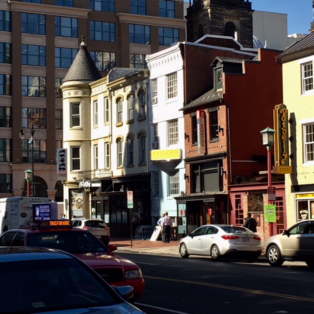
Hello Friends–It’s been some time since I’ve put out a blog post. But at last I have a new painting–and this one took a whole lot of work! I wanted to do another painting of Chinatown in conjunction with a show of my DC paintings. I looked through the images from last February and found one with interesting composition but not so great color. So I printed it out in black and white and went from there. I”m including the color image so you can see what it looked like and how different it is from my painting.
I wanted the building at left with turret to be the center of interest. But the white building in the middle is grabbing more attention, as is the yellow building on the right. Also the building behind the turret sets it off nicely but it’s rather dark and foreboding and there is another dark building just above the white one that I decided to omit. But there were many things I loved about the picture–the variety of shapes in the buildings, the signs, the people on the street and the cars pointing to the turreted building.
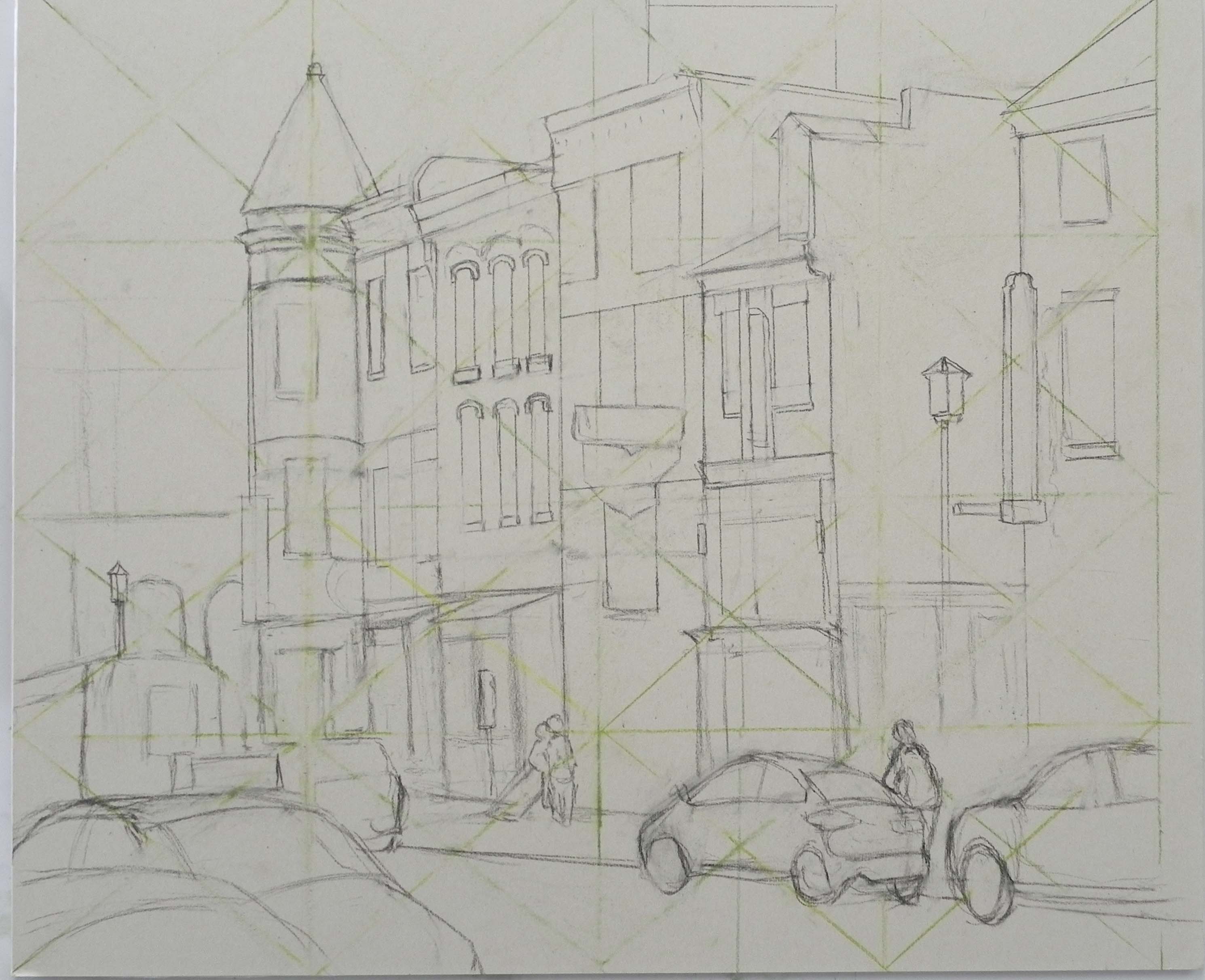
Initial drawing
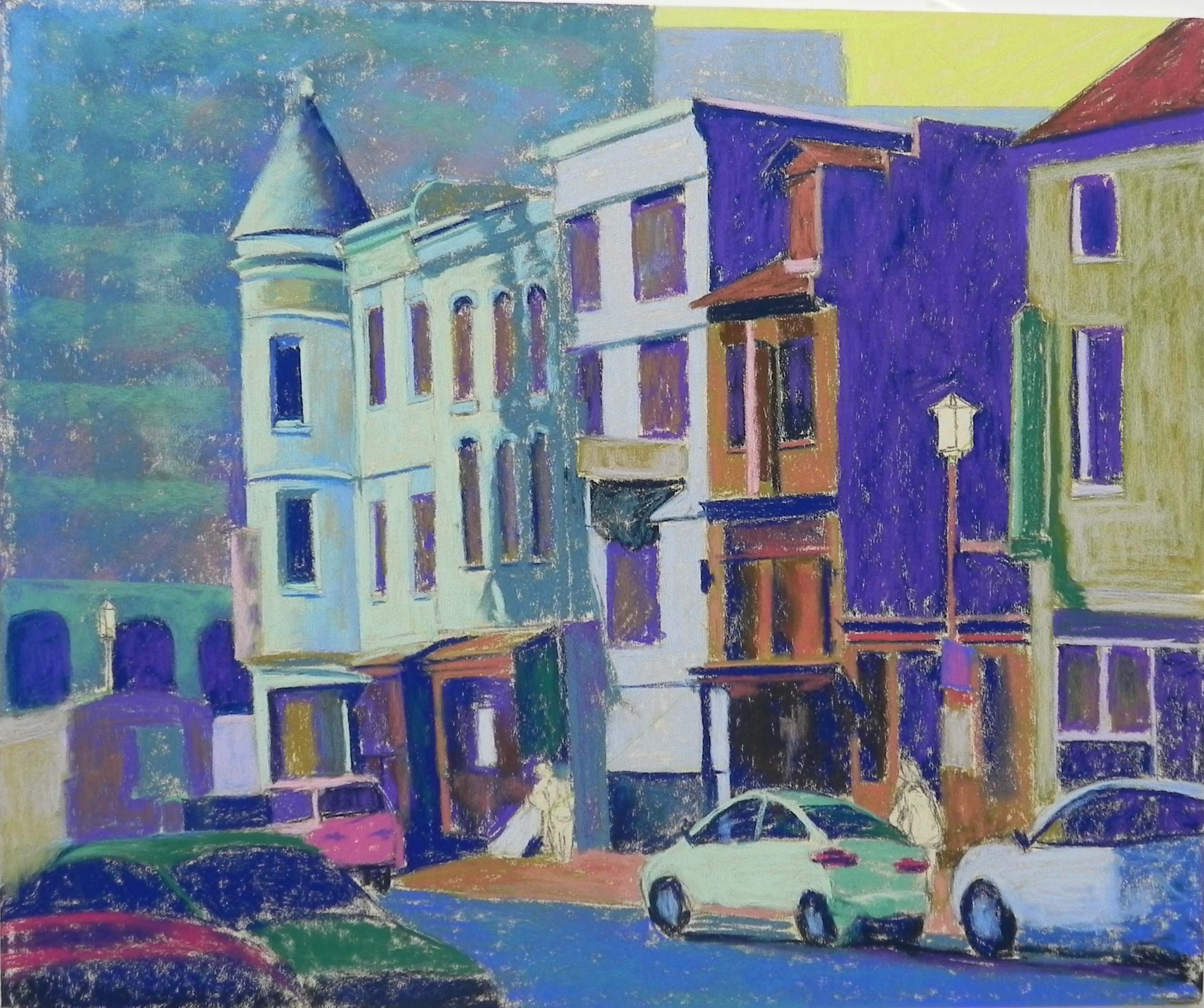
Underpainting before alcohol
Underpainting after alcohol
It took me an entire afternoon to do the initial drawing. I used Chris Iver’s method of graphing in the picture from the photo. You can still see some of the lines in the drawing. Then I chose colors for the underpainting. When I did the background building I tried laying in colors in horizontal and vertical stripes and realized that worked pretty well. I lost it with the alcohol, but did it again with the soft pastel over the underpainting. My students came in and loved the crazy colors in the underpainting and begged me not to change them!!! However–I did and really needed to, of course.
Once i began painting, I realized that I was having a problem with keeping the buildings straight. I brought my T square ruler from home and had to completely reddo some of the buildings and windows! But at least it looked good. The other challenge was that I never established a vanishing point. It would have been way off the picture. So I eyeballed it–not always successfully. But with help from my pastel friends, I finally got it in good shape.
I wanted to explain some of the color choices I made in terms of the composition. First, I changed the black turret to red–why not! I basically went with some of the color in the 3 buildings on the left–all in shades of greens and yellows, leaving the lightest, brightest yellow for the left side. For the tall white building I decided to use blue to keep it cooler and I added a little light red violet into it to give it more dimension. For the building to the right of it, I went with the warm orangey red color in the photo, but I added some grayed green into it to tone it down. In the dark right side of the building I used dark reddish brown and blue violet Ludwigs. I found that the combination vibrated! I wasn’t sure where I was going with the final building. I had used a warm green undercolor and decided to put a cooler green on top allowing some of it to show through. I tried to keep the edge of the green building against the dark on the soft side, so as not to distract from my center of interest. This was all about value.
I intentionally used the same yellows in the little car pointing to the building and chose blue for the one behind it. Now the blues and reds and yellows can carry the eye throughout the painting.
I put a lot of effort into my little people and was particularly pleased with the man next to the yellow car. Doing these small figures in soft pastel (pencils are just too hard) is tricky and I’m always amazed when it works.
Finally, I did a little more with the background building and put a hint of light in the windows.
I am happy with the way the painting came out. I decided to call it “Lunch in Chinatown” because of the many restaurants including Asian places, Matchbox, and Potbelly. I really had fun making up Chinese symbols for the signs! And I’m happy with the way the “Potbelly” sign on the right came out. I kept the values close and also toned down the value of the cast shadow.
I’m happy to be back and hope that the next painting and post won’t take quite as long. Interestingly, today I sold the “Wild Roses” painting from my last post! And my show was quite successful. So I’m happy!