Lake Bonneville, #1

Lake Bonneville, #1, Stonehenge paper, 20″ x 20″

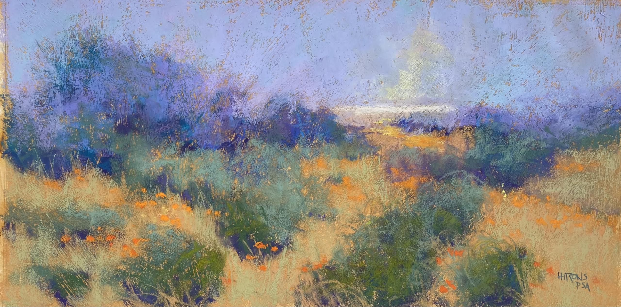
Lake Bonneville, #1 (Study)
Lux Archival, 12″ x 12″

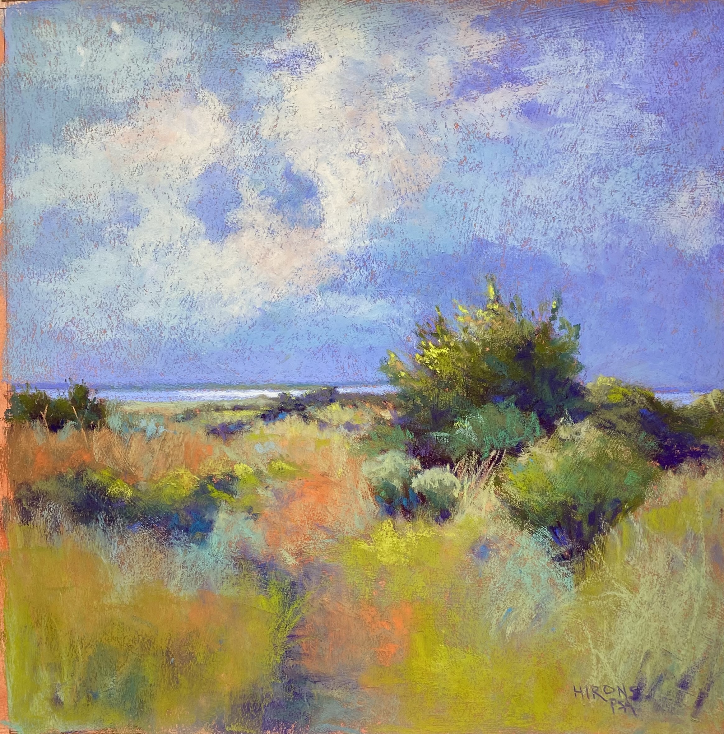
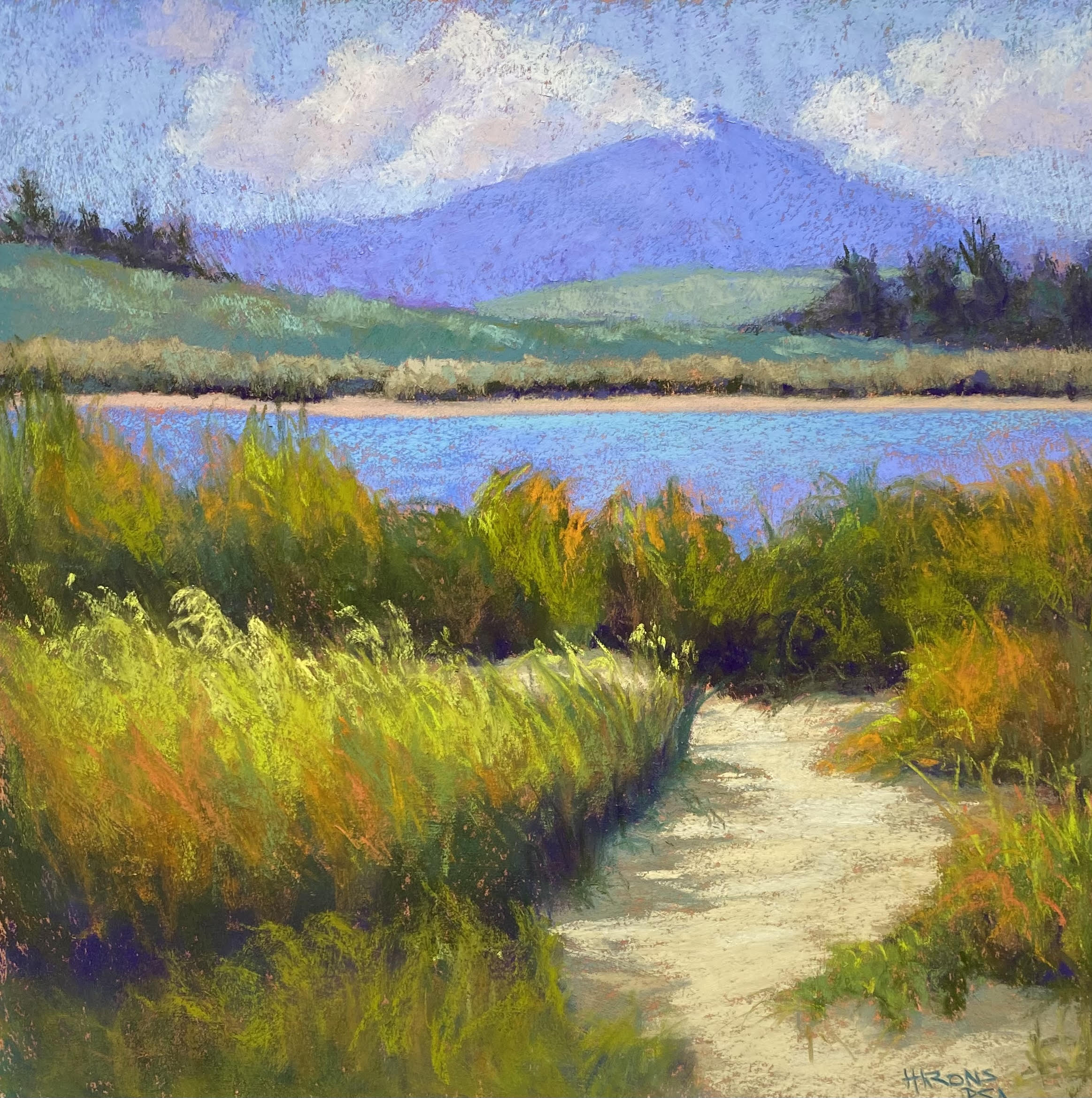
I decided to start a new series of paintings based on photos from Lake Bonneville in Oregon on the Columbia River.  We were there last October and it was one of the loveliest places we visited.  I liked the combination of mountain, lake, grasses and path.  I did a study that I like a lot.  For the painting, I worked on a new paper: Stonehenge. The Rives I had was very lightweight and not great.  The Stonehenge is a heavier paper and worked well, particularly after sitting under weights over the weekend.

The study went so well and seemed so easy.  Not so the painting!  There was too much sky and mountain and it wa difficult to apply well.  I finally had to add another lighter field to keep the mountain from being so big.  I’m finding the skies to be the most difficult aspect of working on this surface as it’s impossible to get smooth applications of color.  But I like it for the grasses, etc.

The painting lacks the bright yellows of the study and I may add those in.

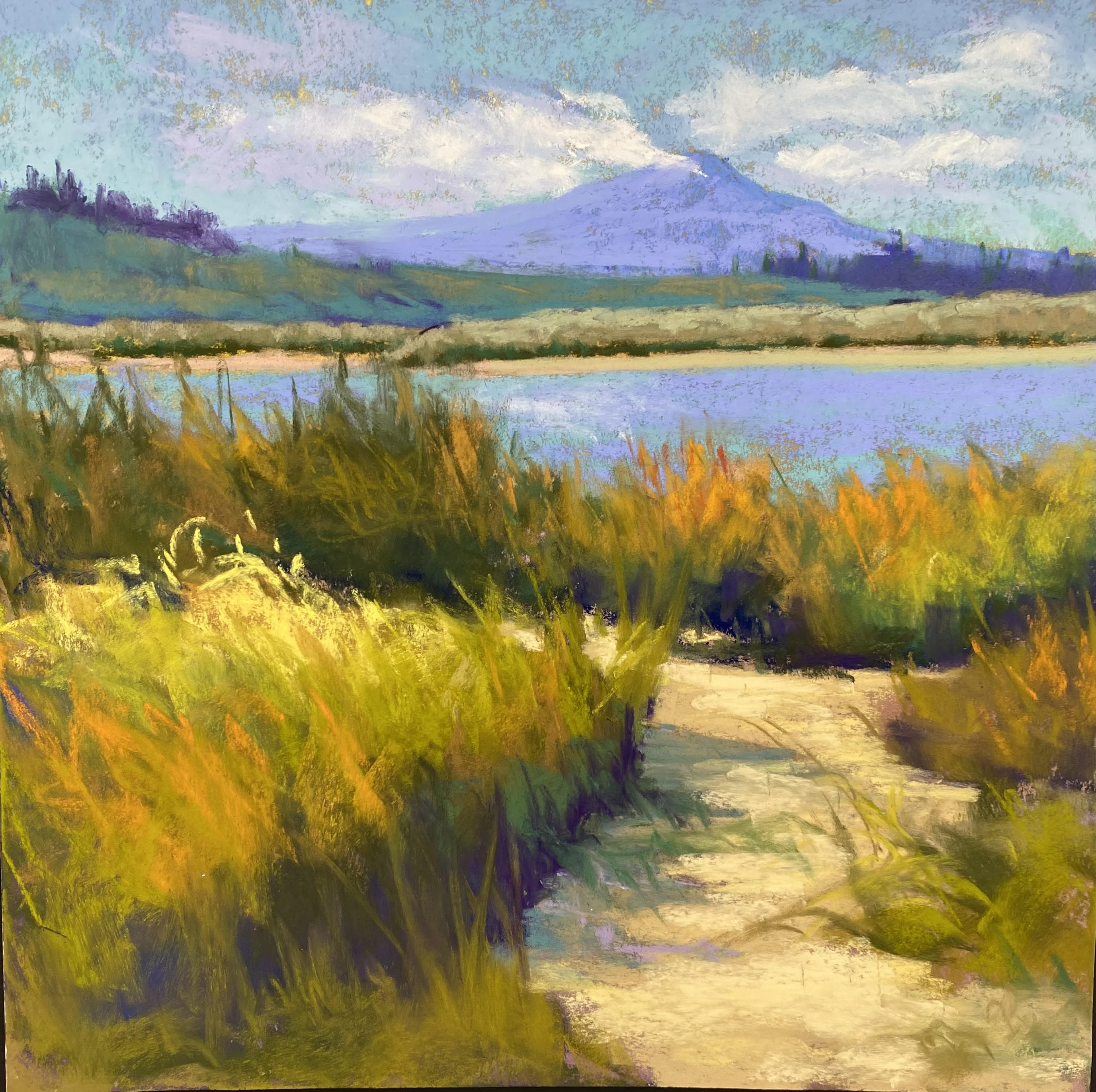
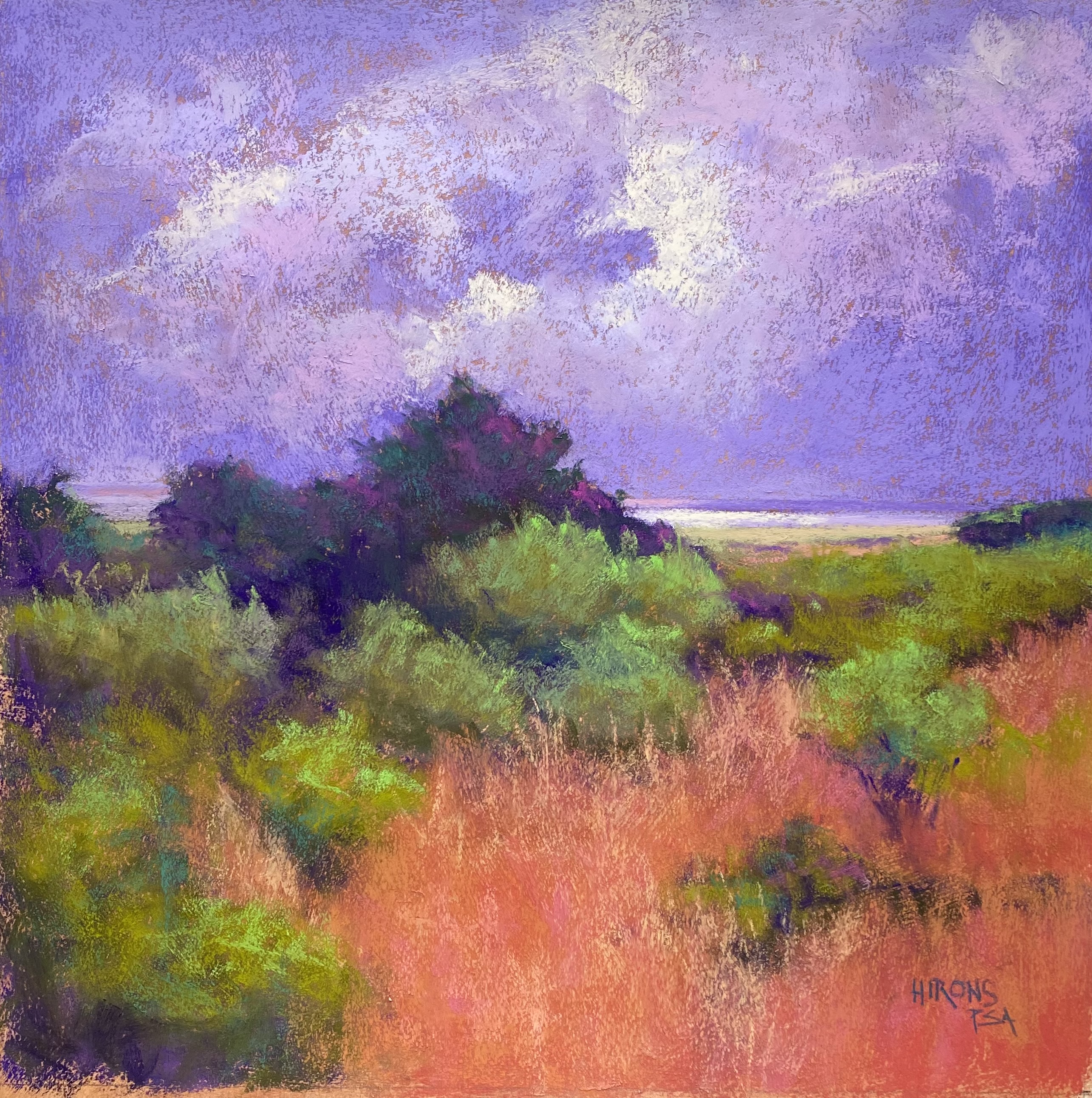
In this case, I didn’t follow the photo completely, but I did try to copy the study and i’m not sure that worked very well.  The sanded paper works so beautifully for the skies and the smaller size is much easier to deal with.  But I will keep at it.  I might try a 12 x 24 next.


Fog and Poppies

Fog and Poppies, 12″ x 24″, Rives with Golden Fine Pumice Gel

On Friday I went to the studio and did a relatively fast painting in a 12 x 24 format, the first I’ve done from this series.  I was intrigued with the idea of fog, despite the fact that there was no fog.  But then, I did grow up on the coast!

I used my typical warm surface but this one was lighter, knowing that the overall values would be lighter.  I started with some hard pastel to lay out the bushes and trees, then moved to soft.  For the sky, I focused on violets and blues to handle the idea of fog.  It would probably be lighter than this, but I liked it.  But, of course, I wanted a little light in there that could shine on the water so I added in a little hint of yellow.  I found it really fun to loosely add the lighter colors over the tree/bushes at left.

I think that this composition worked well with the long, narrow shape.  I envisioned a hill on the far right and liked that idea.  I initially used a warm color for the grasses, then added a whited green on over.  For the bushes, I used darker greens then grayed whitish cool and warm greens (Ludwigs) and that worked relaly nicely.  In the bushes at the bottom, I added some yellow greens as these were closer and would have more color in them.  After doing the grasses and bushes, I had a lot of muted cool colors and I decide I needed oranges.  So the Rehoboth Bay was suddenly decorated with California poppies!!!  I decided I’d better not call this “Rehoboth Bay”  (it IS Rehoboth, not Delaware Bay as I’ve called previous studies).

I now have two 18 x 18s and one 12 x 24.  I tried to do another 18 x 18 today but don’t like it much.  So perhaps I’ve exhausted this subject for awhile.  I have three studies and three paintings that I would frame from this.  I’d like to move on to a new subject with some different elements from the Columbia River trip last October.  I will be having a show in March 2023 that I think I will call “Intuiting the Landscape”.  I want to include studies as well as the paintings.  I may move to something with buildings but for now I think I’ll stick to pure landscape.

Delaware Bay, #2

Delaware Bay, #2, 18″ x 18″ Rives

So here is the second painting, completed this morning. I was careful to make the land larger than the sky in this one. And I decided to use a violet sky, based on one of my studies.  Looking at it, I’m wondering if it needs some toning down–lighter?  More light?  Less violet?  Not sure.  I’m liking the sky in no. 1 better!  But I won’t make any changes at this point.

For this one, I began again with violets in the darks, then used various greens over them.  I wanted the bushes and land area to be darker than what I had in the first one.  I created a shape of bushes in the lower left, and led the bushes off to the far right.

For the foreground, I wanted to play with pinks and oranges, which I used years ago in a Chincoteague painting.  I like it, but I’m not sure it works with the sky.  I think the sky needs to be lighter with more warm colors in it.  SO, I just might have to work further on this one.  Will see.  Any comments will be most appreciated!

Well–I decided I had to revise the sky!  I used a much lighter, duller violet over the original color–lightly. Then added more light, using a very light pink white. And I added more pinks into the clouds.  I think it’s better now.  Time to quit!

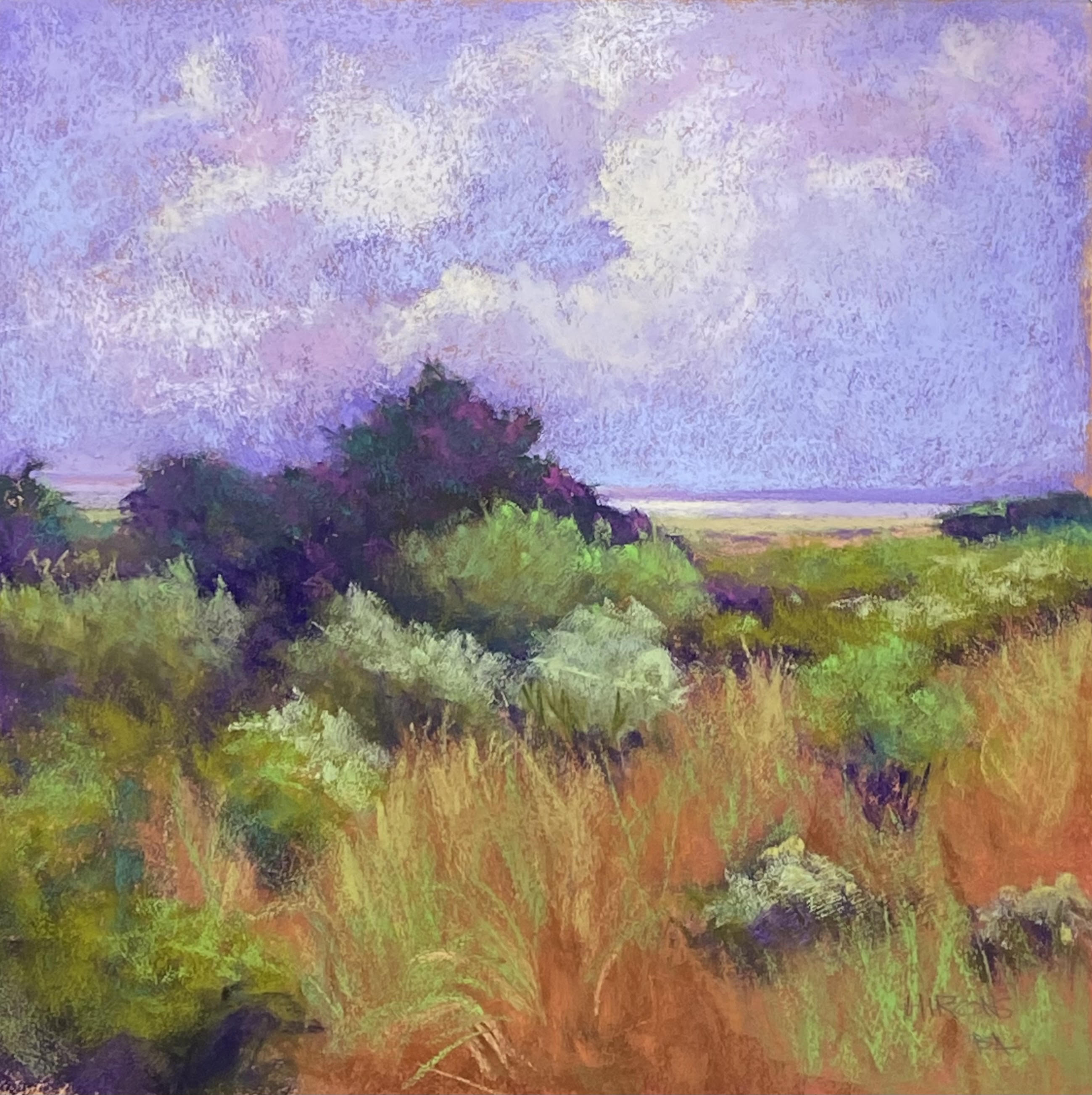
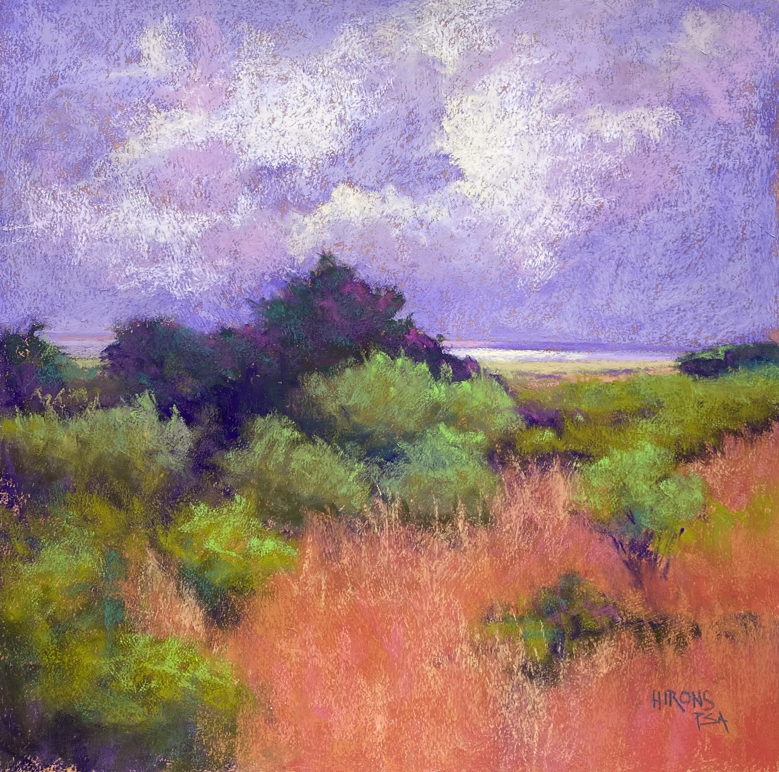
I’m back in the studio–just sold two of my studies!  I also came to revise the painting after thinking about it more.  When I came in, the painting was on the floor folded over!  Well!  I guess that told me something.  Anyway, I have reworked it.  There is now some aqua in the sky along with the violet, which I think gives it more dimension and softness.  I added lighter colors to some of the bushes (which I had in a study) and I’ve changed the foreground grasses.  I wiped off the reds and went back in with more sienna colors and added green and yellow grasses into that.  It’s more detailed now and definitely less “abstract”!  Not really abstract at all!  I told my friend that perhaps I was “intuiting” the landscape as opposed to “abstracting” it.  Anyway, I think it’s a better picture and I hae put glassine on it and I”m done with it for now.  (Sorry the underlining showed up and I can’t find a way to get rid of it)  Also, I realized that what I’ve been painting is Rehoboth, not Delaware Bay!  The latter is much bigger! 

Rehoboth Bay, #2 18″ x 18″


Revised image

Delaware Bay #1

Delaware Bay, #1, 18″ x 18″, Rives

For the first time, I’m posting this blog from my studio on Wilkins Ave!  I have my little all-in-one computer here and I’ll be giving my zoom classes on it beginning next Wednesday afternoon.  I was concerned about the connection, but it seems to be OK. So I’m relieved.

This week I started doing the first paintings from the initial studies on Rives printmaking paper.  It’s a surface I’ve used before and like a lot.  I bought 10 sheets for $4 each at Plaza!  SO it’s a bargain compared to mounted UART boards!!!

I used Golden fine pumice gel and burnt orange liquid acrylic to produce a lovely mid-toned off red surface.  And it lay nice and flat with no buckling.

I did a charcoal drawing to begin with and laid in the pattern of darks in the land areas. I loved putting pieces of color in the distant land and developing the bushes and grasses.  The sky was more challenging because of the surface.  And I had problems with colors.  The sky ended up very blue with not blue below.  I added turquoises to both the sky and grass areas and then added some oranges into the clouds, trying to tie the colors together.

Compositionally, I cut the piece too much in half, despite my initial measuring.  But it’s not too bad.

What I loved about doing the painting was working intuitively to create the composition of value shapes and the color interactions. l It didn’t work until I added the bright yellow greens into the foreground.  This makes it come alive, I think.

I really loved getting back to this surface and a freer way of painting again.  I plan to stick with it for awhile and I have a show lined up in March of next year where I can show them.  So things seem to be working out

Now, I’ll add the second one!