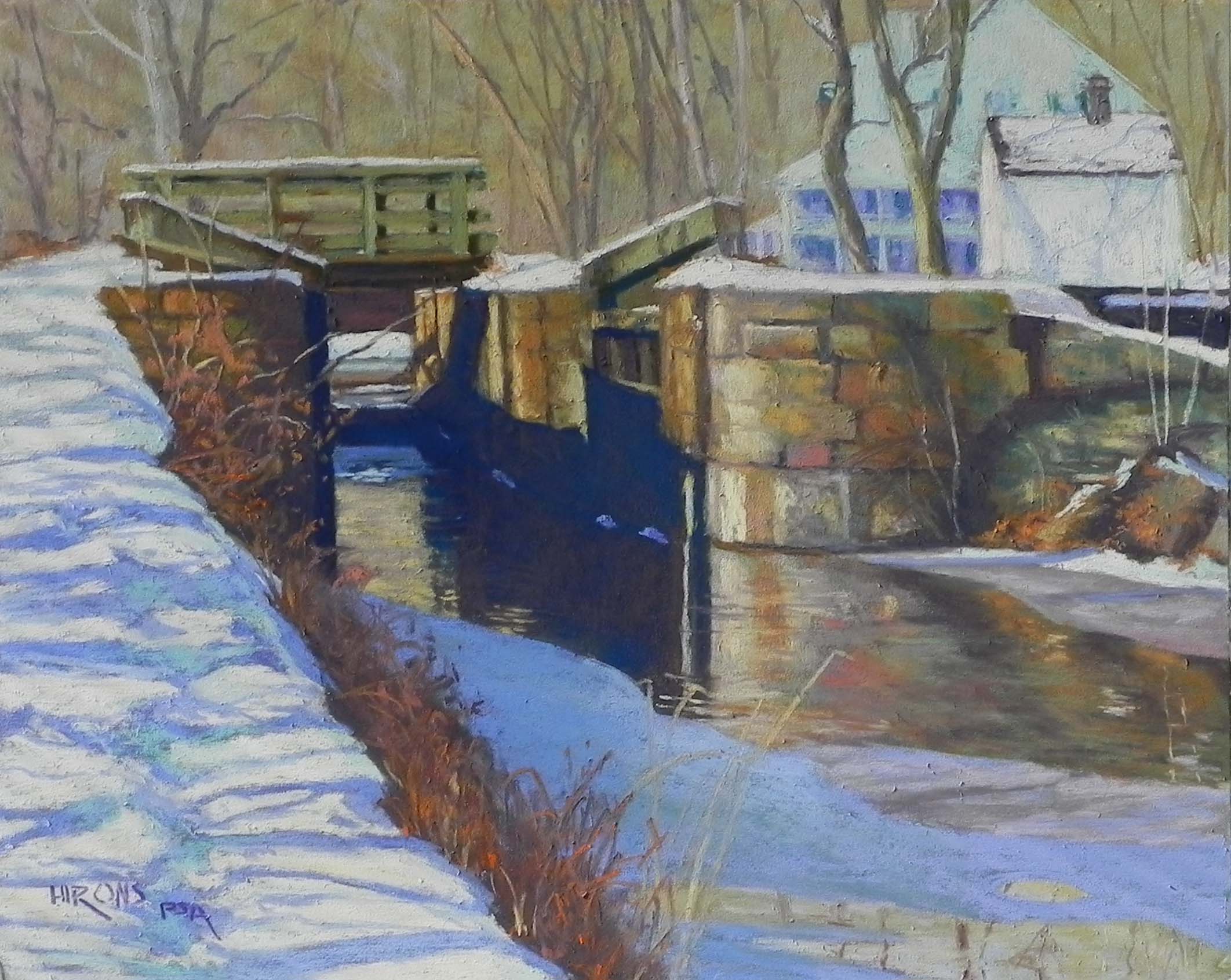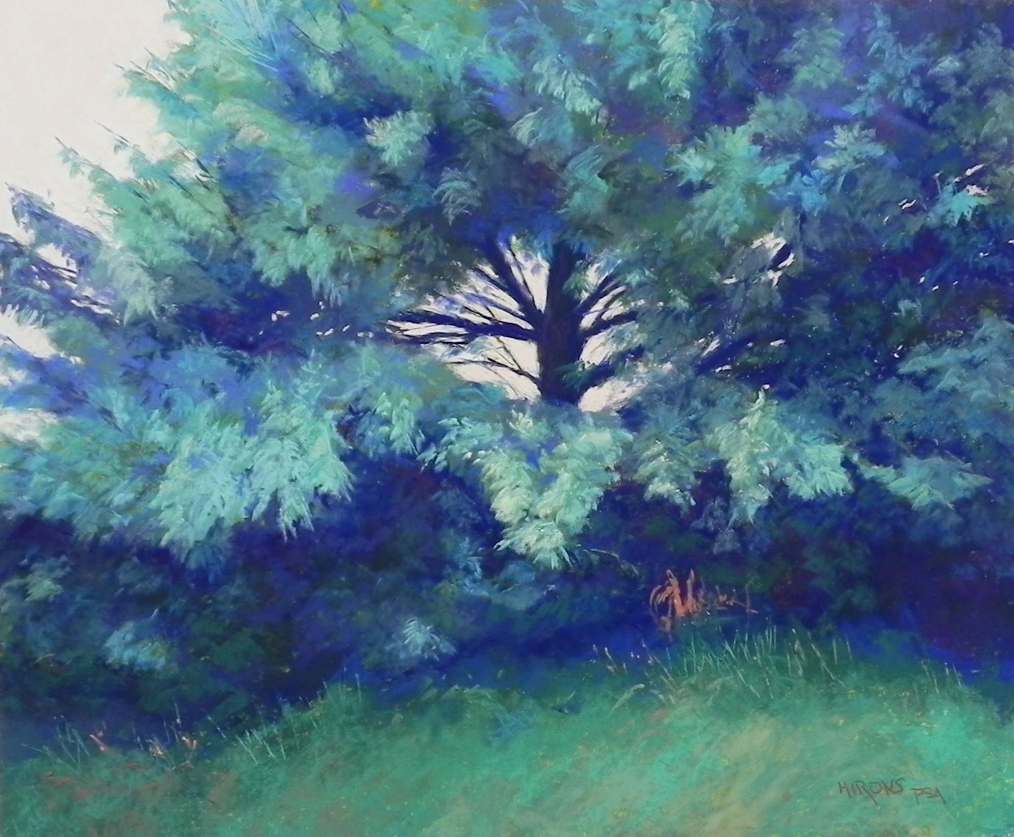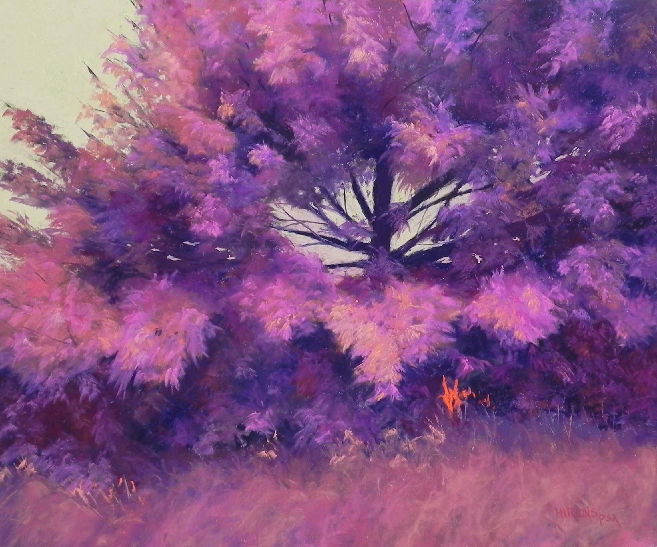
Hot Pink Pine, 20″ x 24″, Pastel Premiere 600 grit mounted to gatorfoam
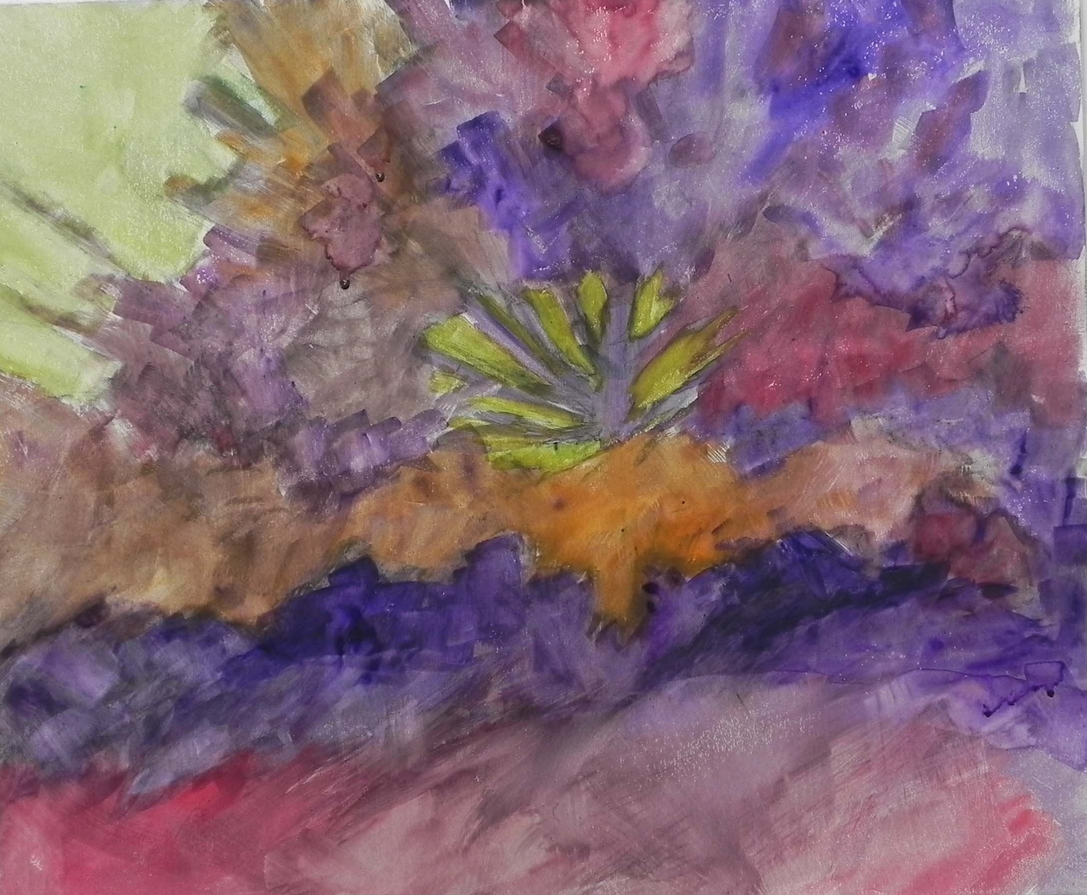
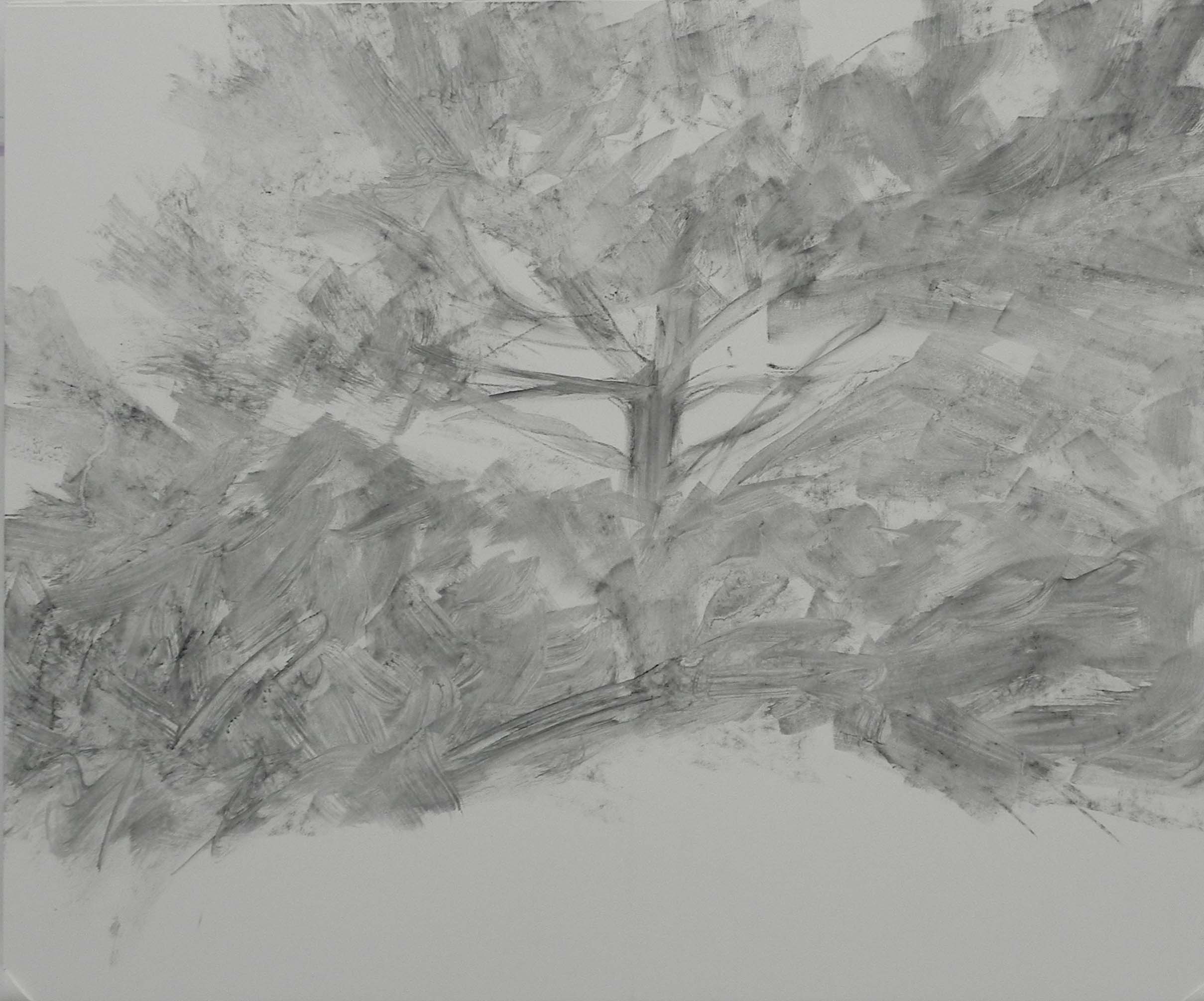
Watercolor underpainting
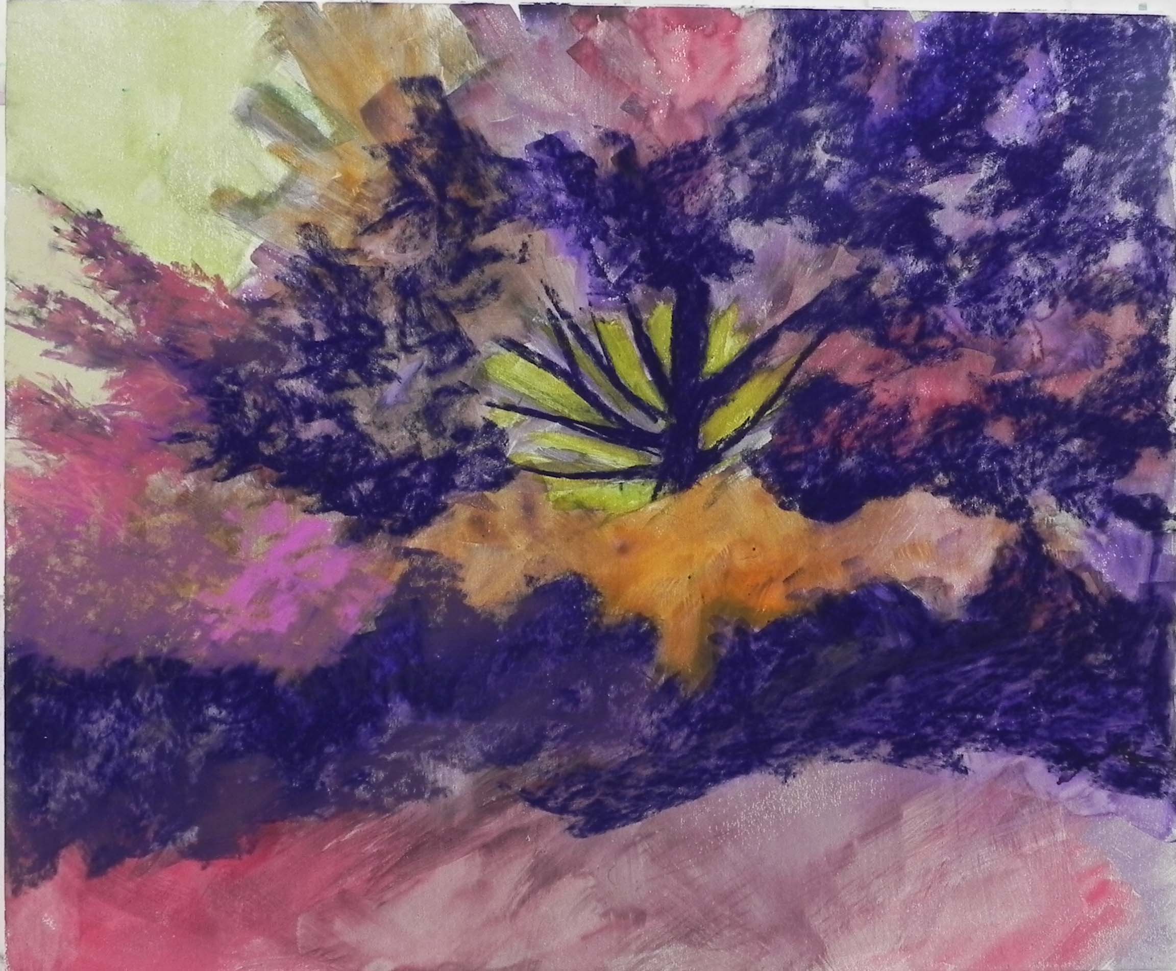
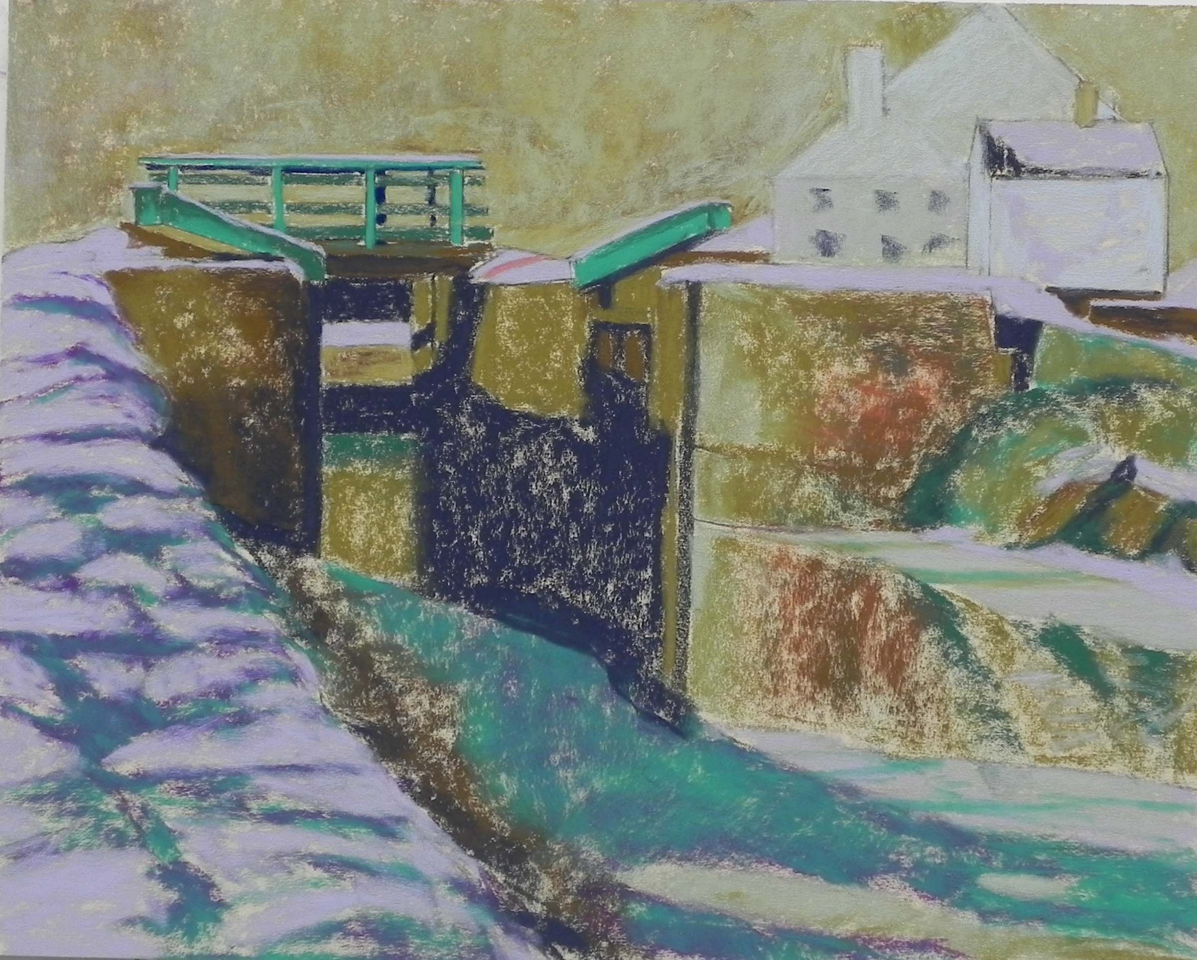
Stage 1: adding dark
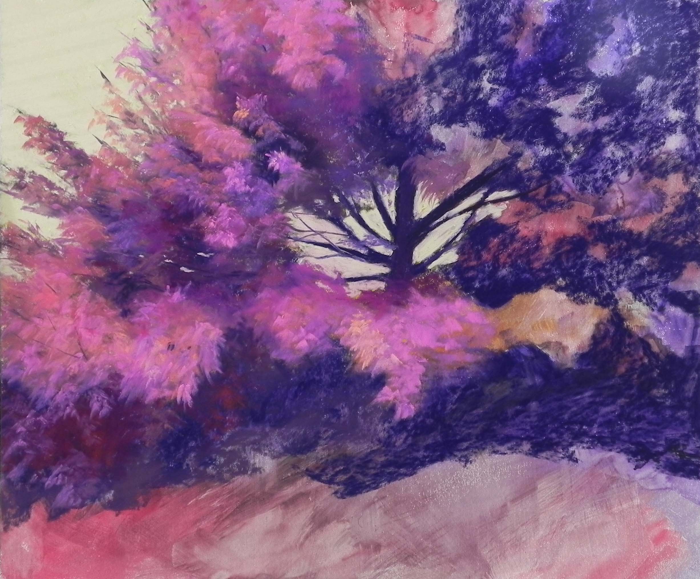
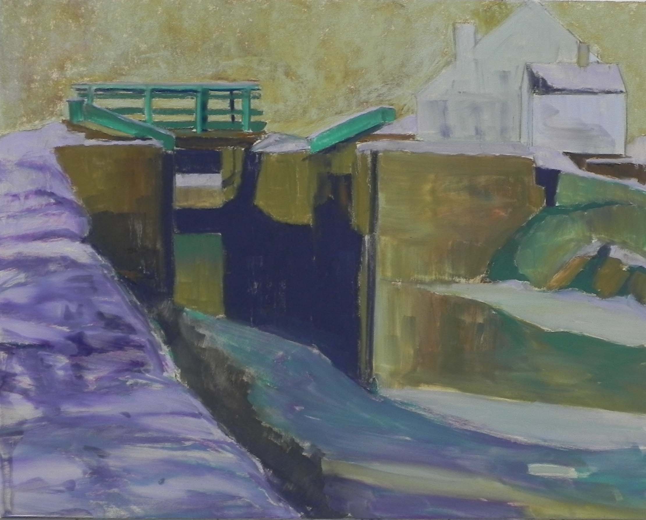
Half done
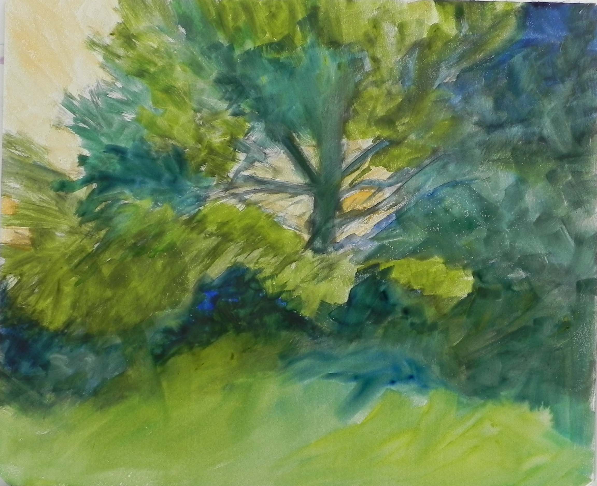
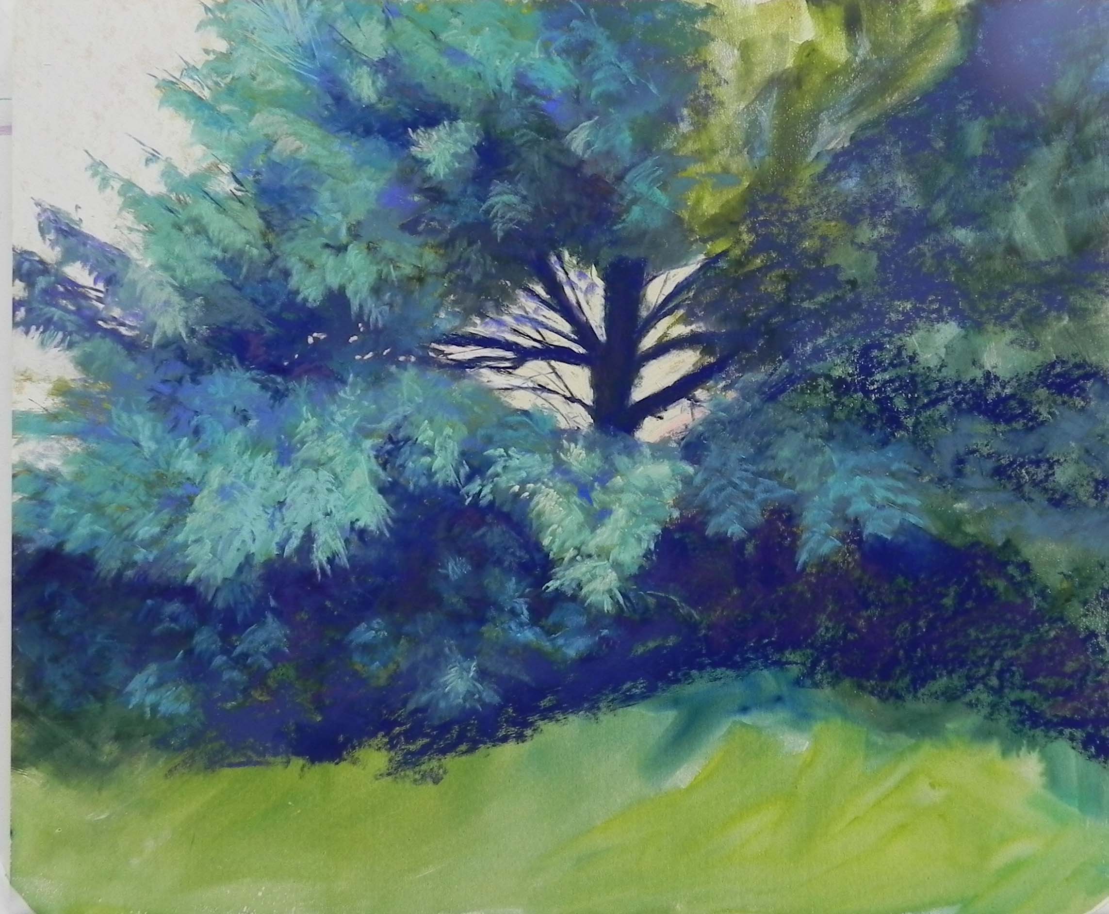
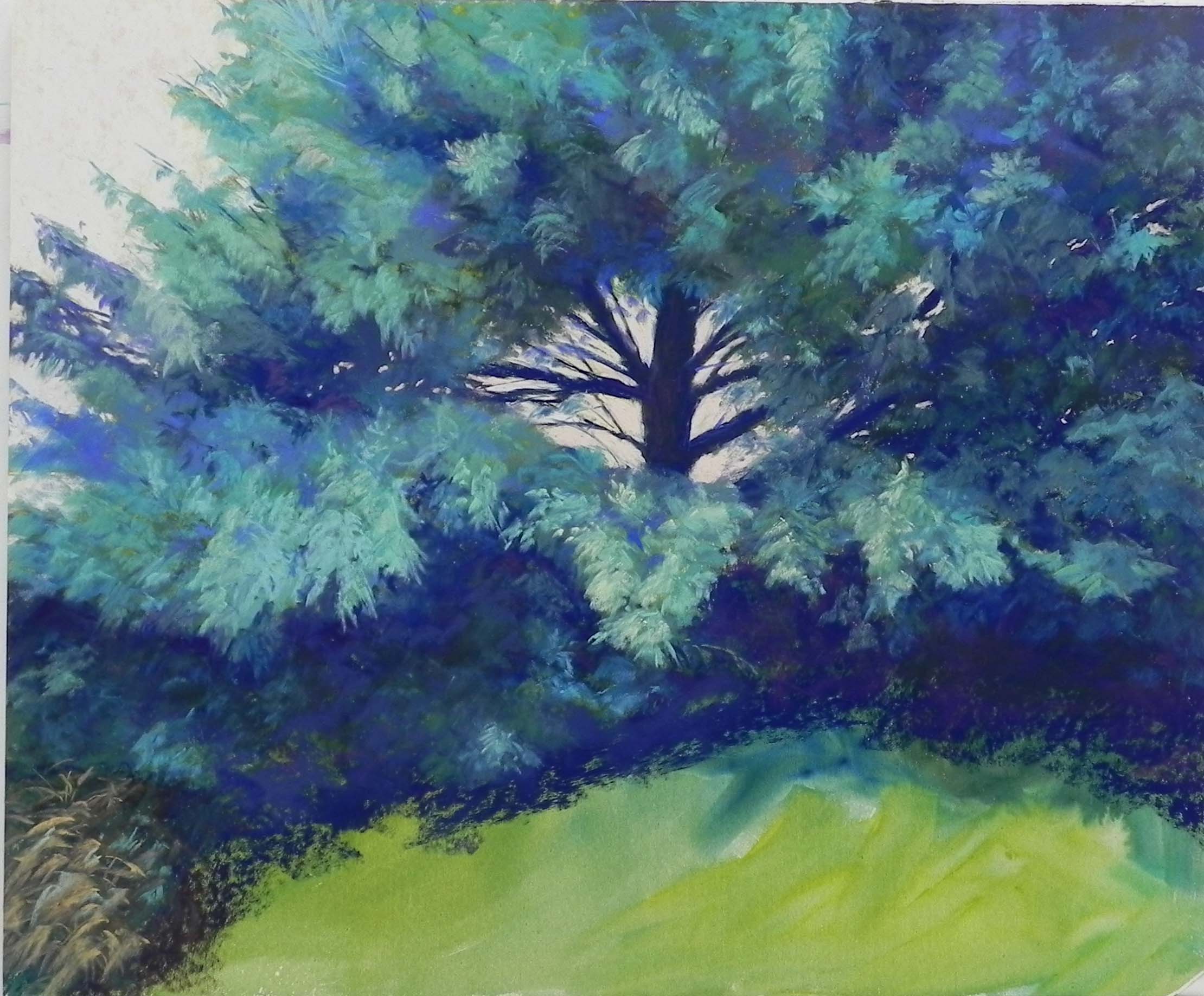
After I finished my painting, Turquoise Pine, I was in the studio with my friend Sunny. She said that I should prove what I’m always preaching: that value is more important than color–by doing it again in a more unbelievable color. I loved the idea and I had several more of the 600 grit Pastel Premiere boards (I really don’t recommend this surface!!!). My original thought was to start with dark purples (none in the first painting), then move to majentas and reds and hot oranges. That was my idea. But once I got going, my natural inclinations kept things pretty much in the majenta range with some soft oranges and warm neutrals added for contrast and light. I’ve always known that I prefer the cooler colors. Yellow, orange and red are NOT me!
For this painting, I used a lot of Great Americans and some Senneliers. I then added Blue Earth for the bottom. As you can see, the watercolor underpainting didn’t do a lot for me. So once it was dry, I took a Ludwig “eggplant” and added in dark purple in the areas I wanted to be dark. This was a good start. I then moved to some slightly lighter red violets, blue violets, and majentas. I found a lovely Great American warm neutral in my box with the reds and pinks and used it for the sky, deciding it was perfect.
What really amazed me was the vibration of color, particularly on the left side where the branches are against the sky. By using warm over cool and cool over warm, it really jumped out at me! My husband calls this painting “Explosion in Pink”!!! Perhaps It is too much??? Maybe green grass would have been good. But, I wanted to do what I’d done in the other painting and keep the same color throughout.
For the lightest areas, I used pinks and then oranges on top. I used a really hot red orange for the squiggle of grass below the tree that is in the photo. Liked it. Maybe I should have used a bright yellow green as the complement, but I tried some pieces of green and it was too much of a contrast.
So, what do you think? Is this nuts? But maybe I’m a little crazy these days!!! I don’t think I’ll do another one of these. Two were enough. But I really had fun doing it. Beat watching the impeachment proceedings!