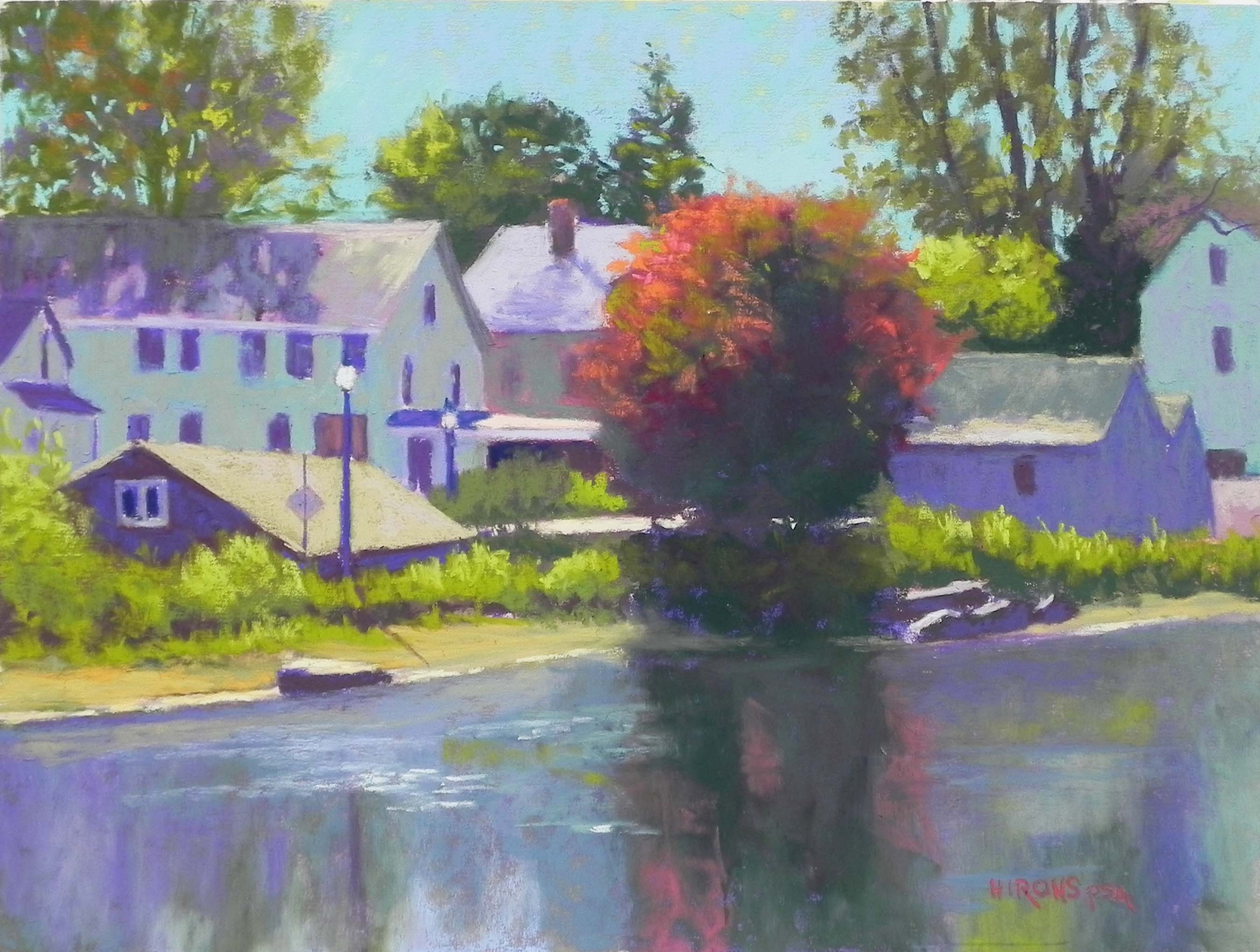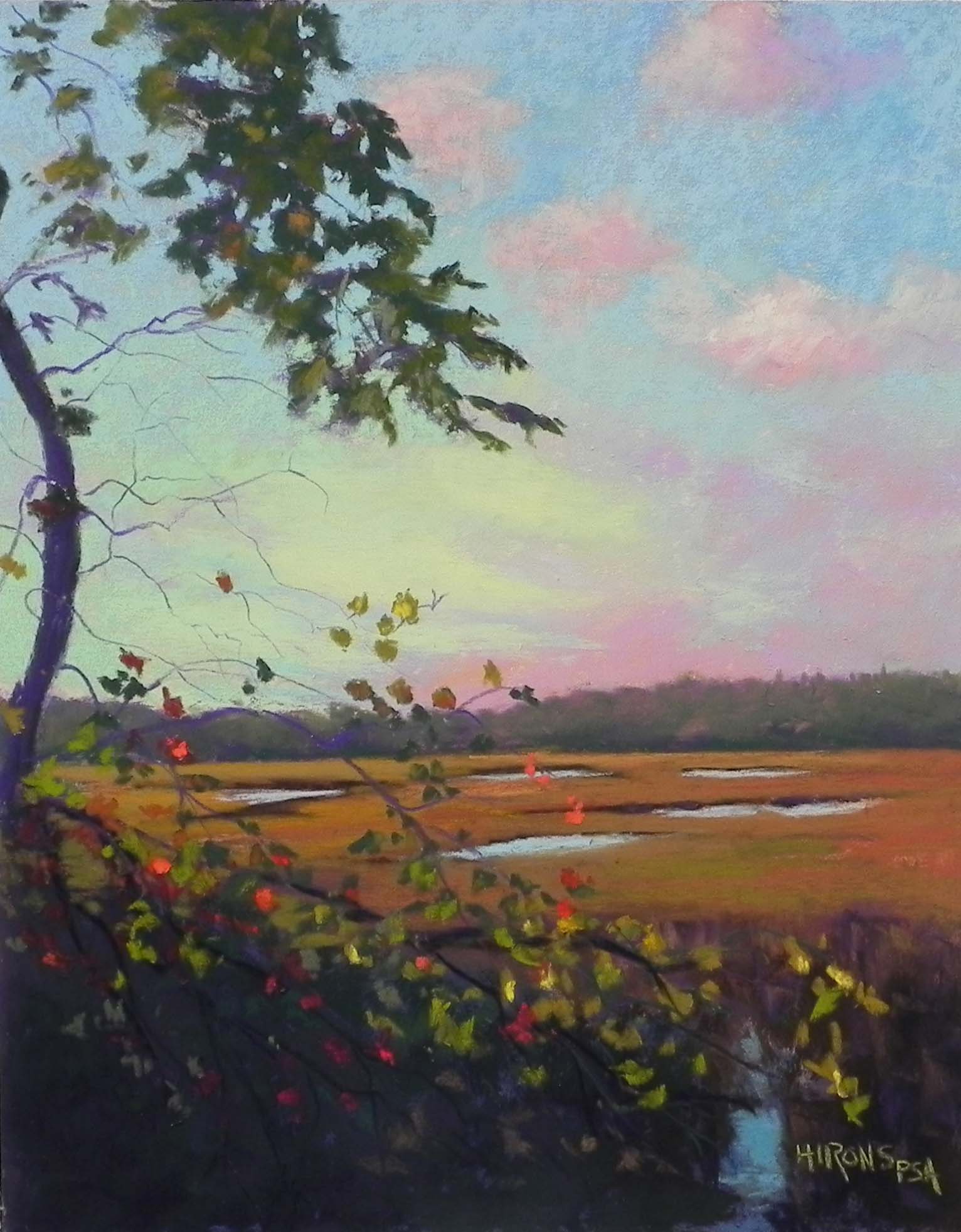
Day’End, Marion, 14″ x 11″, UART 320
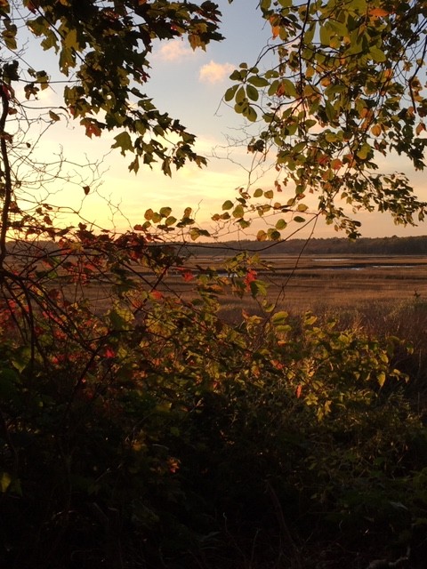
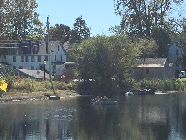
Reference photo
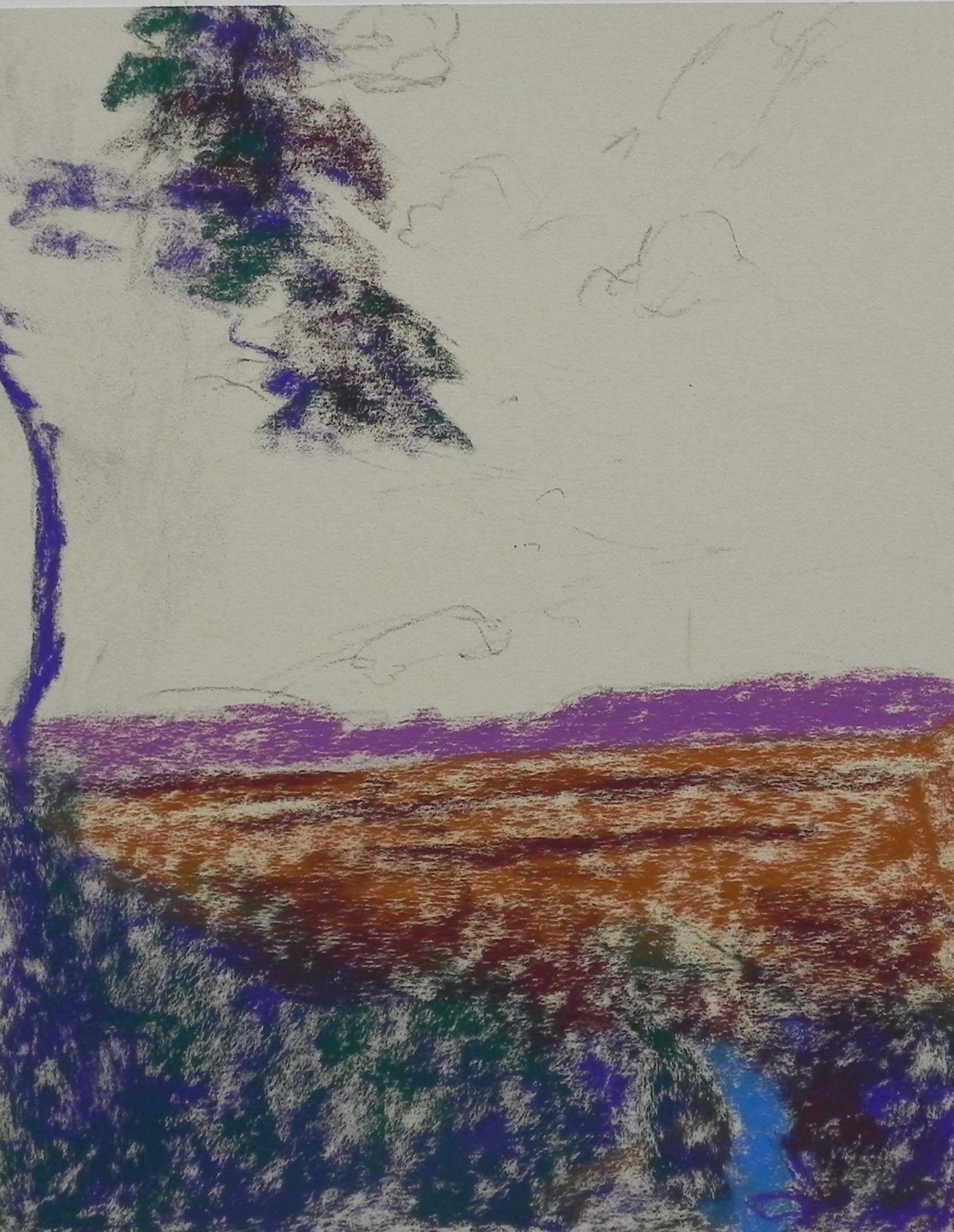
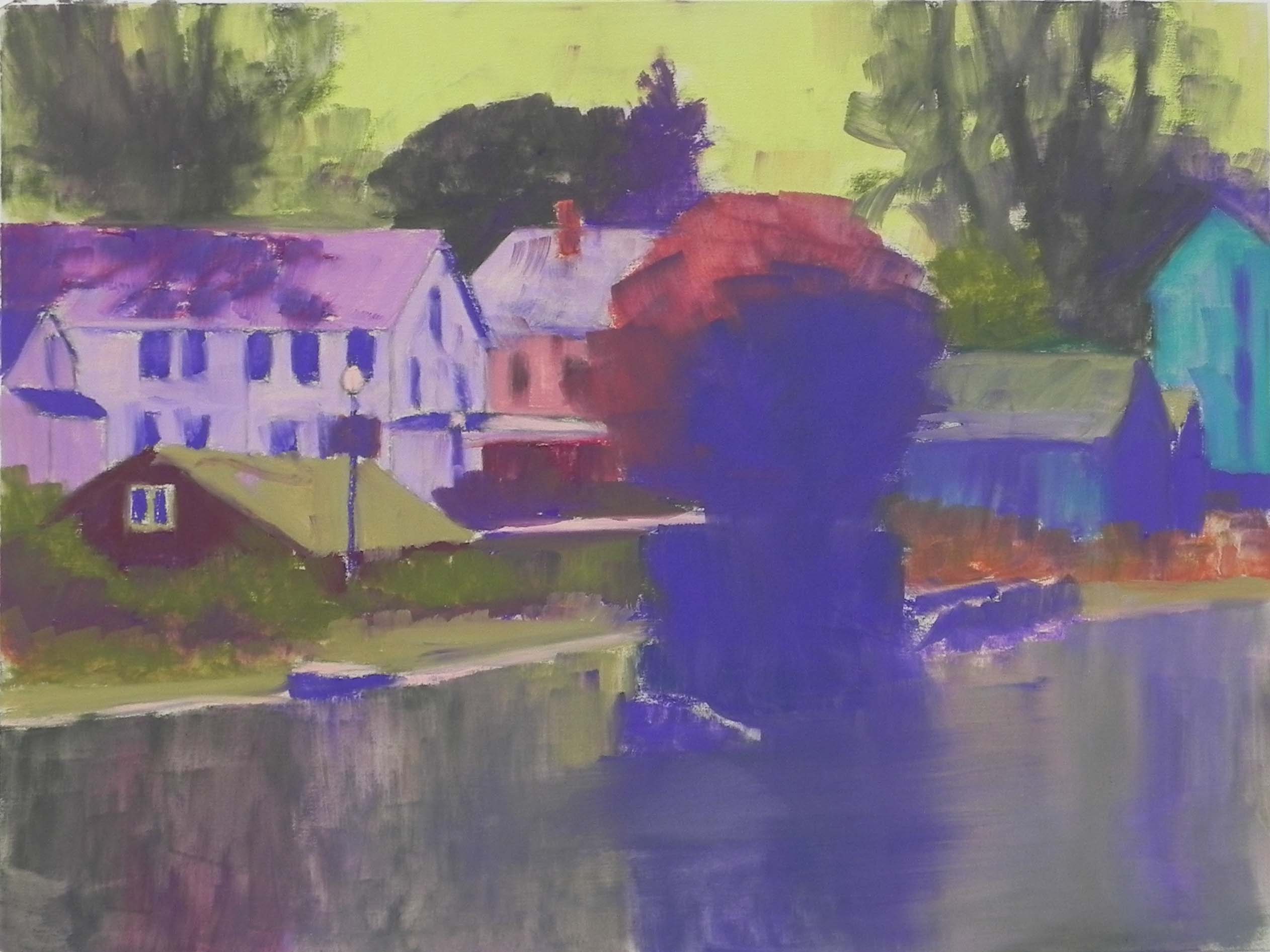
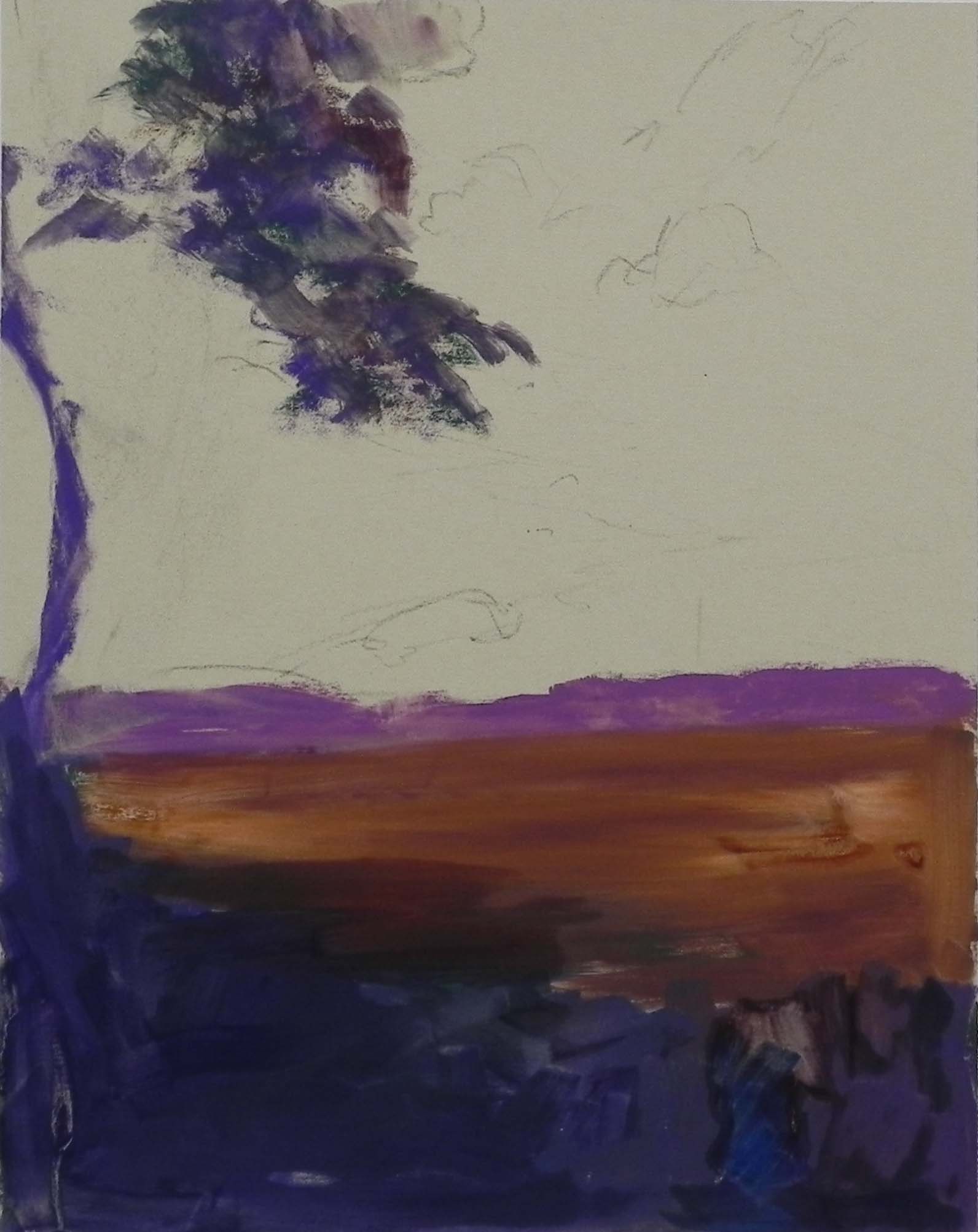
Partial underpainting before alcohol
Partial underpainting with alcohol
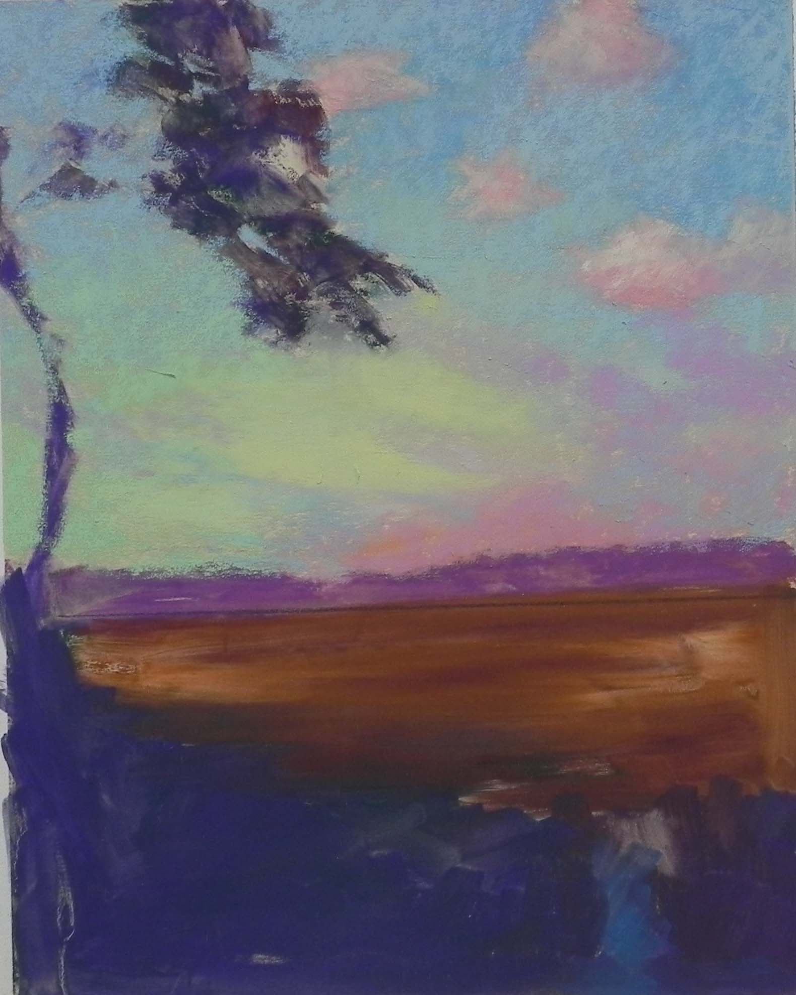
Early stage after input of sky
Today a friend wanted to come to the studio at 1:00 and I was free so came early and decided to do one more painting for this year. It’s appropriate being a sunset! The photo, had a lovely sky by way too many leaves covering and black at the bottom, so I had decided earlier not to bother with it. But today I thought I might as well tackle it and see what I could do. I looked at various surfaces and decided that the 11 x 14 would be best. I did a simple drawing, leaving out the leaves on the right and emphasizing the arc of the tree and liked it. I also decided to add some water at the bottom right, to open up the picture a bit.
I decided that the colors in the sky were too subtle and not to do an underpainting there. So I did a quick partical underpainting, primarily to lay in the shape of the leaves and to get the darks in below. This worked well.
I had to begin the sky first. I thought about using pan pastels but I didn’t have the applicators. Instead, started with Giraults and ended with much softer Schminckes, very lightly applied. It worked well over the beige paper. I went from cool blues to warm greenish blues then to pinks and oranges and violets on the right and a cool green, yellow green and yellow on the left. I’m not real happy with the clouds. The look like four plops of pink! They are just barely visible in the photo and I wanted them due to their color, but I’m not sure how much they add. I may do some more work on them before I frame it.
This is a painting with many layers, the sky, the background marsh, and the tree and leaves in the foreground. I put the blues of the sky in and around the leaves to give them form and used a hard pastel for the tiny branches coming off the tree. The biggest challenge of the painting was probably the foreground leaves. Some were bright red, others greens and yellows and were backlit. I tried to get enough of them in to make it interesting and added a few bright pieces of red orange.
It’s almost Christmas and the beginning of a new year. I hope that you will have safe travels and enjoy the company of loved ones and friends. We look forward to hosting Christmas eve here with two couples from our UU congregation. We will play the piano and the psaltry, tell stories and poems and eat cioppino and other good things! It will be my first Christmas here and the first without my mother. A time for new traditions to begin. Wishing you all the best!
Jean