
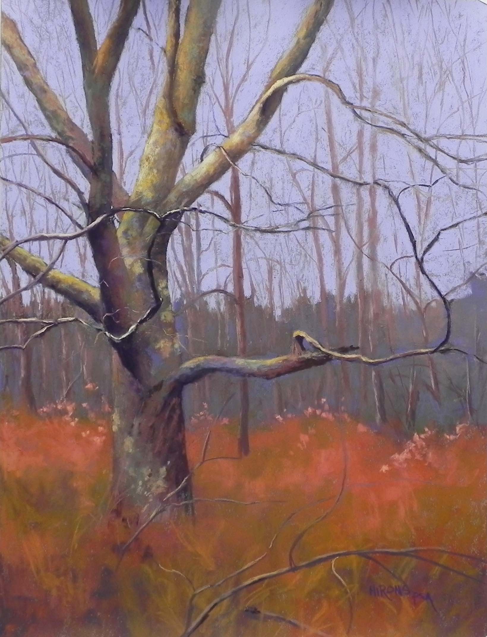
Grace, 24″ x 18″ Wallis Belgian mist (!)
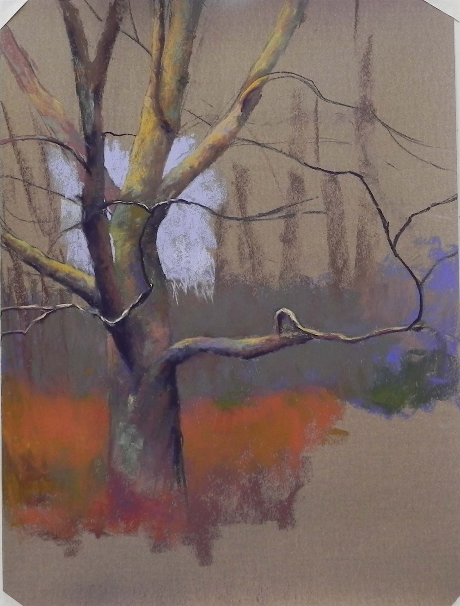
Early stage
A few weeks ago John and I took a Sunday afternoon walk at Lake Frank. It was overcast and the leaves were gone but i brought my phone with me, just in case. I took some photos but didn’t get very interested until, on the way back, I saw some bare trees standing in a field of grasses. I took a number of pictures and realized that I had something. I remembered the grasses as having a reddish brown hue to them, but trying to make them more interesting in Photoshop turned them into a warm yellow brown, which I didn’t want. So I decided I’d just wing it and push the color a bit!
When I moved my pastel cabinet to my new studio last spring, I discovered two 18 x 24 sheets of Wallis Belgian mist, which I’ve been saving for something special. I knew that this was the perfect match! I didn’t want an underpainting. I wanted to be able to draw and react to the paper and enjoy it and I really did! It’s a pity that this paper is no longer available but the Italian clay Pastel Premiere is quite good.
I began with a drawing of the tree and the idea that I’d make the background recede. In the photo, the background trees are more prominent and the same color and value as the big tree. I used Giraults to fill in the background trees (the solid part). Then I found a small piece of light soft violet that I began applying to the sky and loved it. I decided that it was a Schmincke and was SO happy to find that I had an entire replacement stick in my cabinet!
At one point I thought about doing a vignette and not filling it all in, but I realized that it wouldn’t work well. So I put the violet over the entire background, then used on Girault to lightly indicate the trees. I used Giraults for the grasses as well and let them blend in together, using various reddish browns and a warm brownish green.
For the tree, I started with Girault, but moved to softer pastels and ended up using very light applications of Blue Earth, using the grayed violet, cool green and yellow sets. I thought I had finished the painting on Monday but when I looked at the photo, I immediately said “this tree’s too fat”!!! You can see it in the early stage image. So I carved away at it on the right side, using the colors of the sky and grasses to shave it off. I also added lichen to the trunk in several places as it was looking too much the same in my photo.
I had been thinking about calling this “Quietude” but today in class my students talked about the gracefulness of the tree and I decided to call it Grace. I’m happy with this one!