
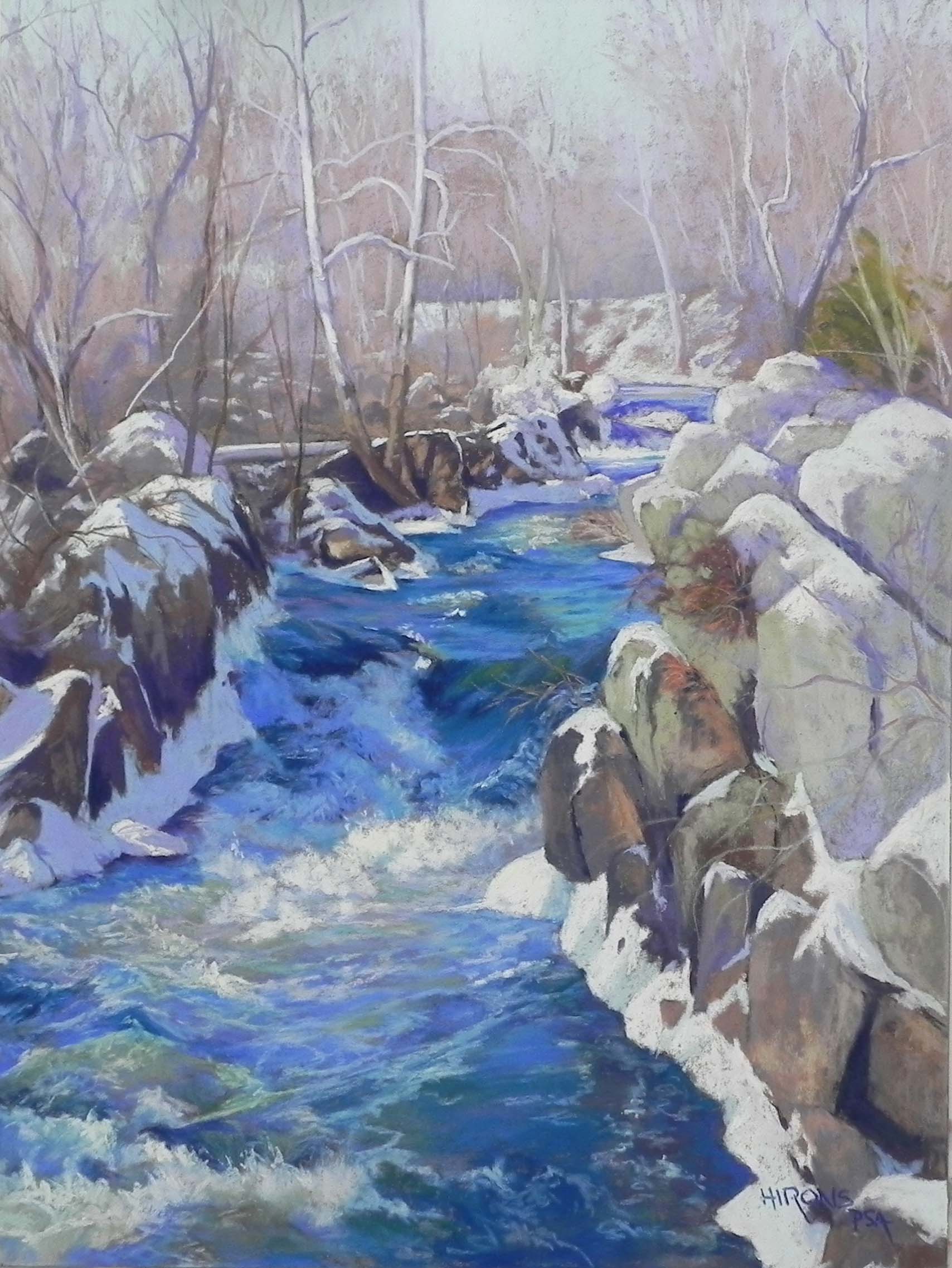
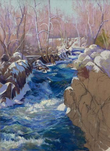
Great Falls Blues, 24″ x 18″, Wallis Beligan Mist
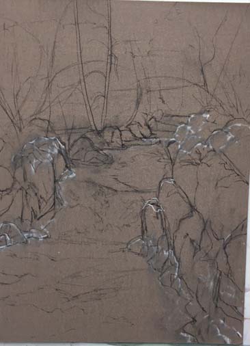
Initial drawing
Sky and trees
Beginning the water
Water almost done
Greetings! We arrived home from spending 12 days in Costa Rica and Panama a week ago. After being immersed in greens, I’ve been back to painting ice, snow, and really cold blue waters! I began this painting before I left. I had one sheet left of Wallis and had my framer mount it to gatorfoam. I wanted to do something special with it. I found a picture of Great Falls that I took in 2015 (I tried to go this year but the park was closed–of course!). I had printed out the photo a year or two ago and decided it was too cold looking and too much work. But now, I realized that it was just what I was looking for! I’ve been doing my series of “Local Wonders” and this surely is one of them. Perhaps the most spectacular. This is a small tributary near the entrance to the walk to Olmsted Island. It’s not the major falls, which is steeper and generally all white!
One of my students asked me to post pictures of the process, so I’ve done that. With such a complicated picture, I find it’s much better to work on a toned surface and the Wallis was just perfect, alas! With so many colors in the water, there’s no point in doing an underpainting. And the brown was perfect for the sky, trees, and rocks.
I used an 18 x 24, which is longer, than the 8 x 10 photo I used as a reference. I had no problem with it, however. This is a picture that benefits from a little more distance. I began with pencil and then decided to add some white pastel to indicate the snow. However, I decided I didn’t like it and got rid of most of it. You can still see some in the initial drawing.
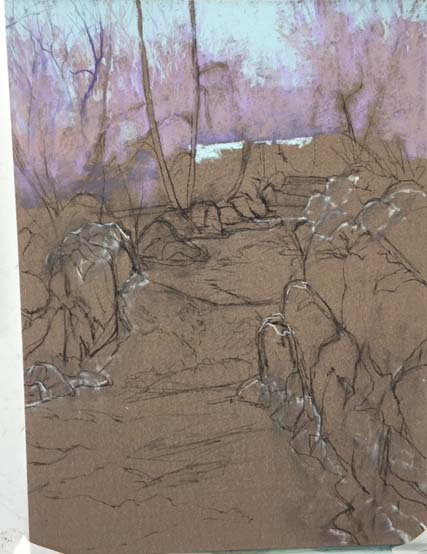
I began the painting with an aqua Girault, laying in the sky. I used a light neutral brown and a light magenta for the trees. The diagonal white snow line in the background is the tow path. I could just barely see it in the photo, but instinctively made more of it in the painting. I like the way the water leads to it, and the towpath than leads the eye on. One of the things I loved about the whole scene were the diagonal lines caused by the rocks and snow and the planes of the water. You can really feel the movement.
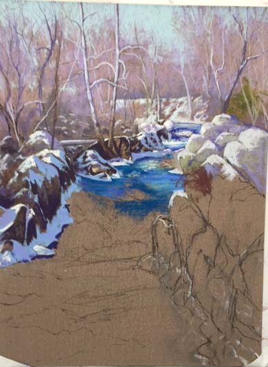
This painting is 98% Girault! I had just the right colors of blues and it was easy using these relatively small pastels to lightly layer in the water and the colors on the rocks. To do the water, I focused on value, temperature, and planes, laying in initial planes with a darker color and adding warmer blue greens on top. The water is a combination of blues, blue violets, true violet, blue greens, and grayed warm greens. For the spray in the middle, I added some light softer yellow, which I added selectively in other places to lead the eye up to the trees.
The rocks at right were a bit of a challenge–some were too large. So I broke them up with cracks and more snow. I used very light grayed greens along with browns and violets.
I’ve never painted water like this before! It was a challenge, but a fun challenge. It’s all about value, temperature and shapes. Strokes were important as well to get the feel of the planes and the direction of the flow.
I know this is a very cold-looking painting but I’m hoping that there is enough warmth in it to make it appealing. Now on to the greens and reds of Costa Rica!!!