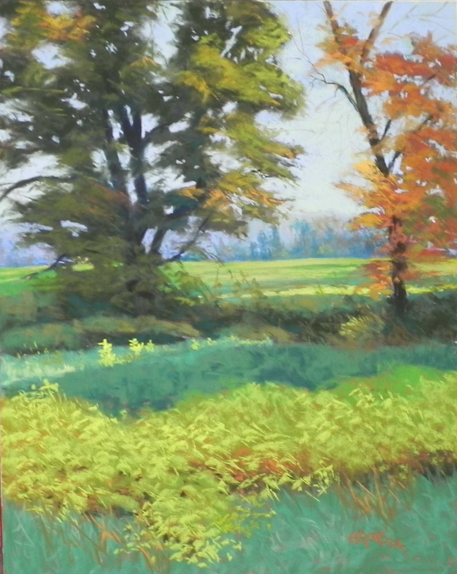
Autumn in the Catoctins, 20″ x 16″, UART 320
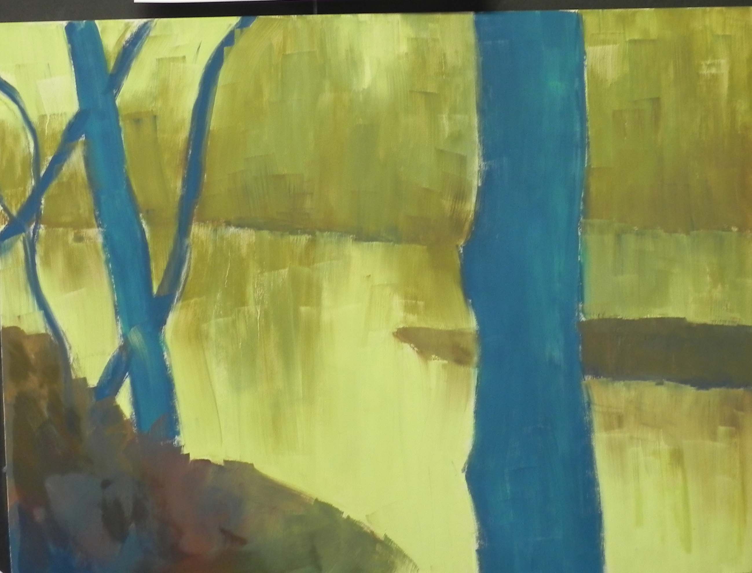
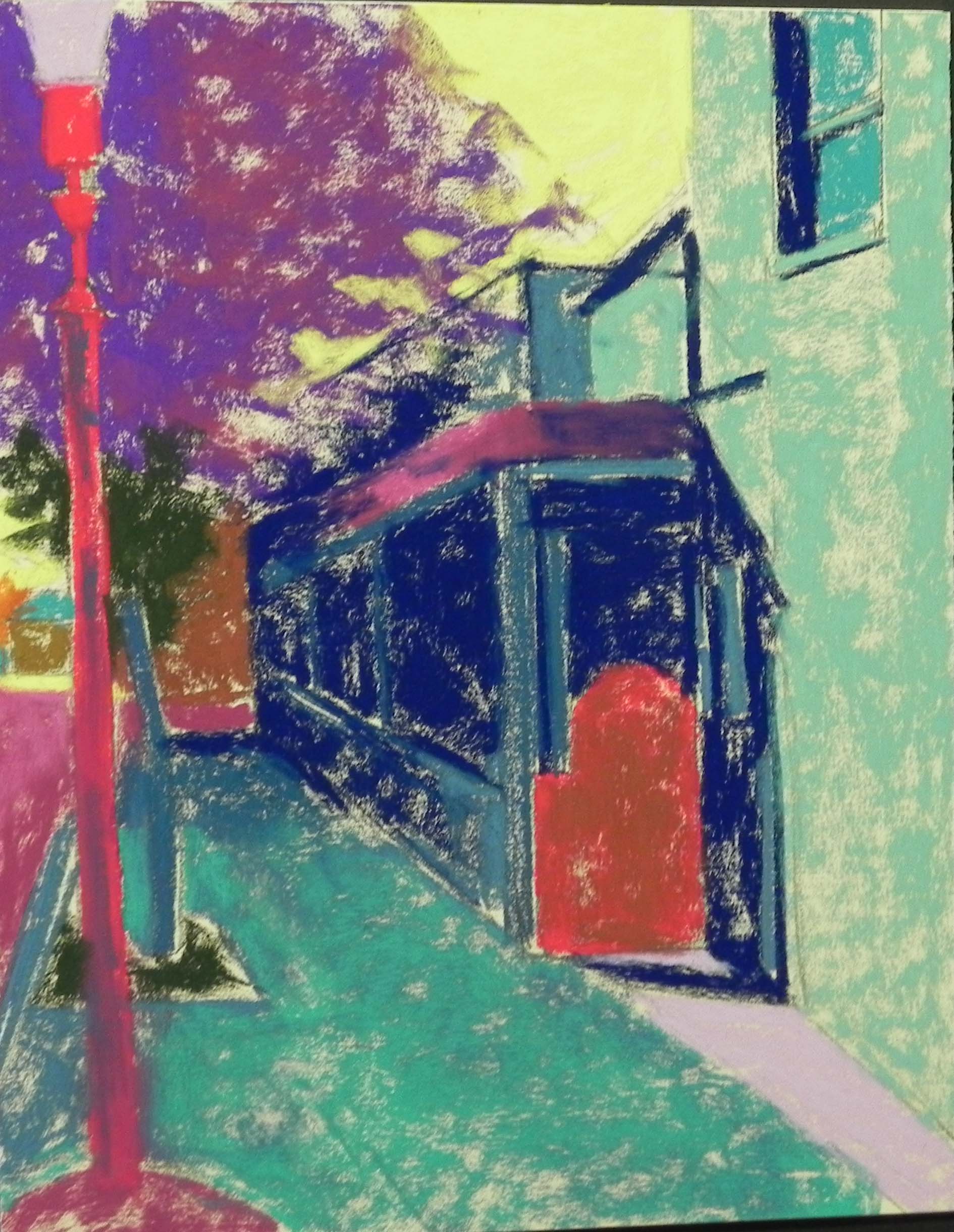
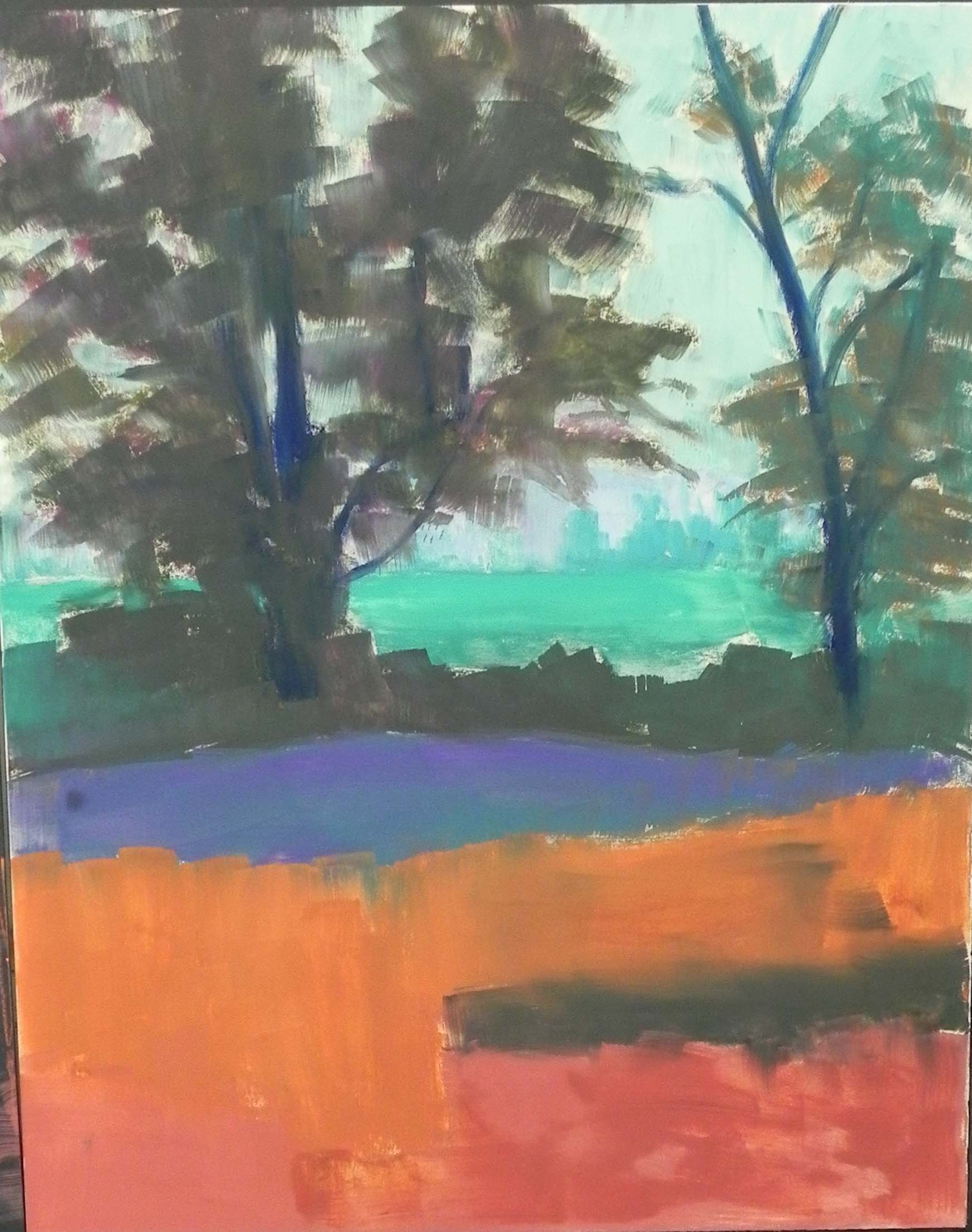
Underpainting, stage 1
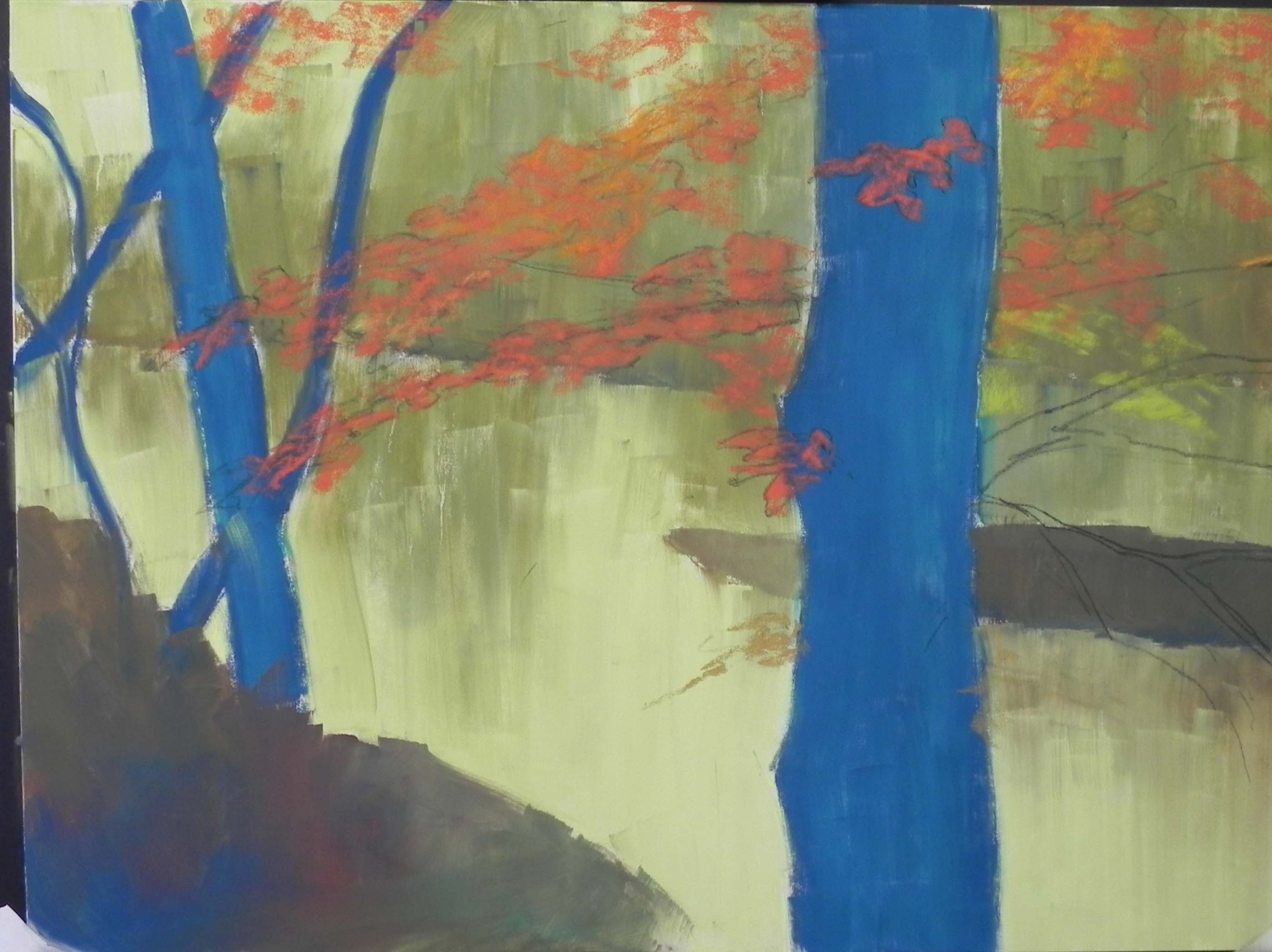
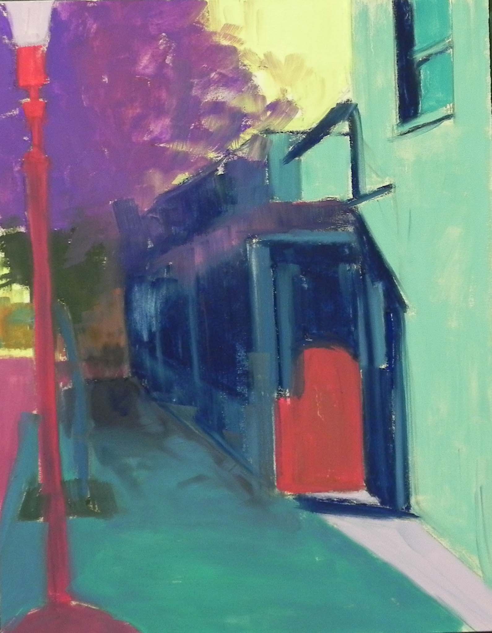
Underpainting, stage 2
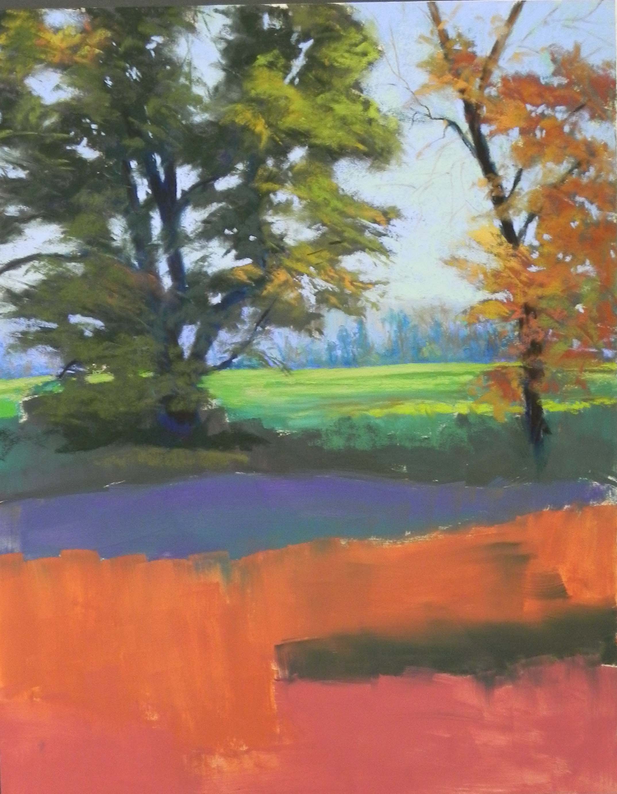
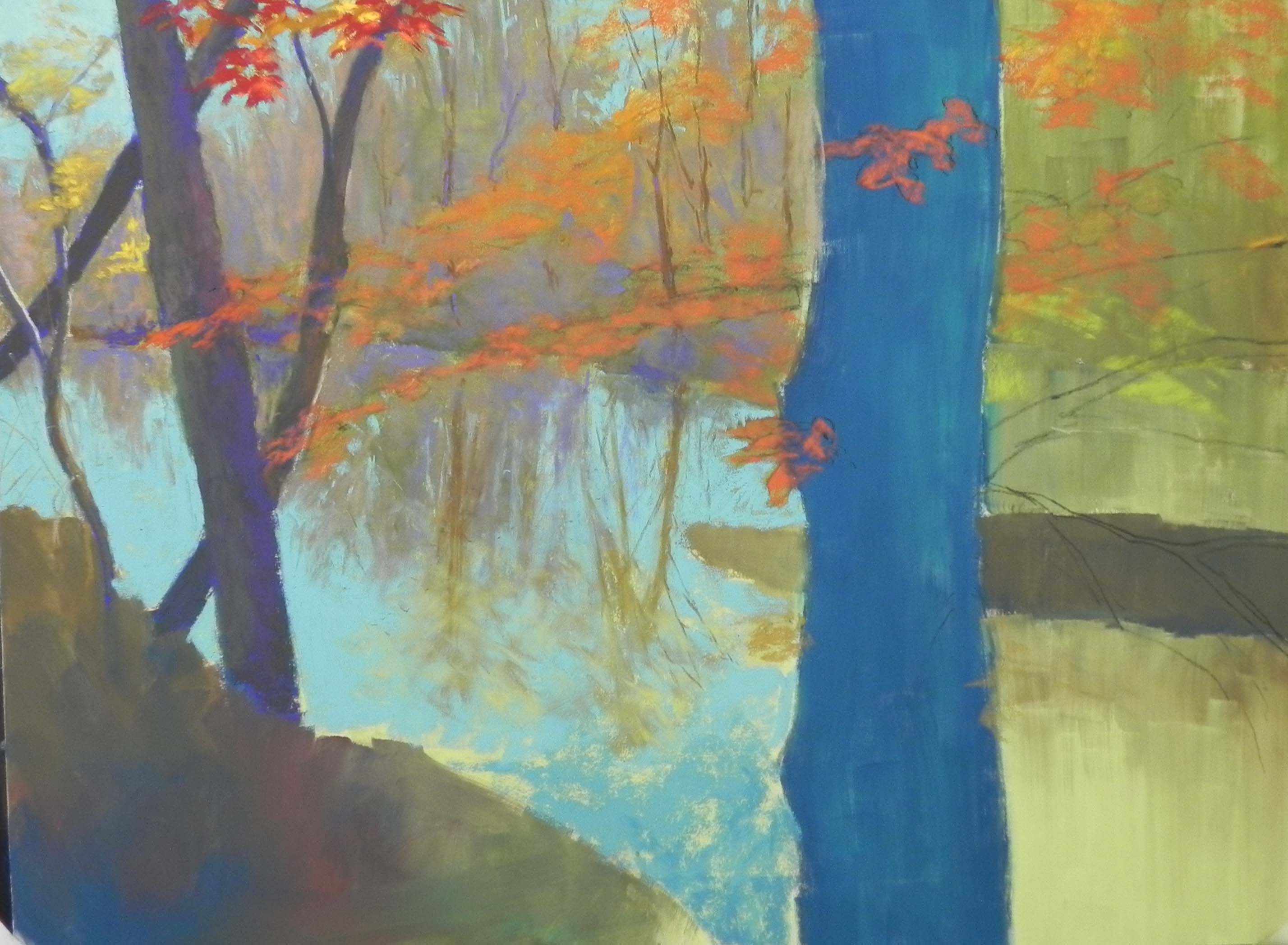
Top completed (almost)
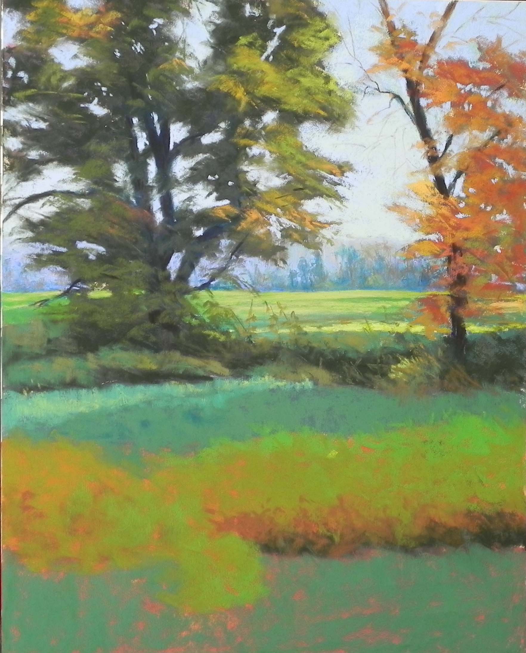
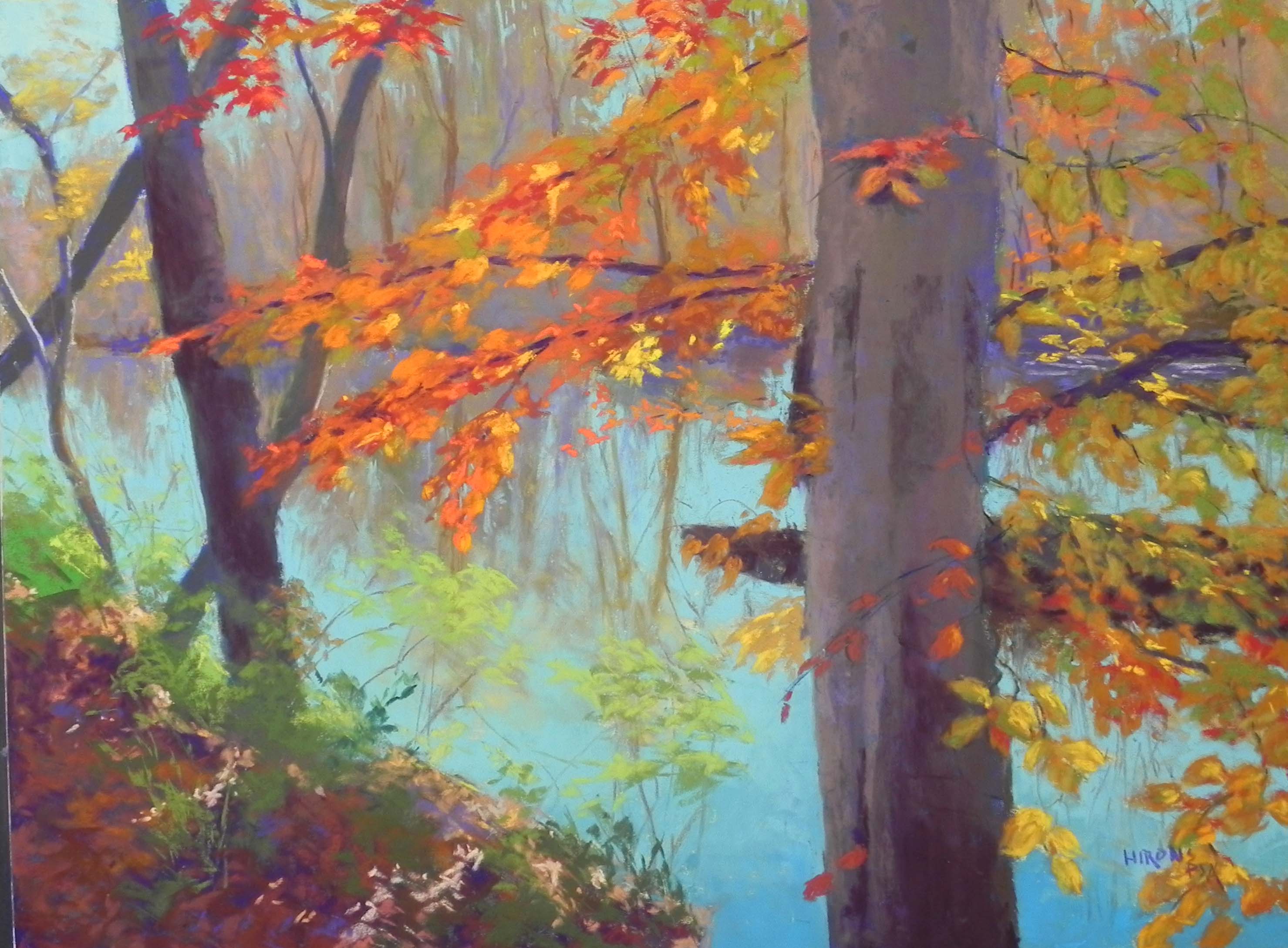
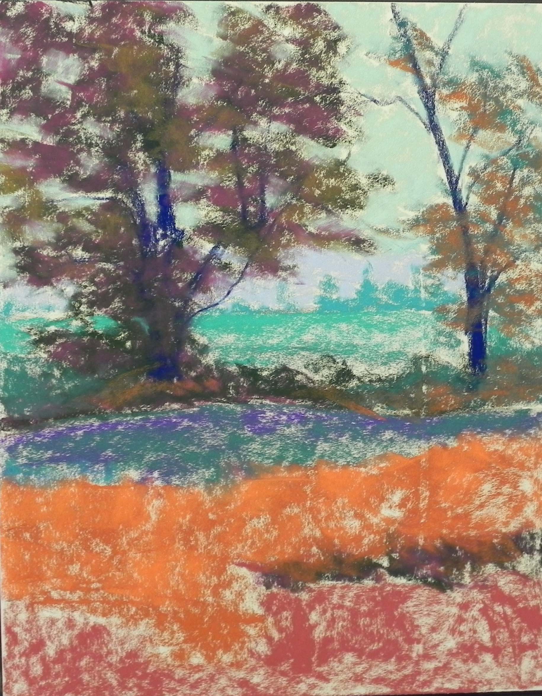
Initial rough in of color in the bottom
I’ve clearly been inspired to paint this week! I just spent the day doing this painting from one of our first fall trips in mid Oct. to the Catoctin Mts. in Maryland. There wasn’t a lot of foliage at the time, but we found a field with wonderful yellow green plants and light streaming through highlighting a few of them. I’ve been wanting to do it for some weeks now.
I took a lot of pictures, both horizontal and vertical and settled on this one, as it emphasizes the large green tree, whose shape I really liked. It also shows a lot of the background field and distant hills.
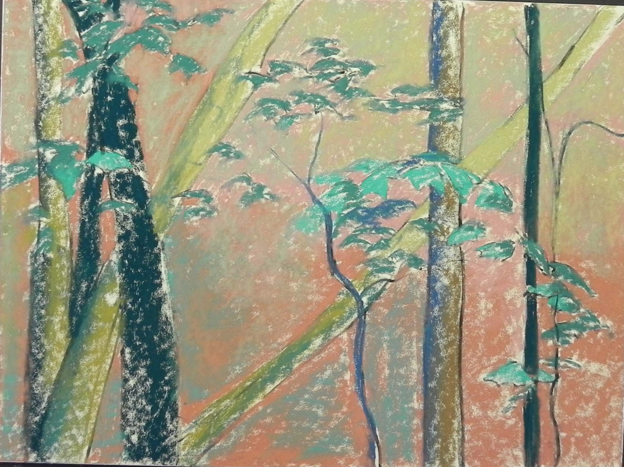
To begin with, I drew one line at the base of the trees, and then decided to start immediately with hard pastel. I started with “bottle green” for the leaves of the green tree, then added red violet over it (whish just created mud with the alcohol!). It was kind of nice being able to skip the drawing stage and go right to the underpainting! I used primarily cool under warm, etc. but not completely. The cool violet really worked nicely in the shadowed greens. But I didn’t like the reddish color in the foreground and had to work to cover it all up. I saw a lot of orange under the yellow greens and that worked pretty well.
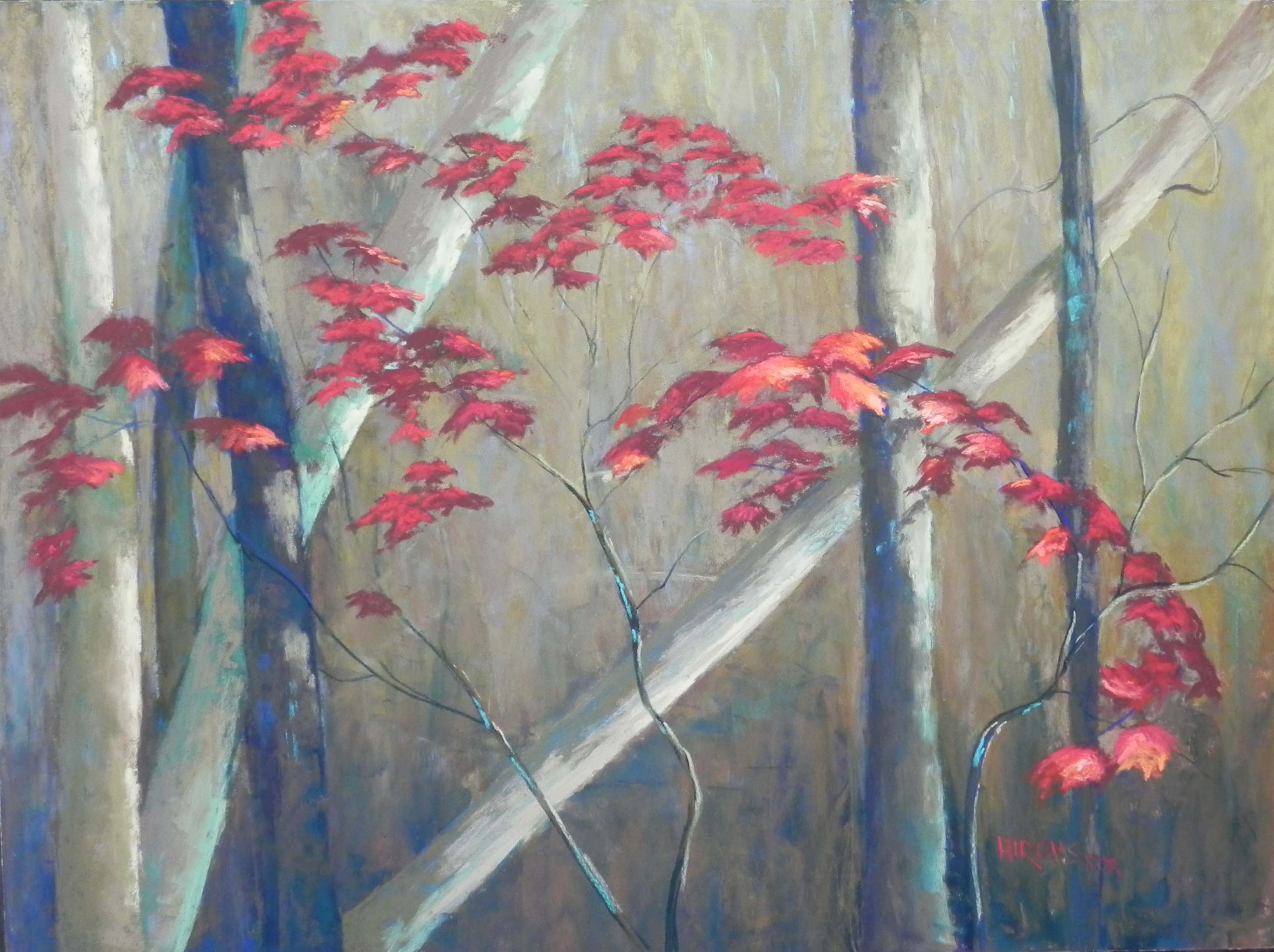
Colorwise, I was concerned that the less important tree on the right is the one with the fall colors. But I think it’s the yellow greens that really dominate in the painting. I brought some oranges into the base of them in the foreground and a few in the large green tree as well.
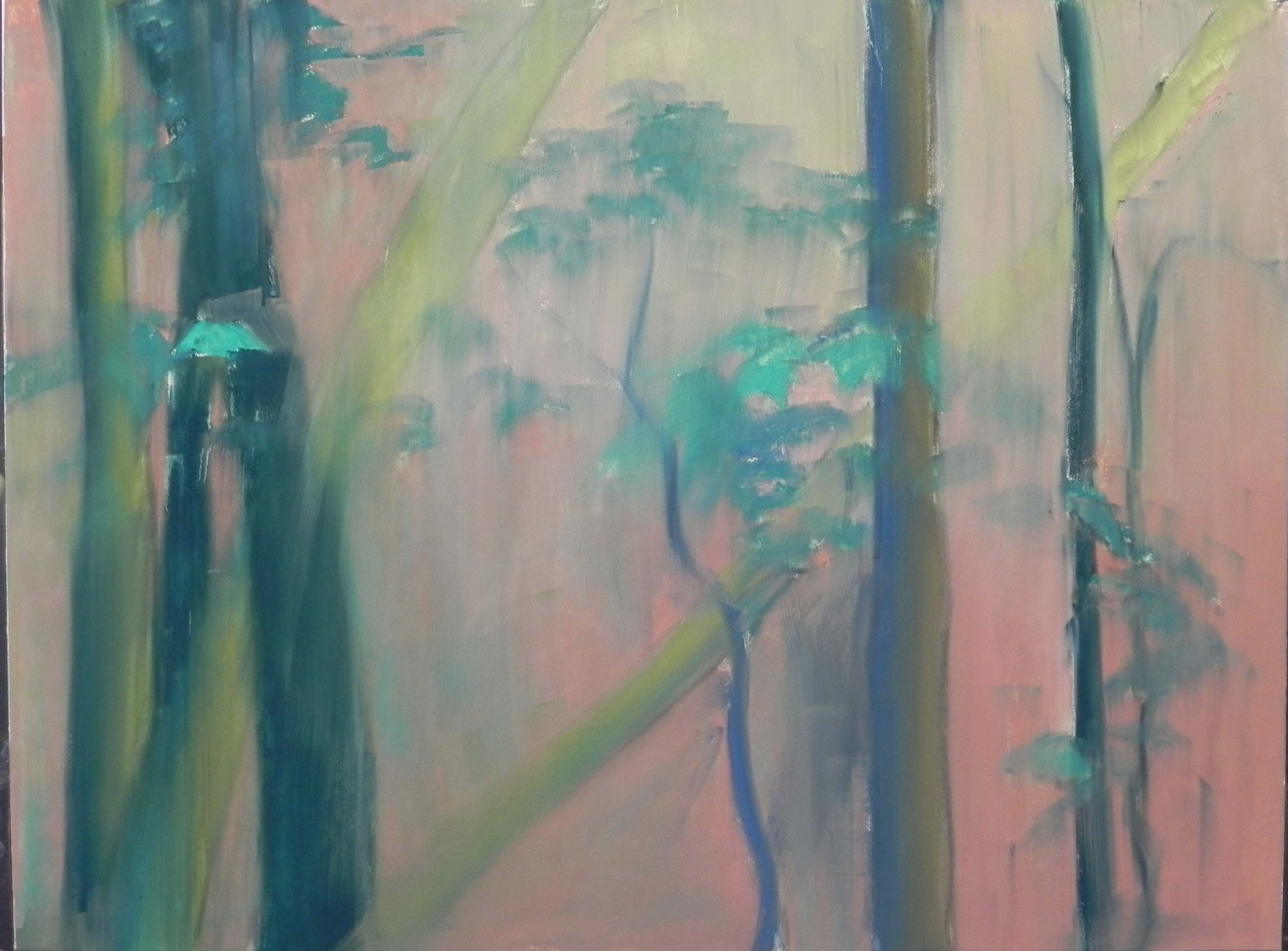
My first concern was to capture the shape of the branches in the green tree and its sky holes. For the branches, I started with a dark blue, then a red violet then finally just went to dark brown. It worked fine. I used two blue violet Ludwigs in the sky initially, then lightly brushed aqua over the blue to warm it up in the center between the trees. I tried to keep the strokes loose in both trees.
The background hills and trees were kind of a challenge. I used a cool blue for the hills, with hints of very light orange in them and a variety of blues and browns to represent the trees. For the field I began with a variety of greens and yellow greens, then put some pink over it to keep it form being too bright.
I used three values of blue green Giraults, along with a little piece of soft darker blue green in the grasses. For the yellow green plants, I began with Girault and then Blue Earth. I decided to bring the part in left front down close to the bottom as a compositional element to lead the eye into the picture. I like the way the diagonal of light and shaded grasses leads the eye to the ravine and then to the distant field.
This was a pretty easy picture in that I really didn’t have to change anything much! A pleasant change from the red leaves. I very much enjoyed spending the day reliving a pleasant memory and tried to pretend I was there painting it on site. However, Rossini was playing on the opera and that gave me a little added energy!