
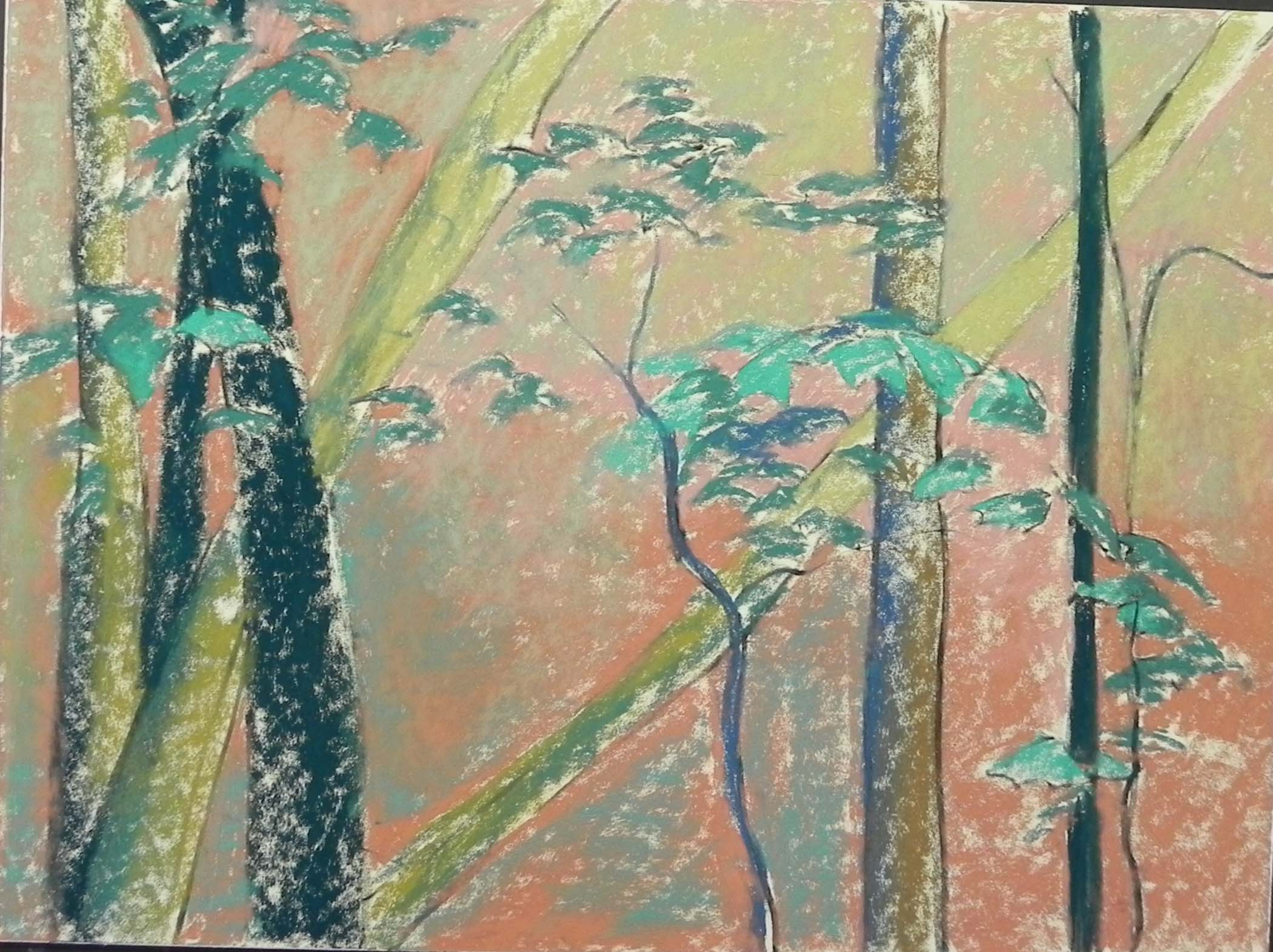
Underpainting, stage 1
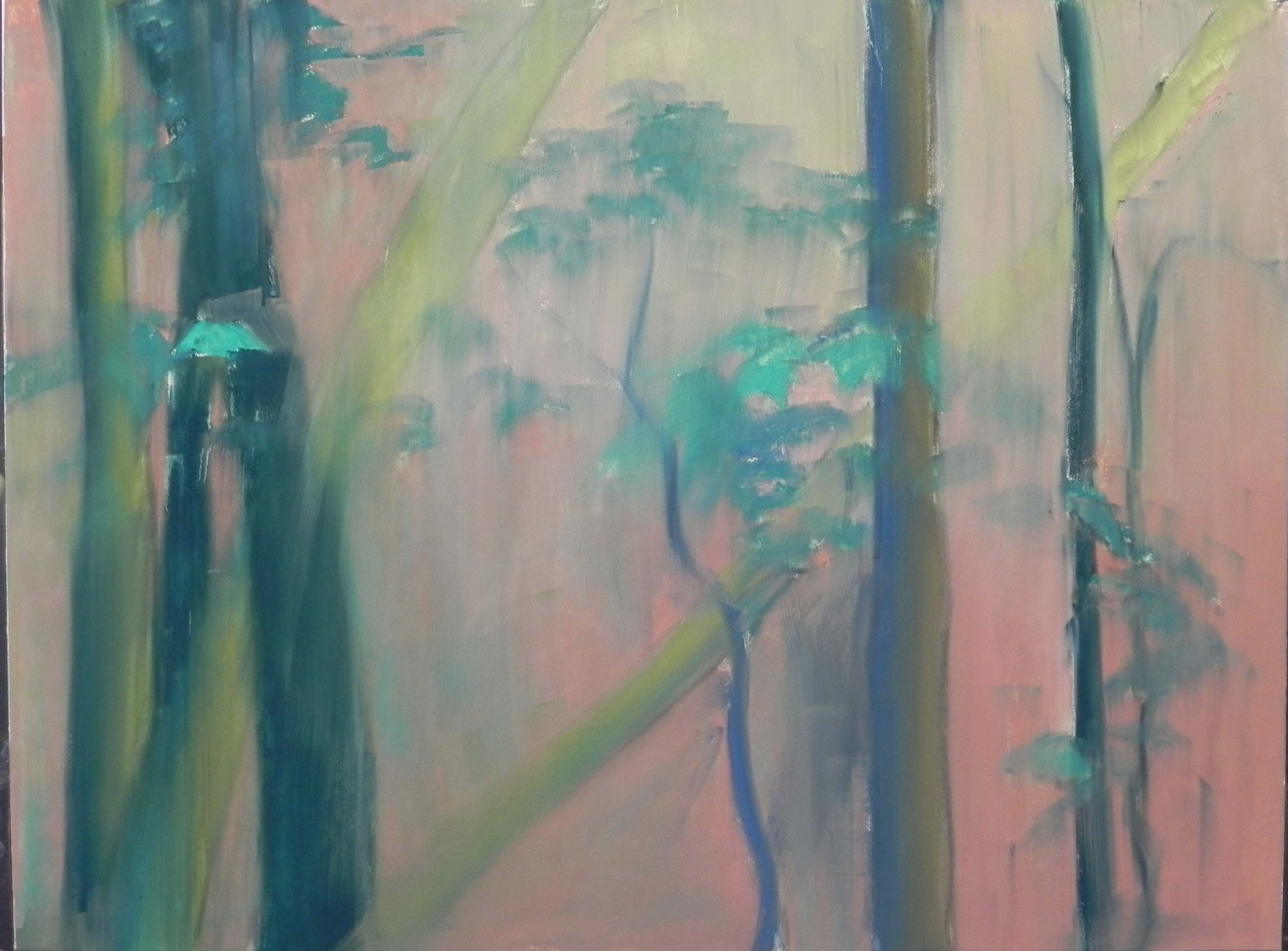
Underpainting after alcohol
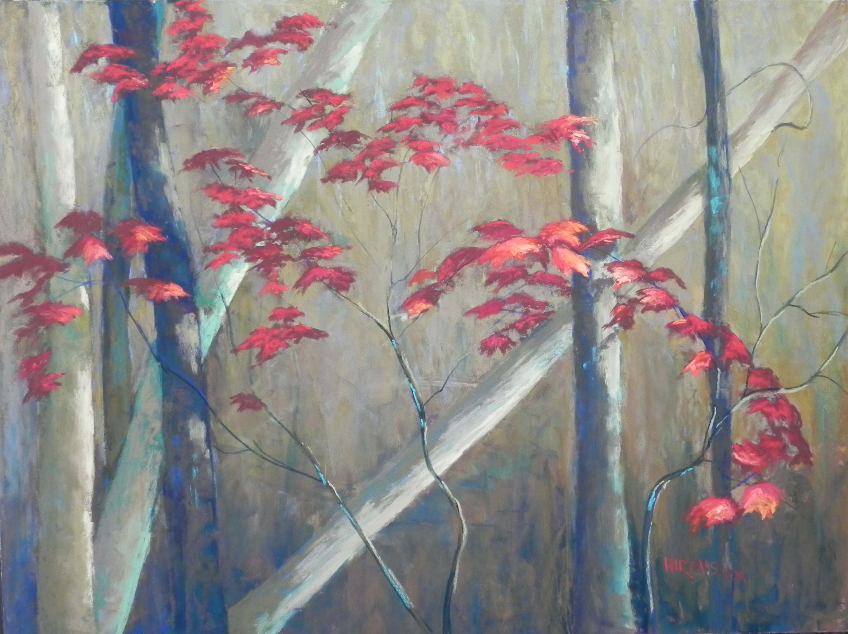
Rock Creek Reds, 18″ x 24″, UART 320
I’ve been working on my second tree painting since before Thanksgiving and this was was a lot more difficult than the one from Swain’s Lock. There was no sky! And there were lots of trees and limbs, all in very neutral colors. But there was a lovely arc of red leaves that began in the upper left and stretched across and down to the lower right. This really excited me and I knew I wanted to do something with it. But what???
My first concern was the trees and the lack of sky. In the photo, you can make out the creek at the bottom and lots of brush. I thought perhaps to make it higher up where there could be some light coming through the trees. The major thing was to figure out which trees to include and what values they would be. I drew them in and settled on a group on the left, with two verticals on the right and a strong diagonal (in the photo). Further along, I added several small twiggy bushes in the middle and on the right. But I wanted to keep it fairly simple and more abstract. I wasn’t aiming for reality!
As you can see, the underpainting looks like something completely different! I knew the leaves would be red, but that was about all! And when I applied the alcohol it all got very dim and kind of Asian looking!
Colors were the next challenge. My initial thoughts were red, dark purples (in the trees) and neutrals. But when I tried apply various violets to the background and trees, I found that the red in them was too close to the reds of the leaves and wouldn’t rovide adequate contrast. So I decided on dark blues instead, then, somehow, found myself using some turquoises as well, which really exctied me! Not them in the tree on left behind the dark blue tree. So I used blues, turquoise, reds, and various browns and neutrals.
Then I tried to put in some blue to indicate sky holes, to open things up. It was a blue violet and it just didn’t work at all. So I brushed it off and decided to go with a very abstract background consisting of various browns, with some blues and aquas thrown in here and there. One of the things I did to begin with was to use various soft pastels to apply color to the background, then took a really hard pieces of Caran d’ache brown and burnished it, so it would lay flat and go back. That worked pretty well.
I roughed in the leaves to begin with with a dark cool red Blue Earth pastel. When I started painting them, I chose some purer reds and a few red oranges. I worked on it through yesterday with those. But I felt it was really missing something. So today I chose some lighter pinks and oranges and one really white-pink and this made a huge difference. Then I took a nice, rich red, and went over most of the dark leaves with that, giving most of them more chroma and interest.
I couldn’t resist using more turquoise and used small pieces of a pretty bright Ludwig in the tree trunks.
So I’ve signed it. But I’m not sure it’s completely done yet. But it’s a lot closer t where I wanted it to be. Any thoughts will be gratefully received!
Jean, I think you should probably leave well enough alone. Love the criss-crossing branches/trunks and how they run counter to the downward arc of the leaves. I do have a question, though – at the underpainting stage are you showing us only a part of the picture for a reason?
Thanks Mary Ellen. I acutally just replaced the photo! I took out the cast shadows I had added to the trees and didn’t like. If you click on the image of the underpainting, the entire image comes up. THese are set as thumbnails.
I love the color combinations. The red leaves really pop. The background has a nice blend and the turquoise on the branches is really nice. It is a great example of putting together a pleasing pallette.
Thanks Janis. I’m glad you like it This one was a real challenge
I really like your background treatment. This piece is inspiring because your solutions weren’t straightforward.
Thanks Tamara. It was a challenge but keeping it simple seemed the best solution. Jean