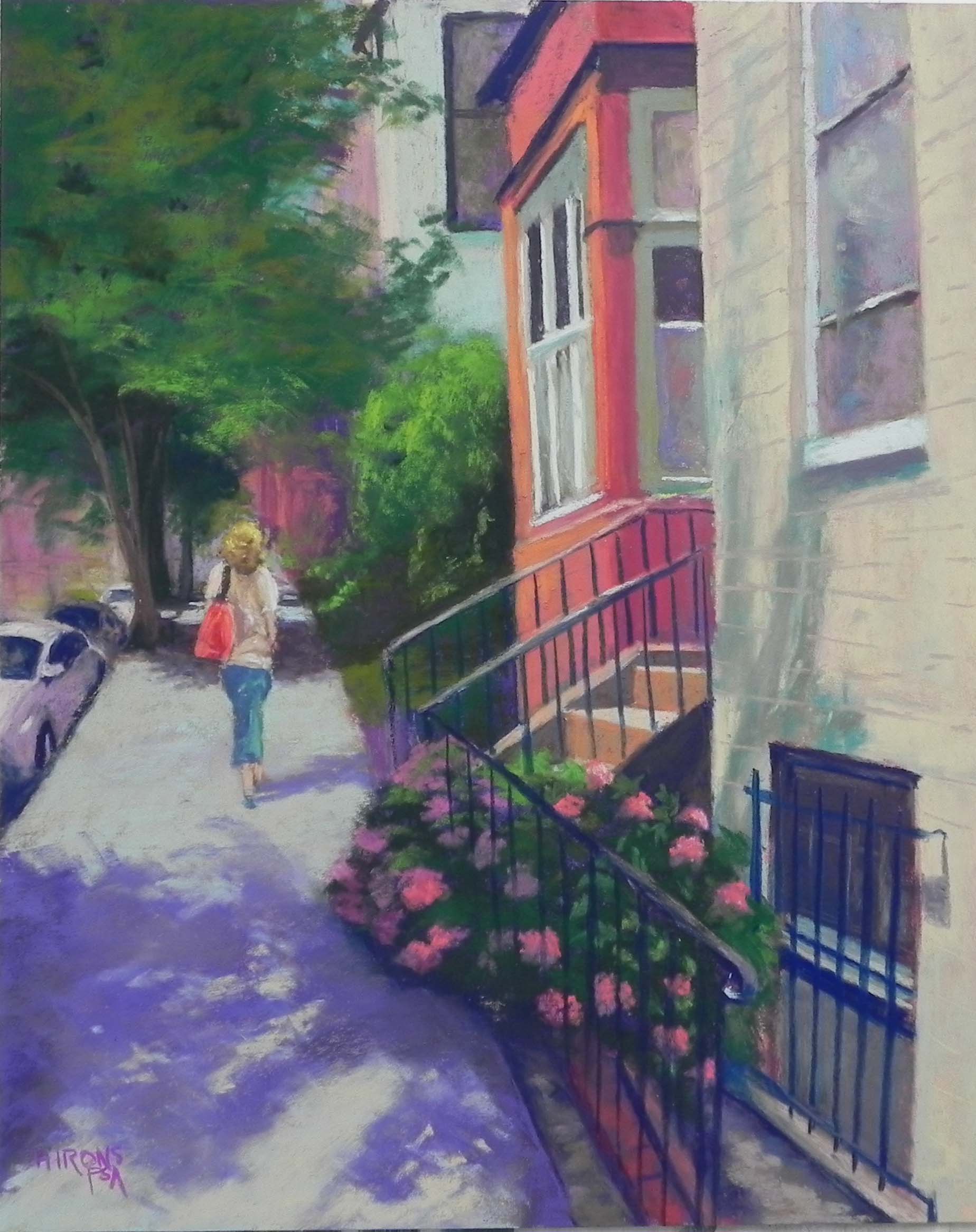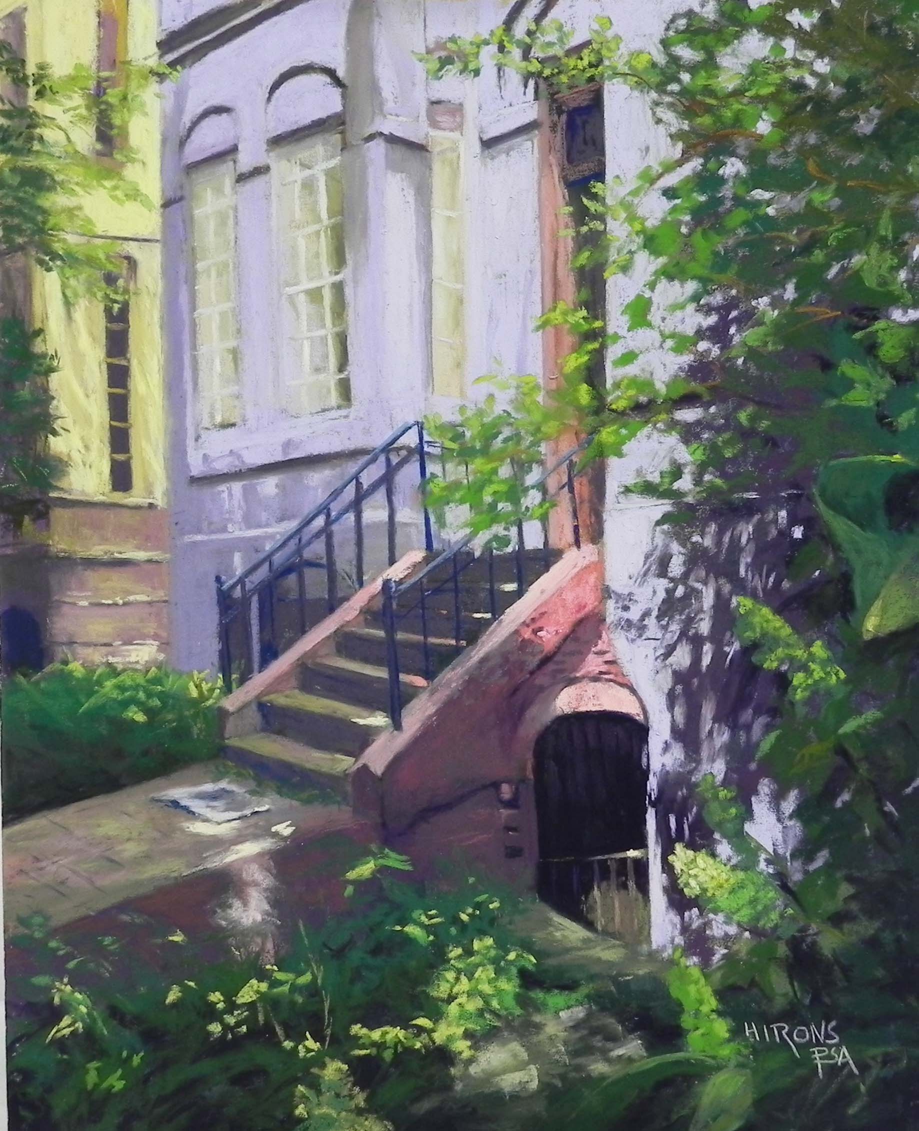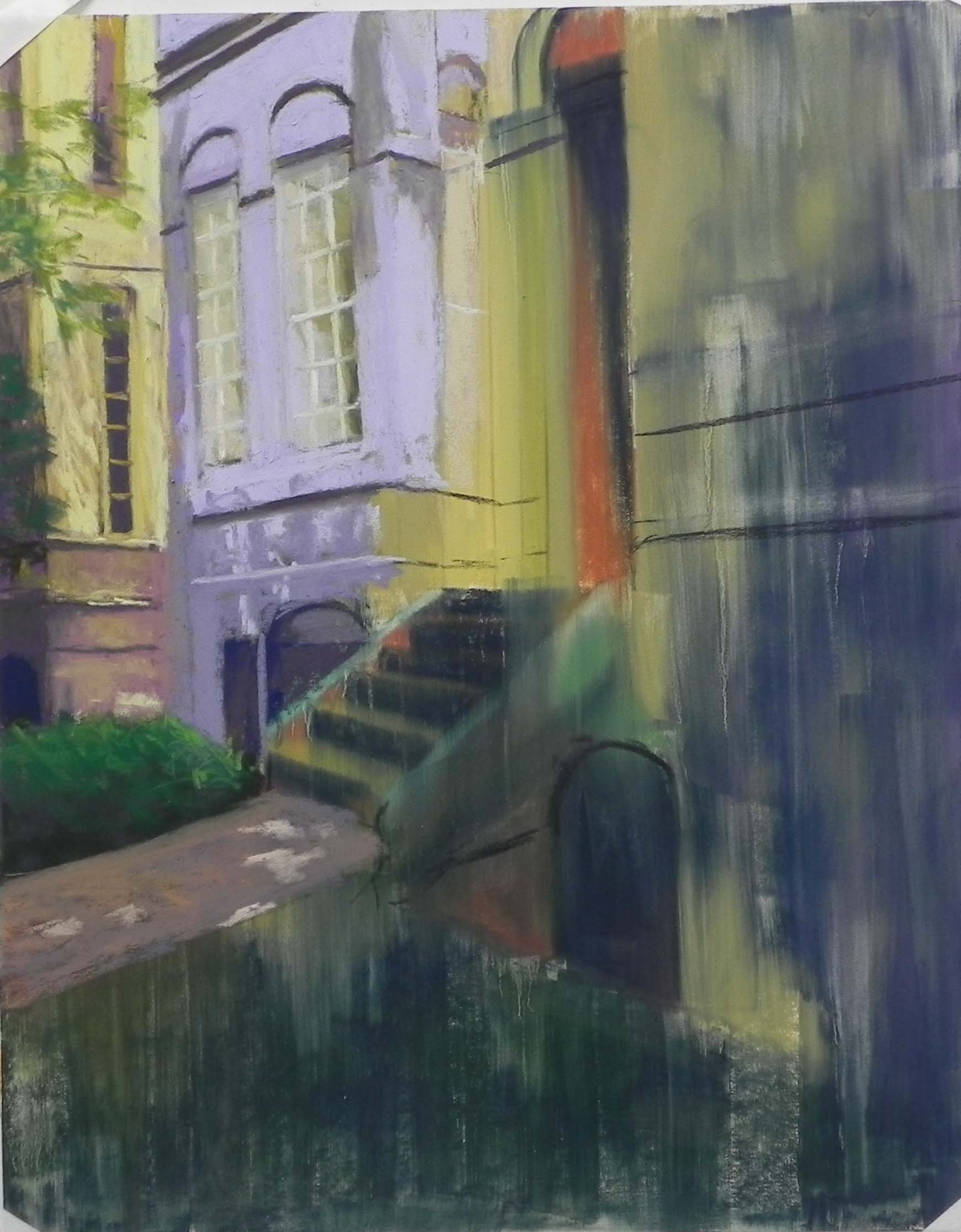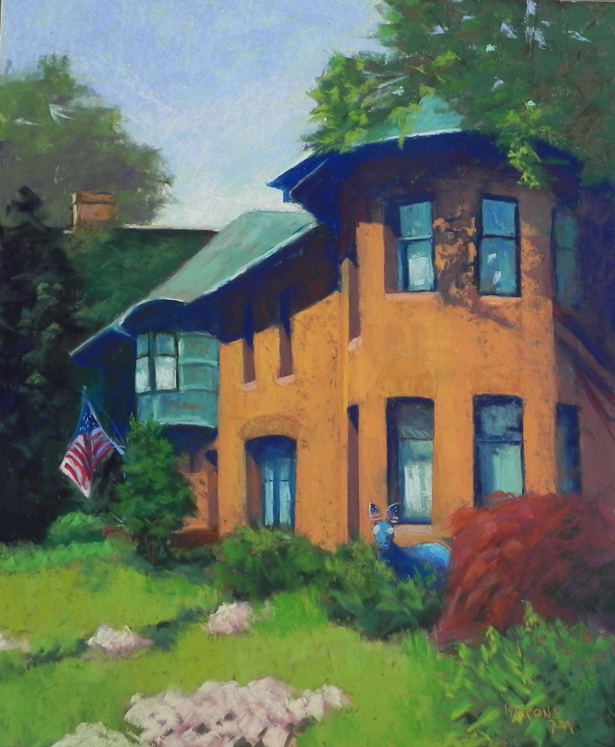
Women’s National Democratic Club, 24″ x 20″, Pastel Premiere white, fine grit
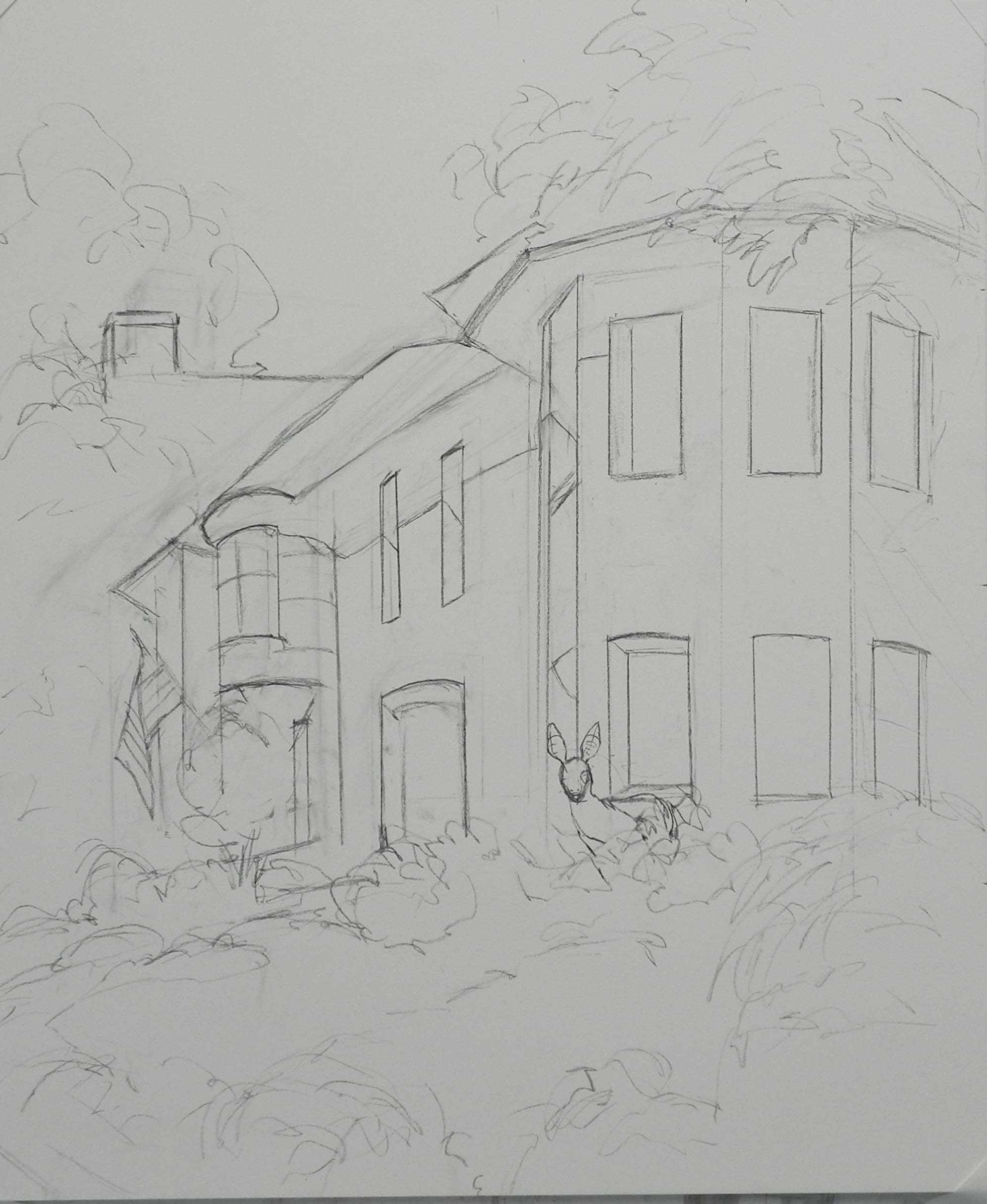
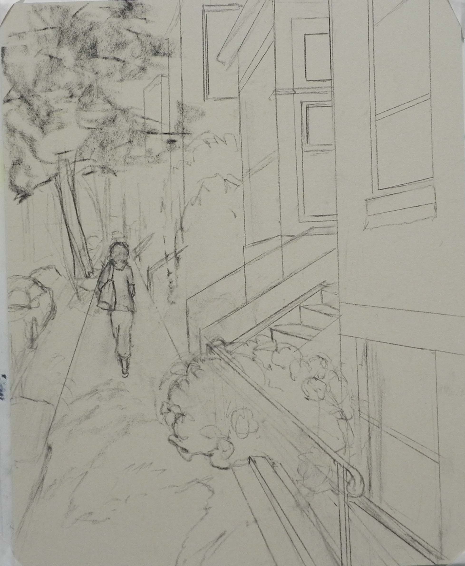
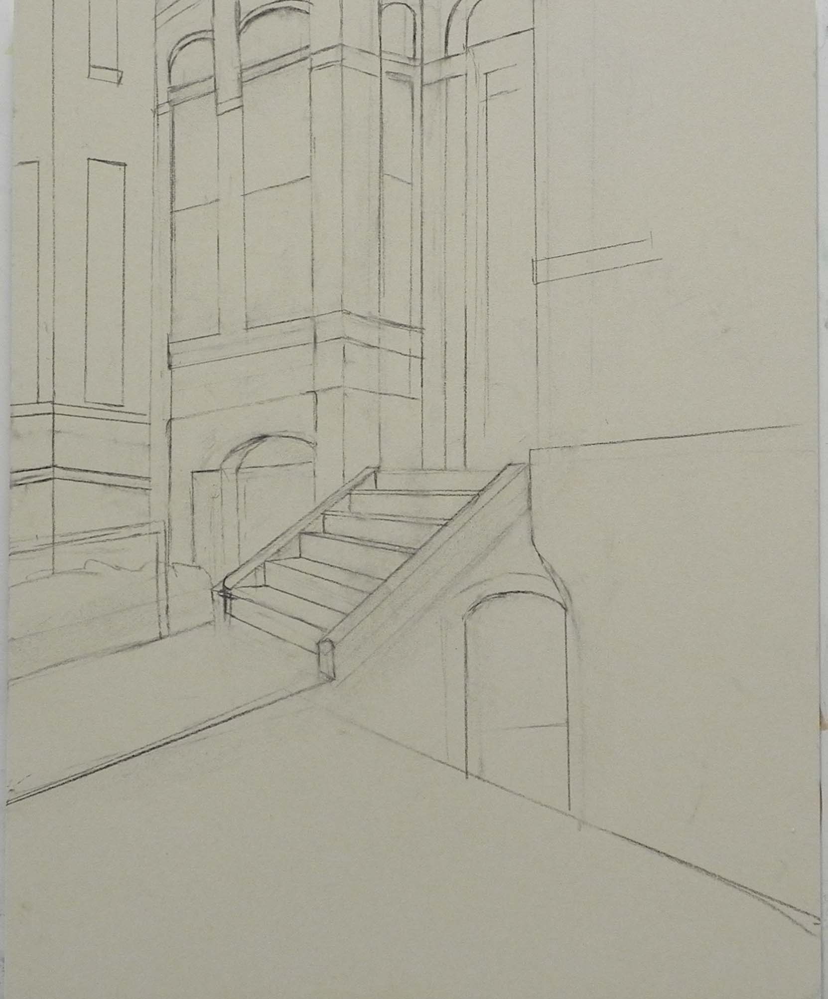
Drawing
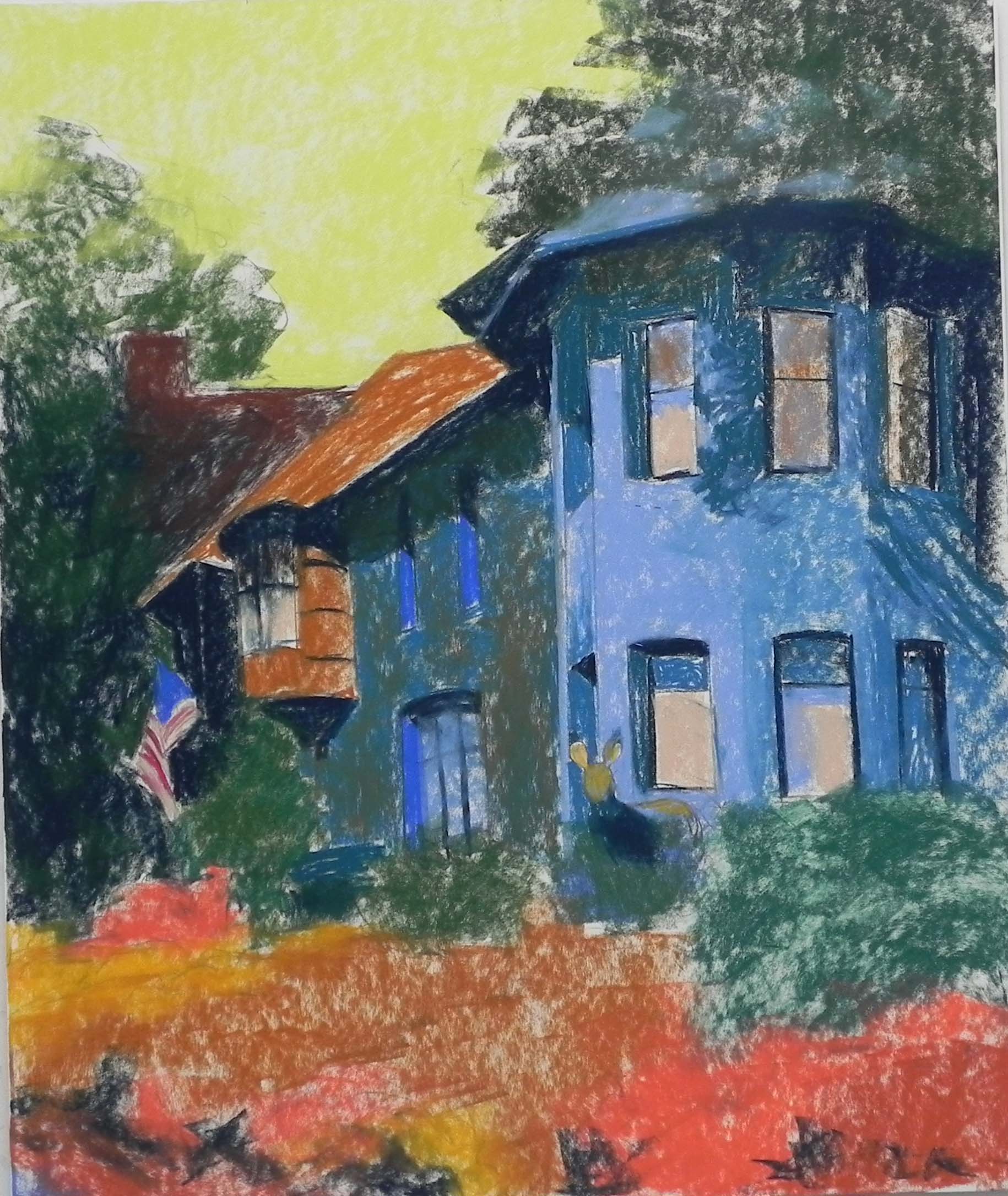
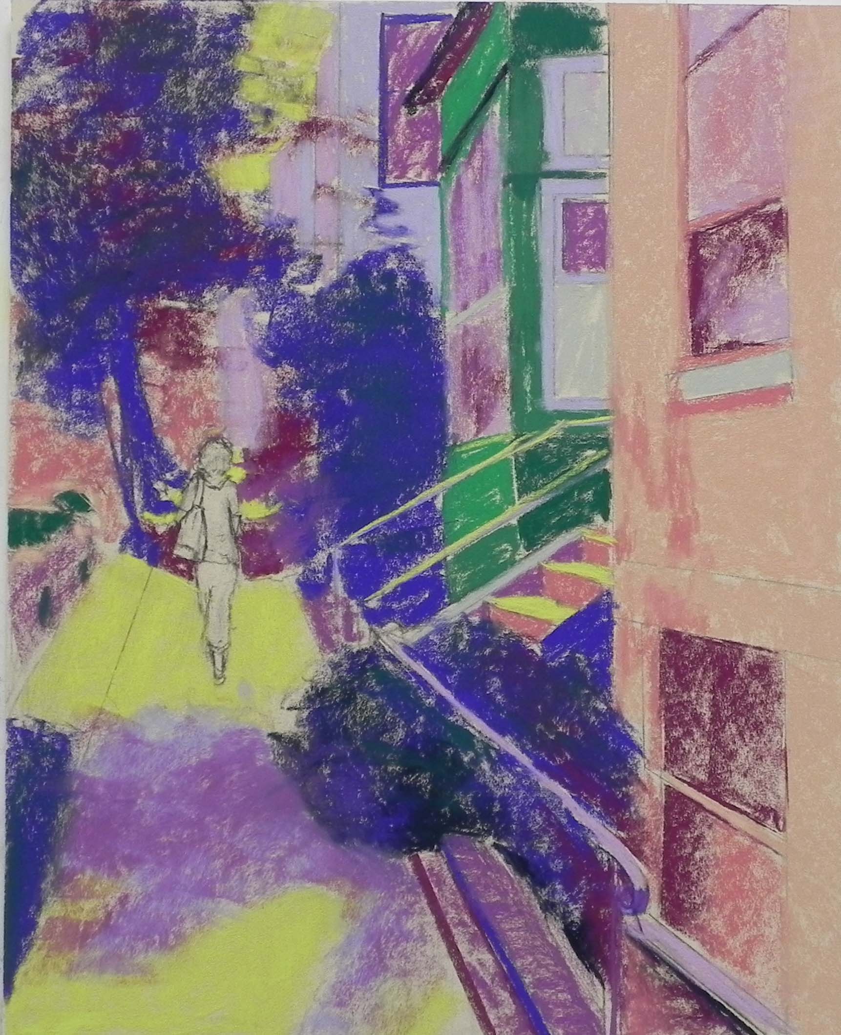
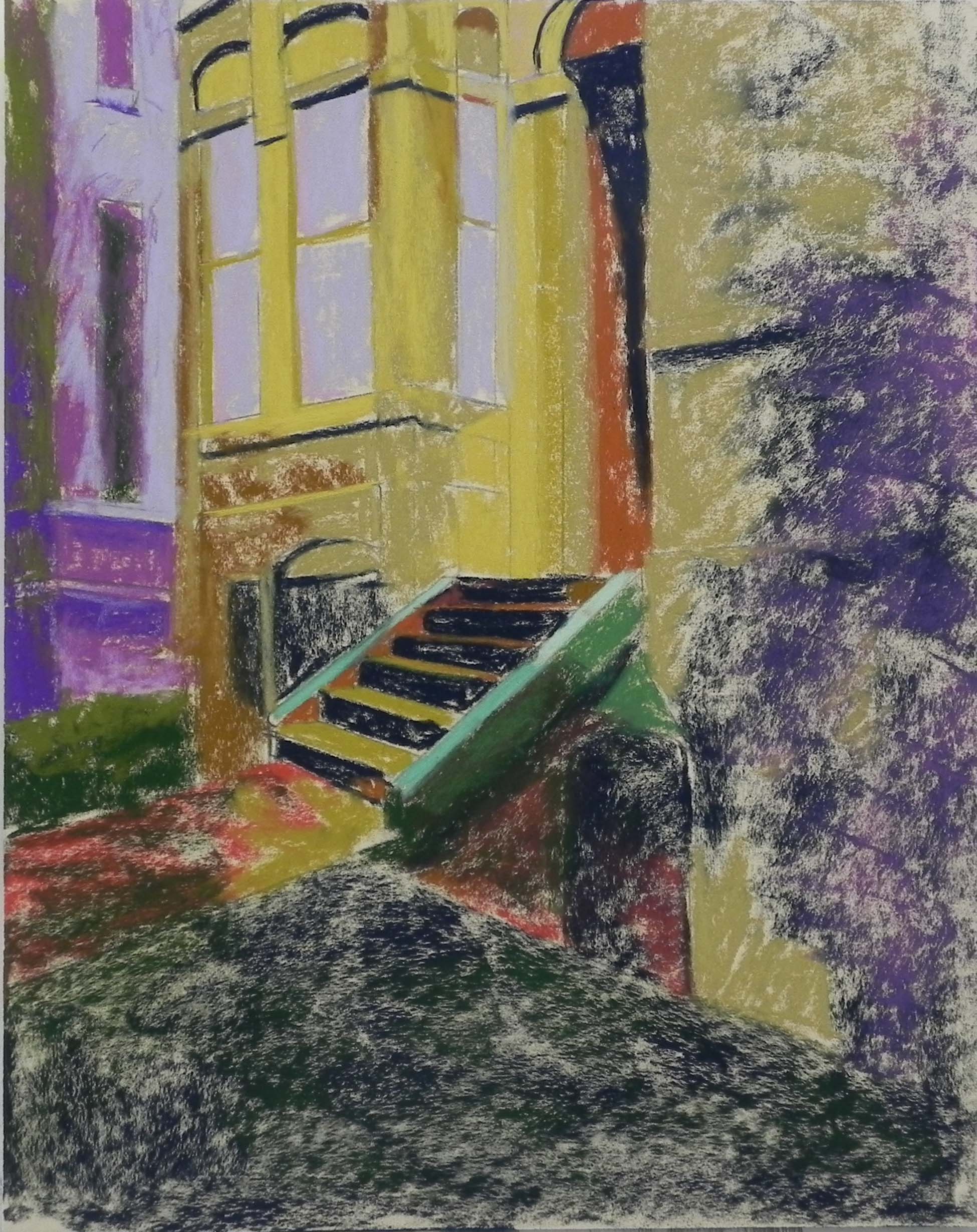
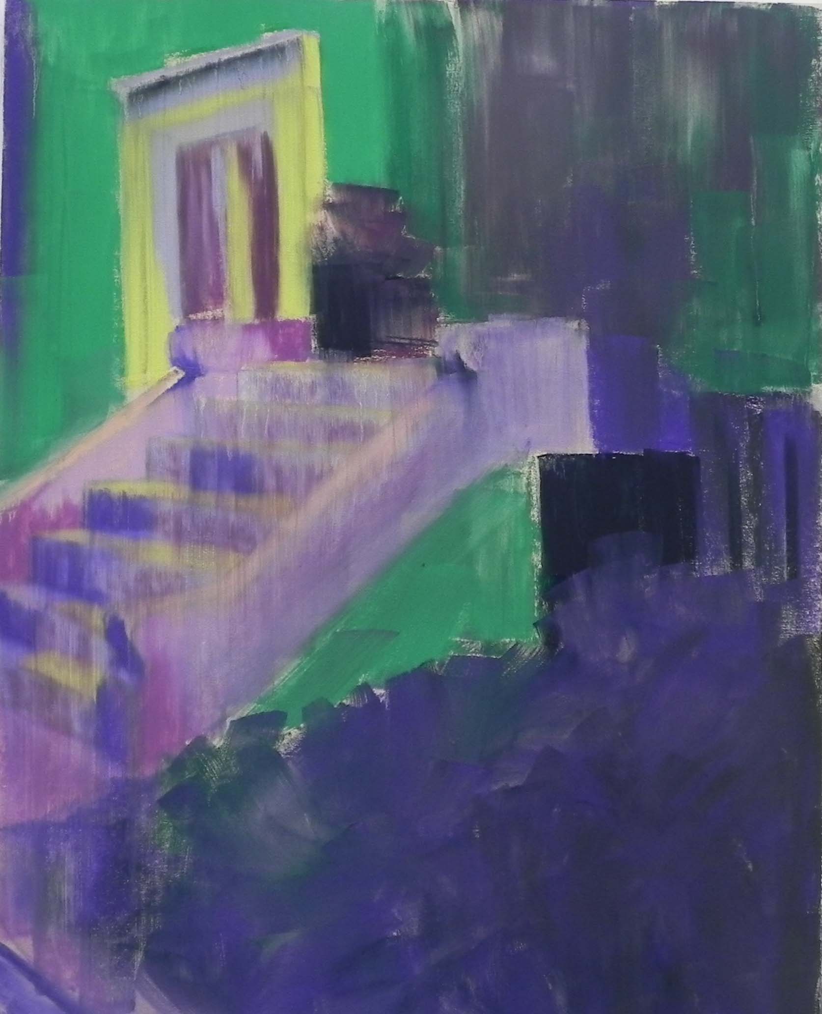
Underpainting before alcohol
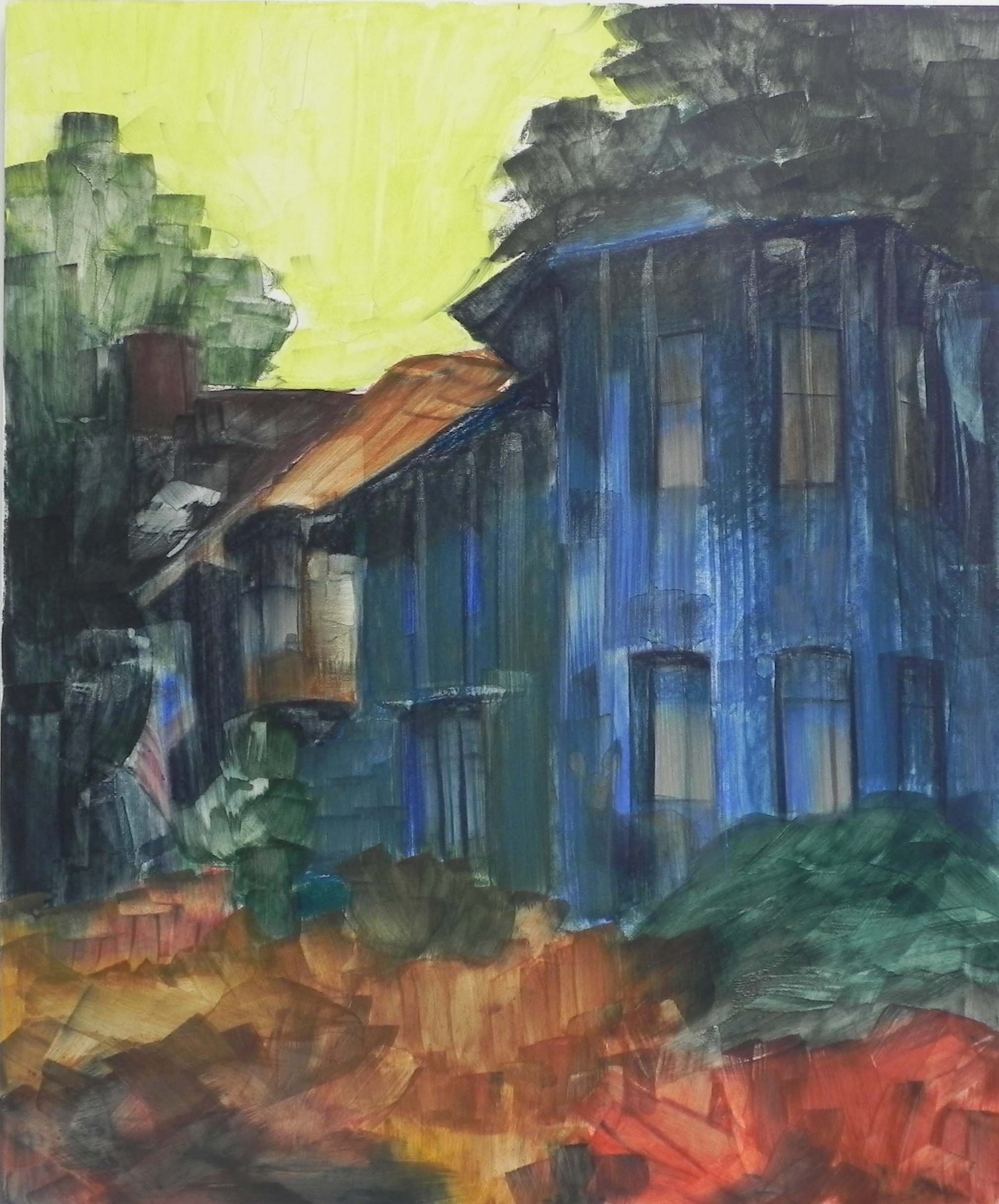
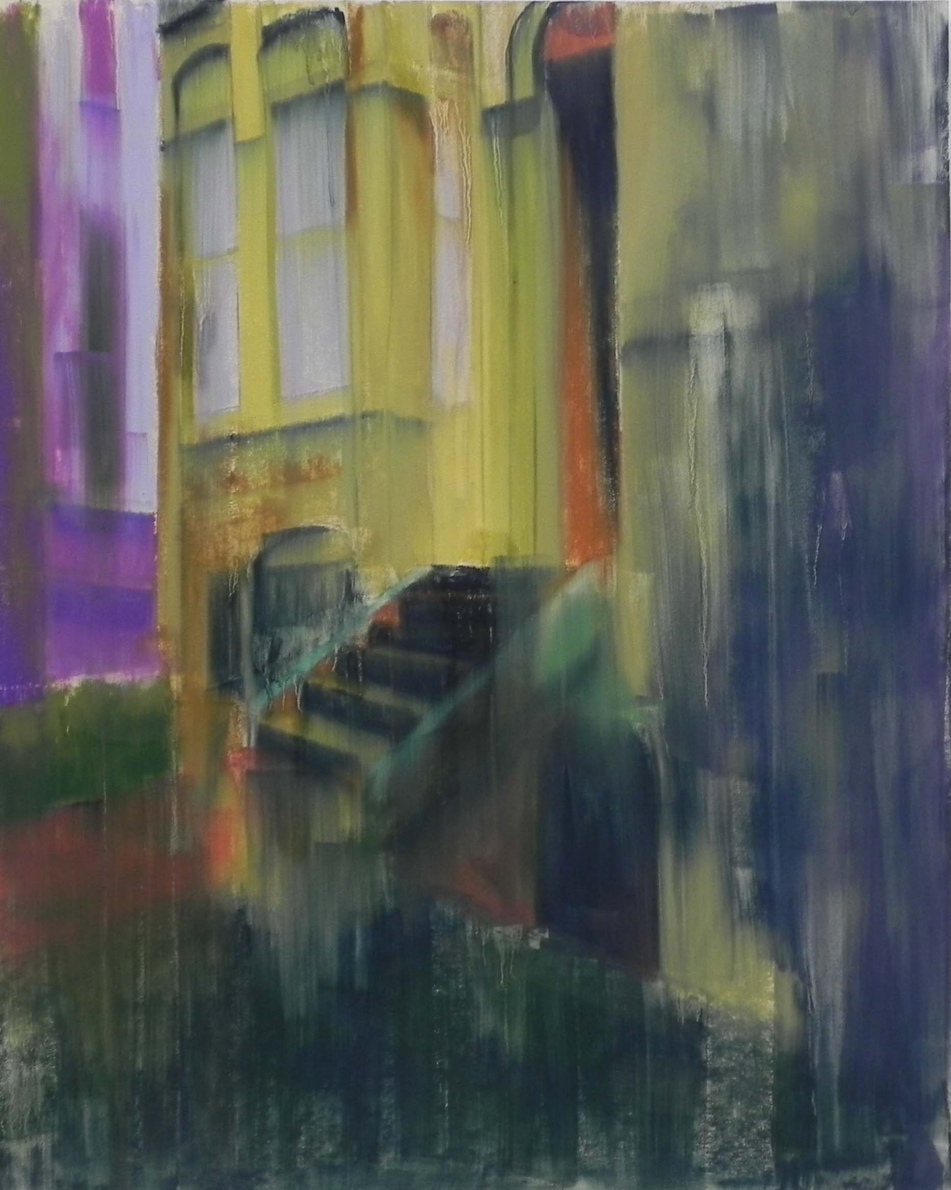
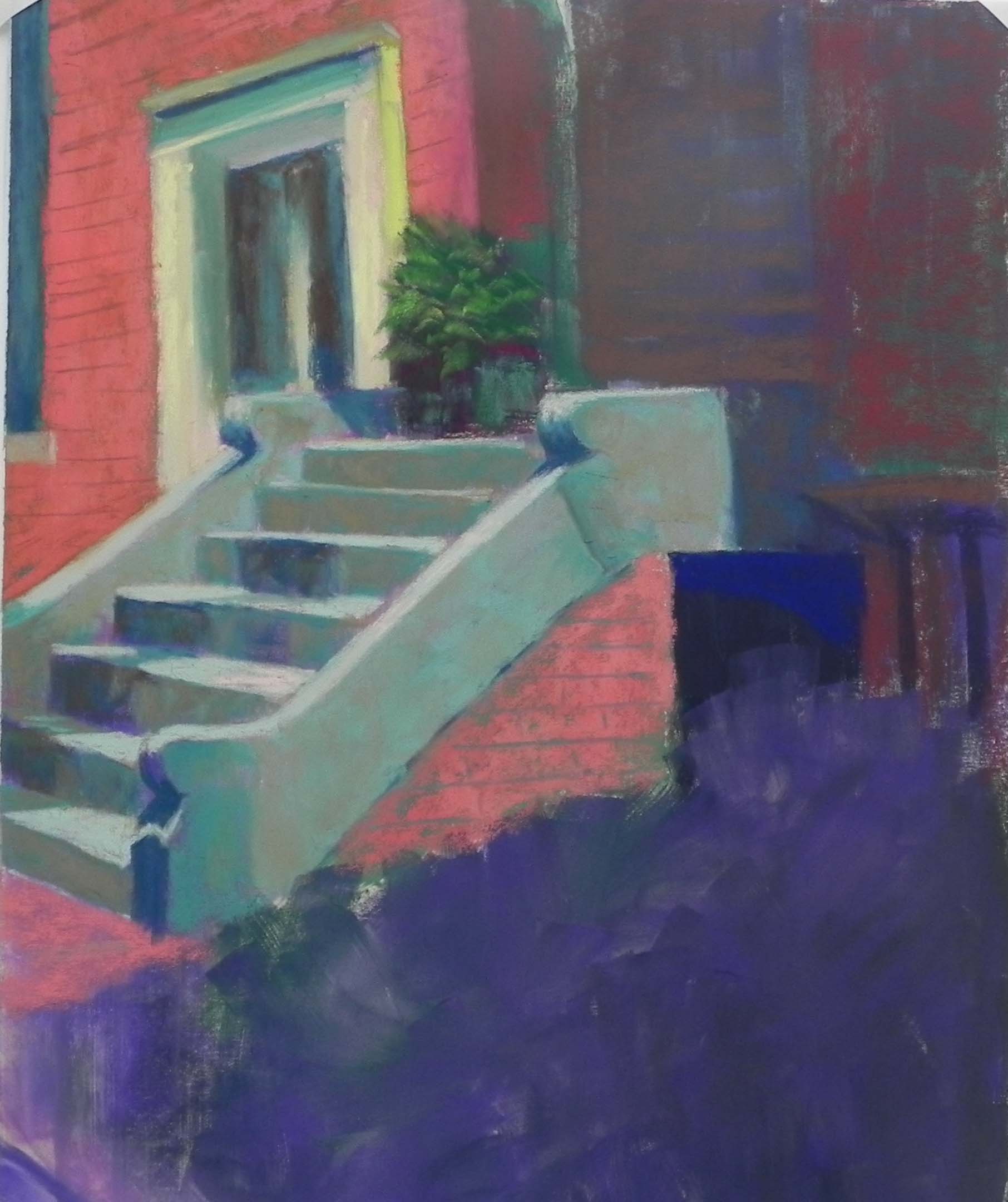
Underpainting after alcohol
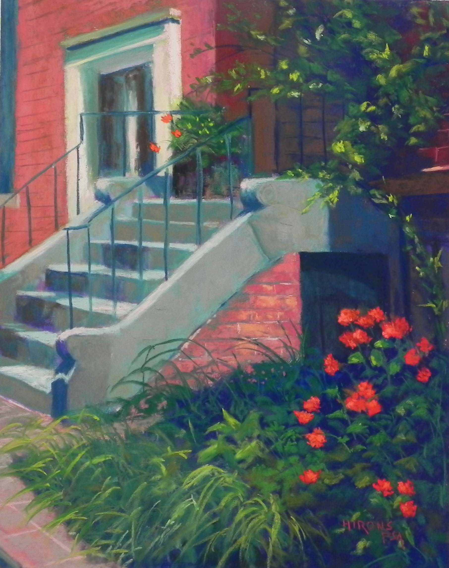
My third and last post of the day. I definitely HAVE had a productive month of July! I completed the four street scenes then did this 24″ x 20″ painting of the building that houses the Women’s National Democratic Club on Q and 17th Streets. It’s a grand old building and the color of the brick along with the aqua-colored copper is quite striking. I took several images of it and ended with a cropped view that I think produces great shapes and contrasts. There’s a flag in a lovely position on the left, and peaking out of the bushes is a blue donkey with flag colors in its ears!
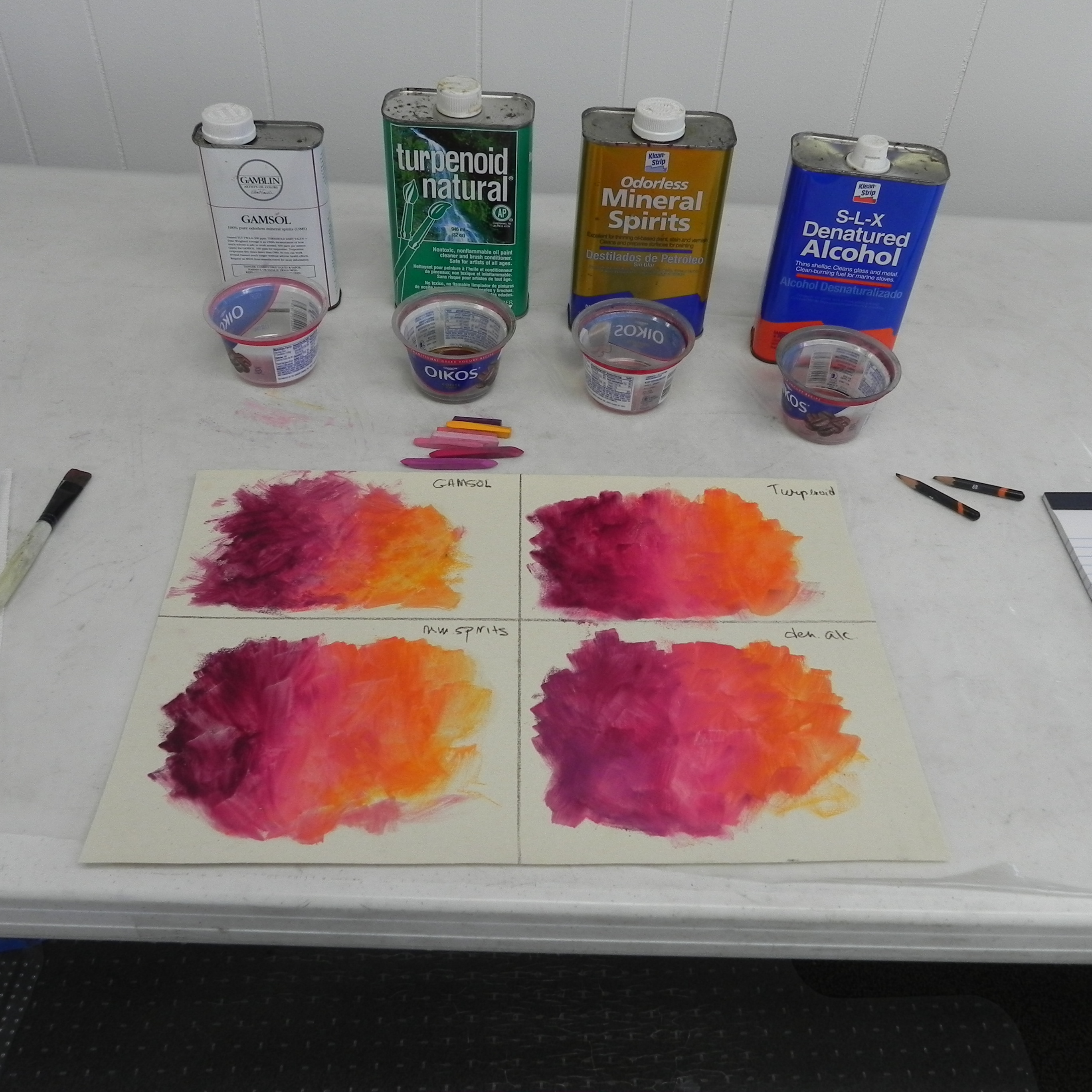
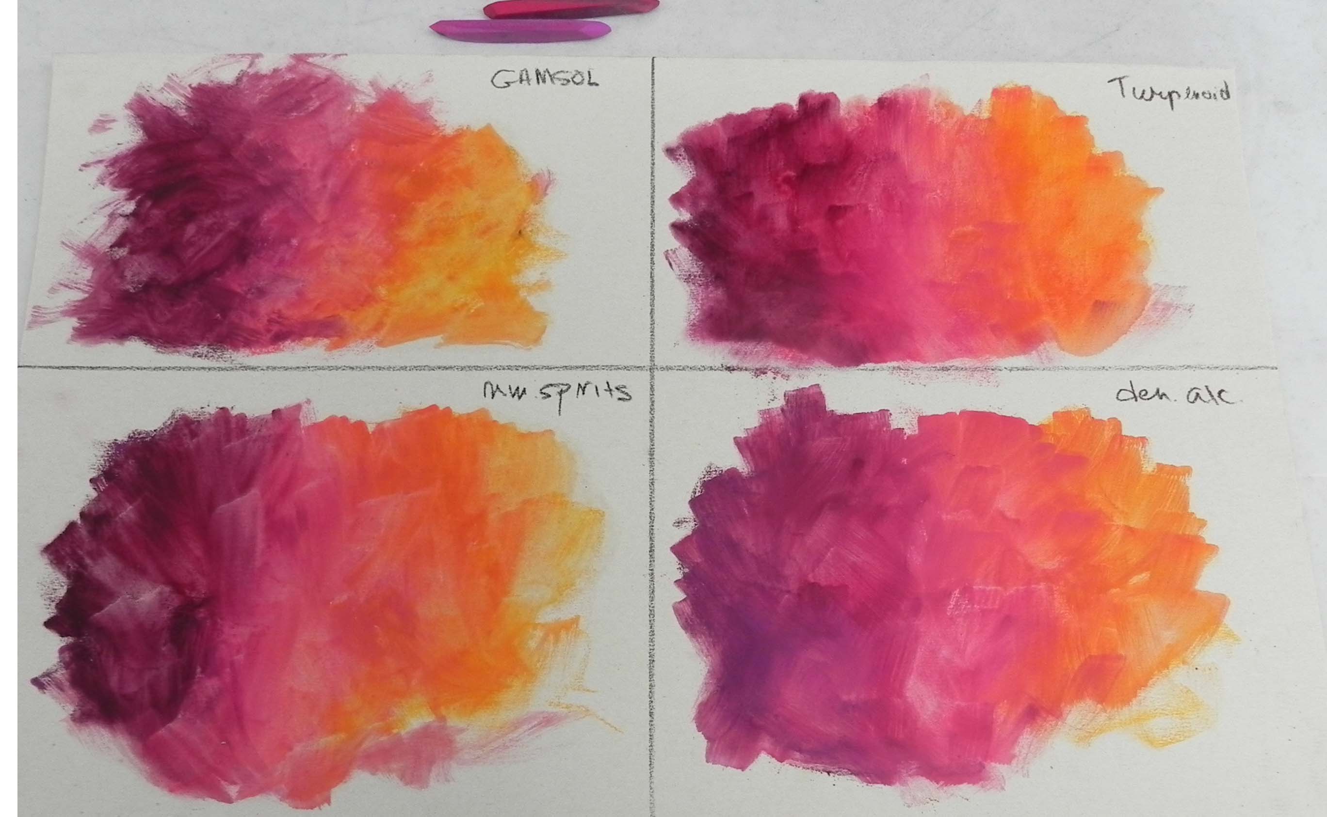
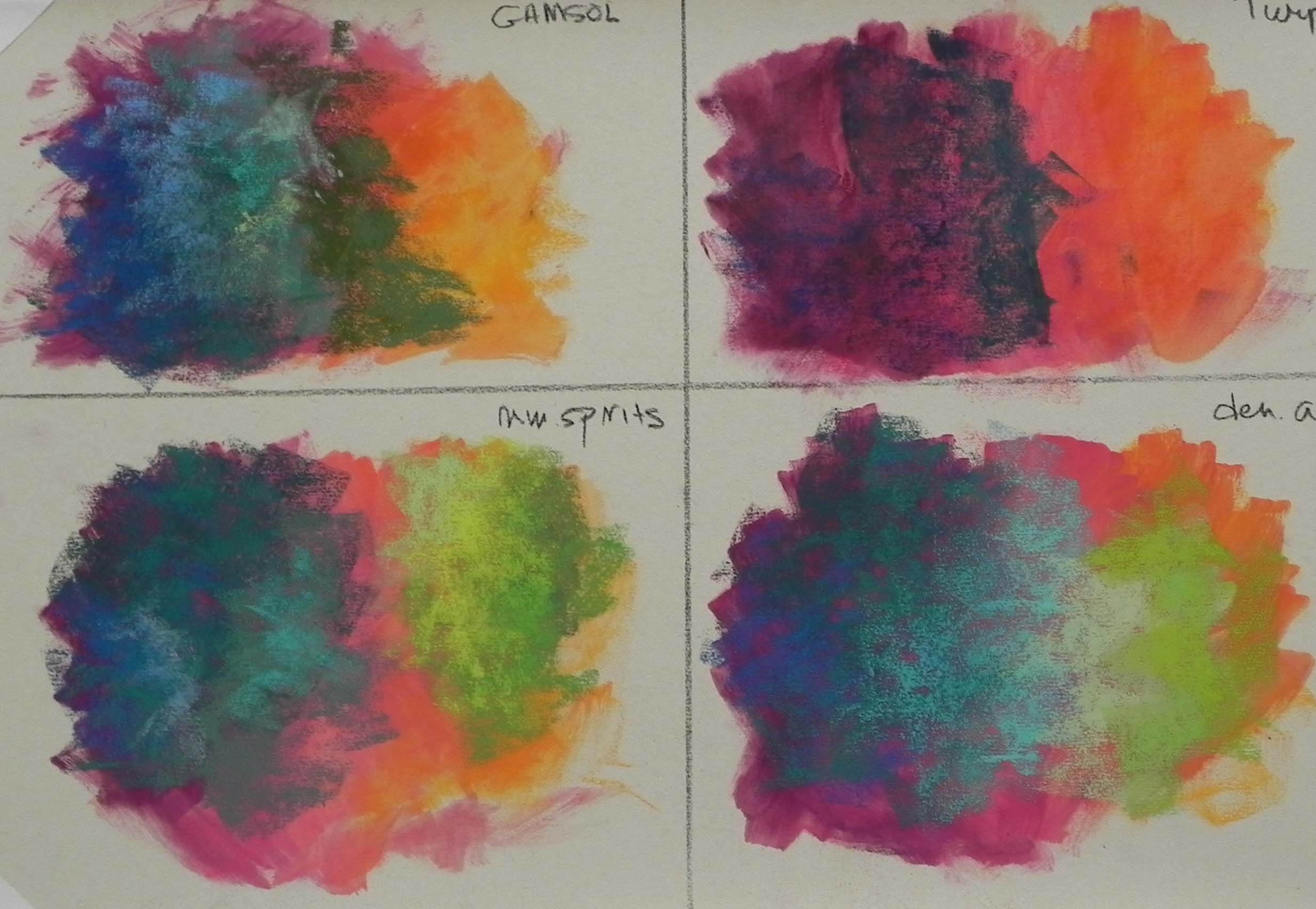
I found a packet of large sheets of white Pastel Premiere and had my framer mount them to gatorfoam. What I didn’t realize was that these sheets were a fine (600?) grit, not the rougher paper I normally use. I’m not sure where I got this! I would never consciously order it. Now I have four more nicely mounted sheets to do something with. Ah well.
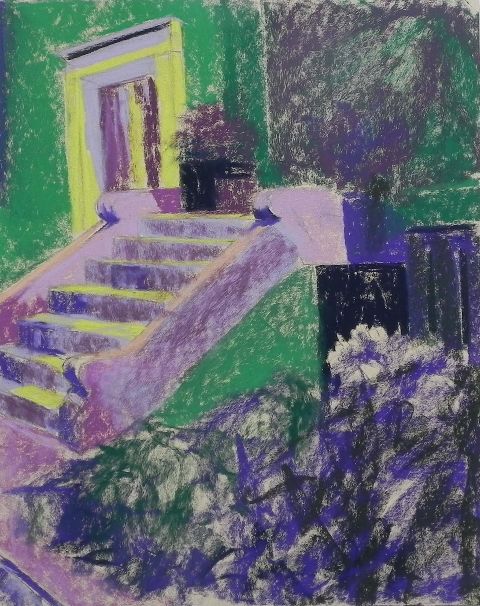
I did the drawing then the underpainting with hard pastel and alcohol. I won’t be doing this again! I knew that the paper didn’t like alcohol. It really doesn’t! It actually created some strange effects, however, that added to the texture of the building that weren’t completely unwanted. However, I’ll have to use watercolor on the other four panels.
I spent a lot of time drawing the building, but I skipped a step and didn’t do an initial drawing. Thus, I forgot that the 24″ is not in proportion to the width of the 8 x 10 photo I was using. But I was able to add more to the left side. Even so, I ended up doing some significant redrawing as I went along. It’s a complicated building with the domed part having maybe five sides?
Due to the lack of texture in the paper, the pastel went on rather flatly. So I decided I’d just keep things simple, such as the tree in the upper left corner. I kept it to a flat, simple shape and liked it. Did something similar when I got to the tree in upper right but there are more sky holes and pieces of light on it.
The windows were hard–getting them the right shape, straight, lighting, the whole thing. And I really didn’t want to over do them.
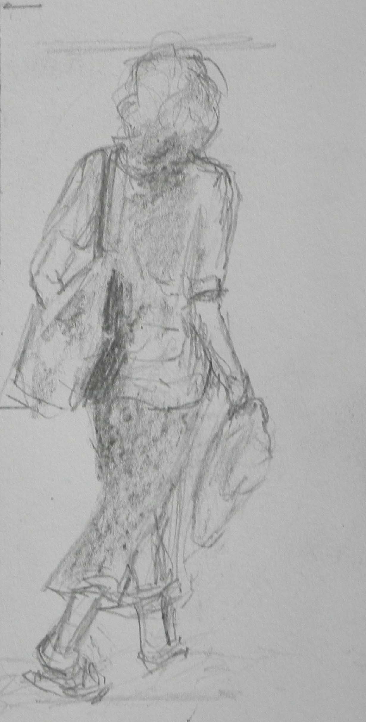
But nothing was as hard as the donkey!!! In my drawing, you’ll see that I made him too big and prominent. After redrawing several times, I realized he was too high up and needed to be down in the bushes. This is one of the donkeys from the days of “Animals on Parade” that included donkeys and elephants all around DC. The eyes on this one are quite strange! But I think I’ve finally captured him pretty well.
I didn’t like the landscaping at all and decided to simplify it–don’t tell them! I just used some clumps of pinkish flowers and kept it all simply done. I liked the Japanese maple, however.
This was obviously done for my upcoming show. I’m hoping they might want it. It was fun to do and I learned something about painting painted donkeys!