
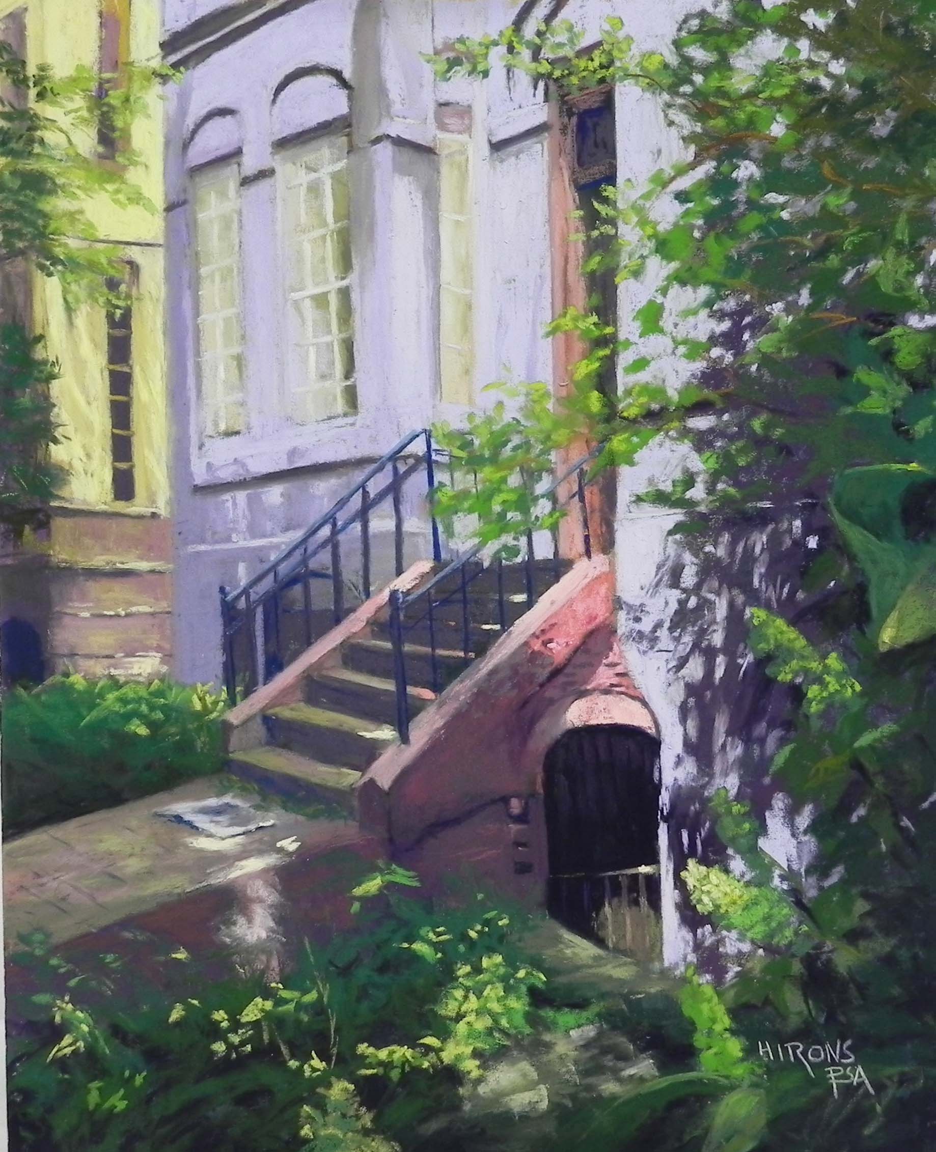
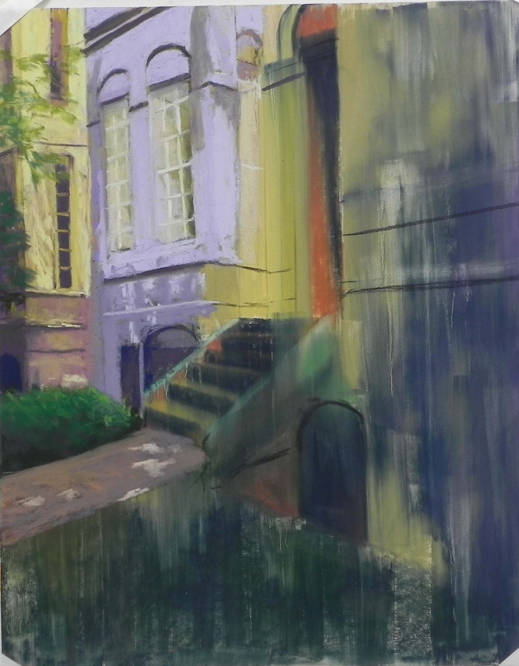
Lavender House on Q, 20″ x 16″, UART 320
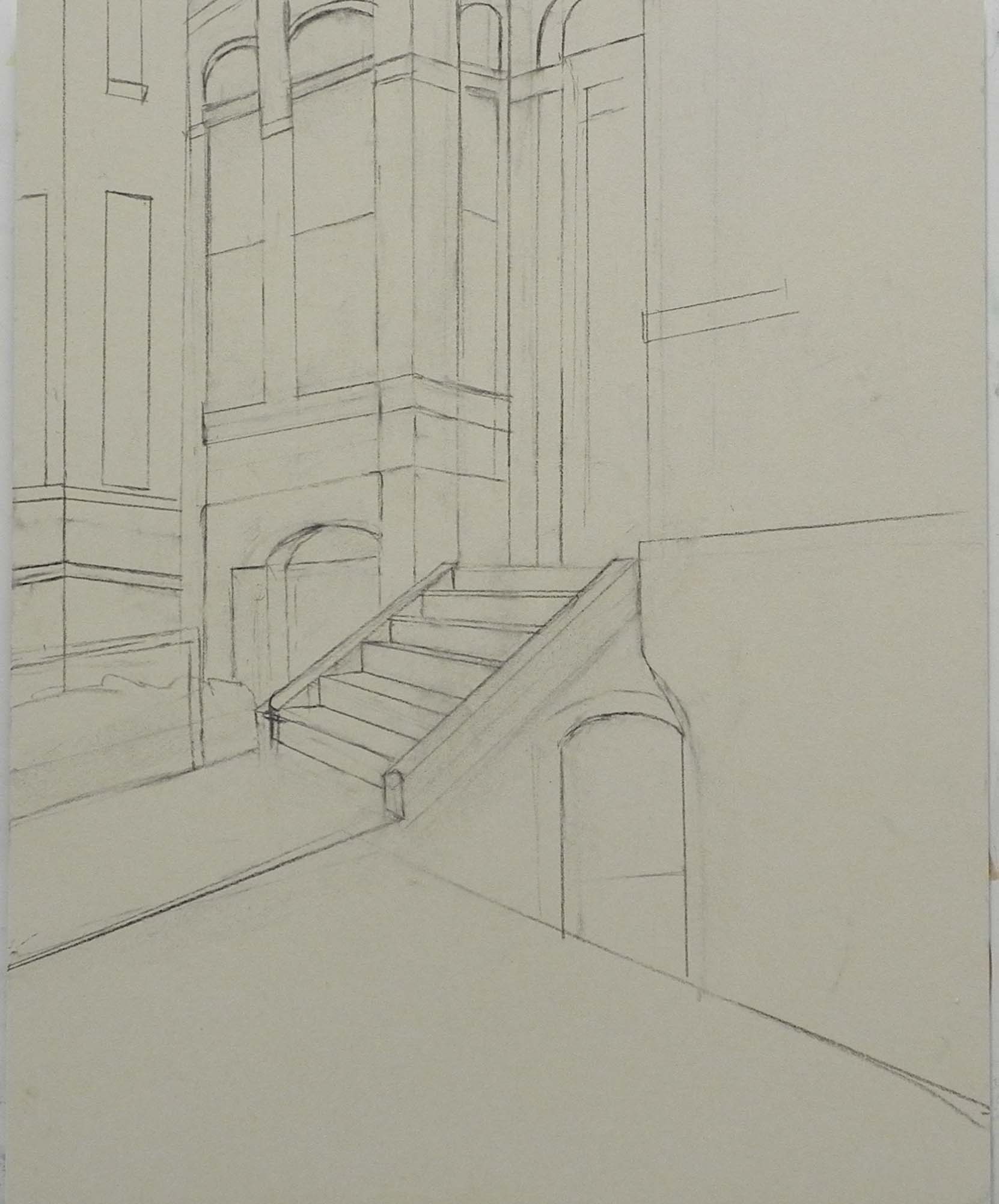
Graphite drawing
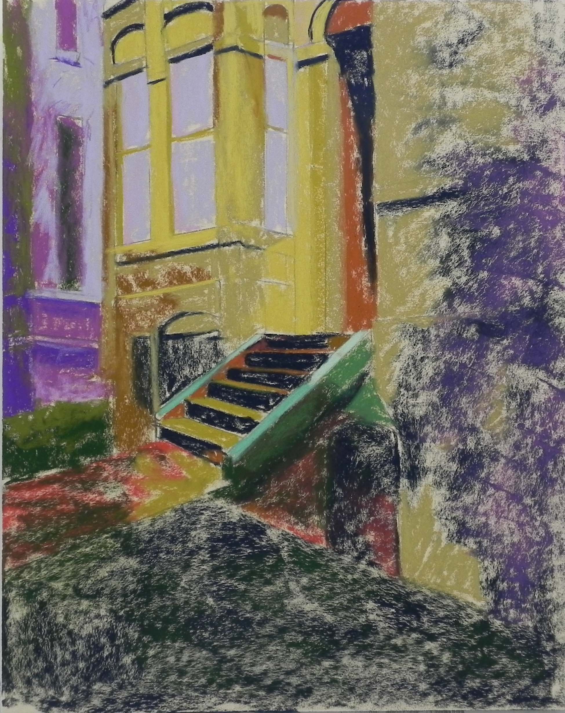
Underpainting, stage 1
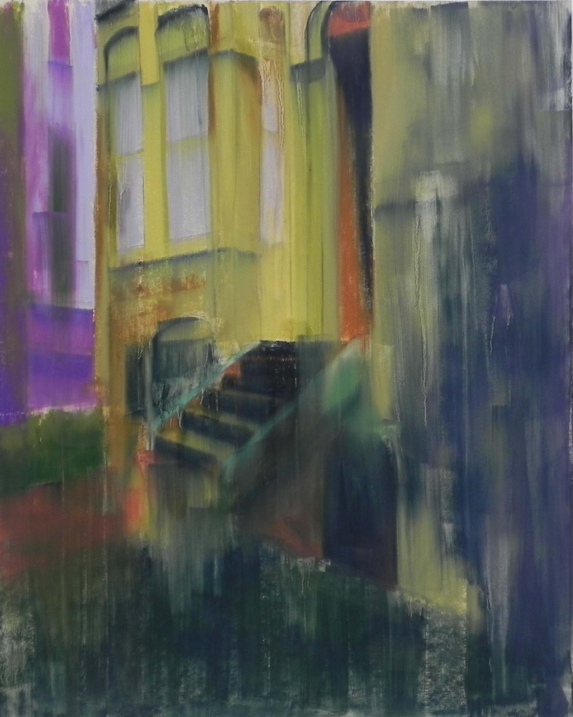
Underpainting, stage 2
Painting in process showing redrawn charcoal lines
Finished my third Dupont Circle street scene today and decided on what the fourth will be. This one was from my second visit to the area and it was the first picture I took. I knew immediately that I would be painting it–a lavender house! And with a yellow house next door. And wonderful light hitting the doorway of the English basement, as well as oak-leaf hydrangeas in light pointing to the doorway! There was no question!
I spent most of one Monday doing the drawing and underpainting. While I spent a lot of time on the drawing, I still didn’t get it right. (Note: I printed out a B&W photo to help me with it, but accidentally mailed it to a friend in prison!!! Ah well). For the underpainting, I used complements with violet under the yellow and yellow under the violet. The orange in the doorway was important as it stood out after the alcohol wash. I did what I’ve been doing and washed it down from top to bottom with a wide brush and a lot of alcohol.
When I came back to it, I realized that the drawing wasn’t correct and that the windows were too high up. Given the very washy underpainting, I was able to use charcoal to redraw the windows and lines of the lavender building. Then I was finally ready to paint!
I started with the yellow building on the left and tried to mix complements for the shadows but it didn’t work very well. So I used a violet in the windows but a darker value of yellow for the shadows. The same was true in the lavender building. I tried adding a warm browning color to the shadows and a green, but they didn’t work well. So I used a darker grayer violet for most of the shadowed areas on the left and a very dark red violet for the shadows on the right.
Another challenge was indicated the more sunlit areas on the violet building. I resolved it by choosing a lighter redder violet than what I’d been using. There was enough warmth and difference to create a subtle glow.
You’ll notice that in the beginning stages of the painting I didn’t include the newspaper on the walk. I decided to add that (as well as lengthening the stairs) and I used some of the same violet from the building on the newspaper. I really like the way it carries the color to another location.
The red color of the stairs and wall over the lower doorway was difficult to achieve as I had it in differing light conditions. For the dark area, I used the same Ludwig as what was in the shadows on the right wall. Then added some brown below, and red to the right with pinky orange in the sunlit areas.
My biggest challenge was the area at the top of the stairs. In the photo, there is a tall wispy tree with green leaves covering that area–right in the middle. I knew I didn’t want to include it. I began by putting in the railing and it looked dreadful. Then, I thought maybe a potted plant. Tried a red geranium and hated it. Then realized I could just bring out a branch from the right to cover some of it up. Much happier with that solution.
The doorway was the easy part. Ludwig eggplant with a slightly lighter red violet applied in strips to inidcate the bars. A grayed green in the sunlit area, as well as on the wall to the left of the door. What I really liked is the way the violet proceeds down to the right of the door. Compositionally, I find this very satisfying.
The greenery scared me a bit, but I used mainly soft pastels and did it fairly quickly. I liked the dappled lighting on the plants at bottom and the hydrangeas.
This was fun and rewarding to paint. My next one will be more of a street scene, perhaps with a person again.