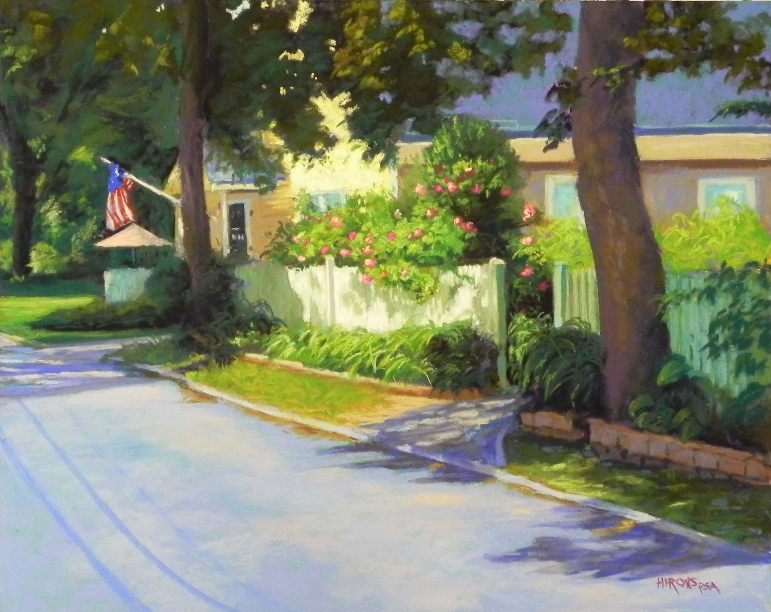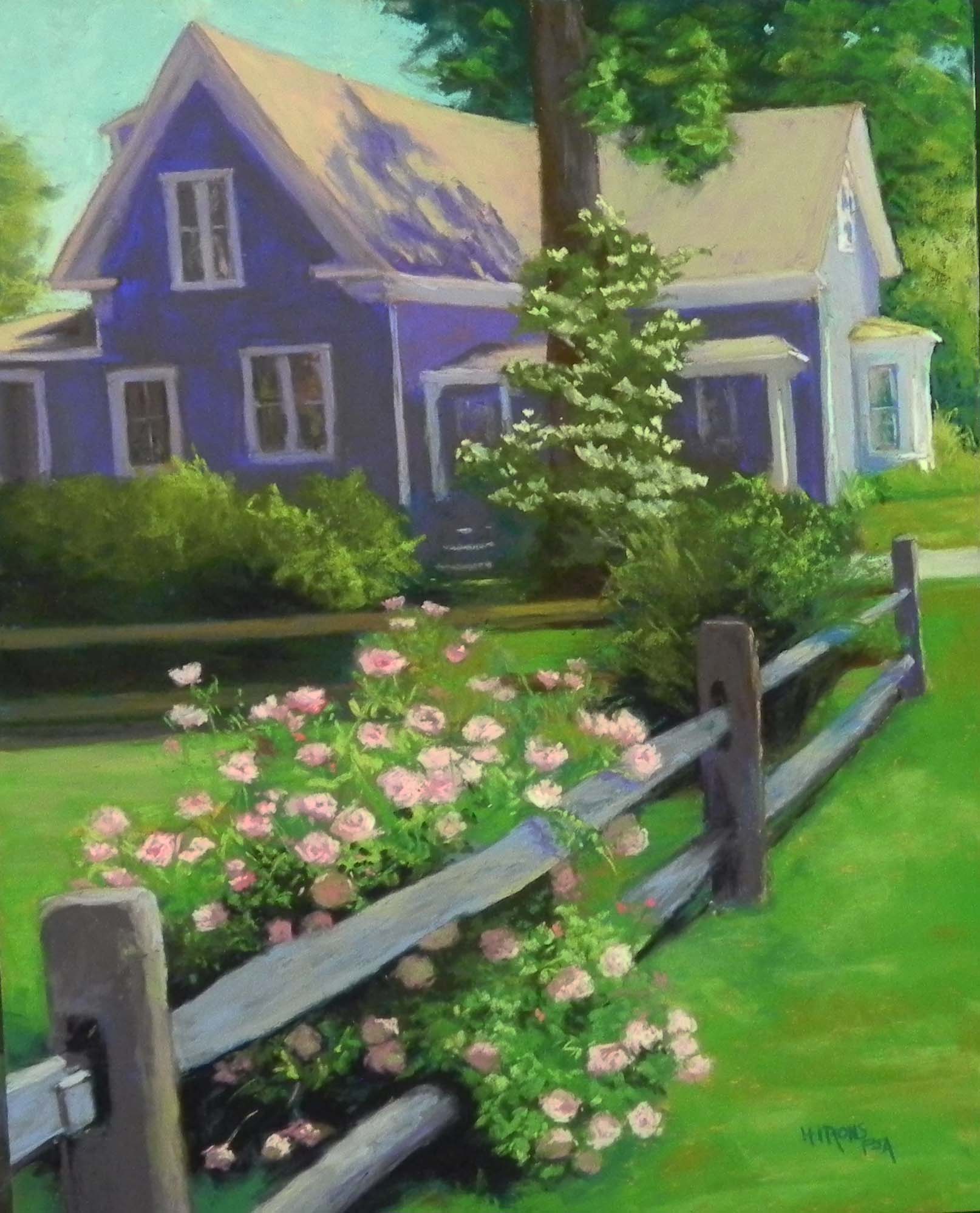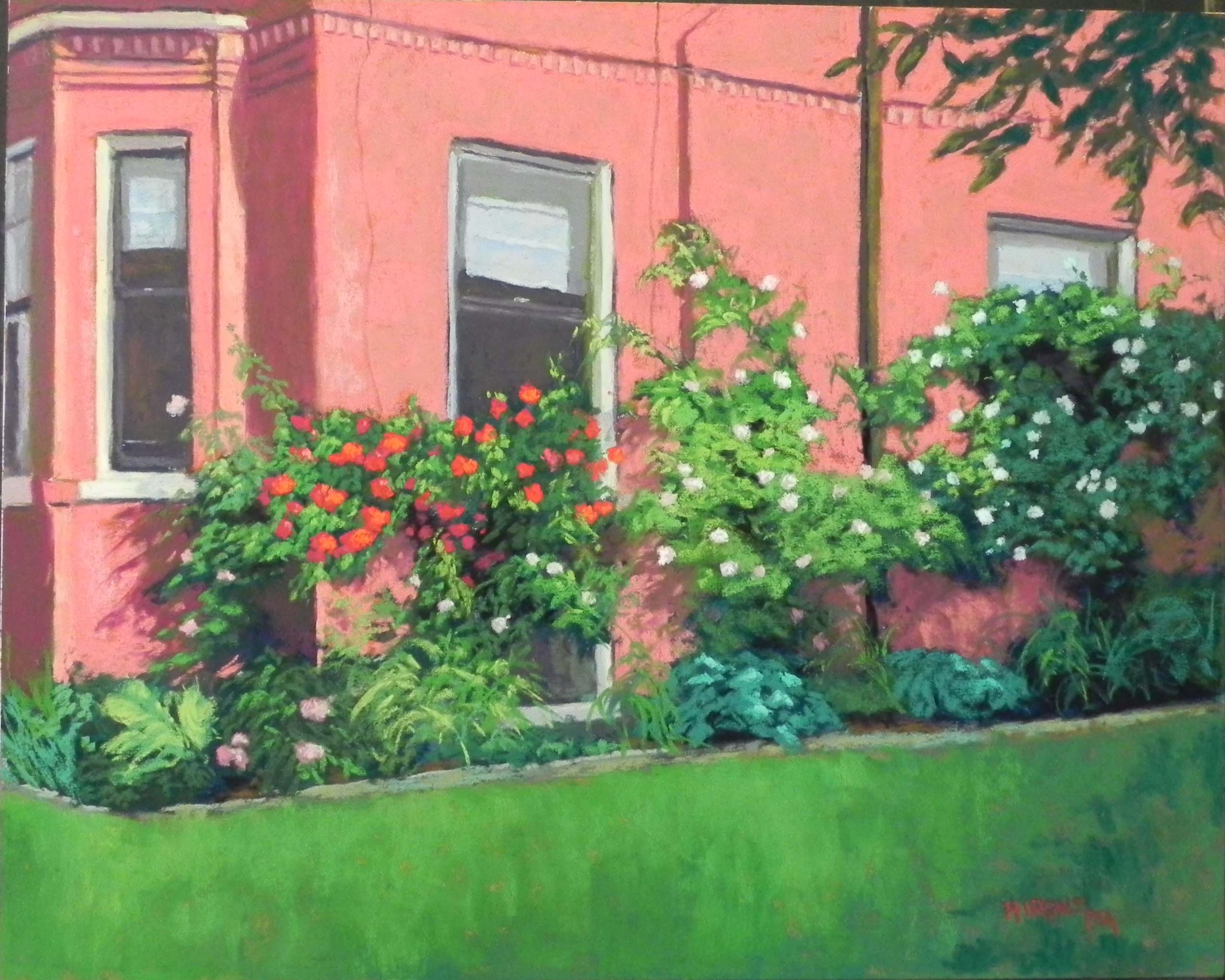
Portland Roses, 16″ x 20″, UART 320 board
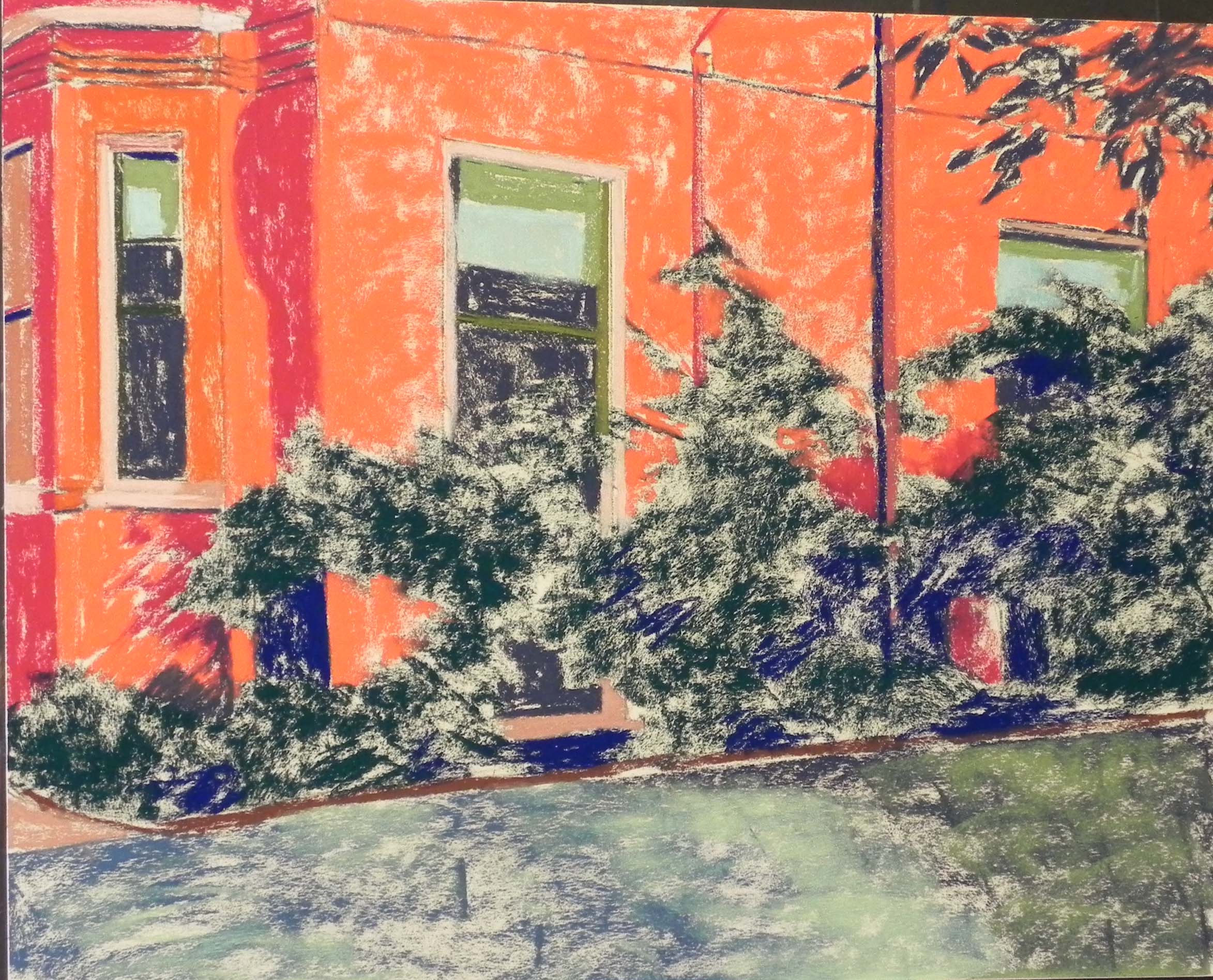
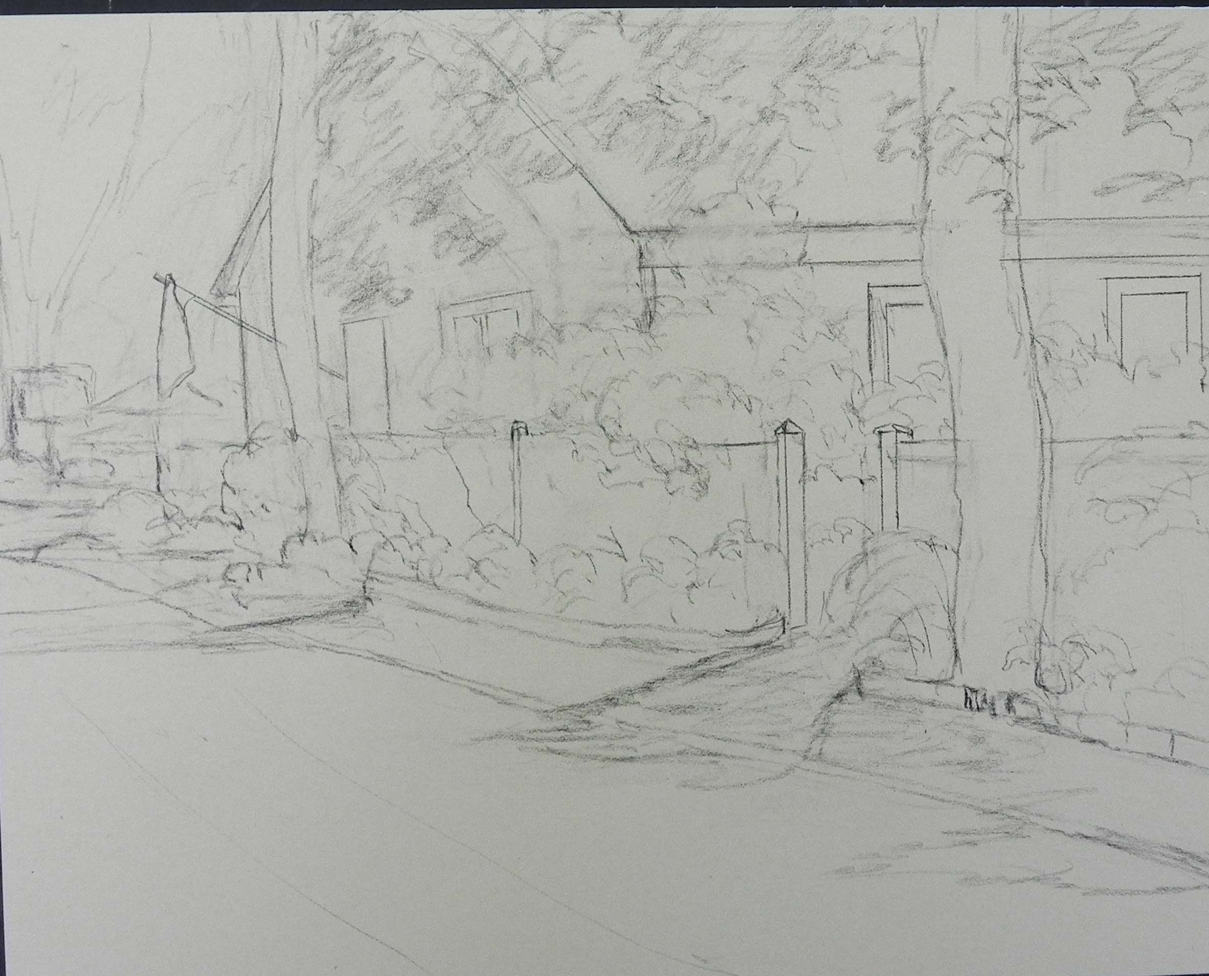
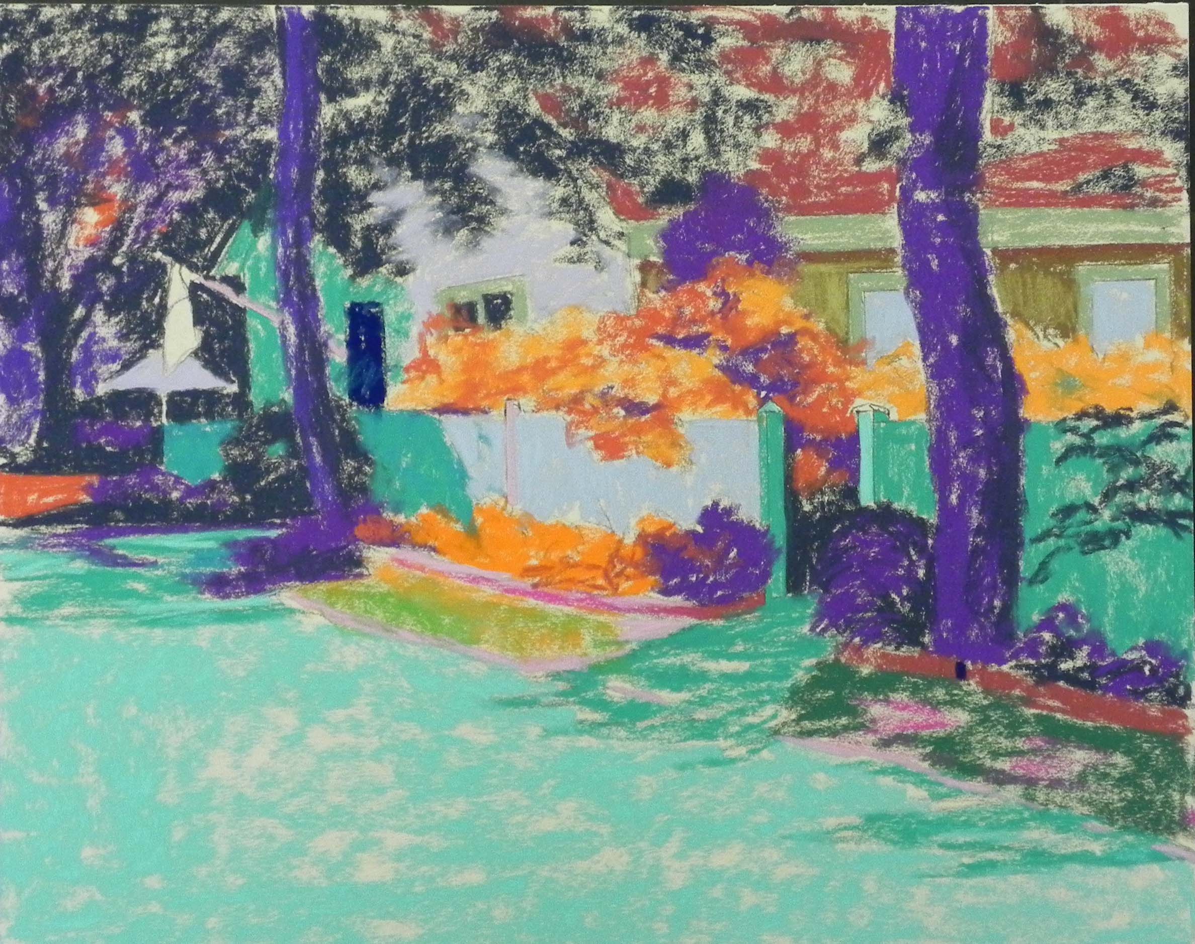
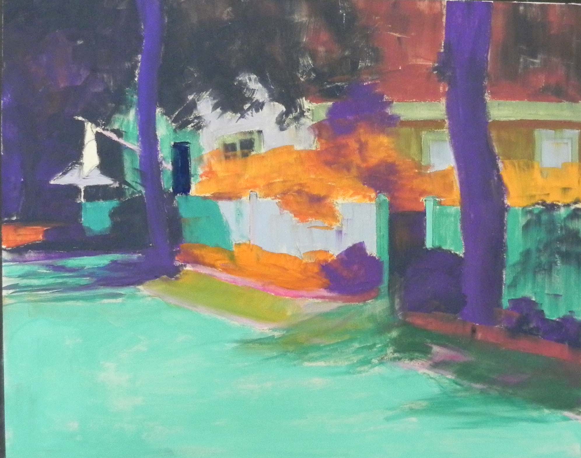
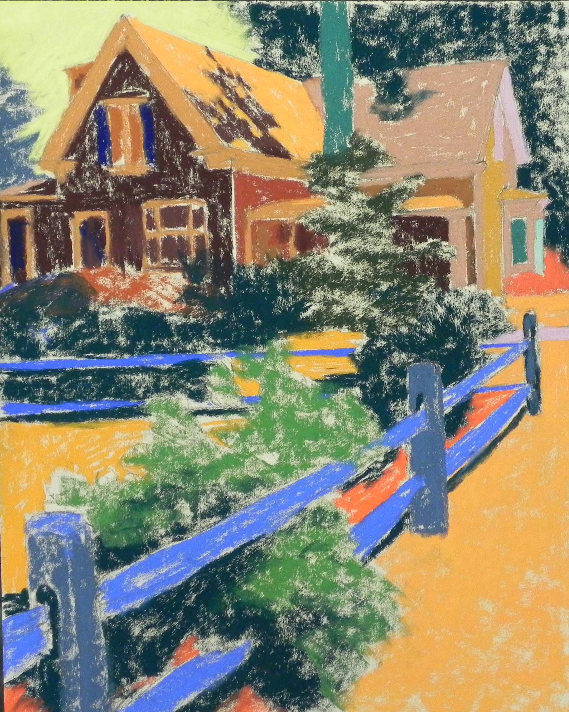
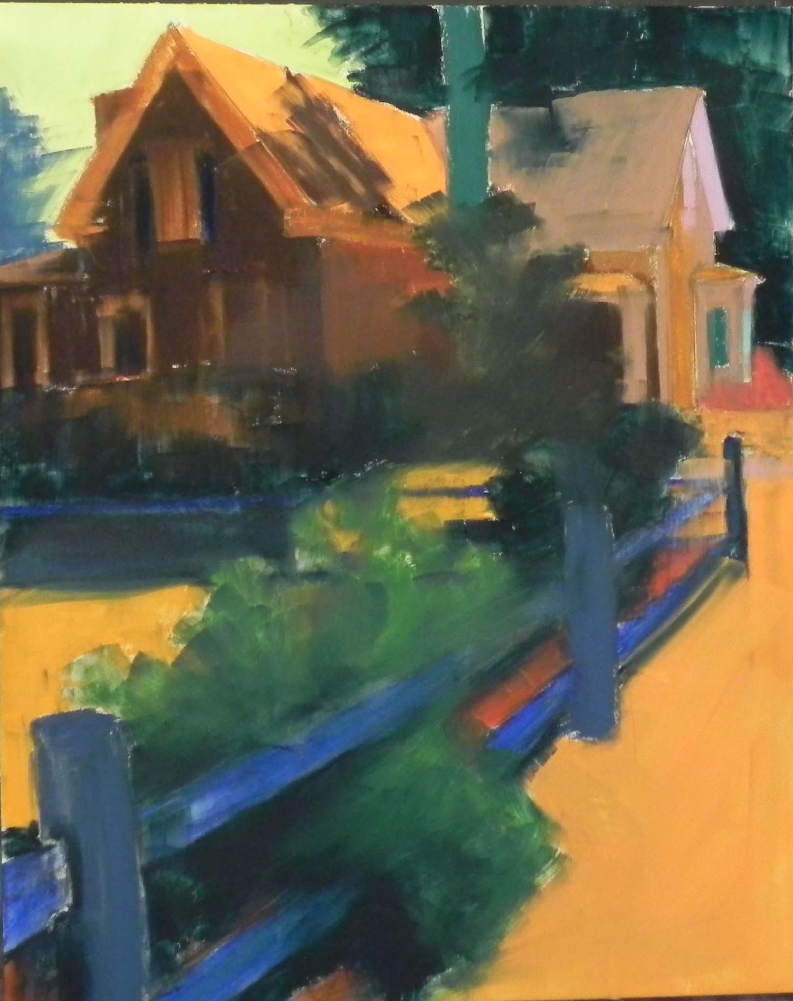
Underpainting, stage 1
And here is the third painting, perhaps the most challenging in some ways. My original thought was to change the color of the building, which was an orange-red brick to either a dull light green or an off white with red brick showing through. I was afraid that the roses wouldn’t stand out against the red brick. I did several color studies and chose some reddish off-whites. Then proceeded with the underpainting with this in mind. But then I really liked the look of it–the warmth of the orange wals–and decided to stick closer to the picture, which meant pretty much putting the same color over the underpainting. However, I used a cooler pinkish red, rather than the real orange. It actually worked fine. (I seem to have forgotten to photograph the final underpainting.)
I used my Terry Ludwig “vibrants” set for the colors in the building and Girault and Blue Earth for the foliage and roses. I really enjoyed doing the window shades, which had subtle creases in them. Used Girault blues and a cream of close values and it worked pretty nicely.
In the photo, the foreground is a driveway with the end of a car at the far right. I intended to put in the driveway but not the car. The driveway was also light-speckled from the tree above. And the color was a blueish violet which didn’t go with anything else in the picture. So I tried to do it with a combination of red and greens (as I used in the shadowed areas of the building). It looked dreadful and was a complete distraction. My husband suggested grass–why didn’t I think of that! I brushed it off, added some orange NuPastel and alcohol, then various greens, getting darker on the right with a hint of shadows from the leaves above. SO much better. With all the business of the rose bushes, a simple foreground that complements the building works much better.
This might be it for rose pictures for now. But it’s been fun!