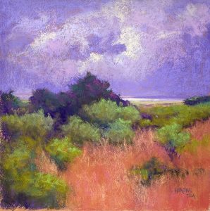
So here is the second painting, completed this morning. I was careful to make the land larger than the sky in this one. And I decided to use a violet sky, based on one of my studies. Looking at it, I’m wondering if it needs some toning down–lighter? More light? Less violet? Not sure. I’m liking the sky in no. 1 better! But I won’t make any changes at this point.
For this one, I began again with violets in the darks, then used various greens over them. I wanted the bushes and land area to be darker than what I had in the first one. I created a shape of bushes in the lower left, and led the bushes off to the far right.
For the foreground, I wanted to play with pinks and oranges, which I used years ago in a Chincoteague painting. I like it, but I’m not sure it works with the sky. I think the sky needs to be lighter with more warm colors in it. SO, I just might have to work further on this one. Will see. Any comments will be most appreciated!
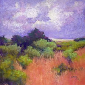
Well–I decided I had to revise the sky! I used a much lighter, duller violet over the original color–lightly. Then added more light, using a very light pink white. And I added more pinks into the clouds. I think it’s better now. Time to quit!
Revised image


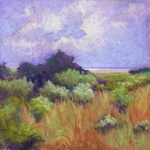
 I’m back in the studio–just sold two of my studies! I also came to revise the painting after thinking about it more. When I came in, the painting was on the floor folded over! Well! I guess that told me something. Anyway, I have reworked it. There is now some aqua in the sky along with the violet, which I think gives it more dimension and softness. I added lighter colors to some of the bushes (which I had in a study) and I’ve changed the foreground grasses. I wiped off the reds and went back in with more sienna colors and added green and yellow grasses into that. It’s more detailed now and definitely less “abstract”! Not really abstract at all! I told my friend that perhaps I was “intuiting” the landscape as opposed to “abstracting” it. Anyway, I think it’s a better picture and I hae put glassine on it and I”m done with it for now. (Sorry the underlining showed up and I can’t find a way to get rid of it) Also, I realized that what I’ve been painting is Rehoboth, not Delaware Bay! The latter is much bigger!
This is also great! Perhaps bring a subtle touch of gold from the foreground into the sky and/or some lavender or purple into the foreground to pull the two sections of the painting together a bit more? Easy for me to say! Keep up the good work and enjoy your new studio.
Jean, I agree with you and the above comment that the sky and pink and orange foreground don’t relate to each other that well. But lovely to look at anyway. I’m glad your studio setup is working well. How is your back?
I definitely like the last revise better. But I like #1 even more. It has more interesting hopping from color to color with little islands of orange, yellow green and aqua in the grasses. I find #2 has too little variety in the greens and even after the last revise, in the orange area. The sky also is more interesting in #1 because it has more color variety, i.e. blue and teal and some pinks. The purple sky of #2 is almost the same hue, just different values it seems.
I do LOVE your new direction in both paintings, though. I’m sure they will be well received in your upcoming show.
Thanks Dana. I agree with you! I shouldn’t have added the pink/orange grasses, and I should have made the sky lighter with more colors. The good thing is that I can easily do it again! I appreciate the comments and i’m glad you like what I’m trying to do!