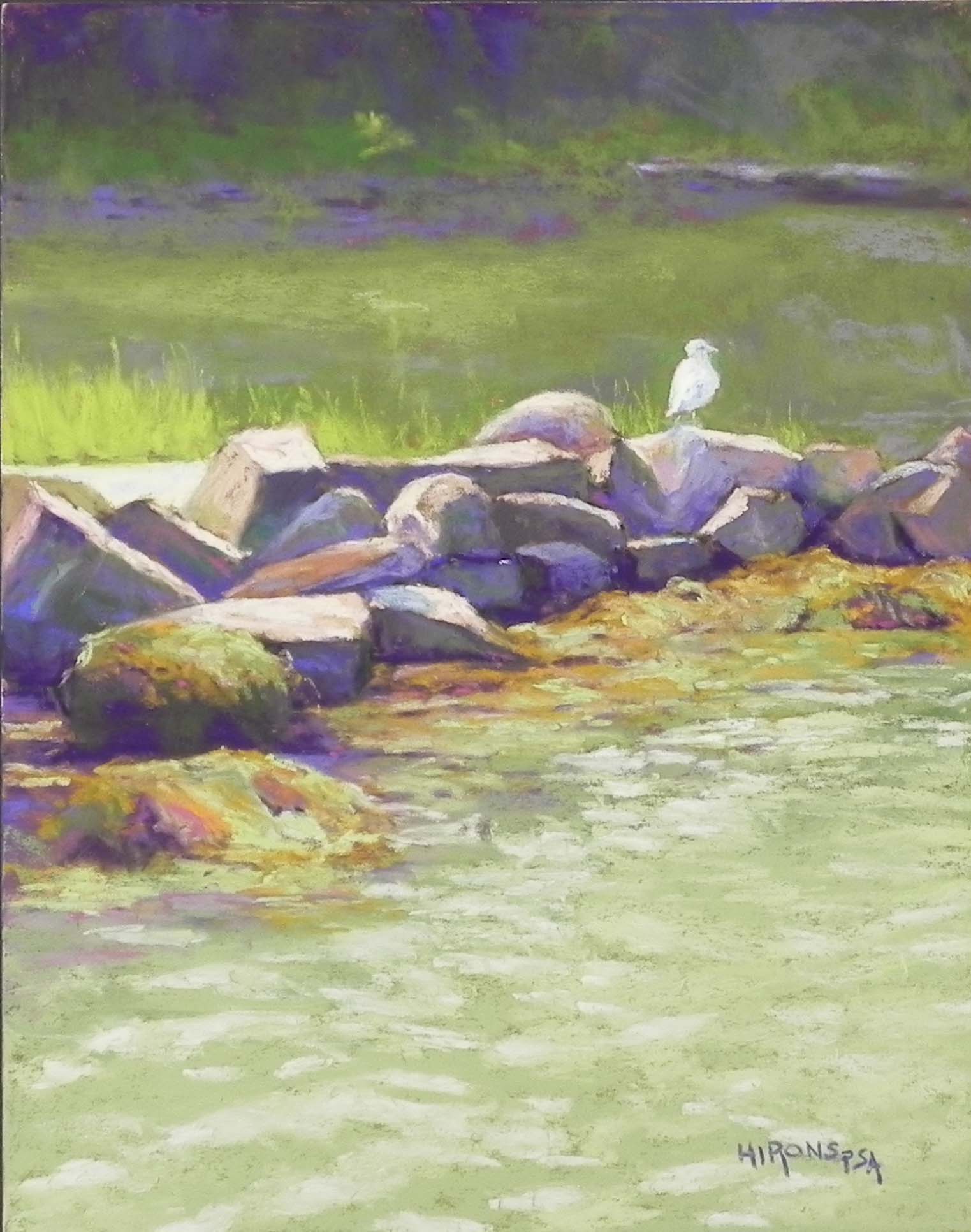
Gull on Rocks, 14″ x 11″, Uart 320
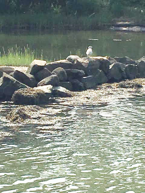
Original photo image
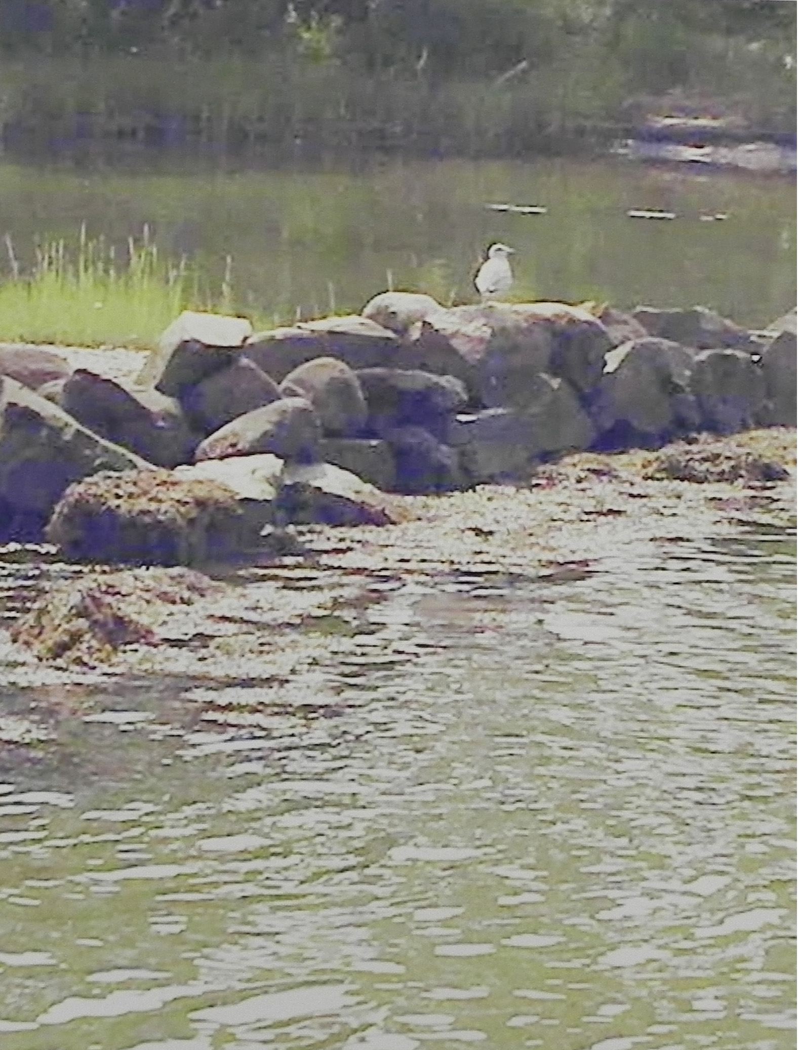
Printed photo image
Today we finished filming the second of two videos for this small painting. The first video is the underpainting. Today’s is the painting itself. Unfortunately, half way through, the camera ran out of room so we lost the part on painting the rocks! However, I still think it’s pretty good. Because I did this as a video, I don’t have all the images for the underpainting, but they’ll be on youtube in a week or so.
I took this picture in 2018 when John and I were visiting Massachusetts. This is on the Slocum River in N. Dartmouth in a nature preserve where we walked with my friend Sarah Brown. I’ve always like the compostion but the dull and dark grays and greens discouraged me from doing it. However, it seemed like a good subject for a demo so I lightened the picture a little and printed it out. The first photo is the lightened version. The second is a picture of my picture! I forgot that my new Epson print lightens everything when it prints. As a result, I got a really light image! But also a much more colorful one. In the printed picture I could see violets and magentas and all sorts of colors that weren’t orginally visible. So I was much more inspired to paint it.
I decided that rather than being an all green picture, this would be a green-violet-orange triad. I figured that the seaweed along the rocks could be more orange than it appeared and would add some nice balance to the picture. In the underpainting, I used mainly greens, violets and browns, with a nice reddish orangy brown in the water behind the bird.
I kept the upper half very abstract, using just violets and greens, smooshed together. For the rocks I used violets, greens, warm neutrals, and some reddish colors as well. The seaweed area was the most challenging, primarily because the color in the photo were so dull and light. I began it with a Roche warm yellow orange that blocked in the area beautifully. I added greens and violets on top and some darker hints of violet below. Im happy with the results.
For the water, I used two shades of green then two shades of lighter green for the light on the ripples. Rather than following the pattern in the photo, I used an arcing pattern from lower right over to submerged rock and then to the upper right towards the bird.
I really enjoyed doing this painting, even though I had initial qualms of doing it for “the world”–not that that many people will view it, of course–but, it will be out there!
Not sure when it will be published but hopefully during the first week or July.
Happy Fourth. Don’t go to large parties. Stay safe. Stay sane!!!