
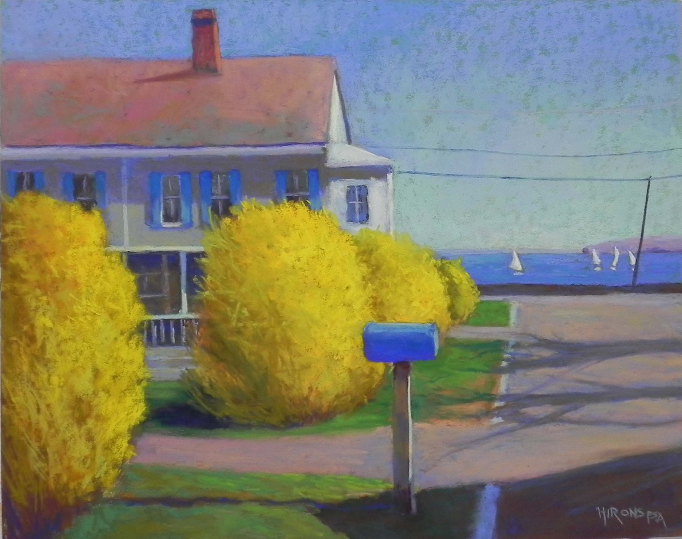
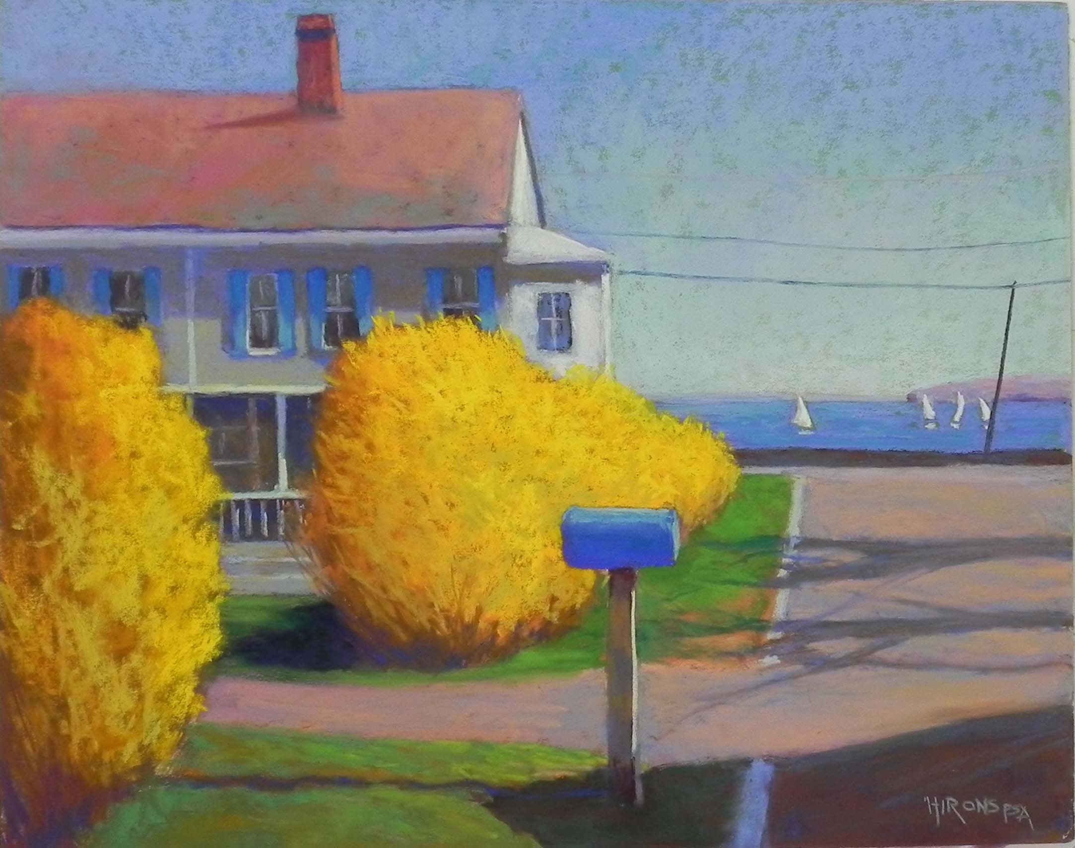
Mattapoisett Blues, 16″ x 20″, UART 320
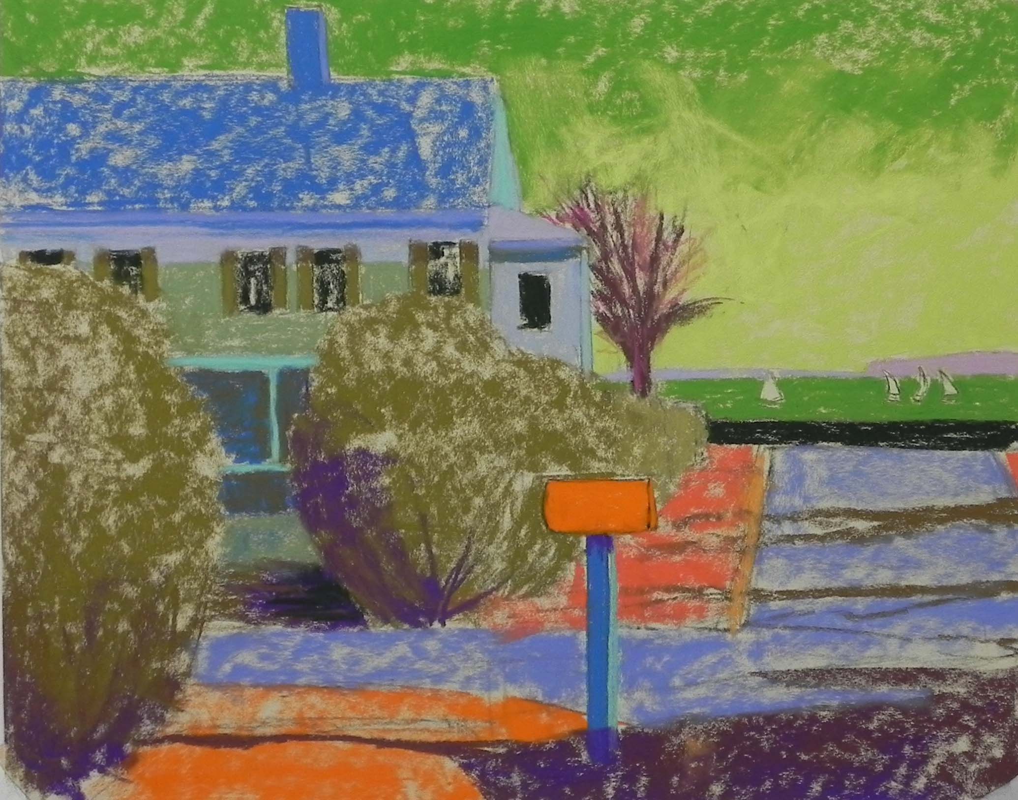
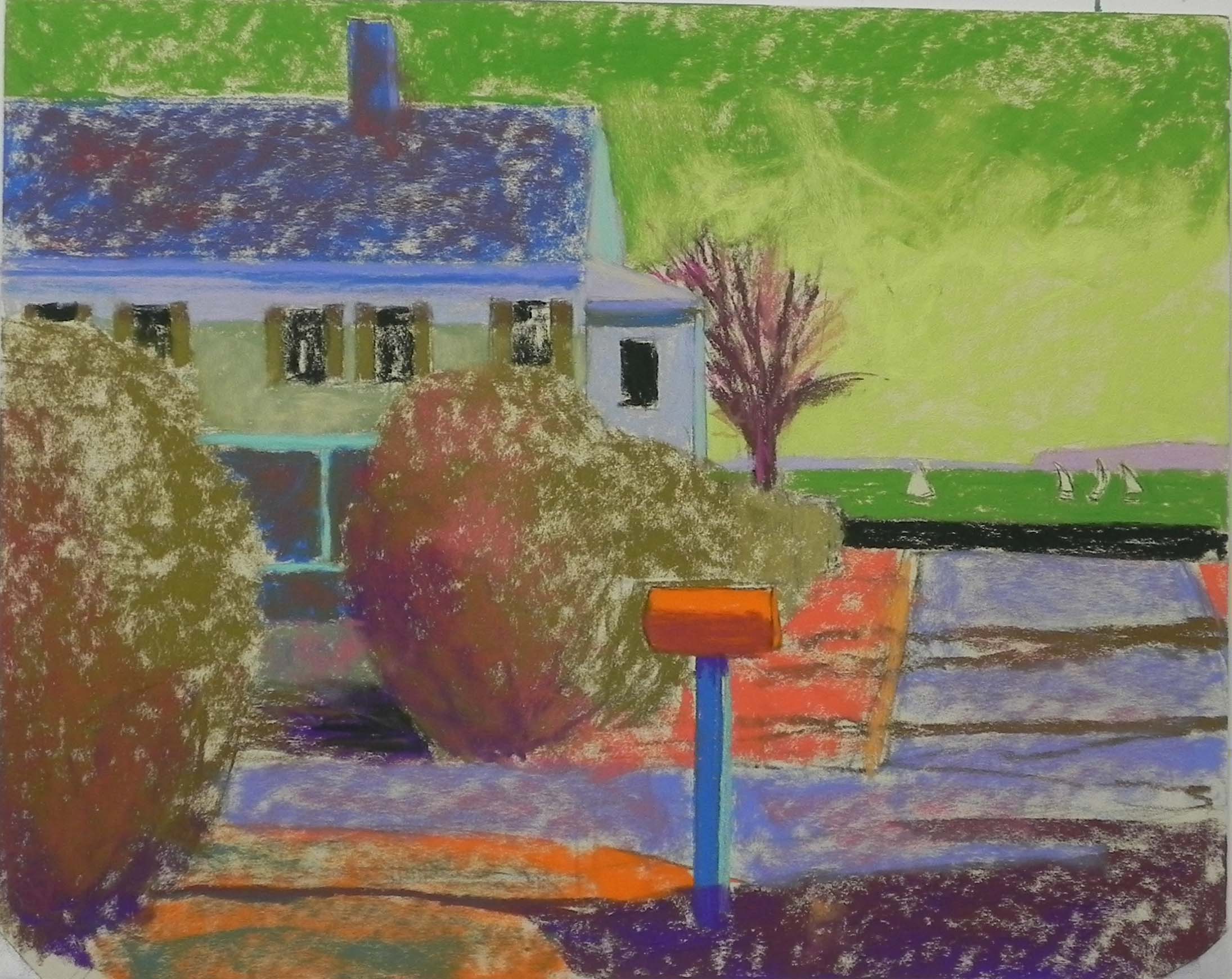
Underpainting, initial colors
Underpainting, more color added
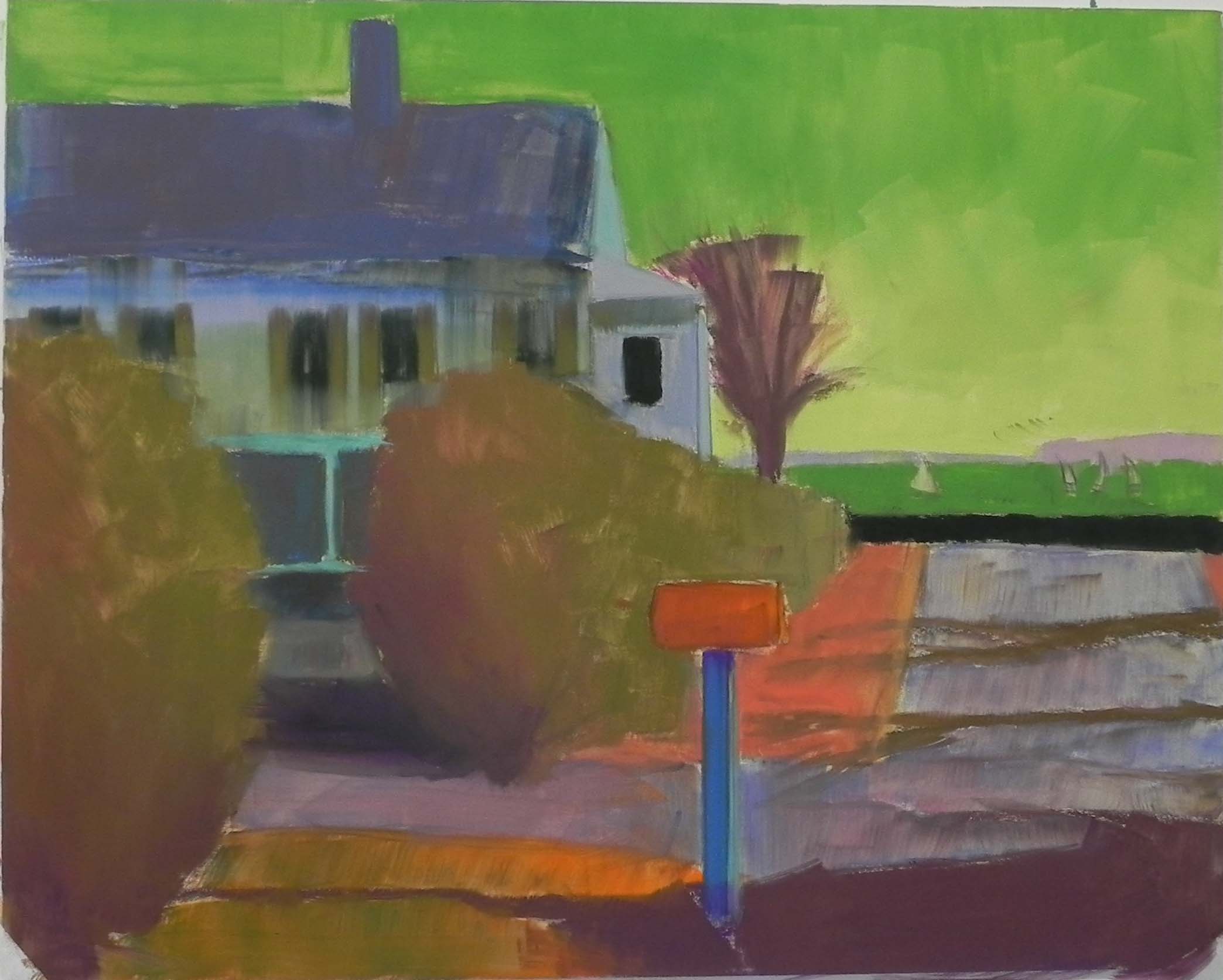
Underpainting with alcohol
Painting in process
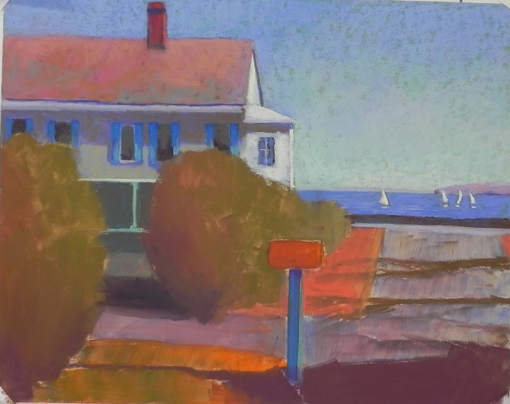
Painting with too much yellow!
I finally got to paint this past week. It’s been awhile. I’ve been focused on art and music videos! TOO MUCH!!! My last art video is called “Color Choices for a Useful Underpainting”. It’s currently being edited by my friend,Helen Wood. It will be a lot nicer than the others I’ve produced so far. We are both learning a lot.
So one of the photos I used in the video is a picture of Mattapoisett in spring of 2018. I loved the blue mail box, along with the blue shutters and the boats in the blue water. But it was never the perfect composition and that’s why I hadn’t painted it (I think I’m getting desparate!). There is a big tree in the photo, right behind the mail box and the forsythia is all bare brown bushes. I knew when I took the photo that it had possibilities. But I wasn’t sure what to do with the tree. In my sketch, I tried moving it to the front of the house, nearer the harbor. I originally drew it that way on the board, but decided it was too busy. Then I thought I’d make it a lot smaller. You’ll see it in the underpainting. I hated it! Thank goodness we can brush off pastel.
I gave a lot of thought to this painting and the mood I wanted to create. I wanted it to have a soft, impressionist look and I chose to use smaller strokes of color. But I also realized that without the trees, it had more of a bare, stark appearance that reminded me of Hopper–never a bad thing! When I decided to take out the big tree, my original plan was to add a tree branch coming over the roof from the left to break it up. But I soon realized that I didn’t want anything there at all. Color variation would be enough.
So, the color choices. In the video, I say that there are only three color choices: opposites on the color wheel (complements and near complements), colors on the same side (analogous), and local color. And I came up with some new terminology of assessing your subject matter for “challenges” and “possibilities.” Or, what parts will be difficult to paint, which parts are rather boring but easier to paint. Perhaps using analogous or local color in the challenging areas will work better, while large boring areas can benefit from opposite colors. So, in this underpainting I actually used them all. And I also decided that because I wanted a soft look that I didn’t want a lot of stark color (except that orange!) in the underpainting and I added more colors to the initial layer.
The challenging areas were the sky (when I though there would be a tree) and the bushes. For the sky, I used a warm, medium green and a lighter yellow green. I’ve never used the medium warm green before but it worked really nicely. Where it showed through it was fine. For the the bushes, I decided to use the color that I saw in the photo of the bare branches–so I was using the local color, knowing that I’d be putting yellow on over it. I used several of the Caran d’ache olive browns. The roof and the road were “possibilties”–rather boring areas. I chose to use cool blue with some red added to it for the roof, and a combination of cool colors for the road, knowing it would end up warm. For the mail box, I used the actual complement and used other oranges in the grasses. I was pleased with my choices on this one and thought they enabled me to do the painting quite nicely.
So that was the easy part! Those bushes were a real problem. Having chopped down the tree, I had more room for forsythia and it became a large yellow blob with too much orange in it. I sent the image to my students for comments and they agreed with me. After reading one comment I knew what I’d do–break up the group of bushes with another walkway nearer the front. This enabled me to add more darks and shaping to the bushes and I also used a lot more yellow greens in them to tone down the orange.
I decided to add the telephone poll and wires and am glad I did. It adds a little more interest to the background. I made up the shadows of the trees on the road but not the large dark shadow of a house.
Back to my original plan to paint it more impressionistically. I paid alot of attention to this in the sky and the house. For the roof, I used quite a few colors, combining oranges and reds and adding some blue green on in places to give it more interest. For the house itself, I combined complements to create the shadows and kept the strokes and edges loose. I’m happy with this approach and will use it in my next painting of Mattapoisett. I’m visiting virtually this year!
I watched your thought princess on this painting, and I really appreciate the thoughtful generosity in sharing it with us all. I like the loose Hopperesque quality. You simplified and found a more abstract character. Th colors are thoughtful, and it has strength.
Thanks so much Sunny. I’m really happy that YOU like it! I really wasn’t sure about this one but I’m now at peace with it.