Glory

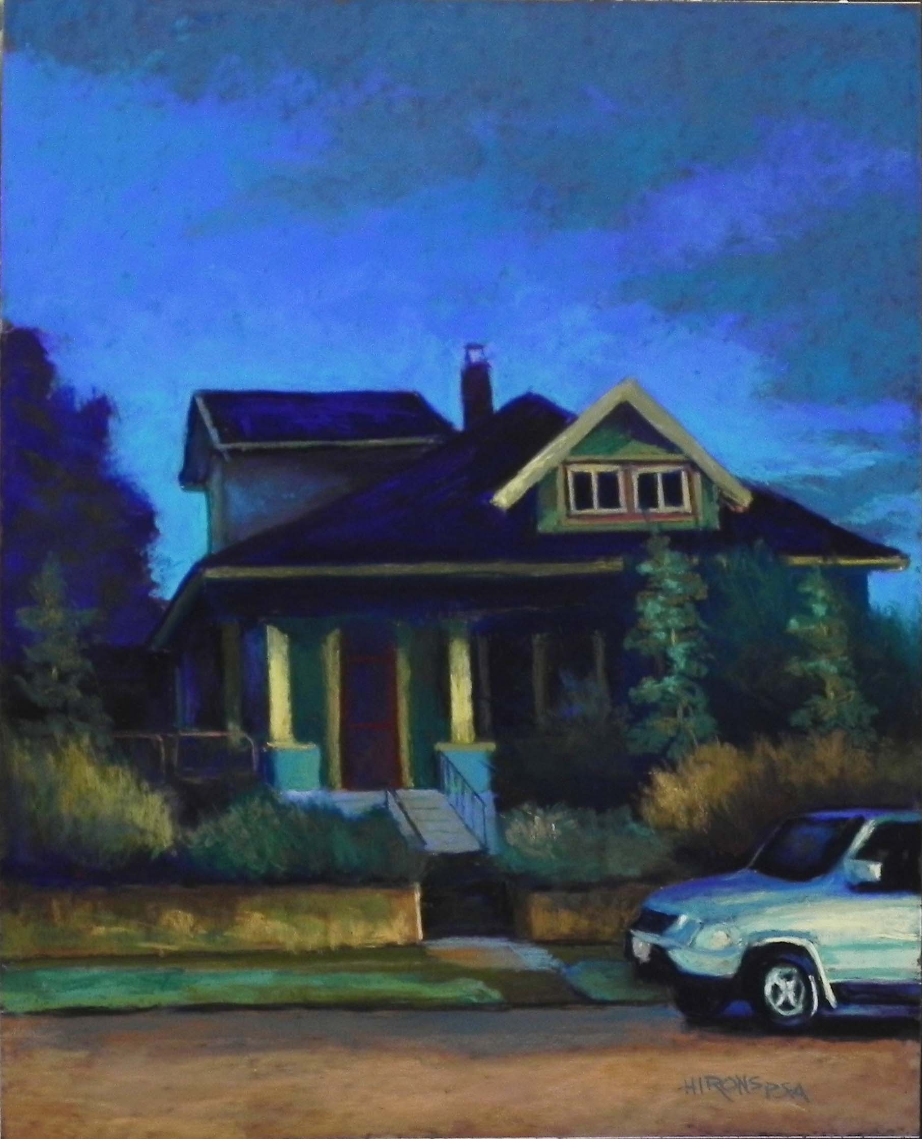
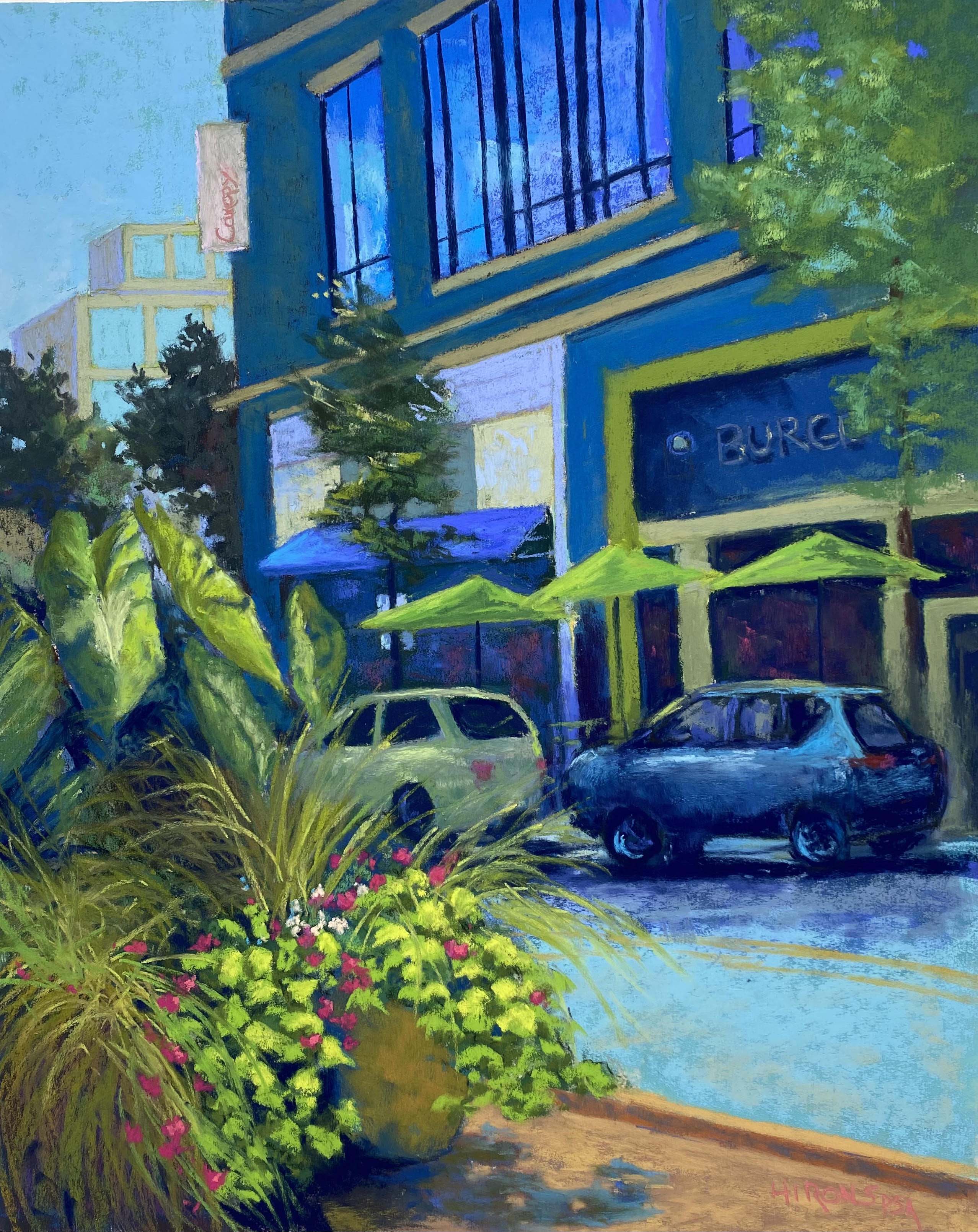
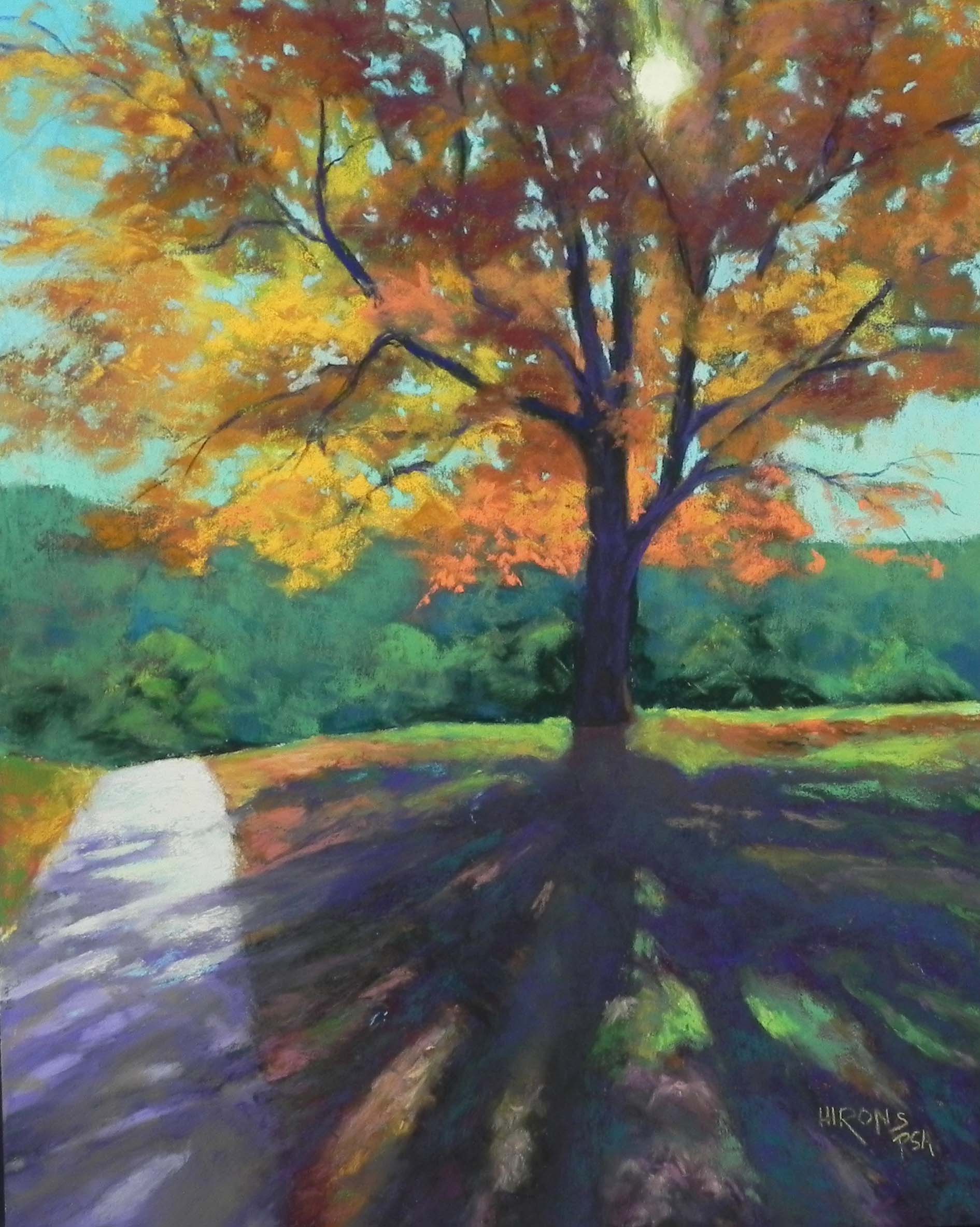
Glory, 20″ x 16″, UART 320 board

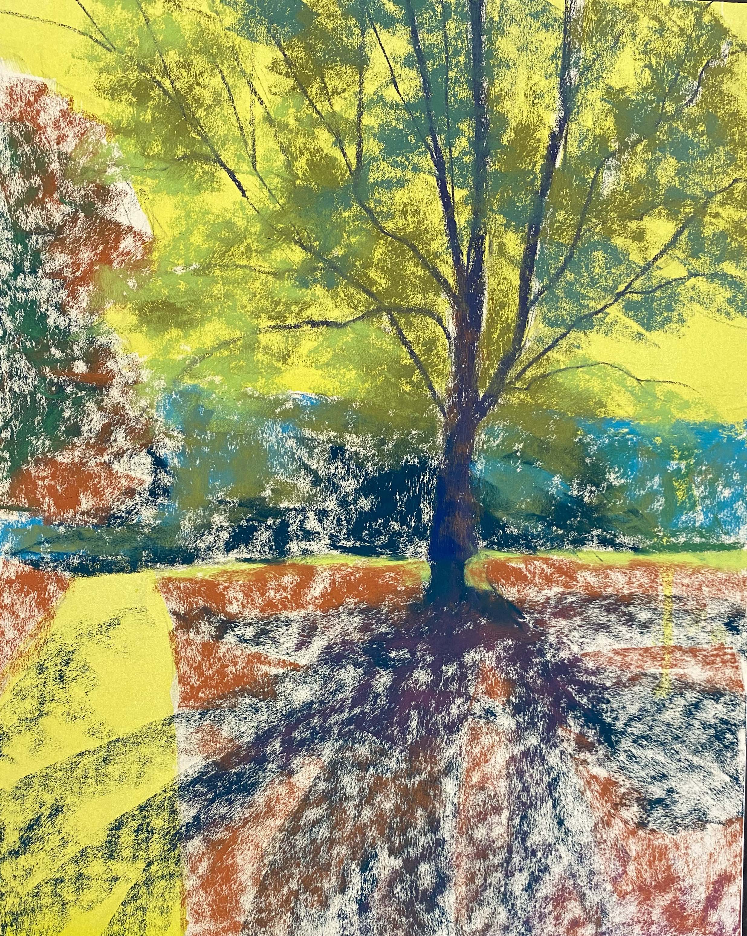
Underpainting with yellow ink and hard pastel

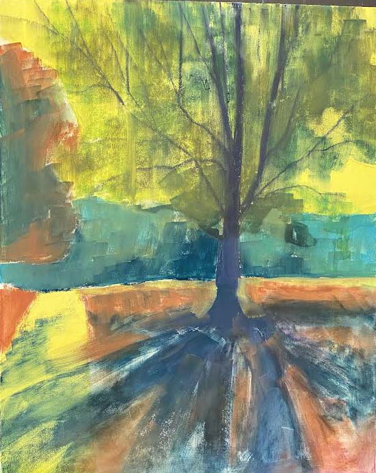
Underpainting after alcohol applied

My classes this fall have focused on light and shadow.  I did two demos to begin with but wasn’t particularly excited by either so I wanted to do something really good that had both light and shadow in it.  We took an afternoon walk in early November  and the first thing I spotted was light coming through a tree that cast shadows on the grass and walkway.  Perfect!  But I also knew that trying to do a 16 x 20 live video of the entire painting would be way too much.  So my first thought was to do the upper half first and video the painting of the shadows.  But when I started working, I started taking a lot of photos and decided that I could do a two-part demo.  The first in Powerpoint with images and discussion; the second as a video.

Looking at the underpainting and the final work, you will see that I initially had included a tree on the left.  It was in the photo (of course) and I didn’t think to take it out.  But, as soon as I saw what the underpainting looked like, I knew it had to go!  So, I used some wet paper towel to try to sponge it out of the sky, then used yellow green hard pastel and alcohol to complete a better underpainting.  (It didn’t do great things for the surface however! So I don’t recommend doing this.)

The use of ink and hard pastel was OK.  I was able to have a background set into the paper over which I could place the tree.  And if a little yellow showed through it would be OK.  But I wished I hadn’t used it in the path.  The path needed to be warm and it would have been better to start it with a cool color.  But, of course, pastel will cover anything.

The tree top was quite easy.  I used various greens for the underpainting, which I always do with fall colors.  Then I used four or more Giraults in yellow orange, red orange, and reddish brown.  Then added softer pastels on over that.  I used three Ludwig turquoises for the sky.

For the sun, I used a Schmincke light yellow that had a fair amount of yellow in it–not the whitest yellow. I used a yellow green Girault around the central part.  Then, I added a mid-toned magenta Girault to the leaves right around the sun.  This worked like magic!  It gave the look of hazy sunlight and helped the sun to really glow.

My favorite part of the painting was the background.  After I had eliminated that terrible tree, I kep it very simple with some bushes in front, painted with loose strokes of several Giraults; and blues and greens in the background.  The results now make it look like one is walking in a much more open environment than the woodsy area that we were in.  I learned important things from this!

The shadows were another story!!!  They were done as part of the live demo. I used three or four of the intense dark Ludwigs, then added lighter colors on over.  I had to keep trying to lighten.  And doing the shadows on the path was tricky also as the surface was lighter and the shadows had to be a little different in color and value — but not completely different.  And I kept having a hard time with the shape and size and where they should be. I think there are too many of them, particularly since I left out a branch on the left.   It’s more about the sun than the shadows, but I didn’t want them to be a distraction.  Again, this image is a little too dark.

So now I have just one class left and plan to take a two month break from teaching.  I’ll begin again in February with zoom and in-person or maybe just zoom.  I hope to paint with friends in January and at home in December.  But it’s also time to see other friends and do holiday things.  I hope that you too will be able to enjoy this holiday season.  Let’s not worry about the new variant!  Just get your booster and wear your masks and live life!  We will be going to the Kennedy Center this weekend and having dinner in Georgetown–both of which we haven’t done in years!

Happy holidays to you all.

Bungalow Nocturne Blues

Bungalow Nocturne Blues, 20″ x 16″, UART 320 dark board

Drawing on board with pastel pencil

Beginning stage with hard pastel

Initial layin of sky with soft pastels

When we were in Portland on our trip to the Northwest in October, we took walks in the early evening and morning and I experimented with taking shots with low light.  My Iphone 11 was supposed to be good at this and the shots came out really nicely. So I  wanted to paint my favorite one of a bungalow with beautiful blue sky behind it.  I did a half size drawing and immediately decided to add more to the sky and some of the road.  Then I did a color study on black Canson and realized that working on black was the way to go.  SO–I ordered 5 16 x 20 UART dark boards and eagerly waited for them to arrive.  A friend who paints with me has been using it for some time and I was happy to finally have the chance to give it a try.

The paper is much darker than it appears in the photo (cell phone really adds a lot of light), but it’s not black.  However, you can’t use graphite, so I used a pastel pencil.  I hate sharpening them and resist using them!  But for this painting, having an accurate drawing was essential.  I tried a hard pastel and it was too think and ungainly to use.

I began with hard pastels and, as you can see, started the sky too light.  But it didn’t seem to matter. I basically used the colors I was seeing but focused on blues and greens.  What I wanted was a painting with a lot of nuanced color with light hitting the trim on the window and posts, as well as the car.  The light was from a street light–no moon, unfortunately.

While i was working on “dark”, nothing ever seemed to be dark enough.  And now this photo, looks too dark!  I used a lot of my Terry Ludwig intense darks.  But I also used my Roche petit blues that I received as a gift last Christmas.  The grayed blue of the sky is a Blue Earth, but the rest of it is Roche. As are many of the colors, house, roof, etc.  They were perfect for this painting.

For once, I didn’t have a hard time doing the car!  It’s probably a Subaru (like mine) so it seemed quite familiar.

This is my first nocturne and i hope I’ll find more subject matter to do others. I’ve already started a quite different painting (also from Portland) on another of the dark boards and am loving it.  So who knows–this might be my next kick!


Moody Blues (Pike and Rose, #2)

Moody Blues (PIke and Rose, #2), 20″ x 16″, UART 320 board

Reference photo

10 x 8 drawing

Underpainting, stage 1

Underpainting with alcohol

It’s been awhile, once again, since I’ve posted.  But in the time since the last posting I’ve completed 3 16 x 20s and 3 9 x 12’s (which I won’t post).  So I’ve been busy!  This painting is my second from the relatively new area of N. Bethesda known as Pike and Rose.  And, it was a real challenge.  I’m including the reference photo so you can see what the challenge was–a tree and a car!  I really loved the greenery in the foreground, but I knew the car had to go.  That meant having to fill in the two cars that were there and the street.  And I had to make changes to the background in upper left as well, having removed the tree.  I seem to be in a blue and green mode these days!  I DO love the combination and had fun playing with various Ludwig grayed greens and blues for the buildings.

Unlike the last painting, where the umbrellas were the focal point, this time I wanted it to be the greenery in the foreground.  I had the umbrellas too large at first and I used Blue Earth pastels on them.  I then brushed it all off and made them smaller and used Girault, saving the Blue Earth for the foreground.

The biggest challenge, by far, were drawing the two cars.  I did several versions of the one in the back and brushed them both off.  Then took a reference shot of my neighbor’s car and used that!  I think it worked well enough.  At least the front is now distinguished from the back!

After adding all of the various blues and greens, I added the bright magenta flowers in the foreground (which were there), gave more of that color to tail lights, and added it into the windows behind the cars.  I really liked the effect.  I also made the vertical sign in upper left pink. I added the lettering using a hard pastel with the painting on the table and glassine over it.

I had no idea what to call this painting.  My husband suggested “blue mood”  which I immediately changed to Moody Blues!  Not sure how moody this picture is but at least it’s got a better title!