
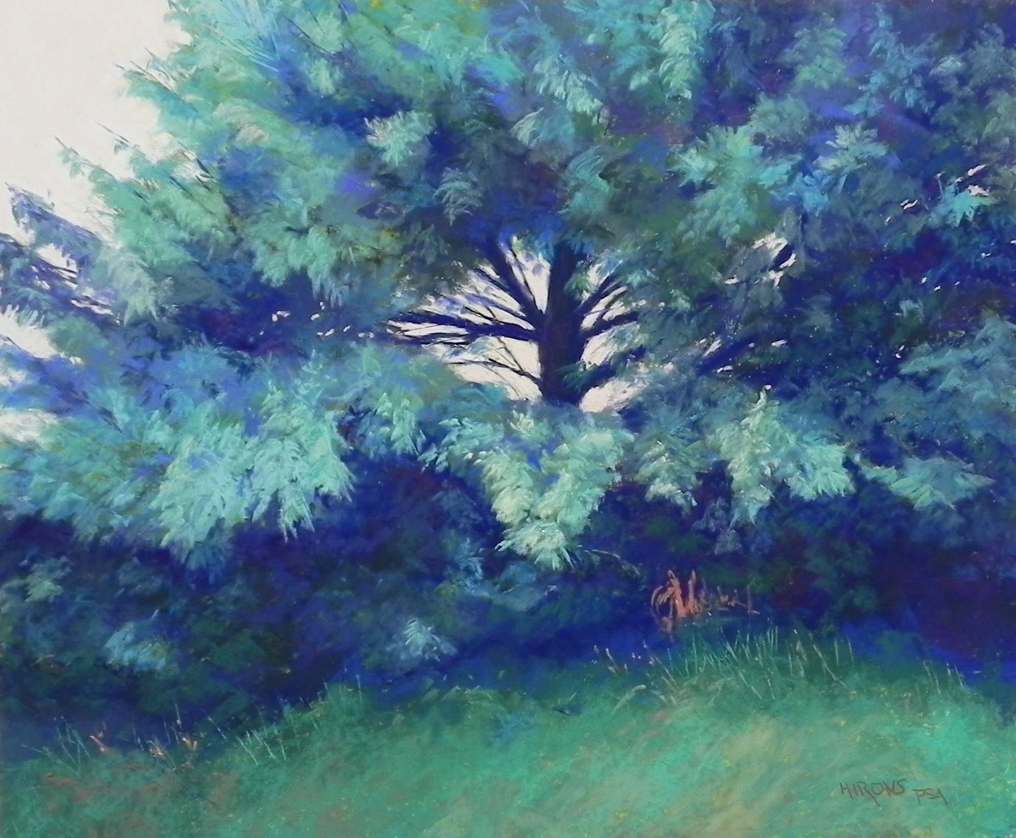
Turquoise Pine, 20″ x 24″, pastel premiere white fine grit
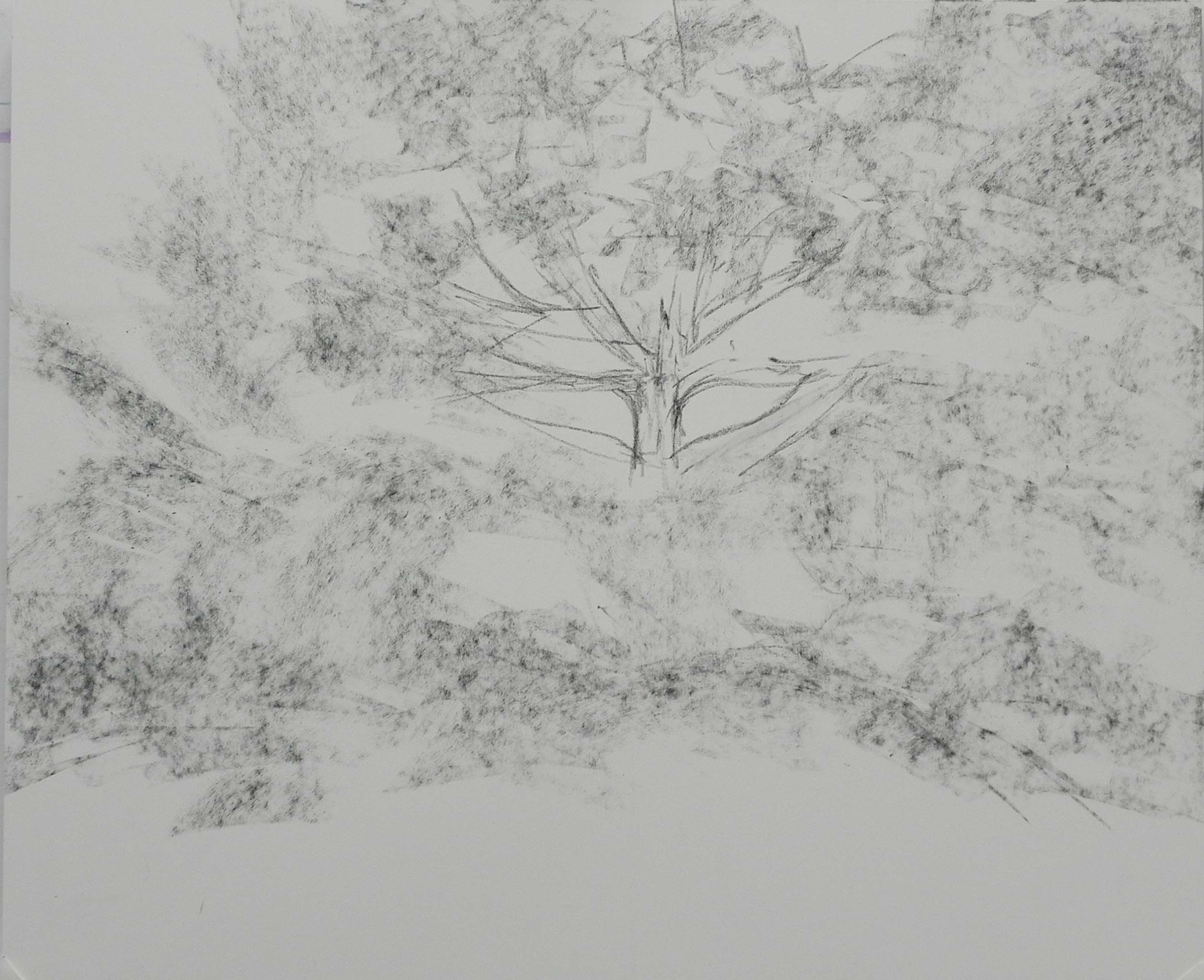
Initial drawing
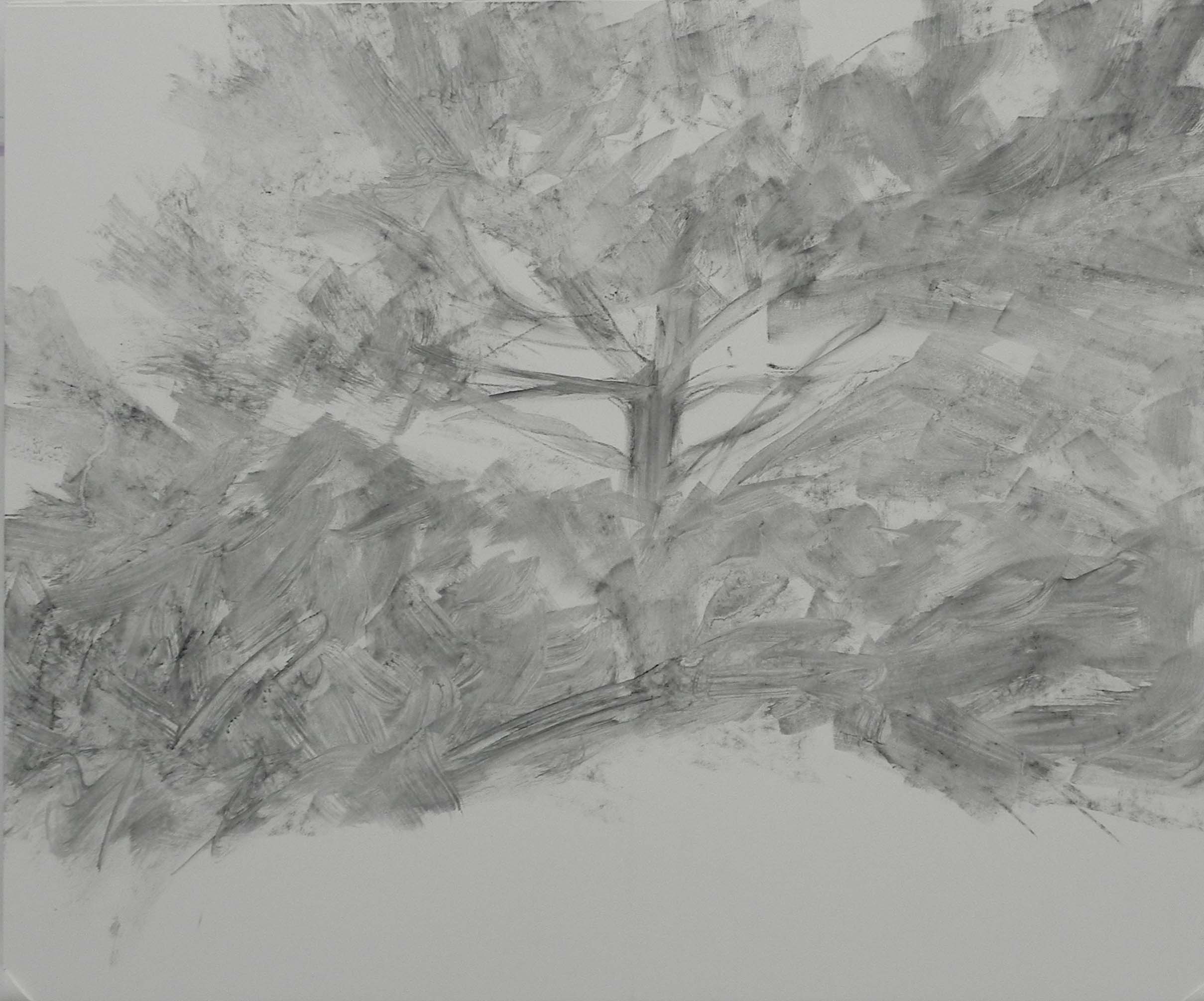
Drawing brushed with water
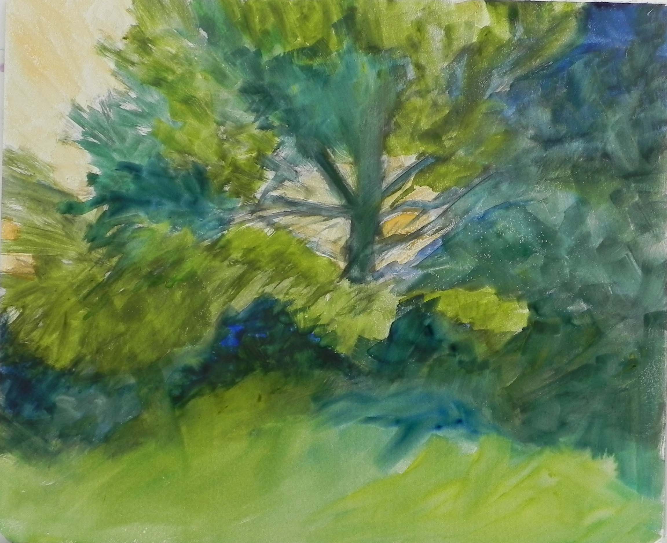
Watercolor underpainting
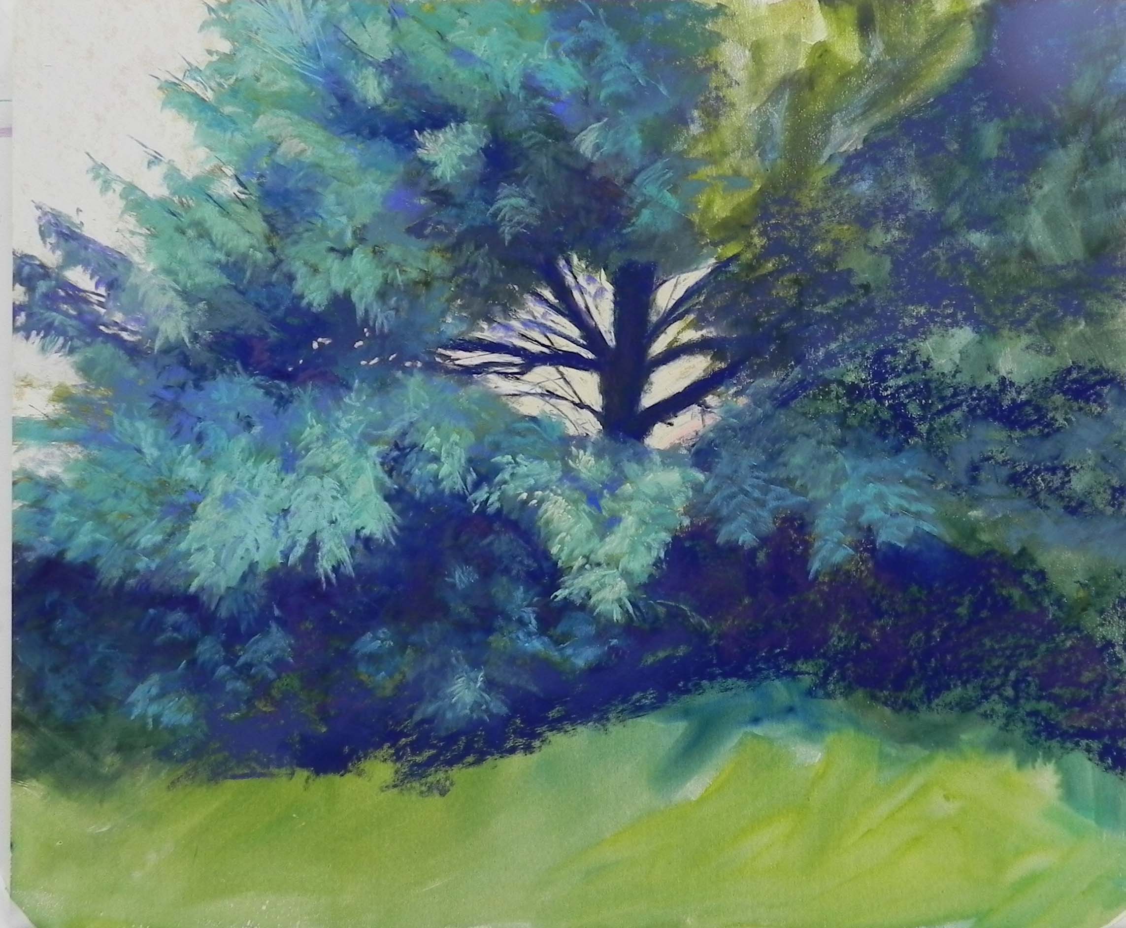
Partially done
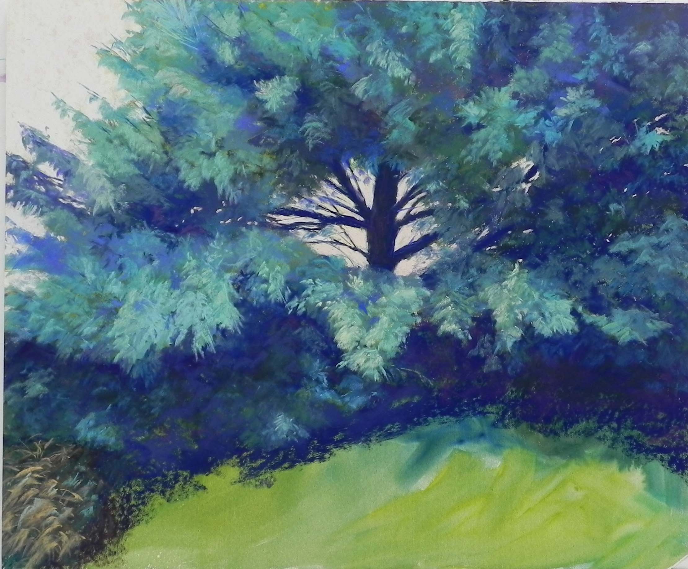
Trying out possibilities for the bottom
Happy New Year to my fellow artists. I’ve really enjoyed some down time with a chance to paint and do a little teaching one-on-one. So here is the first painting of 2020! It’s a pine tree I saw in Iowa back in October. I really liked the photo but not the colors and I decided to work from black and white and use the colors I like: blues, blue greens, and turquoises. I asked for the Ludwig 30 turquoise set for Christmas and had to give it a try out!
The surface is an odd one. It’s Pastel Premiere very fine grit (600?) white paper that is mounted to gatorfoam. I think someone gave me the paper. I remembered that it doesn’t like alcohol so I had to use watercolor as an underpainting. I began with a graphite stick and lightly roughed in the composition. I then applied water with a brush to get a sense of the movement in the picture. After that, I applied various green watercolors, with orange in the sky. While not as dark as I would be going, the watercolor underpainting helped me with the general masses of dark and lights. And I didn’t mind having a little showing through.
I used a variety of pastels, but basically all soft. I did a lot of “hitting” the paper with Schmincke’s, Ludwigs, and Unisons. I worked at trying to emulate the look of the needles on the branches but using the sides of the pastel in various diagonal strokes. I used a few Giraults for filling in and smoothing over areas but basically, I kept to the softer pastels. The paper has almost NO grit!!! So you really have to apply the pastel with force.
I took my time with the tree. Something as complicated as this requires a lot of stepping away, sitting and looking, etc. I wanted to be sure that the movement and composition worked. The painting is bigger than the photo with more room on the right and at the bottom, so I had to be sure it was working.
My biggest challenge was what to do with the bottom of the painting. It was all grasses and quite detailed. In the last image I’ve included, you can see various brown and green strokes in the lower left corner. I REALLY disliked this! Checked with my husband and YES, he disliked it too! So I decided to simplify it and keep the color within the overall scheme. I ended up getting out my boxes of green and turquoise Blue Earth pastels. I used a combination of turquoises and the very grayed brown greens. I liked this effect a lot!
Finally, I added the orange squiggle under the tree that was in the photo and seemed like a lovely touch. I added small pieces of orange to the grasses at left as well, and a little darker in the shadows.
The sky is the one simple area, but not so simple. I used various light oranges and pinks, and settled on a little darker pinky orange. It doesn’t show very well in the photo.
I LOVED painting this picture! All of our paintings should give us joy! I hope to find more subject matter that will make me feel as good. I wish great paintings for you all in 2020.
Stunning, Jean! You’ve infused those heavy branches with a lot of motion — it feels like a blustery day. Many thanks for sharing your process. Happy new year!
It’s lovely to hear from you Evelyn! And thanks for the comment. I hope you are doing well with your own painting.