
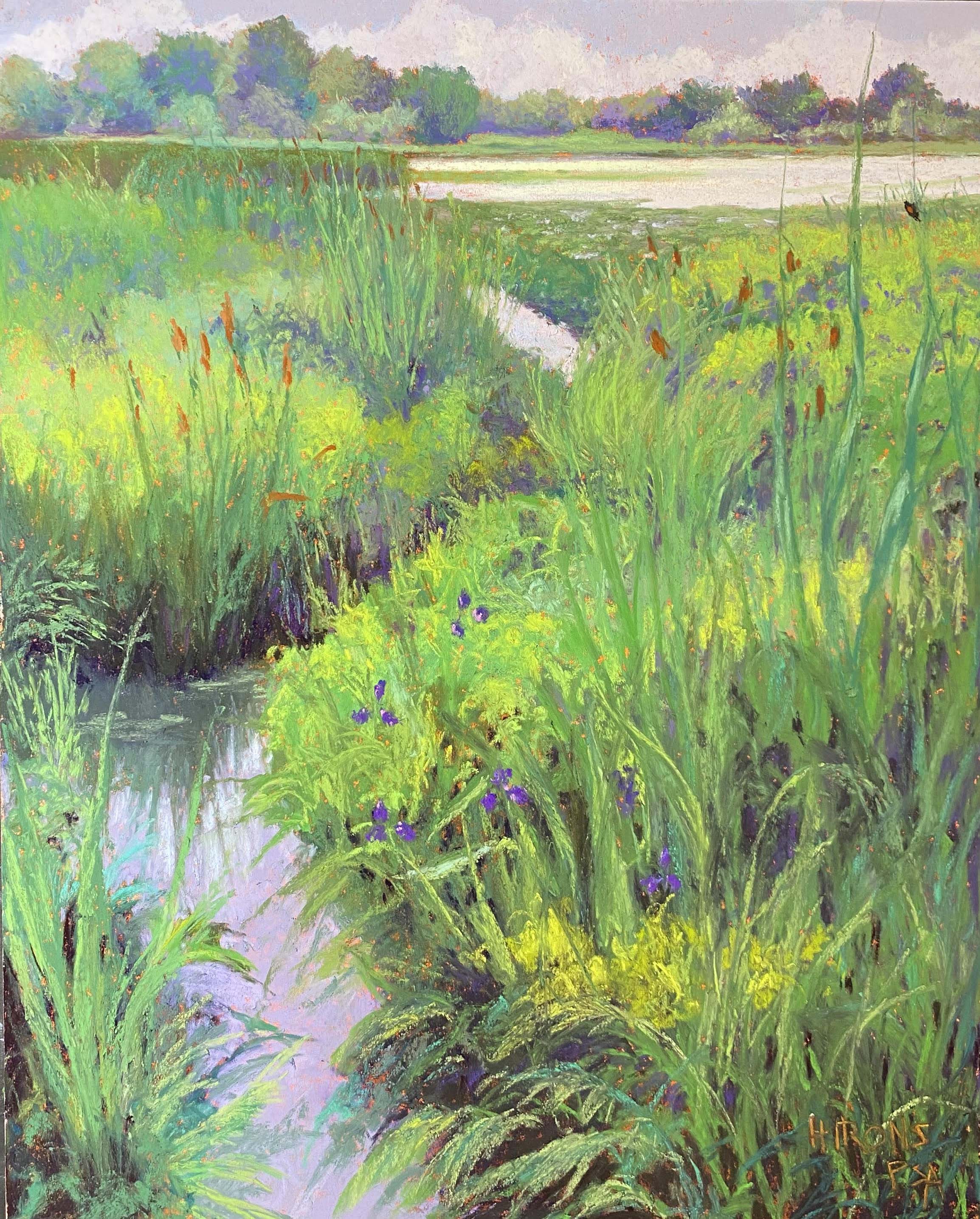
Purple Flag, 20′ x 16″, Pastel Premiere white
Top done
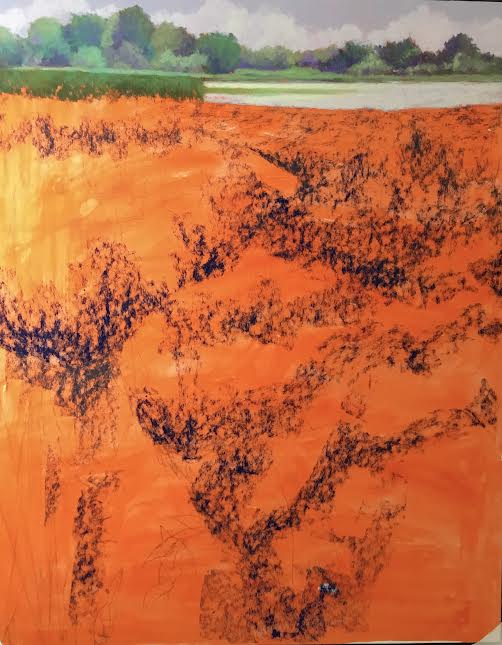
Laying in left side with soft pastel
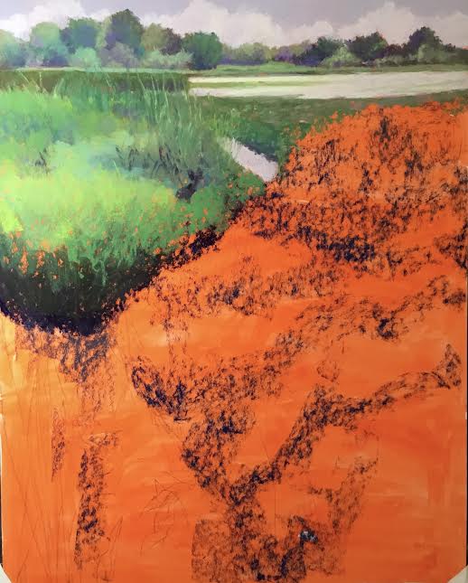
Darkened bottom; right side was daunting!
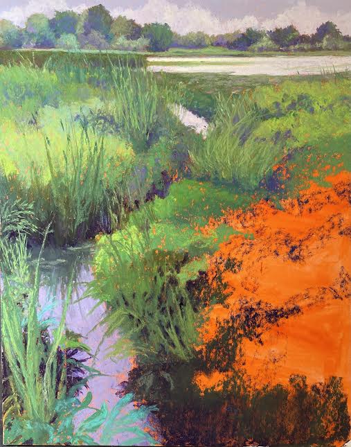
Painted in but not done
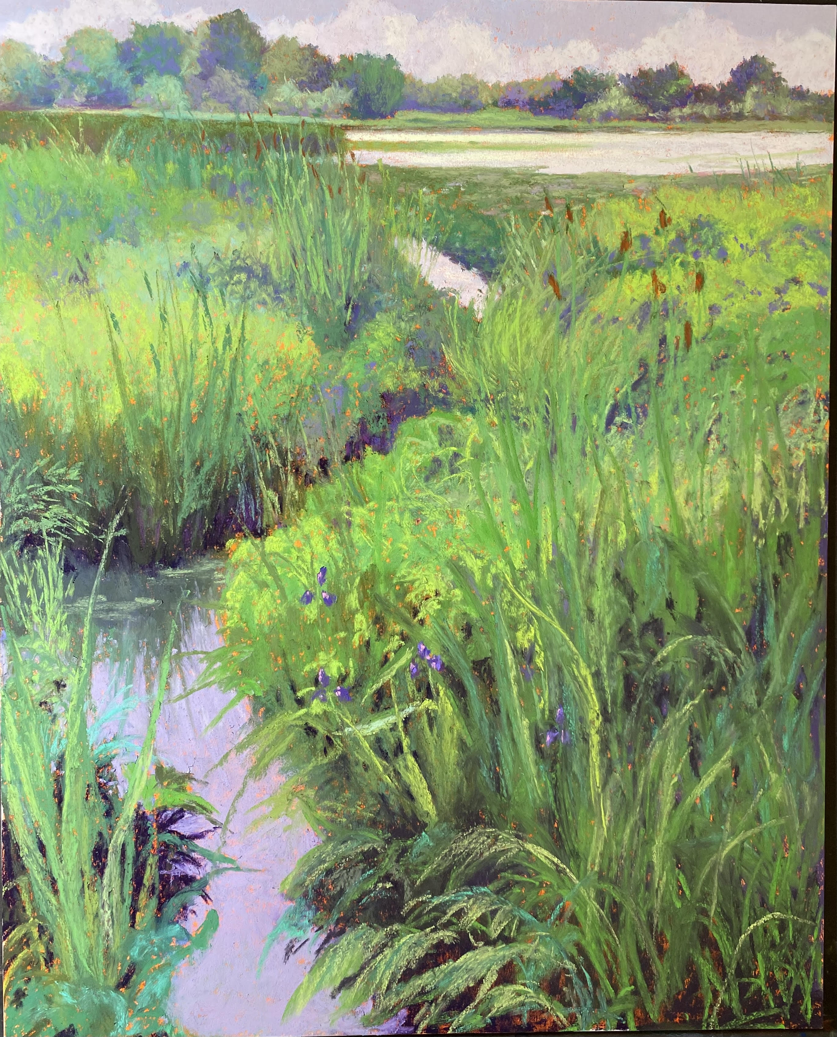
I completed a second painting from Litchfield, CT today. I decided that a vertical 16 x 20 would be best and I had some mounted Pastel Premiere white medium grit in that size. It’s the same paper I just worked on, only the other was not mounted. What a difference–it was awful!!! I toned it orange and that was a mistake. It didn’t take the pastel the same way at all. So it was really a struggle. As you can see from the hard pastel that I applied, it left pock marks in between. It didn’t go on smoothly at all like it did in the last painting.
But I loved the composition and knew I wanted to do it from the minute I took the picture. The pattern of the water leading tothe background really excited me. Doing complex grasses like this when they are all green, however, means having to find or create patterns in them. I did that with the lighter yellow greens. I used a combination of rounded strokes for “rounded” bushes and vertical strokes for grasses. Fortunately, you can make up a certain amount of it!
For the top, I used a grayed violet for the sky and various Girault and Blue Earth violets for the clouds. I wanted it to look like the overcast, rainy day that it was. I used a combination of greens and violets in the distant trees and liked the effect, so I continued it below, using pieces of various violets in the shadowed areas of the grasses. The first four pictures were done using the photo. Today when I went to finish it I didn’t look at the photo at all. Instead, I decided to focus on what I thought was needed. I added some lighter color to the area of water around the grass reflections and that made a huge difference. I removed the dark shadows in the water from the lower left side as they didn’t read well. And I worked at getting a pattern of yellow greens going to give structure to the painting.
I knew I wanted to add the lovely purple flag iris, that I found in other areas. It’s barely visible but you can see it on the right side by the water. I also could not resist adding in a little red winged blackbird to the grass in upper right. They were all over there, so I really didn’t need to make him up!
I’m really happy with this painting now, but I wasn’t happy with the experience of painting it! I’m going back to the unmounted paper in 20×24, and I have one sheet of Lux Archival left for an 18 x 18.
On another note, I’m in the process of having my book republished! It’s going to be available in soft and hard cover and I’m hoping that a publisher will pick it up. I’ve had so many complements on it over the years. So I finally decided to do it. I hope it works!!! I’ll let you know.