
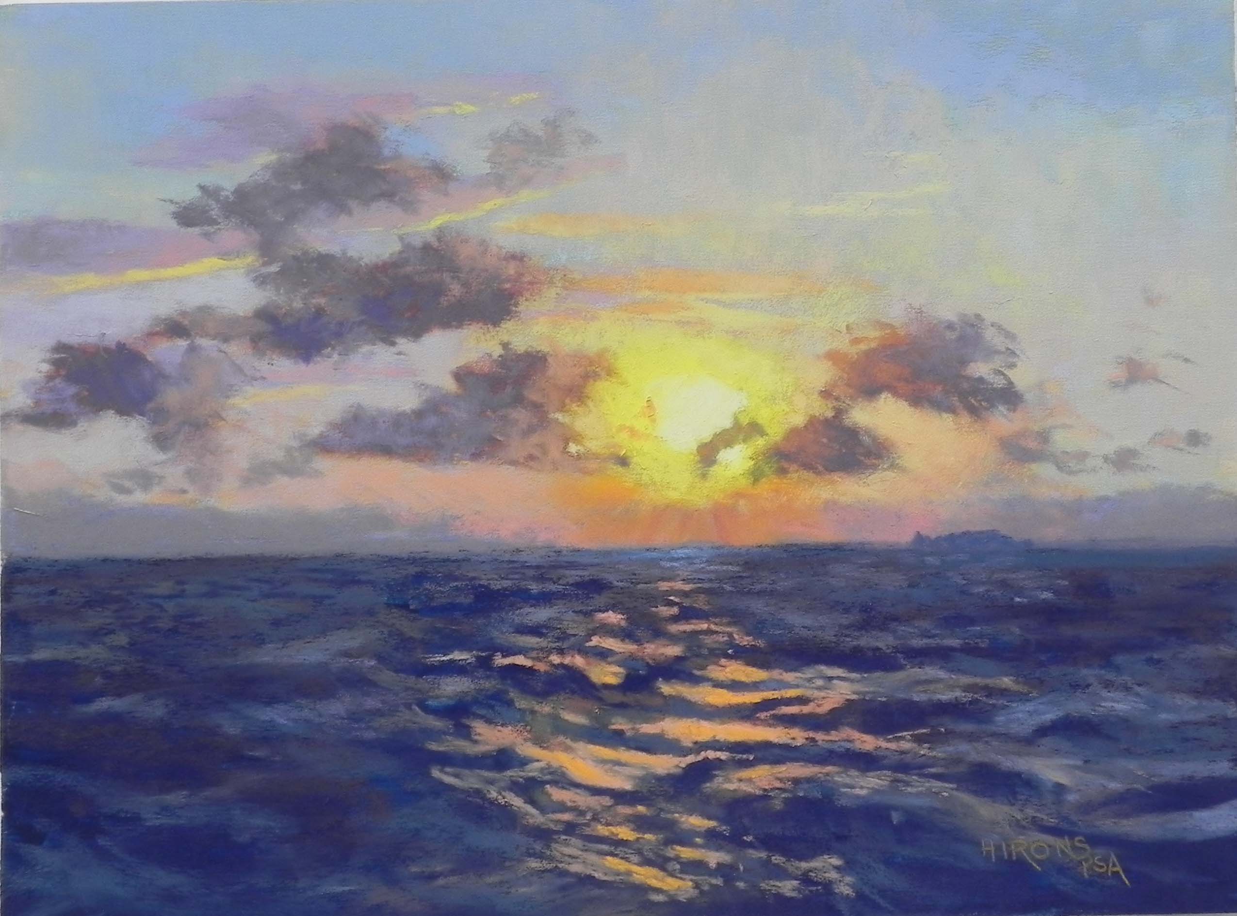
San Blas sunset, no. 2, 12″ x 16″, UART 320
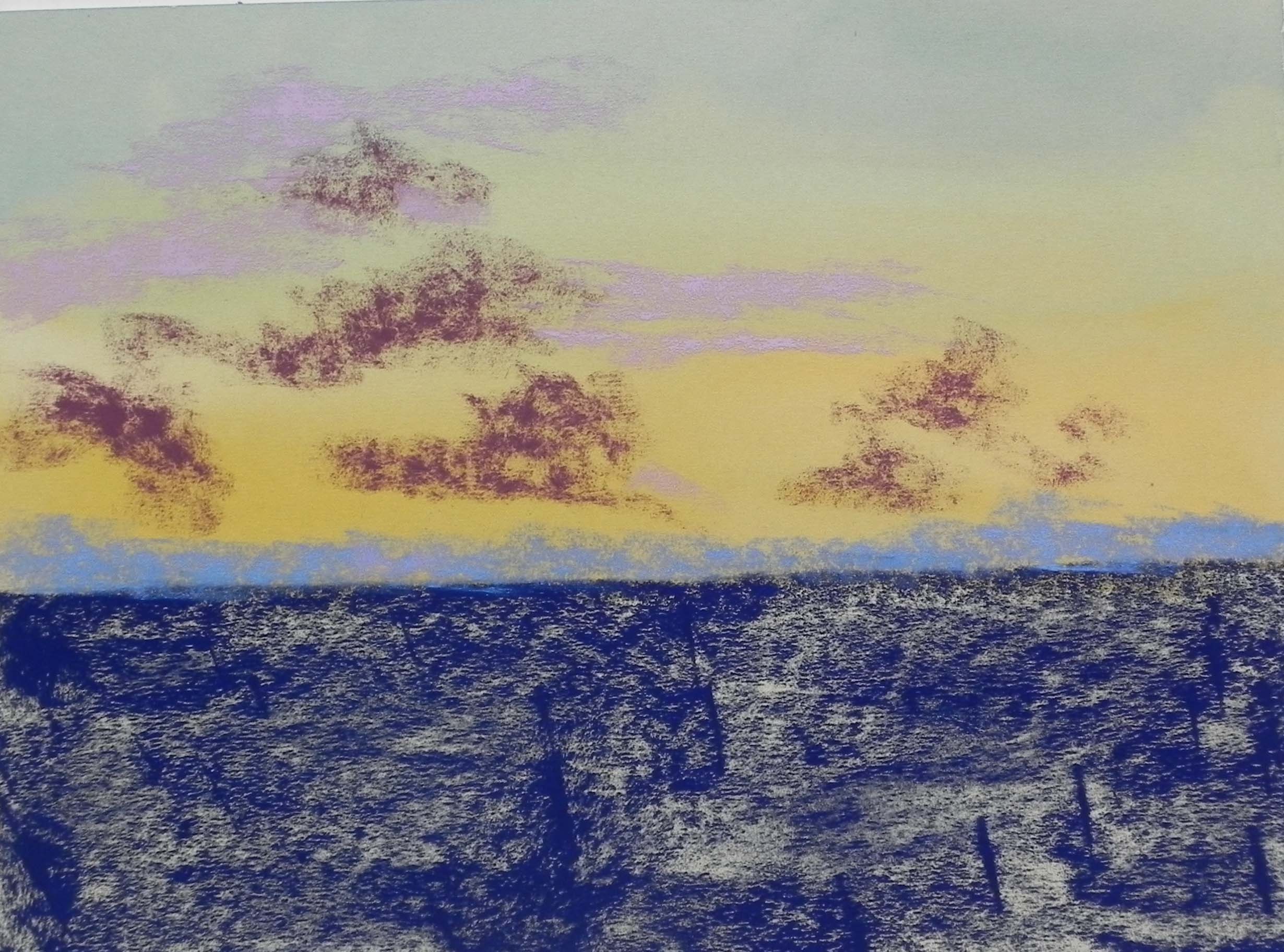
Water color and hard pastel underpainting prior tio alcohol
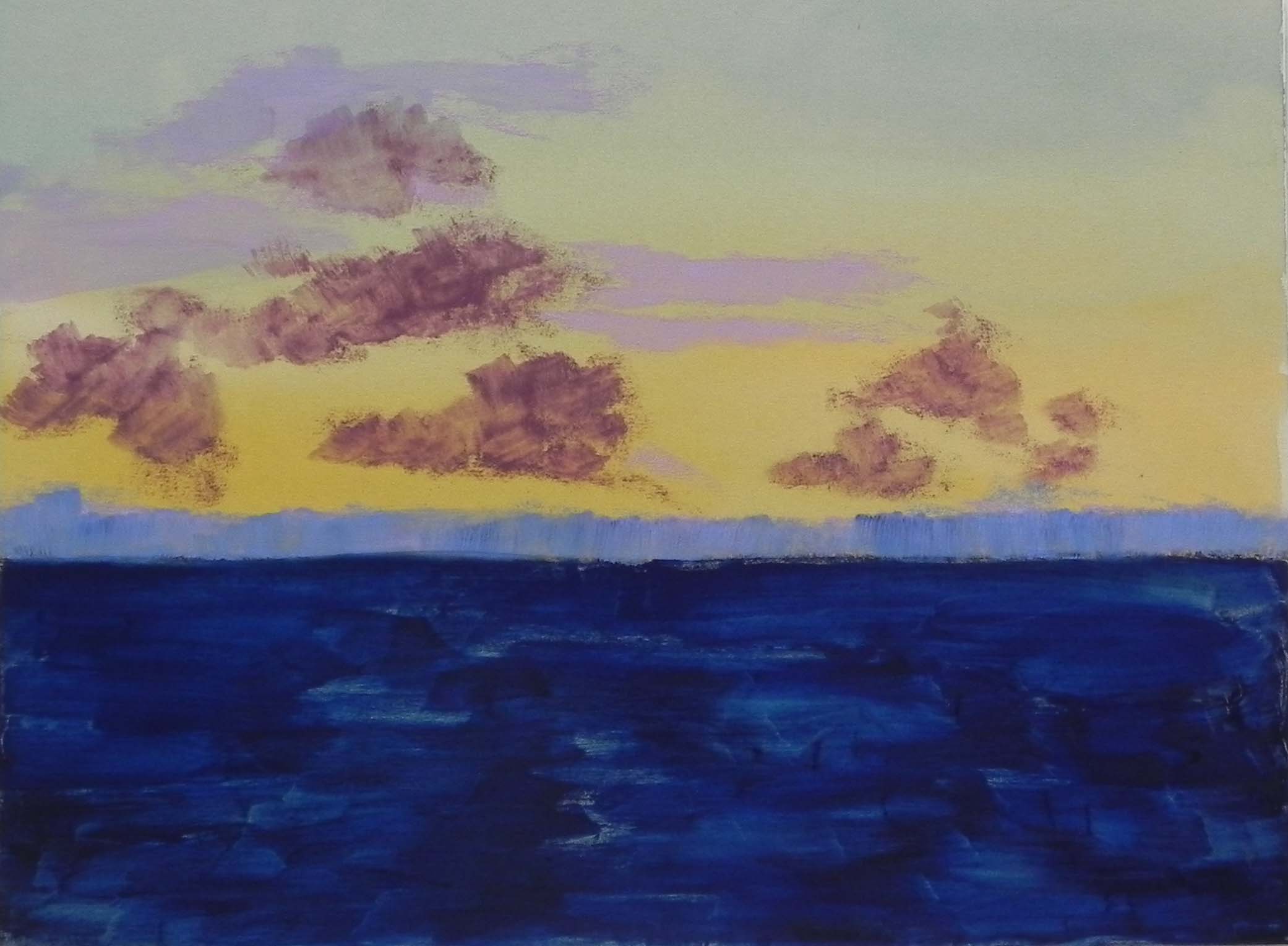
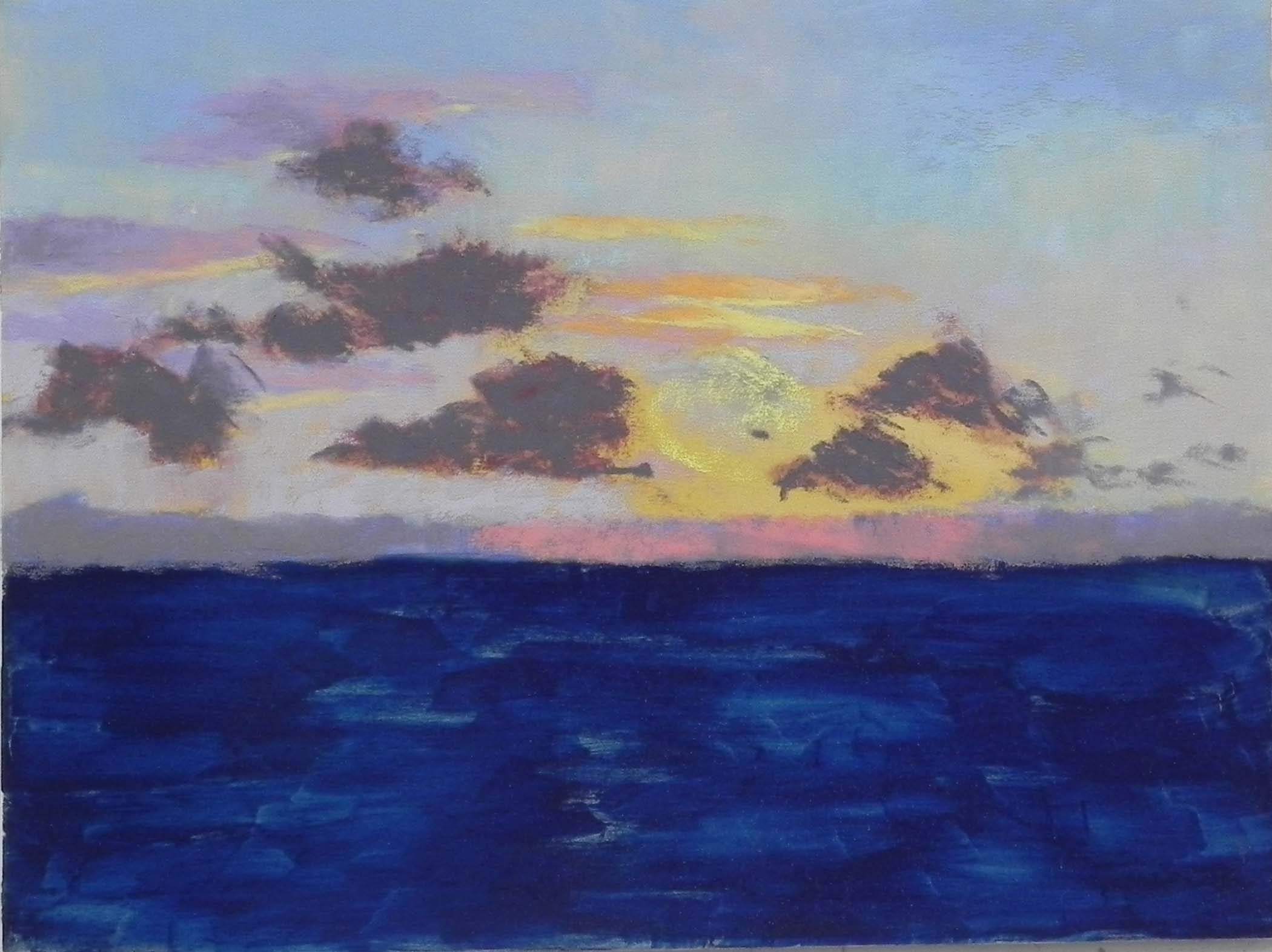
Finished underpainting
Step 1 sky
Step 2 clouds
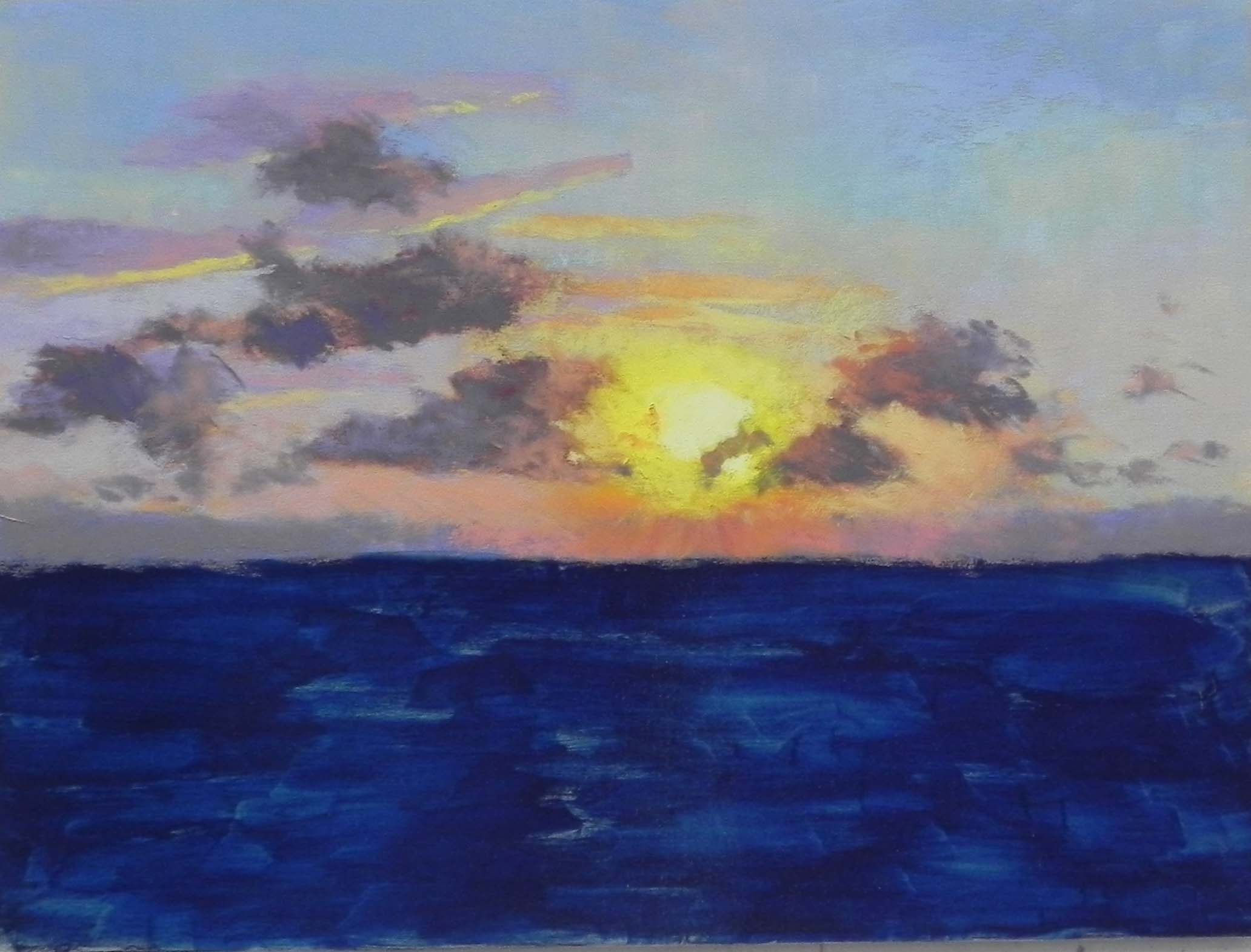
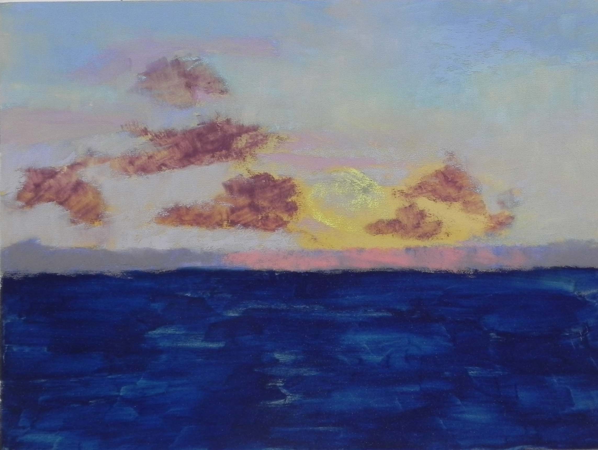
Step 3 Sun
On this rainy cold Thursday I’m going to add two new blog posts for paintings I finished last week. This one is my Wednesday morning demo and the second of my sunsets. They are both now framed and hanging in my studio! For this second one, I was more challenged with the photo. It had white clouds in the upper left corner that I didn’t like and chose to omit. And in this one there is reflection on the water, which is choppy, unlike the calm sea in no. 1.
Like the first, I decided to do a watercolor underpainting for the sky and hard pastel for the water and clouds. There are two layers of clouds: distant clouds that are warmed by the sunlight, and closer clouds that are darker. Having gotten rid of the white ones, I added more of these two categories. In laying in the sky I used some pan pastel to show the class how they work, but pretty quickly resorted to Giraults! They go on much faster when one is doing a demo! In step 1, I roughly laid in where the sun would go but didn’t want to put it in right away. I focused instead on getting the sky the way I wanted it then softening the color in the clouds. Then, in step three I added the sun–a bright, very soft deep yellow with a soft whitish yellow in the middle and oranges around it. It really popped! The final, and most difficult part, was putting in the water. As I noted, it was very choppy when I took this picture (on the way to San Blas, actually). I began by using three values of cool blue to indicate the waves and water. I then found a dull orange soft pastel that seemed right and indicated the light. But it wasn’t quite bright enough. I went to a more yellow orange and it didn’t look right at all. So I brushed it off and found a brighter true orange that I only added in a few of the major light pieces. This seemed perfect as it produced more of a glow. I did a little finger blending of the waves but not too much.
The last step, following the demo, was to fix the clouds. I didn’t like the diagonal line they were creating on the left (see step 3). So I extended the top cloud with a light piece to break it up. As in the other painting, I added a small hump on the horizon on the right to indicate one of the little cays.
This demo took longer than the first and was more challenging. But I’m quite pleased with it and the two paintings–framed in light gold plein air frames–look great together.