
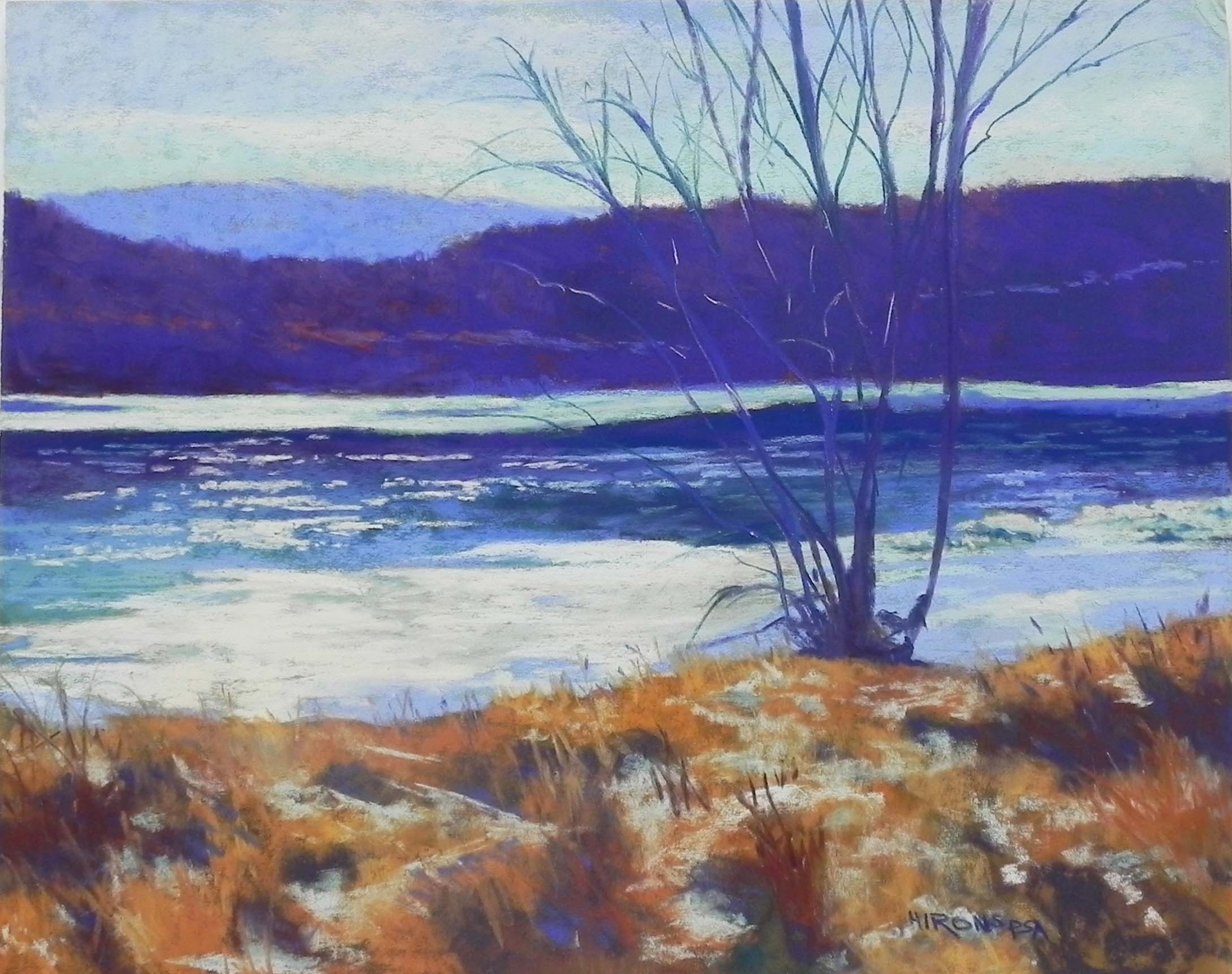
Sunlight on the Delaware, 16″ x 20″, UART 320
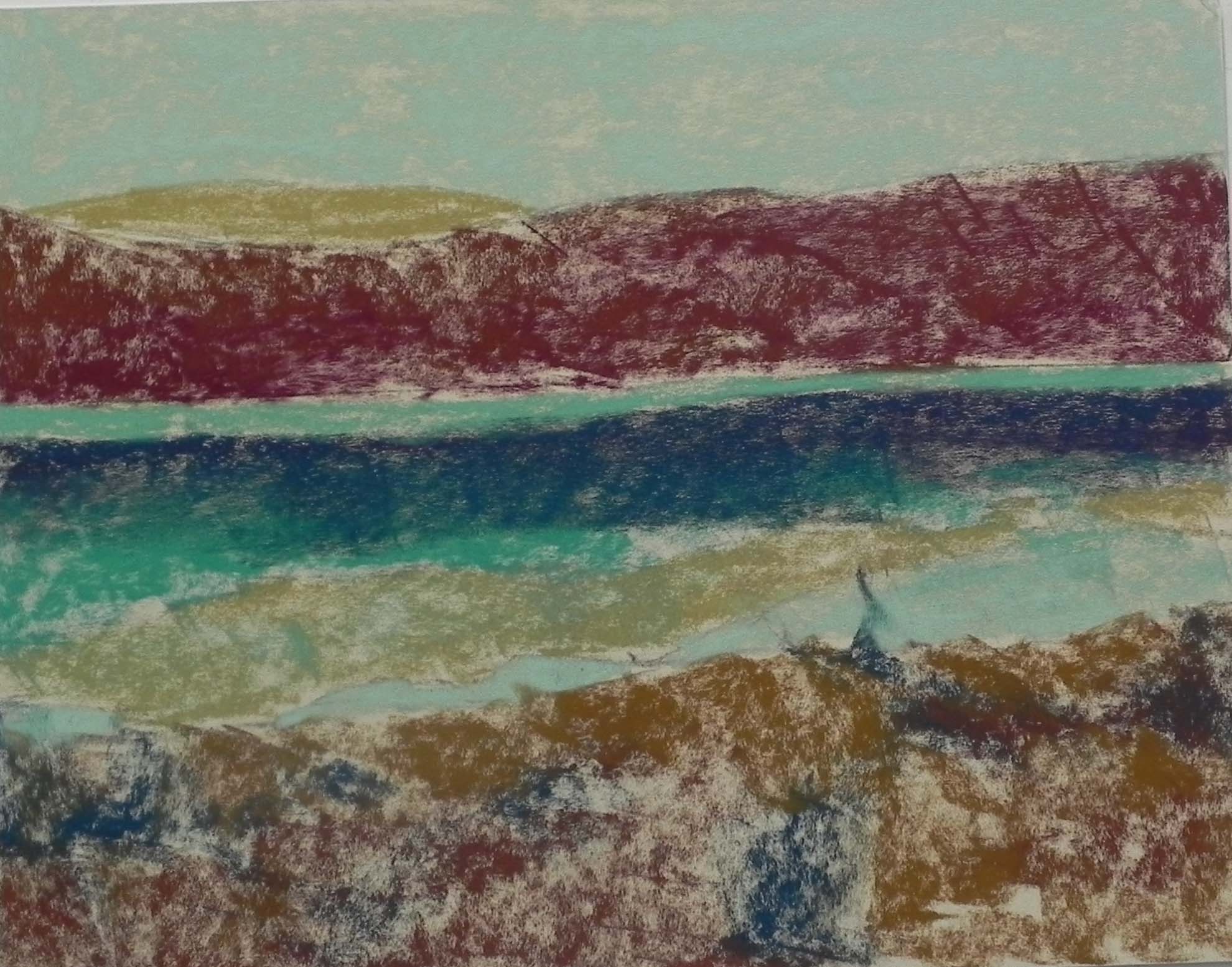
Underpainting, stage 1
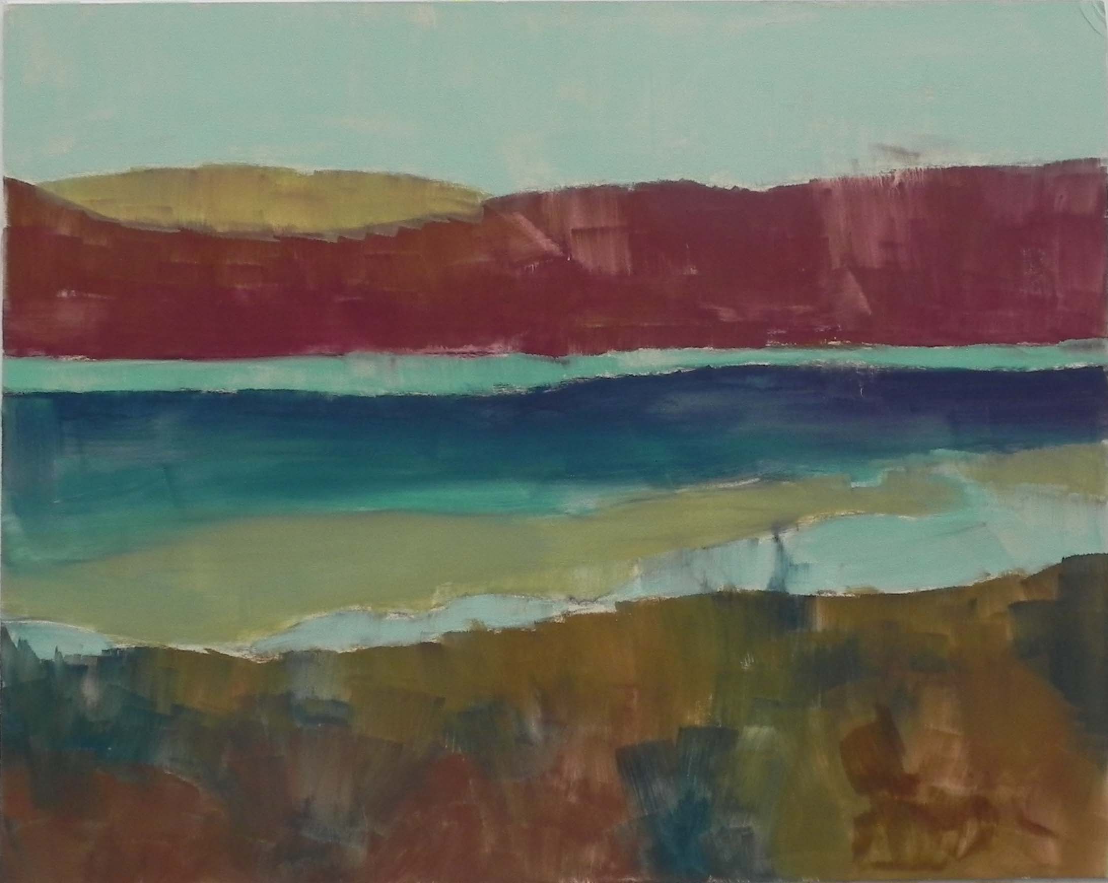
Underpainting, stage 2
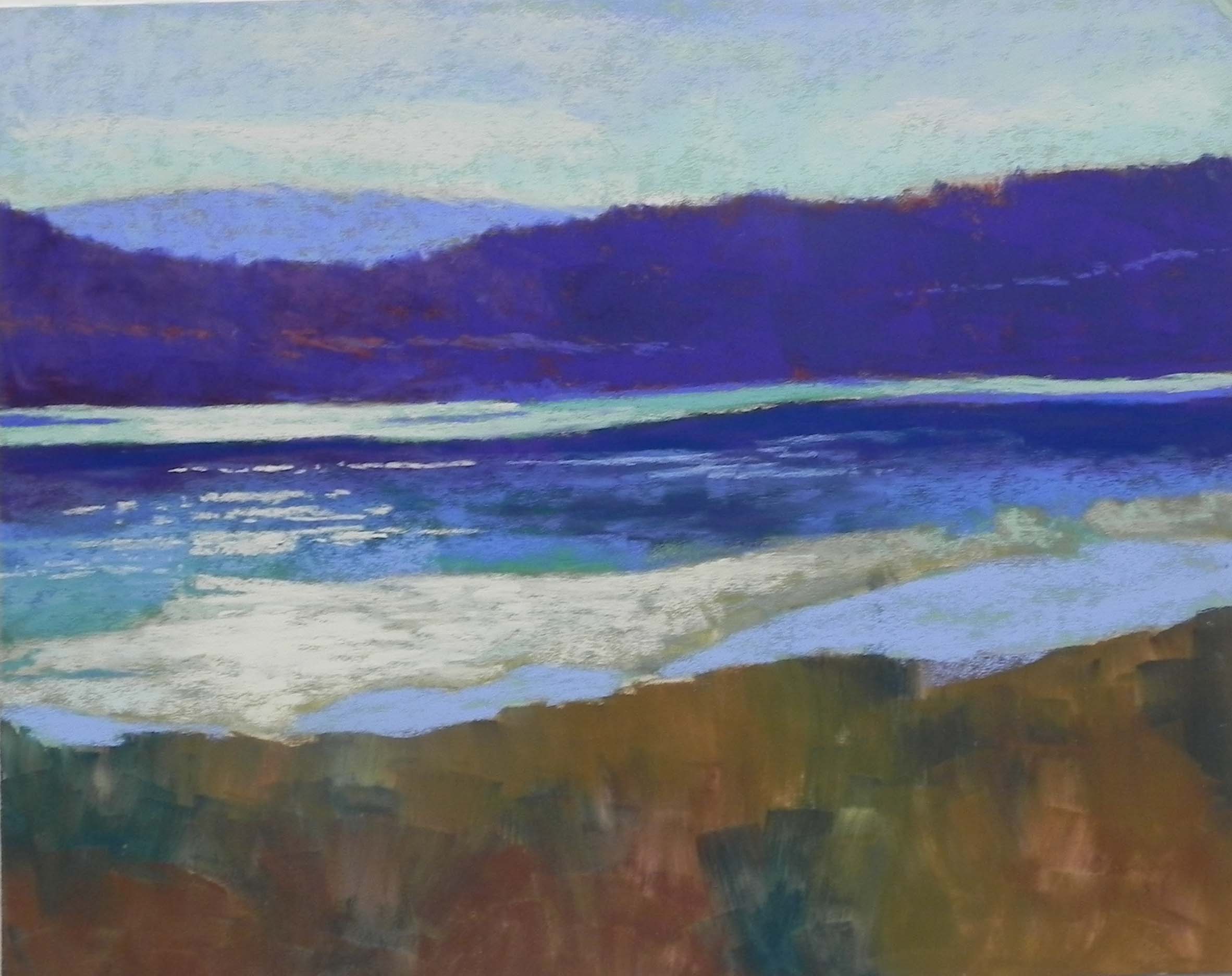
Partially completed
Today was a very happy day for me! Not only did I get to do a demo for a lovely group of students, BUT I’m really happy by the results of Super Tuesday. Feeling a lot more hope than I did a week ago. So, now back to the art. I did the demo for my Wednesday class, plus a couple of new people from Saturdays. I chose a photo taken alongside the Delaware River in the Delaware WaterGap, probably from December of 2016. There was a light dusting of snow on the ground but what was really striking was the light on the ice. I liked the composition with the lovely tree and the warm grasses in the foreground. The scattering of snow also made it interesting, but I wasn’t quite sure how I was going to do this — I think it’s a first!
For the underpainting, I chose warm under cool/cool under warm for the mountain/tree ridge and the ice. But I decided to use a light cool green for the sky to give it the feeling of winter. And for the foreground–the most complicated part, I decided to use several browns and a violet that would be darker and duller than where I’d be going but that wouldn’t have to be completely covered. For the water, i wanted to just go with dark blue to begin with, but decided I had to add some of the colors from the tree back and sky as it’s what’s creating the color.
For the sky, I began with several blue violets, then blue greens on over. I used a Ludwig very light orange to get clouds in there, softening them with more blue green. Went back and forth over it several times until I was happy.
The background mountain was the easy part! But I started a little too light and had to darken it once I’d added the tree ridge. For the ridge, I began with one Ludwig dark blue violet over all of it. Then I used a dark red violet and a softer warmer, red violet on the left side (where the light is) and a dark, cool blue on the right. For the distant road that is visble through the trees (of sunlit top of a field?) I used a grayed reddish brown. I’m not sure how well you can see the subtle differences in the online version, but we all liked how it looked in the painting.
The water and ice were pretty easy. I used a variety of blues in the water, and some of my turquoise set to begin the ice. I wanted ot be sure that the background strip of ice would be a little cooler and not compete with the foreground. To begin the large ice floe, I used a beige and a light turquoise and liked the combination. Then I added my lightest yellow in very saturated strokes to achieve the sense of light hitting it.
Next I did the tree, using first a Ludwig blue violet for the bigger branches, followed by a hard NuPastel for the smaller ones. That completed the easy part!!!
I started slowly with the foreground and found myself getting too fussy. So I quit that and used Giraults to lay in areas of lighter and darker grasses throughout the bottom, using some violets and blues in the shaded areas. Then, I used one of my light turquoises and very lightly started applying it to the browns and it worked. Liked it even better when I got bolder and used the side to make some diagnonal lines. Within intending it, I seem to have made a pathway from the bottom left up to the light.
This was fun and had enough challenges to make it a good teaching experience.