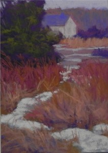
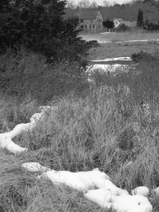
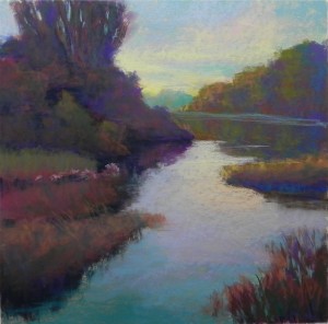
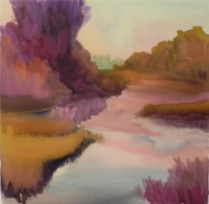
This scene really excited me! I loved the dark tree, open marsh with distant house and the snaking piece of light snow leading the eye into the middle of the picture plane! The color in the photo was almost non-existant. I envisioned using reds for the bushes and warmer earth tones for the grasses and played with a neutral color for the house that is lighter in value than the blue gray that it actually is. I also simplified the background. I will definitely do this in a larger format, no doubt refining the colors, which may be a bit bright. The shape of the board did not allow for the roundness of the tree, which I really like, so I will pay attention to that when selecting a surface on which to work–probably 11 x 14 or 16 x 20.
Monthly Archives: February 2013
Snow studies
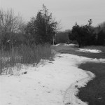
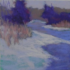
Here is one of the color studies I did yesterday. The photo in color almost looked black and white, there was so little color! But I like taking pictures of snow on an overcast day when the snow is the lightest shape in the composition. Once I turned it into black and white, I could see all kinds of possibilities that the color photo might have prevented me from using. I started the 6 x 6 color study with cool hard pastels and did an alcohol wash. The aqua I used under the snow can still be seen in the lower left corner. I mixed warms and cools over one another. The lightest light is a very light Ludwig pink, which I used sparingly. The tree forms need refinement and variation in value. But I find the overall composition and color scheme to be very pleasing and will probably move on to a larger format.
Workshops
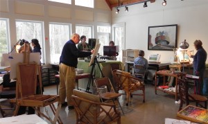
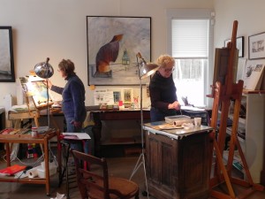
From left: Claire Tremblay (behind easel), Nicole St. Pierre, Colin Browning, Mary Sexton, Janet Gendreau, Helen Bryant, Sarah Brown
I had a wonderful time in Massachusetts with 8 very talented artists. We meet in the beautiful studio of Sandy Bilodeau and the setting is perfect for creativity and sharing. The two themes for this workshop were broken color and loosening up. My first day’s painting really encompassed both of these, the second was less successful! But my struggles gave the opportunity for others to offer solutions and that was great.
Teaching is something that I thrive on. I am fortunate to have groups of people in Maryland and Massachusetts who I can teach on an ongoing basis. But I’m also planning to develop a 3-4 day workshop based on my book that I can give to others. There are many people giving plein air workshops, but what I’d really like to teach is how to successfully work from photographs. While it’s often considered tabu, most of us do it and sometimes not that well! More and more, what I thrive on is working from black and white photos, focusing first on shapes, then using an intuitive approach to the color. The creative process begins when I see something and snap the photo. Then I can play with it on the computer (cropping mainly) and do small studies that might lead to a bigger painting. In my next post, I will show some of these studies from my trip this past week.
If this is something that you think others in your area, or your pastel society would enjoy, let me know. My schedule for 2014 is fairly open. I teach from late Sept. to early April on Mondays and Tuesdays, but have a little flexibility. From April to early September, I can be available to give a workshop. You can email me at: jeanhirons@comcast.net.
In other news, you can read an interview with me at http://laboocks.blogspot.com/2013/02/an-interview-with-artist-jean-hirons.html. Thanks to Lori-Ann Boocks, whose beautiful paintings were recently shown at my church in Bethesda.
Using Intuitive Color
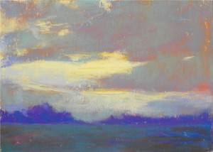
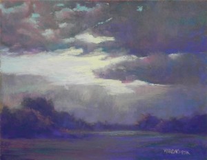
For my advanced class this week, I was to do a demo on working from a black and white photo using intuitive color. Last Monday I spent time doing color studies and chose the one given in this post. I liked the use of warm color under cool. When I began doing the demo, however, I began with warm, moved to blue greens, then started using cool pinks and majentas! All of a sudden I had a completely different color scheme! But I liked it and decided to stick with it. My challenge was what to do with the sky. I began with very light aqua and pinks, to keep with the cool red and greens. then put in the lightest soft yellow that I had. It is noticeably cooler than the yellow used in the color study but it definitely added brightness. It has more of a silvery quality, I think. The 11 x 14 format gave more room for the land and I decided to add a layer in the front so as not to have the solid line going across the bottom. The resulting picture is darker than the study, but I like it. I’m considering doing it again on a 16 x 20 pastelbord to see what happens that time. If I do, I’ll post it! The main lesson here is to let the painting speak to you. Once I started going in a new direction and liked it, I kept with it and put away the color study. I may frame both!
Abstracting
- Underpainting for Marshscape
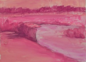
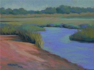
Next week I’ll be in Mattapoisett, MA giving a workshop to a wonderful group of people I’ve been with since 2009. One of our topics is loosening up to incorporate more abstraction in our paintings. While I will never be a purely abstract artist, l like to begin my paintings with strong abstract shapes. It was the shapes of the water, foreground grasses and sand bank that drew me to this image from Mattapoisett. I’m going to do a demo from it next week and decided to do something today in advance. I worked from a black and white photograph so as to be completely free to chose my colors (one of the ways I like to loosen up). I decided to play with two things I seem to have a hard time with: 1) using more of a blue green palette and 2) using a tonalist value scheme. I began with a hard pastel underpainting in various reds. In laying on the initial colors, I tried to let some of the underpainting show through. Over time, I cancelled most of it out, but there are still bits and pieces poking through. I used a mid light blue green for the sky, later adding a little blue violet to relate to the violet in the water. A hallmark of some tonalist landscapes is a darker sky that is not in strong contrast with the land. I couldn’t resist using some strong darks in the foreground grasses and placed other small pieces of dark to lead the eye back into the channel. To offset the pinky oranges in the foreground, I layed some soft pink over the distant grasses. The only strong lights and darks are in the foreground, with the background primarily differentiated by subtle temperature shifts. I used nothing but soft pastels in the painting in order to keep it as painterly as possible. I find that the UART 400 is great for these types of applications.
Using a Light Touch
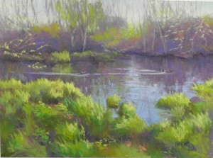
For this quiet picture, I used a different approach from my last painting. I decided that this is a center of interest painting, rather than big shape (even though the shapes are really critical in this painting) and decided to work on Wallis mounted museum grade white paper. I used a watercolor underpainting and primarily used Girault pastels. (I did not use hard pastels because I wanted to begin with more grayed tones that are not available in the hard sticks). The soft pastels were limited to the bright yellows and yellow greens in the foreground, but a lot of these are also Girault. When I work on Wallis, I like to use a light touch, barely touching the pastel to the paper. I learned this from watching Albert Handell and Richard McKinley. Wallis paper is “pastel grabber” in my definition, in that it readily accepts the pastel with little resistance. For this reason, I like to use the grainy Giraults, which can leave very soft layers without cakey build up. Compositionally, I found a number of challenges in the original photo. The photo was taken in fall, so there were a number of oranges, including the bright grasses on the far shore. I tried putting that in as orange, but it distracted from the bright yellows of the foreground grasses, which were where I wanted the eye to go. I added a third little duck in this area to enhance the center of interest (I seem to be into ducks lately!). Using greens in the background, instead of the warmer oranges and reds of the photo, helped tie the picture together. The foreground greens are so strong. I introduced a lot of the background violet into them, along with small pieces of orange. Another change to the composition was to bring the water down into the lower right of the composition. The original shape was too straight and boring. This added a degree of tension and more interesting shapes that I found pleasing. While the sky looks pretty bland, I added a number of blues to it, but kept them subtle and they don’t show up very well in the image. The quietness is enhanced by the horizontal format, the use of many grayed colors, and the subject matter of ducks swimming on a peaceful river. The only excitement is in the light hitting the foreground grasses, which I tried to limit.
The Evolution of a Painting-Part 4
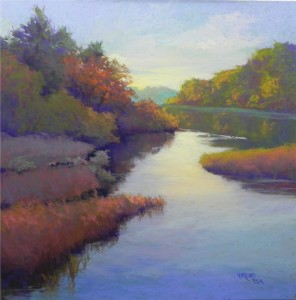
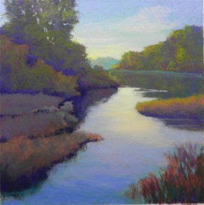
In this final version, I have changed the tree in upper left completely in order to provide more sky and make it less domineering. Actually, there are now two trees: a spruce and a tree in fall foliage to its right. I added some warmer colors to the background trees at right and to the marshes on the left. And, I decided that the reeds were a distraction and took them out! With so much busyness on the left, the expanse of water with its changing colors is a welcome relief, I feel. The light water moving to the right is being caused by three ducks–little specks of dark color that can’t be seen in this image–that add interest to the painting. This picture was a struggle in many ways but I decided that I could make it work and kept an open mind as to what to retain, change or omit. While I’m sure it could be improved even more, I’m satisfied to let if rest for now. I think that the flow of shapes and values leads the eye to background and the sunny yellow sky and the tree at left does not dominate or disturb this flow.

