Beach Fantasies

Beach Fantasy #1, 11 x 14, Richeson "terra cotta" on gatorfoam

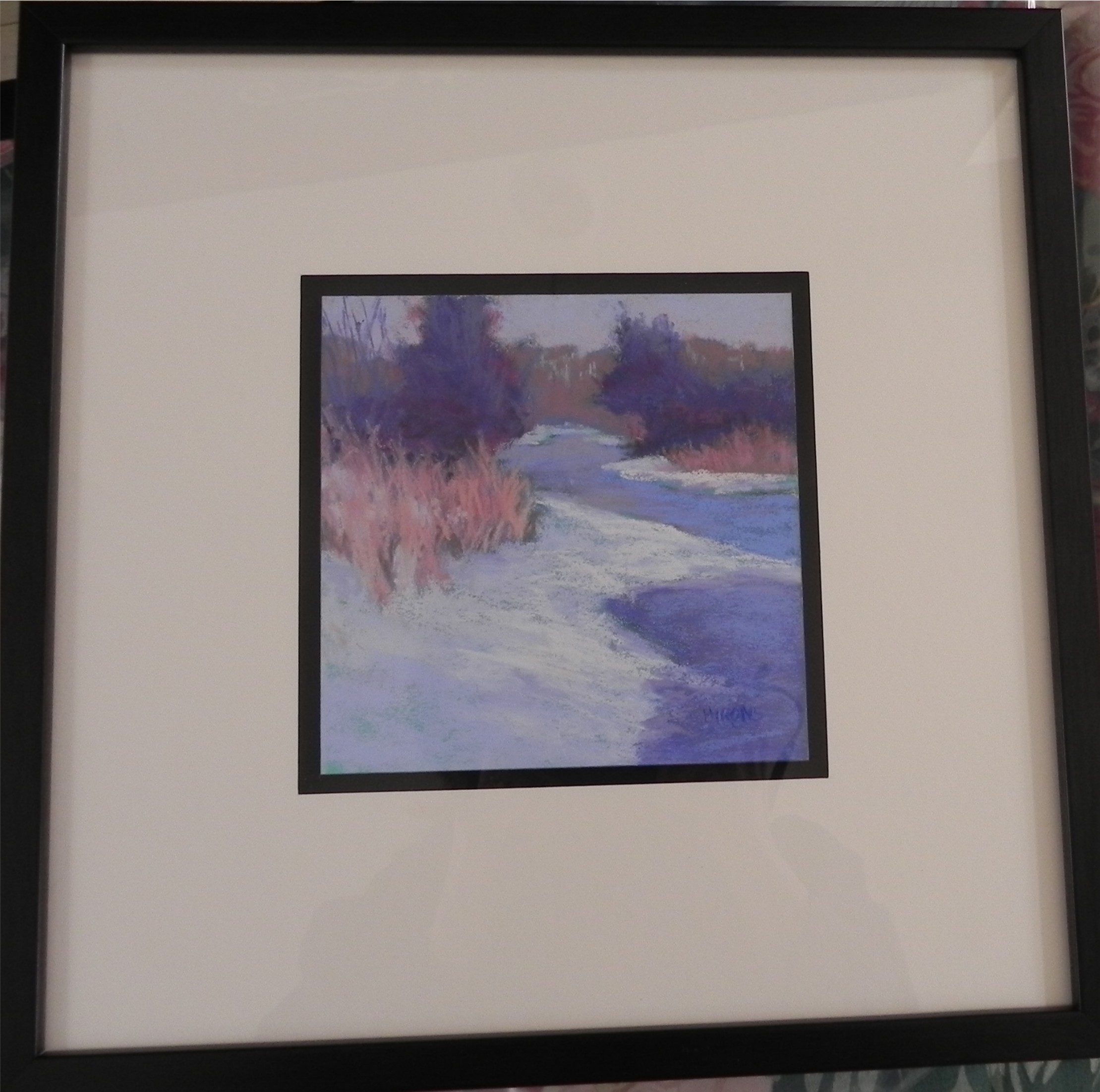
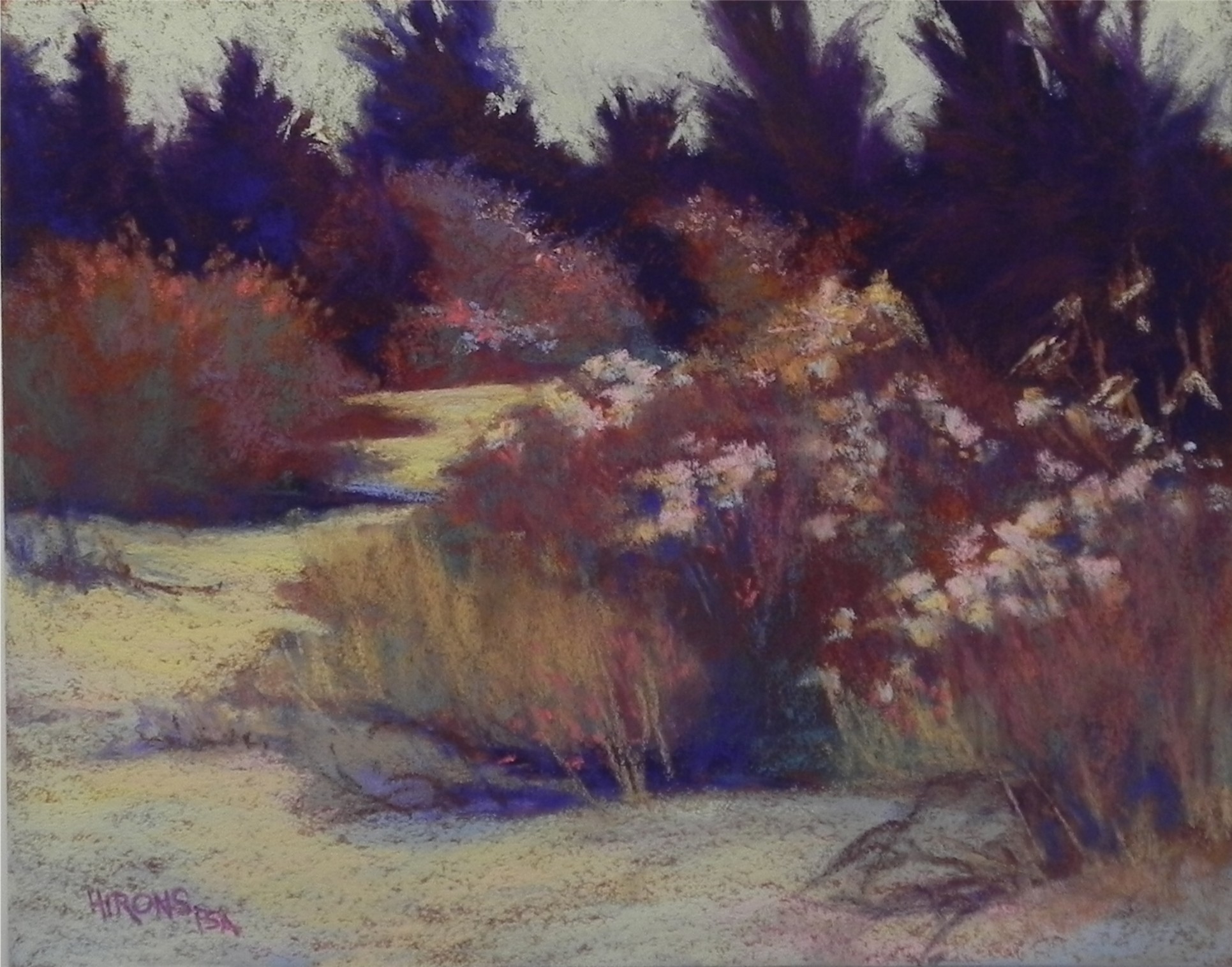
Beach Fantasy #1, 11 x 14, Richeson “terra cotta” on gatorfoam

Beach Fantasy #2, 11 x 14, Richeson "terra cotta" on gatorfoam

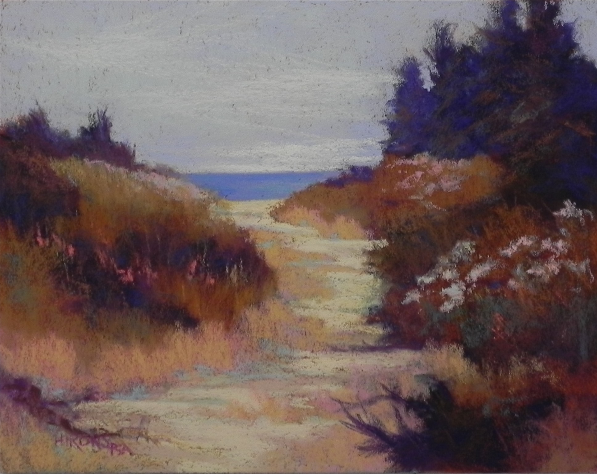
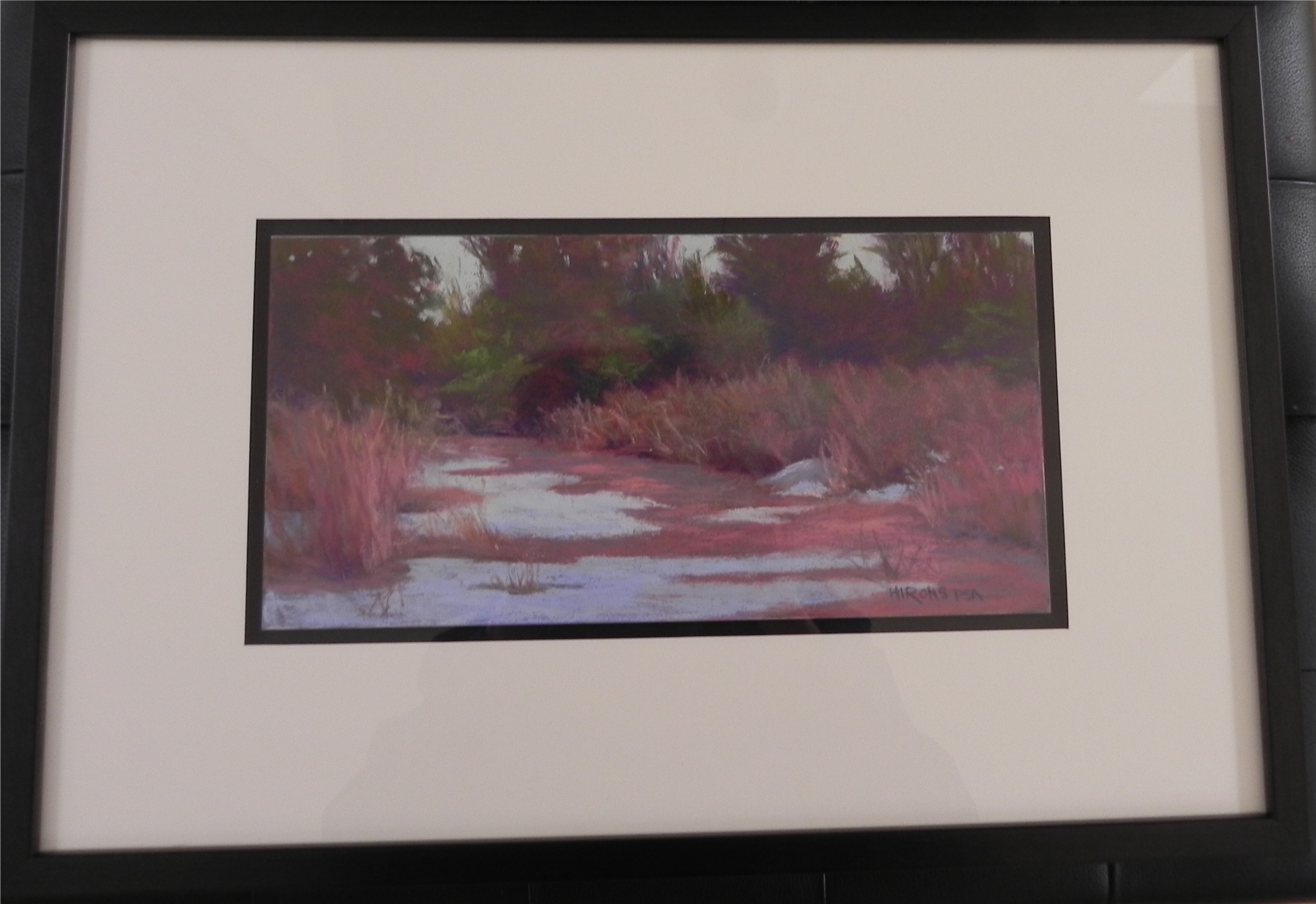
Beach Fantasy #2, 11 x 14, Richeson “terra cotta” on gatorfoam

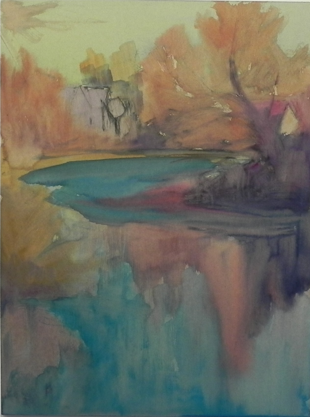
Yesterday I decided it was time for something different! I wanted to give myself the chance to play. Today is my birthday and I decided that creating a painting more from my imagination would be a good way to spend the day. The first painting was done from a black and white photo and color study, so the composition was pretty much set. The second was done from a different photo and the one I used for #1. I wanted to include the sea in this one, but I used a similar color palette.  This is about as close to abstract painting as I get! It’s all about shape, value and color, pushing here and pulling there.  Working on the Richeson was interesting as I haven’t really used it in years. It’s very rough and allows for a lot of broken color. The warm red surface was a good backdrop for the violets and browns, but I found myself wanting too much to fill it all in. The sky is more successful in the first one as there is much less of it–just pieces of color. The sky in the second was more of a struggle. There is more aqua in it, which doesn’t show in this image. I decided to add some light clouds to break it up, but it’s still reading like a large gray mass!   I’m calling these both fantasies because the colors are totally intuitive, as is the composition in the second. I have flowers on the bushes but no greens!  I didn’t want any.  Sometimes we need to get out our artistic license and use whatever colors we want!

The Color Aqua

Watercolor underpainting

Watercolor underpainting

Aqua river, 16 x 12, UART 500

Aqua river, 16 x 12, UART 500

I am well known as liking the color purple–in my paintings and my clothing. But really, the color that excites me the most is aqua–particularly when I see it in water. It was the lovely blue green that excited me most about this scene of the Mattapoisett River. Yes, I like the house and the fact that there are two other buildings barely visible. The soft reds of the early spring budding trees add a lovely contrasting color. I spent some time deciding on a surface. I wanted to use a square but opted for a 12 x 16 because I have frames!  (I have to think about economics these days.) I used the last piece of mounted 12 x 16 UART 500 and really enjoyed working on it. I relate to this surface quite differently than some others, I think. I decided on a water color underpainting to keep it loose, using warm colors in the sky. Left some of the sky showing through the light aqua pastel, but in the water I used more saturated and blended applications. I was really happy when I found just the right blue green to add to the right of the bush. I feel that this color grabs the eye and leads us into the picture (I hope!).  I will probably change the title–any suggestions?

Spring’s Arrival

Spring's Arrival, 16 x 12, UART 500

Spring’s Arrival, 16 x 12, UART 500

Some pictures are a joy to paint, others give us a lot of grief!  This week I learned that two pictures from the first category–Gracie and Fog Study in Blue–were accepted for the juried show at the international pastel convention in Albuquerque (IAPS).  I was delighted, of course. At the same time, I was struggling with this picture from my recent trip to Mattapoisett. The car was parked on this driveway and I was excited by the position of the house, the curve of the road, and the light.  There was no forsythia in the picture, but it was in full bloom elsewhere, so I decided to add it against the cool blue violet of the house.  I began with a drawing in graphite, then did a watercolor wash and lost most of my drawing!  Had to work and rework the house to finally get it right. The background trees and bushes in the foreground weren’t too bad. But the road! I brushed it off at least twice trying to get the right values and angles for the shadows. I no longer have much of a sense of it. It seems busy to me. Would welcome any comments or suggestions!  (I’m worried that my recent “up” time was ruined by a fall in Mass. and continuing back pain. Perhaps I’m now in a “down” time! Fortunately, my ups and downs aren’t very drastic, but I do find that I go periods of painting well or not so well, a common thing with many artists, I think.)

Winter Barns

Winter Barns, 12 x 16, UART 500

Winter Barns, 12 x 16, UART 500

I’m back from a week in Massachusetts. Visiting my mother and giving a workshop on the Cape, along with three days of painting with friends were the highlights. The bombing and a fall that left me with an injured back were the negatives.  This is the second demo I did for the workshop (Pastel Painters Society of Cape Cod). It’s an example of a center of interest painting. The left barn was supposed to be the center of interest but as I lowered the evergreens into the foreground and then added a tree in front, this area started to take prominence. The original photo was completely on one plane with a large, dull field taking up most of the picture!  So they all agreed that I improved on the composition. They also made me stop!  I’m not sure this is really done yet and I had to leave the picture there, but I thought I’d share it with you. This is one of the most lightly painted pastels I’ve ever done!  It’s the same surface and place as the white house in Poolesville in an earlier post. The photo for this one was so uninteresting, however, that it really needed something!  I did a watercolor wash and then applied pastels very lightly on over and redrew with graphite in places.

The Last Song

The Last Song, 12 x 16, UART 500

The Last Song, 12 x 16, UART 500

I think I’m on a western kick. I found this photo from Washington State that I tried to paint several years ago. It was a disaster!  I went into the reds too soon and I didn’t like it at all.  So I decided to try it again, sneaking up on the reds!  I did a lot of drawing and didn’t want to lose my lines. So I decided to do a partial underpainting using hard pastel but no wash. I used complementary color, putting greens under the red and dark reds under the greens. Then, because there were lots of little light pieces of paper showing through, I mooshed it all with my hands!  I then sprayed it with workable fixative. I used direct application of soft pastel for the sky and background mountains, then added various reds and oranges to the building, letting little pieces of green show through. The foreground is all Girault greens.  This was a much more successful painting than the first one. It’s my second use of the UART 500, using a very different technique. But I like the surface very much. Here is the underpainting.  I find that it’s a lot of fun looking at a photo and thinking about the possibilities of how to make it work and, since writing the book, I now have a much better sense of what these possibilities are!

Partial dry underpainting

Partial dry underpainting

On the Road to Jackson

On the Road to Jackson, 16 x 20 Pastelbord

On the Road to Jackson, 16 x 20 Pastelbord

I seem to be all over the map these days–from Maryland, Maine, and Massachusetts–to Wyoming!  This is a case of having exhausted my recent shots and being in a real painting mood.  This photo is one I’ve had in the photo book I bring to classes for student use for several years. Having just received my set of 50 Girault greens (and not having much green outside right now), I decided to try them out.  I worked on a new, white Pastelbord. The clouds and sky were done with Blue Earth pastels. There are a lot of different tones of grayed blues in them, but they look a little peaked. Using the new Giraults on the hard Pastelbord was a little daunting. They felt hard and I did a certain amount of scribbling with them. But in the end, I really liked the soft effect and the lack of cakey buildup.  One of the things I’ve always liked about the photo are the blues in the background and the combination of light blue green and yellow grasses in the foreground. Using several blue violets and the greens from my new set was perfect for achieving a wide variety of greens. I began this painting with charcoal wash, followed by a hard pastel/alcohol underpainting of  reds, oranges, and lavender.On the Road to Jackson 001

Framed studies

Framed study for Snow Space, 6 x 6, pastelbord

Framed study for Snow Space, 6 x 6, pastelbord

Path to the Sea, Framed, 6 x 12, Pastelbord

Path to the Sea, Framed, 6 x 12, Pastelbord

I promised I’d send an image or two of how I frame my paintings by floating the mat around them. Here are two that I picked up this morning. The black outline around the painting is a black mat that the board has been glued to (by my framer). The spacer was applied to the black mat and the white mat was cut to allow about 3/8″ of black showing. This can be done with two white mats to give a double matted look. Sorry I couldn’t seem to film these straight. The dark spot in the middle of Path to the Sea is me hovering over the picture!  Not perfect, but hopefully you get the idea!  I’m happy with the look of these. My larger pictures will be framed primarily with warm silver plein air frames.

A Center of Interest Painting

White House in Poolesville, 12 x 16, UART 500

White House in Poolesville, 12 x 16, UART 500

I’m working on a new surface. I ordered ProArt Panels with UART 500 grit surface some weeks ago in 11 x 14 and 12 x 16 sizes and this is my first chance to use one. I’m preparing for two workshops in Massachusetts coming up in mid-April where I will discuss the difference between what I see as “center of interest” and a “big shape” picture. I’m going to be using the UART for the first and thought I’d better try it out. To date, I’ve used the 280 (which is too rough) and the 400 (which I like a lot). The 500 is finer and more like Wallis. With the exception of the sky and the “whites,” I used nothing but Giraults on this picture and they felt just right. The surface is quite fine and the pastel goes on very easily, quickly filling the paper, so the harder Giraults are great for it. I did a watercolor underpainting and was pleased with the results. The color of the paper is such that you could work directly on it, but I wanted to use water color to see how it would work at the bottom of the painting, where I wanted to leave it unfinished. Because the paper is mounted and cut to the exact size, the edges can be difficult to cover as there is a very slight lip. But they won’t show under a frame.  This is very different from the bolder, big shape pictures that I’ve been doing for years now. But it was a pleasure to do and, who knows, maybe my style (like my eyesight) is changing!

Daybreak, Route 6

Daybreak, Route 6, 11 x 14, pastelbord with gel

Daybreak, Route 6, 11 x 14, pastelbord with gel

Here is another painting done on a reclaimed pastelbord. The values in this painting were a real challenge (as was the filming!).  The “black” areas of trees are a combination of dark violet and reddish brown, with a slightly lighter green on top. Getting the values of the sky and the light and dark clouds was challenging because, while the darker clouds look “dark” compared to their surroundings, they were lighter than the road and sidewalk. Darkening the lighter areas of cloud helped put it in balance. I should have used a black and white photo for help, but was lazy.  The textured board had too much texture on the top and I had a hard time getting the clouds to look right. I almost gave up on it a number of times and was wishing I was working on UART or Wallis!  But brushed-on surface worked really nicely in the road and made it very easy to quickly lay in the trees.  Hand-made surfaces can be a lot of fun to work on, but they don’t take the same amount of pastel that quality papers do, and you have to use really soft pastels once there are multiple layers. I tried using Unison in the sky and had to switch to Schmincke.  Still, I had fun doing this picture, which is yet another from Mattapoisett. Of course, this could be anywhere.