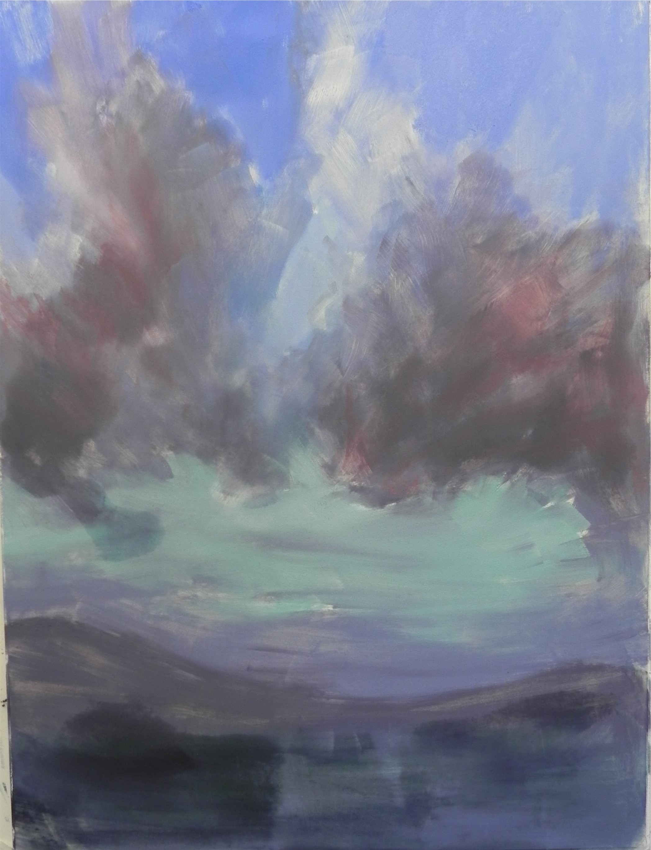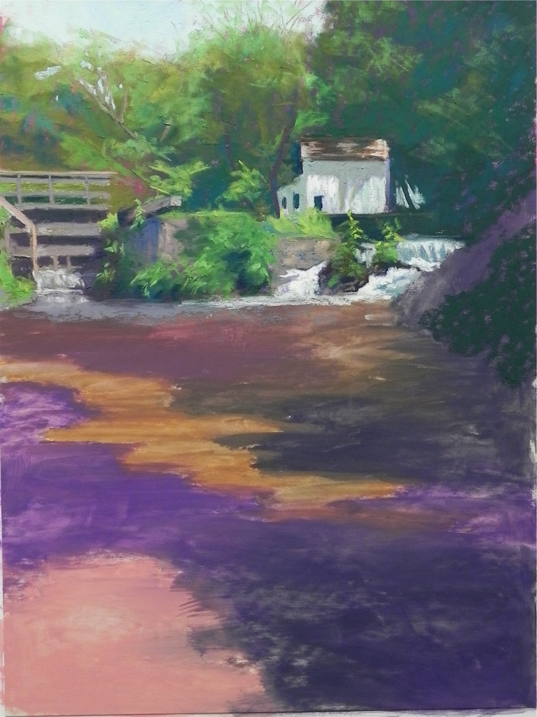
Sepowet Pastorale #2, 16 x 20, Rives BFK with AS liquid primer
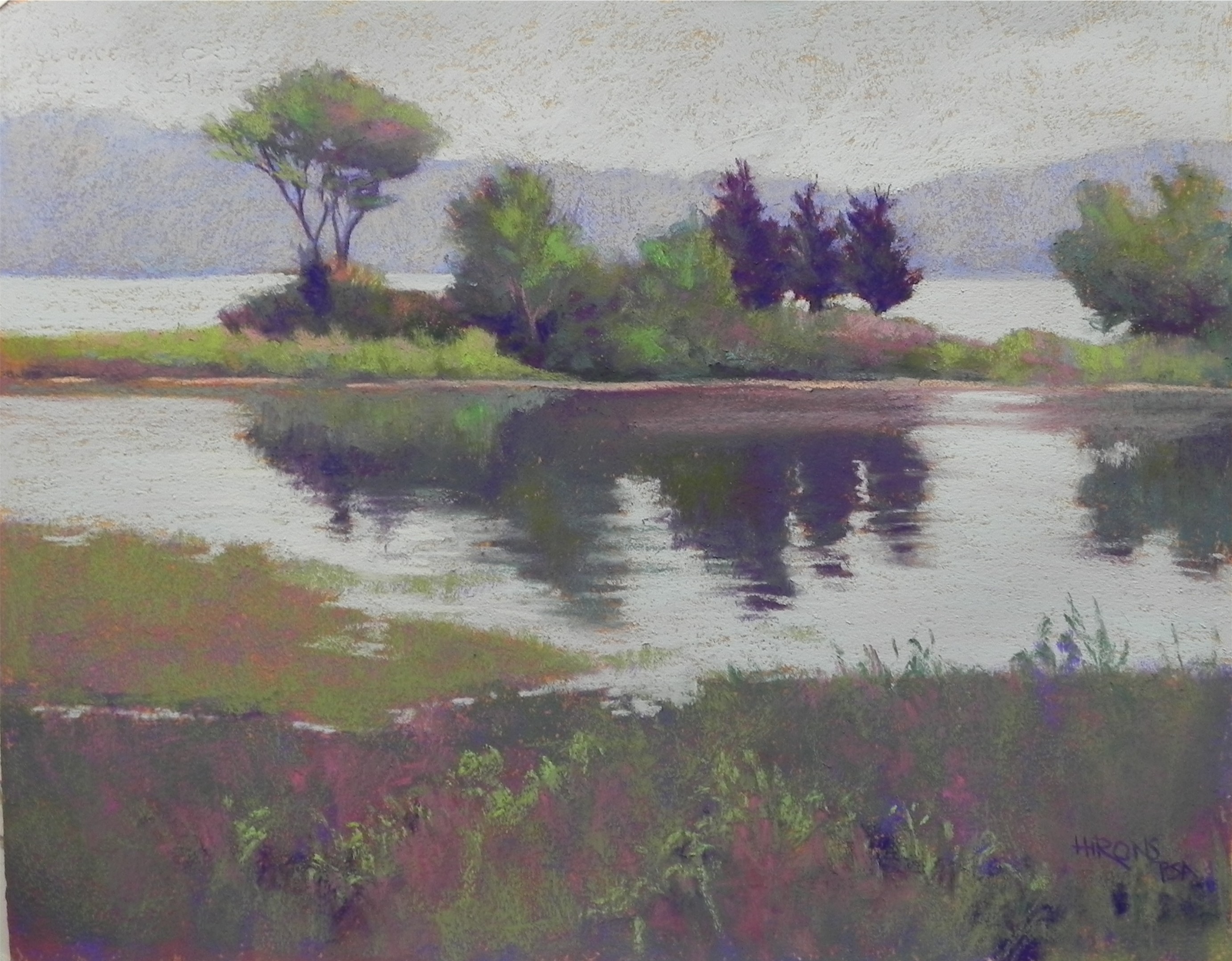
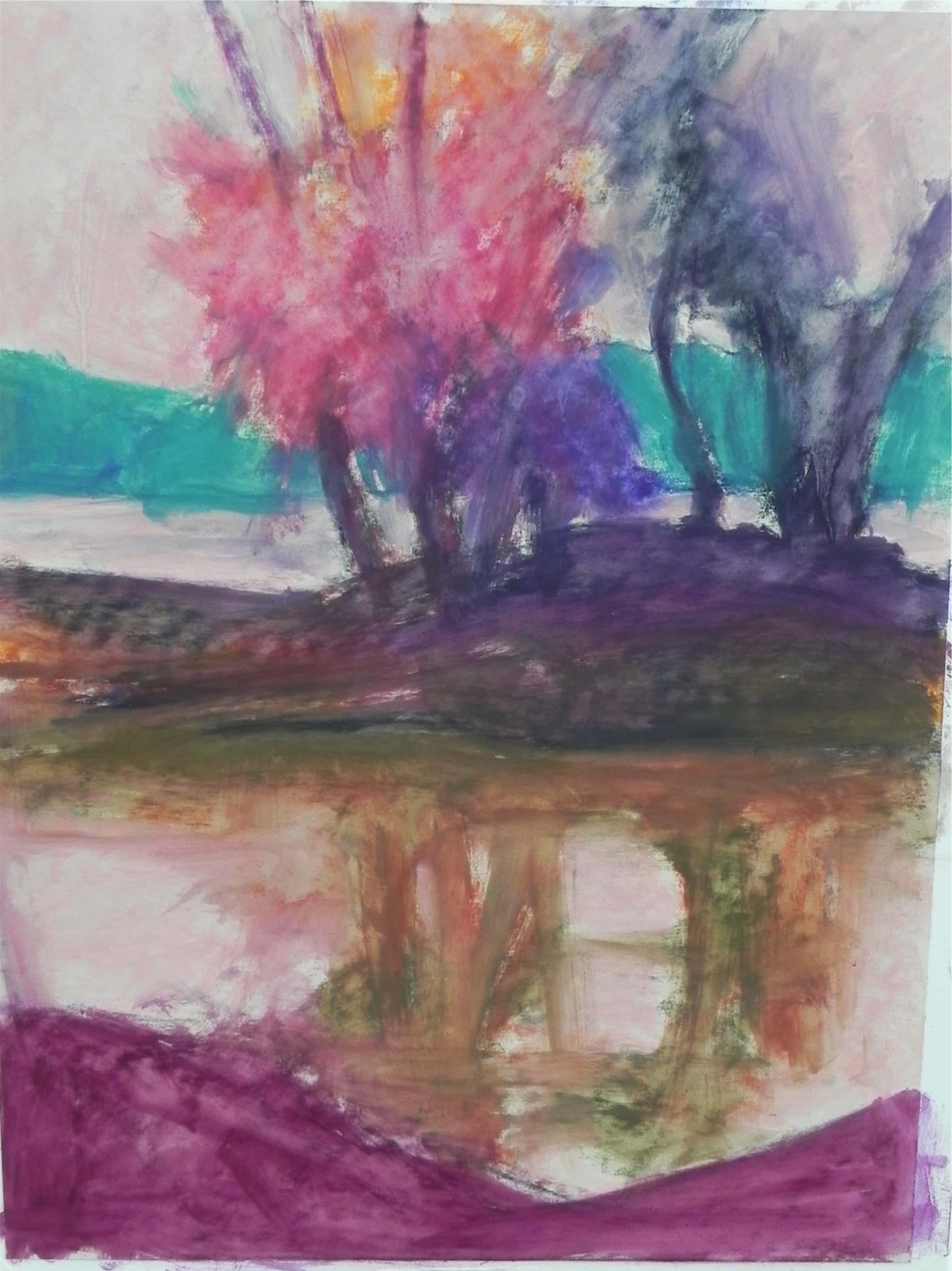
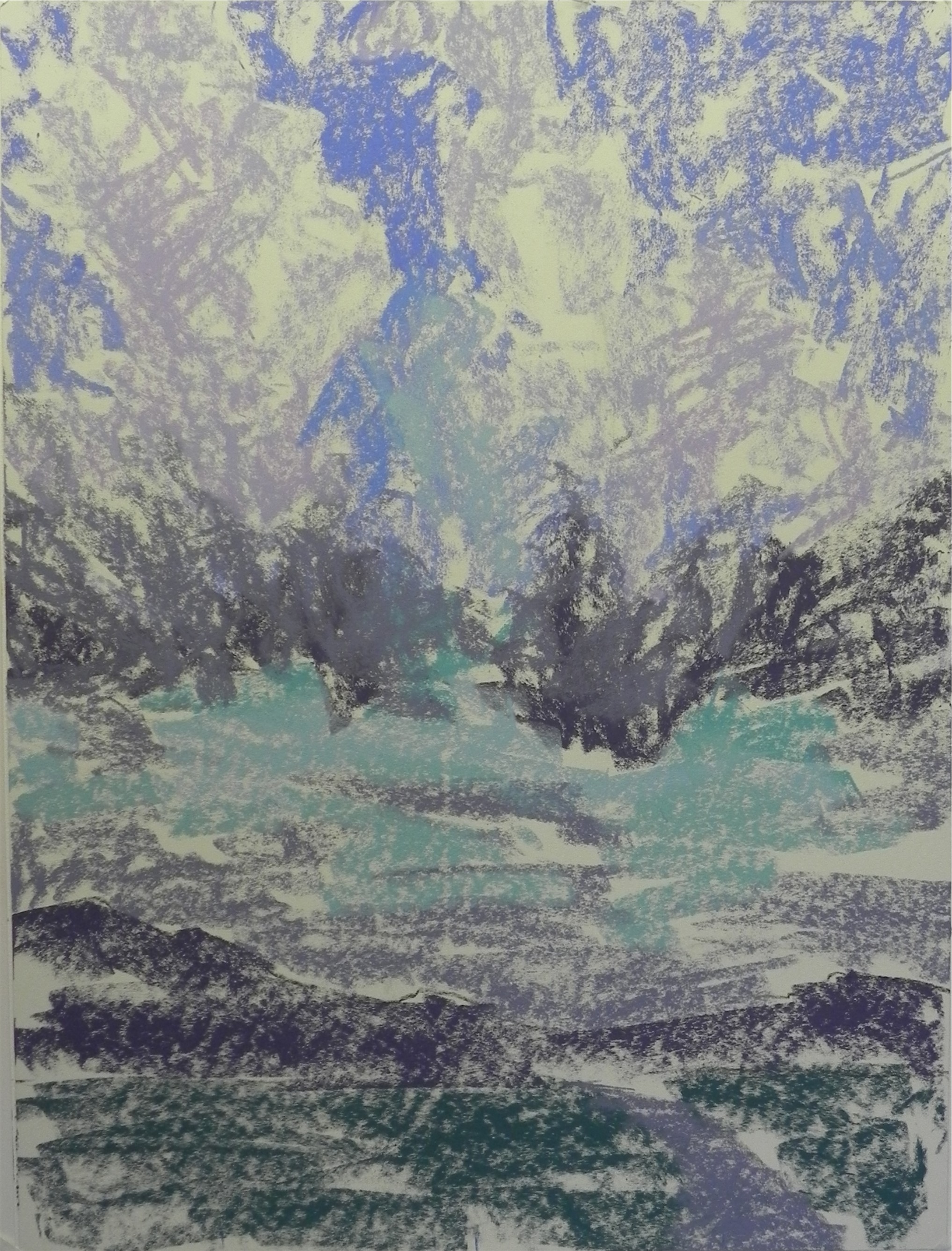
I’ve spent the last week working on two commissions and yesterday was the first chance to get back to my Sepowet series. For this painting, I toned the paper with a combination of raw umber light and raw sienna that created a lovely soft orange brown that I will use again. The first painting (#1) was done on burnt sienna. I’m including this early shot so you can see the color of the surface. I’m finding that I love working on the Rives paper. I’m beginning with Giraults, then using Ludwigs and Unisons–soft but not extremely soft. In the past, I felt that I got too gummy, but not with these paintings. It’s great to be able to use the soft pastels and enjoy it so much! As you can see, I’m not terribly interested in reality when it comes to the color. I worked from black and white again and decided to focus on greens and blues after doing several small color studies. I love using this warm green for the sky. In the center, I added some yellow to lighten it. so there would be a contrast with the cooler green at bottom. In the partial picture, you can see part of the layin, 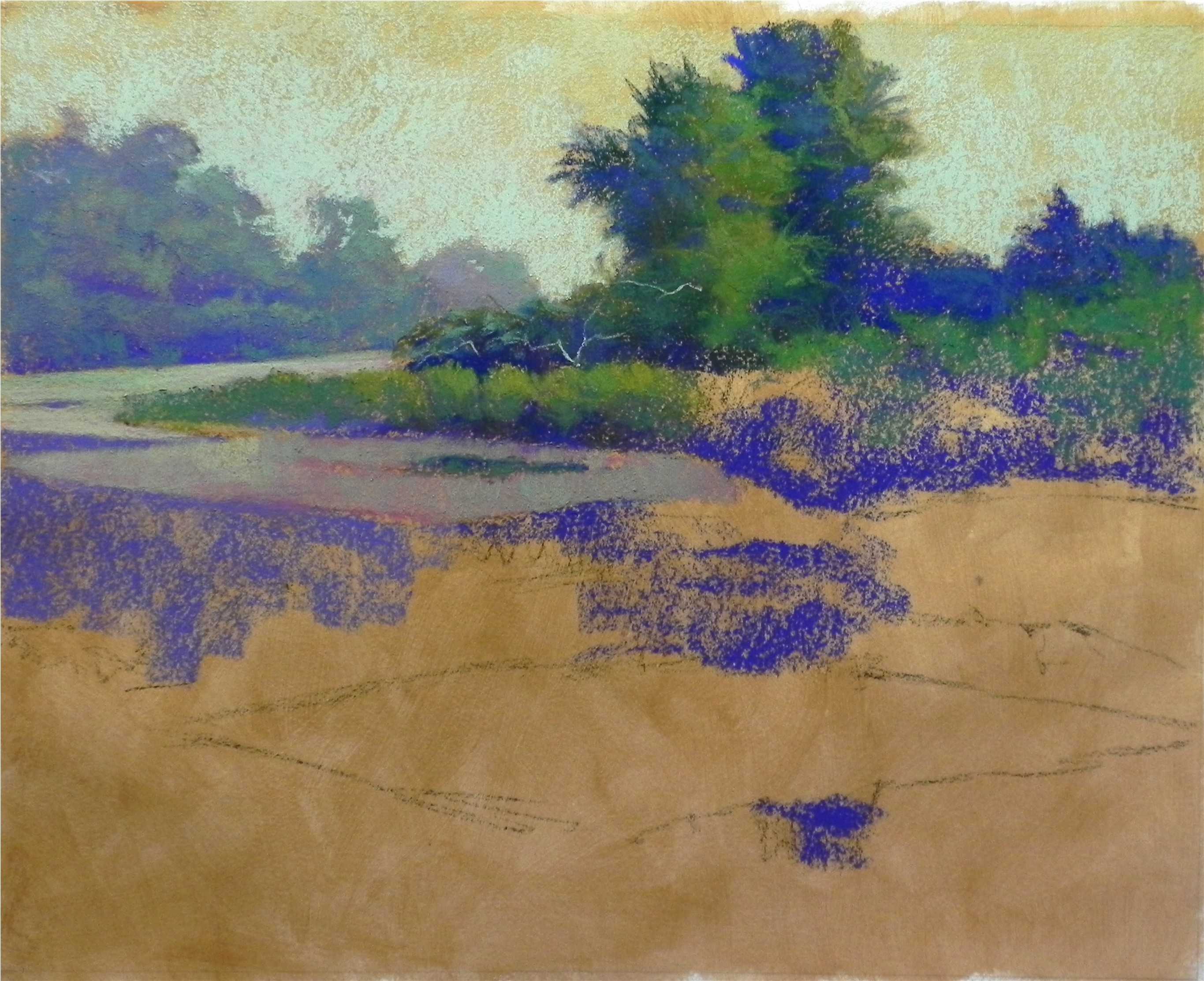 done with charcoal and just simple lines. For this technique, I want as little charcoal or graphite as possible, as it’s important to have the surface remain pure. I should have spent more time with the initial shapes as I had to correct a few and it’s not easy. Brushing down is not a good thing to do, as it dulls the undersurface and I had to do it very carefully. But I’m LOVING this! This week I move into my new studio! I’m going to buy a few things today, but we’ve found a lot of stuff in the house to bring and my husband is going to build me a new pastel box that I’ll be filling from my many drawers of pastels. Having a second studio is going to be a challenge. But having a more public venue should be stimulating. I want to continue working in this style and build on it. Have I found my style yet??? Who knows–but what fun!
- Partial painting showing color of surface