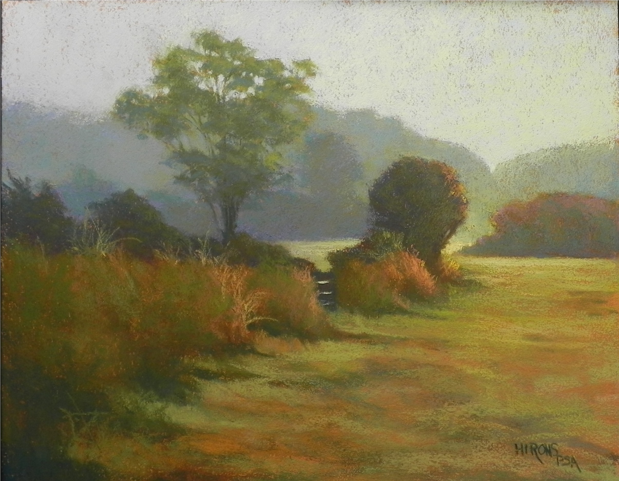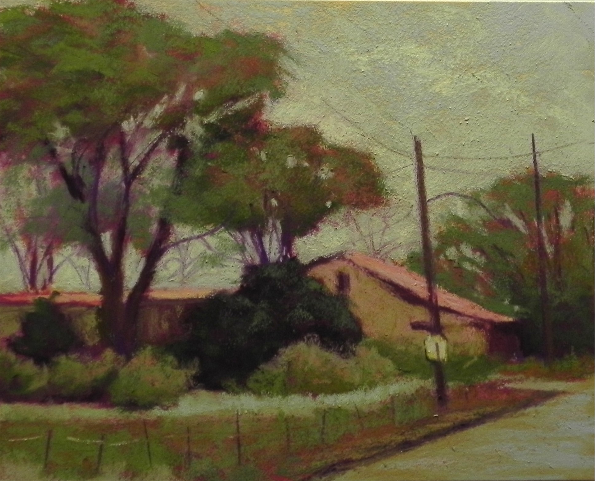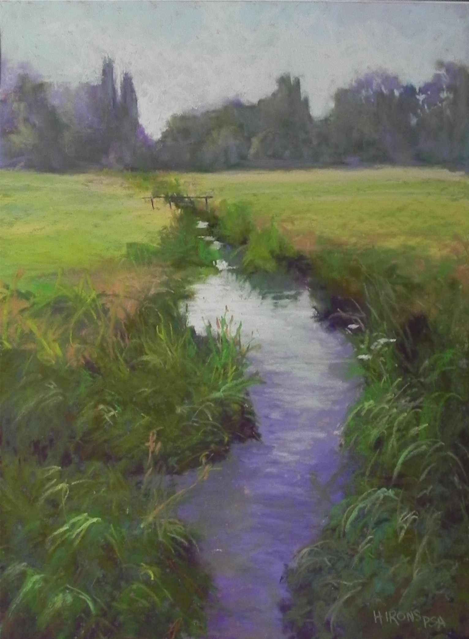
Violet Stream, 16 x 12, UART 400
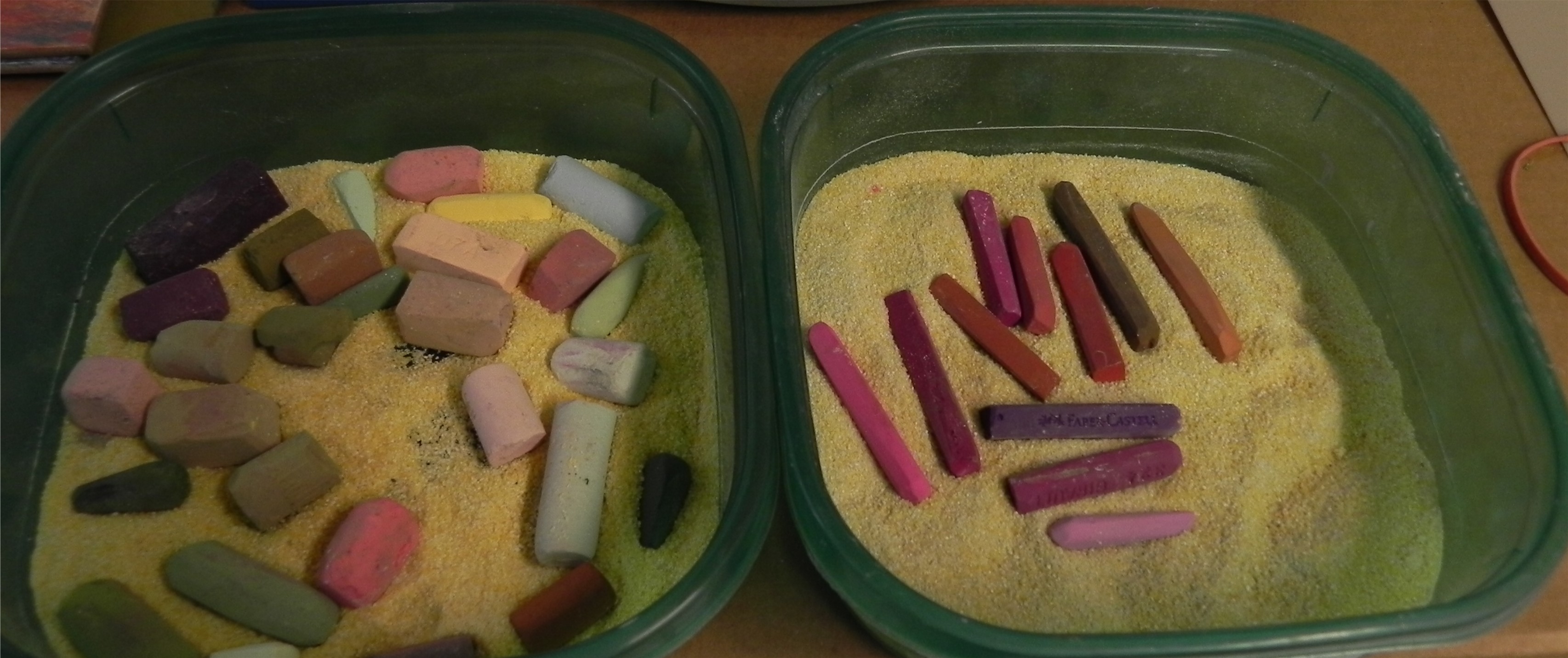
Watercolor underpainting
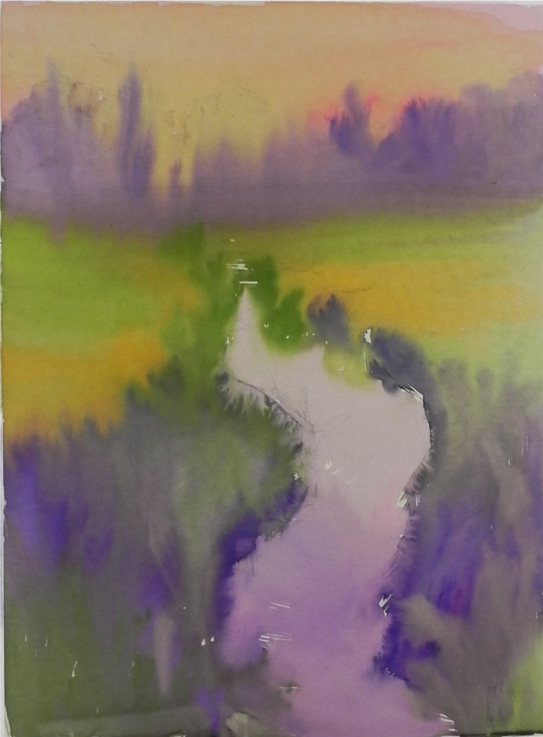
I’m sharing with you the painting demonstration I did for my Monday class at Capitol Arts Network. This is a picture from Salisbury, England. One person was quite surprised that I had chosen this subject to paint. But I knew as soon as I filmed it that I would paint it. It’s a classic Richard McKinley subject! My original thought was to do something more like Richard does, by using watercolor and lighter applications of pastel. So I did a watercolor underpainting, but then (of course) proceeded to cover it all up! I thought about doing a hard pastel underpainting in the lower part to provide the dark background, but instead added dark violet pastel. When I added the greens into it, it blended in very nicely and created a lovely effect. So I was happy enough with my approach. I made a number of changes as I went along, particularly in the background trees–lightening and reforming them. I also decided that having a certain amount of detail in the foreground really helped. I liked the few pieces of light on grasses in the lower left corner, feeling that they grabbed my eye and led it into the picture. I added a few small white flowers in the mid right. The center of interest, of course, is the light on the water. The stream leads the eye back to the trees. My original shape was ugly! So I made sure that this was a shape that I liked. As I was doing the picture, I really wondered if it would be any good. But when I finally finished, I was happy with it. Another demo tomorrow–this one will be a hard pastel block-in.