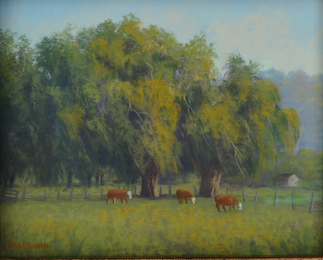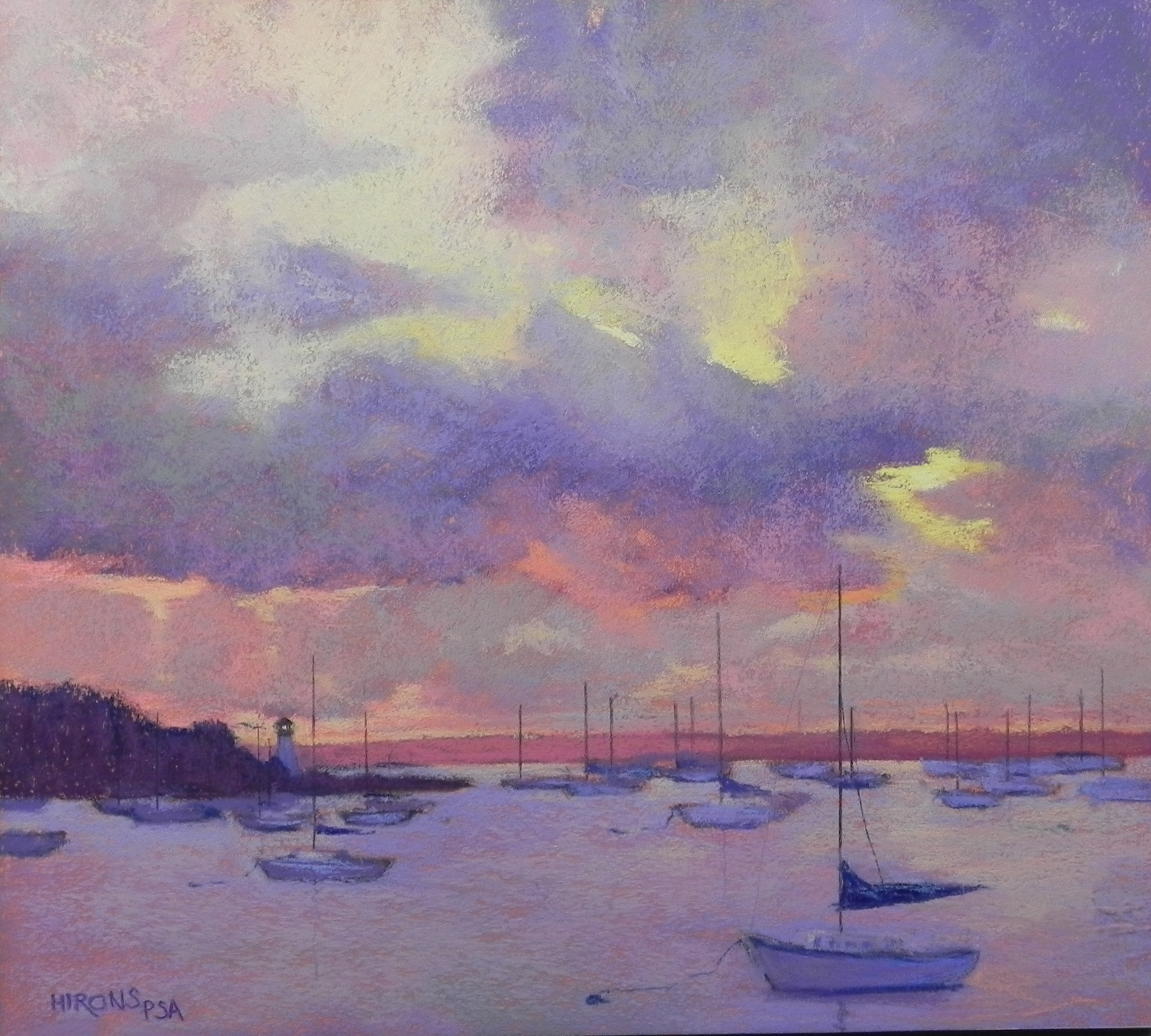
Harbor Sunrise, 18 x 20, BFK Reeves
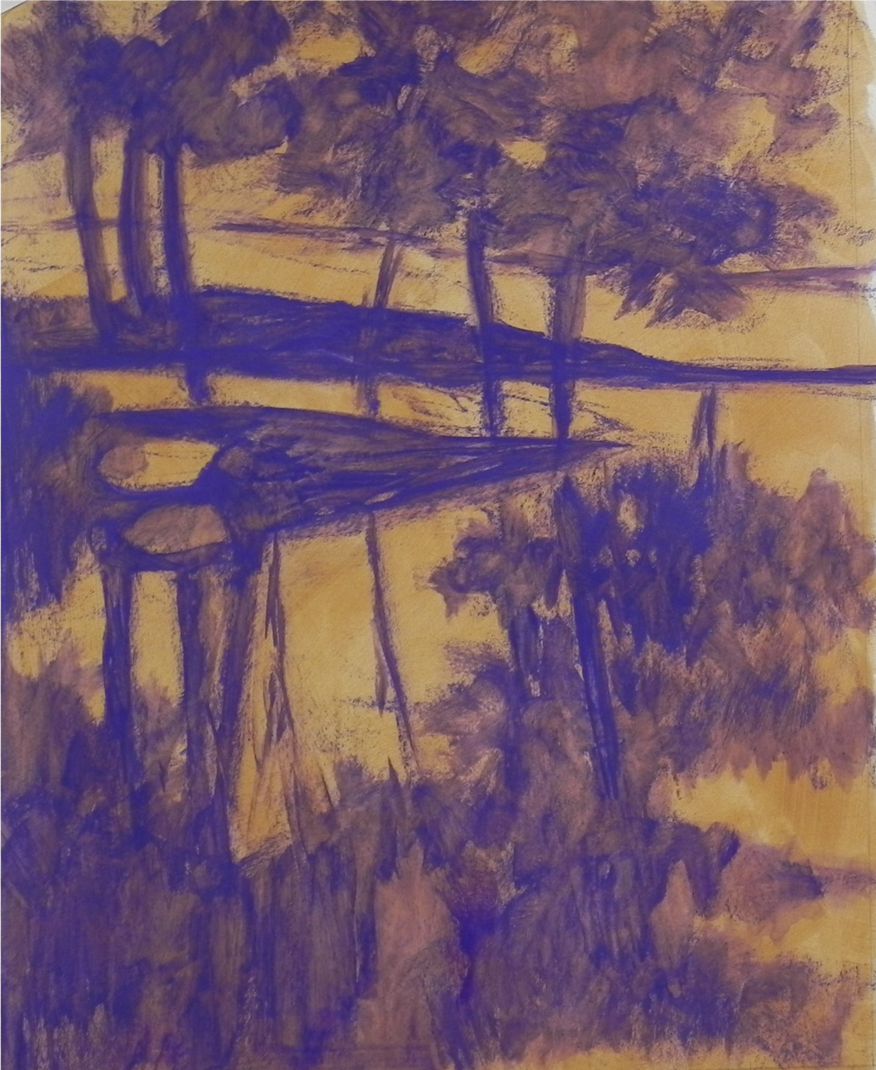
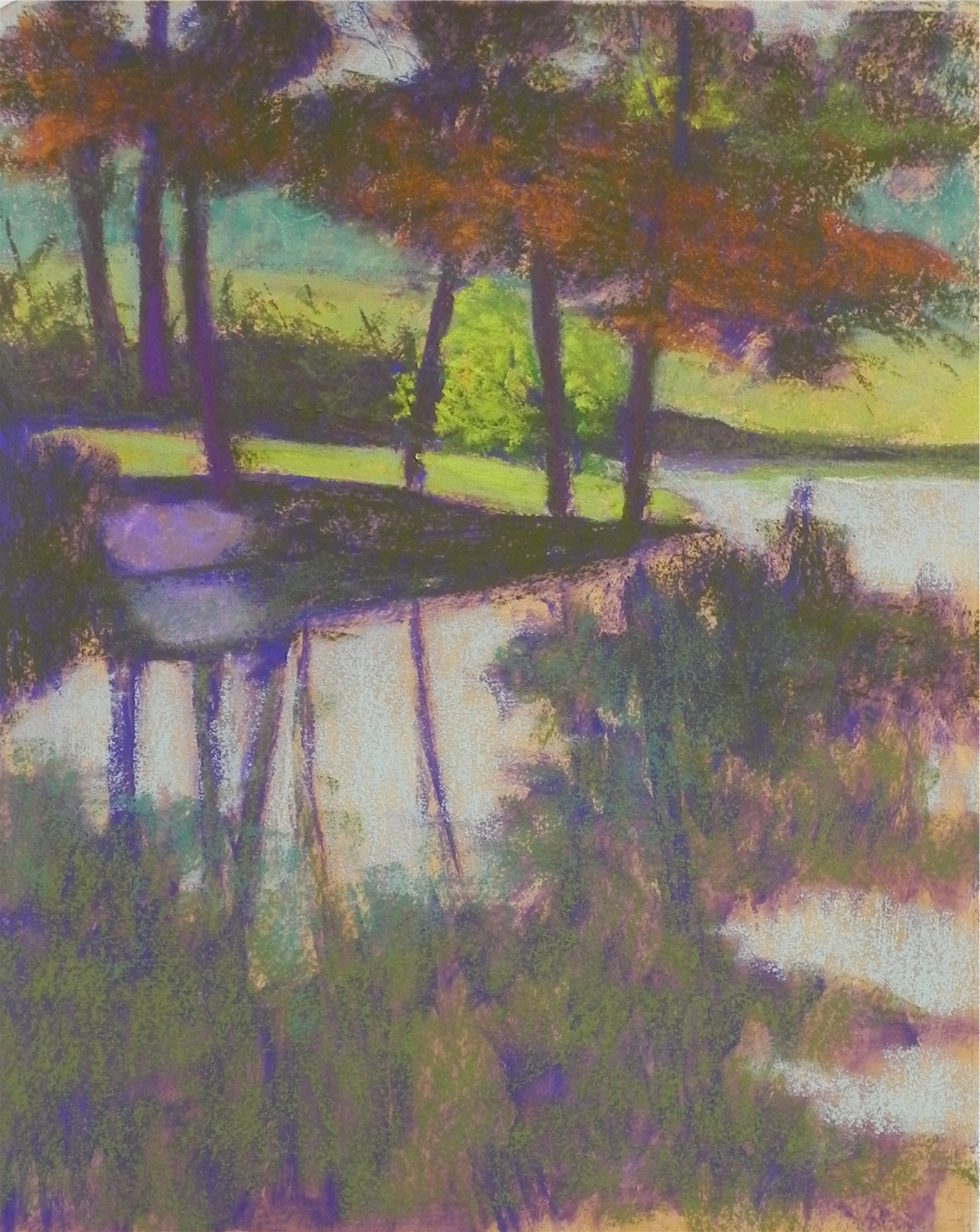
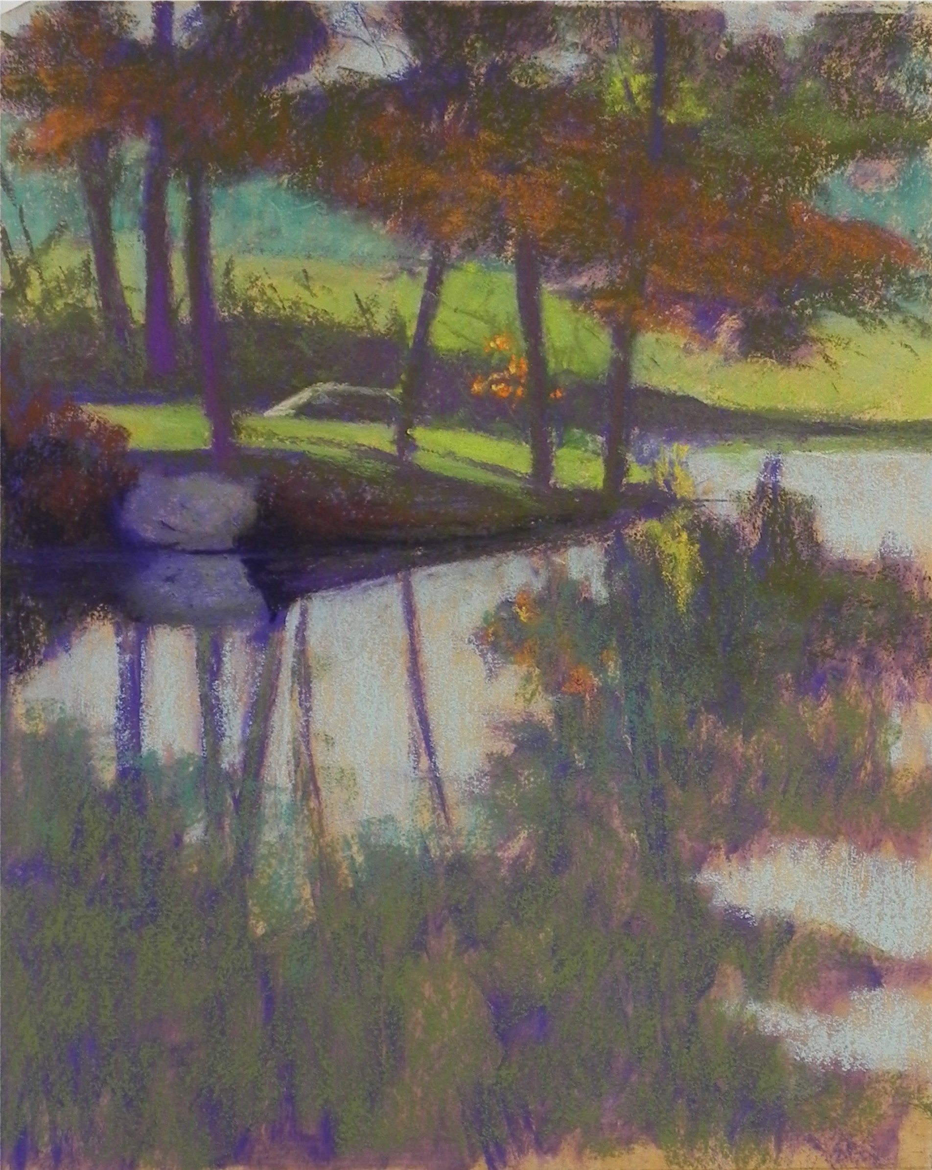
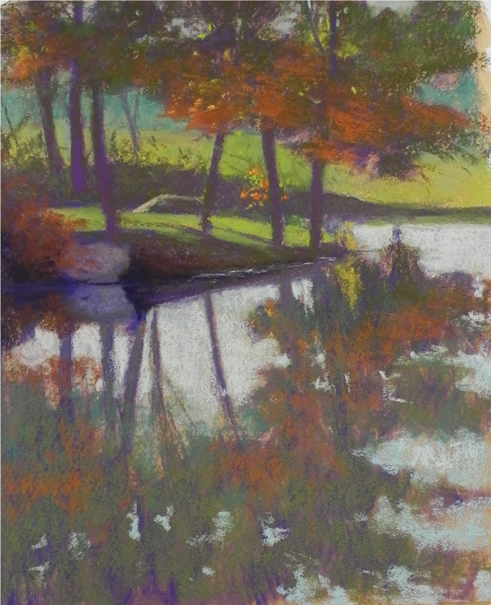
Brought this painting home from the studio yesterday and filmed it in sunshine this morning. Wanted to send it out as a Thanksgiving present to you all! I’ve resisted painting the Ned’s Point Light house in Mattapoisett, but every time I do, the painting sells! The photo reference for this was taken in the fall of 2010 on a trip home in September. (It’s when I made the decision to write a book.) I decided to try it out on the Reeves paper using a lightly toned red gel. I first tried to do it as a 22 x 30 and that was a disaster (went in the trash). I sarted over, planning to make this a 20 x 20, but I placed the horizon line too high! So I cropped off two inches at the bottom and made it into an 18 x 20. Much happier with it now. I had to make up the cloud shapes as the photo was kind of boring. I kept working and reworking them to try to give them interest without being overpowering. I worked a lot on the boat in the foreground but kept the others as simple shapes with masts. I hope you all have a lovely day with family and friends. We are driving to rural Loudon County, VA to be with some of our closest friends. Always a nice time. Will be in Mattapoisett for Christmas.