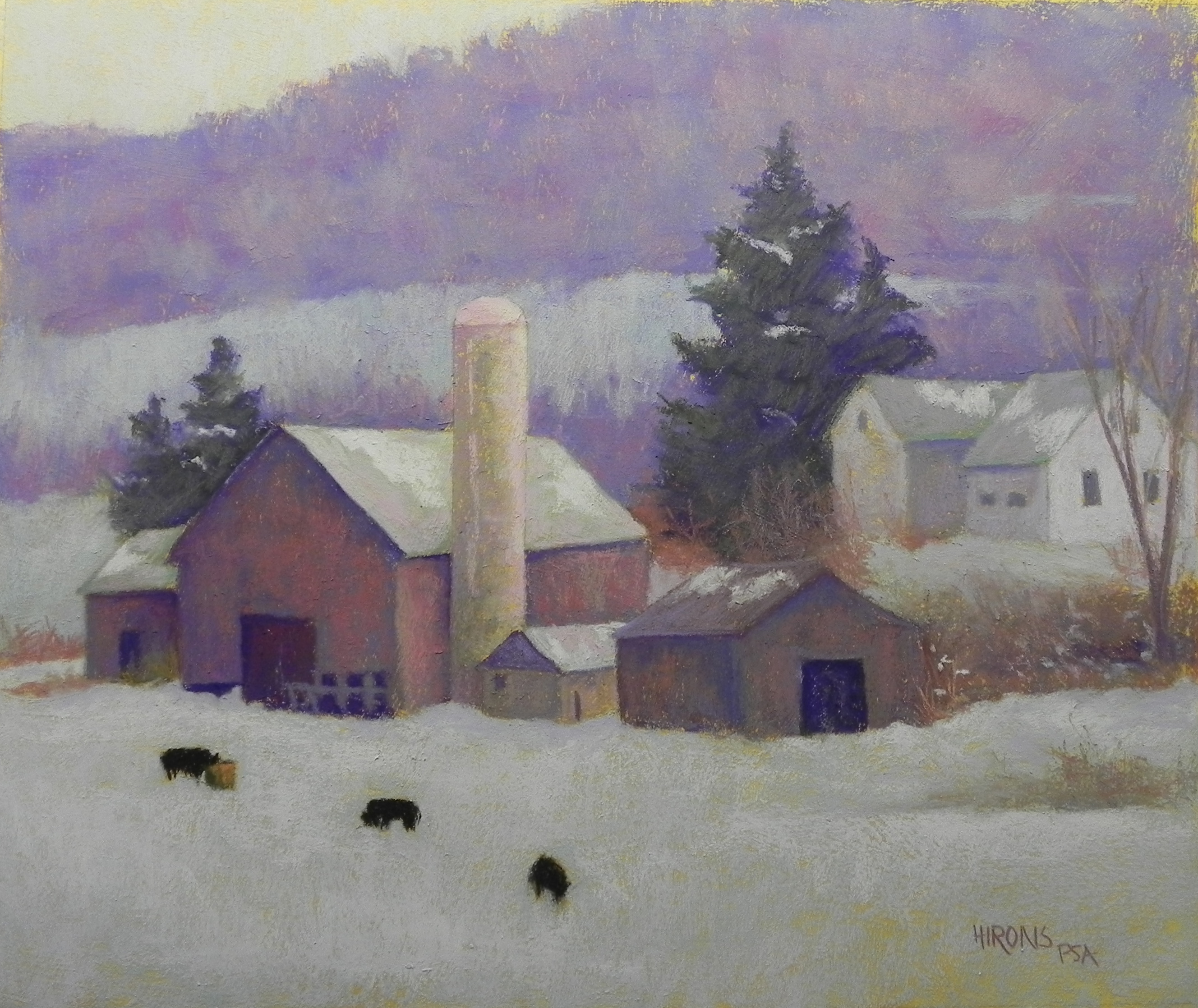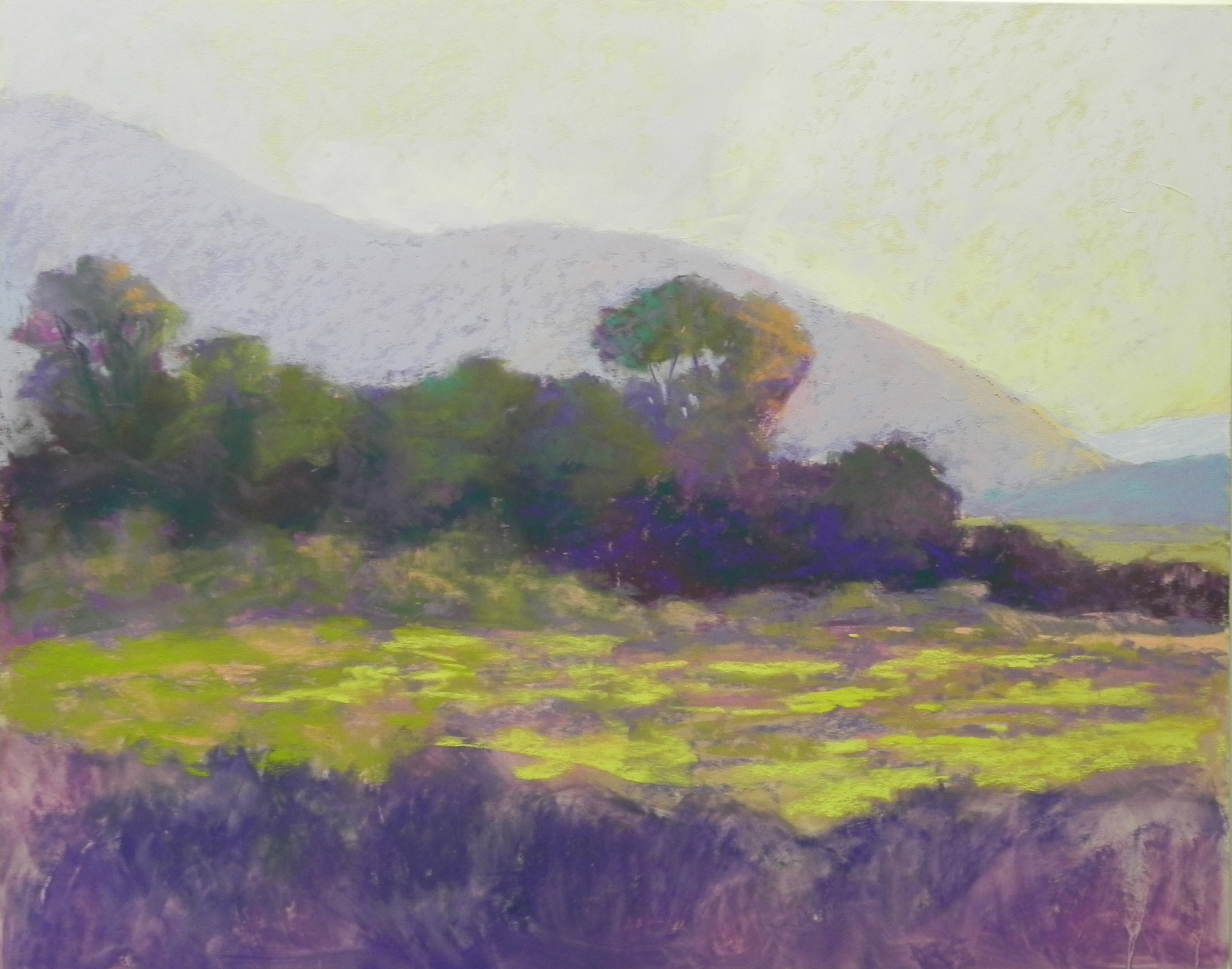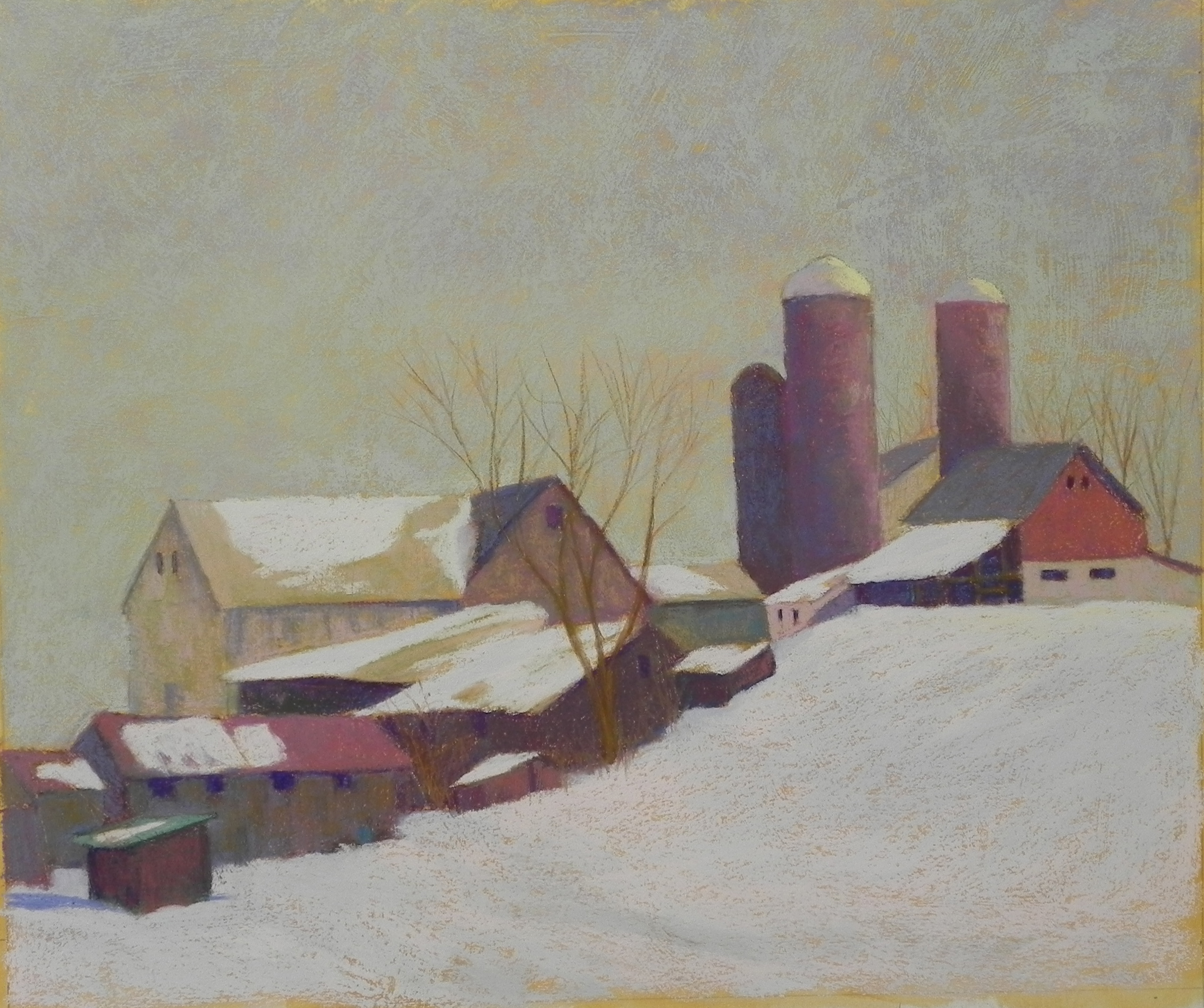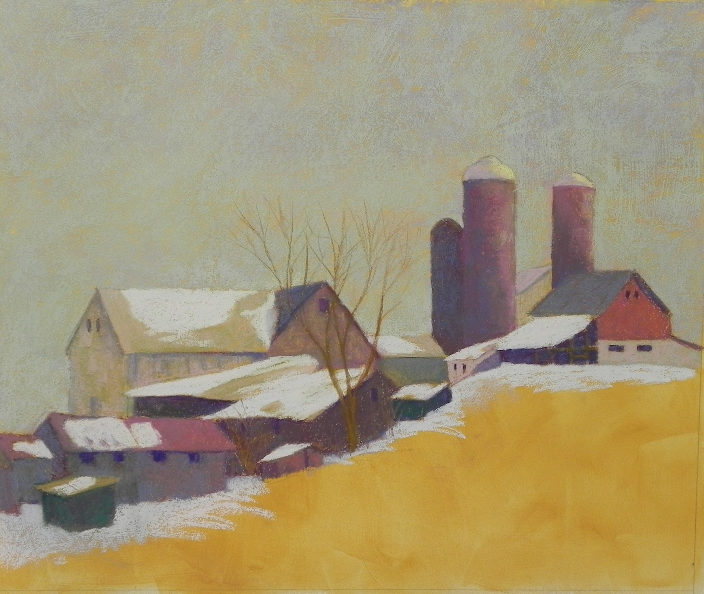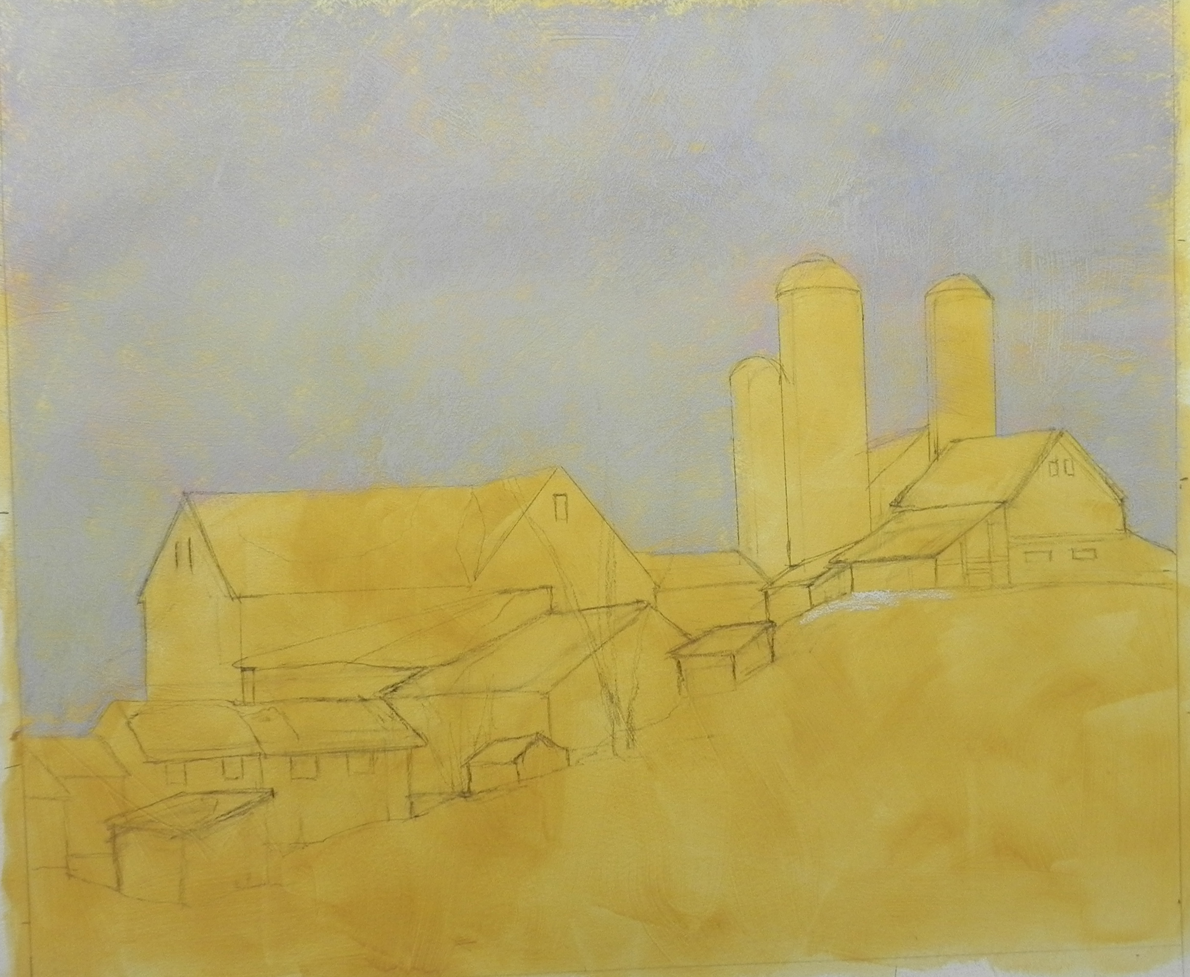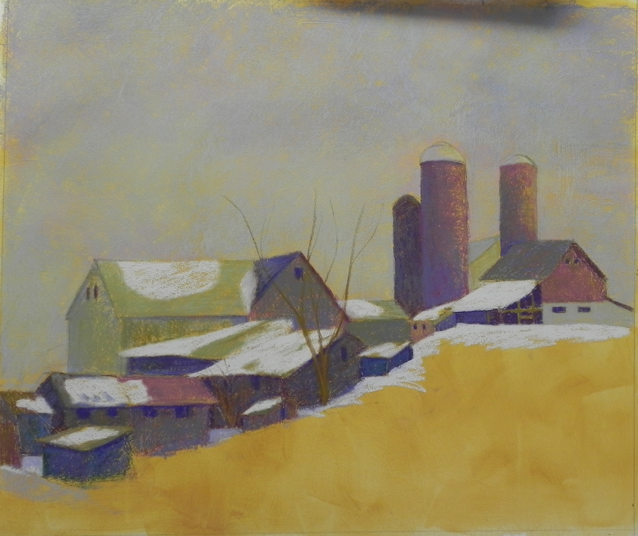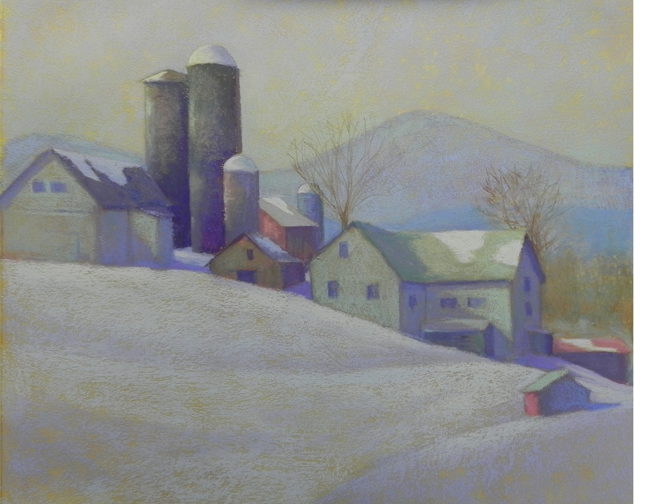
Amish Farm #2 (in progress) 20 x 24
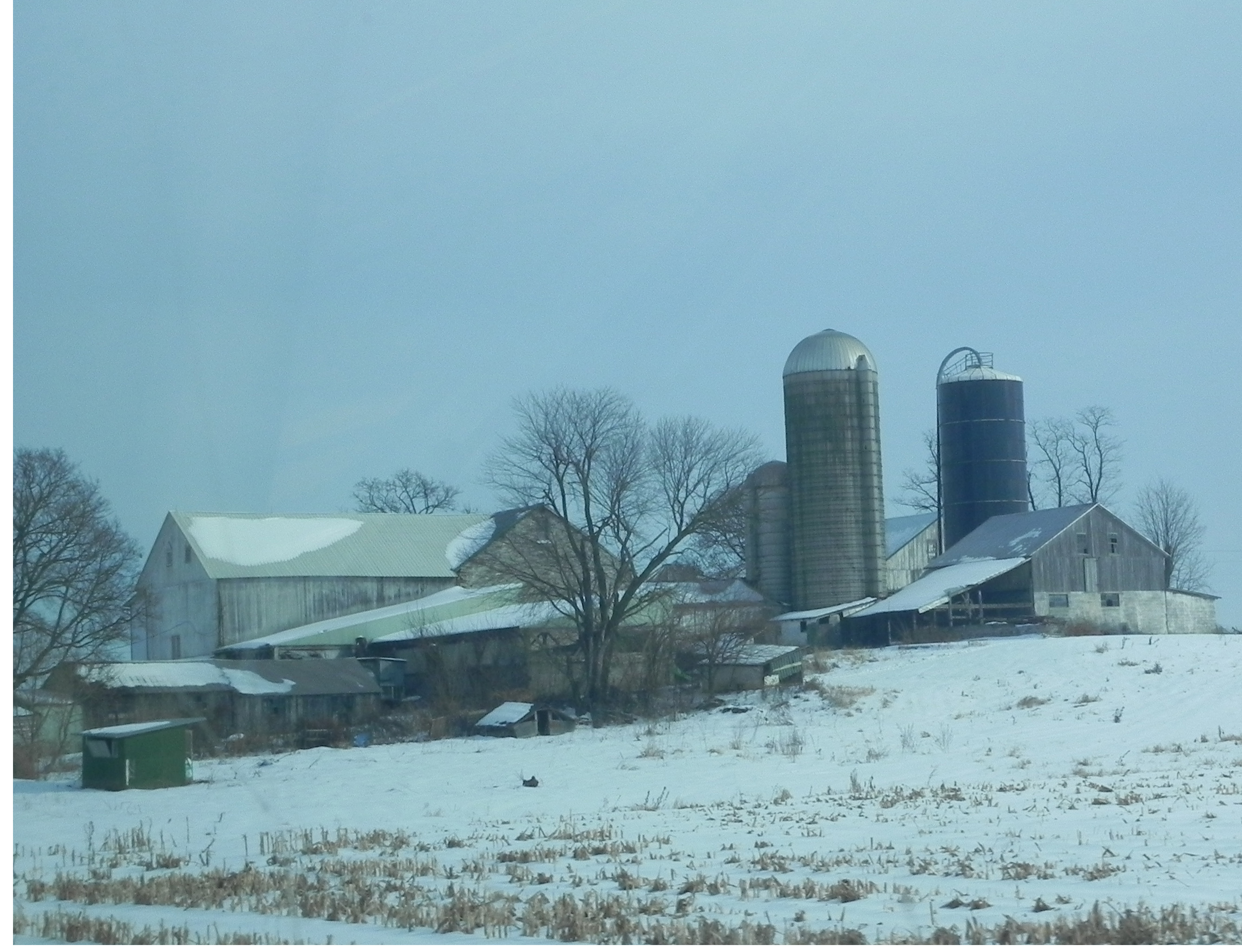
This is the same farm that I painted in Amish Farm. I took a picture of it from the other side on the way home. There was a small mountain in the background and the farm was completely flat! I changed that, moved the silos around and took great liberties with the color. I also added snow, which had all melted by the time we were there! This painting has been giving me a lot of trouble. I’ve discovered, however, that the surface can take a lot of wear and tear. I’ve been able to brush off pastel then use a kneaded eraser to get back most of the surface color (which was raw sienna). This has been a wonderful discovery! The colors in this one were a challenge for me because the light source in the photo is coming from the left. I have changed it so that the house and barn have some light on them and it makes it much more interesting. I decided to use a light violet and greens for the both buildings (after several other unsuccessful combinations) and I like the unity it produces (but is it too light???). I have small bits of red in three places. I added the little building in the foreground. I like the way the light on the house produces a strong vertical, with the horizontal to the right and the diagonal roof of the small building. For the snow, I used three values of bluish white to create subtle movement. The picture is pretty light, but I wanted to capture the sense of light-infusion that I see when there is snow on the ground. Would appreciate your comments! Is there too much green in the house, i.e., should the roof color be changed? There is only one area of dark, at the bottom of the silos. (The silos were really fun. I played with light and shadow and texture and really like the way they came out. If you click on the picture and enlarge it, you’ll be able to see them more clearly.)
Off to gallery sit today, then two days of my Abstracting the Landscape workshop. Will bring this picture and see what they say. By the way, I did a lot of this this morning between 3:30 and 5:00 AM. A car overturned outside my bedroom window at 2:30 and I couldn’t get back to sleep!!!