Ned’s Point at Sunset

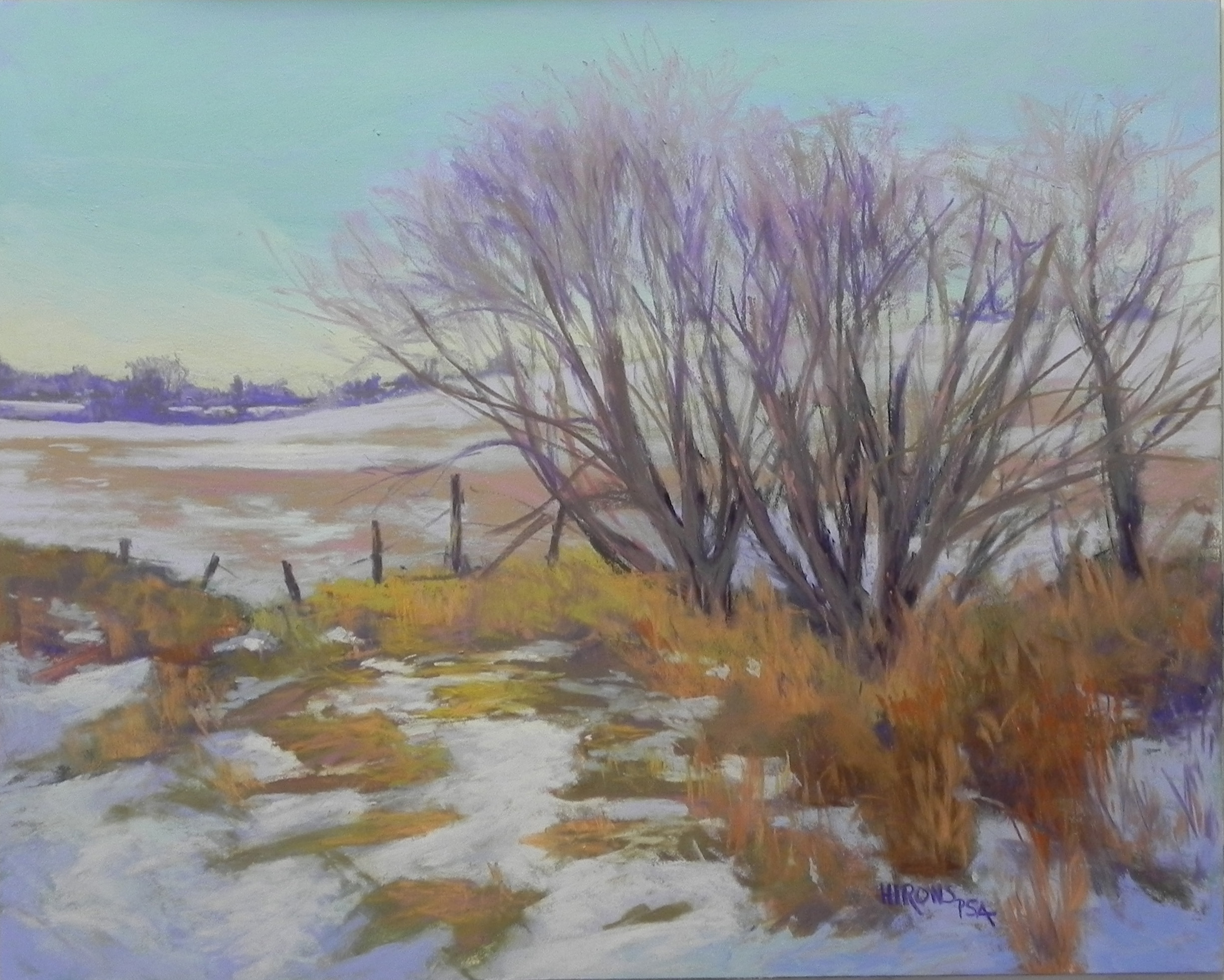
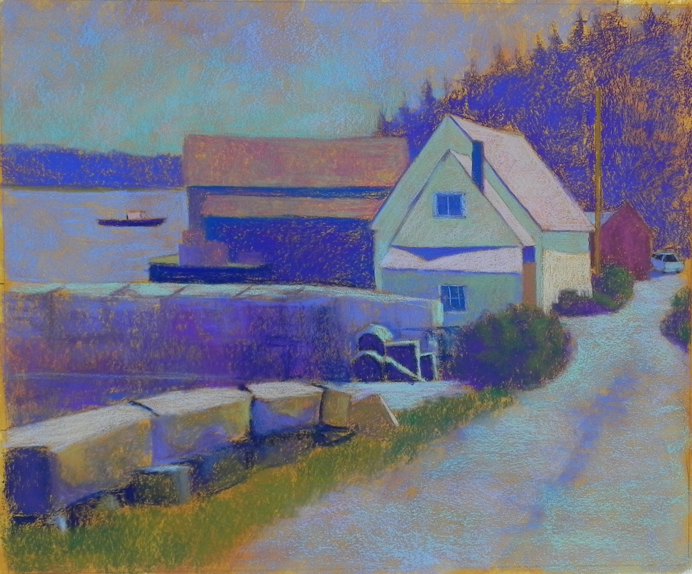
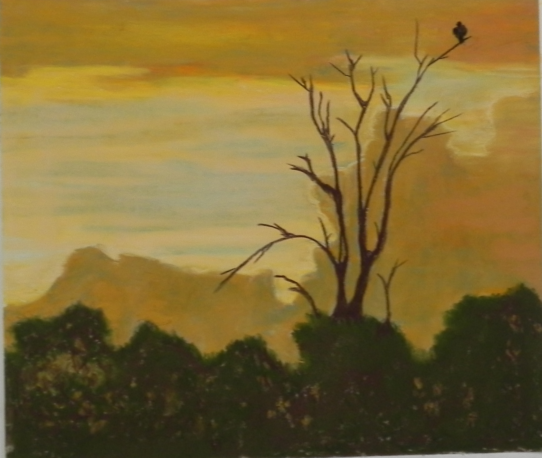
This is a third painting that I plan to bring to Rogers Gallery in Mattapoisett in June. It’s a picture of the ever-popular Ned’s Point Lighthouse. I painted it several years ago but never framed it and the picture got damaged. Decided to do it again on my new surface and I really like the way the colors blended in the sky and foliage. And the texture gives the stucco feel of the lighthouse surface as well.  I used Giraults exclusively, except for the bottom, where I added softer greens. The warm oranges and reds  are also Girault and Ludwig. I’m loving the more refined surface that I’m able to get by using Girault. I’m not using hard pastels at all. The picture is 15 x 22 — a half sheet of the Rives. It’s a nice size but will have to be matted.

Ned's Point at Sunset, 15 x 22, BFK Rives

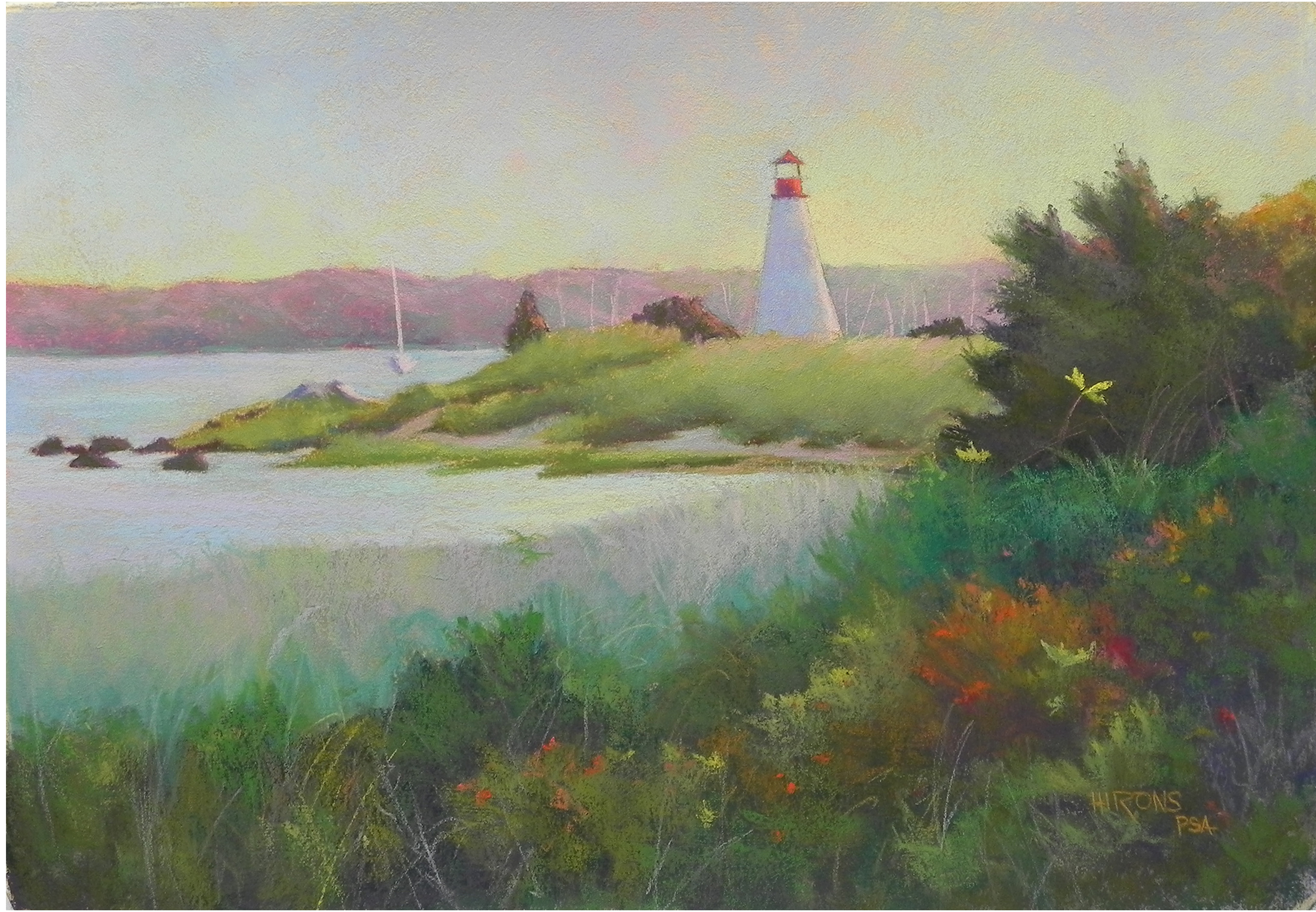
Ned’s Point at Sunset, 15 x 22, BFK Rives

Snow Demo-Winter Fields

I did this demo last Monday but wasn’t happy with it. First the trees were too dark and the wrong shape. Then I killed the sky!  Finally today I got it back out and added warmer color to the sky and worked some more on the trees and snow and decided to call it quits! I did a watercolor underpainting in the sky and distant field that did little for me. Used hard pastel everywhere else. The original picture was one that my husband thought was very boring, so I had the challenge of coming up with something more interesting. I’ll include the original photo with this. The main differences are fewer trees and light on the snow. I also gave more emphasis and shape to the field behind and added the fence. This is it for snow pictures!  While it is snowing now, I think I’ve had enough!  We are all ready for spring.

Winter Fields, 16 x 20, Pastelbord

Winter Fields, 16 x 20, Pastelbord

Reference photo

Reference photo

Sundown, Ship Street

I’m working on some paintings to bring to Rogers Gallery in Mattapoisett in June. I’ll be bringing Harbor Sunrise, so did this as a counterpoint of sunset. Will be focusing on harbor and lighthouse. For this painting, I decided to watch the surface very carefully. I’ve been finding that the use of really soft pastels too soon produces gummy-looking results that I don’t like!  I decided to try pan pastels for the sky, but found they did nothing but fill in the surface and look dull. So I used Giraults in a progression from cool to warm at the bottom. I kept to the Giraults until I got to the bottom of the painting, then used a number of violet and brown Ludwigs for the shadows of the road. The greens are all Girault. I was pleased with the results. I never felt that the surface got away from me.  I’m including the underpainting, as well, done after I finished the sky.   Since the painting would be warm, I used primarily cool colors to cover up the lighter surface. One of the other things I’ve become aware of is how I relate to the color of the surface. Some of the surfaces have been too yellow–almost mustardy (a color I hate!!!). For this one, I used the brown umber and it produced a lovely soft, neutral color that I enjoyed working over in the sky.

Sundown, Ship Street, 20 x 24, BFK Rives and Colourfix liquid primer

Sundown, Ship Street, 20 x 24, BFK Rives and Colourfix liquid primer

Hard pastel underpainting i all but sky

Hard pastel underpainting in all but sky

Bob’s Noodle (!!!)

And now for something completely different!  Last Tues. morning we woke up to 2″ of fresh snow and bright sunshine. It was so beautiful. I wanted to go somewhere nice to take pictures but had to gallery sit and couldn’t take the time. But while driving through downtown Rockville, I saw the light and snow on a building I’ve been interested in–Bob’s Noodle 66.  I had to do it!   But it didn’t get off to a good start. Today, I was ready to chuck it or try to wash it off, but decided to give it one more go.  The colors were a lot of the problem. I was trying hard not to use red violet because of the orange roof. But I finally gave in and cooled the roof as well, flattened the background tree, and voila!  Of course, I can’t imagine that anyone other than “Bob” would want it!  But it was  a fun challenge.  The reflection in the road was what really sold me when I saw the photo. I have to admit to leaving out the two Chinese characters that were in the sign. That was beyond me!  Now to go out and enjoy the 60 degree temperature while it lasts.

Bob's Noodle 66, 20 x 24, BFK Rives and Colourfix liquid primer

Bob’s Noodle 66, 20 x 24, BFK Rives and Colourfix liquid primer

Snow demo

Yesterday I did the second of two snow demonstrations for my classes at Capitol Arts Network. I was more excited about the Monday demo, but I liked yesterday’s better!  It’s on a 16 x 20 mounted UART 500 board from ProArt Panels. Unfortunately, it warped a bit, and I’m hoping that my framer can flatten it, as I really like the painting.

Started out with a rather wild underpainting. I used water color for the sky and snow and hard pastel for the buildings. And I used yellow green in the sky and snow areas!  Not sure what the class thought. The different media created very different values of underpainting that I had to be careful to overcome. I ended up using nothing but blue greens and blue violets in the snow–no yellows or oranges. It gives it a unified look and the color is quite unique, I think. The warm pieces are in the buildings and in foreground grasses.  I think I need to darken one piece of roof snow (in the middle).

The foreground was the big challenge as this is quite different from the photo. I felt like I was sculpting and making it up!

I’m having problems with the blog. Can only add text if I add the photos afterwards, which places them at the bottom. Not sure what’s going on. This is the only solution I’ve figured out for the moment.  Any title ideas???

Snow demo (no title yet), 16 x 20, UART 500

Snow demo (no title yet), 16 x 20, UART 500

Stonington Harbor–Final

Black and white photo reference

Stonington Harbor, 20 x 24

I just made a few more corrections to the painting and thought I’d send them to you, along with the color photo, which I tried to include in the last post, but who knows where it went!  When I looked at the color photo, I realized that the green bush was a rosa rugosa and I immediately saw the value of adding the bright pink pieces into it.  I wasn’t happy with the background house roof and simplified it a bit. I’ve also played with adding a few warmer colors into the road. But now it’s under glassine and done!  I filmed it today on a cloudy day. Yesterday I had bright sunshine coming in, so this version might be a little washed out. However, I thought it was worth sharing again.  On Monday, I’m taking it with me to a talk I’m giving to 200 boy scouts and their parents on creativity!!!  Thought they might enjoy seeing something summery. I’ll bring the black and white photo with me, and the color and show them the difference. I’ve written my 15 minute talk and look forward to it.

Stonington Harbor


Initial layers in hard pastel

Initial layers in hard pastel

Happy snow day!  We have over a foot and it’s wet, but not too bad (of course, I’m not the one doing the shoveling!).  I just finished this picture that I began in the studio on Monday. This is from a photo I took in Maine in 2009. I woke up at 4:30 thinking about potential paintings and remembered this picture. What has always stumped me about the photo is the large expanse of the road. I decided I could take care of that!  And, indeed, in going to a squarer format than the photo, it narrowed the road and gave more prominence to the house.  I used a very gold tint for the gel and I love the way it looks with aqua and violet.  I began the painting using hard pastels and basically doing warm under cool and cool under warm. I worked from the black and white photo and was really pleased when I added the orange over the cool lavender in the house roof. I put a violet over the aqua in the shaded areas and it produced a perfect grayed color. Before adding the softer pastels, I sprayed it with workable fixative (something I won’t do again at CAN!).  This morning I looked at the color photo and realized that the lobster traps are yellow and red! I added some more color to them, but didn’t really like the bright colors very much.  I was much happier with my interpretation of the traps and the roofs, color-wise.  And, I think the road expanse is just about right.  It’s really interesting how the different pastels go onto this surface. The Giraults tend to fill it in, which can be good or bad, depending on what I’m looking for. I think that the perfect pastels are the Unisons and Ludwigs because they aren’t as soft. I used my Ludwig “vibrants” set to add various reds to the roofs this morning and found it so easy to add them lightly.  Thanks to Catherine and Renata, who painted with me yesterday, and gave me helpful comments.


Stonington Harbor, 20 x 24, BFK Rives and AS Liquid primer

Stonington Harbor, 20 x 24, BFK Rives and AS Liquid primer

OLYMPUS DIGITAL CAMERA

Amish Farm–Again!

Amish Farm (#2) 20 x 24, BFK Rives and AS gel

This is what I painted yesterday. It should look familiar! I used the same black and white photo from my first Amish Barn picture (looking east). I tried not to think of the colors I had used before and in this one focused more on blue greens and violets. I also set the sun direction as coming from the left (thank you Catherine!). One of the reasons I did this again is that I have a friend in Australia (currently sweltering) who is interested in purchasing a snowy barn picture.  One participant asked whether this represented any form of abstraction. For me it does because the focus is on shape, some of the shapes have been exaggerated (silos), and there is a minimum of extraneous detail.  It was fun doing this again. I might also think of doing part of it as a separate painting. But I need to get out and get some new barn photos!  Happy Super Bowl watching for those of you who do this sort of thing (we are still debating here!!!)
Continue reading

Abstracting the Landscape Workshop


Nikki O'Neill doing color study

Nikki O’Neill doing color study

Catherine Nickle doing color study

Catherine Nickle doing color study

Dawn Capron and her color study

Dawn Capron and her color study


Nikki's painting of a scene from Africa

Nikki’s painting of a scene from Africa


Catherine's painting

Catherine’s painting


Dawn's painting

Dawn’s painting


On Friday and Saturday, 3 of the original 6 who had signed up for my first Abstracting the Landscape workshop met in my studio. On the original date we had a large snowstorm (of course!).  The follow up session will have 4 people in April. We all agreed that we were glad that it was a smaller group–more time to talk and share, and, of course, more table space for all the pastels!  The downside was not having all of the people to share with. As you will see from the paintings, none of us wants to become non-representational. But we all would like to become a little looser, stronger, bolder in our approaches to painting. We discussed what that meant in terms of composition, value, color, and technique and each person identified personal goals for themselves. We then did a number of studies on the first day–composition, value and color. Yesterday we all painted. (I will share my painting in a separate post.) It was an intense, but fun experience (enhanced by the discovery of the Saint Michel French bakery down the street and their almond croissants!!!)

I am looking forward to the next installment in April. And I’d like to find a way for the entire group to get together from time to time to share their progress. This is just a beginning for all of us.

The primary emphasis of the workshop was on defining strong shapes and I think this comes through beautifully in the three paintings.