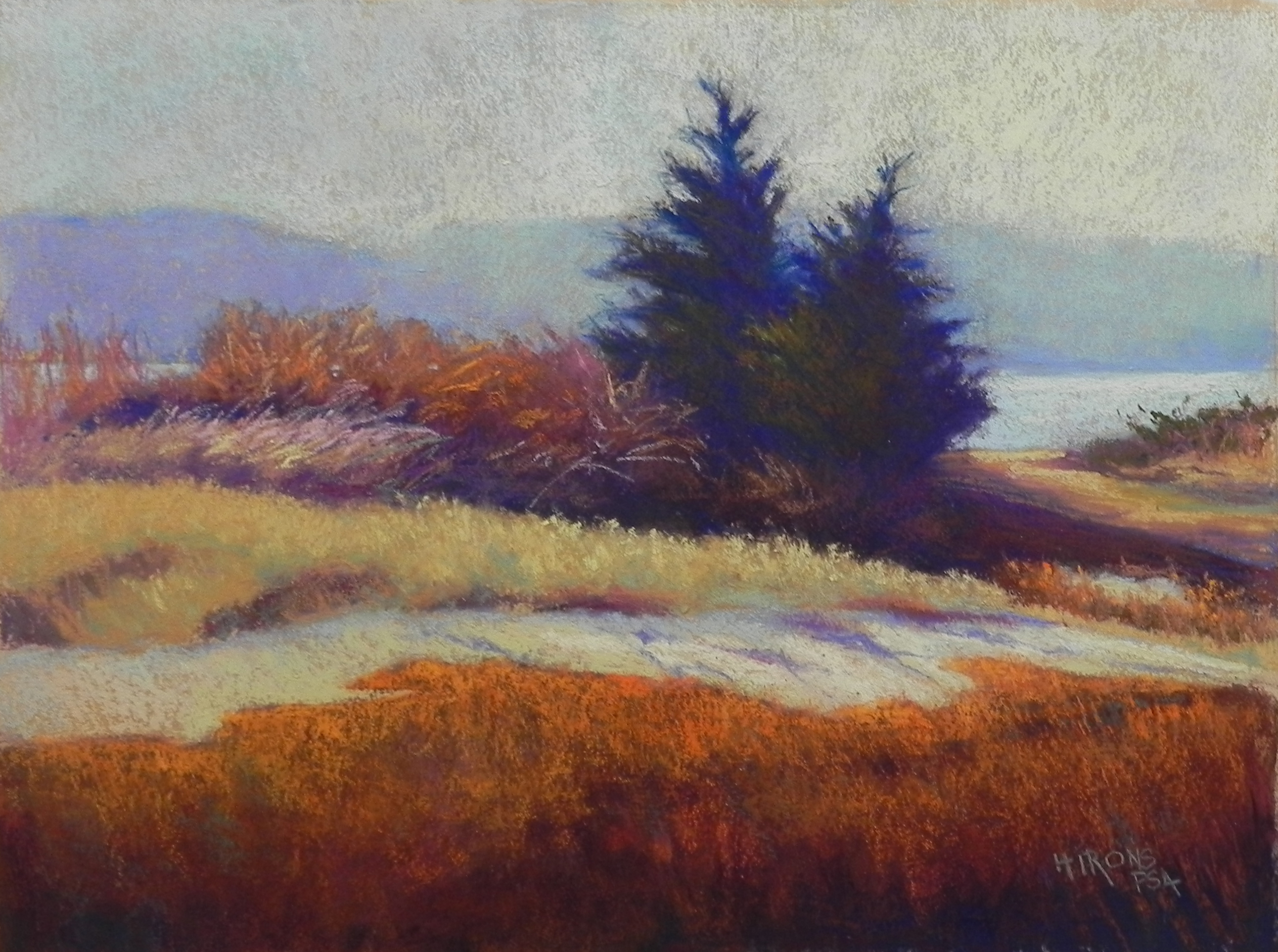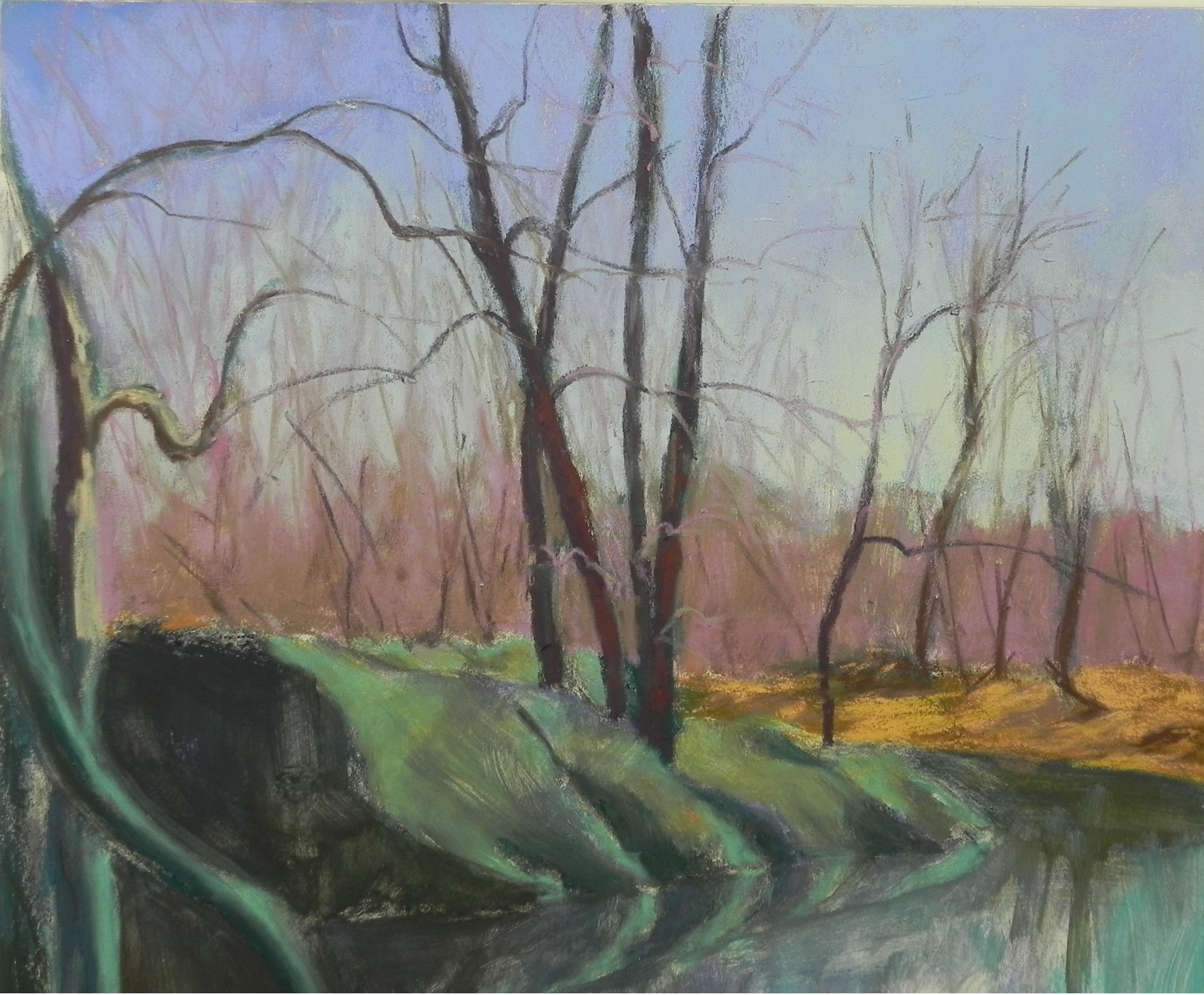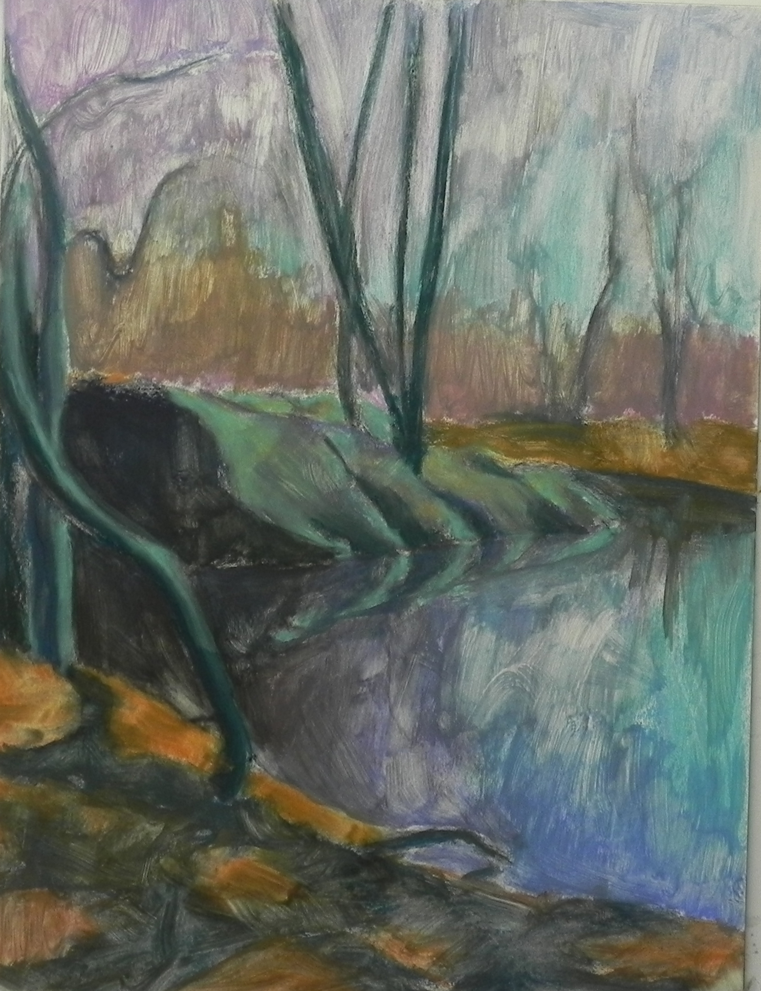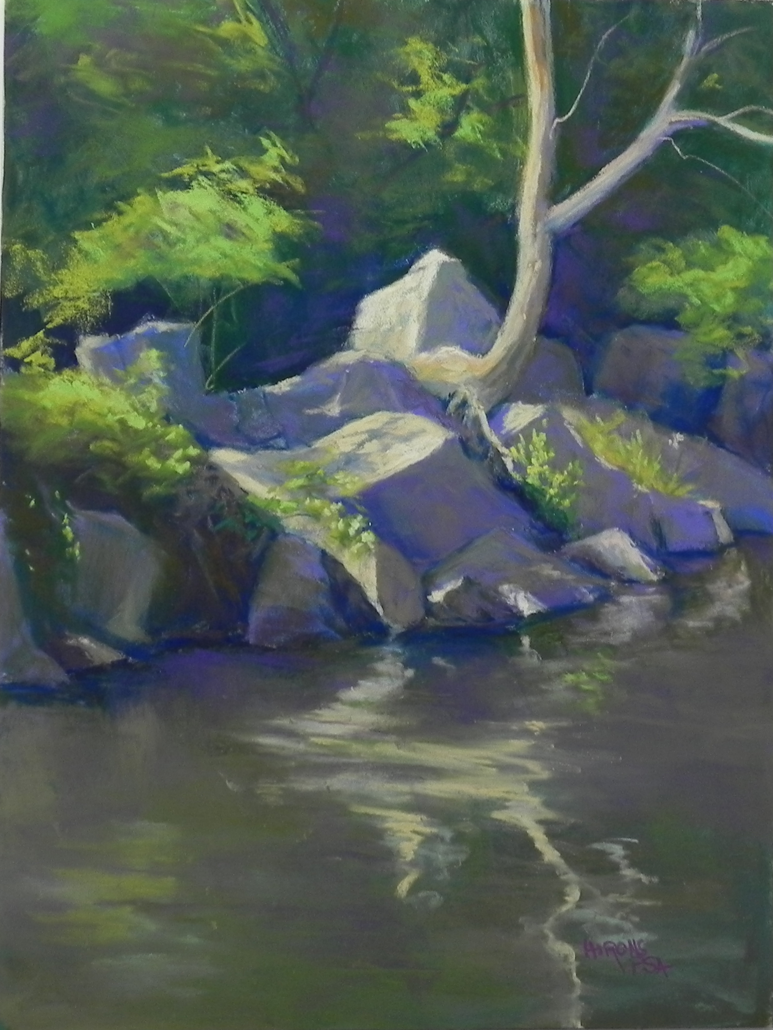
Wide Water Reflections, 12 x 16, pastelbord
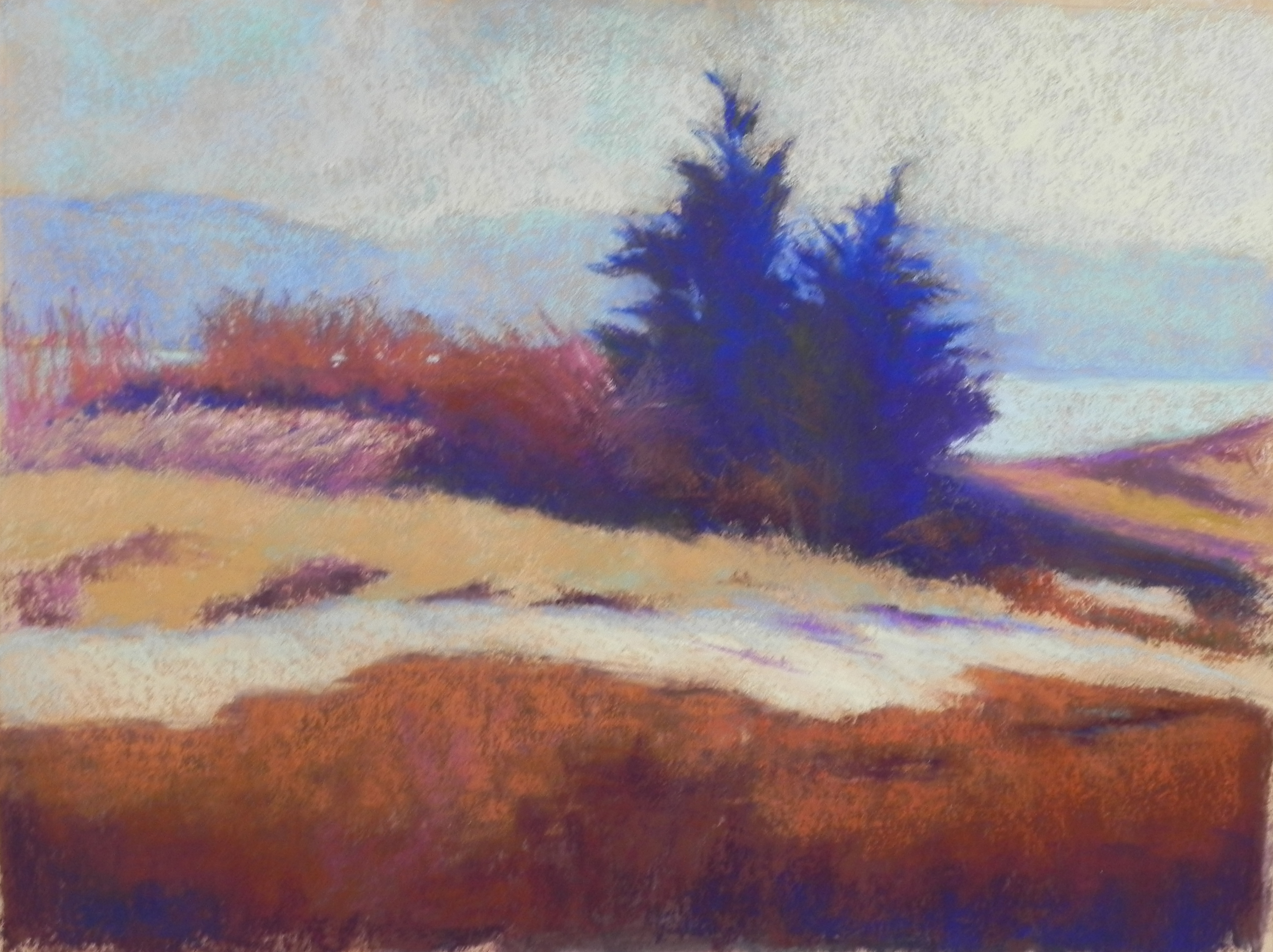
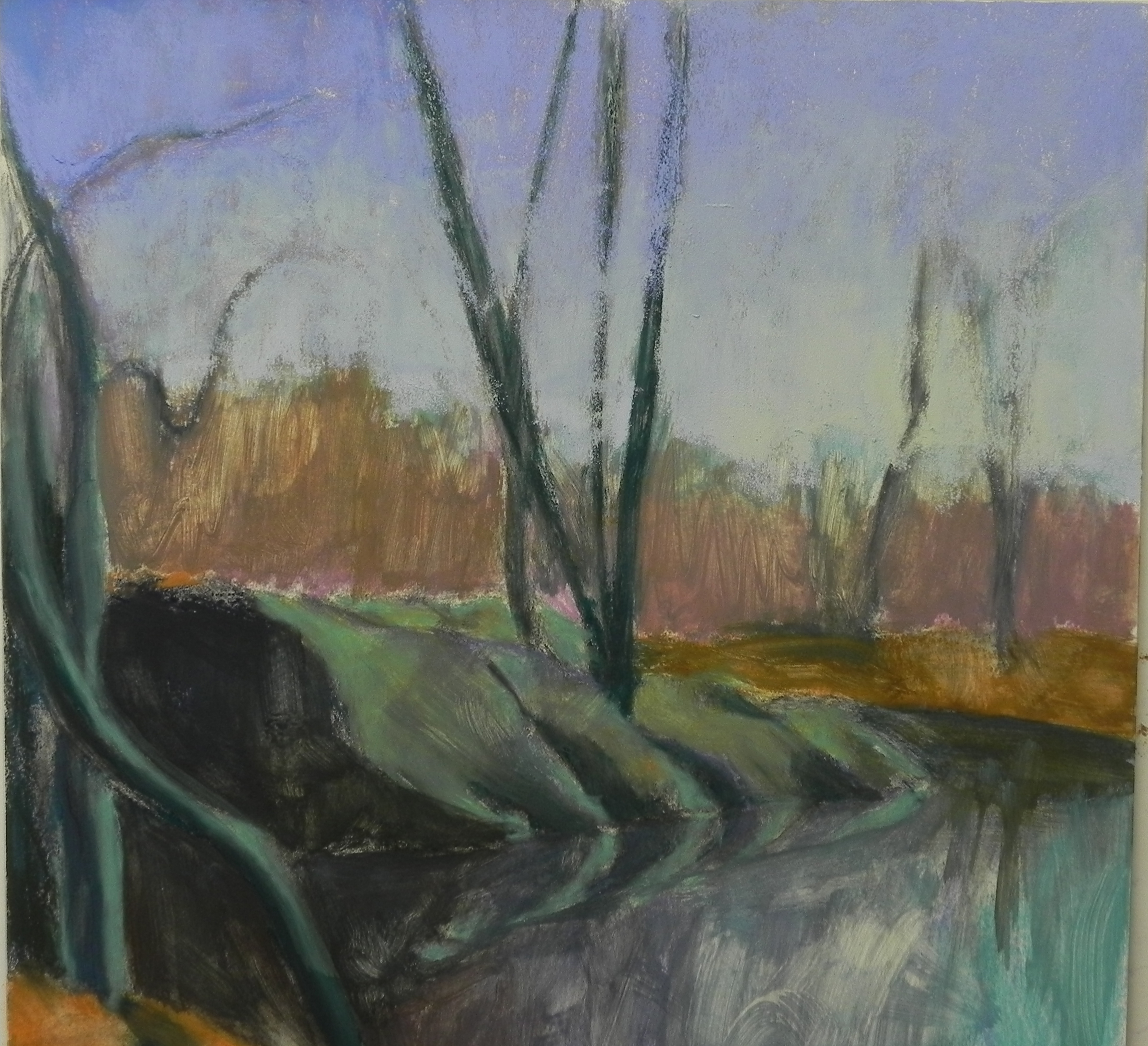
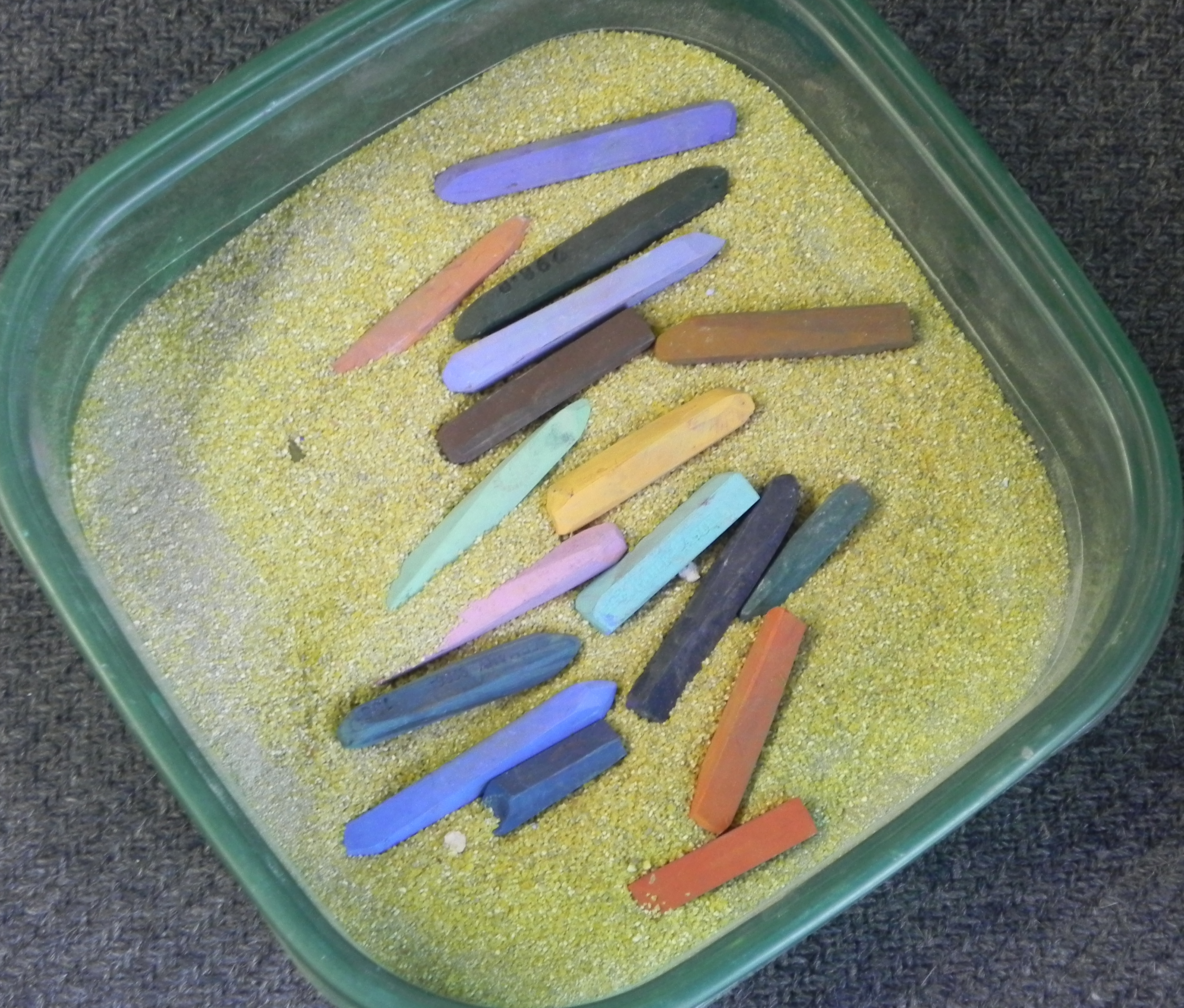
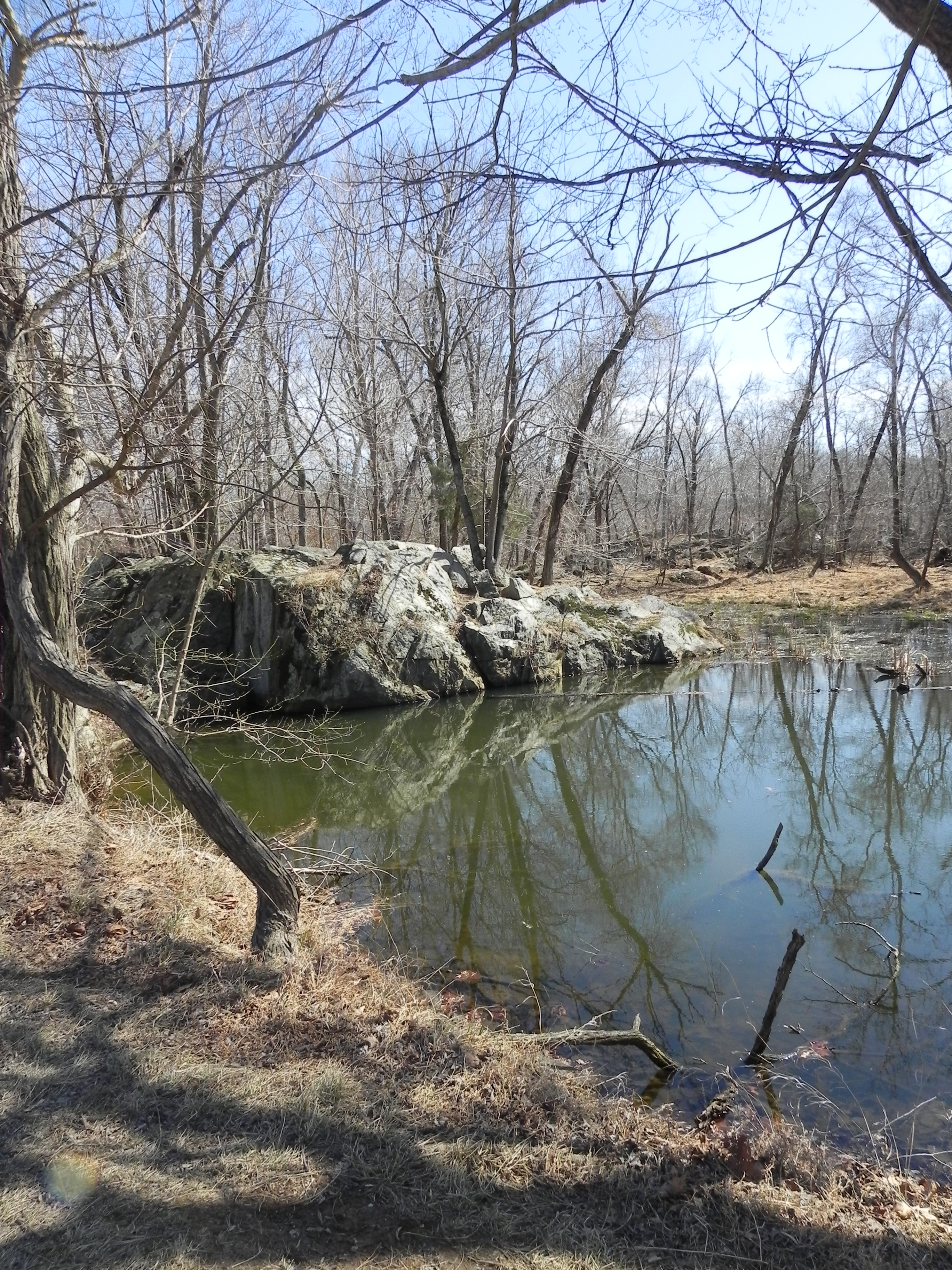
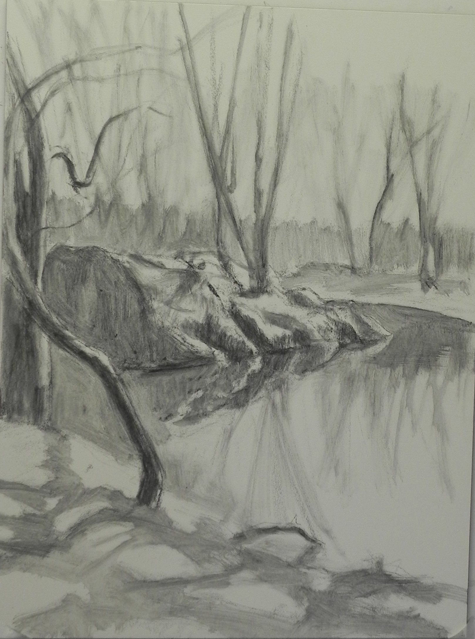
This is the demonstration that I did for my class last Wednesday just before flying to Providence. I began with a graphite drawing and wash (below), which made the demo much easier. I didn’t have my camera, so have no intermediate photos. I did a hard pastel and alcohol underpainting. I used a lot of blues and greens in the underpainting, using an aqua for the light areas of the rocks. I lost some of the detail, but was able to get it back. I was working from a black and white photo only as I no longer had the color version. I used a lot of violets in the rocks and the painting didn’t come together until I started adding darker red violets to the trees and water reflections. I used hard pastels for the underpainting, Giraults for the background trees, rocks and water, and soft pastels for the highlighted greens, reflection in the water, and lights on the rocks. I did this painting years ago for demonstration and I know that this one is much better! I looked at the painting in the studio yesterday and added a little more to the top and bottom but this is pretty much the way it was done at the end of the demo.
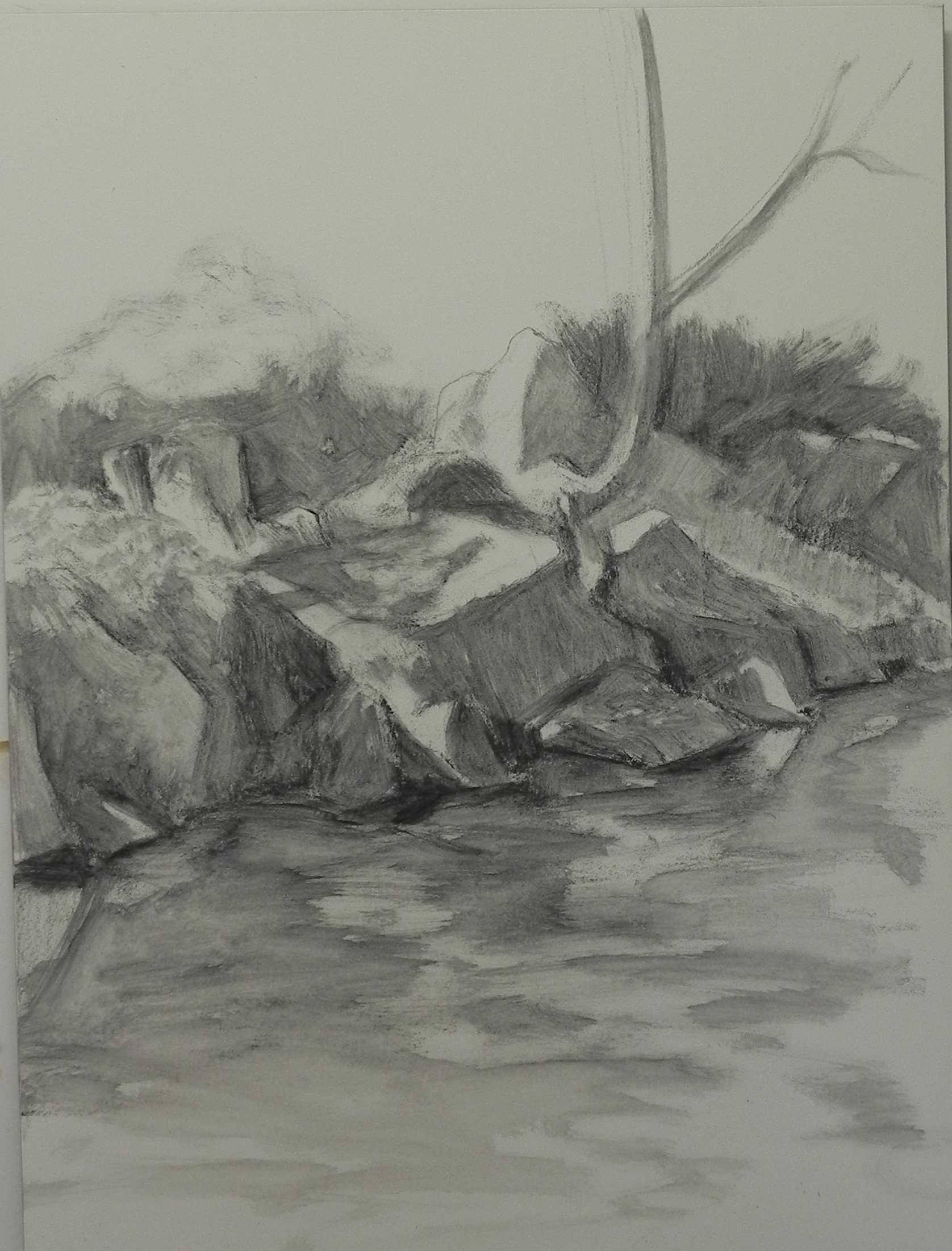
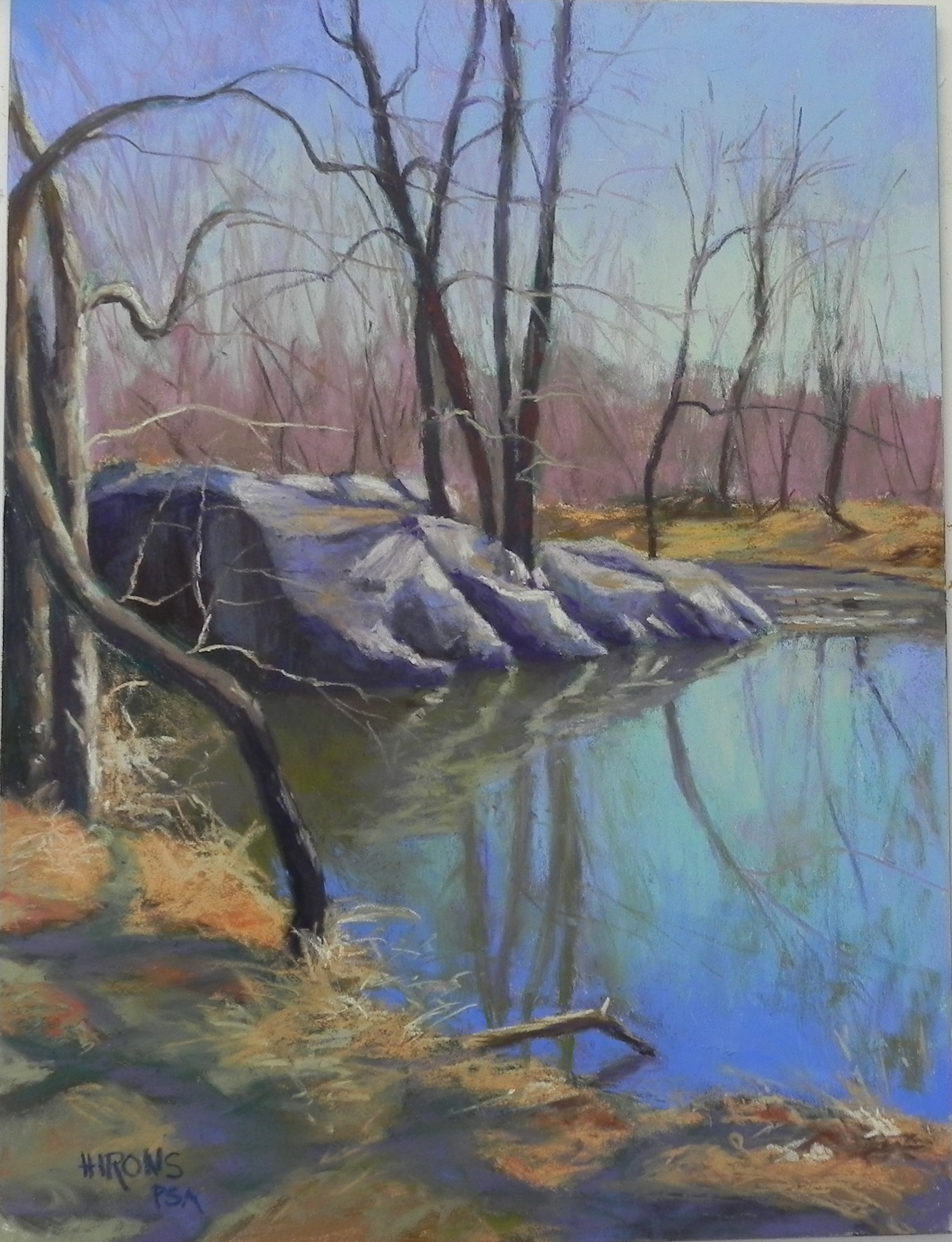
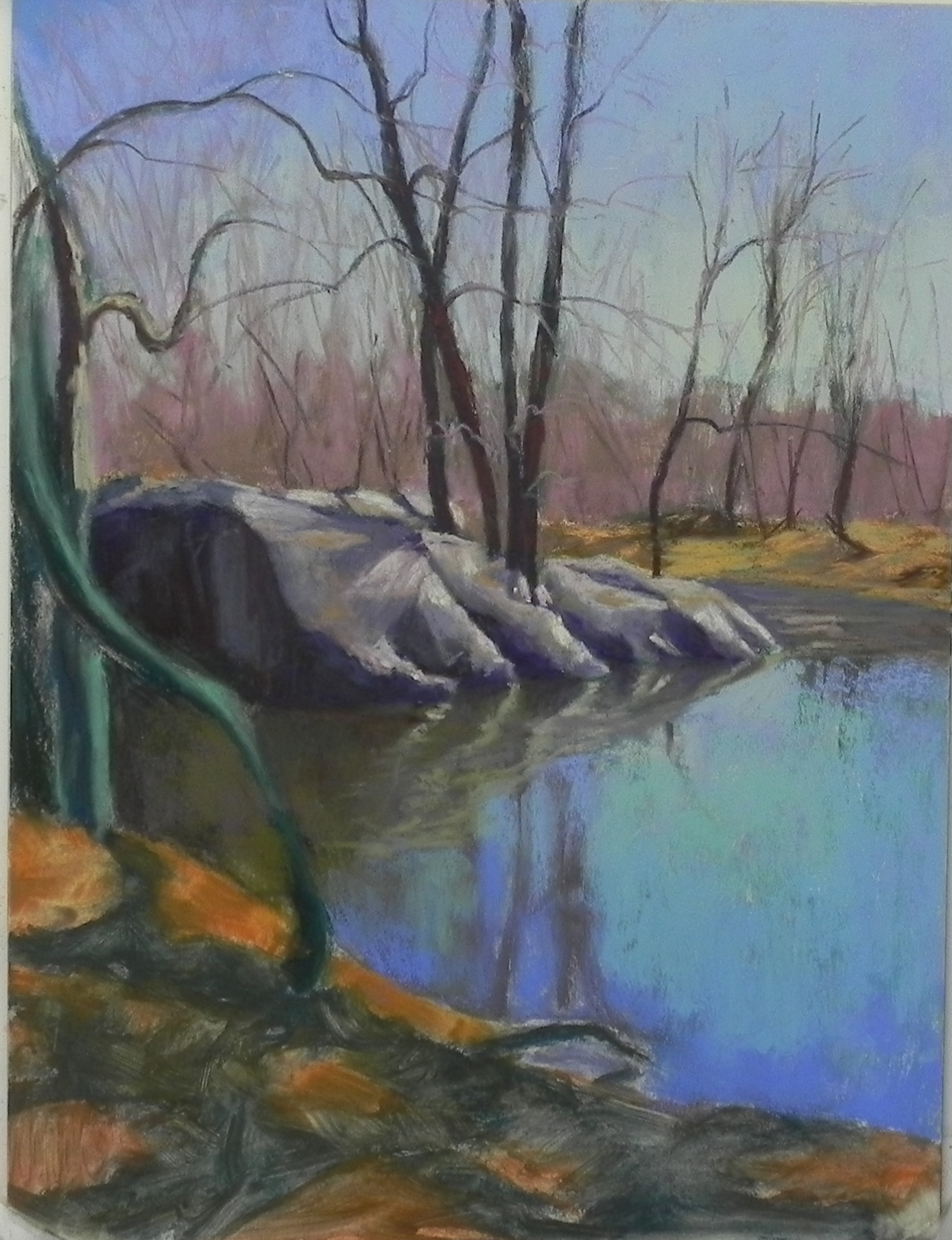
Initial graphite lay-in