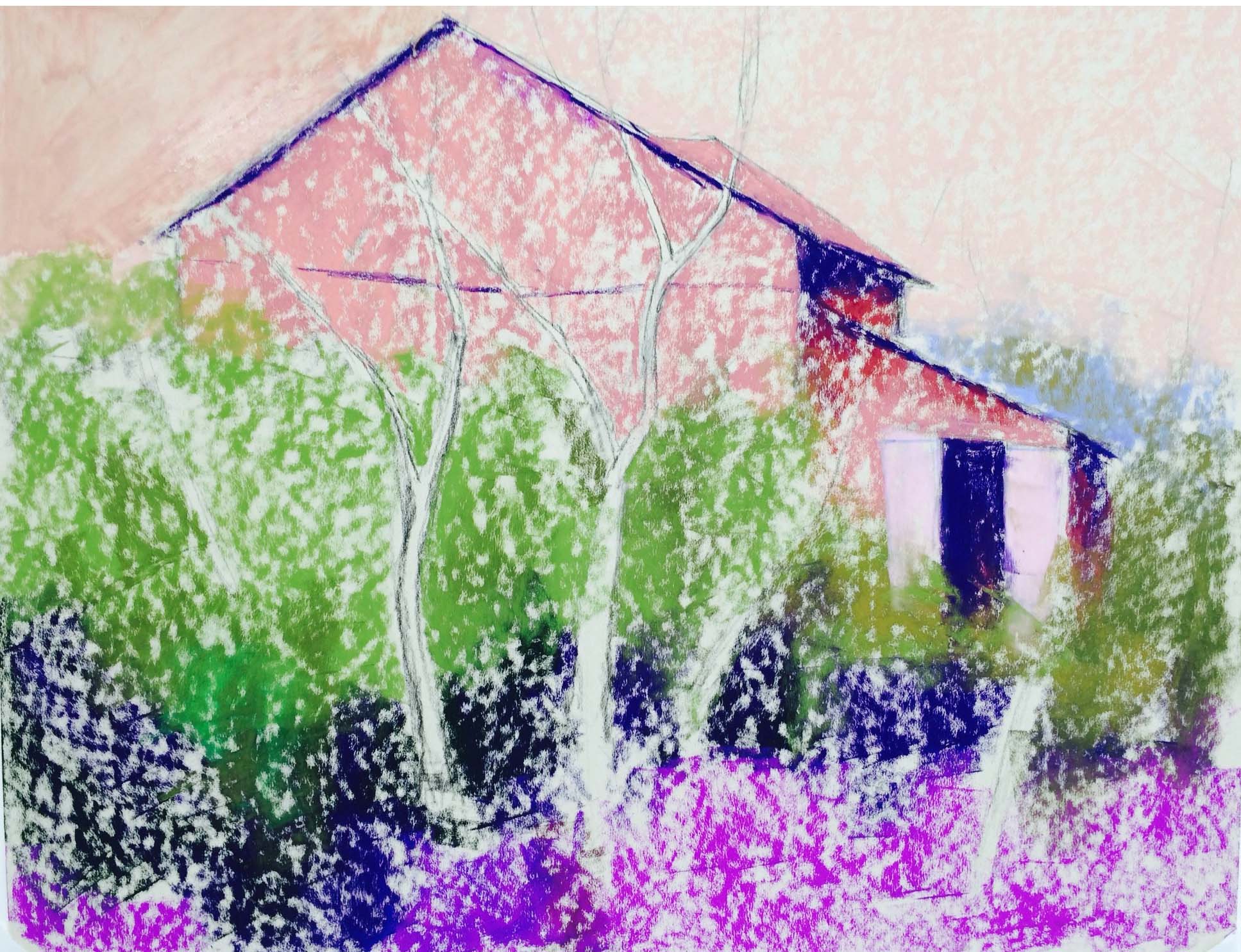
This was a fairly complicated picture for me and not what I usually do. The photo was similar, but the barn was less defined and the reds were all cool and rather dull. I began the underpainting with a drawing of the barn and some basic colors. Warm under the barn, pale orange under the sky, warm greens under the reds, and cool magenta under the grass in foreground. In the photo, the other color along with the reds was a yellow orange. I decided that I didn’t like this and went with a warm green instead. By using the warm greens in the underpainting, I had the background color that I wanted. I covered most of it, but it was still a help.
You will notice that in the underpainting, I have doors on both sides of the opening at right. I realized that this didn’t work at all and got rid of the one on the right. What I’m not seeing in my photo is the turquoises in the barn and the aquas in the door. I didn’t think that the painting was working at all until I added the warmer red oranges to the red areas. Suddenly it came alive! I wanted the reds to be more concentrated on the left and fade off to more greens on the right. The sky is the same light red violet that I used in my painting House with Golden Roof. Both of these photos were taken on the same day within a very close proximity of one another. I made up the pale background on the right, feeling that it needed more distance, and I kept the edges of the barn very soft, except in a few places. What I think works here is the dark, rich greens against the variety of reds in the bushes, moving up to the more lacy sumac leaves at top. I really had no idea whether this painting would work or not! I did no studies for it, but I had an idea of what I wanted to do and I think it worked. The image of the underpainting is before I had added the alcohol, except in upper left corner (thanks Sunny!).
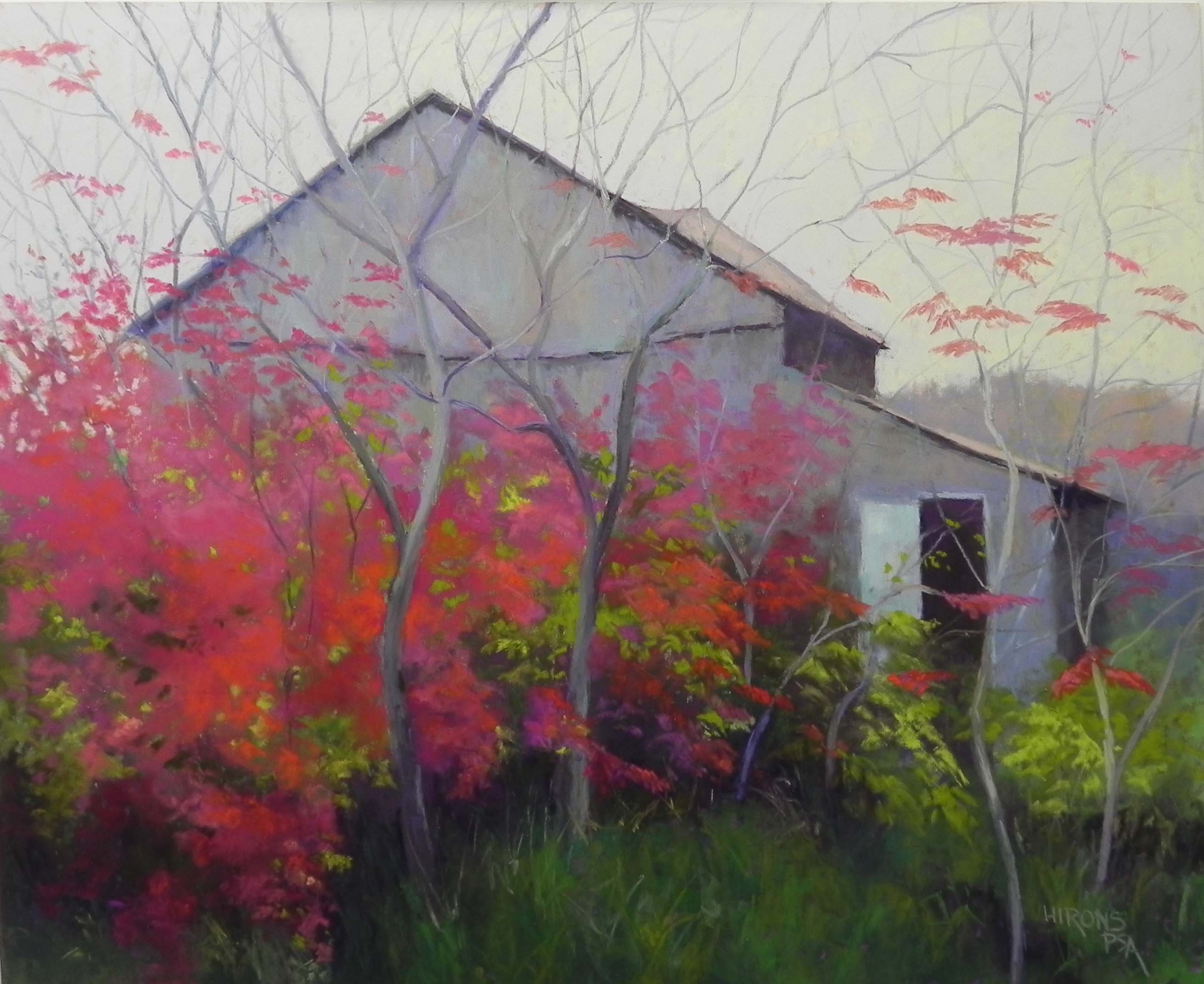
Autumn Reds, 20 x 24, UART 400
Initial underpainting