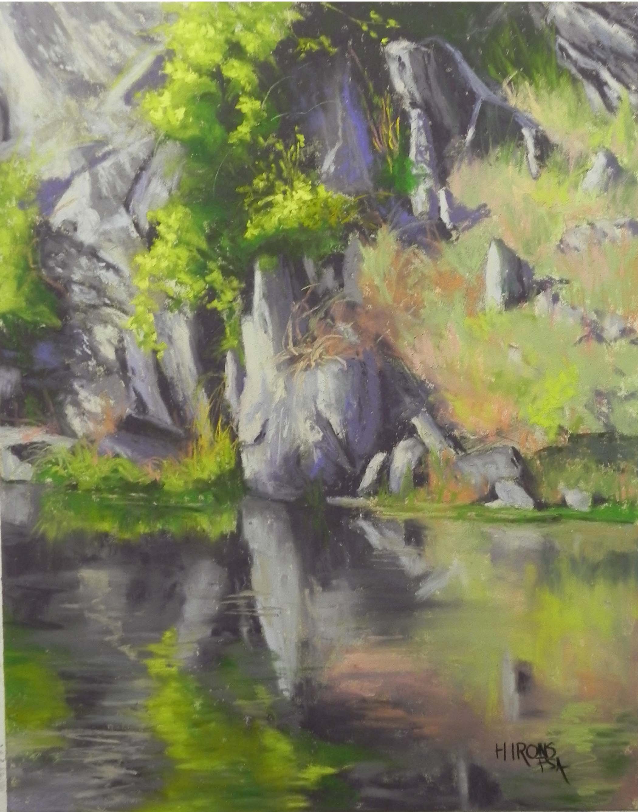
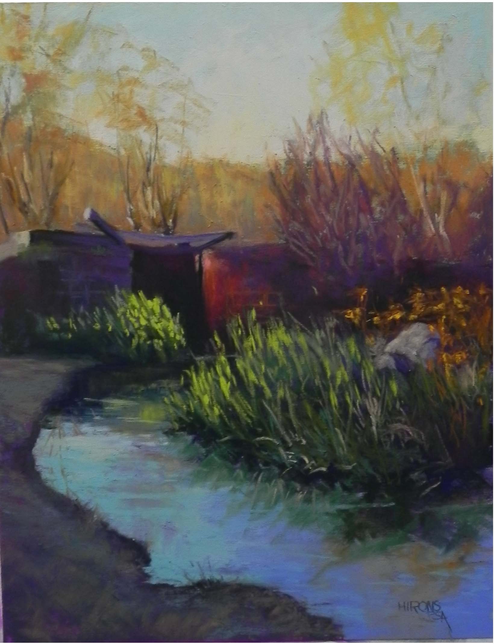
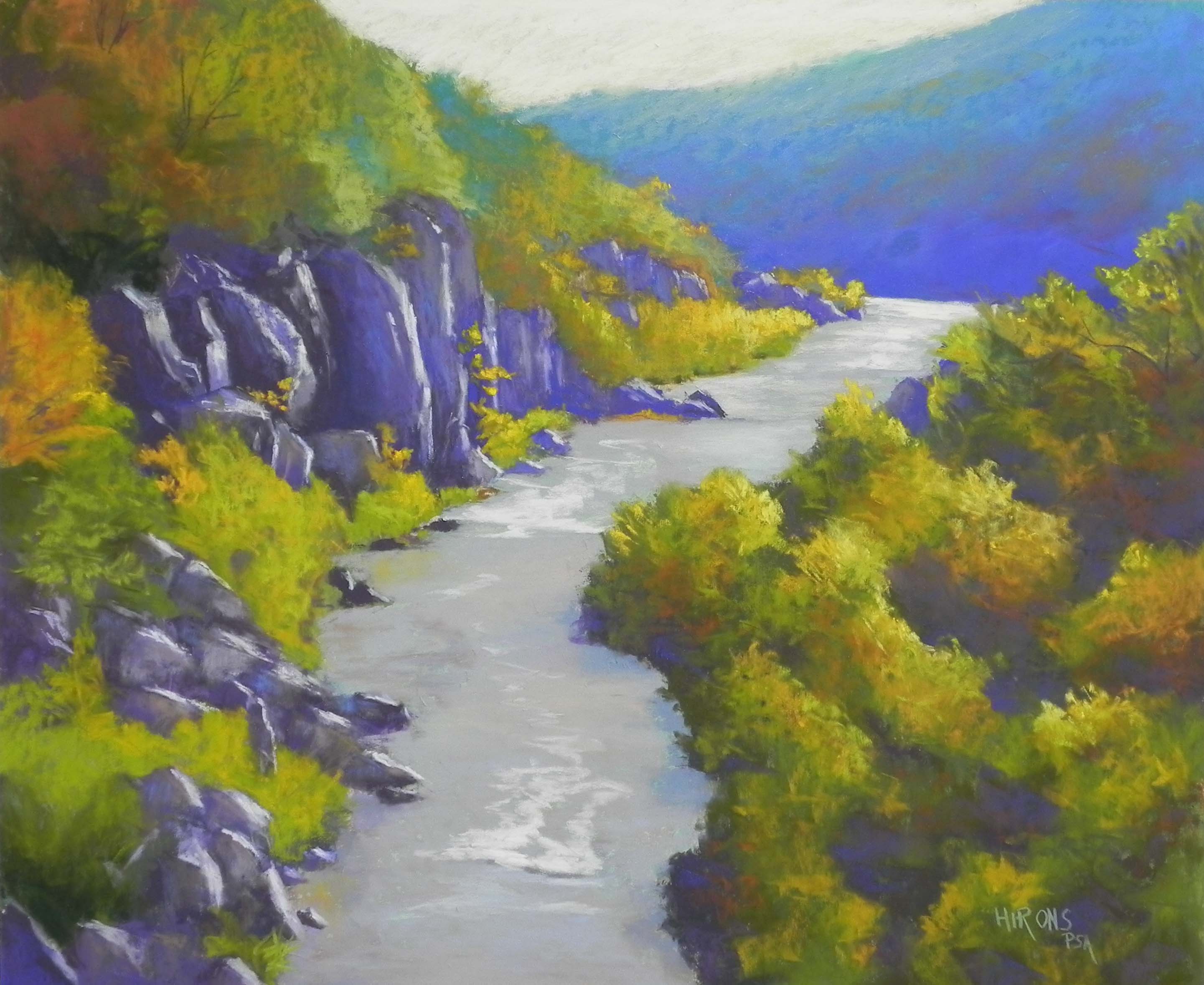
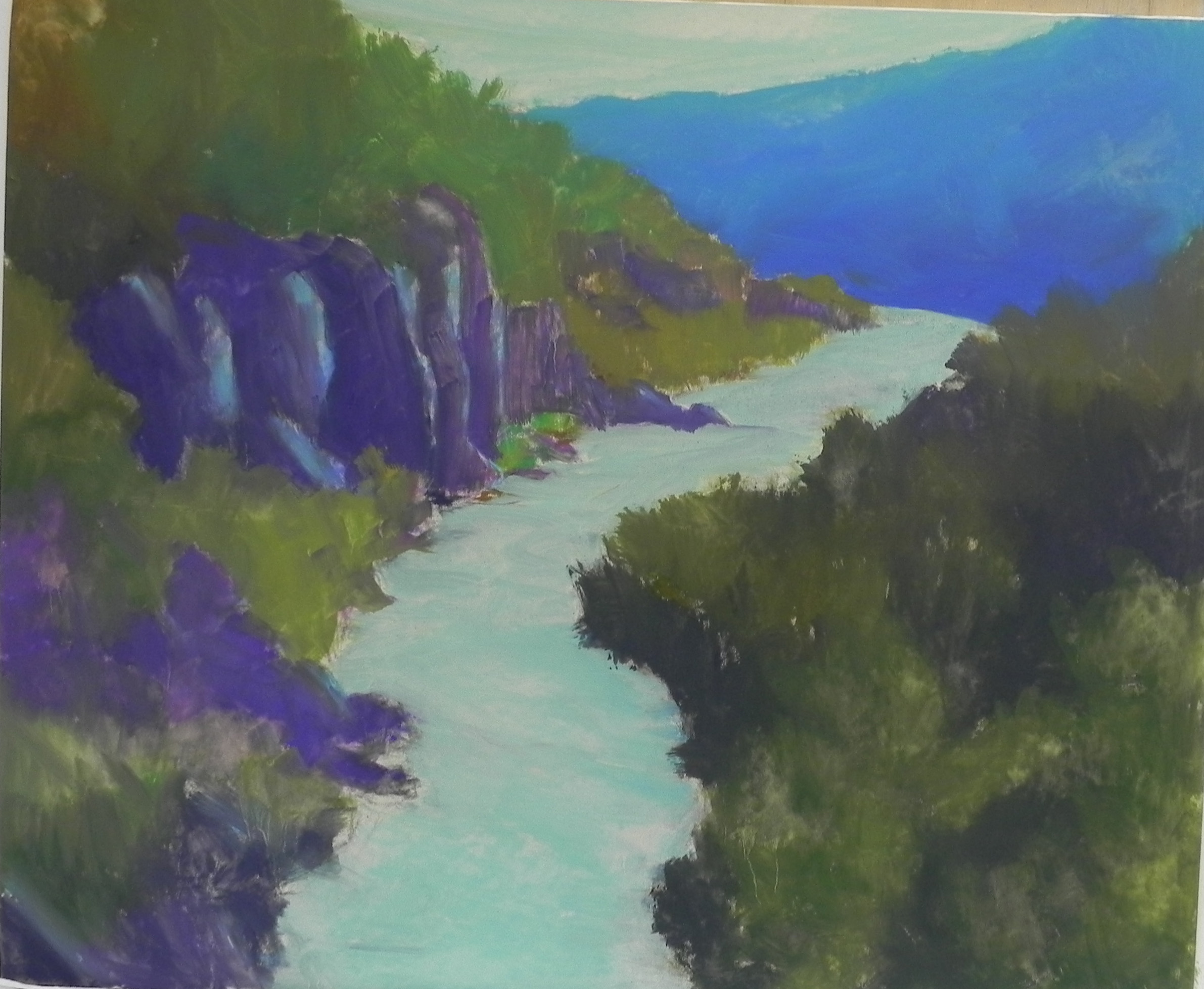
Here are two more pictures from the C&O Canal series. The left picture was done in Massachusetts as a demo for an old friend who has taken up pastel. It’s from the same photo as the earlier painting. I changed the orientation and the color scheme. I also got rid of the rock (actually a piece of cement, I think). I like the colors and flow of this one. The blue violet seemed a little too bright, and I layered a dark brown over it. It’s still more vivid than the dark grayed red violet that I used in the earlier version, but I like the contrast with the yellow oranges. The second painting was one I’ve been wanting to do since taking the picture. I really liked the abstract shapes in the lock and its reflections. I did an underpainting of primarily local color. The most successful think was adding some blue greens into the upper part of the painting to push it back and give the sense of distance. This is it! I’ll have these paintings in my studio for the Friday night opening of the December show. Now, on to snow–which is promised for tomorrow! Happy Thanksgiving to you all.
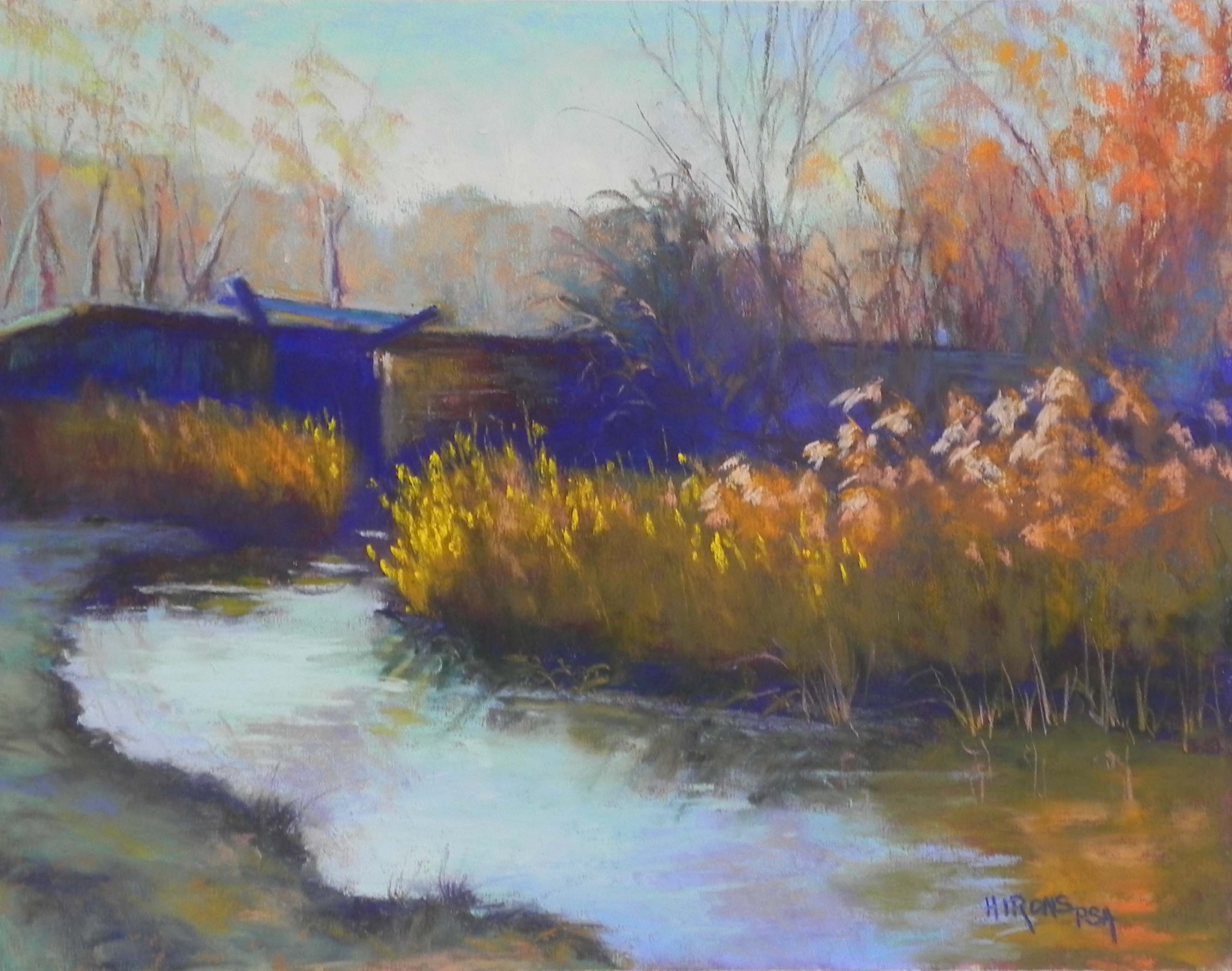
Late Day Light, C&O Canal, #2, 11 x 14, UART 400
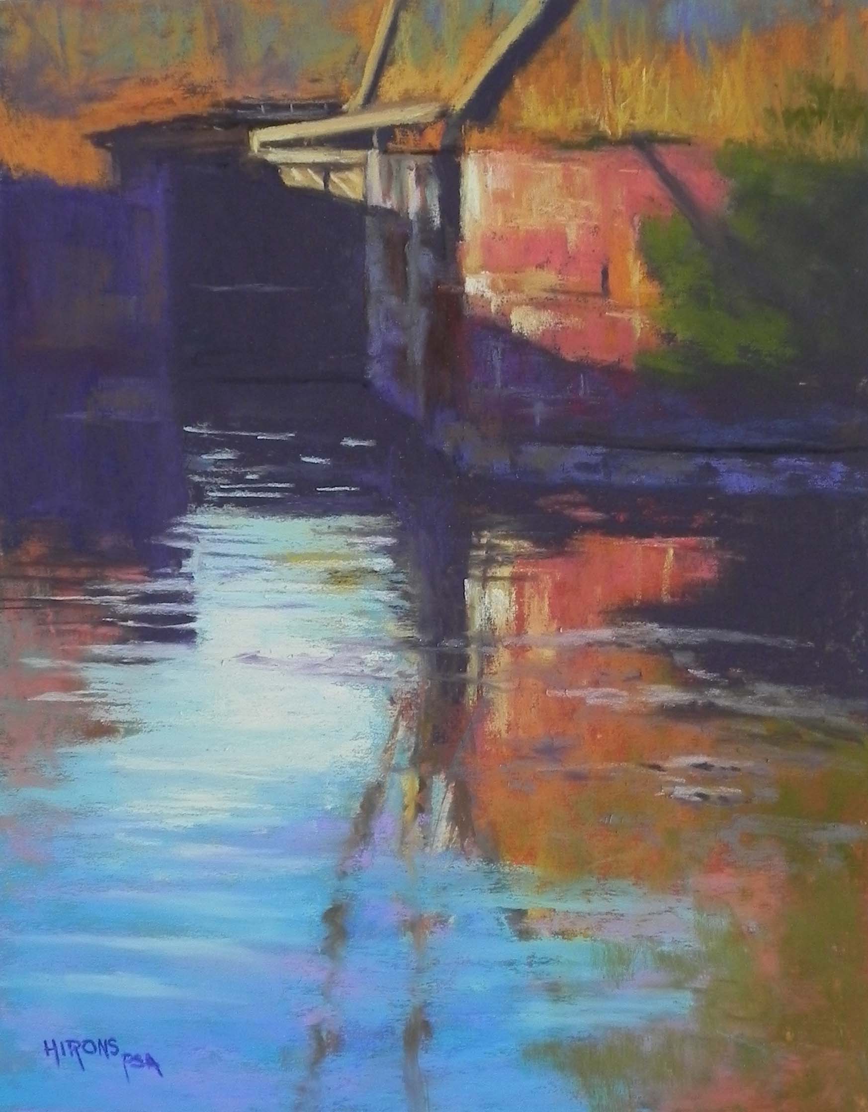
Lock Reflections, 14 x 11, UART 400