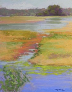
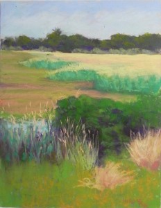
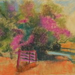
I’ve just spent some time in the studio working on these two plein air paintings that I did on Wednesday during a brief trip to Chincoteague, VA. For those not familiar with this area, Assateague Island National Seashore is a very large barrier island along the Delmarva Penninsula that separates the mainland from the Atlantic Ocean. Chincoteague is both a town and a National Wildlife Refuge that is in Virginia. It’s a favorite get-away for many in the DC area, but it was John’s and my first trip. We will go back! We lucked out with a clear, beautiful day the one full day of the trip. But the photos from the first, more muggy day are actually best. The most beautiful spot is Snow Goose Pond that has a drive around it, only open to cars after 3:00. John dropped me off with my gear and I spent two happy hours doing these two paintings. They aren’t great, but I really enjoyed looking at and trying to capture the multitude of color in the marshes, grasses, and distant trees. Of course these pictures lack the many birds and ponies that one sees there. They may appear is some studio pieces. I tried to focus first on composition and some of my changes today had to do with the composition, adding a little more water in the Marsh painting to open it up, and changing the shape of the trees in the Grasses picture to make them more interesting. I tried to remember the color and change it only to match my memory. My photos are amazingly dull! But one woman came by and said “I’ll bet you are having fun with all this color” so it wasn’t must my imagination. Anyway, I was so happy that I’d brought my easel and pastels. I may try to do a painting this week as I get ready for IAPS.
Monthly Archives: May 2015
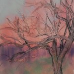
Fall Apple Tree (commission)
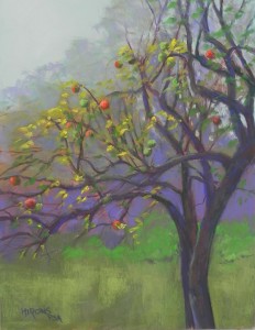
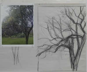
Yesterday I spent a good part of the day in my studio doing a commission. The request was for a painting of an old apple tree that had been in the client’s mother’s yard, but now gone. I was sent 4 photos, all rather dull, with surrounding trees, fence and houses. I had NO idea what I was going to do!!! So I started with my favorite of the photos and drew with charcoal on newsprint to try to capture the flow of the branches, which is what the customer loved. I really wanted to find a way to keep the background abstract and suggestive as it did nothing for the tree! I decided to play a bit and started by toning the white board with watercolor-a mix of violet and orange that produced a nice warm rust color. Then I got out my pan pastels, which I basically never use, and roughed in the fence in violet and put some green in the sky. But it wasn’t doing much and I didn’t know where I was going with this. So I next drew in the tree with charcoal and added water to it. Of course, now, I had all these little branches and I realized that the color underneath them was totally unhelpful! But I proceeded to paint the trunk and major branches of the tree, using a dark grayed violet. I couldn’t decide where I was going with the color! I wanted to have some red apples, so tried using a red-green palette, using my cool red and turquoise Blue Earth pastels. I didn’t like it. I switched back and forth from soft to Giraults, then back to soft. I really thought this painting was going to end up in the sink. At one point, I took all the violet Giraults out of my corn meal box and put them away, only to get them out again and realize that this was the perfect color!!! What a surprise! When I put the soft violet into the background trees and mixed yellow into the sky with my fingers, I suddenly had some beautiful atmospheric effects. I used the violets of the “fence” to provide a colorful background. When I added the yellow leaves and red/orange apples, the colors really came alive. The client was very happy with the painting and so was I.
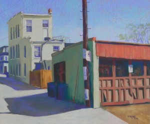
No Parking
I spent a hot day in my studio today working on another alley picture from Capitol Hill. This one is from a lovely walk in early spring. I loved the color of the garage at right, the many signs on the telephone pole, and the color and odd shape of the tall building. Plus, the shadows, of course. The pole was problematic as it is almost right in the middle, but I couldn’t move it and maintain the light and shadows on the signs. So I left it as it is. It’s not quite centered! The color scheme here is green, red orange, and blue violet. I used all of these colors in the shadows and dark places as well as in the telephone pole. You can see the colors I started out with in the underpainting. They really helped me and there are little pieces that show through here and there. The sky color was quite unusual, but I thought it would relate to the color of the garage.
This is the third of my alley pictures in my Insider’s Washington series. I just picked up the 6 framed Georgetown Canal pictures and they look great!
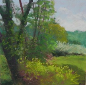
Painting at the Winery
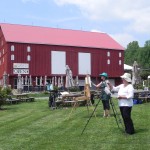
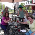
Went out yesterday afternoon with a group of my pastel friends to paint at the Sugar Loaf Winery on Comus Road. We have one mountain in Montgomery County–Sugar Loaf. It’s a small mountain but you can see it from many angles. And we have one winery, very near the mountain. It’s a pleasant place to be as there is plenty of off-road parking. Most of the others chose to paint a rather boring gray barn that they did wonders with colorwise. I chose to pick and choose from the trees and bushes across the street. I particularly liked the large tree going off at an angle to the left with a brilliant yellow green bush growing up against it. I opened up the scene with a stretch of grass and more sky. There were actually all trees just to the right of the big one! But that’s what we can do outside–look at the landscape and see what will work as a composite! I’m so happy to have this group of wonderful people to paint with. Most are current or former students who live in the area. I got it started, then am asking each of them to organize an outing since I won’t always be here. Kathy organized this one and it was great. We enjoyed a lovely bottle of rose and cheese and crackers after a successful paintout.
Spring Apples
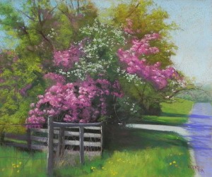
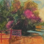
Here is my latest studio painting. I began this painting on my birthday and had a wonderful time with it. It’s a grouping of several types of flowering trees. One was definitely a regular apple tree, the other I think must be crabapple. It was quite amazing! I’m sharing the underpaintings with you and thought I’d talk about the surface and color choices for the underpainting. I didn’t change the composition or color scheme for this painting. My main challenge was dealing with the large amount of detail. So I decided it was time to return to the Reeves paper, which I have enjoyed working on so much. It turned out to be perfect! I applied two coats of liquid primer, toned with sienna and umber (you can see the color on the upper right of the underpaintings where there was no pastel added). I did an underpainting using Holbein sticks, which I’ve found to be quite useful for this purpose. Given the complexity of the subject matter, I decided to go with the local color and not the opposite. It might have been nice to have green under the red, but I found it a lot easier having mapped out the reds ahead of time. Remember that an underpainting is there to help you! For the grass, however, I used several oranges as this was relatively straightforward.
In applying the greens and reds of the foliage, I used primarily soft pastels. I find that they work better on this surface than the Giraults. I did a lot of “hitting” the pastel against the paper to leave small marks. I really liked how the surface allowed the undercolors to show through. The fence was probably the most difficult part. It’s going at several angles and in the far left, it’s just wire. I thought about adding more fence posts or slats, but didn’t want to cover up the grass and decided to go with it as it was. I added a hint of the wire, which I think you can see. I mainly loved the angle of it and light hitting the back side.
Yesterday I entered this painting, Spring Stream and another in the PSA show. It’s getting a lot harder to get into it, but I’m giving it my best shot!

