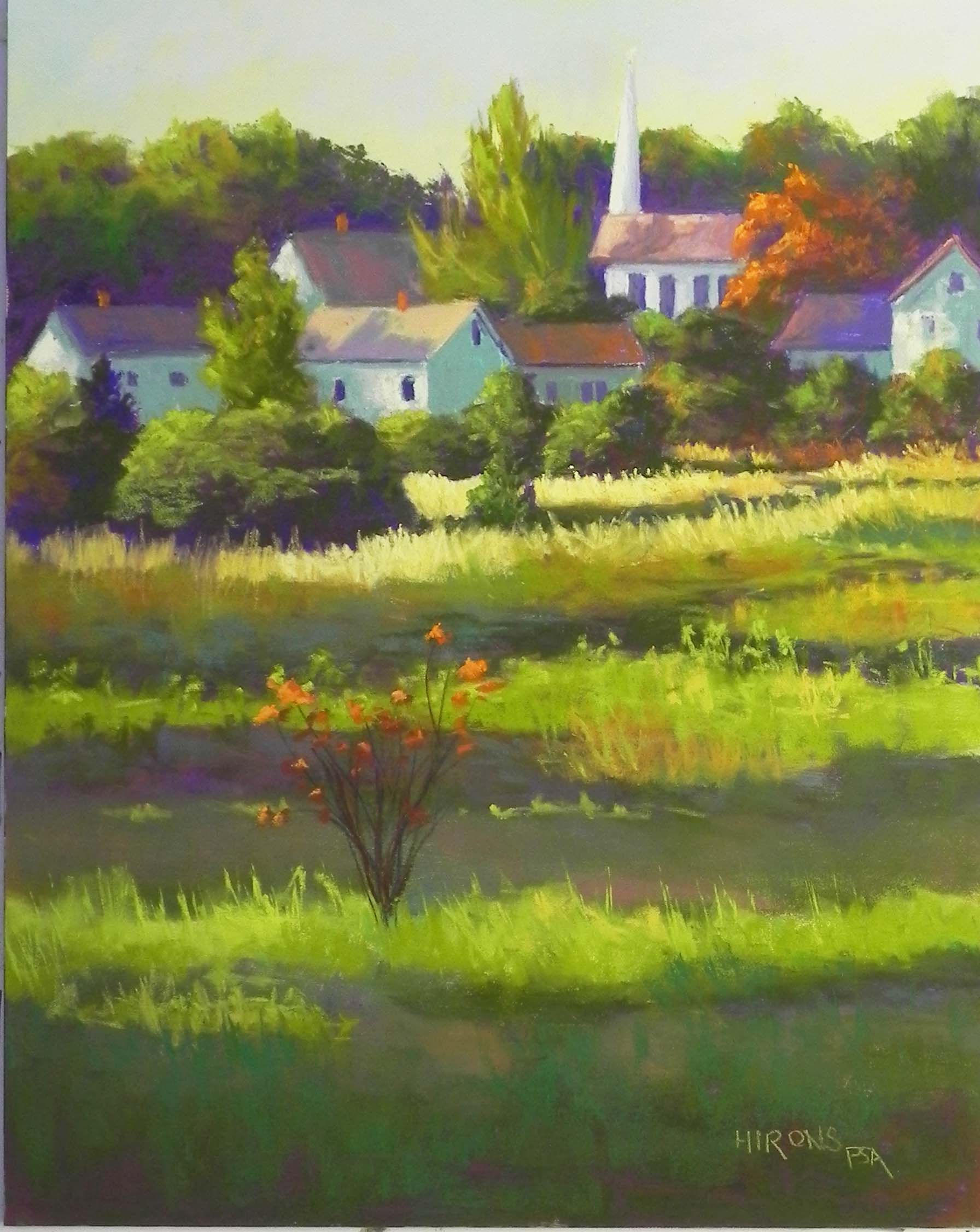
I just completed this painting, potentially for the gallery in Vermont. It’s actually not Vermont–it’s the Finger Lakes. But who’s to know! I loved the shape and color of the barn and the lifting fog, not to mention the golden rod leading the eye into the distance. I made a few changes in the composition but they are relatively minor. I worked on a gold surface without any underpainting, just a pencil drawing. I wanted to capture the sense of the intense morning light flooding in as the fog was lifting and the sparkle of the flowers and grasses. I’m not sure what color the barn really is. It might be brown. But it looked violet to me when I took the picture and certainly in the photos. It works so well with all the warm greens and yellows. I filmed the barn from the east side of Lake Seneca on our drive home. Everything was so beautiful, I kept stopping the car to jump out, irritating my driving companion, who was anxious to get home! But I’m glad that I did. I’ve just gotten up my courage and sent the three images to the gallery owner. Wish me luck!
More on the painting. The biggest challenge was the large expanse of barn. I resolved it in two ways. First, I added a small tree just to the left of the bottom window to help break it up. Then I added some greens and a little of the red from the ground into the surface. This breaks it up and helps tie the colors together. Before I did this, it was too purple! Imagine!!! I worked very hard when applying the primer to the paper to avoid loose bristles. But one got past me that was in the roof to right. I was finally able to remove it. I keep remembering Richard McKinlay saying that loose bristles are like “little logs” in your painting. He’s quite right!
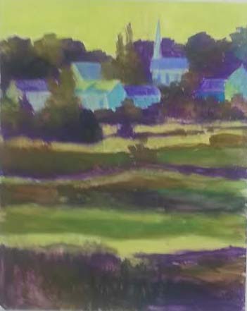
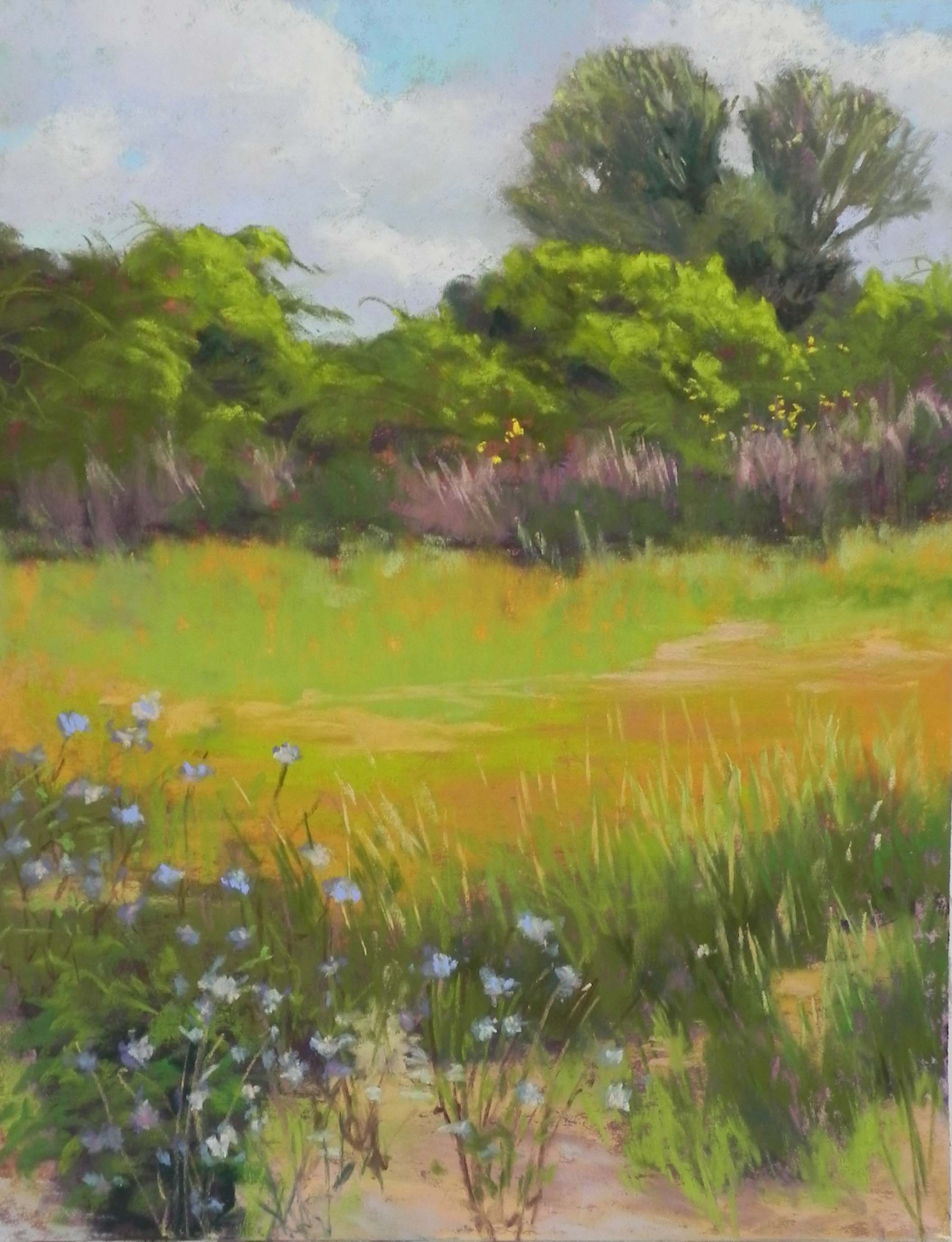
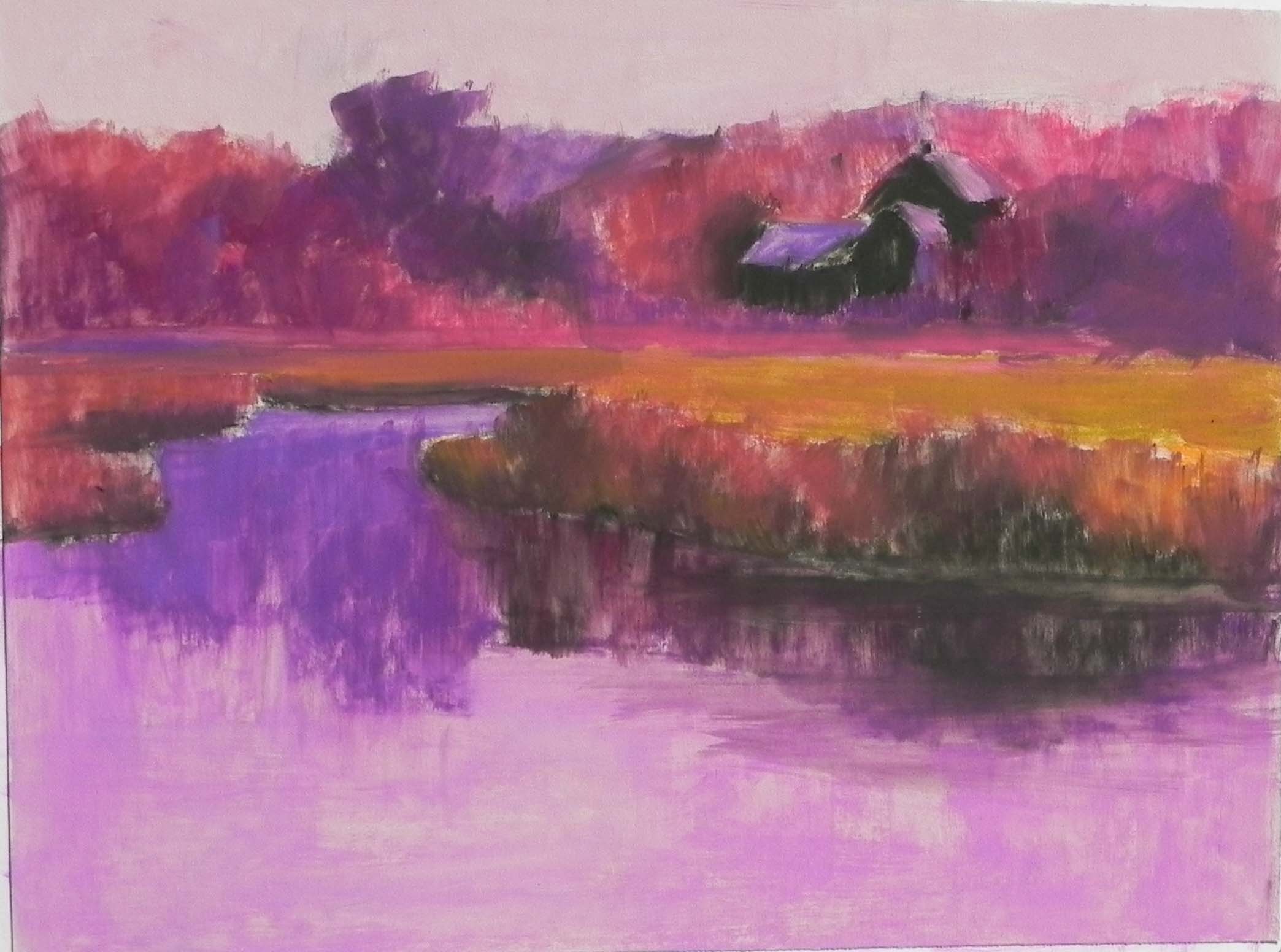
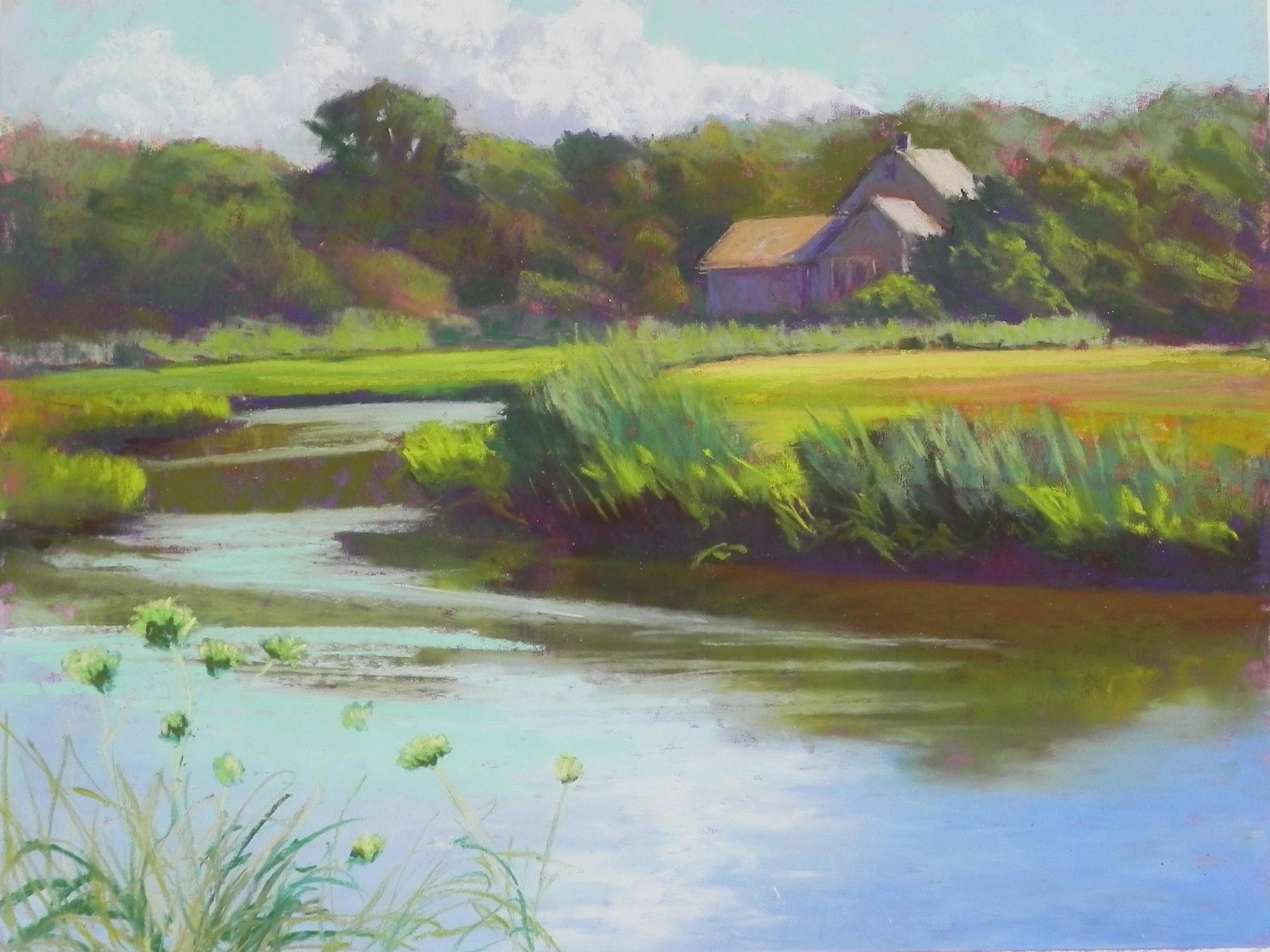
John downloaded Windows 10 to my computer and I’m having a really hard time with my photos. I download them, then can’t find them. If anyone knows the secret to this, let me know!
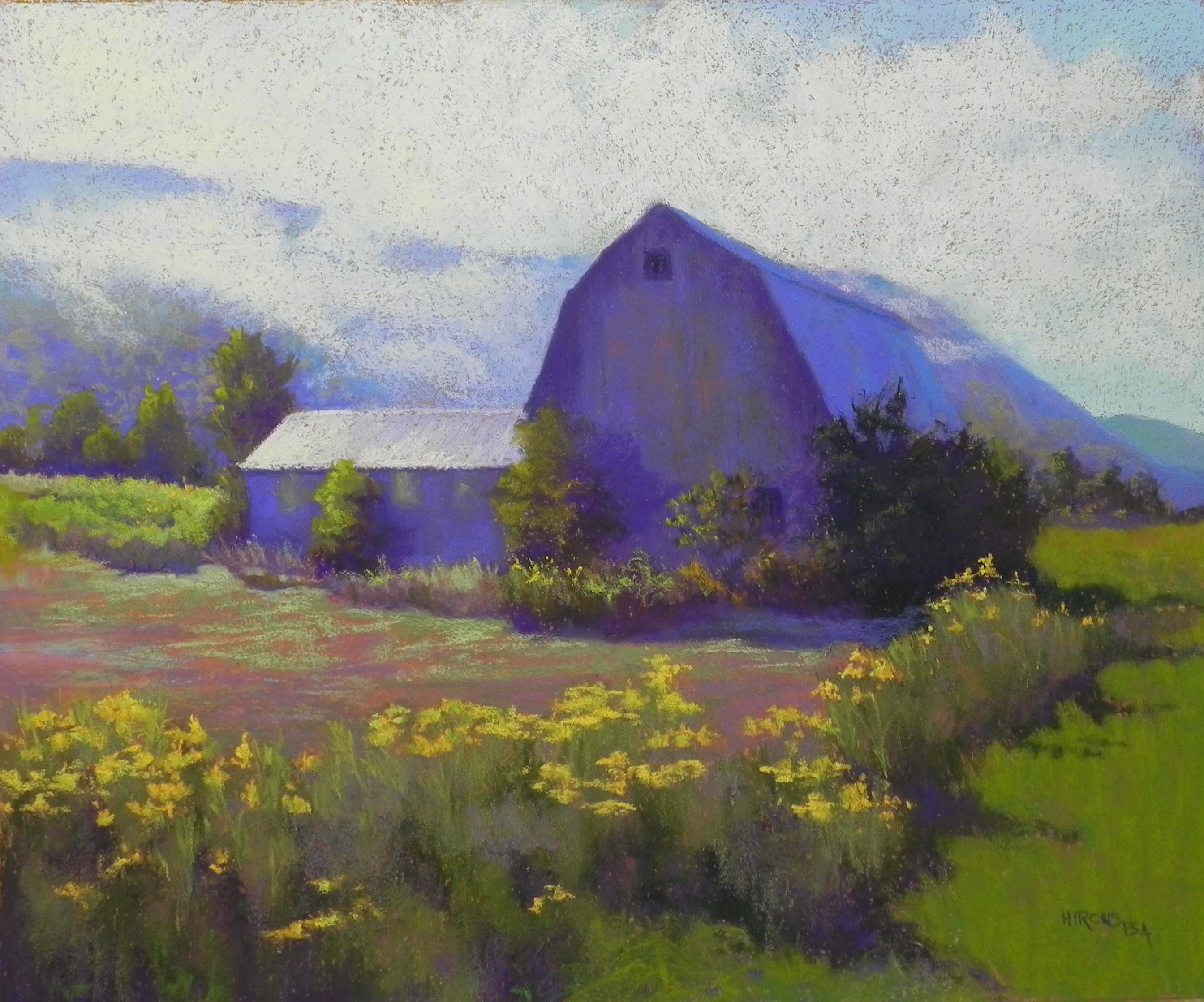
September Gold, 20 x 24, Rives with Art Spectrum Liquid Primer