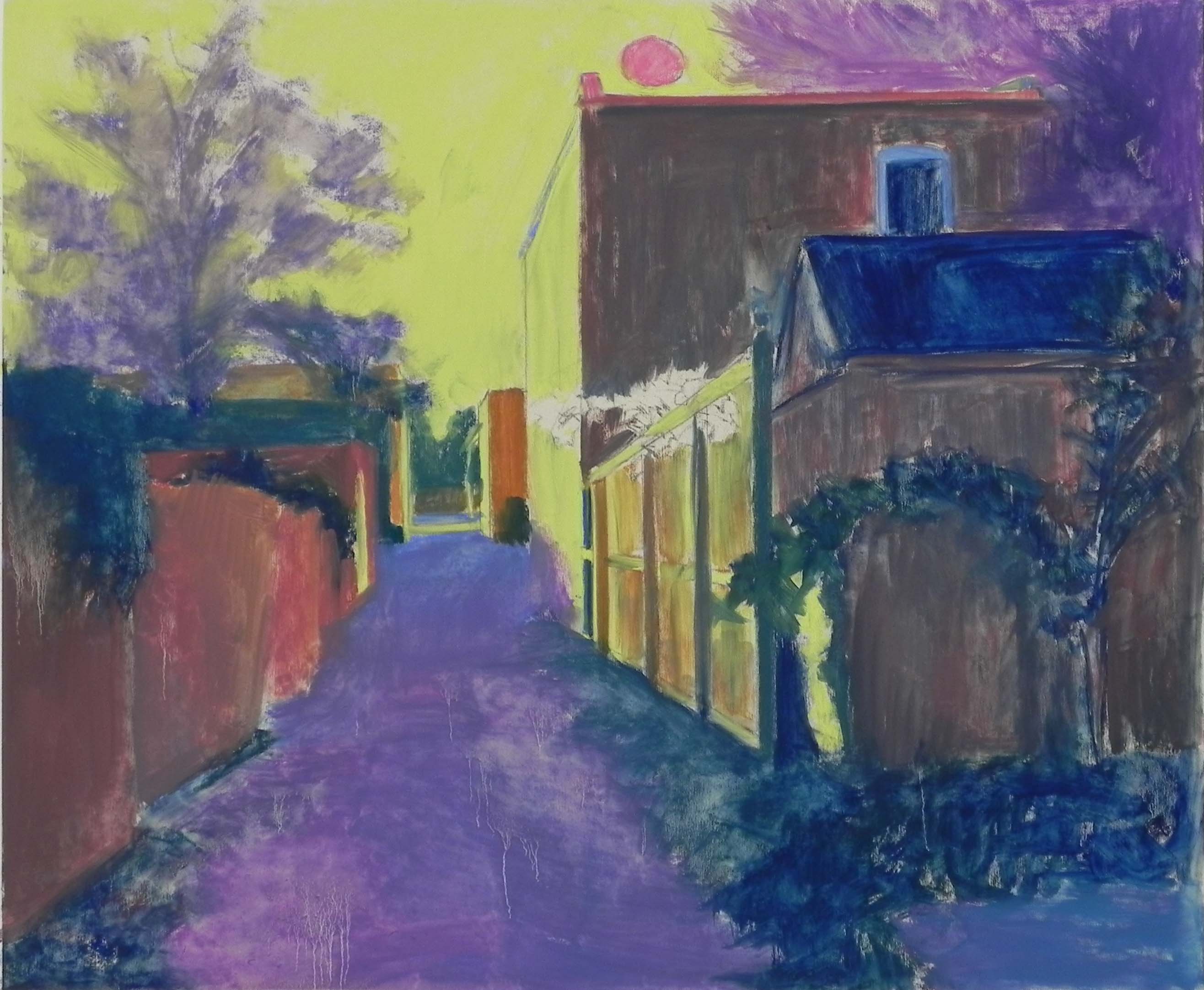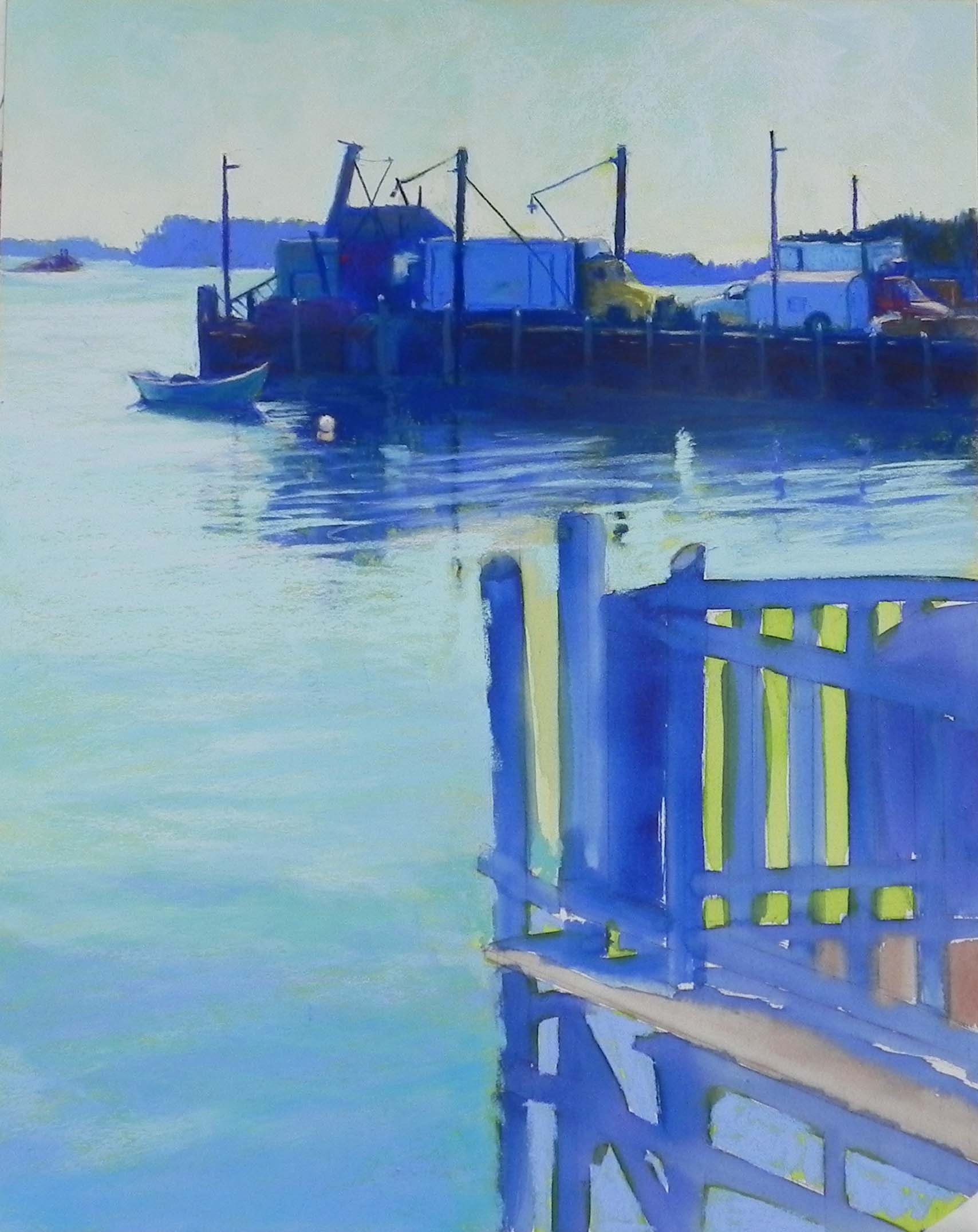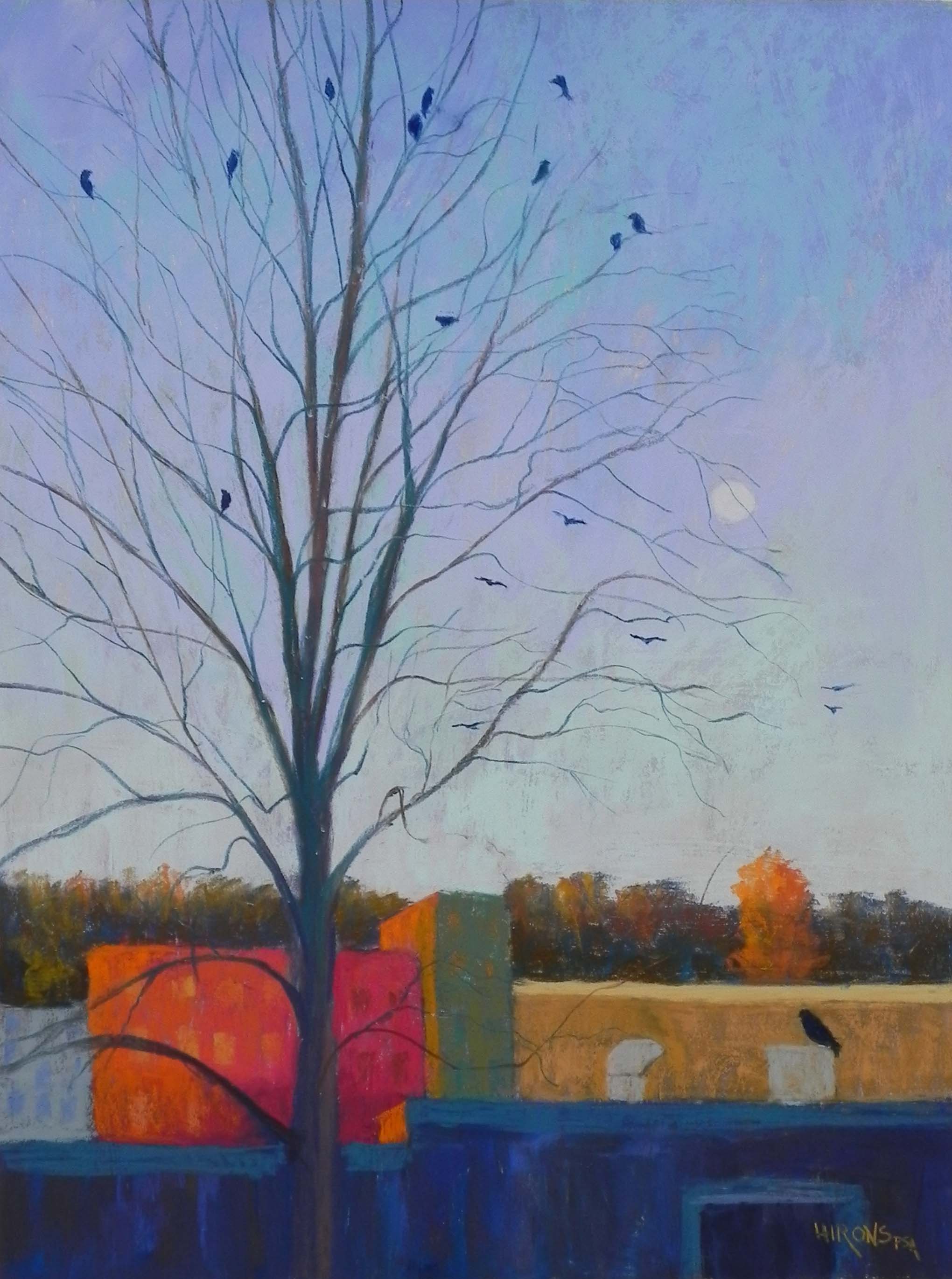
Moon Rise with Crows, 24 x 18, Pastelbord
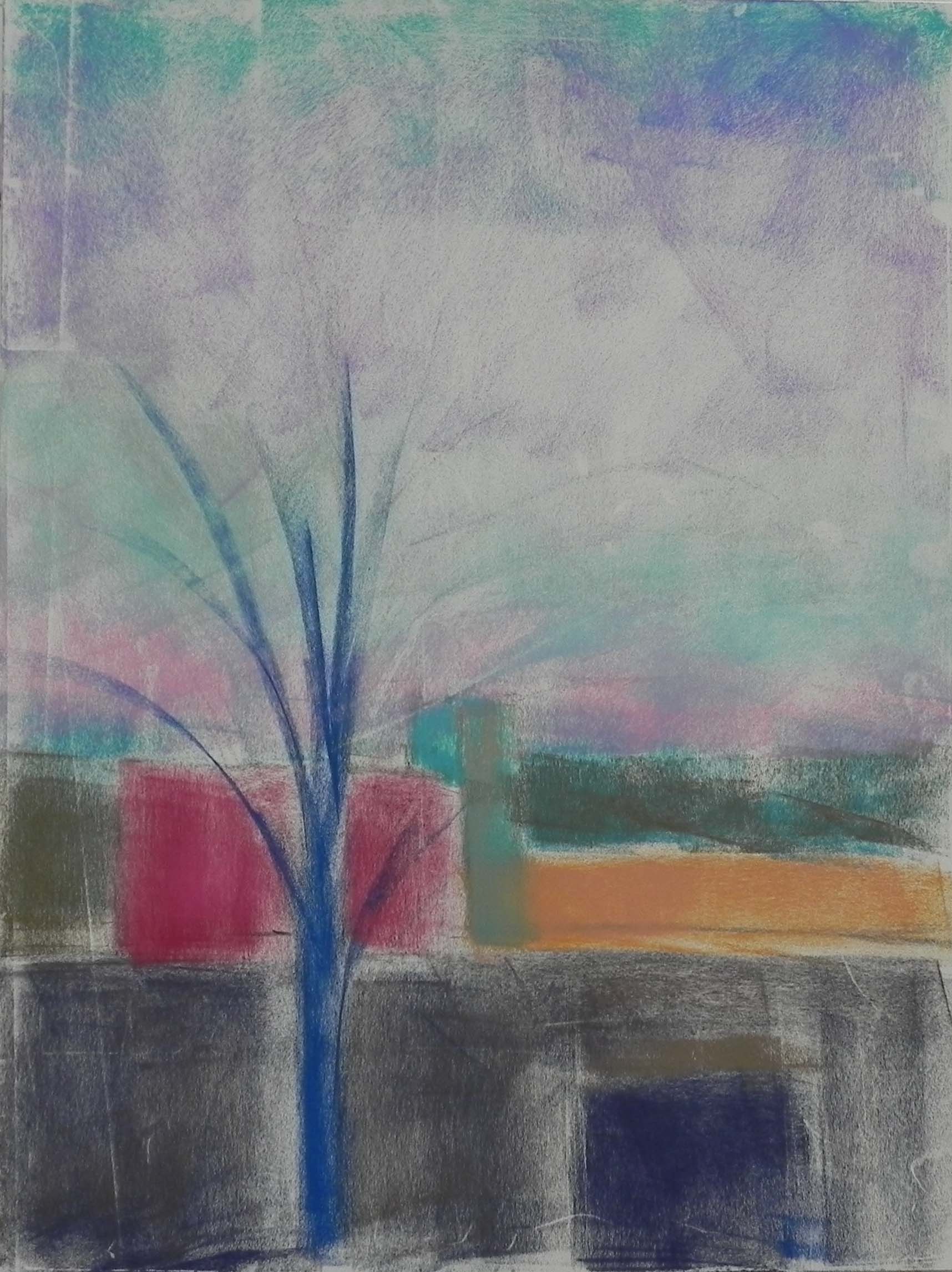
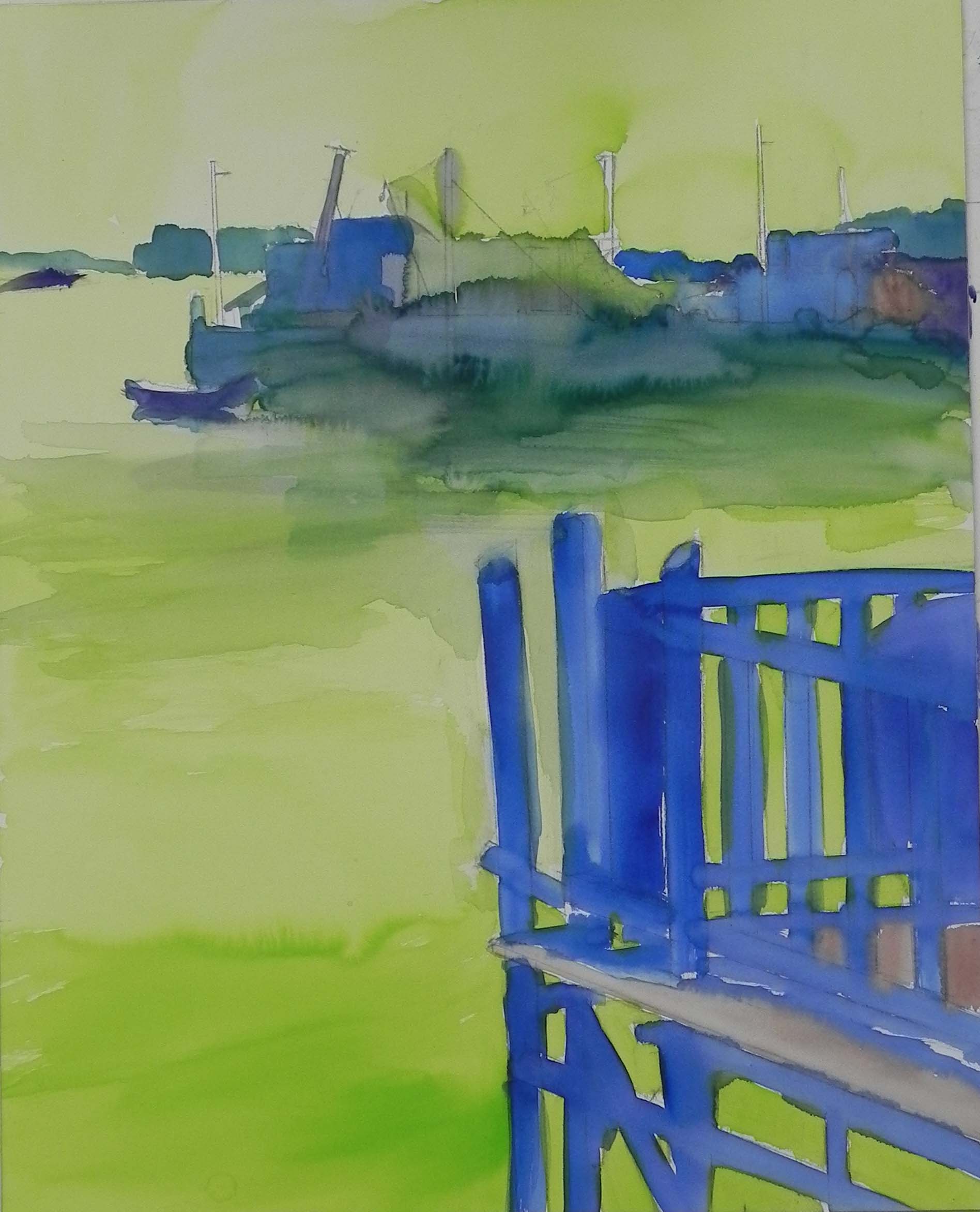
Underpainting prior to the alcohol
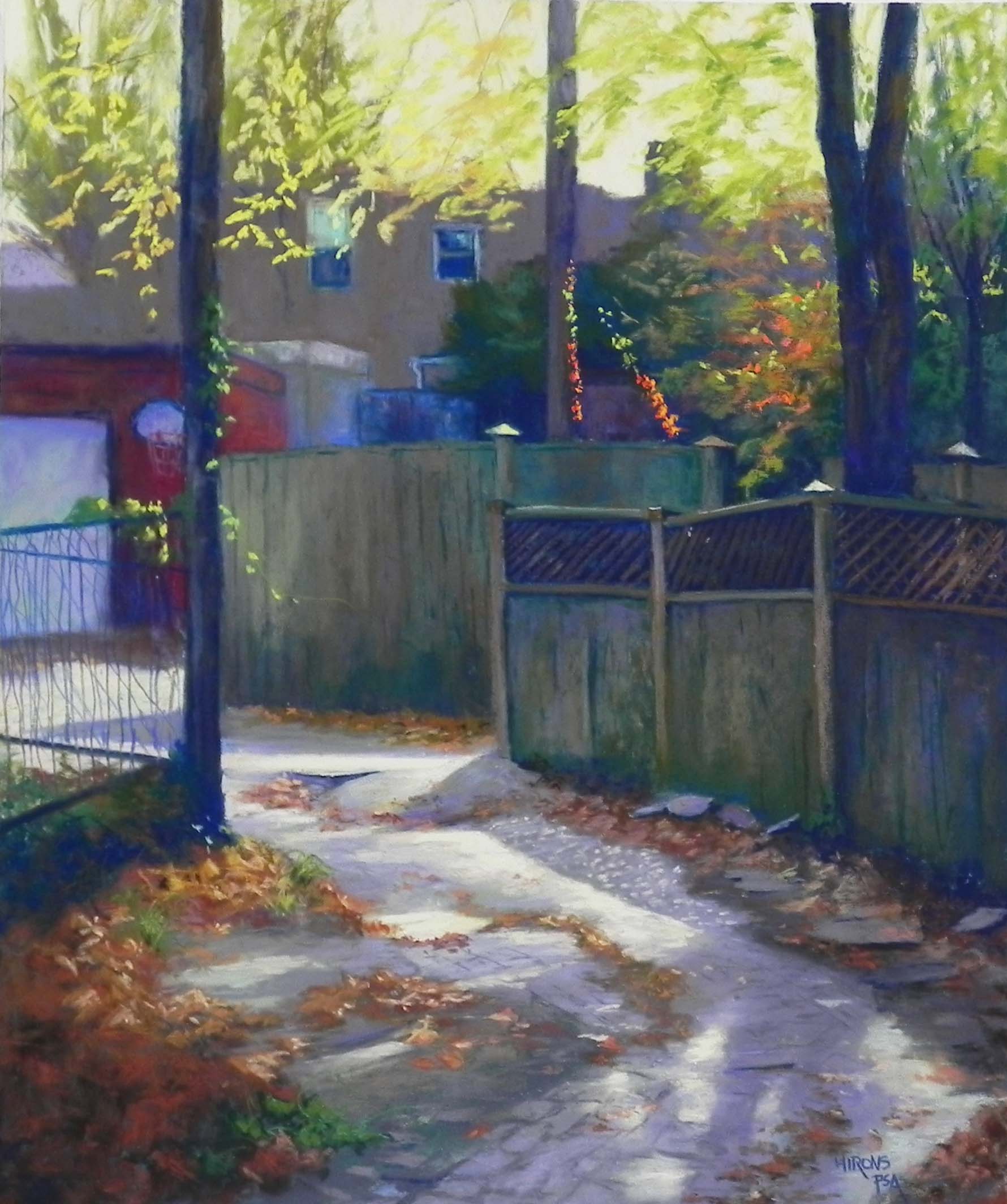
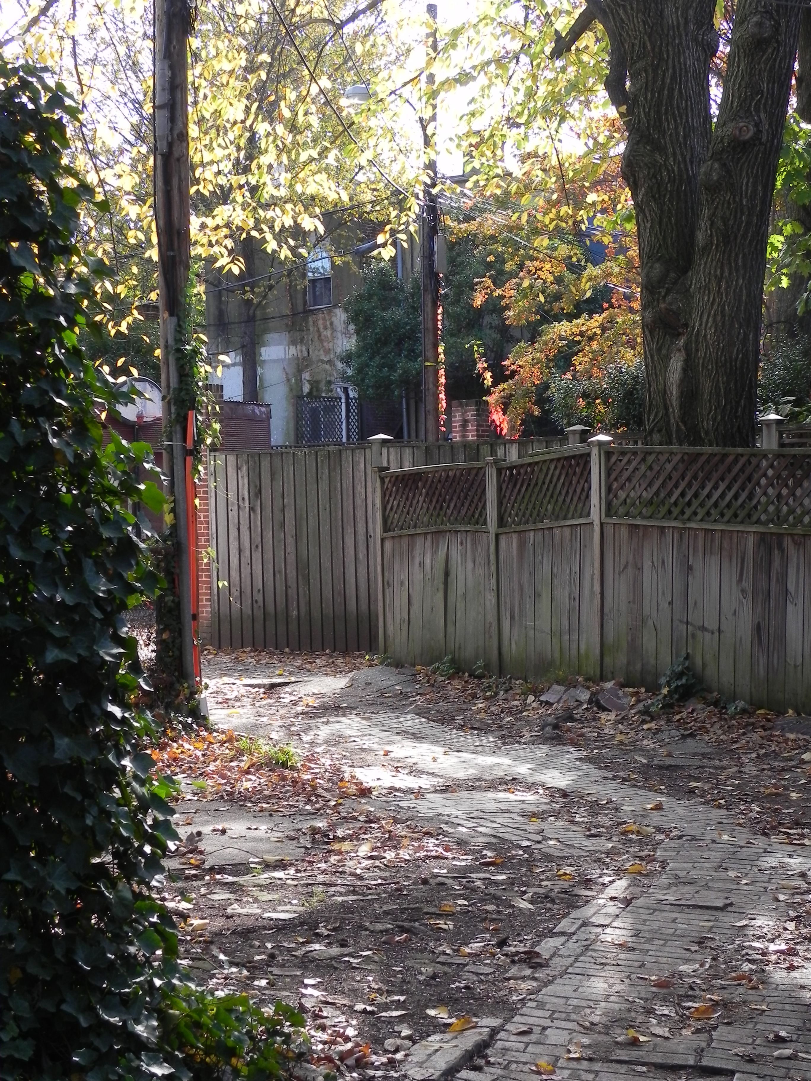
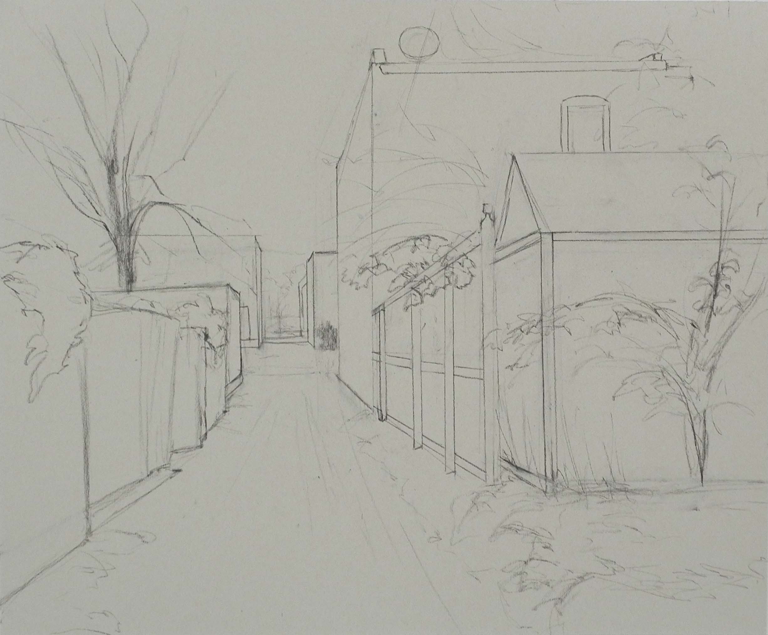
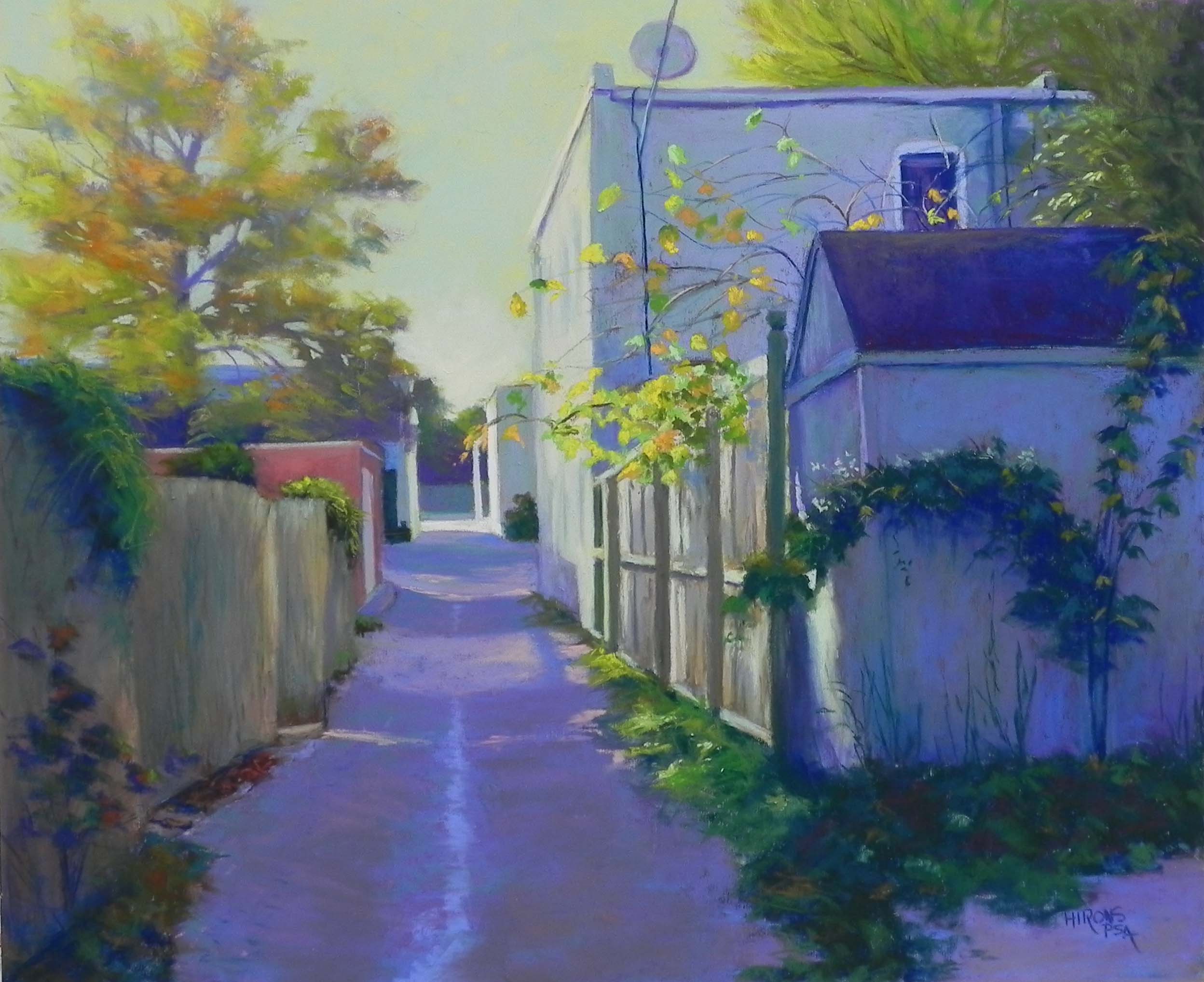
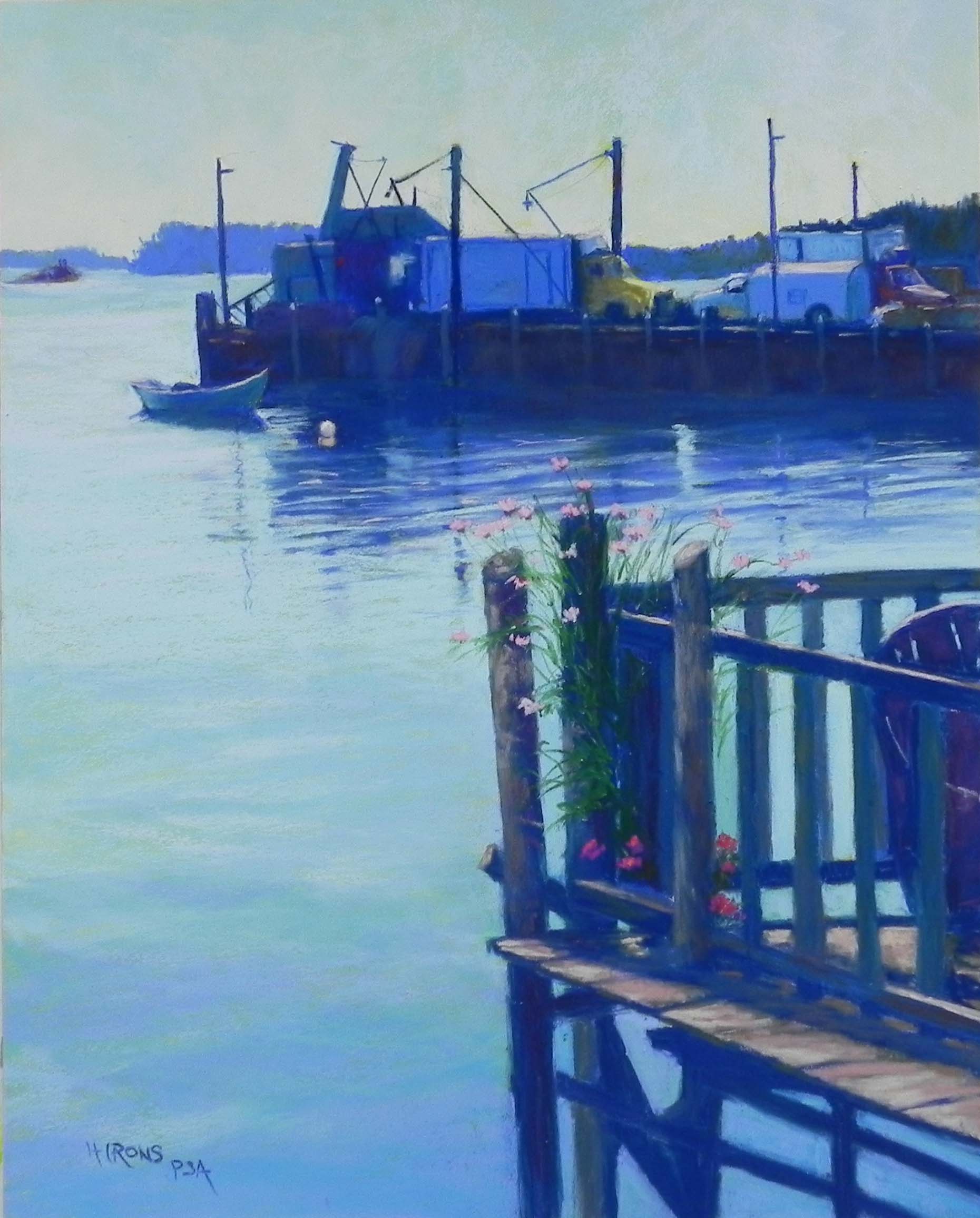
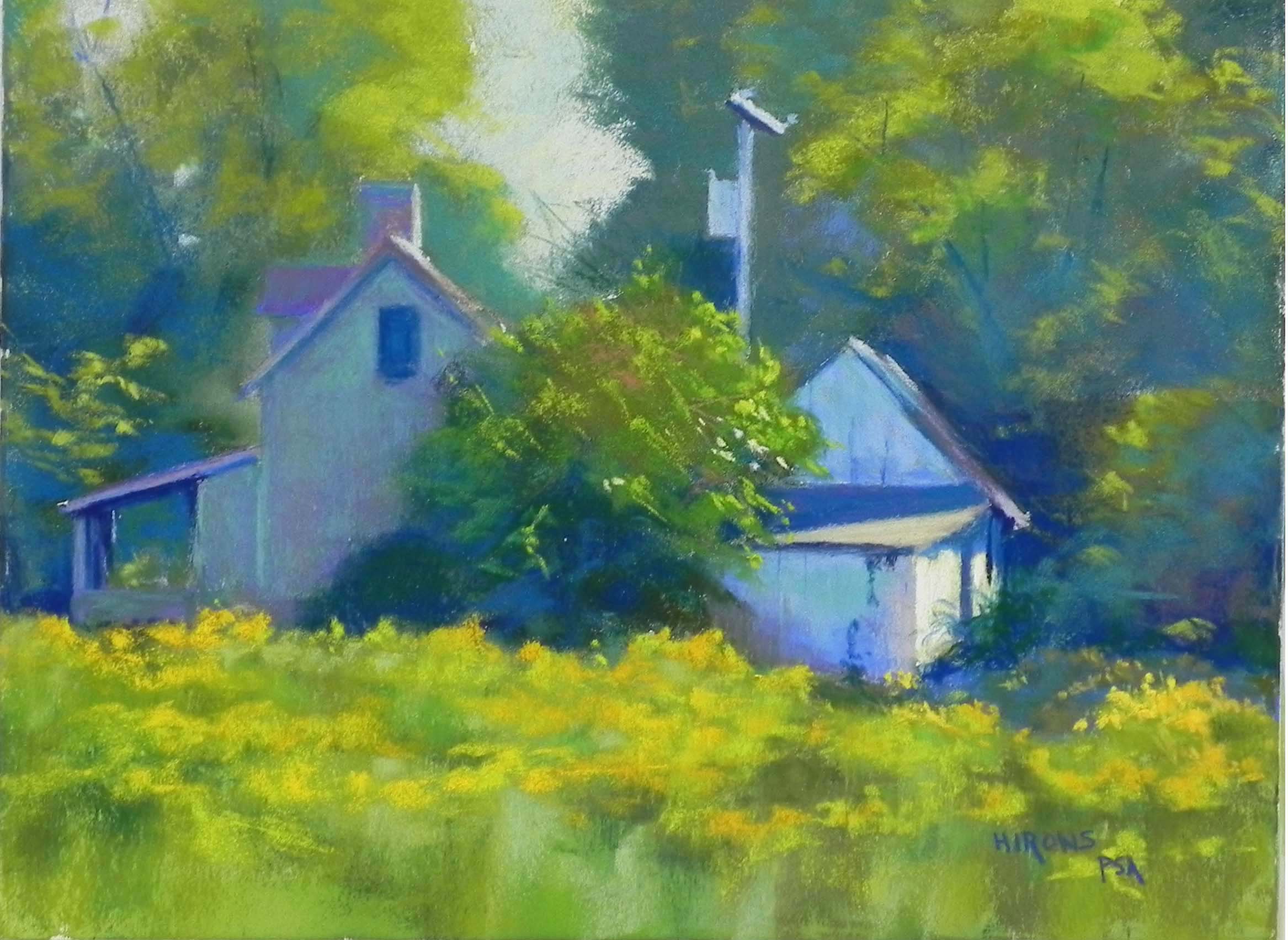
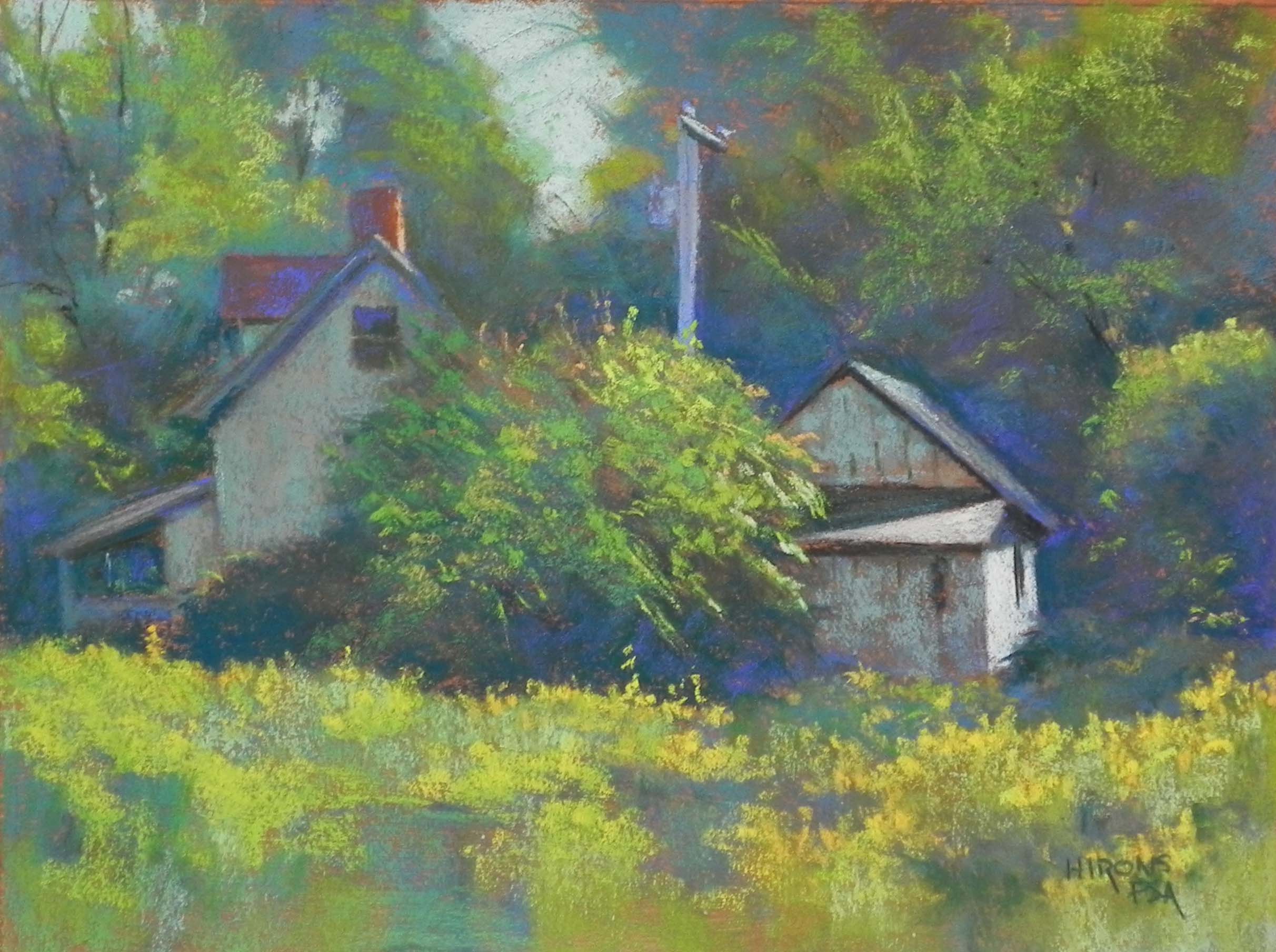
And now, for something completely different! On Wed. morning, I went to the studio with an 18 x 24 white Pastelbord and three photos that I took late in the day on Monday, looking out the front window of our building. The light was hitting a brick building making it glow and I loved the shape of the tree and the many crows coming in to roost. The moon was further to the right in a different picture. But I knew it was critical.
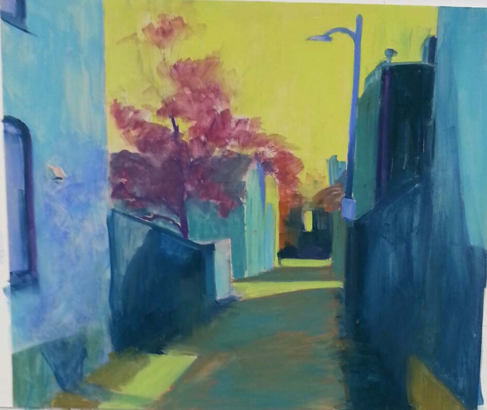
I decided to do a quick, light underpainting using my Holbein sticks and alcohol. This turned out to be something of a disaster that I then made use of! The alcohol didn’t melt the pastel into the board. Instead, the brush just pushed it around in streaks, that left noticeable ridges–like a brushed on gel! I was disgusted with it. But I decided to carry on and that soft pastels would be what was needed. So this painting is almost entirely soft pastel–crows were done with Girault. I used a lot of my Blue Earth pastels, particularly in the buildings. It was so much fun to layer color on loosely, and to see the effects of the underpainting (note in the brown building to right if you can). Also, the light aqua pieces in the sky show the effect of the surface. I won’t do this again–it will be nothing but watercolor or really watered down liquid acrylic when I’m working with Pastelbord. However, I really enjoyed doing this painting and was happy at the results.
Hope you all had a lovely Thanksgiving. Such a lovely day here in the Mid Atlantic. We drove to the countryside in Loudon County, VA for dinner with good friends in a beautiful sunlit house amid fields and trees. Very nice! Making a dinner tomorrow for my ex! Cheers!!!