Lighthouse with Delphinium

Lighthouse with Delphiniums, 20" x 16", pastelbord

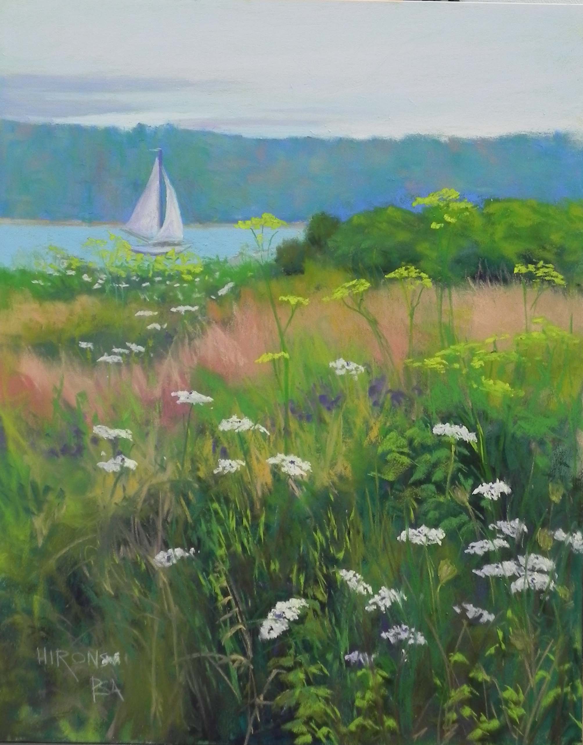
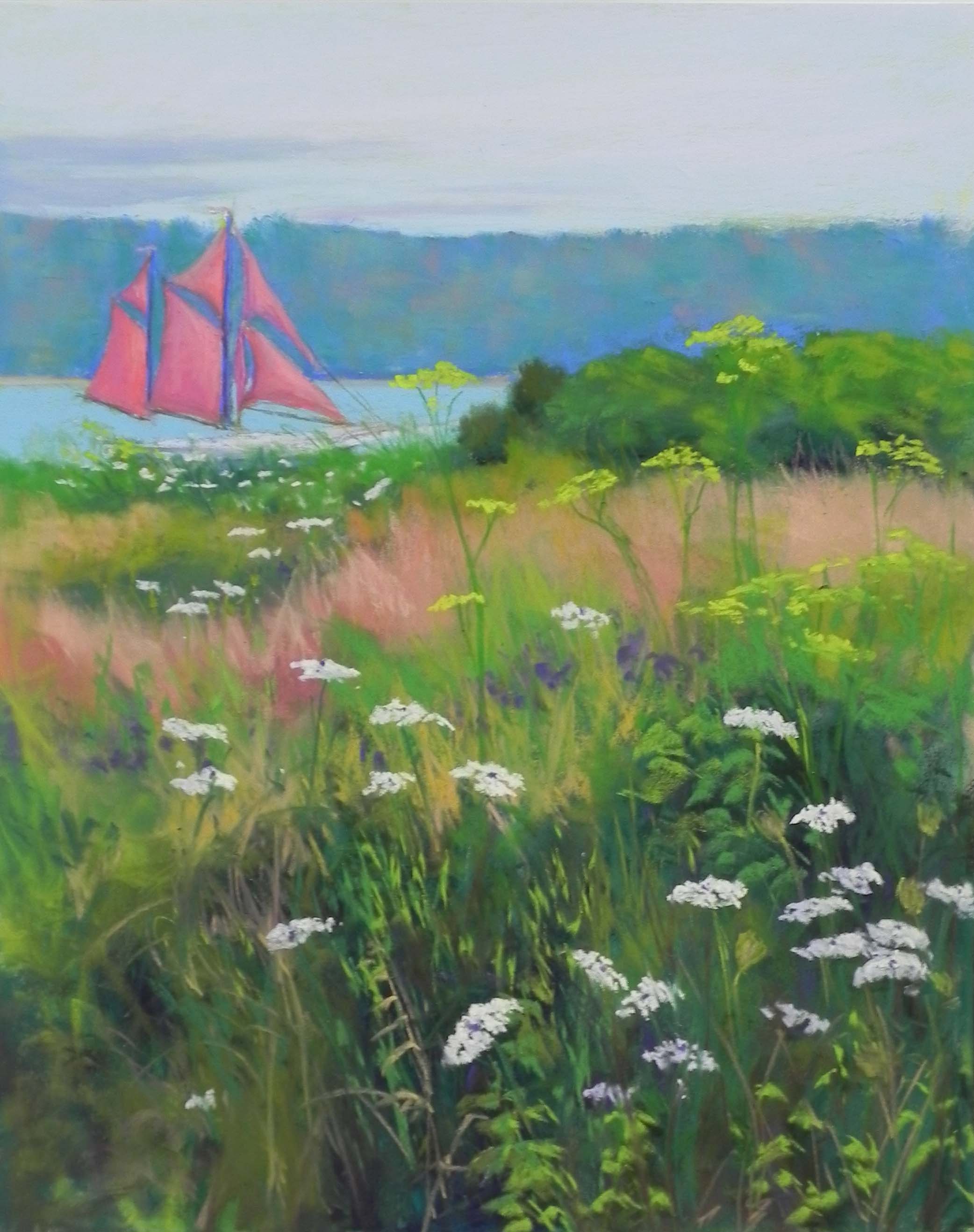
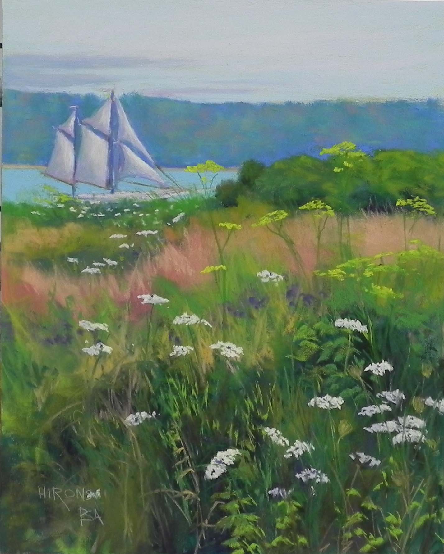
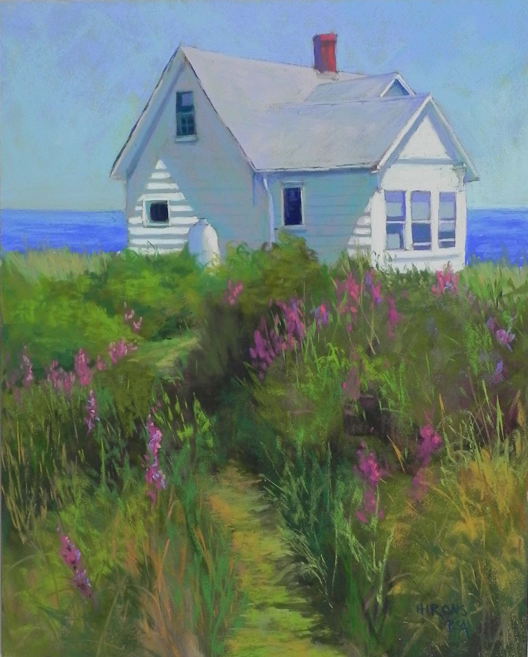
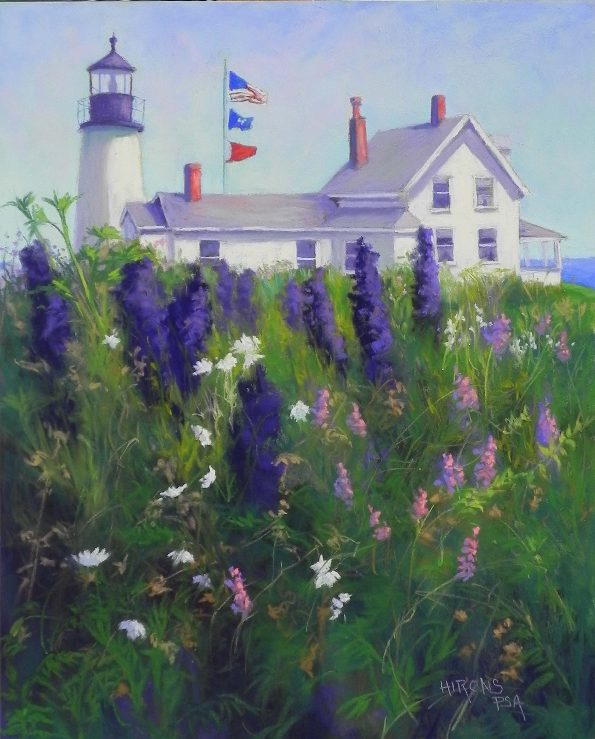
Lighthouse with Delphiniums, 20″ x 16″, pastelbord
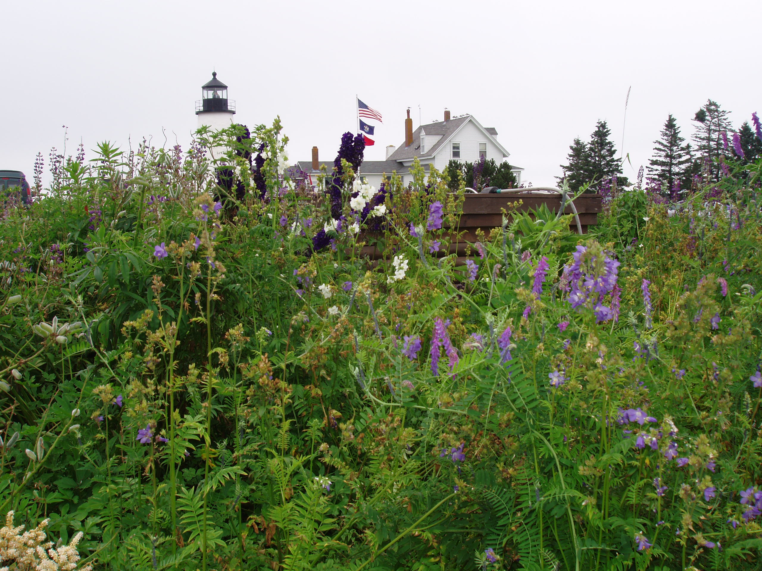
Reference photo

Reference photo

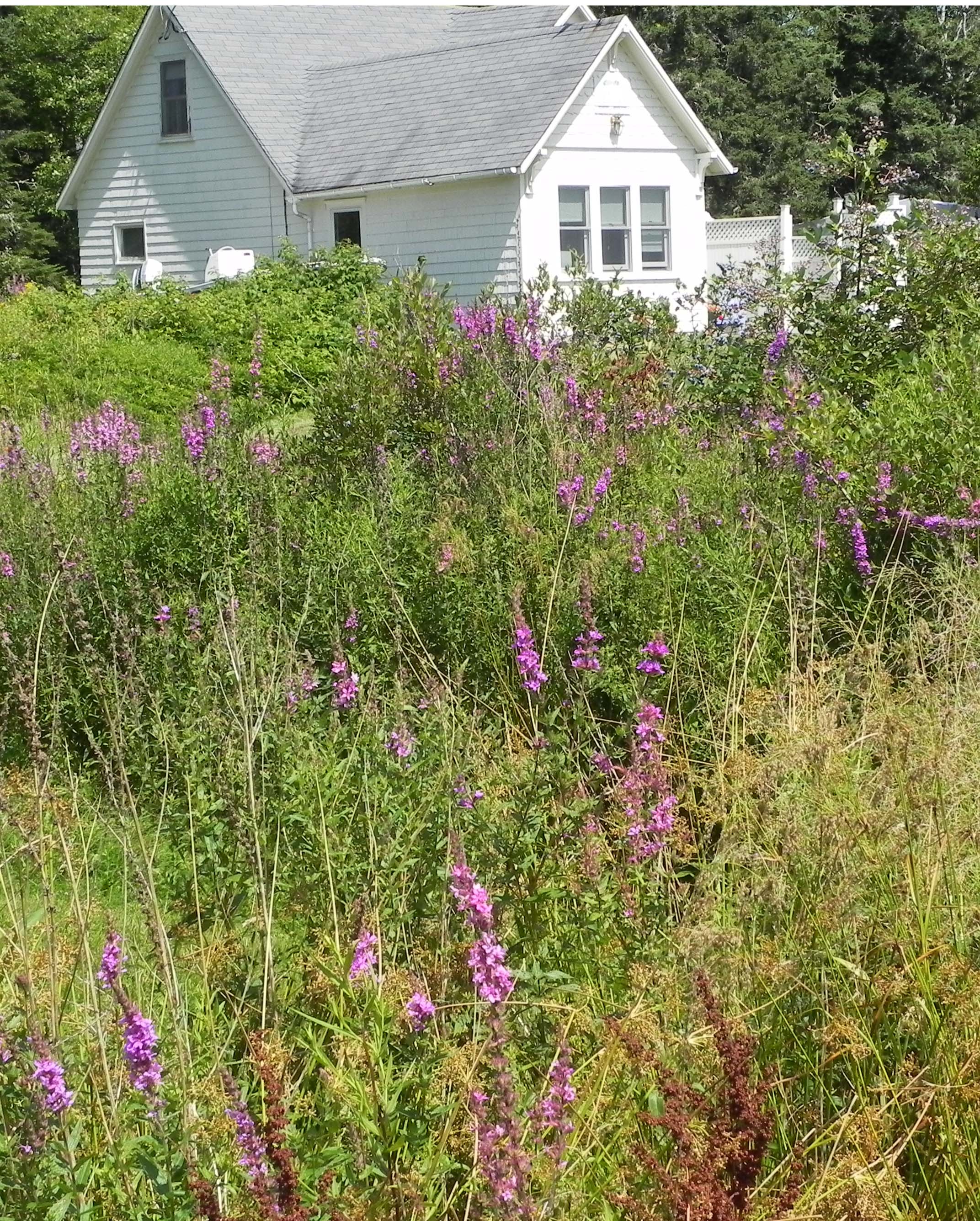
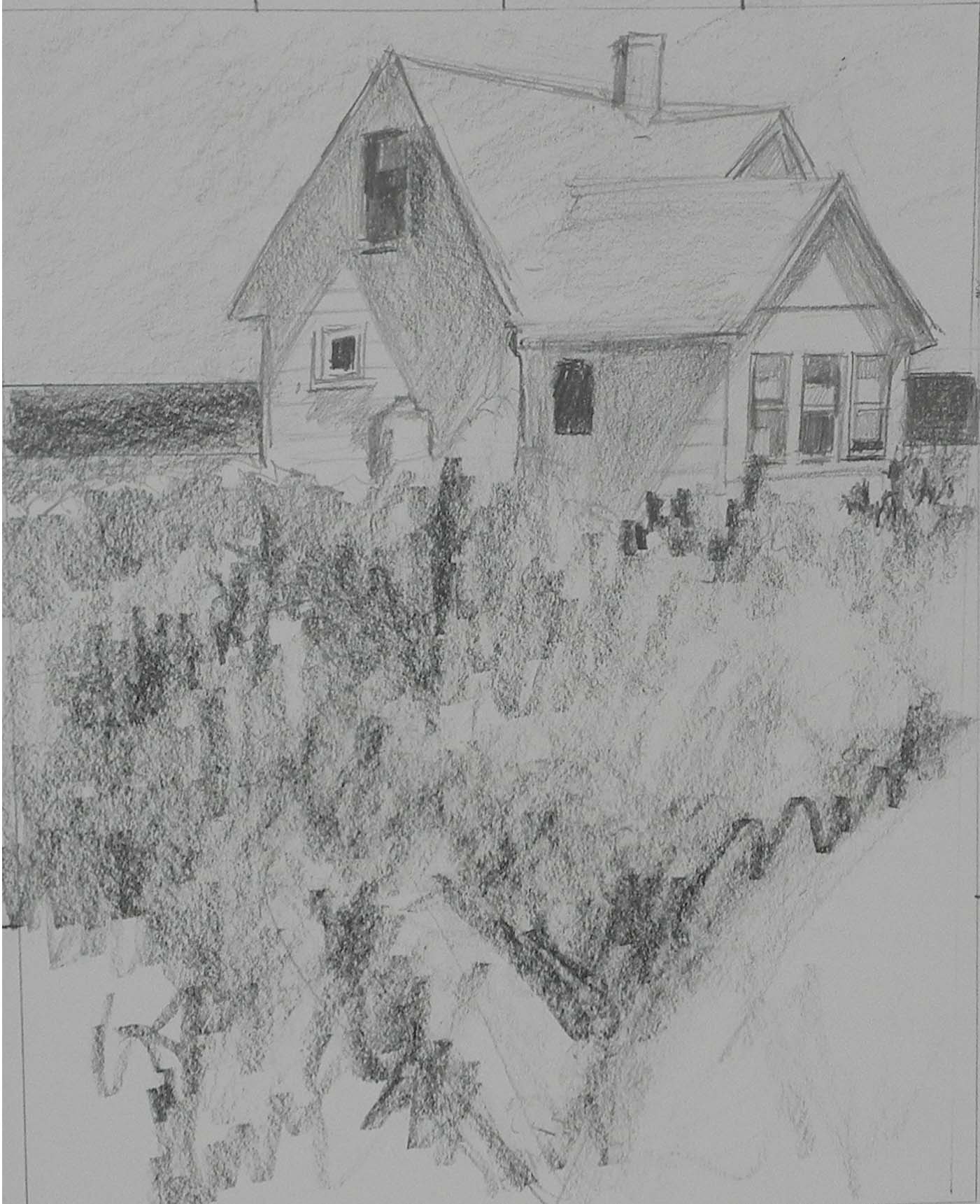
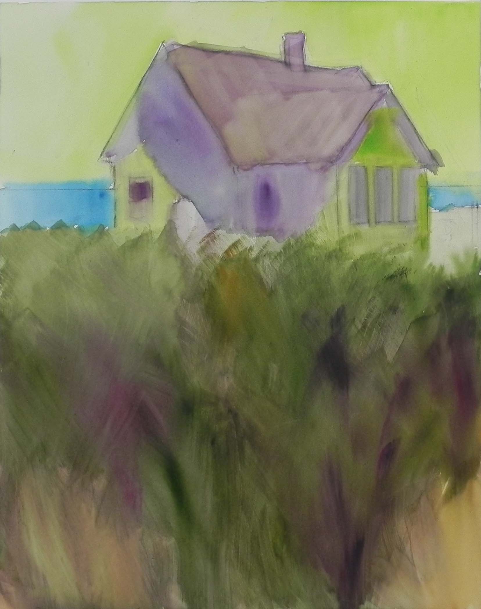
This is painting number five.  I’m including the original photo so you can see the changes I made. This is Pemaquid Light in Maine. I must have bent down in order to get the tops of the lighthouse and adjoining buildings with the delphiniums rising about it. I really liked the buildings, but knew that I wanted to make this a vertical to go with the others. So I had to make some compositional changes. I shortened the back building to the right of the lighthouse, and moved the lighthouse behind it.  Liked this much better. Then, I decided to show some of the water and lawn so as to provide some distance.  I removed the large brown structure that might be a raised garden bed.  But the key change was to make the sky blue and to add light and shadow to the painting!  This was not easy!  I used a picture of a lighthouse on Cape Cod that had light and shadow on it and went from there, adding it to the house and roof. Then, I decided that I really didn’t like the delphiniums the way they were in the photo, so I placed them more at random. I also removed the pine trees on the side of the house, moved the flag pole, a removed the dormer as well!  Hopper made changes; so can I!!!  But, you notice, I decided not to call it Pemaquid Light.

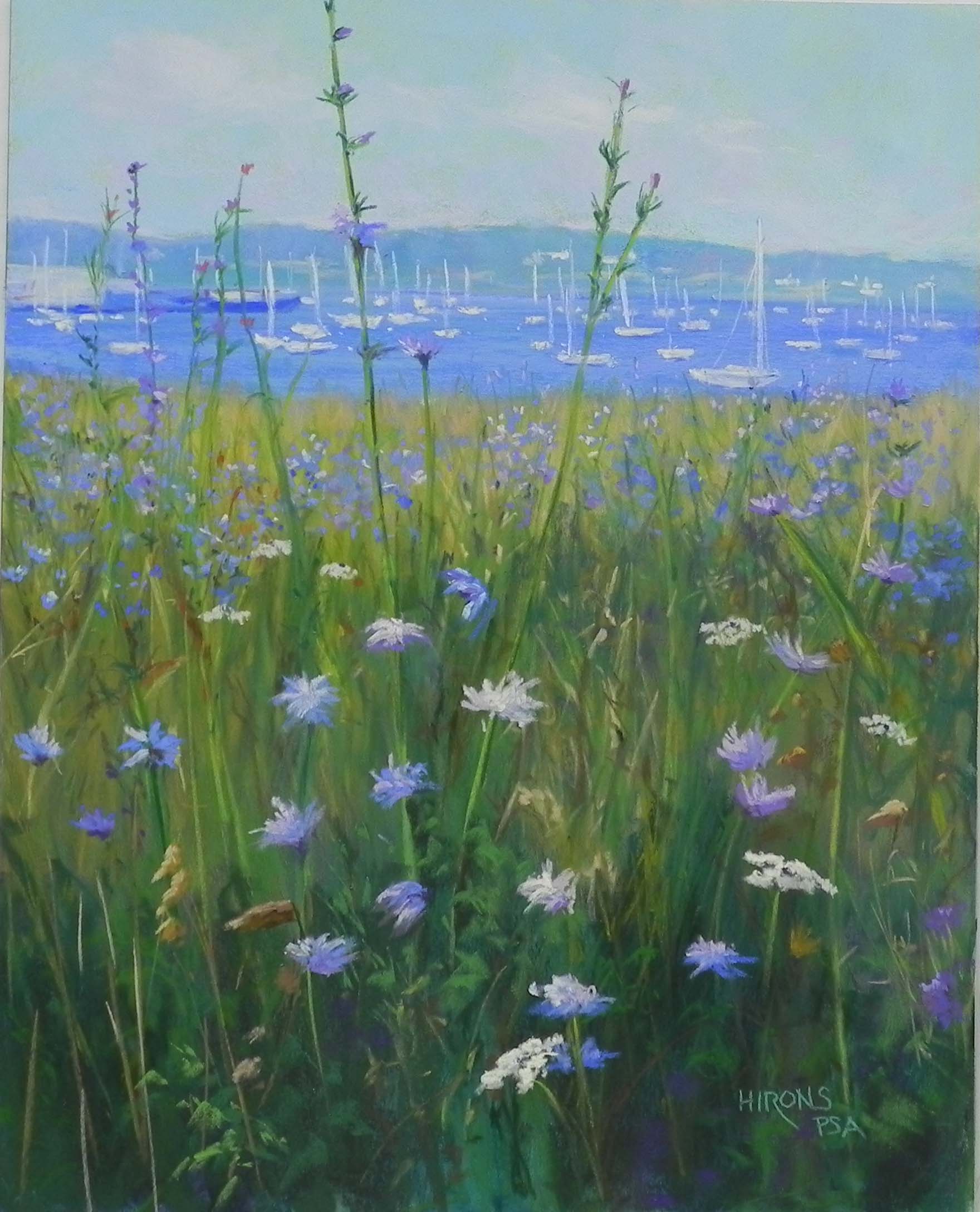
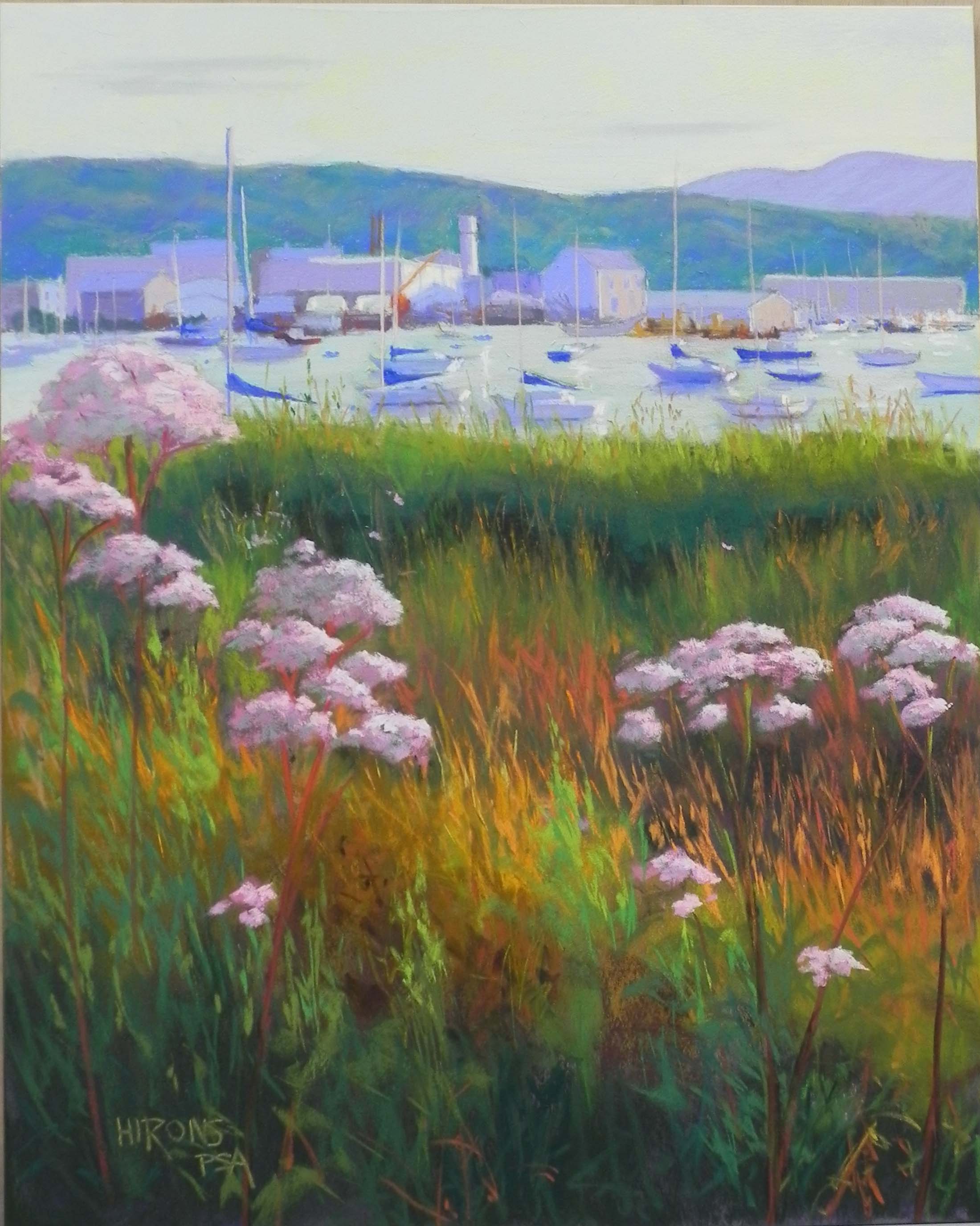
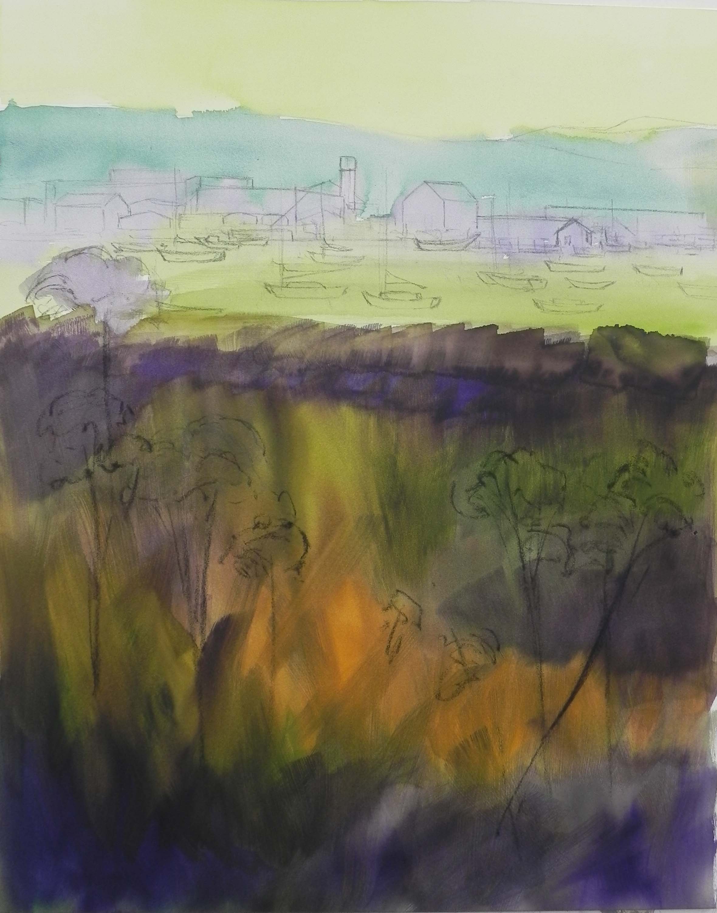
I did a watercolor underpainting on this one as well, using warm yellow green under sky and house and lots of dark greens below. I liked the pinks in the sweat peas.  The white flowers in the photo turned out to be petunias!  But I couldn’t have petunias in this location!  So I made them into something more generic.  I tried to place them strategically so as to lead the eye into the picture.

I looked at a lot of photos of Pemaquid Light on the internet. Not one of them was taken from this perspective with a flower garden. So I think this is somewhat unique!

Harbor Lace

Harbor Lace, 20" x 16", Pastelbord

Harbor Lace, 20″ x 16″, Pastelbord

Version 1

Version 1

Version 2

Version 2

I got to the studio today and was able to finish off two more potential paintings for the Hamptons art fair.  This one was supposed to be the last painting in a series of 4, but I didn’t like the boat in the first version of the picture. I found another photo and did a fifth painting which I’ll post next.  This is Rockland, ME and there  is a red windjammer that sails there regularly. I took a photo of it in 2009 and thought it might make a good painting for this series. But the red in the photo was quite dull and I pushed it, then decided I didn’t like it.It looked hoakey to me!  So I brushed off the red and change it to white with shadows in violet (version 2).  I still didn’t like it. My neighbors at Washington ArtWorks really liked the foreground and felt it should be about that and not about the boat. I agreed. So today, I brushed off the entire boat and put in a much smaller, simpler sail boat.  I like the picture better now. But it’s probably my least favorite of the group.  I thought you might like to see the progression of this painting. It went from being about the boat to being about the Queen Anne’s lace in the foreground–which actually was a different flower!

Spring Walk in Kew

Spring Walk in Kew, 16" x 20", UART 400

Spring Walk in Kew, 16″ x 20″, UART 400

First application of pastel over graphite drawing

First application of pastel over graphite drawing

Painting after application of  workable fixative

Painting after application of workable fixative

Being snowed in, you never know what will happen!  John’s been going through old photos and came upon a stack of 4 x 6’s from our March 2005 trip to London.  One of the pictures is of me walking in Kew Gardens with hanging willows.  I really liked the picture and decided it would give me something different to do. There are many “different” things about this picture. First, of course, it has a figure, something I rarely include. Second, there is no wet underpainting.  And third, I got out pastels I haven’t used in a long time, such as Holbeins and Dailer-Rowneys.  Most of my hard pastels are in my public studio, but I wanted to work on UART.  So I decided to do a dry “underpainting” or at least to just begin directly with the harder pastels that I had and then spray it with workable fixative.  I discussed this form of painting in my Wednesday class last week. It’s something I don’t normally do because I won’t use the fixative at Washington ArtWorks.  But here I can open the doors and stick the painting out over the snow (trying to avoid the drips from the icicles!) and spray away.  Kind of stinky afterwards but it was a good time for a lunch break.

In addition to using different pastels, I used a rubber tip blender to smooth out some of the areas and get rid of the light specks, particularly in the lower left and right.  I used a lot of colors in the tree but I’m not sure how well it’s showing.  It was an overcast day but there was light on the left side of the figure, so I added warm colors to the left side of the branches.  The sky was done with two colors of very light Daler-Rowney, a violet and a cream. I bought a set of neutrals many years ago after they changed their format and I’ve hardly used them. They were quite soft on the UART, but I think of them as being a medium hard pastel, like Rembrandt.

This isn’t a great painting, (the figure and bush are too close in size, for one thing) but it was fun playing with different materials and techniques and remembering a visit that was 11 years ago. And, in the meantime, the plow came and our little court is now plowed and my new Subaru is ready and waiting to deal with the snow! Hoping that the Wed. class can go ahead.

Snowy Day Painting (Chincoteague Morning)

Chincoteague Morning, 20" x 24" Rives with AS liquid primer and oil wash

Chincoteague Morning, 20″ x 24″ Rives with AS liquid primer and oil wash

Oil wash underpainting

Oil wash underpainting

Partially painted with charcoal redrwaing

Partially painted with charcoal redrwaing

Hello Friends. We’ve have between 2 and 3 feet of snow here in Rockville, MD.  Yesterday I decided to try something a little different, given that I’d be working in my home studio.  I’ve been wanting to get back to the Rives again.  But I decided this time not to tone it and to try an oil wash underpainting instead.  I have oil paints that I bought some years ago and Gamsol.  I used a lot of Gamsol to avoid applying the oil too heavily that won’t dry.  The result was a rather subdued underpainting–not as lovely as I thought it might be. But it was OK.  I ended up using charcoal to redraw the clumps of grasses.  I made the decision to include the rays of sun coming over and through the trees, which showed up on the photo as a bright violet.  I thought it added some drama to to the picture and I loved the light sparkling on the water.

This is my second 20 x 24 from the “Marsh Walk” in Chincoteague. For the first one, I used a B&W photo and used a lot of warm colors. This time I decided to use the color photo and stick with the greens. But I added a lot of cool red magenta over the greens. At the end I added some orange into the grasses to liven it up a bit. The sky is a mishmash of blues, violets, aquas, with pink and yellow lights.

I expect to be stuck here for several days, missing my classes and exercise and eating like crazy!  I hope that those of you in the DC area are keeping warm and safe. If you do any painting, share it with me!

Harbor Days

Harbor Days, 20" x 16" Pastelbord

Harbor Days, 20″ x 16″ Pastelbord

And here is the third painting, completed today.  This one was more of a challenge than the first two as there is no real focal point or composition!  It’s pretty much about a field of chicory with little white boats behind it!  I did it some years ago as a 7 x 5 miniature and it came out very nicely. But I had no idea what it would be like to do it larger. The boats in this picture are all white and small. I decided to keep them very loose. I added in the pier on the left and felt that added a lot to the picture. I also added pinkish clouds in the sky, which I really like.  The bottom was the challenge!  I did another watercolor underpainting (and forgot to film it). I used a combination of blue violet and red violets for the chicory. The most important change was to add in Queen Anne’s lace into the painting (rather than the poisonous flower in the previous painting!).  I love the shape and texture of Queen Anne’s lace and I think this was a good addition, particularly the one at the center bottom which draws the eye into the picture and then up (hopefully!).

I named this Harbor Days, which is the name of the July festival held every year in Mattapoisett. However, this is Rockland, MD. I just liked the sound of it!

Harbor Sundown

Harbor Sundown, 20" x 16", Pastelbord

Harbor Sundown, 20″ x 16″, Pastelbord

Watercolor underpainting with graphite added over top

Watercolor underpainting with graphite added over top

I’m continuing working on a series of 20 x 16 paintings for the Hamptons. This second one was originally a horizontal that I cropped into a vertical. It’s Rockland, Maine around sundown. I really liked the colors in this picture and the shapes of the buildings in the harbor. The boats were fairly distinctive so I spent a lot of time drawing and painting them.  I did a light layer of watercolor at the top so as not to completely lose my initial drawing. Then spent a lot more time putting in several coats of watercolor at the bottom.  You’ll see from the underpainting that I redrew the buildings and boats after putting on the wash.  The flowers are something you see in Rockland. They aren’t Joe Pyeweed nor Queen Anne’s Lace. A friend tells me they are poisonous!  But I liked the shape and the pink tint to them. While the picture is clearly about the foreground, the background is pretty important as well and I like the way the flowers lead the eye up to it and to the building with light and shadow near the top.  The mountain is the hill behind Camden.  I really liked the added depth that it gives to the painting.

Shore House with Loosestrife

Shore House with Loosestrife, 20" x 16", Pastelbord

Shore House with Loosestrife, 20″ x 16″, Pastelbord

Reference photo

Reference photo

Graphite sketch, 10" x 8"

Graphite sketch, 10″ x 8″

Watercolor underpainting

Watercolor underpainting

I’ve just completed my first painting of 2016. This is one of four that I plan to do for the summer ArtHamptons fair on Long Island.  I’m including the original photo (taken in Port Clyde, Maine), along with my drawing and underpainting.  There were significant compositional changes that occurred at various  stages, that I wanted to show.  I liked the house in light and shadow, but not the fact that the roof was cropped in the photo and that the background was just trees. The dark green would provide nice contrast, but not a lot of interest.  So I decided to open it up with sky and water.  You can see from my original sketch that my plan was to have the field take up the entire foreground with a swath of dark leading the eye into the picture. I began with watercolor underpainting because I like this on Pastelbord. But I’m having a hard time getting it dark enough. (Today I bought a couple tubes of gouache to see if that will be better and still retain the tooth of the surface.)  I wasn’t too concerned with the colors of the underpainting, just wanted to cover up the white.  I do like using the yellow green under the sky and this has become something I’m using more and more.  I finished the house and the top part of the field on Monday.  Yesterday I went in and sat and looked at it. I saw the small piece of grass showing just below the gas tank (also added by me!) and realized that what this painting needed was a path!  I converted the patch of dark to a path and immediately loved the effect. I’m glad that the path is broken up by the bushes. But it serves to lead the eye into the picture.

Some other observations. I did a painting of a white house and loosestrife years ago as a demo in Mass. There wasn’t much sky in that one and I used greens and magentas of the same value to create the shadows in the house. I tried to do that this time and it didn’t work. So I added some warm blue green over it and it was just right. There was so much blue around the house that it had to be in the shadows as well.  The roof is a combination of light pink, cool green and violet.  I had to make up the chimney!  I was thinking of adding the white fence from the photo in to carry the house over to the right, but decided it wasn’t needed. Fortunately, the spaces to the right and left of the house are not even!  So I’m happy with my first painting. Hopefully, it will find a home in some beach house somewhere up north!

Happy new years to you all.