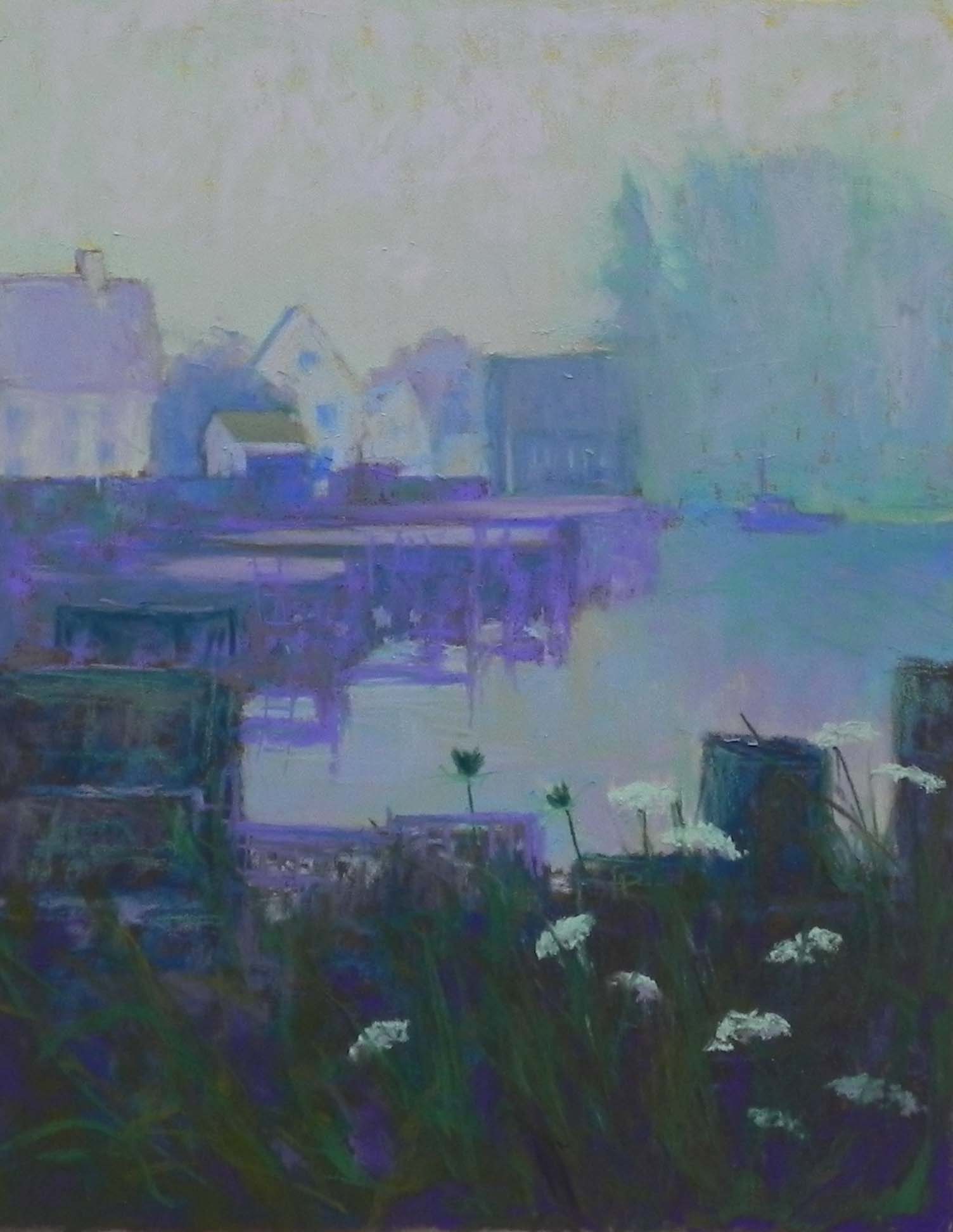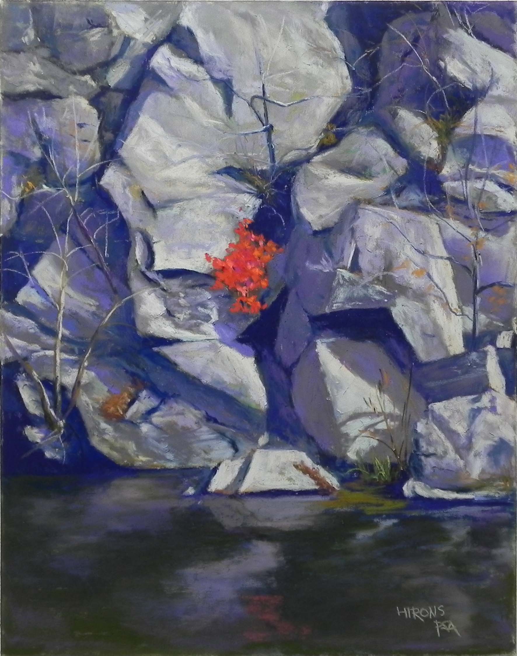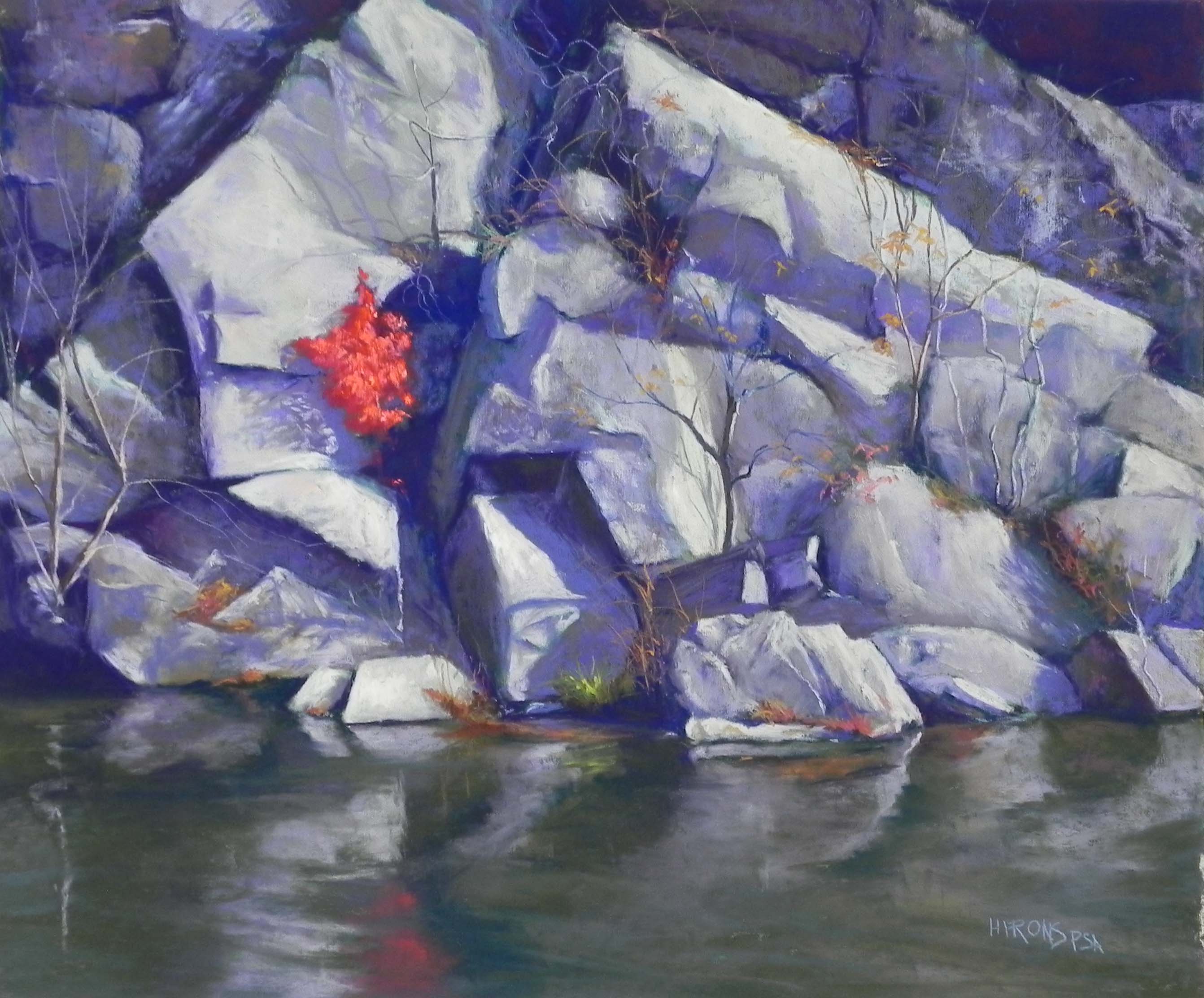
A Touch of Crimson, 20 x 24, UART 400
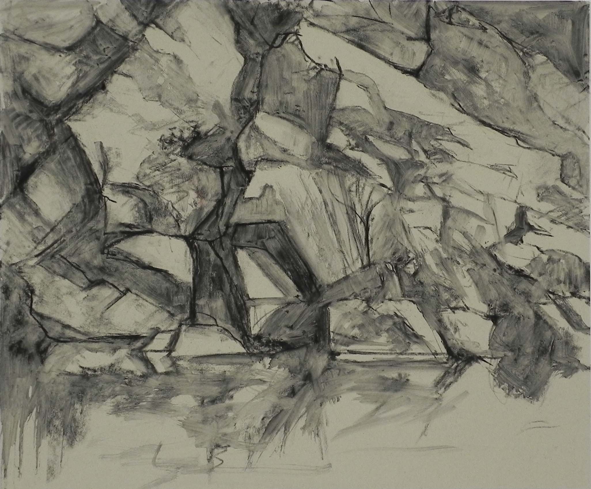
Charcoal drawing, mixed with water
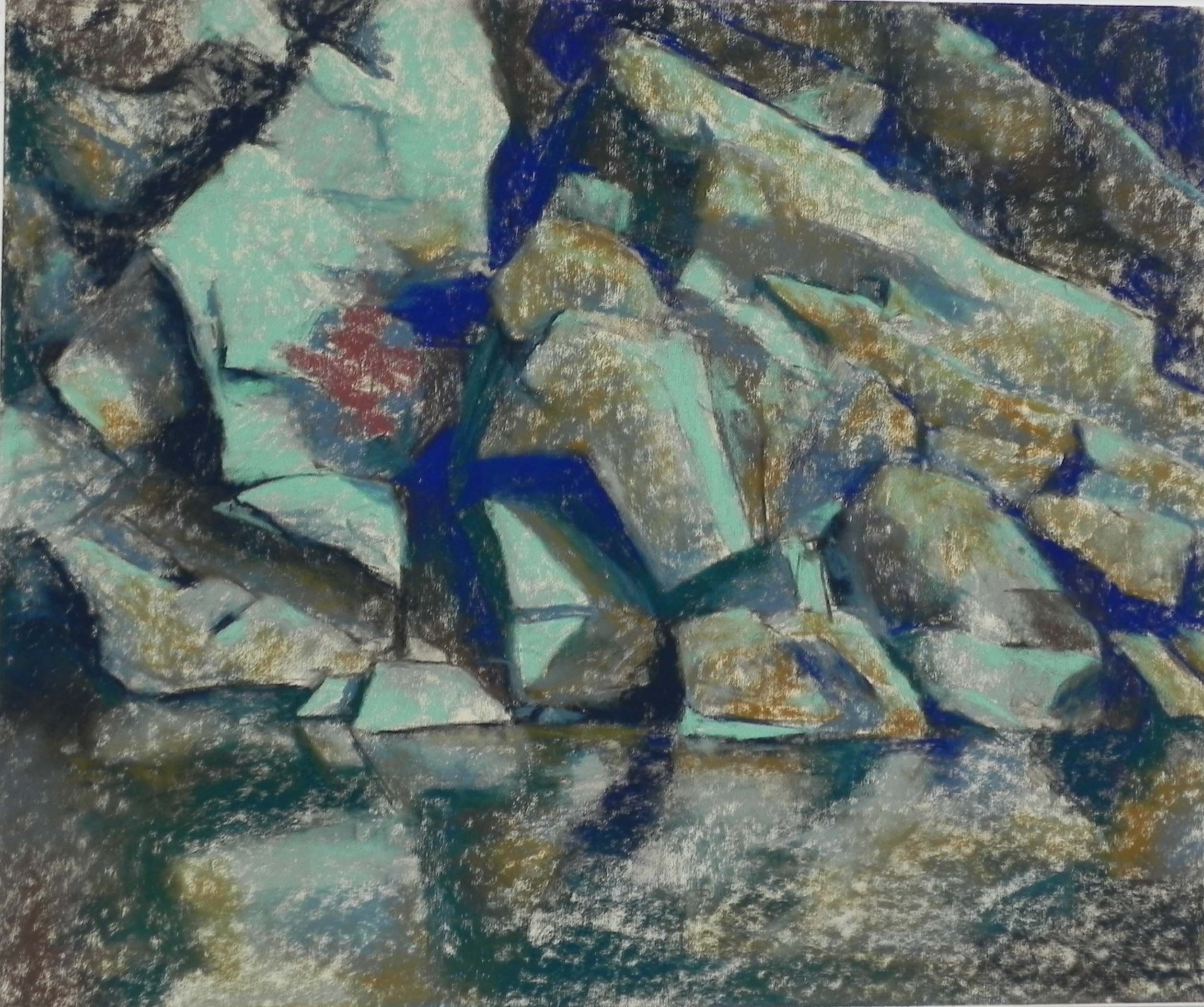
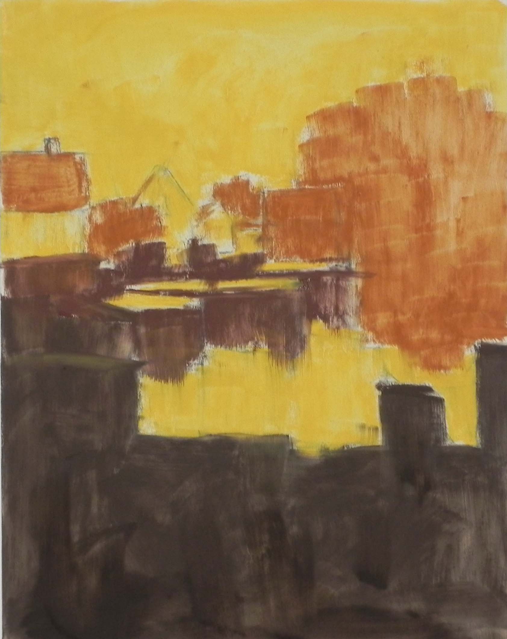
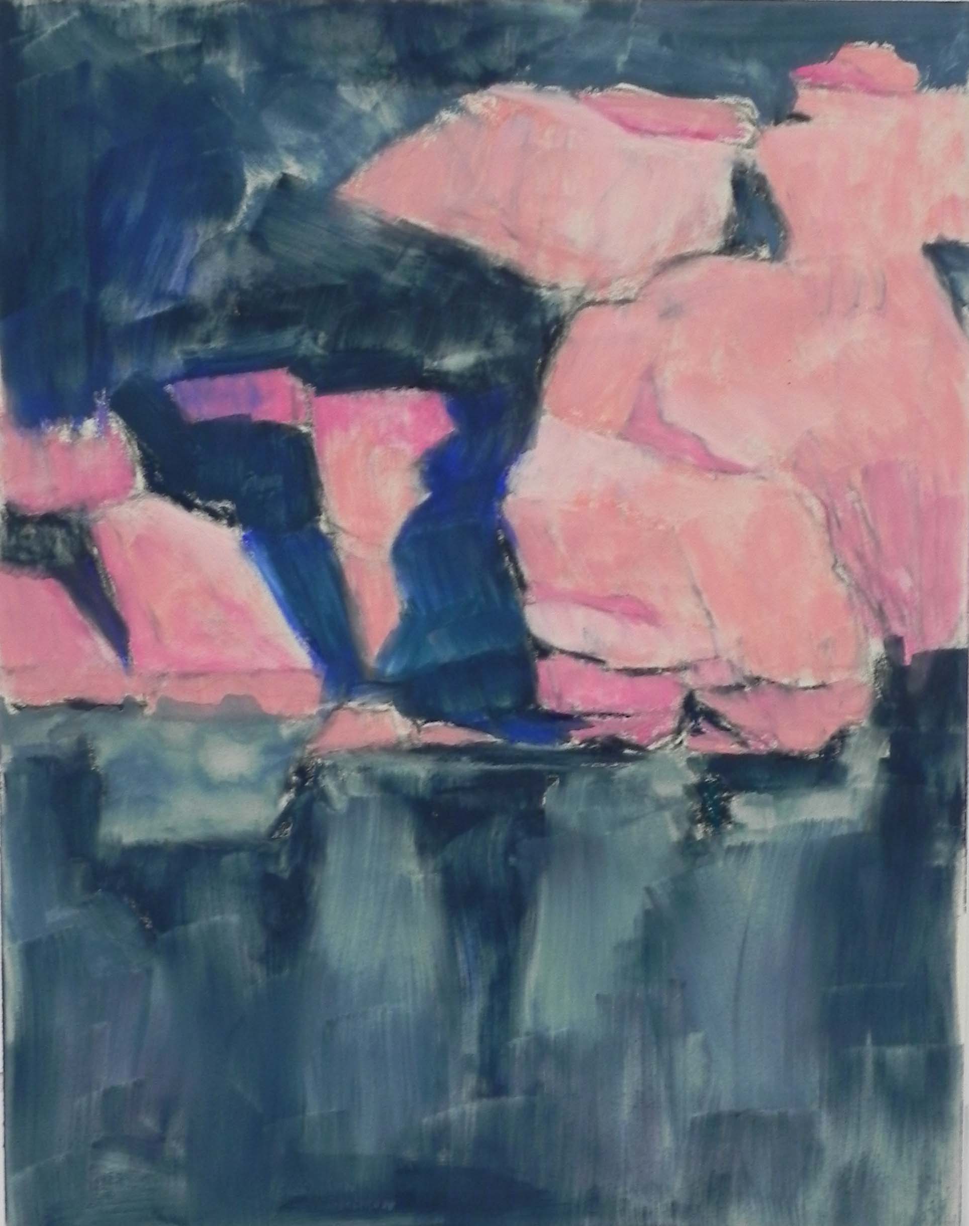
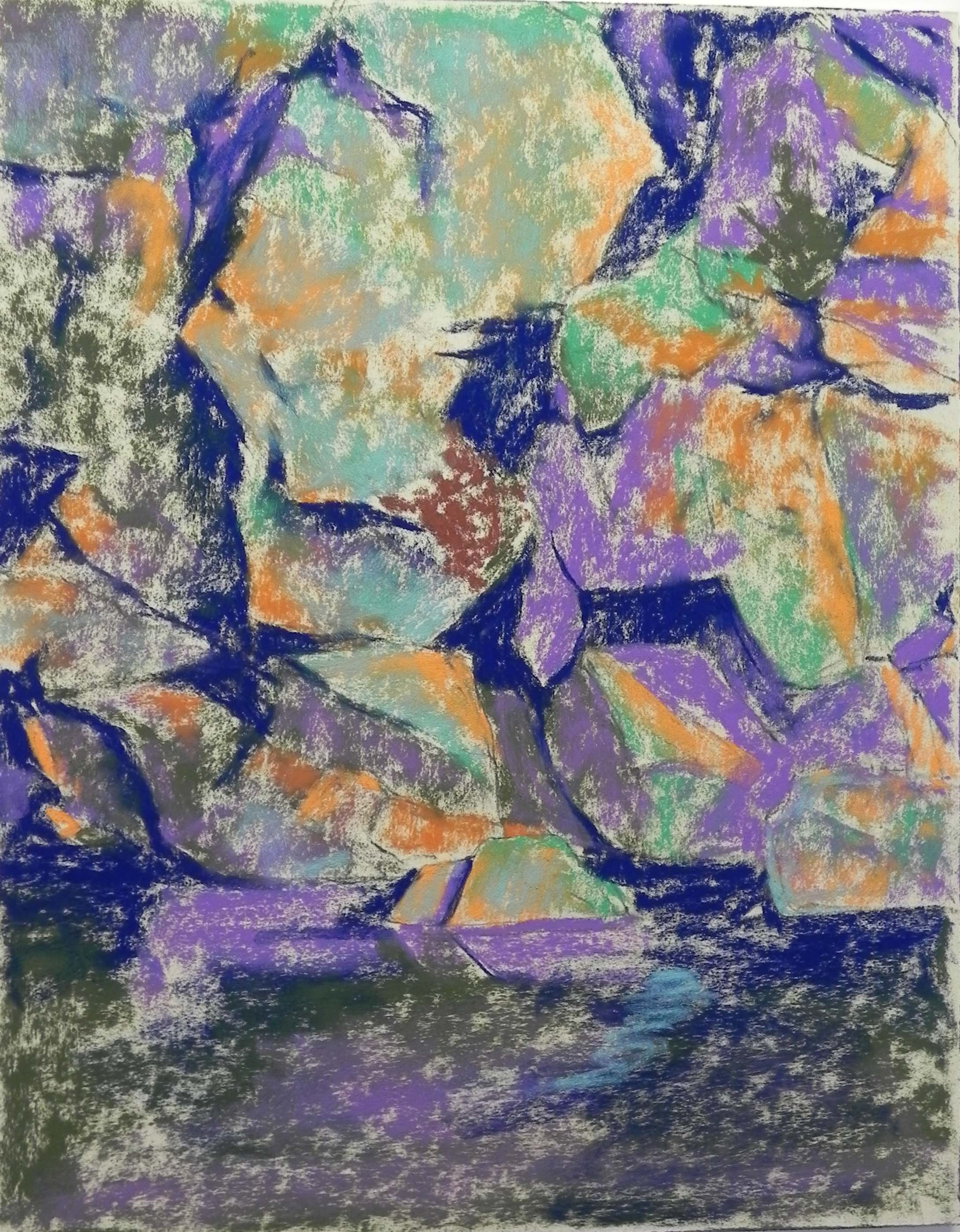
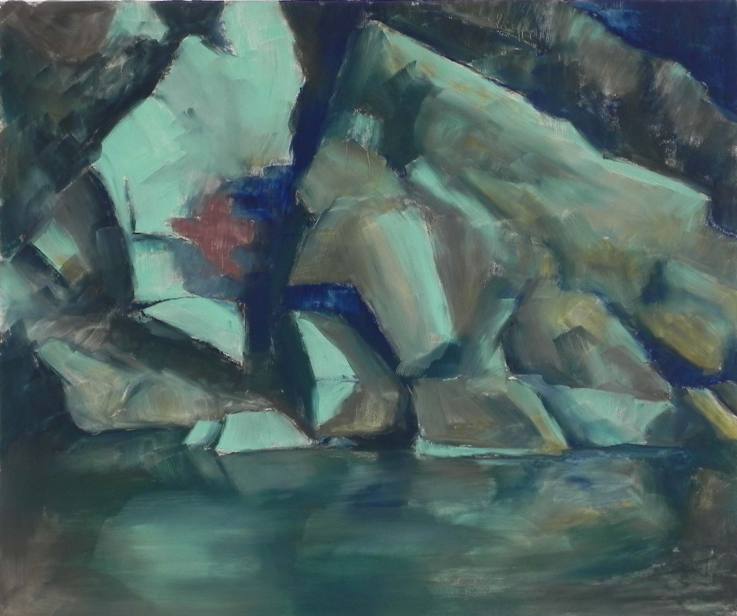
Underpainting before alcohol
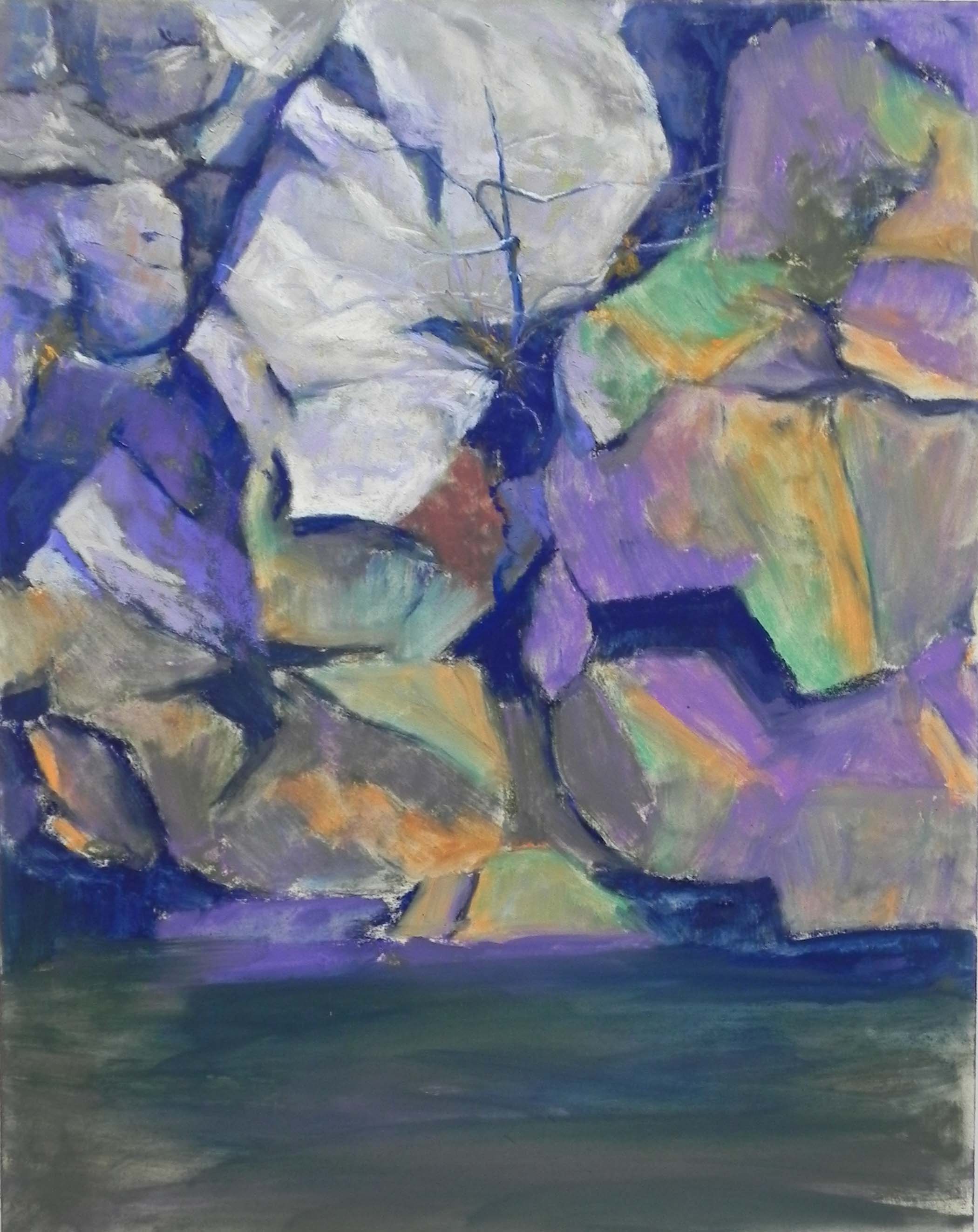
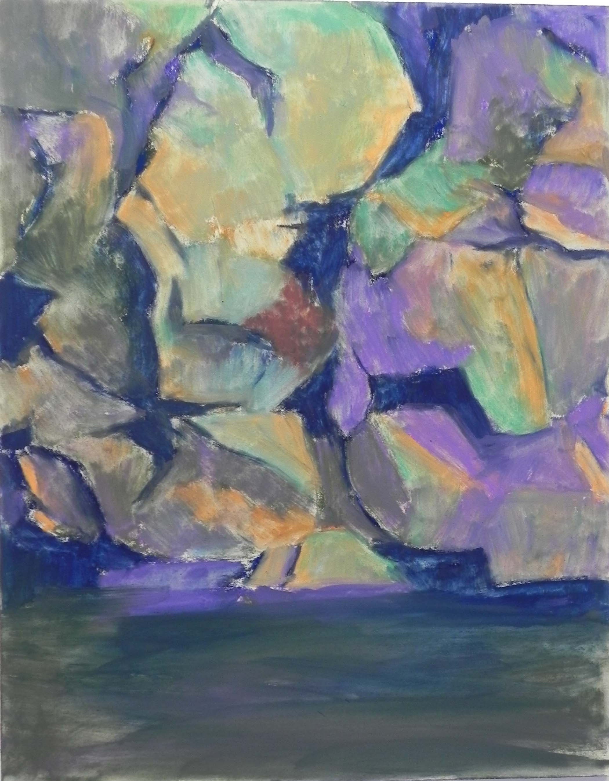
Underpainting after alcohol
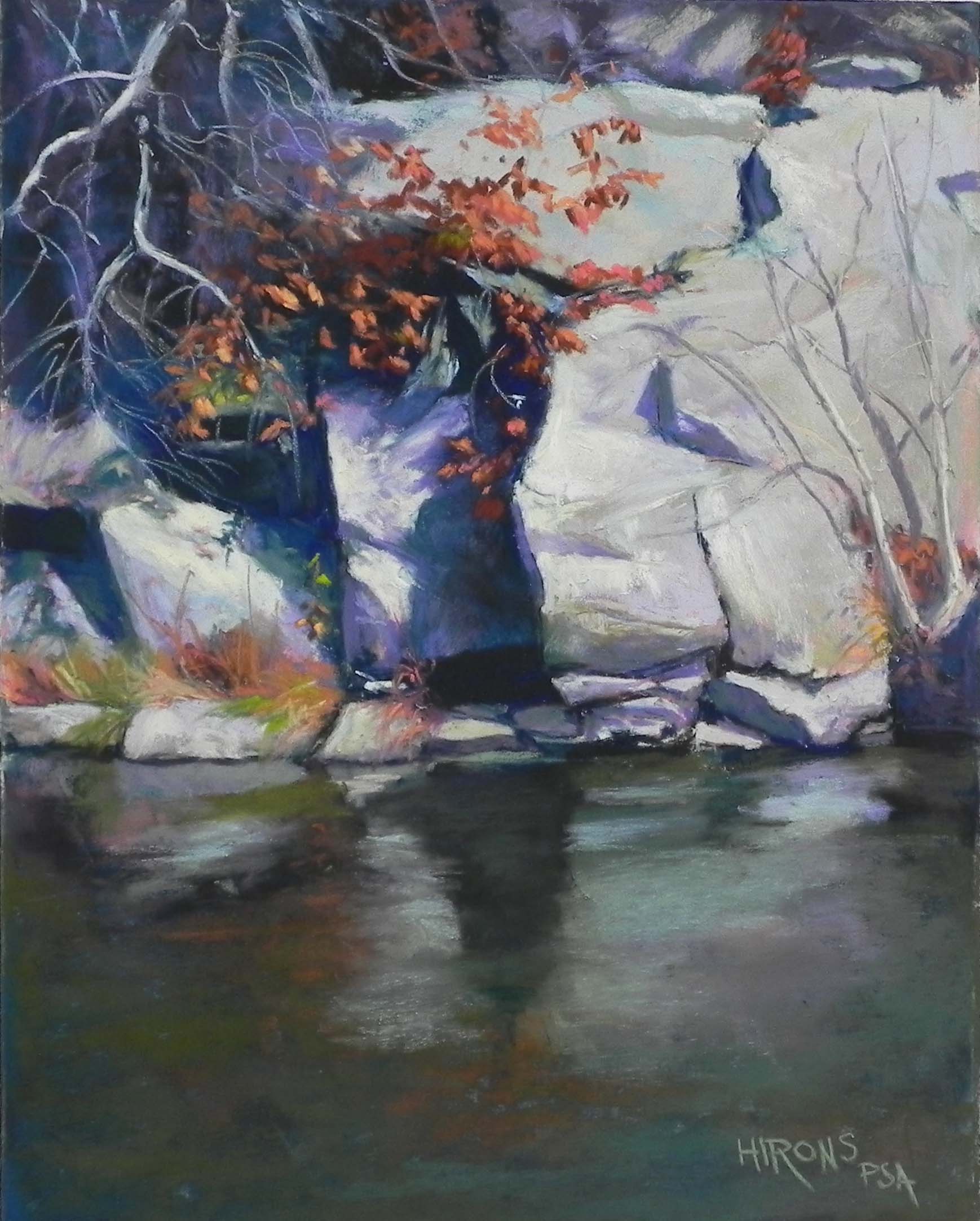
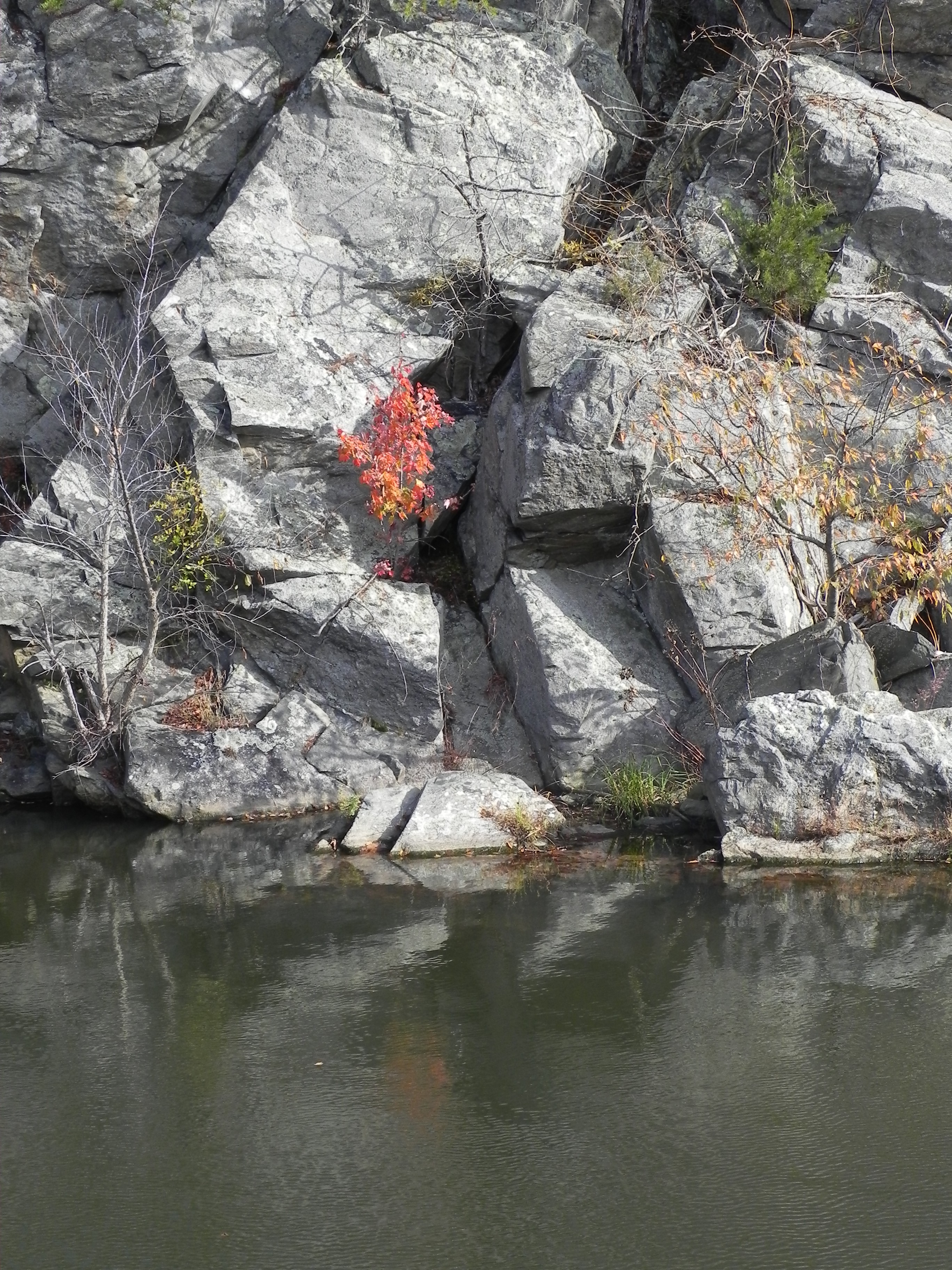
I worked all last week on a large painting of the rocks and small red tree that I painted before. I used a different photo that presented more of the rocks and set off the tree in a more traditional spot for a painting. I began with charcoal, using the sides to create the dark crevices in the rocks. There was a pattern in the photo that I don’t think I fully achieved in the first painting. I was determined to get this in the second painting. For the underpainting, I decided to use a mix of cool blue greens and warm browns and the result was quite striking.
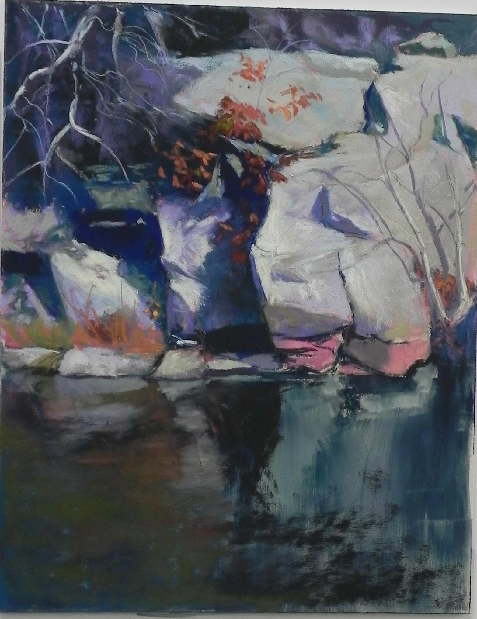
To begin the painting, I used a Terry Ludwig “eggplant” pastel to lay in the darks. Then I went to the Giraults, at first trying out various greens and warm neutrals, but then going to violet (of course!). It IS very violet. But I was thinking of the red and what would go with it. I personally love the combination of violet and red. I’m planning to go to Wide Water when it gets a little warmer and do some sketching/painting to see if I can capture the actual color from life. In the photos, they have a very metallic goldish glow. Fortunately, it’s a place that is nearby.
I spent a lot of time on the rocks. My aim was to keep the background rocks on left and right loose and not overly detailed. I used softer pastels on these, which went on loosely and quickly and didn’t produce the hard lines that the Giraults can produce. I started with Giraults in the area around the red tree, then put a light Schmincke on top to emphasize the light on the pieces of rock pointing to the tree. The long rock at right top was a problem. I broke it up with vines and an added tree that wasn’t in the photo. Then I went in and added pieces of dark to break up the lines.
This is a very different type of subject matter for me–not a house in sight! There’s no depth to the picture, so it’s really a still life. But I’m really enjoying it and look forward to doing more paintings of varying sizes. I’m going to add these to my Insider’s Washington series and make giclees of them.