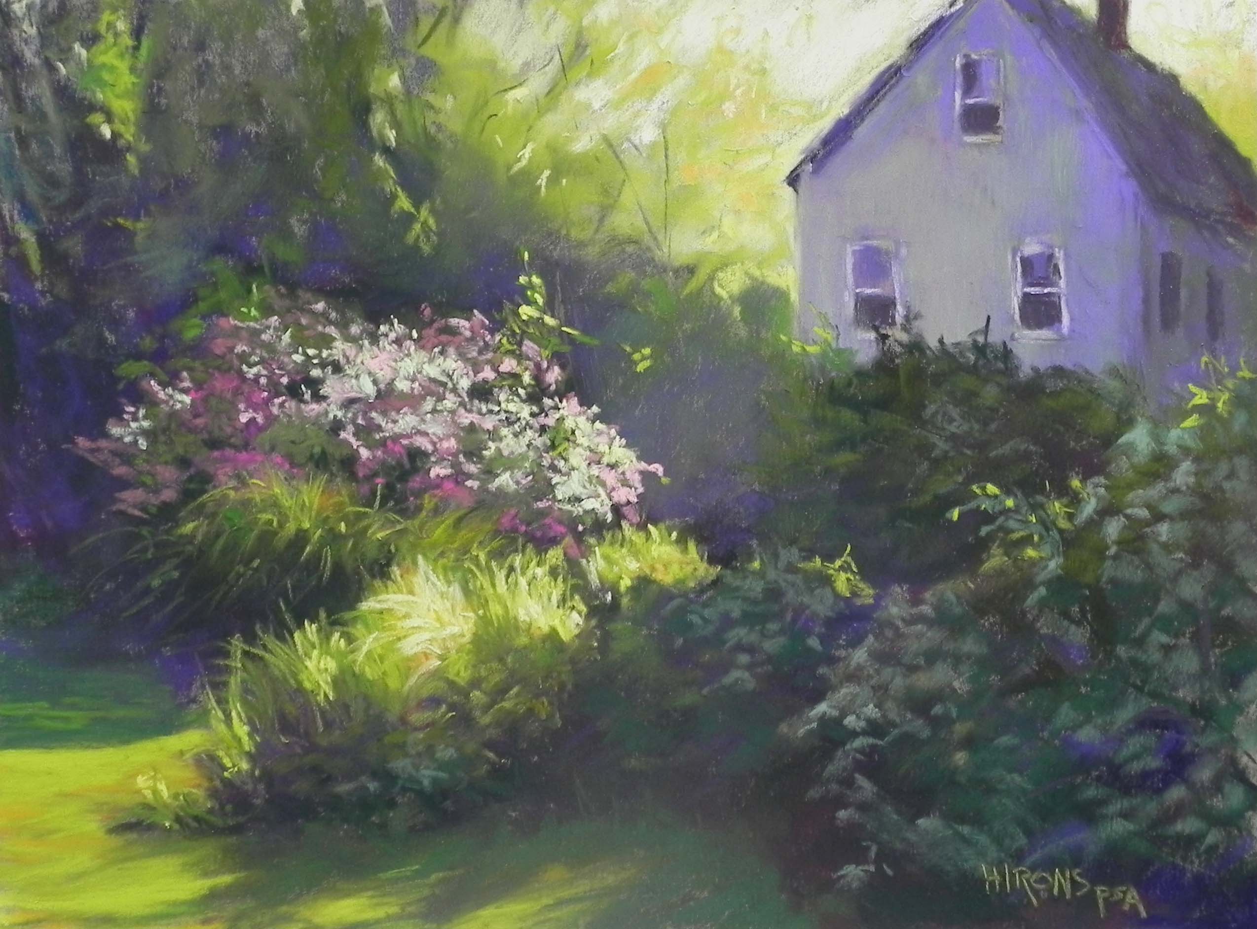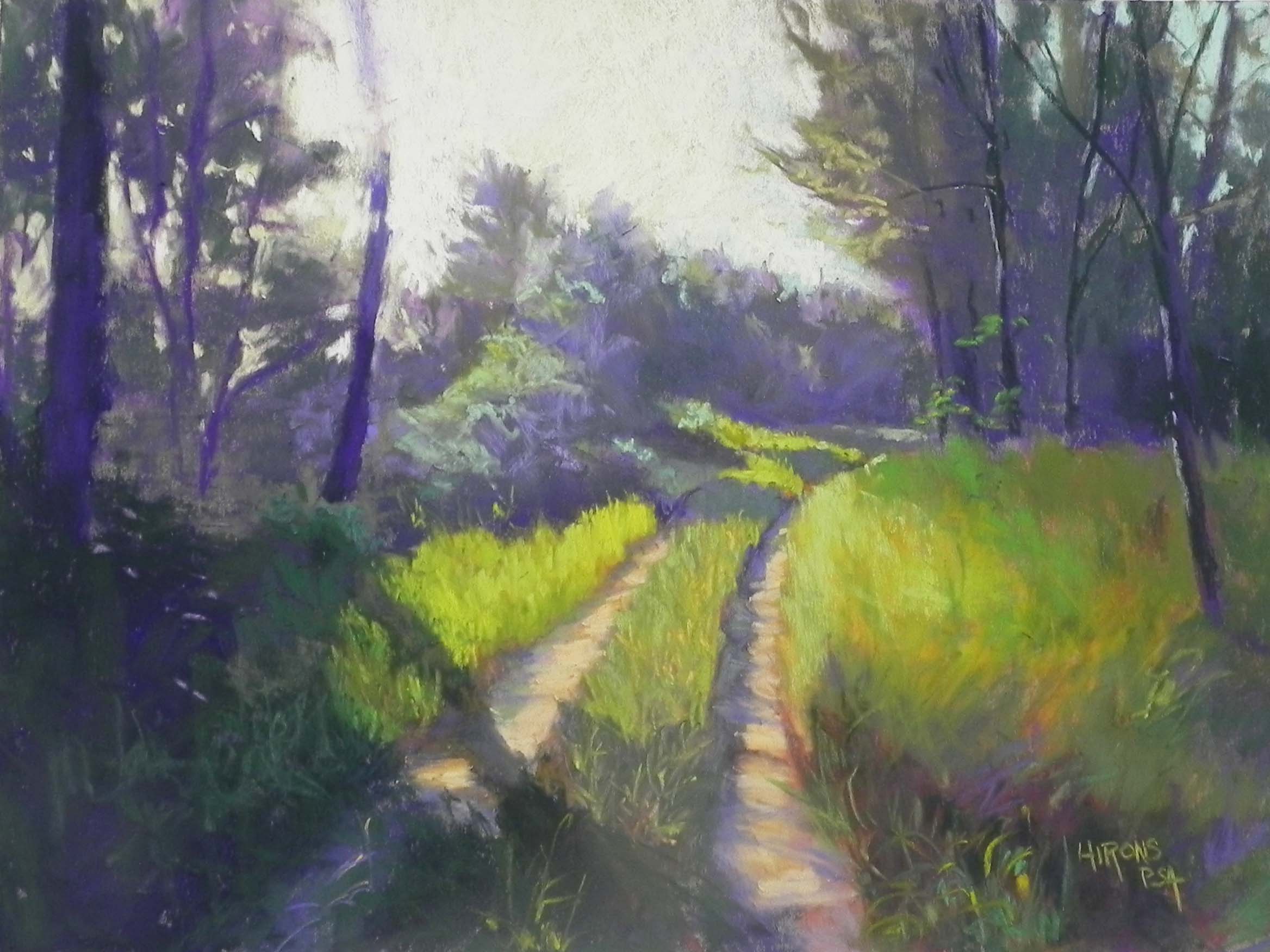
Sunny Path, St-Aulaye, 12″ x 16″, Pastel Premiere “Italian clay”
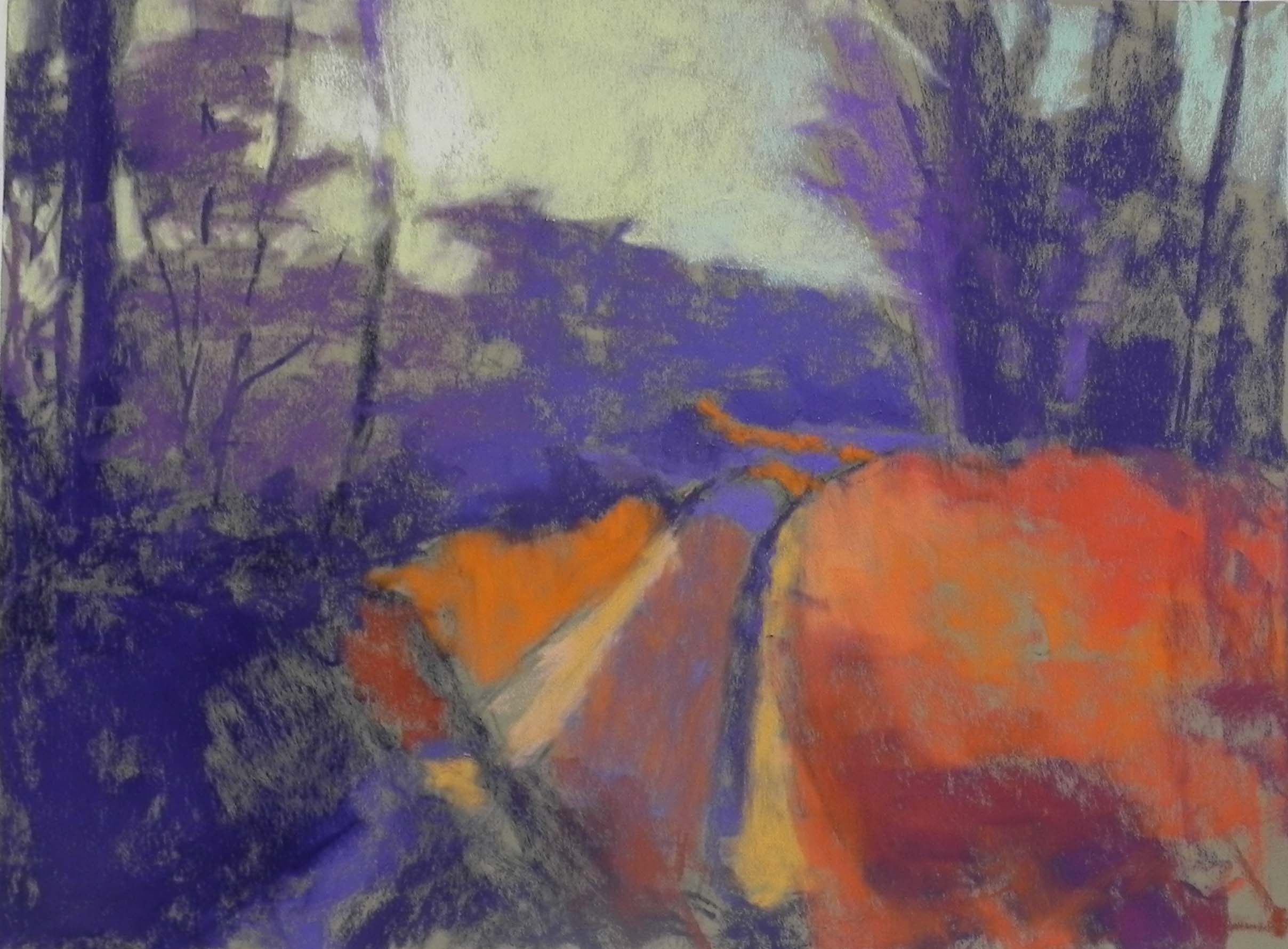
First application of pastel
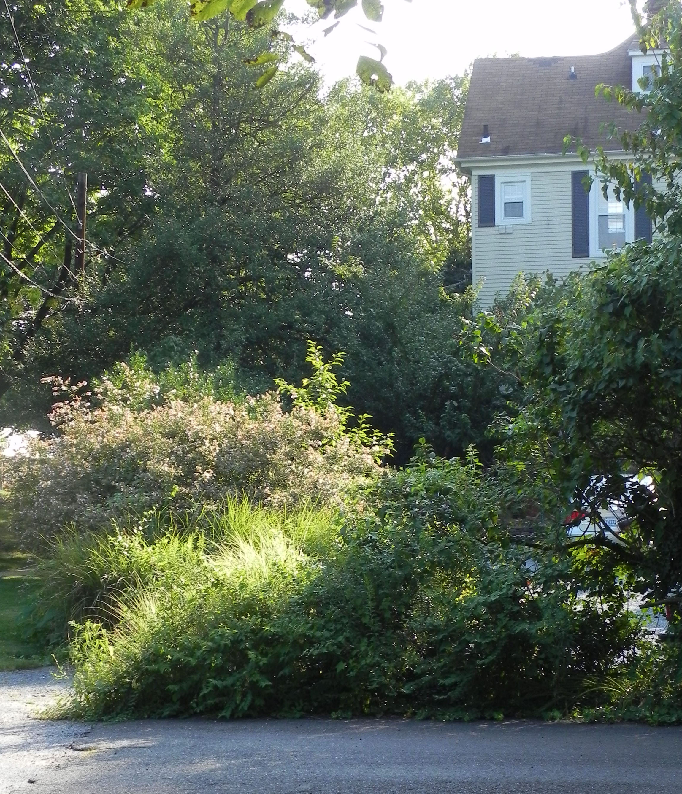
Here is Wednesday’s demo of a sunlit path down the road from our B&B in St.-Aulaye, France. It was a lovely morning and the light was quite beautiful. I didn’t make any significant compositional changes to this picture until near the end, when I added the small tree on the right, which we all liked.
Since this picture is all green, I decided to start it using violets for the shady areas and oranges for the sunlit grasses. I wasn’t sure how this was going to work but it turned out to be quite nice. Some of the orange shows through on the right and gives the grasses more interest and depth.
This was an example of shooting into the sun and the sunlight almost wiping out the tree on the left! The picture doesn’t quite show the sky correctly. I used an aqua on the right and brought some of it into the sky to the left of the trees at right back. I used several yellows and a light orange in the center and left part of sky with the whitest Ludwig yellow directly behind the tree.
The most challenging part was the trees in center. I used various Unison grayed greens for the lit tops of the bushes and I changed the shape of the tree in the middle (you can see some of original tree shape in the initial layers. The trees at left have a lot of red violet in them, which worked well.
One of my students was having a problem with the shape of the grasses on the right and I added in the tree on a whim. We were all surprised at how effective this was. It provides a triangle between it, the trees in rear right and the tree on the left.
I found this painting to be much more difficult than the one I did on Monday, perhaps because the shapes and values were so critical. But I had a lot of very useful help from my students!