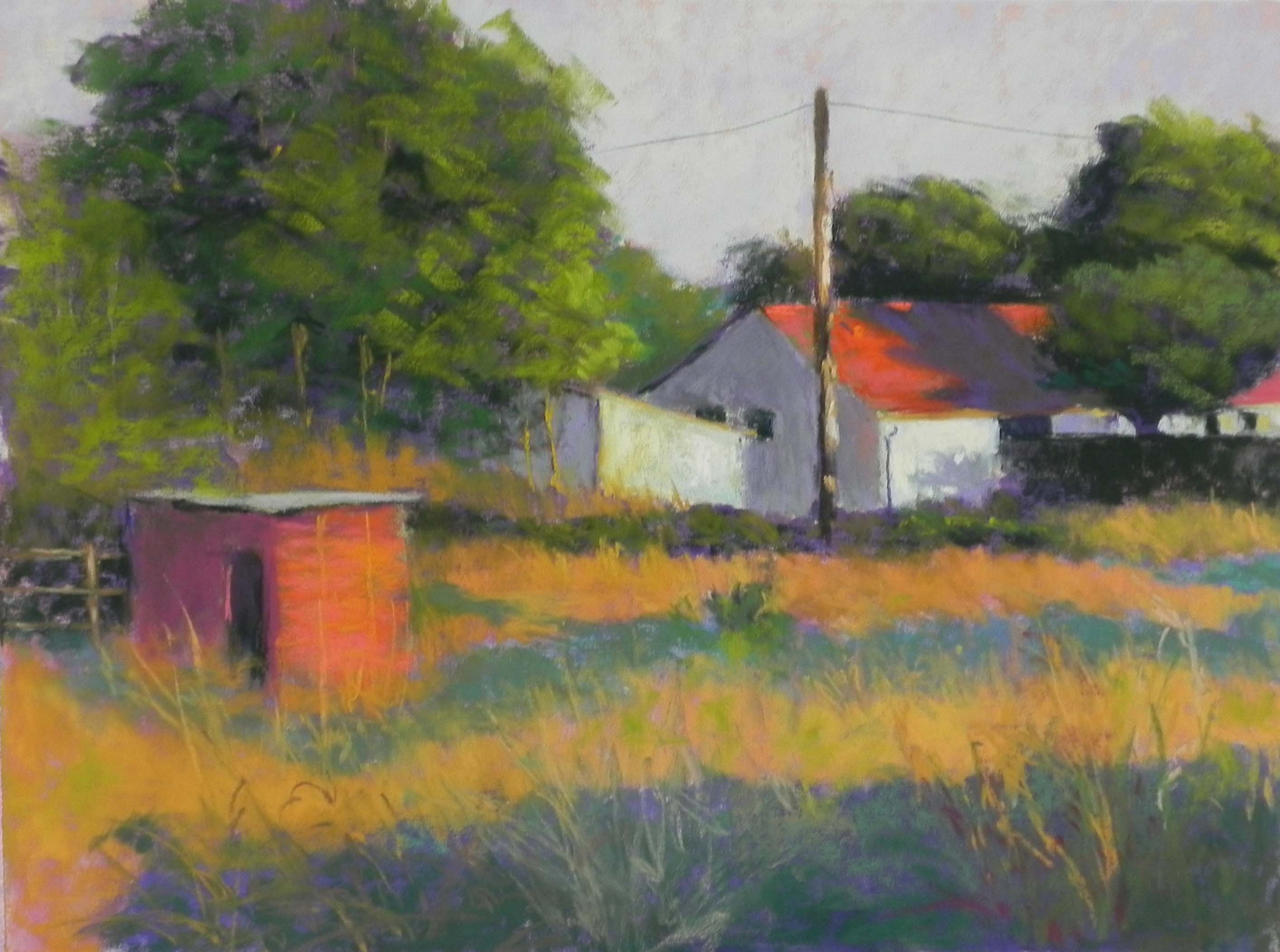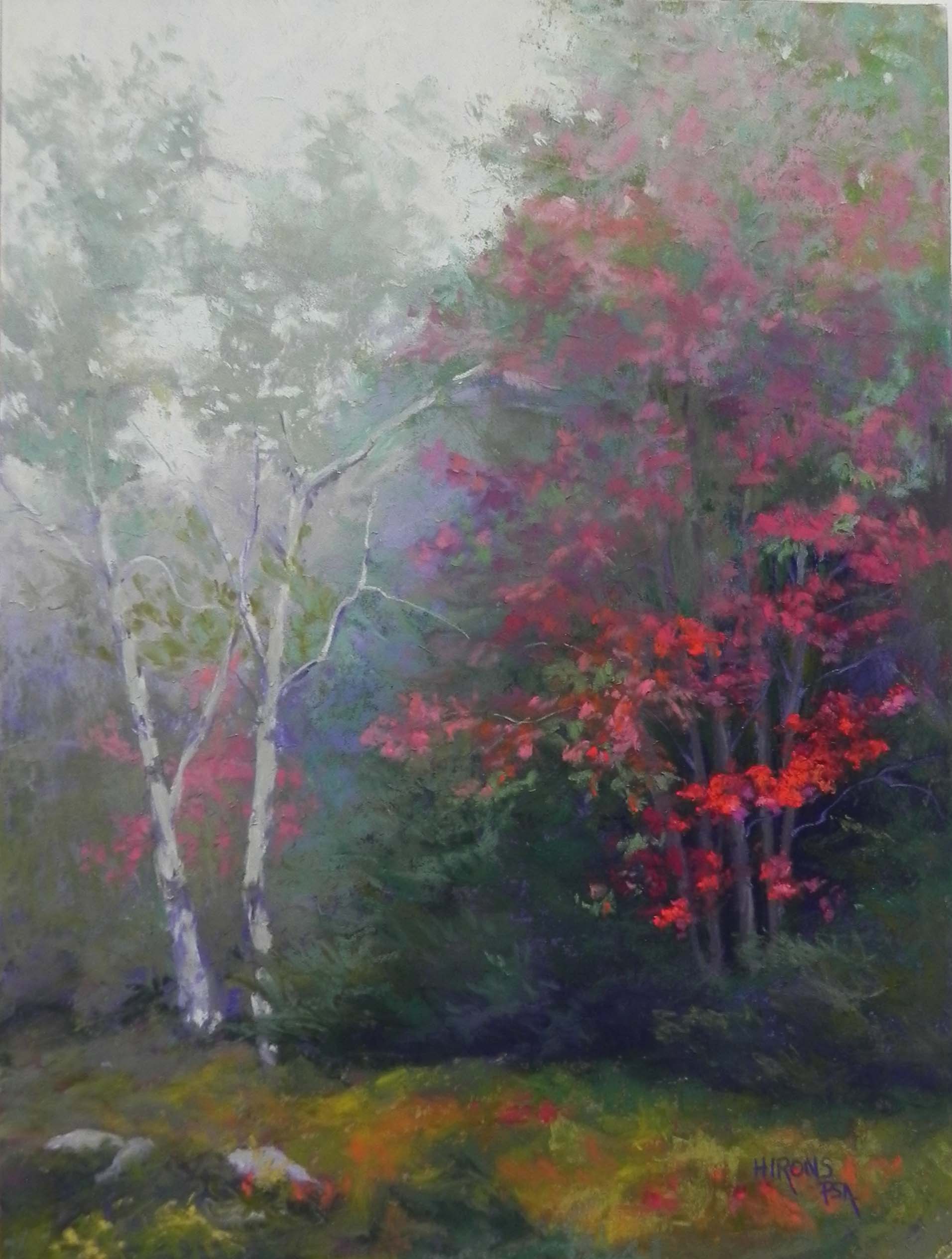
Autumn Shadows, 16″ x 20″, pastelbord
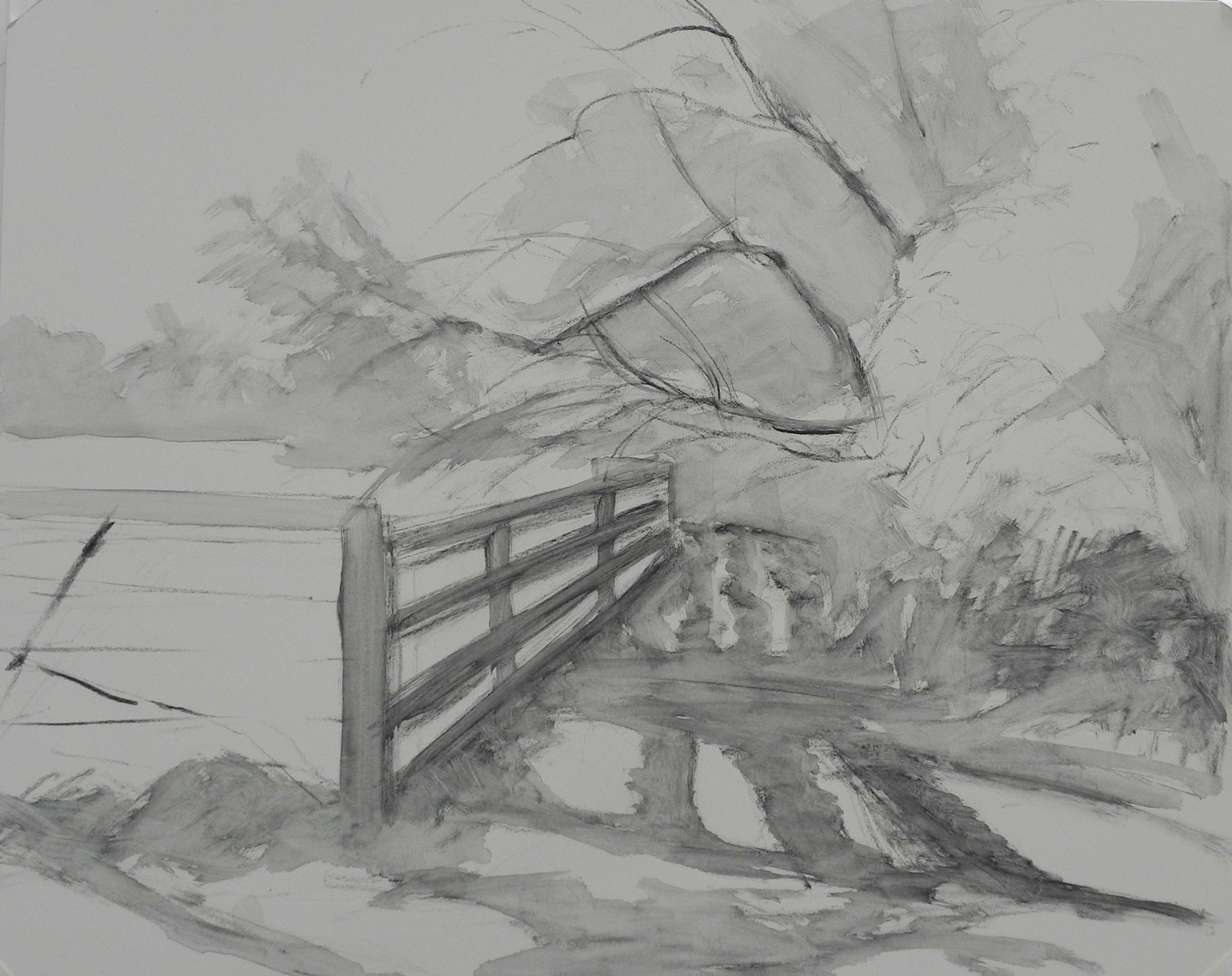
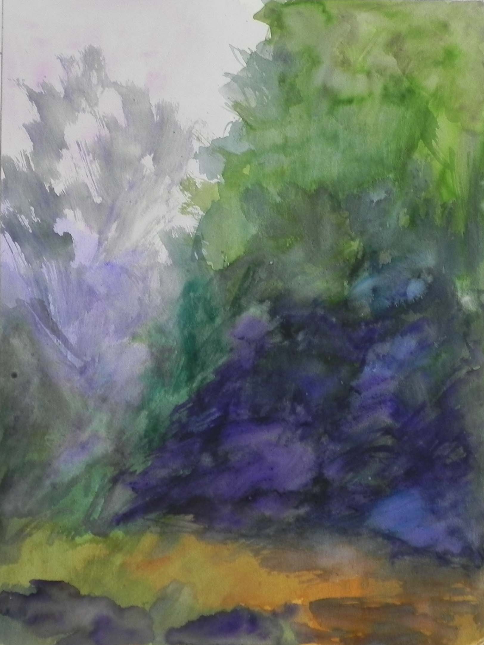
Charcoal and water lay-in
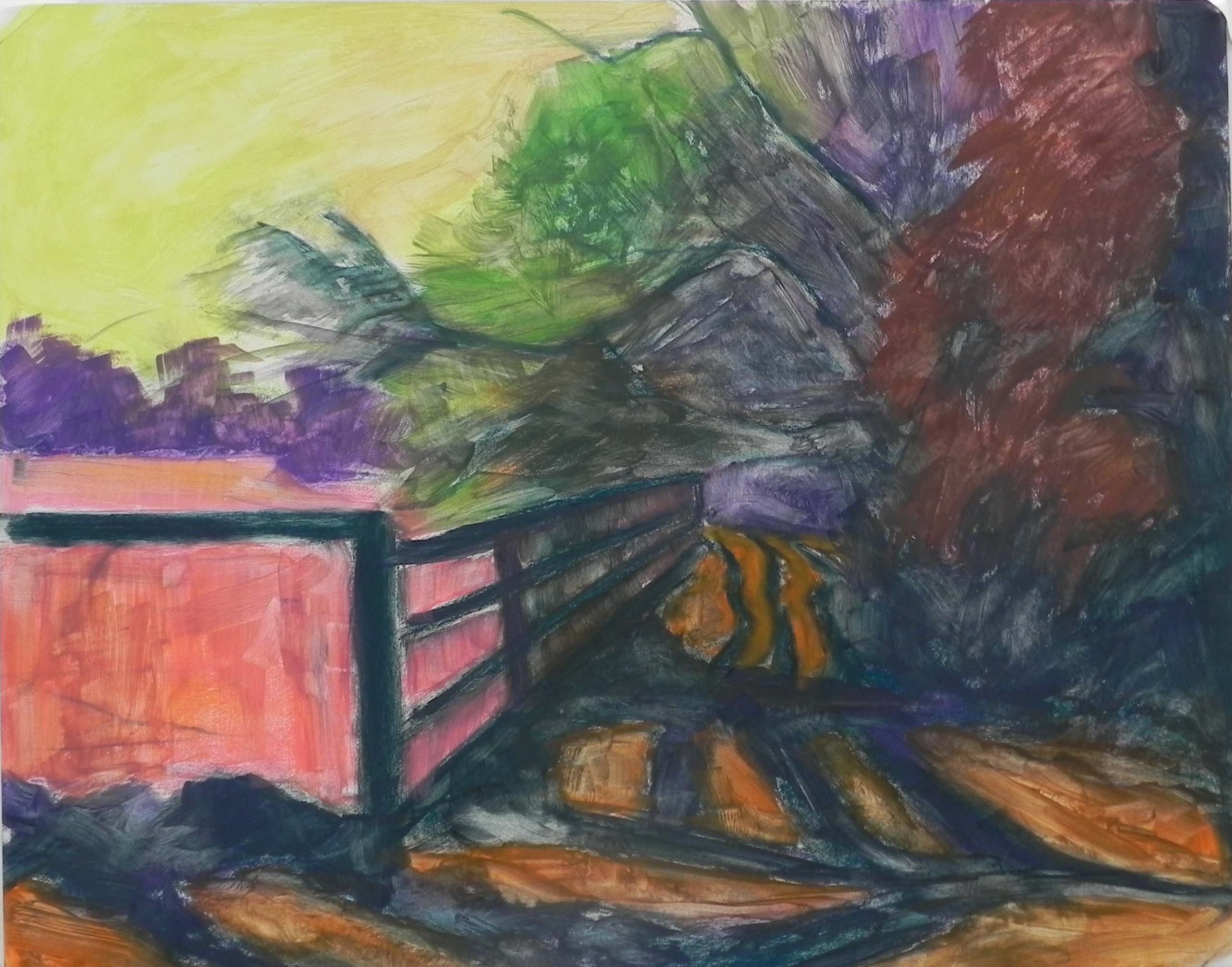
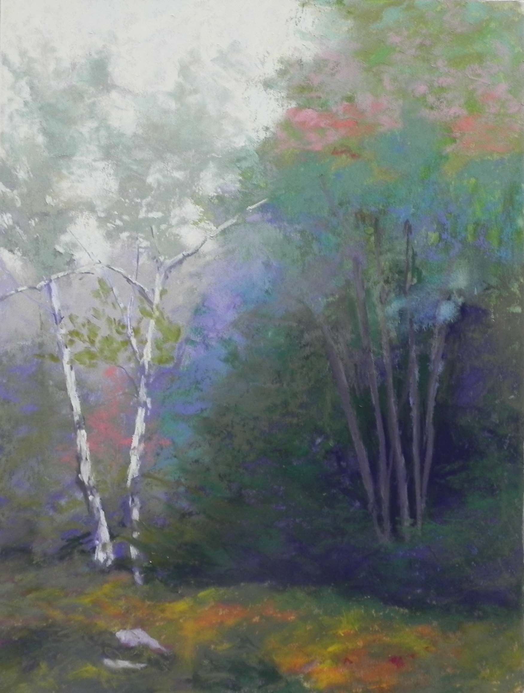
Hard pastel and alcohot underpainting
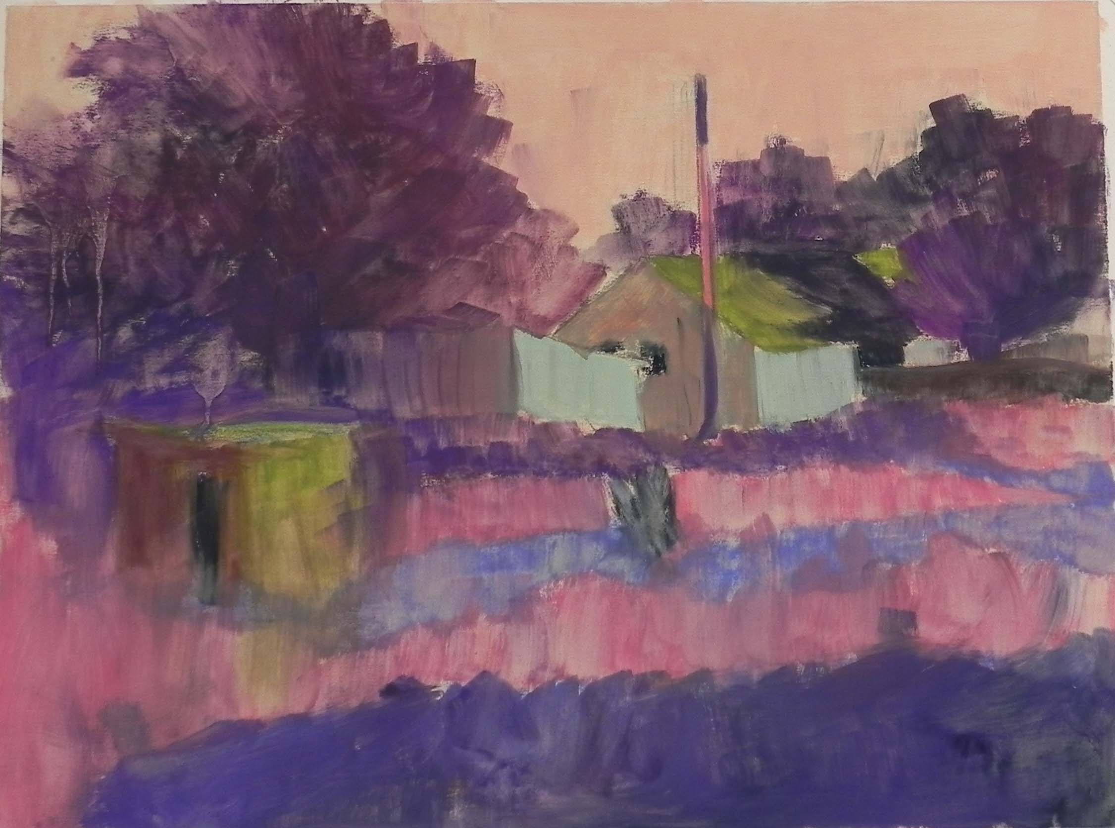
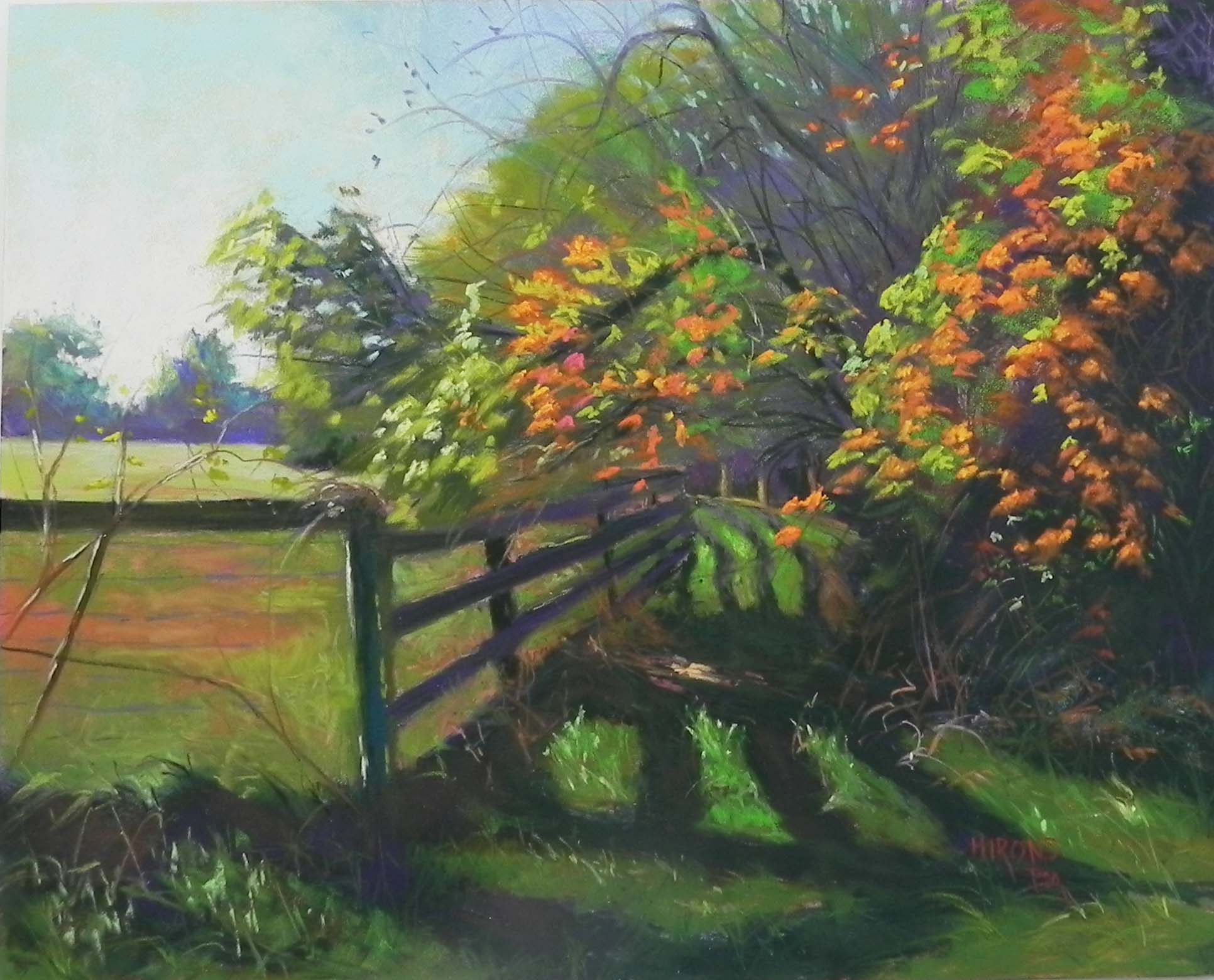
Today I did a demo for my Wednesday class. We discussed shadows briefly, and then discussed this painting, which is certainly all about the shadows. I went for a drive in Montgomery County yesterday and got several shots that I liked, but was really taken with this one. If it looks familiar, it’s the same group of trees that I painted in the spring for the paintings called “Spring Apples”. I was particularly taken with the bright green grass with wavy fence shadows, and the brightness of the leaves against the more subdued background trees. It was a beautiful, sun-filled day and I wanted to say that in the picture.
I began by using water-soluble graphite and charcoal on a 16 x 20 white pastelbord. As I have in the past, I chose to use a bright yellow green under the sky and I allowed some of it to show through. It provides such a sense of light! I used some blue violet in the upper center, then greenish aquas in the sky to the left. The bottom of the sky at left is my favorite Ludwig yellow. I began with the distant trees and the field, which I toned down with pink. I liked having some of the orangy earth showing through as it ties to the oranges in the trees. I began the distant trees on the right with greens in the underpainting so that I wouldn’t have to cover them up. The distant trees were done quickly and lightly with various greens and violets. The foreground leaves were done with soft Schminckes and Great Americans, hitting the pastels against the board to create marks.
The distant path and shadows gave me some problems and i kept changing the value and the size of the shadow until I was happy with it. I began the dark shadows with a Unison dark violet and dark green, then brushed some lighter green over. In the left foreground, I added some warm brown to the shadow to give it more depth.
I was concerned about having two groups of orange leaves and liked the painting much better when I added leaves over the distant path and in the upper center.
This painting was more difficult than Monday’s, but having painted the subject before (although at a completely different time of year!), I felt like I had an idea of where to begin and how to make it work.