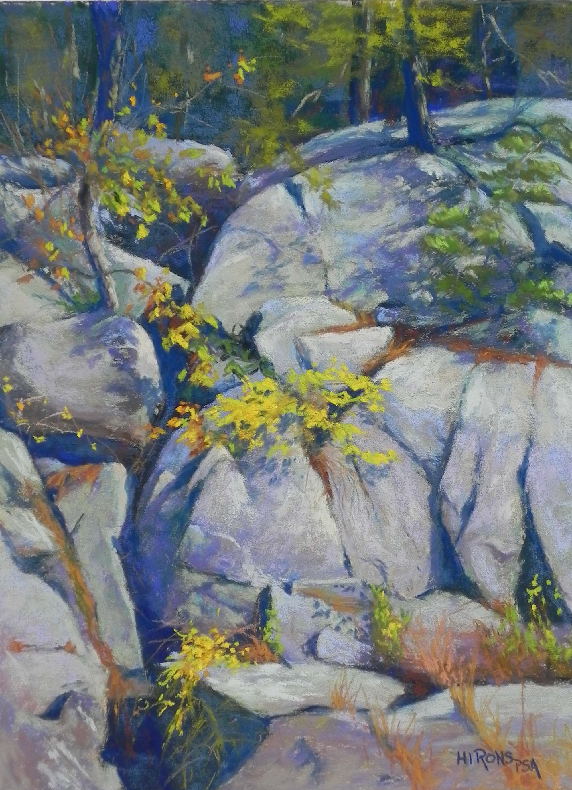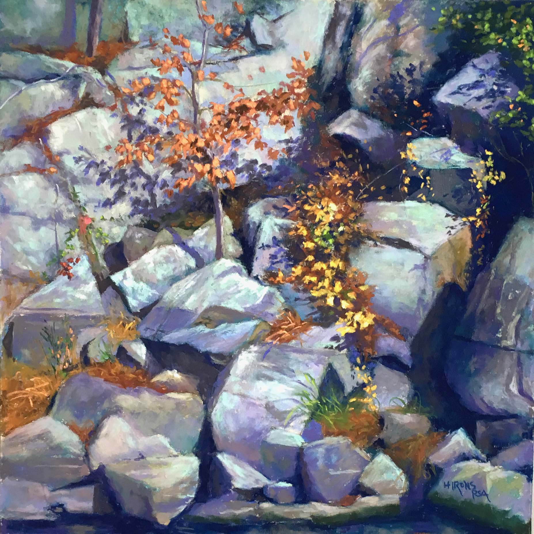
Orange on the Rocks, 16 x 16, UART 400
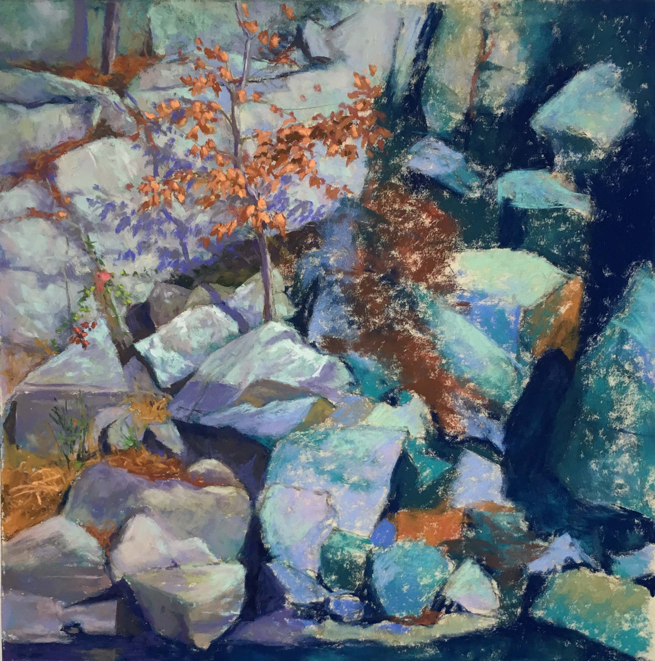
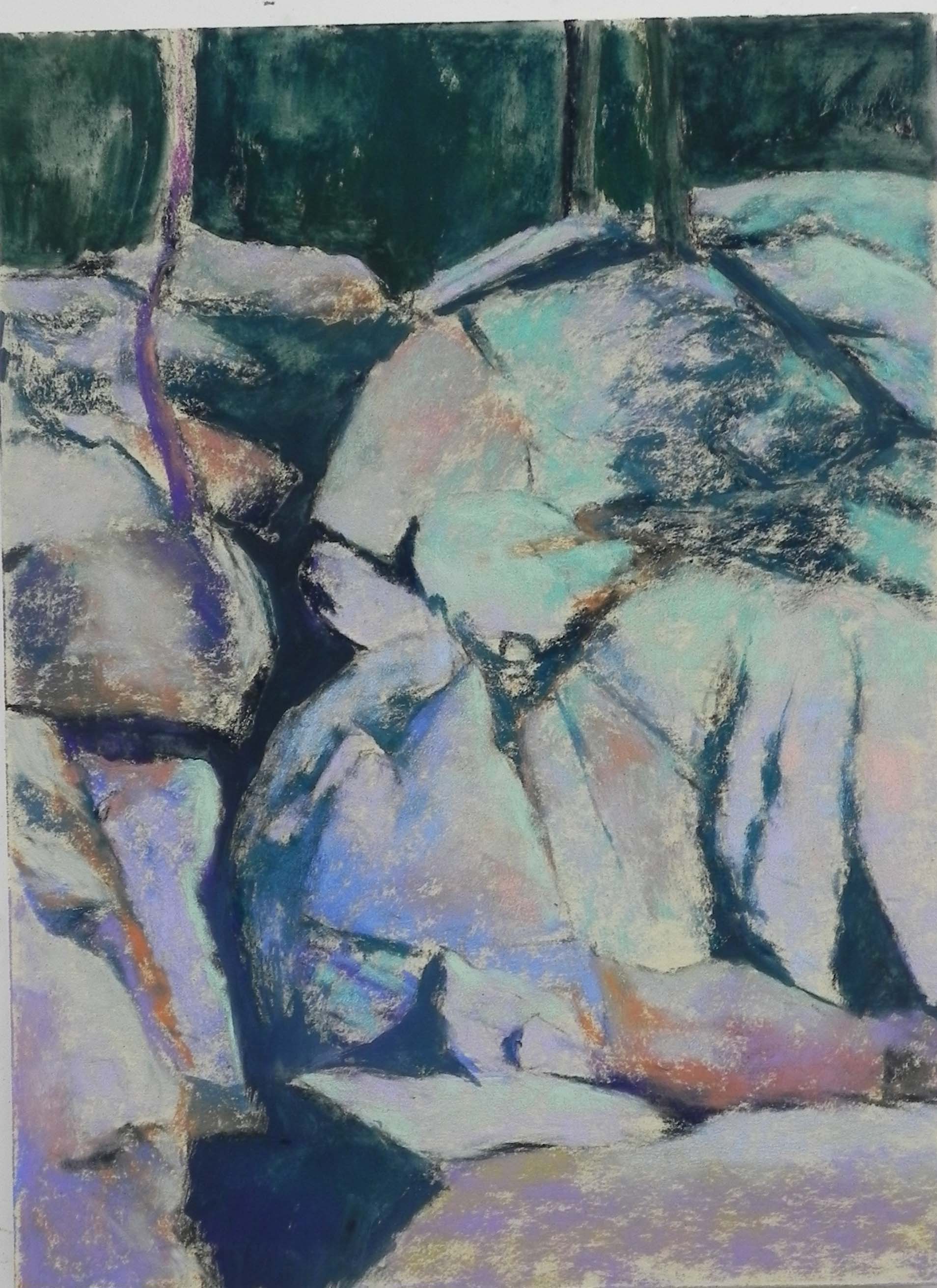
Partially painted, showing dry underpainting
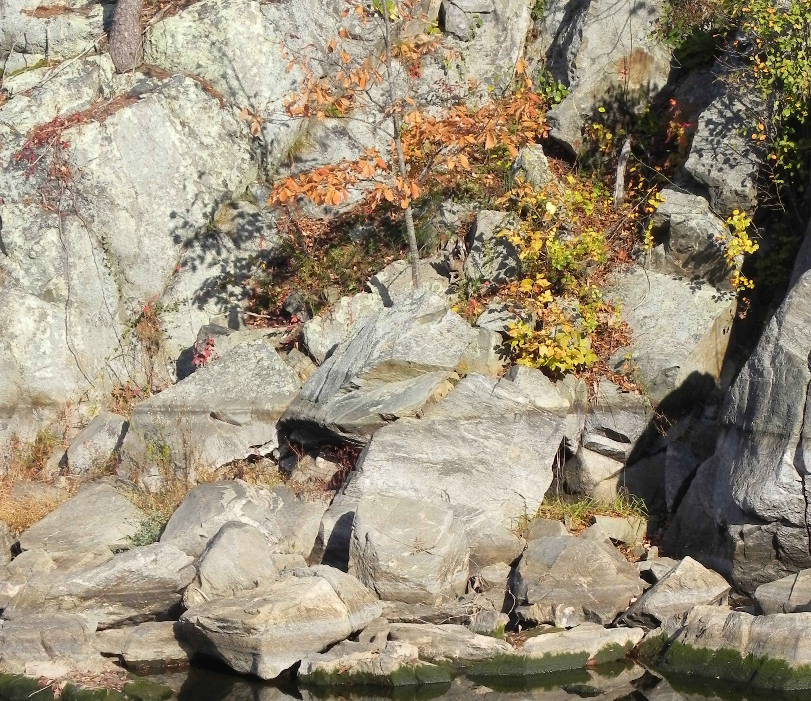
Reference photo
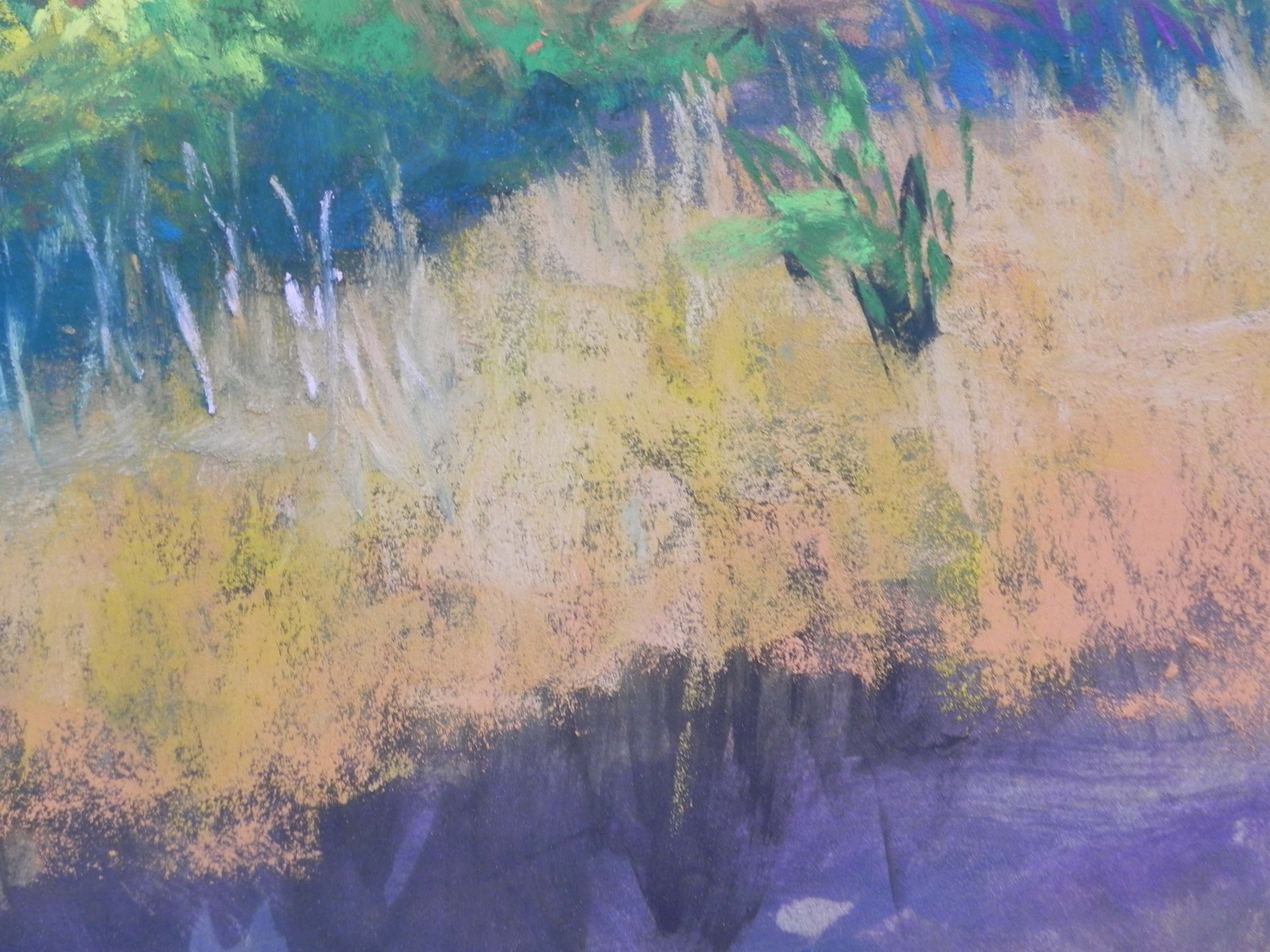
Happy Thanksgiving to everyone. I finished clean up today, got a few Christmas things done, then went off to the studio to finish up a painting I’ve worked on this past week. It’s another rock portrait from Great Falls. This is a very busy picture! I wanted the focus to be on the small tree with orange leaves casting a shadow against the whitish rocks. There are a LOT of rocks in this one! I’m including the reference photo as well, so you can see the original color.
I began this again with hard pastel over graphite and decided to spray rather than use alcohol. The original colors had a lot of aqua and blues in them. For the final, I used grayed violets, browns and greens. I also made some compositional changes to play more with the dark crevices and the pattern of darks in the picture. The original photo was not a square, so I had to make some change at the top, where I had more room. I decided to use a small tree surrounded by orange leaves, rather than the thicker tree in the photo, which is surrounded by rocks.
From the initial image (partially done), you can see that I started out the cast shadow of the small tree in a lighter violet. I realized that it was too close in value to the leaves. So I darkened the shadow. Then I added more darks to the leaves and more saturated strokes of a medium light Schmincke orange to make them standout. I had a challenge with the yellow leaves that are leading up the rocks to the right. At first I had them too bright and they detracted from the tree. I tamed them down with yellow greens on top of the yellow. I’m hoping that the oranges of the grasses and leaves also create a path through the picture, along with the darks. I used some finger smudging to try to lose hard edges but there is still alot of contrast, so I”m not sure how well the center of interest stands out.
I didn’t have quite the same tooth in this painting because the surface is 400 and not 320. But I still enjoyed layering color and coming up with something more colorful than the original.