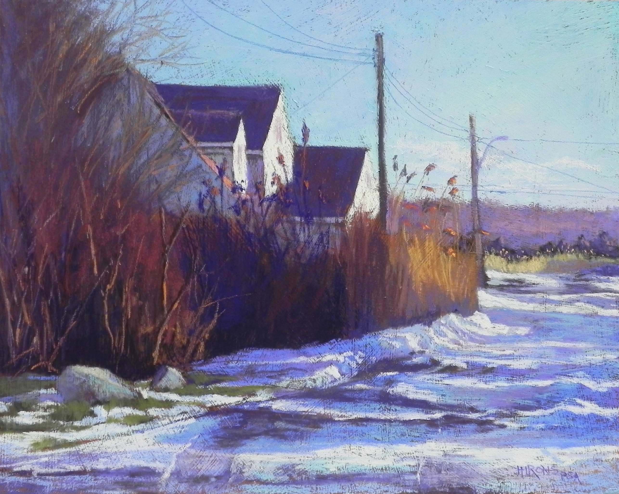
Shore Houses in Winter, 16″ x 20″, resurfaced Pastelbord
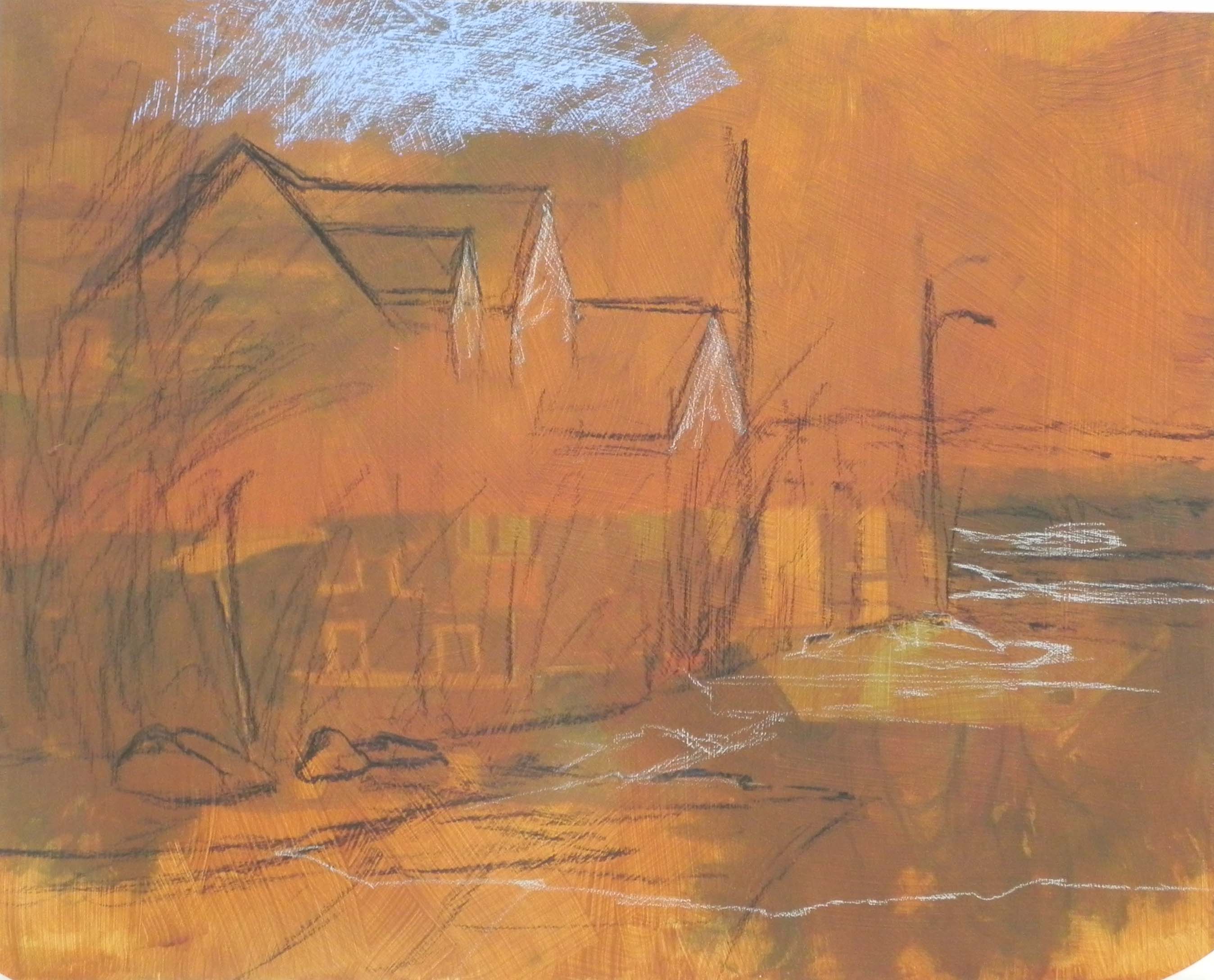
Initial sketch on toned board
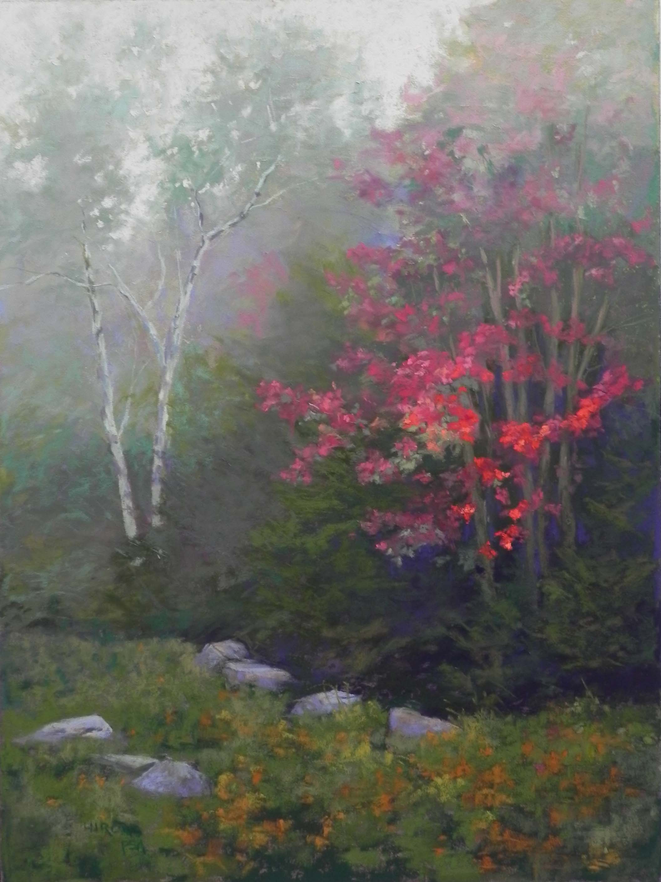
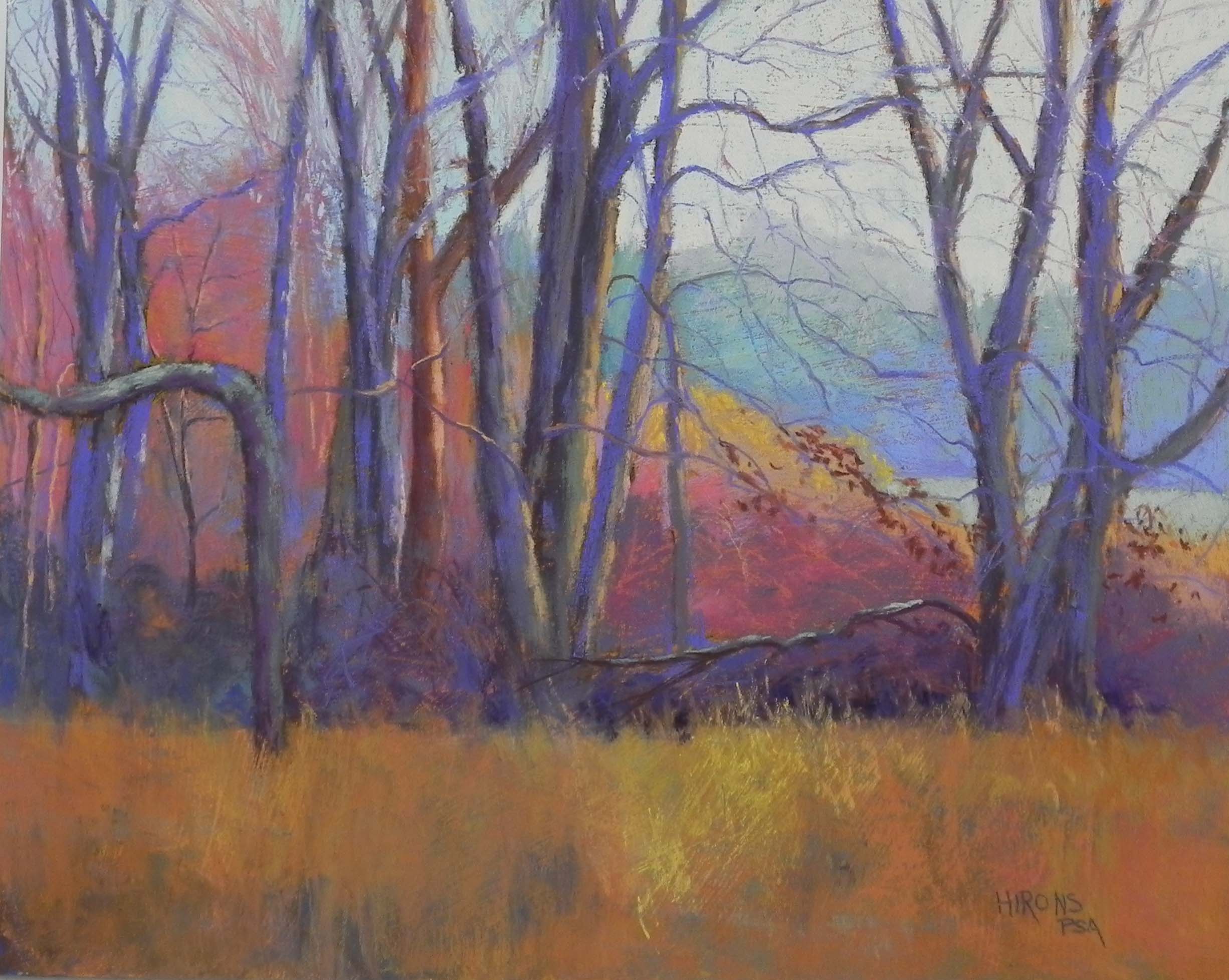
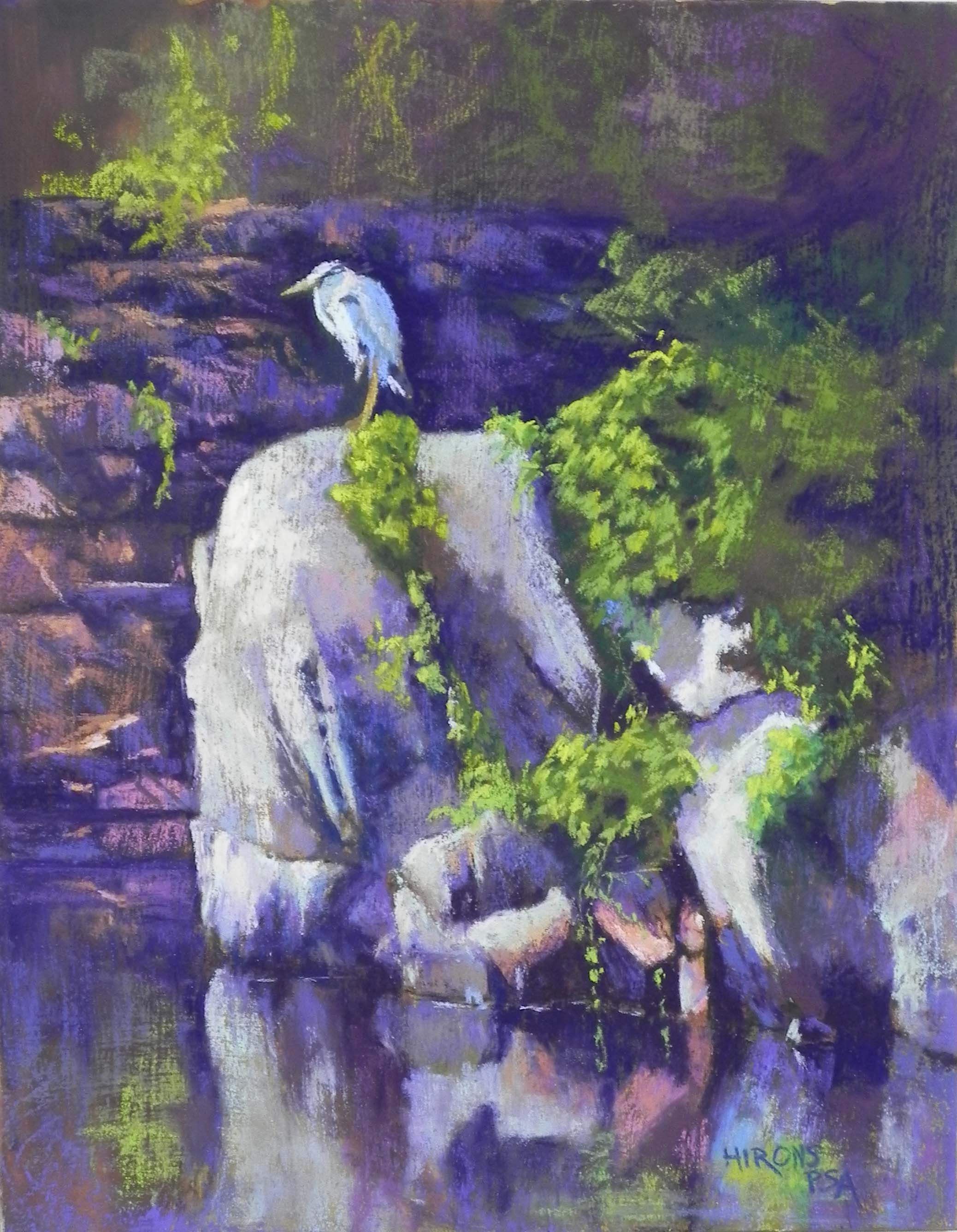
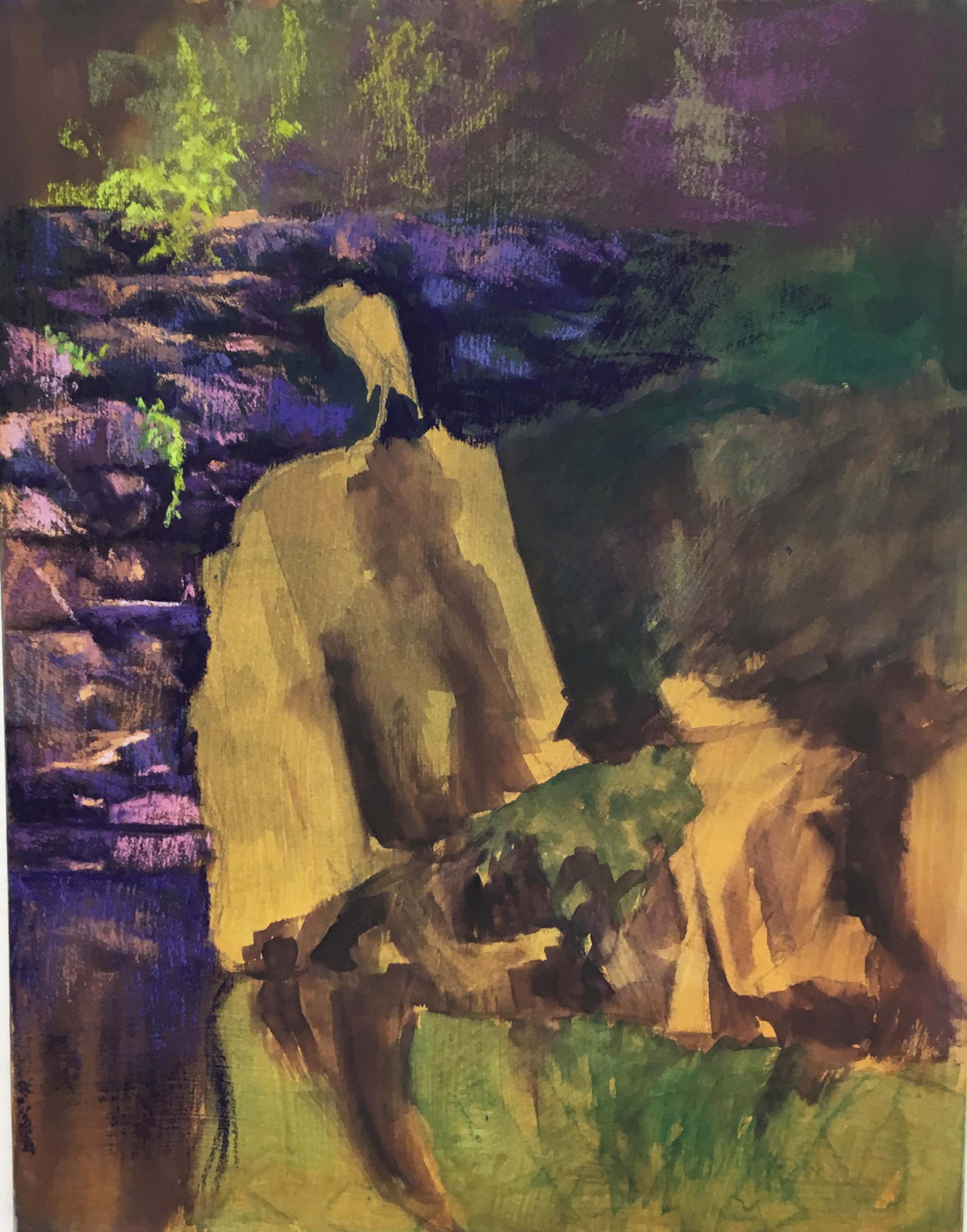
Today I decided to paint something completely different from the fog picture. I had a black and white photo from Mattapoisett that I had taken some years ago (haven’t seen snow there in a number of years!). I knew that a resurfaced pastelbord would be perfect for it as there were many bushes, reeds and trees, as well as a snow-covered road. So I resurfaced my last 16 x 20 board with two coats of relatively dark-toned liquid primer and brought it to the studio this morning. I didn’t do any sketches or preliminary studies, but I had looked at the photo a lot. The only change i made was to move the houses a bit to the left to minimize the trees at left and give more room for the road. I began with a charcoal and light hard pastel sketch and remembered to take a picture just as I was starting to add the pastel! You can see from the first layer of pastel, how rough the board was.
I began this painting similarly to the way I did the field painting behind my mother’s house. I used Ludwigs and Unisons and brushed in color to lay out the major areas. For the houses, I used a light green where the yellow would eventually go. The road was the hard part! I began with blue violets and a blue-tinted white . Once done, I went back to the sky. I think I may have overworked it. I basically got rid of all of the texture so it looks quite different from the rest, but I still rather liked it. I decided to add low clouds on the right to give it more interest, and I added some light red violet as the last thing.
The road was a lot of work and I kept taking breaks. I used a dark blue violet Ludwig in the snow beneath the darkest part of the reeds and I really liked the sense of shadow that it provided. I used it as well on the road, but then added blue green and other blues and violets over it to tone it down and bring down some of the sky color into the road. I did not overdo the road like I did the sky, leaving it quite rough in places. The surface really worked for me in trying to create the tire tracks in the snow at bottom.
The bushes and houses were quite simple, in comparison to the road. Using warm ochres at the right of the grasses, and warm red browns to indicate light on the left, varied nicely with the dark violet and red that I added in the middle. I added the wires at the end using a pastel pencil.
It was fun to do something with structure after the fog of the past two days! I love both and am happy that I have the opportunity to paint varies scenes.