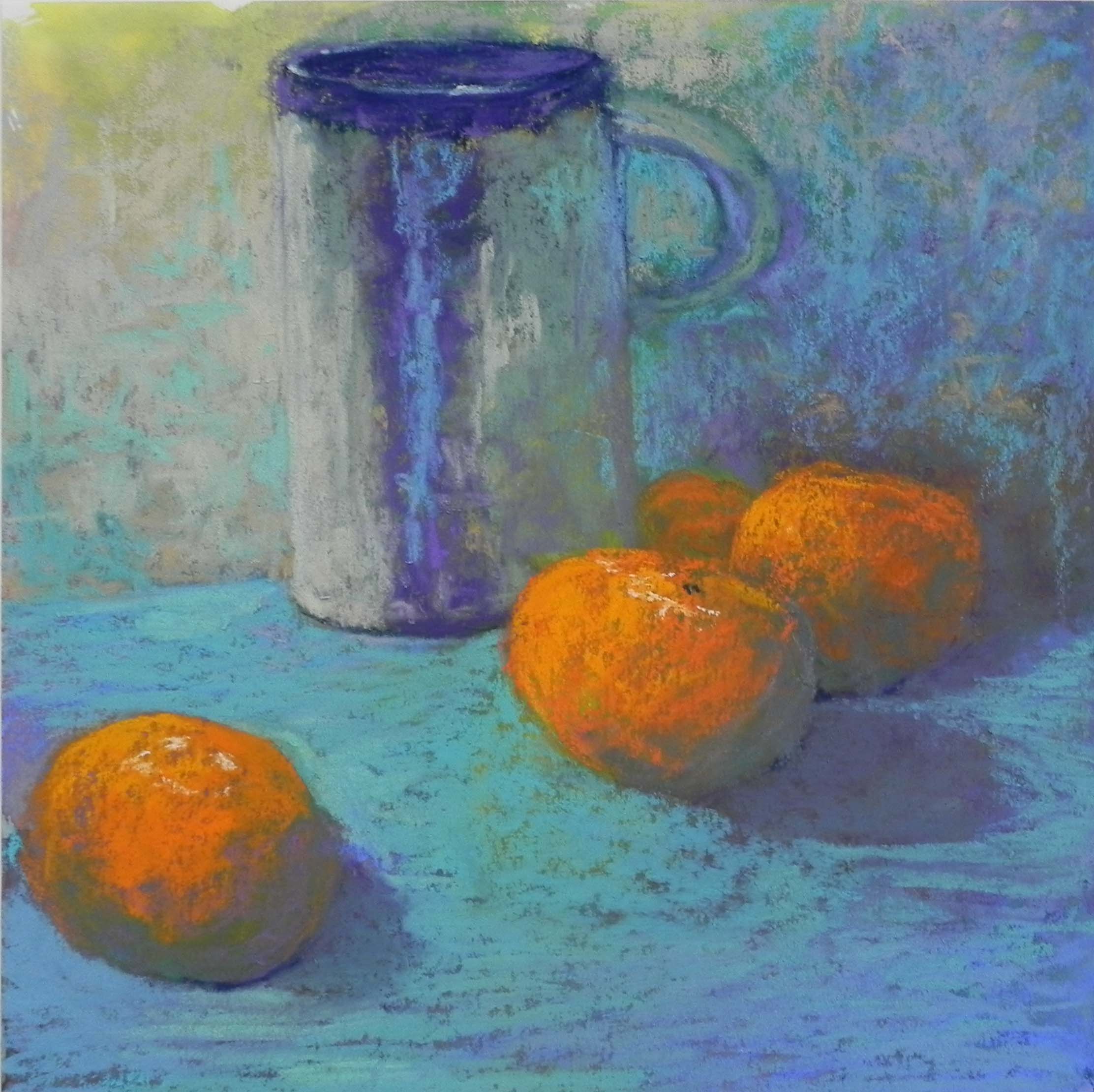
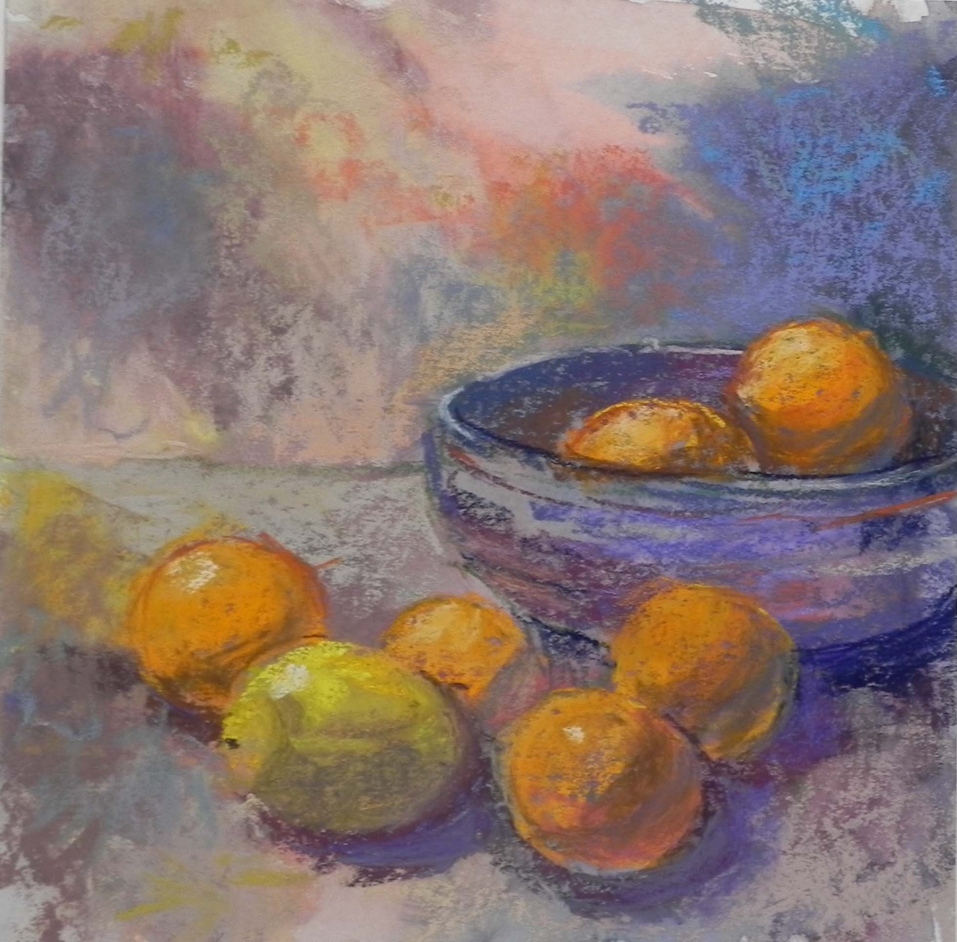
Cobblestone Alley

Cobblestone Alley, 20 x 16, UART 400

Cobblestone Alley, 20 x 16, UART 400

Underpainting with alcohol

Underpainting with alcohol

I spent a lovely day at the studio today while my car was being serviced.  Took the picture of the underpainting that I forgot last week, then worked on the painting most of the day.  I spent time at the beginning correcting the drawing of the church on the left and I was happy with it when it was done. Also made sure that the garage looked right, shortening it, and extending the roof up on the right side.  For the sky, I used a light orange to begin with, then later went back with the lightest Ludwig violet and yellow. I thought it was looking too one-dimensional and the violet helped (but I doubt that you can see it in the photo).

My Blue Earth pastels really came in handy in this picture. The tree at right is almost all the green set, and the street is mainly the warm neutrals, along with some blue and pink Giraults.

My husband suggested adding a bush in front of the wooden fence and I put in a rose bush with flowers that pick up the reds on the left.  I like to think that I would have thought of this myself, however, I want to give him credit.  (He once read a whole book on composition so as to better give me comments!)  The last thing that I changed was the building in the distance on the right. I had made it green, as it was in the photo. But I decided that reddish brick would be better to help balance the large amount of it on the left. I used a soft pastel and used it right over the soft greens that were there, which helped dull it.  I think that the picture hangs together better with it and it ties together with the rose bush as well.

I was a little intimidated by the idea of indicating both brick and cobblestones in the foreground, but it really wasn’t so hard. I used browns and violets to fill in the area first, then the lighter Blue Earth neutrals to make the stones.  I didn’t want to over do it, but I think that it’s obvious what it is and it’s much more interesting than the newly paved alley up the street!

I won’t be painting much this month. I’ll be off to the pastel convention in Albuquerque (IAPS) next Tues. and coming back on June 14. Then I leave for Mass. on the 19th where I’ll be bringing paintings to galleries, giving a one day workshop, AND celebrating my mother’s 98th birthday!!!  We have looooong genes in my family!

Tips on Underpaintings

Photo reference

Photo reference

Cobblestone Alley, Underpainting, stage 1

Cobblestone Alley, Underpainting, stage 1

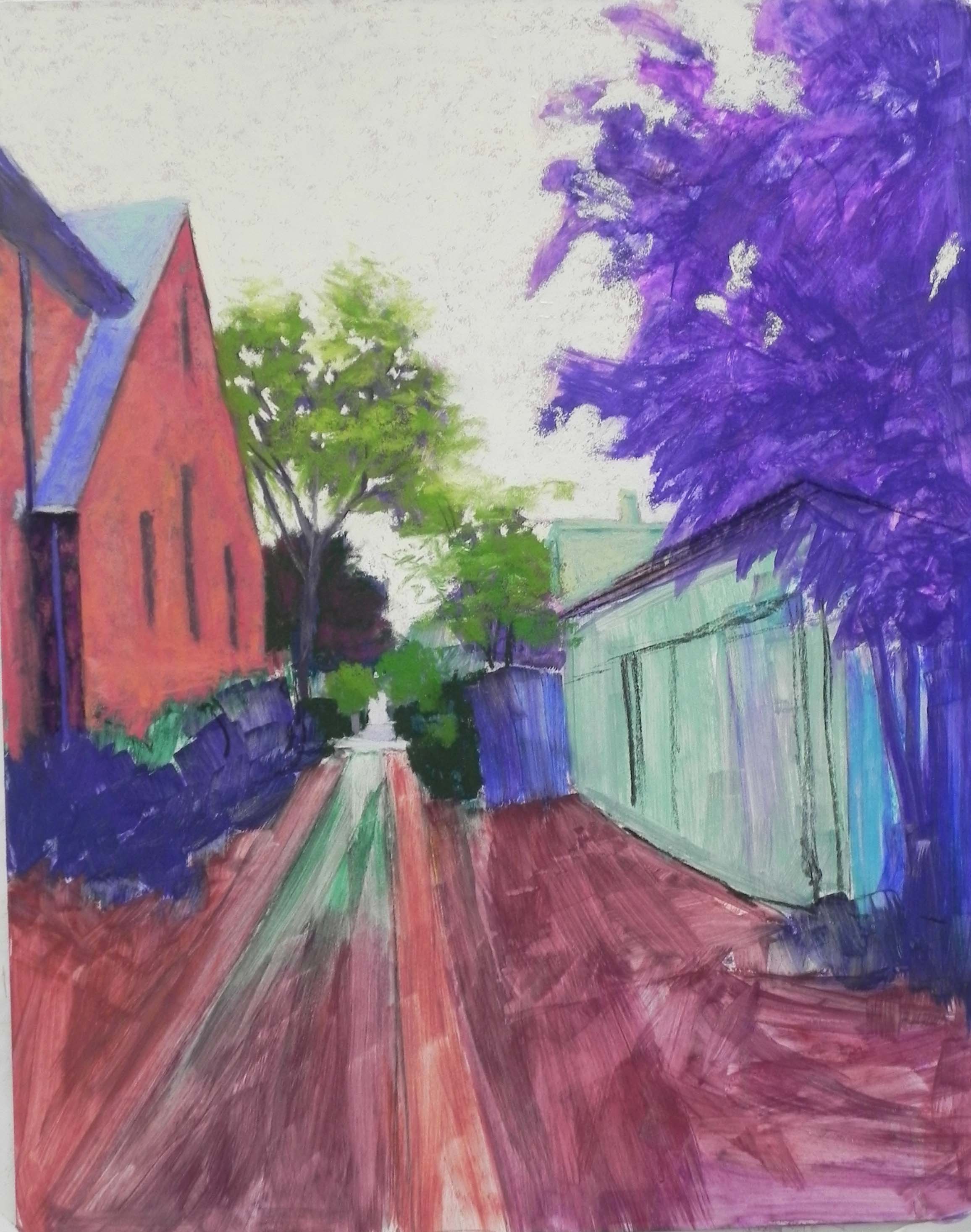
I spent a couple hours at the studio today working on the underpainting for a new alley picture that I drew yesterday.  While I was doing the underpainting, I thought about yesterday’s class with some new students and their questions about underpaintings–and all the questions I keep getting from my regulars!  So I thought I’d do a post with just an underpainting and really focus the discussion on that.  I took a photo before applying the alcohol, but unfortunately, got into a conversation and forgot to film it after the alcohol!  But perhaps its easier to see the color choices and amounts of pastel applied from the un-alcoholed version anyway.

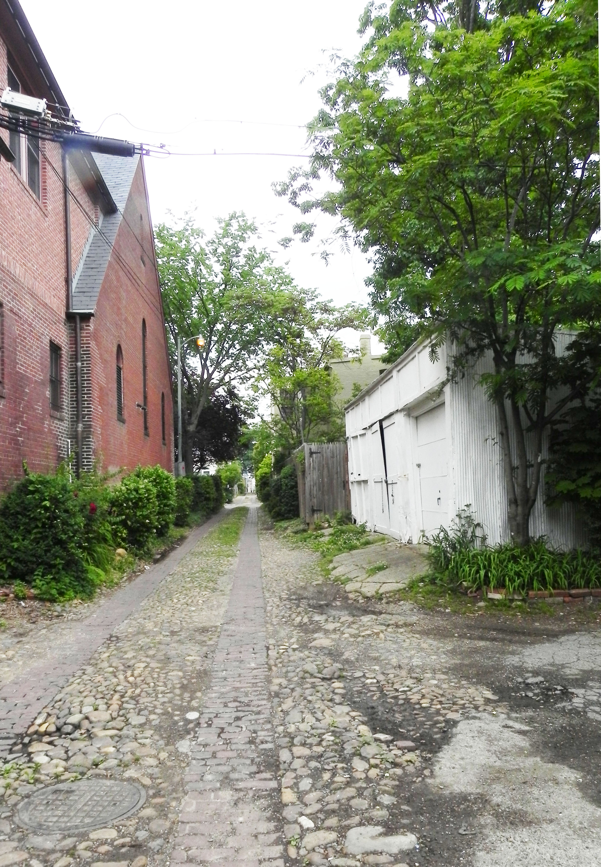
I’m giving you the original color photo as well, so you can see what I was working from. I also printed out a B&W version, which I found quite inspiring.

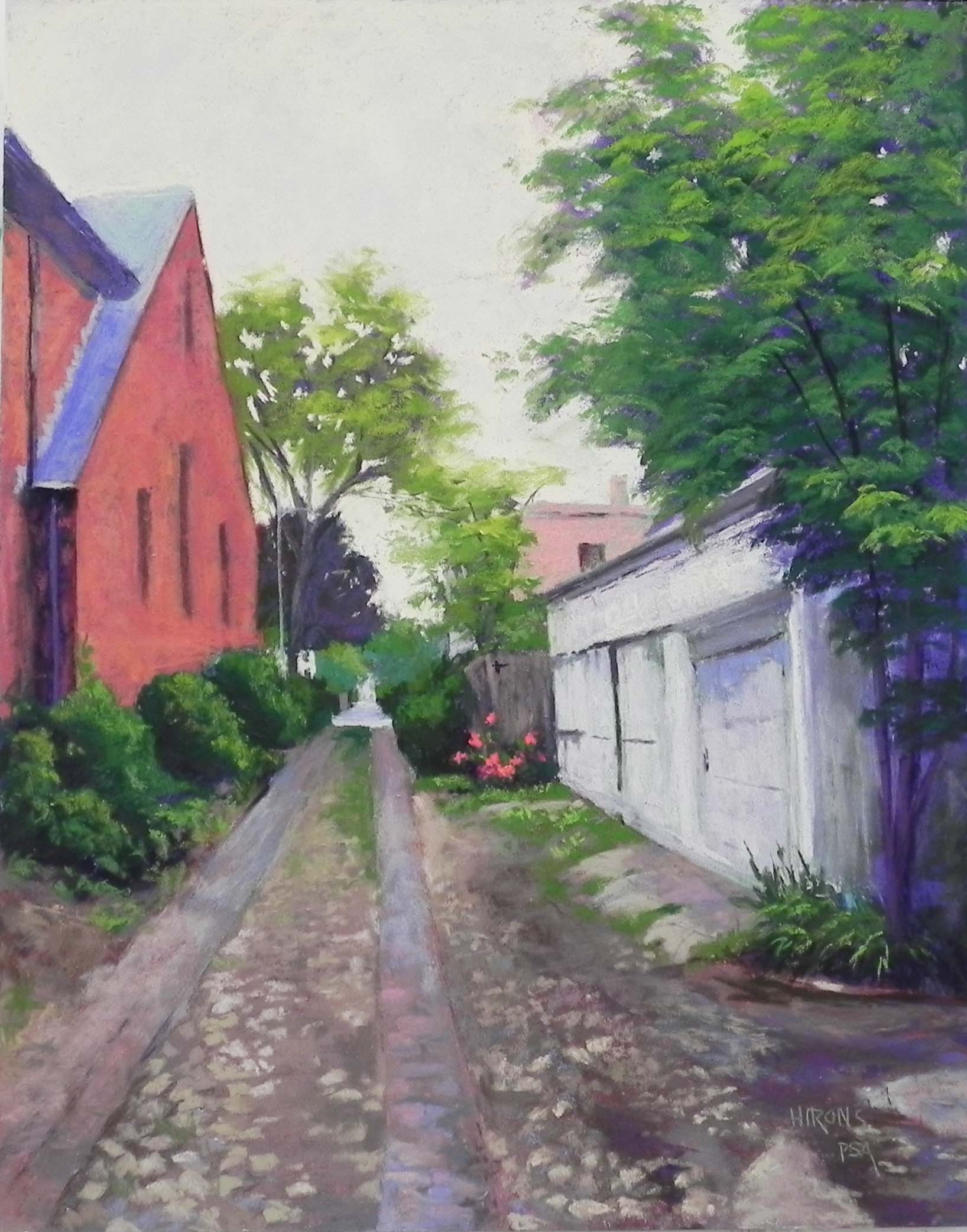
So first, about the photo. On Tues., I had a date to meet friends at the Library of Congress and left early to take photos of alleys. Unfortunately, it was an overcast day with no interesting light at all.  But I found this alley, that I really liked and know that I’ll go back to. I liked this photo because of the richness of darks and lights and thought I could do something with it.  I was thinking of making it into an 18 x 24 but it wouldn’t work.  So I am now working on a 16 x 20 board of mounted UART 400.

The first concern that I often hear from students is:  why spend time on the drawing and then lose it in the underpainting?  This is a legitimate question, for sure. I spent a lot of time on the drawing yesterday and I didn’t stop until I was satisfied with the overall layout of the picture.  Once I have the basic shapes where I want them, it doesn’t matter whether I lose some detail. And, over time, I’ve learned not to even draw in the detail to begin with. For instance, you’ll see that I haven’t added the windows into the church or any detail into the white garage.  Also, my only concern with drawing in the foreground was the overall shapes of the brick vs. cobblestone areas and the lines. When I began, I focused first on the end of the alley and where that would be on the paper. I didn’t want it in the middle, and I wanted more space on the right and less on the left.

Once I’ve done the underpainting, I find it easier to see things that aren’t quite right and correct them. For instance, the roof on the garage is not steep enough, and I think the building needs more foreshortening.  I can correct this easily with a hard pastel.  I also don’t think that the church is quite right, but part of the problem with it is the angle of the photograph. However, I can draw over the completed underpainting, and do more underpainting, if I feel it’s necessary.  Remember that pastel is a very forgiving medium!

Another advantage to doing the underpainting is that it allows me to begin rather intuitively and quickly, not worrying about perfection.  Once I have color down, then I can focus on the level of perfection that I want to achieve.

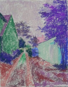
Color choices.  It was the color choices that I started thinking about while doing this.  It’s the hardest thing for new people to grasp. I tell them that it doesn’t matter what color you use as long as you don’t begin too lightly.  Having worked for over 20 years in pastel, I know that my color choices are very intuitive, based on experience and what appeals to me at the moment.  In this picture, you’ll see a wide gamut of selections!  So I thought I’d try to explain them.  First, the sky,  I used two pastels: a light violet and a lighter whitish orange. The sky is white in the photo and it was pretty gray when I took the photo. But i still see light there, and I think I’ll want to use a warm neutral of some sort (e.g., beige, cream) for the overcolor. So I decided to start with a cooler violet, that would also tie to the violets in the trees and shrubs.  I could have used almost any color here, but I like working lighter over darker and warmer over cooler, so this should work. (I often use orange under a blue sky–warm under cool).

For the trees, I’ve used several values of violet and red violet. There is very little light on them and I didn’t want to get into the areas of light and dark in the large tree at right. So I kept them simple. I almost never use green under green, but I did use a little dark green in the bushes, and went with greens for the very small distant trees at the end of the alley. These are small details that are easier to see if the local color has been applied. For the brick building, I’ve used the complement: green under what will be red brick. This always works for me.  For the white garage, I wanted something darker and cooler than what I’ll end up with. And adding the green to the building might help tie the two buildings together (in the underpainting at least!), given their differences.  (I’m sure I went for the green because of the green on the left.)

I know that the foreground is going to be the real challenge in this picture. Unfortunately, I don’t have a textured, hand-made surface, which would make it easier.  So I wanted to begin with some richer, darker color, over which I’ll apply neutral browns and grayed violets.

The underpainting, once the alcohol was applied is darker than what you are seeing and the shapes are quite well defined. Sorry I forgot the photo!  But I hope that this will be helpful to some of you who are struggling to figure out why and how to do an underpainting and what colors to apply. I could have used a completely different palette and still come out with a successful painting, but I tend to go with the solutions that I know will work. For those new to this, it’s a matter of trial and error. Just remember to think value first, temperature second!

Doing underpaintings provides a chance to be a little free at the beginning before getting down to the more serious work!  So enjoy it!!!

A happy Memorial Day weekend to you all.

Amish Farm Revisited

Amish Farm Revisited, 20 x 24, Pastel Premiere Italian clay

Amish Farm Revisited, 20 x 24, Pastel Premiere Italian clay

I used to pride myself at being a seasonal painter. But lately, I’ve been painting whatever I wanted to in my studio and this is the latest painting–more snow!  It’s from a photo I shot from the car in Dec. 2013 on the way to Mass.  Some of you might remember seeing my earlier painting (I actually did two).  I was in an abstract mood at the time and I exaggerated the hill and worked from black and white, putting in lots of colors that weren’t there.  I also did both paintings on Reeves, so they had a much more textured broken color look to them.  Recently, I was going through photos and came across it in color and B&W and I decided that I really loved the original (real) version of the scene and that I should paint that.

I would have done an underpainting but I didn’t have any mounted light paper in 20 x 24, so I used a sheet of Pastel Premiere Italian clay. I liked the idea of working directly over the drawing.  The challenge for me was the coloring.  At the time, I remember that the sky was infused with yellow light. It was probably 10-10:30 in the morning on a winter’s day and the light was quite amazing.  I loved the fact that the sky was darker than the snow, but that the snow had lots of corn popping up in it.  So composition wasn’t an issue, but color was. I cut a small piece of the same paper and did some studies for the sky. I started with Ludwigs and immediately put them down–too soft!  I didn’t want the sky to look cakey. I went to Girault instead (of course!).  I worked with several blues, blue greens, and a wonderful grayed yellow green that brought the sense of yellow into the sky that I remembered. It’s not exact, of course, but I like the effect of it. I decided to make it pretty much the same all over, but did lighten the bottom a little on the right.

One of the color aspects that I really liked in the photo were the dark green building on the lower left and the solid blue silo on the right, both in about the same value and solidness of color.  After completing everything, I added some of the blue to the dark green, and some of the green to the dark parts of sheds going up the hill. It helped tie them together, and added more dimension to the shadows. I used Giraults exclusively for the buildings. But when I got to the snow, I instinctively went for the Ludwigs. I began with a blue violet, then two blue greens on top. They seemed perfect for the snow, which has more mass than the sky. I used hard pastels for the corn and the tree branches against the sky.

I wasn’t sure about this picture when I began it, because I really DO love working over underpaintings. But now I’m quite happy with it. And even though I worked from the photo, it’s still not all that realistic!  I mean, who has ever seen a sky this color!!!  But I really like it.

Playing in the Studio

Mug with Clementines (by me)  12 x 12 Multi-media pastel board

Mug with Clementines (by me) 12 x 12 Multi-media pastel board

Still life by Sarah Miquelle, 12 x 12

Still life by Sarah Brown, 12 x 12

It’s been rather cold, wet and miserable for the past few days and my artist friend  Sarah (Brown) Miquelle is here from Massachuetts. After several days of museums, we decided that a day of playing in the studio would be just the thing!  We went to the local art store and bought some colored inks, which I had decided to try for toning boards. (I promised my class that I would try out something new). I bought 5 bottles of Liquitex and Daler-Rowney inks, some of which are irredescent.  I brought some small boards and 12 x 12 Multi-media pastel board–the very thin, rather textured boards.  I first tried using straight ink, but it was too thick and I decided I’d better use water. That worked better, particularly with a hair dryer. But I needed two coats and even then it dried very lightly.  I wasn’t overwhelmed with the possibilities, I have to say!!!

However, we both did a 12 x 12 painting from some pottery and fruit.  I began mine with a drawing using a Girault. I didn’t really set up a composition, we just had the bowl, mug and fruit sitting there!  My initial composition included two large lemons and several of the clementines.  As I worked on the painting, both Sarah and I agreed that the mug was too small. So I enlarged it.  Then I got rid of the lemons and replaced them with clementines. I liked it much better. Sarah was better at leaving her painting loose with more of the ink tone showing.  I started using irridescent pastels–Schminckes, Senneliers, and Great Americans–all soft!  It was nice because they covered up the texture of the board and it was quite sensual, actually!   I may have overdone it, but I really had fun using them.  I’ve only left a little of the undertoning showing in the upper part of the painting.  There were no real shadows (too much light in the studio), so I basically had to make them up.

It was really fun working with surfaces and pastels that have been hanging around my studio for years and a new medium of colored ink.  I wouldn’t suggest that you rush out and buy the ink, however.  Watered down liquid acrylic or gouache are just as good, if not better.

I have one sad piece of news to report. Robert Mogul wrote to tell me that he is no longer producing the True Grit Pastel Panels which I have been using. I’ve really enjoyed using these–mounted UART on Gatorfoam.  I have a lot of gatorfoam still, so I may have my framer produce some boards for me.  But I’m sorry to hear that Robert couldn’t make a go of it.

Sarah applying ink to a board

Sarah applying ink to a board

My initial drawing on toned board

My initial drawing on toned board