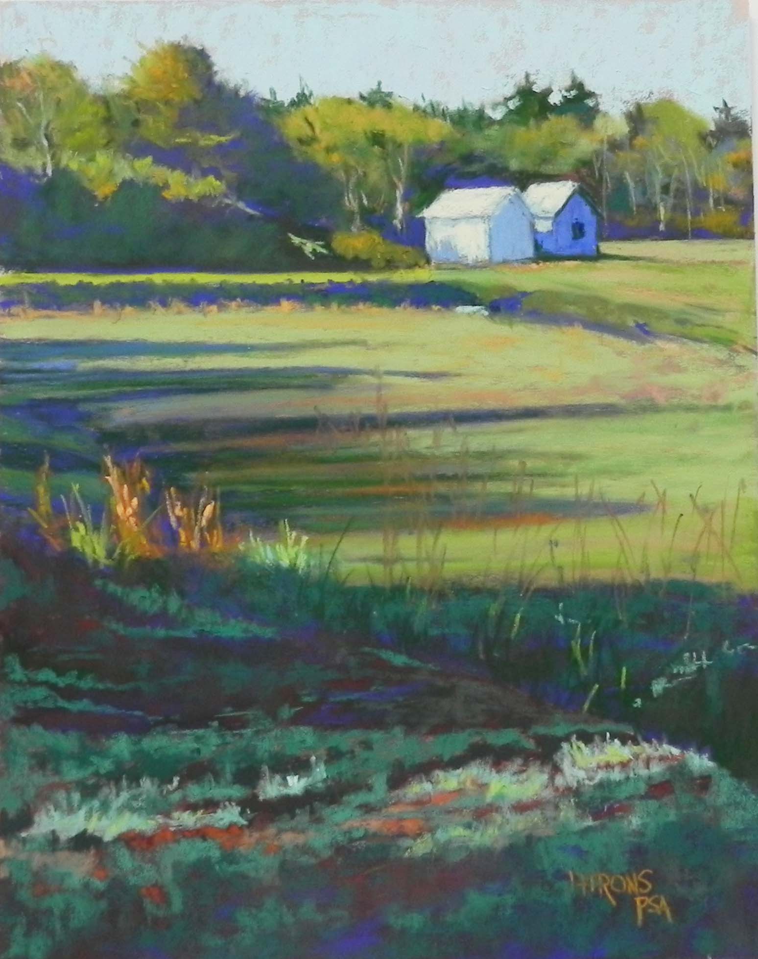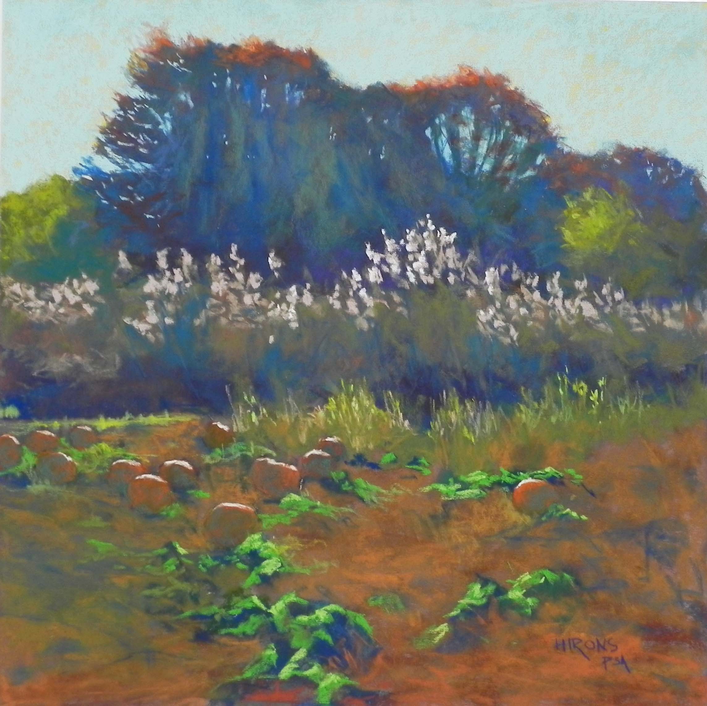
Pumpkin Field, 20″ x 20″, UART 320
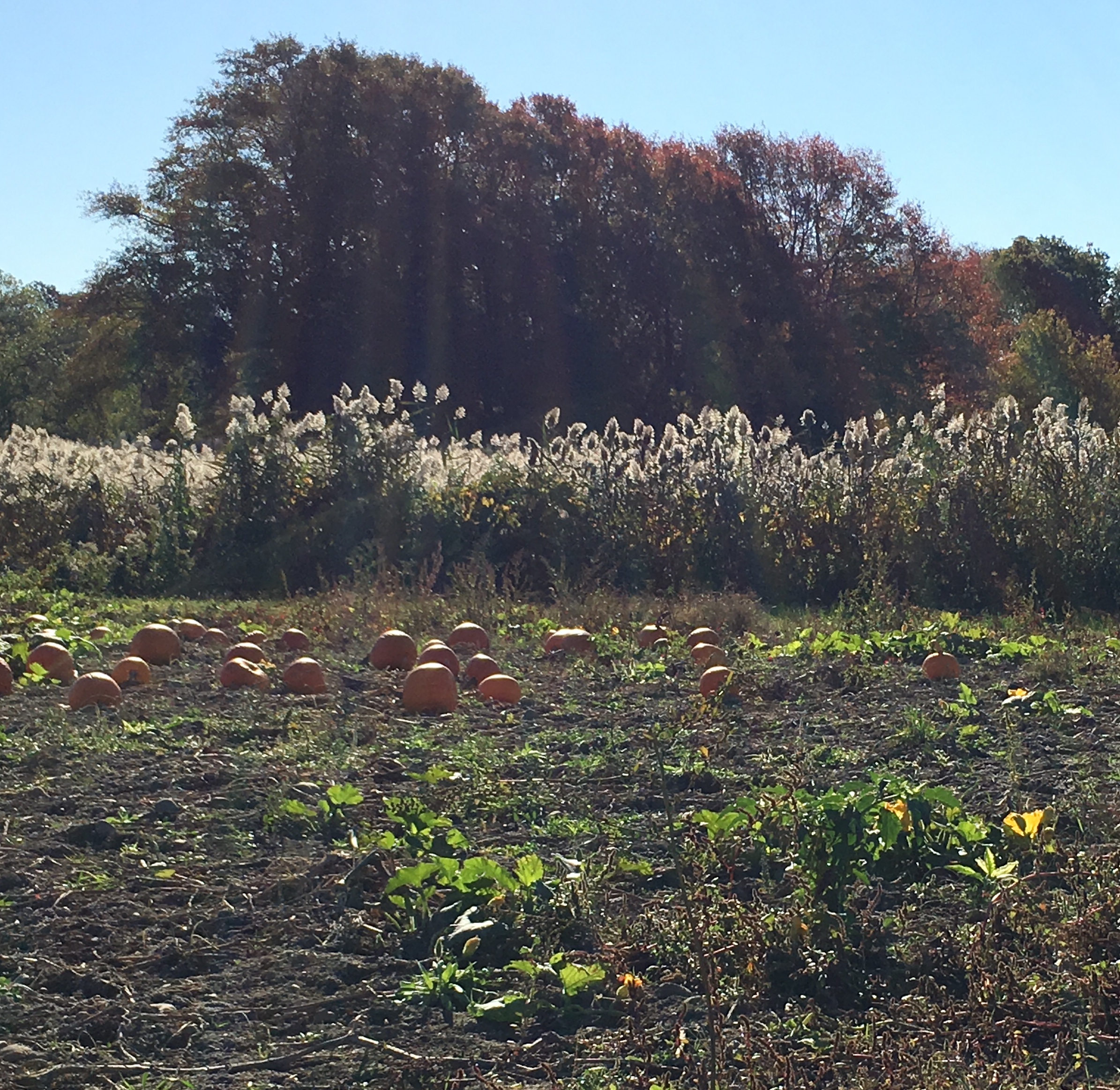
Source photo
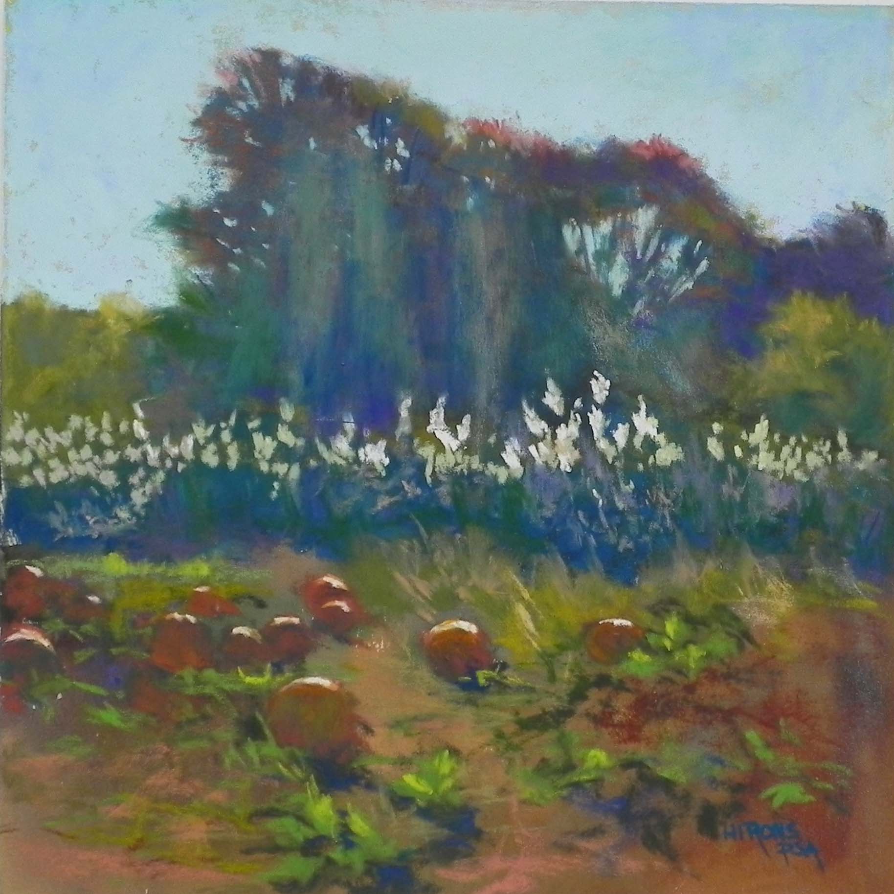
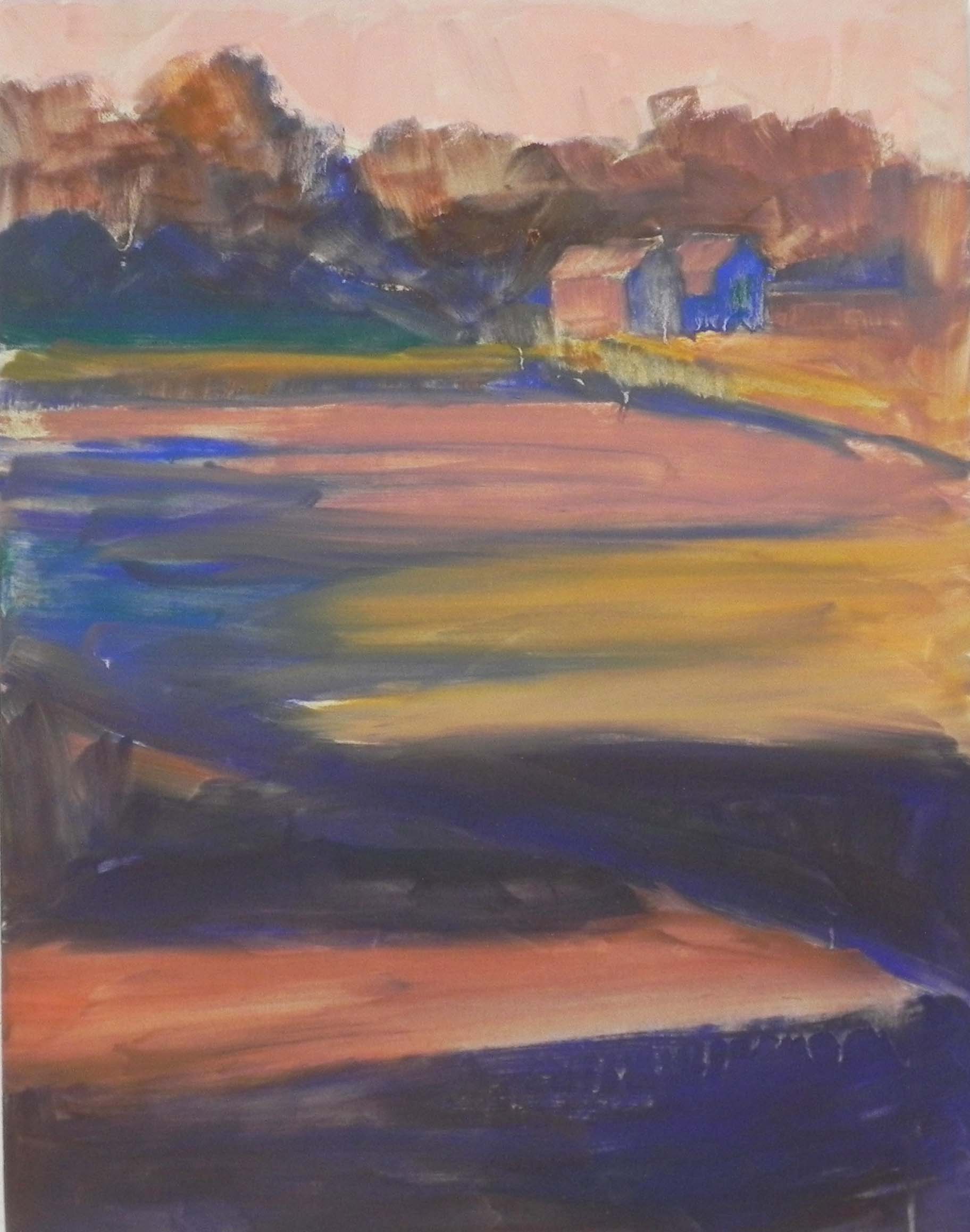
Smaller initial painting done as color study, 12 x 12, UART 320
On Monday, I did a large demo–a 20 x 20. I had my framer mount UART 320 onto gator foam. I used to paint directly on gator foam and still have sheets of it from a case I bought many years ago. So now I’ve decided to use it for mounting paper.
This painting was important to me, given its size. After looking at the source photo several times, I suddenly realized its potential. I took the photo with my friend Sarah Brown in Tiverton, RI. She suggested we ignore the “no trespassing” sign and just drive in, park and take pictures, which we did. Shortly thereafter, I woman road down the road and into the field and chased us out! But not before I got this photo. The others are all looking away from the sun and are much less interesting. I loved the light streaming through the trees and the way it hit the reeds and the tops of the pumpkins.
My initial thinking on this painting was that I wanted this to be a combination of blue greens and red oranges, and it actually turned out that way! If you look at the photo, it’s all pretty much brown, including the ground. But I thought there was real potential with the trees for multiple colors with the warm blues prevailing. I also decided that this would be a good painting for a watercolor underpainting. None of the darks are as dark as they might be, given the profusion of light in the picture and the shapes are all pretty nebulous as well. I used yellow in the sky. Then a combination of ultramarine blue, mars violet, and turquoise for the trees and grasses. I used warmer colors in the foreground.
I was worried about this painting and decided that doing a 12 x 12 study would be a good idea and I was glad that I did it. The first thing I blew was the sky! I went too dark, then too light, and brushed it off, completely losing the yellow underpainting. When I did the big one, I knew exactly what I would use and I was able to leave a lot of yellow glowing through.
For the trees, my initial thinking was that I could do the trees solely in watercolor and then add some color to the top, and finally the streaming light. However, I ended up using very light layers of Giraults, mixing different blues, greens, and warm reddish browns.
Compositionally, I made one change that I thought was important. In the photo, you can see that some of the grasses are taller and they are directly below the tallest part of the tree. I decided that they would be better on the right side. I used the bright green leaves to lead the eye into the picture to the grasses, then up to the bright orange at the top. I think this makes a better flow.
You’ll notice that the pumpkins are not all that visible, due to the warm color of the earth around them. I loved the fact that they were primarily in shadow and I used a combination of cool green and dark red orange, first Girault and then Blue Earth, to give them form and depth. I used a peach Schmincke to begin with for the light on the top, then wen to my lightest Ludwig orange, which really made them stand out.
One of my students noted that in the 12 x 12, the color of the earth was lighter, creating a path into the picture, and asked if I wanted to do that. But we decided that the green leaves were enough.
I added a number of warm greens into the background trees on left and right, in the reeds, and in the grasses in front of the reeds. I think that this helps balance the color. I used a blue green for the darks under the leaves, to bring the color into the foreground. I made final adjustments to the sky holes and shape of the trees after the class, but really enjoyed engaging my students in the creation of the painting. One person looked at the photo and wondered what the heck I was going to do with it! And I did pass it by the first time I looked at it. But working from photos is all about seeing potential. I like working this way because it gives me time to think about the painting and where I’ll go with the color, what kind of surface and underpainting will work best, and how I might change the composition. I wouldn’t always do the kind of detailed “color study” that I did, but because the surface cost me money, I decided it was worth it. Every painting is a new adventure and a change to explore!