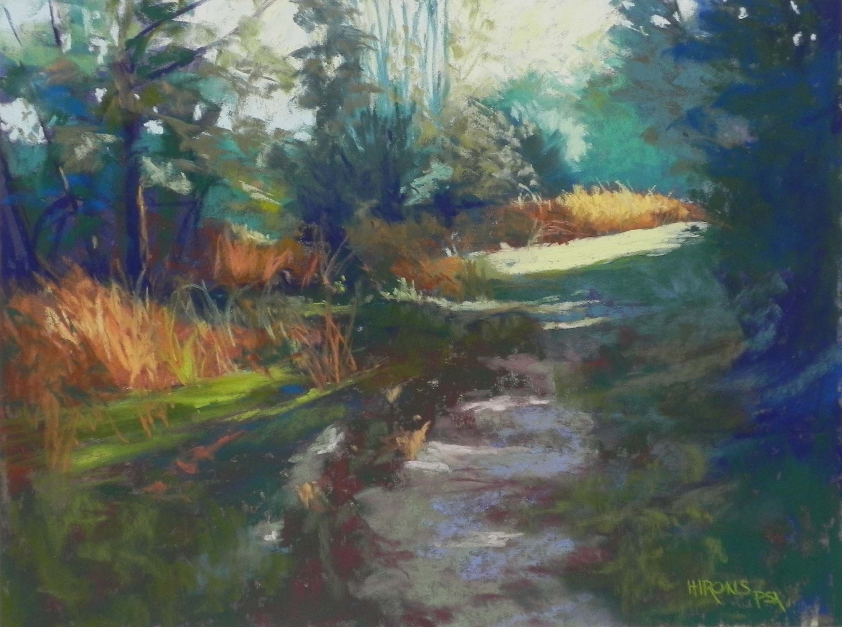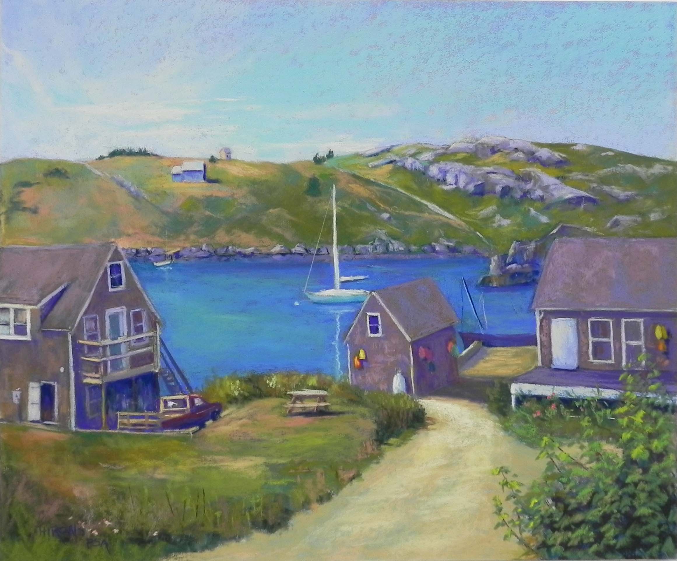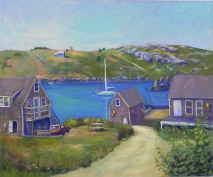
Happy Day, Monhegan Island, 20 x 24, UART 320
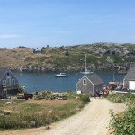
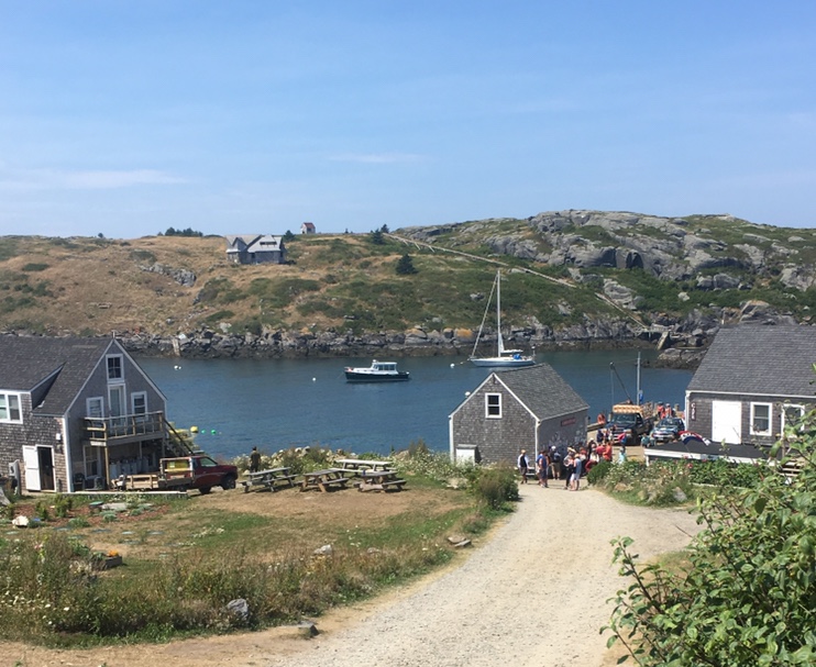
Source photo
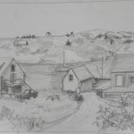
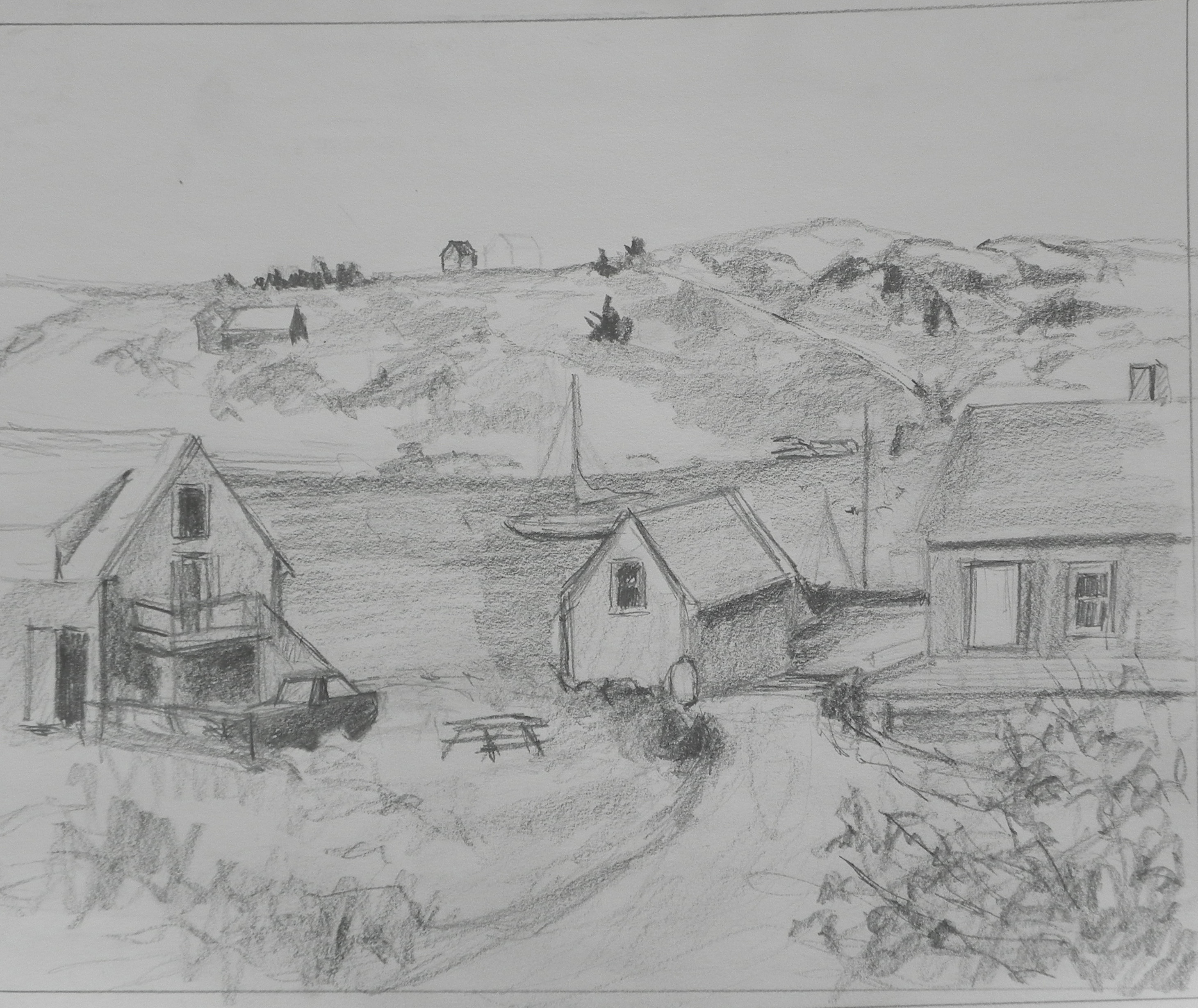
Graphite drawing on board

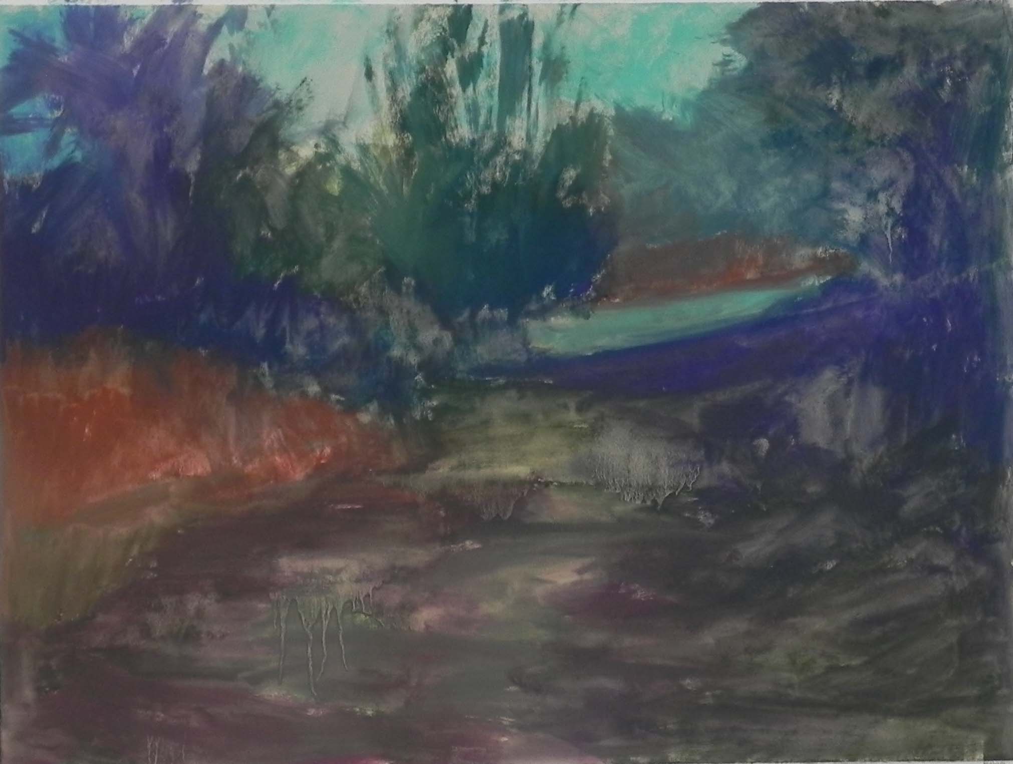
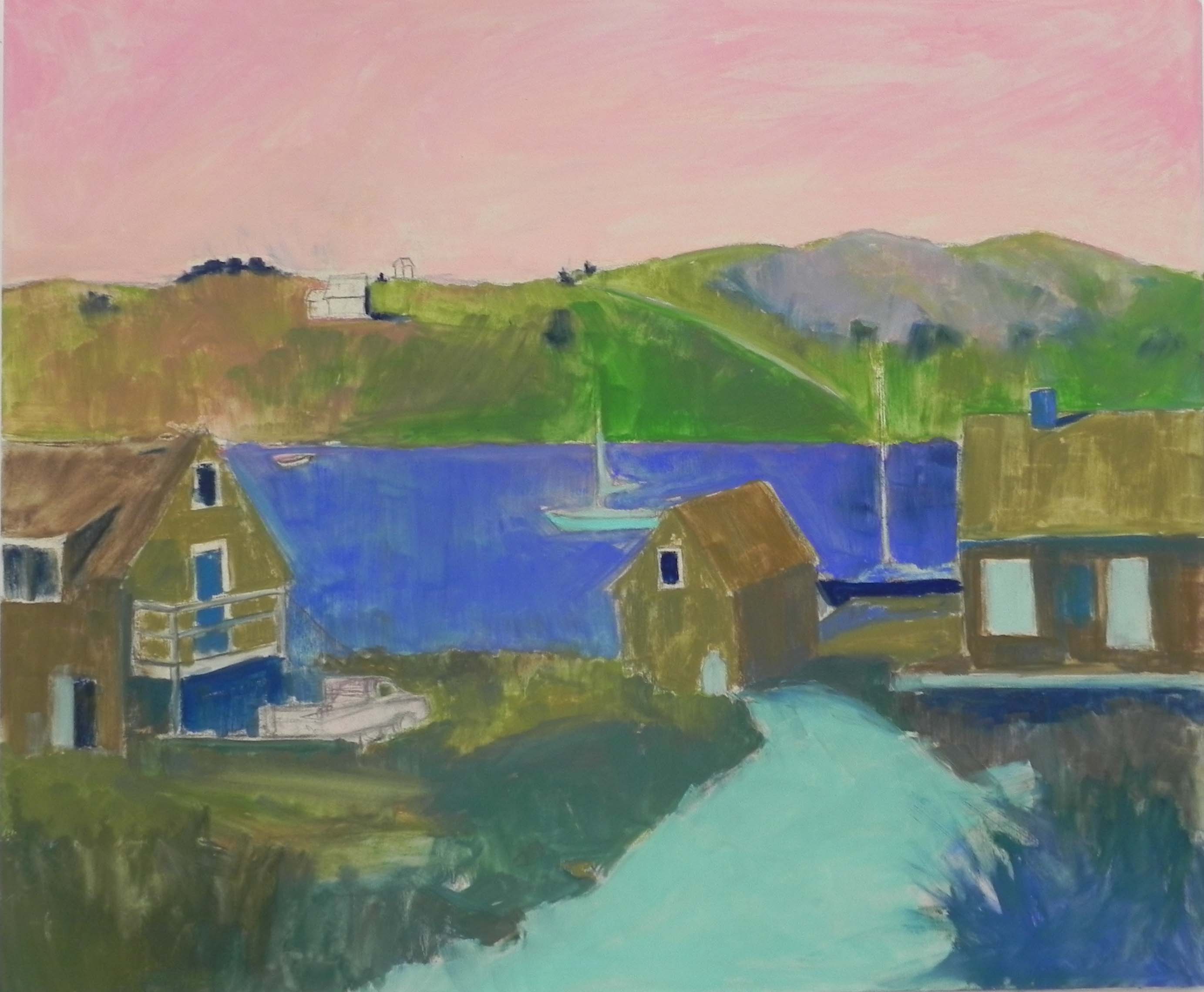
Underpainting, hard pastel and alcohol
Last week I spent three days in the studio working on a commission from a new client in Buffalo. He was interested in Maine and sent me a photo from Monhegan Island to see if I could paint it. I knew I could–although there was a lot in this photo that I felt needed changing! The first thing I had to do was get rid of the people in the picture! The dock was crowded with vehicles and people that I knew I didn’t want (and couldn’t draw!!!). And there were way too many picnic tables as well. I also didn’t like the positioning of the boats in the harbor, or the design of the house on the far island. All of this needed to be simplified, moved, or eliminated.
Secondly, the light in the picture was flat and uninteresting. I couldn’t change it a lot as it would have been too complicated, but I tried to improve on the sky and make it a little more dramatic. I did a drawing on paper, then spent a lot of time doing the drawing on the mounted UART 320 paper. I did the underpainting with hard pastel. For some reason, I decided to start with reds and decided I really didn’t like them! I left it in the sky, but used blue in the water, browns for the buildings, and aqua for the road. I didn’t have a clear color palette in mind. I knew that I needed to stick with the actual colors to a great extent, so I just used what I saw or thought would be useful. I sent the drawing and underpainting images to the client and he pointed out that the house on the right was more at an angle. I appreciated that and changed it.
In painting the island (Manana), I simplified the house and decided to add a small dock and boat below it. I really like the tiny little building at the top of the hill! Not sure if someone lives there??? There is also what looks like a pipe running down the hill to the left of the rocks. Every picture I’ve seen has it (including those I took when there), so I decided to keep it.
When I got to the water, I had some challenges. In the photo it’s really dark. The client wanted something more turquoise, but I said that it couldn’t look like the Caribbean! So I began with blues, but added some warm green into them on the left, where the sun is. I think that worked pretty well. I also put more of the turquoisy green in the sky at the client’s request. I moved the sail boat to the left of the middle building, almost right in the middle. But I it was better than where it was in the photo, and when I tried to place it more to the left it stood out too much. So I liked having it “attached” in a way to the building.
The house on the left and the truck were the biggest challenge. I tried to change the truck, to remove the wooden frame on the back of it, and also to change the color. None of this worked! In the end, I copied the picture as close as I could and it finally made sense. The road goes down a bit to the left where the truck is parked and the land to its right is on a little hill. I didn’t see this right away but it finally made sense. I tried various colors on the truck, from a cool red that looked too purple, to blue, and finally to a dark shadowed red. This was one of the last changes I made, after having added the yellow and orange buoys to the two buildings at the request of the client. I knew that I needed warm color on the left and the red of the truck was perfect, finally!
Another big challenge was the dock, since I was removing all the clutter! What to put there? I decided to add a fishing boat behind it and keep it simple. For awhile, I had the dock the same color as the road and it was very much in competition with it. So I darkened it and was much happier.
The aqua underpainting really worked for the road. I left a little of it showing through and used various Girault ochres, then added a very soft yellow at the far end where it begins to turn.
I happily used a lot of red violets in the painting, in the distant rocks and in the buildings. I hadn’t used them in my recent shore painting and I missed them! They are a good base color for the weather-beaten shingle buildings, over which I added some browns. And they worked well with the various greens and the ocher of the road.
This was a challenging painting. I spent three days last week, then took a fresh look at it on Monday. It was then that I made the truck red and added some finishing touches. The painting is now on its way to the framer’s in Buffalo. I really enjoyed sharing my progress with my client, Devin and I think he really appreciated it. His mother was an artist so he has an “eye”!