
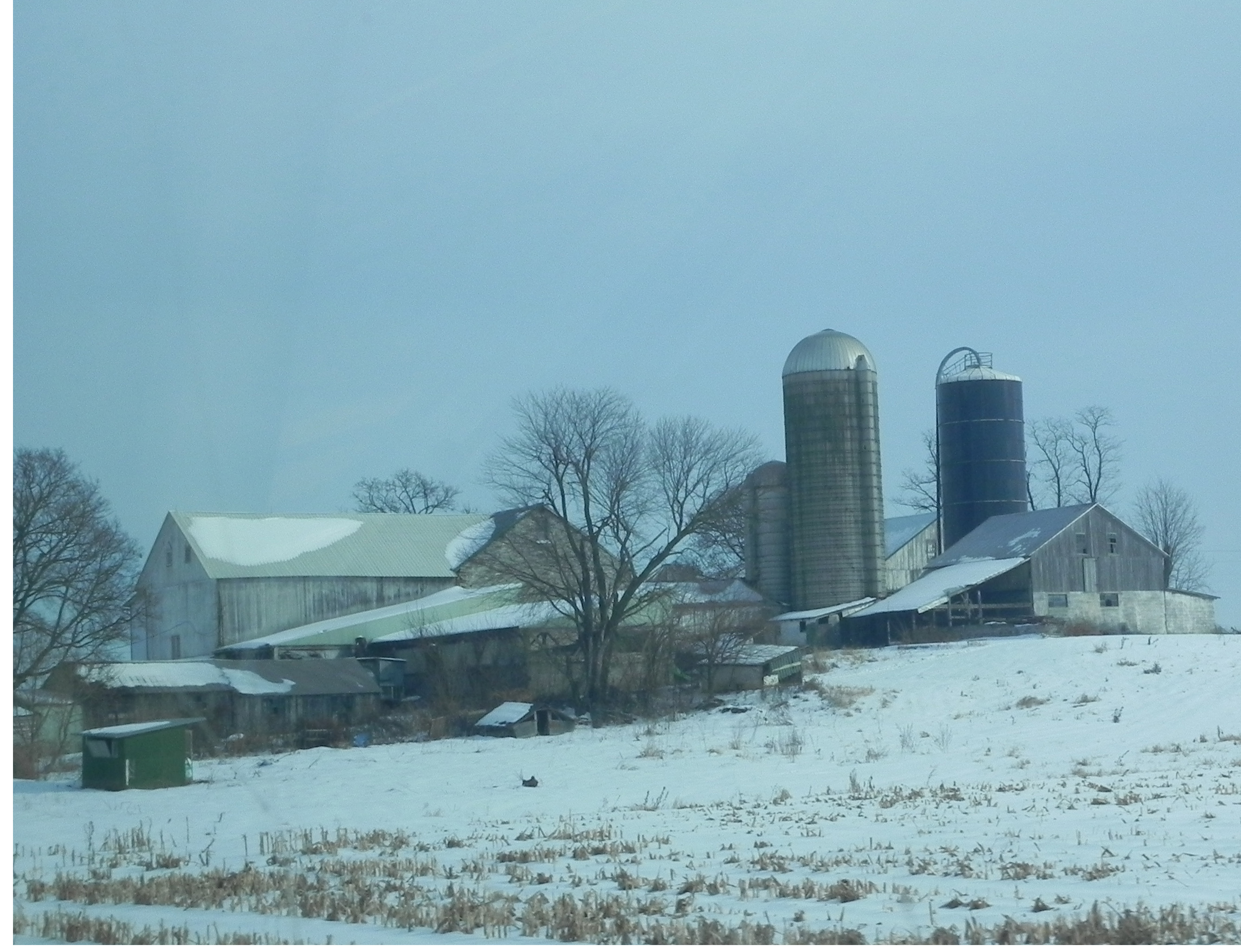
Photo of Pennsylvania Farm taken from car window
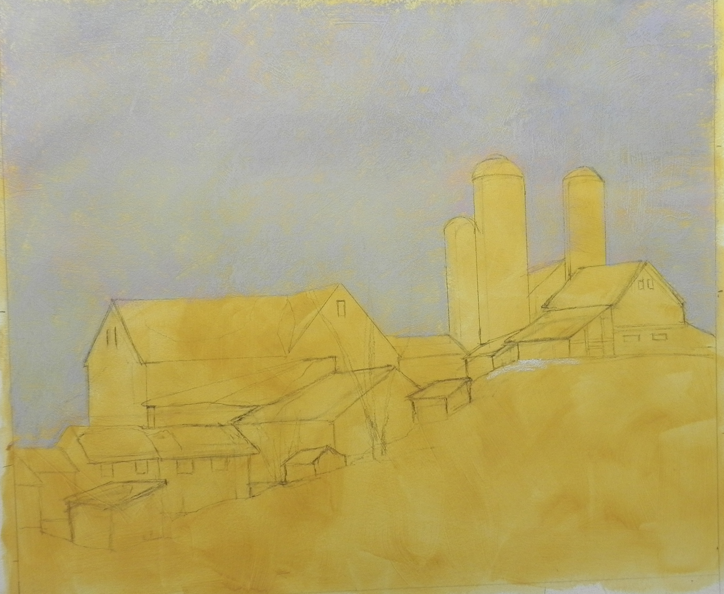
Pencil drawing and first layers of sky color
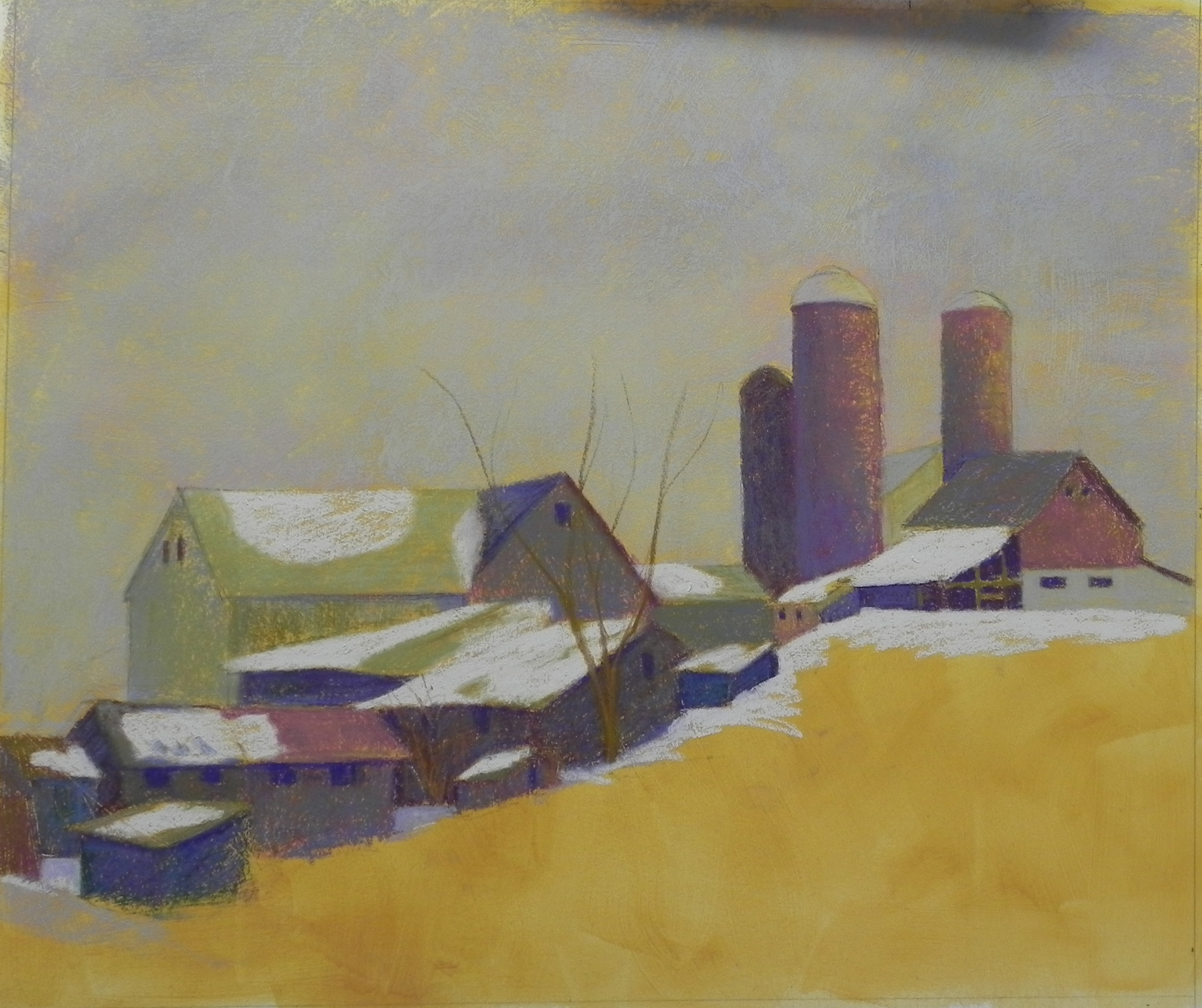
Farm buildings done with hard pastels
I know that many of you are in the deep freeze and it’s coming this way. The wind has picked up and I’ve decided to spend the day at home doing a painting I’ve been thinking about for several weeks. The photo was taken from the car window near Kutztown, PA on our recent trip to New England. The day was bright and sunny and there was a lot of yellow light infusing the sky. This doesn’t show particularly well in the photo but I wanted to try doing something with it. One of the things I love about farms are the various sizes and shapes of buildings that seem to multiply over time. I loved the way this one hugged the hill and decided to emphasize it. I also wanted to try using the Rives paper for buildings, something I haven’t yet done. The second image shows the pencil drawing and the initial colors of sky. I used several blues, violet, greens, and a light almond color. It’s probably too light! And it’s becoming a little gray, so this is going to be a challenge. In the third image, I’ve added hard pastel to all the buildings in varying combinations of colors, and used an Art Spectrum tinted white (cool gray) for the initial layers of snow. I’ve decided to be brave and do this as a demonstration for you, not knowing whether I’m going to ruin it or not! I started a blog post after finishing the sky but chickened out! Now that the buildings have been added, I’m feeling better about it. But I have to decide a number of things: what to do with the sky; what to do with the snowy field–add the pieces of vegetation or not? And how much to go into the soft pastels (which I’m dying to do!) I used primarily the Caran d’ache for everything so far and found myself actually doing cross hatching because they are so hard! (This is something I used to pooh-pooh because it was all you could find in the pastel books!!!). I plan to add more trees, etc., but decided I needed to get the sky the way I want it before I do much more. I’m liking the combination of colors in the buildings. I used a mix of violets, greens, green golds, and a blue. By using the same colors, but in varying orders, and combinations, I think I’ve been able to maintain some continuity while also providing variety and interest. We’ll see what happens next!