
Here is the completed fourth painting in my Georgetown Canal series. This one is different in that it is on the new pastel premiere 400 grade white, rather than the 400 UART that I used for the first three. The sheets come in 20 x 26 and have a good coating on the back. I ruled off two inches and decided to try using them unmounted. It worked great. I hope they won’t be a problem to frame, but they didn’t have the warp in them that the mounted ones had (I had my framer dry-mount the UART.) However, the paper doesn’t seem to like hard pastel very much! I applied one color, then when adding another over it, it frequently brushed off the first! And the alcohol underpainting was not as satisfying as that on UART and Pastelbord. I found it too easy to brush off the color altogether. But once I started working on top with Giraults, I found that the paper had a really nice tooth and it was possible to let some of the underpainting show through–something I really like in buildings. I decided to do a warm under cool/cool under warm underpainting (except for that horrid yellow green on the left!!!). I liked putting browns under the mostly cool grays of the bridge. So the paper has pluses and minuses, but on the whole, I was very pleased with it. If I can use it unmounted, it will save me a lot of money ($18 for 20 x 24).
For this painting, I removed a bridge at the top of the photo in order to not block the distant buildings (which I had to make up!). I also wanted the focus to be on the arched bridge, but liked that there were two more behind it. In this painting, the canal boat is in the distance and there is a car coming across the bridge to the left. In the photo, the car was heading off the right side and I wanted it to be coming into the picture, not going out of it. I also like the small bushes that are in light and shadow on the left side. Color-wise, the picture started coming together when I brought the magenta from the buildings on right into the greens on the left to gray them down. The picture had much more color balance at that point, and the green (a cool green) was too strong anyway. I played with the yellow light on the wall at left. I didn’t want it to steal the show, and I had to really tamp down the light on the far distant wall, which I had too strong initially. I used some mid-light beige colors to begin the wall, then added a few saturated strokes of light yellow, but left most of it more neutral.
I’ve just completed the drawing for #5. So much perspective, so many lines and arches! I think I’ll be ready for pure landscape when this series is done!
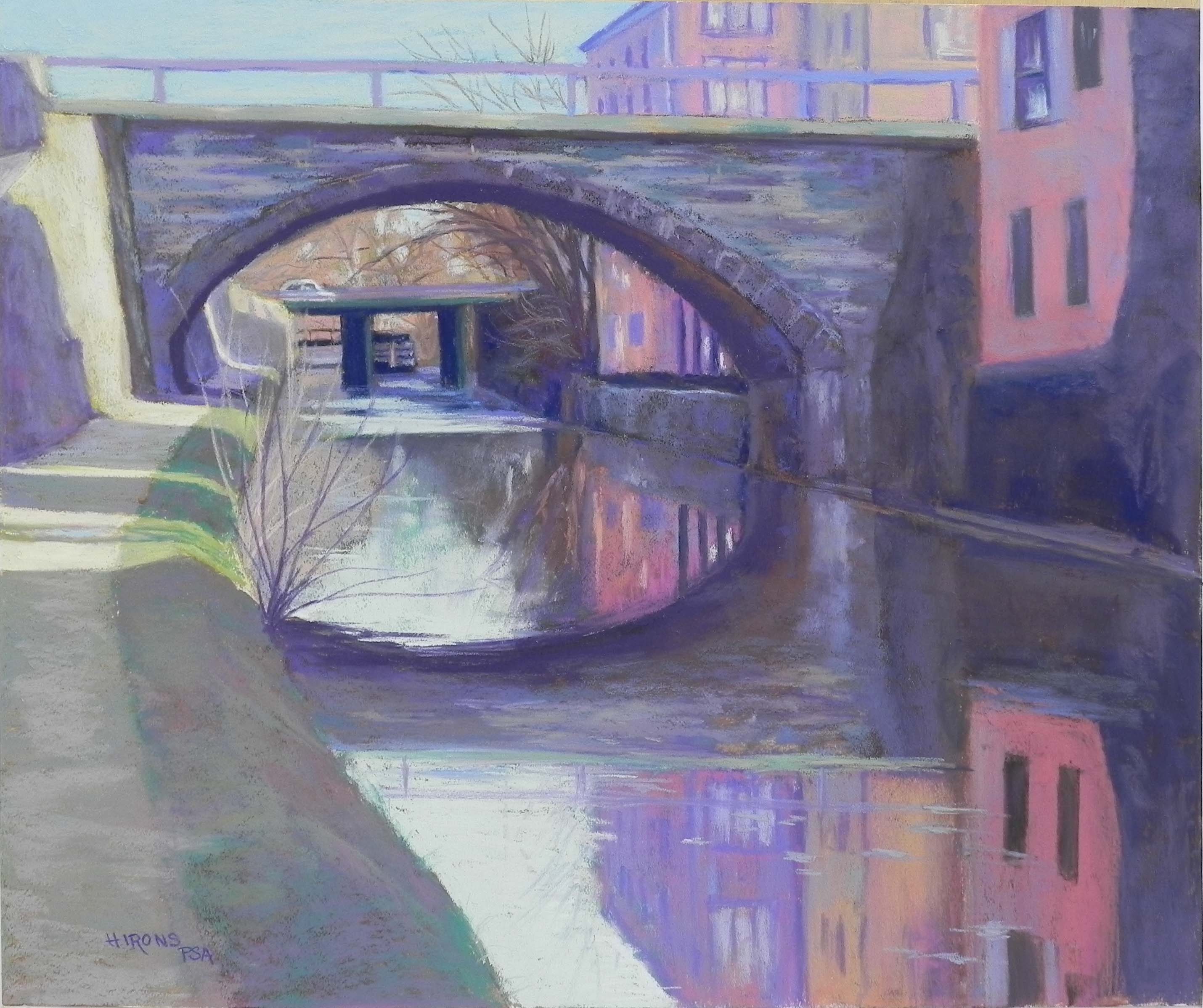
C&O Canal, Georgetown, #4, 20 x 24, Pastel premiere 400 white
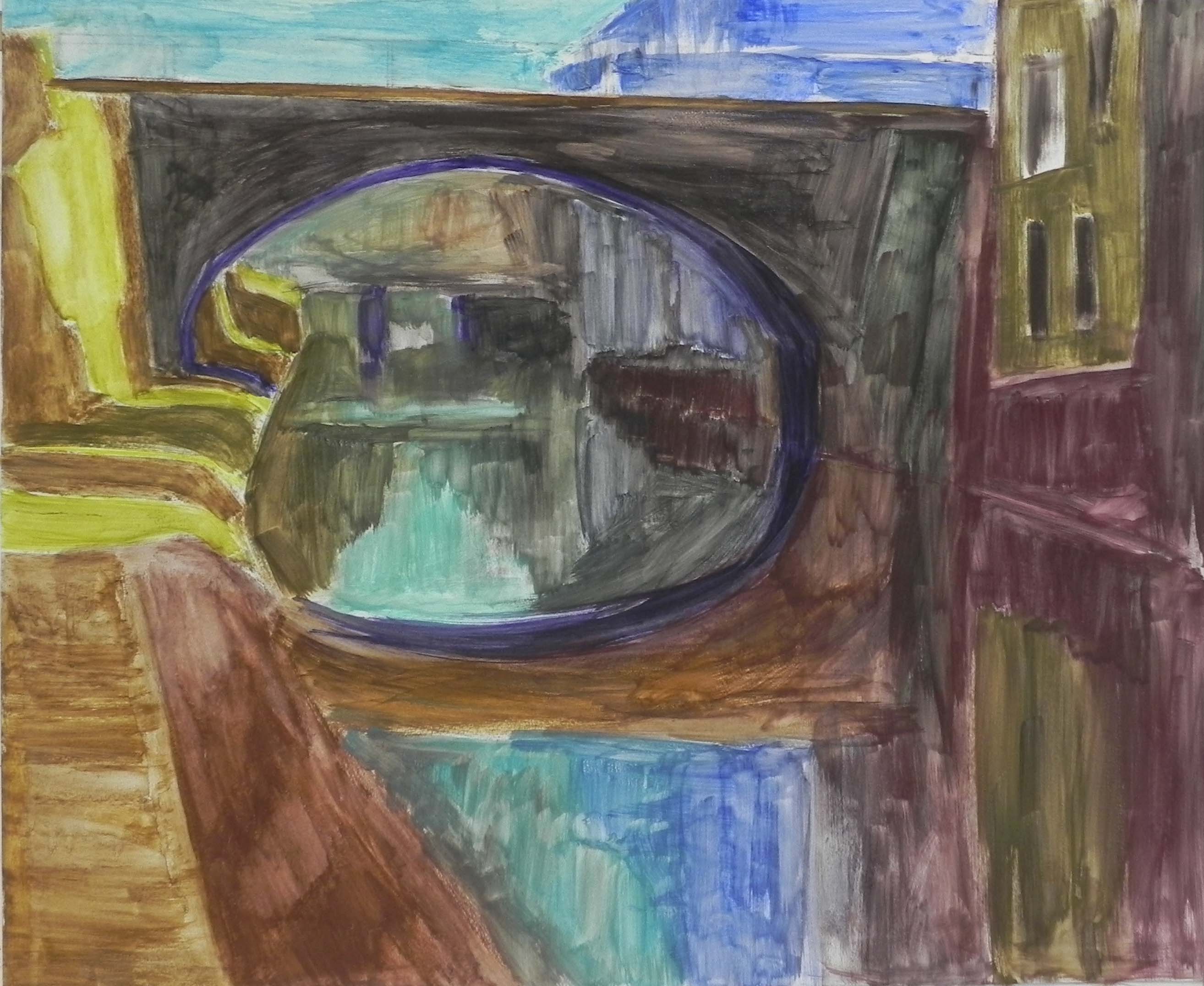
Underpainting