
Today in class I showed my students how to make your own surface using Art Spectrum Liquid Primer, various colors of liquid acrylic, and whatever surfaces they brought in to work with. I used the Rives and toned it a reddish brown. Others used mat board and reused Pastelbords. Once their surfaces were done, I did a demo on mine. It was a very different experience from doing the other two on the Pastelbord for a number of reasons. The first was that I was working with a solid tone and no underpainting. The second was that the tone was such a dark reddish brown. Some colors I chose early on just didn’t work! I finally decided to use blue greens, with some blue violets and browns to tone them down. I thought about trying to make it more orange and fallish, but the color photo was there influencing me and I kept it truer to the photo. However, the resulting painting is quite different from the other two, I think. The rough surface is fantastic for foliage, but the light that I see in the first two seems to be missing from the third. Of course, it might be my choice of colors, but it does seem a little duller. (I also just noticed the solid dark outlining on the shed, which needs to be revised!) The house in #3 was done with blue green with the same value of red orange mixed in. I really enjoyed doing this painting, but not as much as the one on Pastelbord with watercolor. So that should tell me something! So what do you all think???
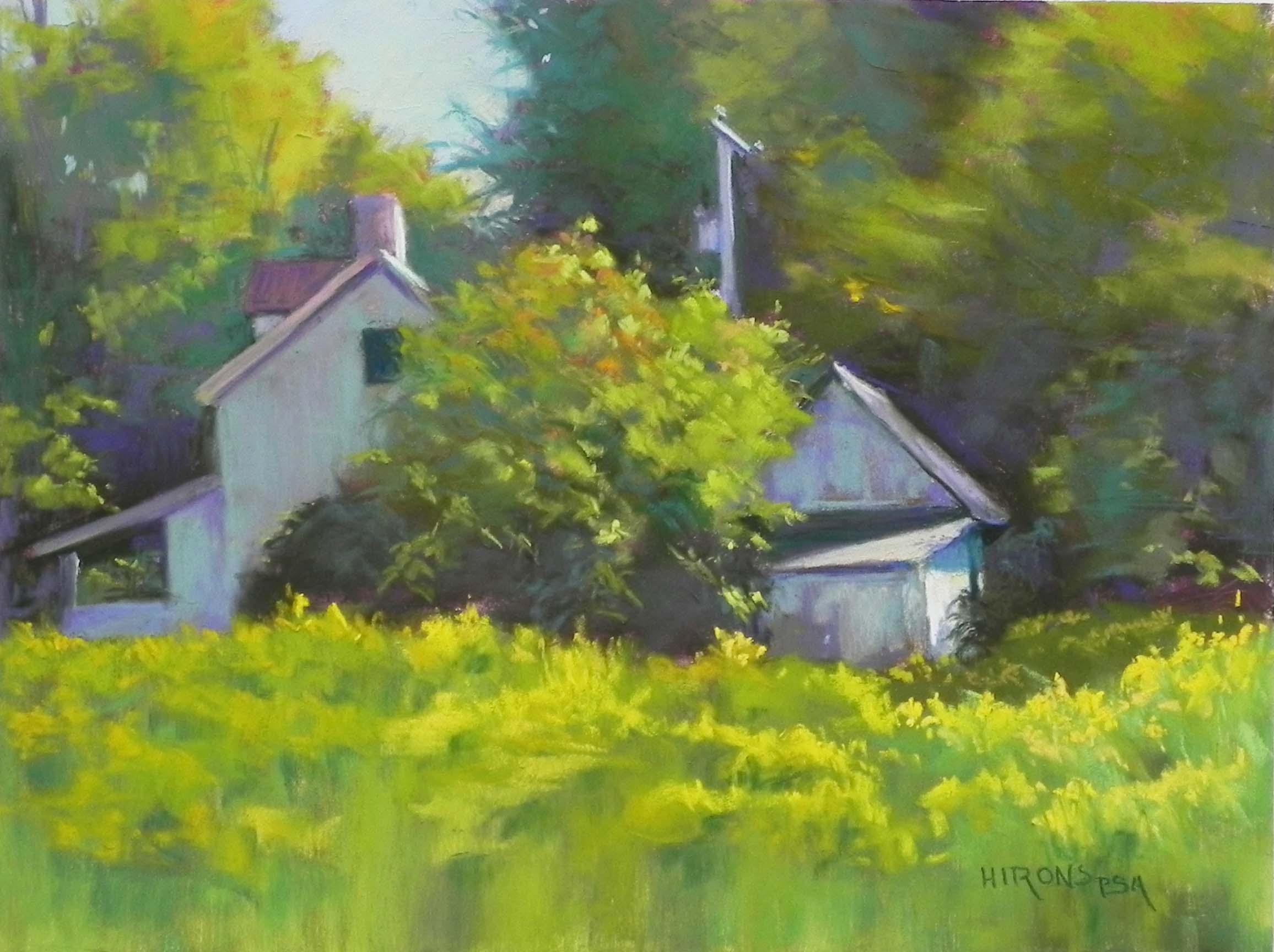
Catching the Light, no. 1, 12 x 16, Pastelbord
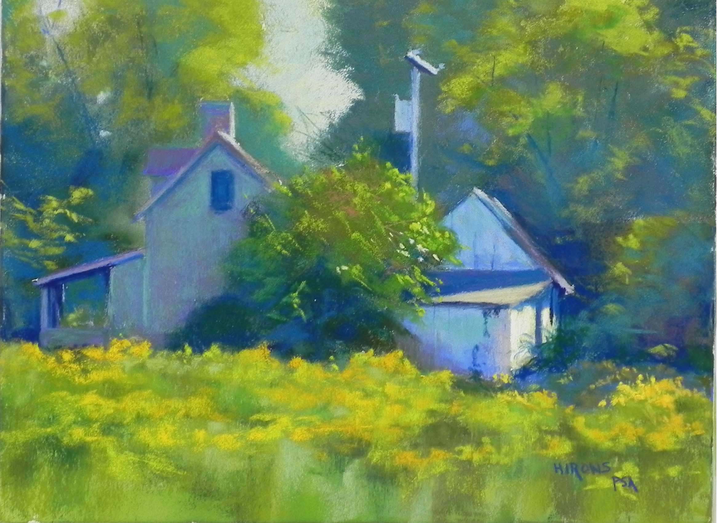
Catching the Light no. 2, 12 x 16, Pastelbord
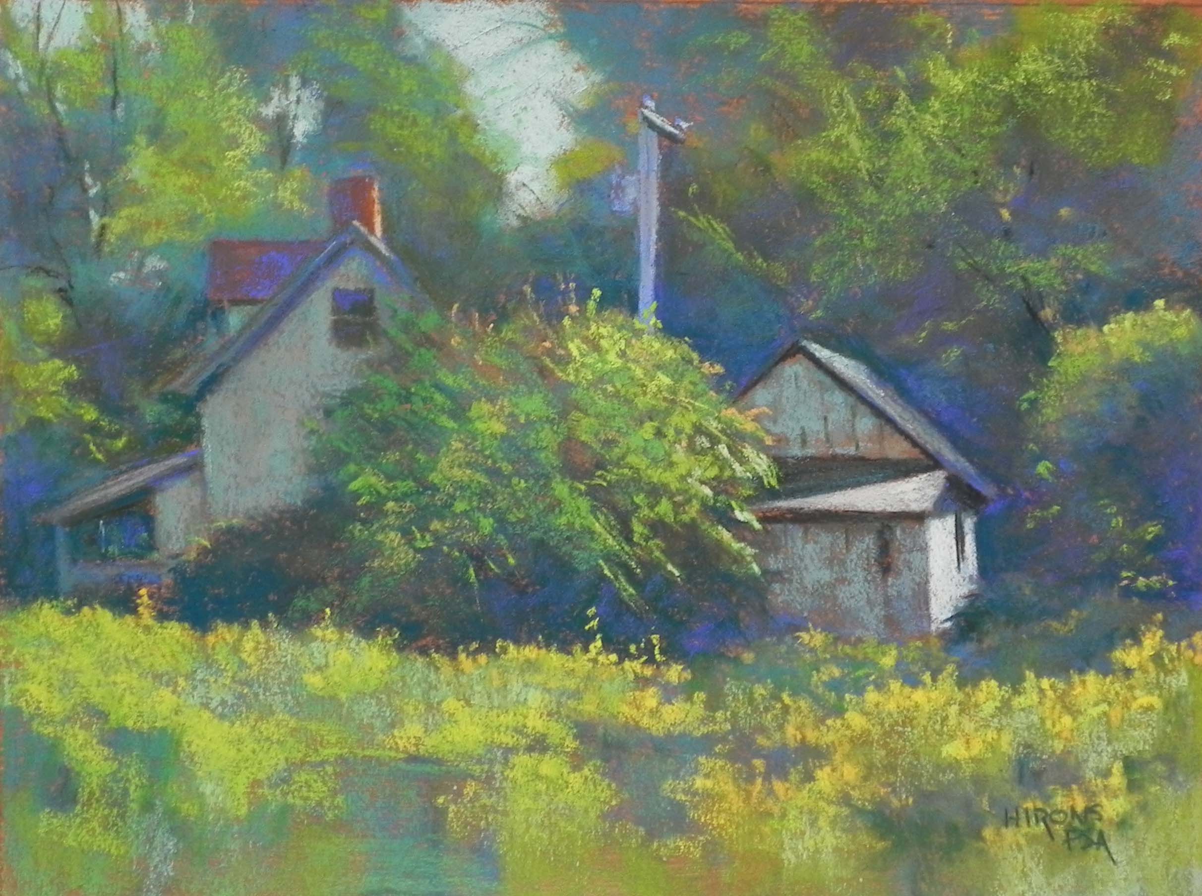
Catching the Light #3, 12 x 16, Rives with Art Spectrum Liquid primer
Your 3rd painting with the dark warm undertone gives the scene a definite fall feel. Since this is what you wished at the onset, I think it works. #1 feels like summer and #2 feels like spring.
June–thanks so much for your comments. I never thought about it in this way! Really appreciate it.
It seems there’s not as much contrast in #3, hence, not as strong a light. I like the buildings in #3 best, and also the central bush.
Dana– I noticed that I hadn’t put as strong darks into the 3rd one as I had in the first two. So you are right about the light. Glad you like elements of #3. I enjoyed doing all of them.