
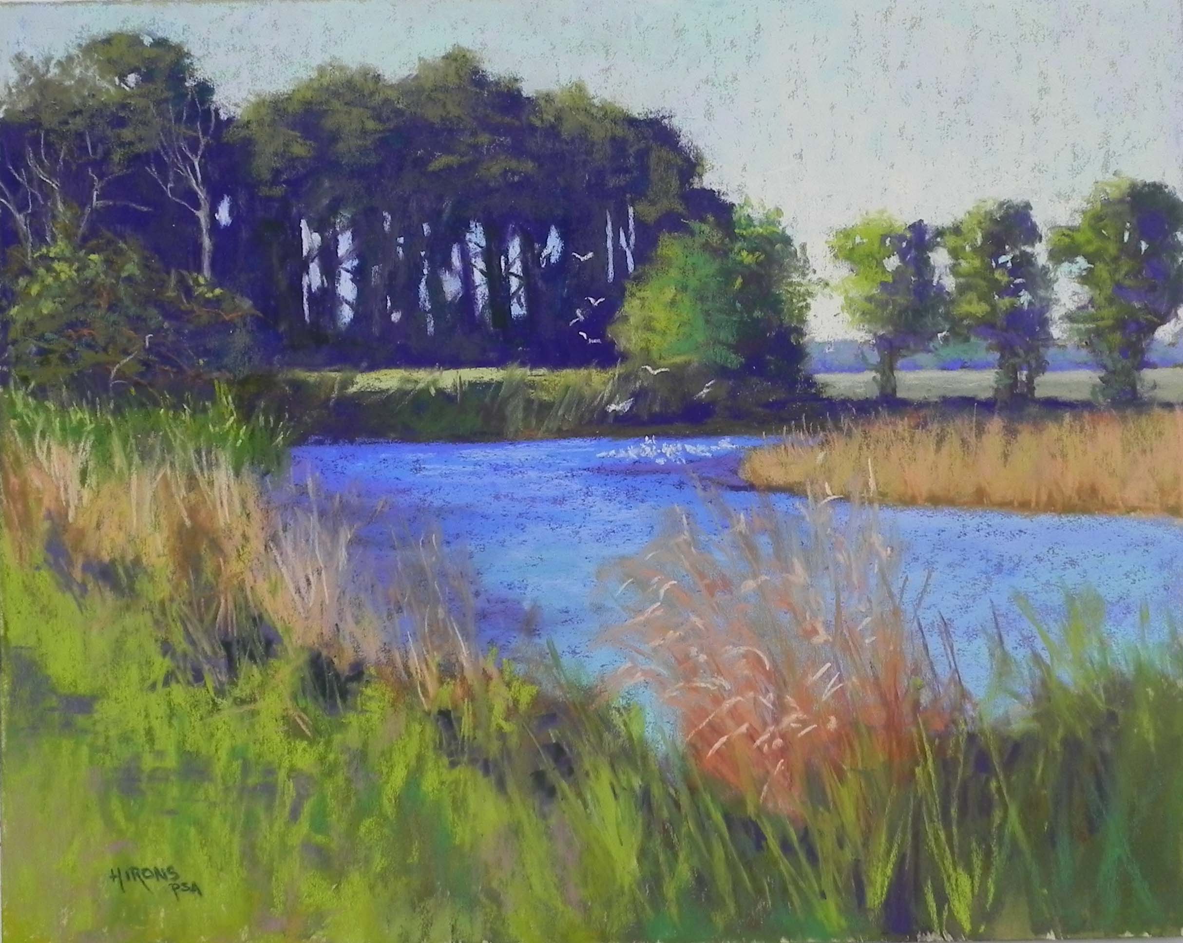
Chincoteague, #1, 16 x 20, UART 320 mounted board
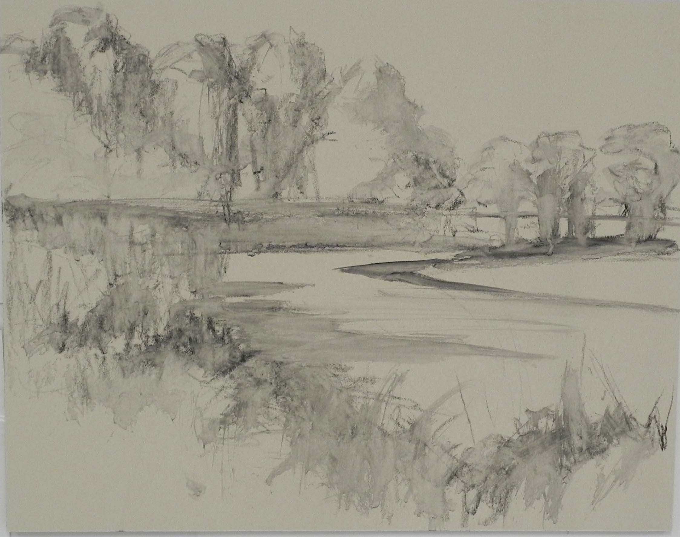
Charcoal lay-in brushed with water
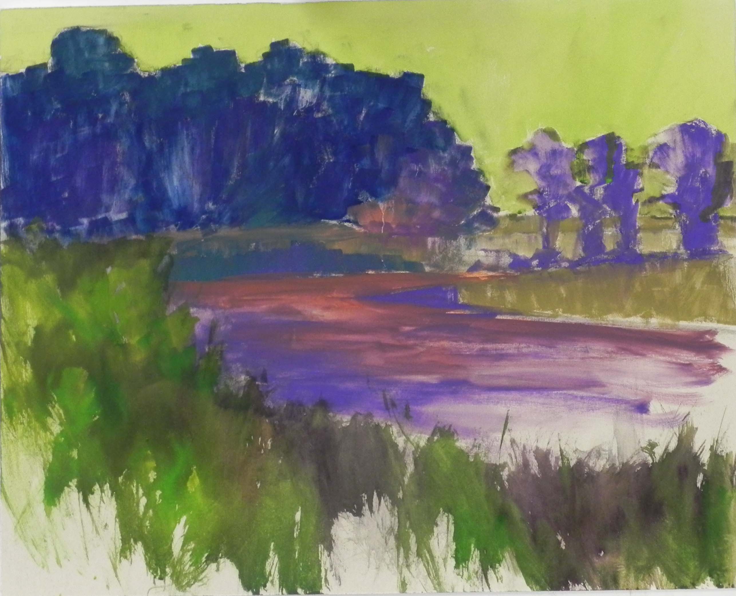
Underpainting with watercolor and hard pastel
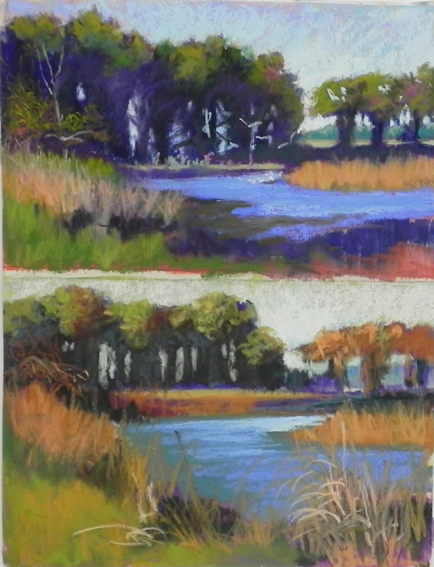
Color studies
I did two demos this week and will be sharing them in two posts. I have no titles for these paintings yet! So I’m calling them Chincoteague #1 and #2. If any of you have inspiration, let me know. This one is the one I did in my Monday class. I’m sharing the initial lay-in, color studies, and the underpainting, along with the finished painting. The class focused on the decision-making process and I had a hand out with the types of decisions one makes. One of my statements was to be sure to allow the painting to speak to you during the painting process–this one did! Several times!!!
I began with a graphite drawing and two color studies. I decided to stick with the colors that were in the photo (color study above). Then I used charcoal to draw in the basic shapes. I used water and a brush to soften and set the charcoal and while doing this, I had the idea of making this into more of a vignette and leaving the bottom left corner unfinished. In the class, I used watercolor for the sky and for the reeds and grasses at bottom. I used hard pastel and alcohol for the trees and water. It was kind of a mish-mash! Not the most impressive underpainting I’ve ever done!!! I proceeded in painting the background trees, and the water and grasses a upper right. Then I tried to loosely put pastel in on the bottom. Pretty quickly it became obvious to all of us that this was not going to be a vignette! So I proceeded to paint in the lower left corner and the painting had much more unity. After bringing it to my critique group on Tues., I adjusted a sky hole and the trees at right, but left the rest as it was.
Compositionally, this is pretty close to the photo with one exception. I decided to add white egrets in the water and rising into the air against the dark background trees. This provides for a center of interest and the bright piece of yellow green field also draws the eye to that location. My original plan had been to eliminate the green tree where the egrets are. But when I did the lay-in, I realized that I needed something there. So I drew in a rather small bush. But as the painting progressed, it turned into a tree (just as it was in the photo). I also made a change in the color of the water. In the photo there were dark pieces that reflected the green trees above. I decided to just add violet to the water in place of the green, which helped tie the water to the red violets in the trees. I also added a more aqua color to the water in the foreground. I did the water and then added the orange grasses on over, which worked pretty well. The painting was completed in about 2 hours and I think it has the look of a painting that could have been done on sight. I’m happy with it now, but will welcome comments.