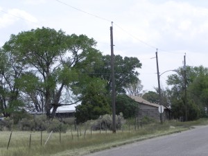
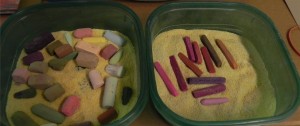
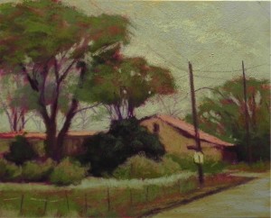
OK–I’ve been painting and listening to Bach and now I’m feeling much better! The photograph, as you can see is rather dull. Why would I want to paint that? For me, it’s about the shapes–the shape the building, which extends to the far left of the photo, and the shape of the roof on the right. Also like the shapes of the trees and the pattern of lighter grasses close to the bushes. The telephone poles and sign are an added attraction! My original thought was to change this into a sunny day and use blue water color in the sky. But I changed my mind and decided to keep it all in shades of warm, grayed greens, with orange, pink, and magenta. I started with orange watercolor in the sky. Then used a Great American “cad green” in its lightest value. Using white Pastelbord, I did a dual underpainting, using water color in the sky and hard pastels for the land objects. These are all in the box at right: majentas, purple, sienna browns, and pinky reds. Alcohol was used for the wash. The top layers of pastel are all soft: primarily Ludwigs and Great Americans. Unusual grayed greens were found for the bushes. I used additional warm color in the trees to keep them from being all green. I changed the composition to allow more of the house to show, adding windows and completely changing it’s makeup to stucco (or something more interesting than what it is!) I used similar colors in the road to those in the sky. The sky should probably be lighter and the final painting may well be. But I like the uniformity of color in this little painting and I’ll try to keep it so. Will bring these boxes of pastel with me to the demo, along with my travel box for additional color, if needed. I have no idea what to call this picture. Any ideas???


Thank you for showing us your demo and process! Very educational.
“Tucked Away” seems to describe the feeling I get with this house cozily nestled withing the bushes and trees.
Love the warmth and life you added to a rather drab photo.
Thanks so much Kim. Glad you like it. Your suggested title is interesting and I’ll see how I like it. Might ask the participants in the demo for their thoughts as well. Giving titles to paintings is almost as hard as pricing them!!! Mine always seem to start with the word “House” so I think I’ll try to avoid that.
I really appreciate the info you gave on your underpainting. I have never tried a combination of watercolor & pastel with solvent but why not?! I would call this something with the name “home” in it. Maybe “Almost Home”?